wall paints & varnishes in
Green
Our green colours


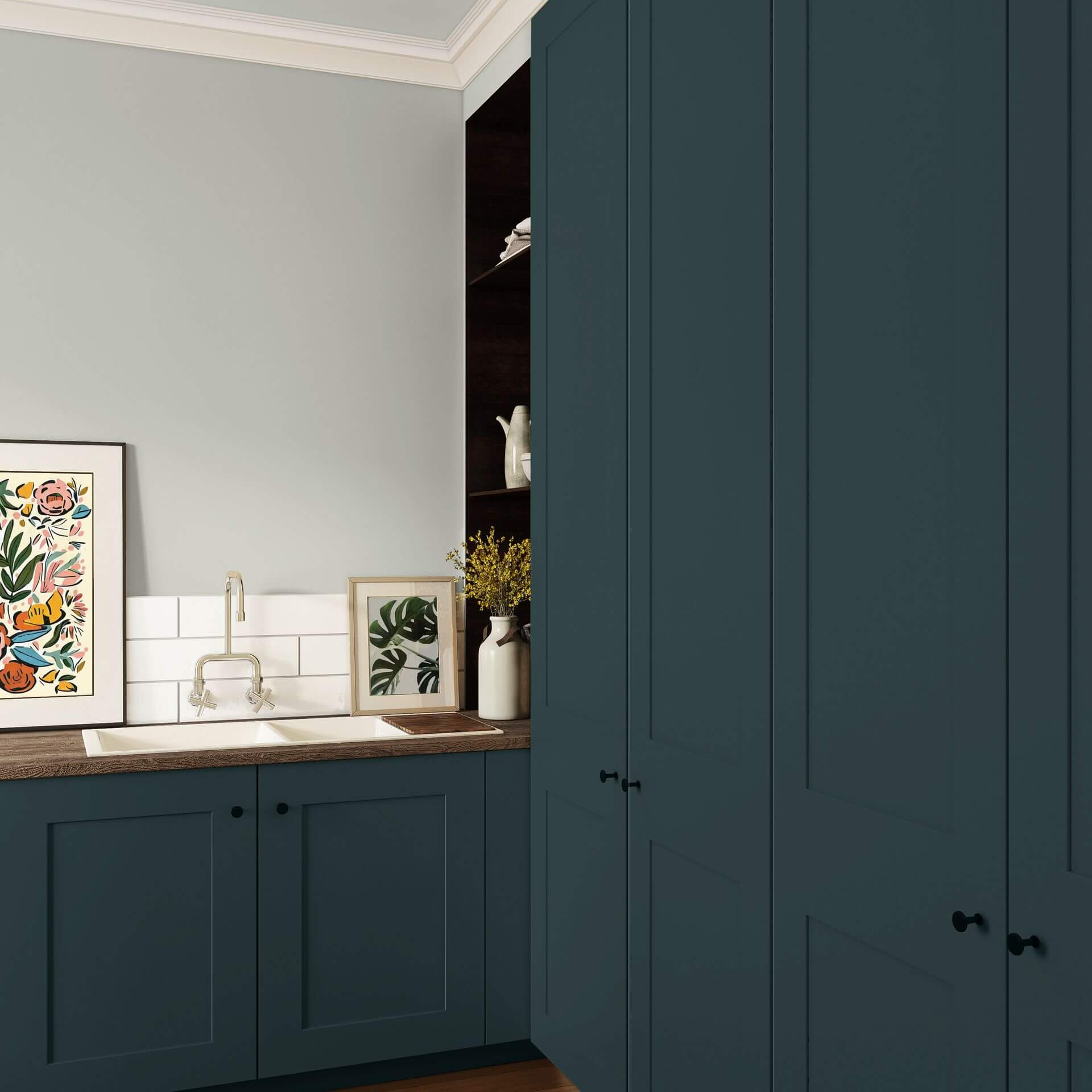
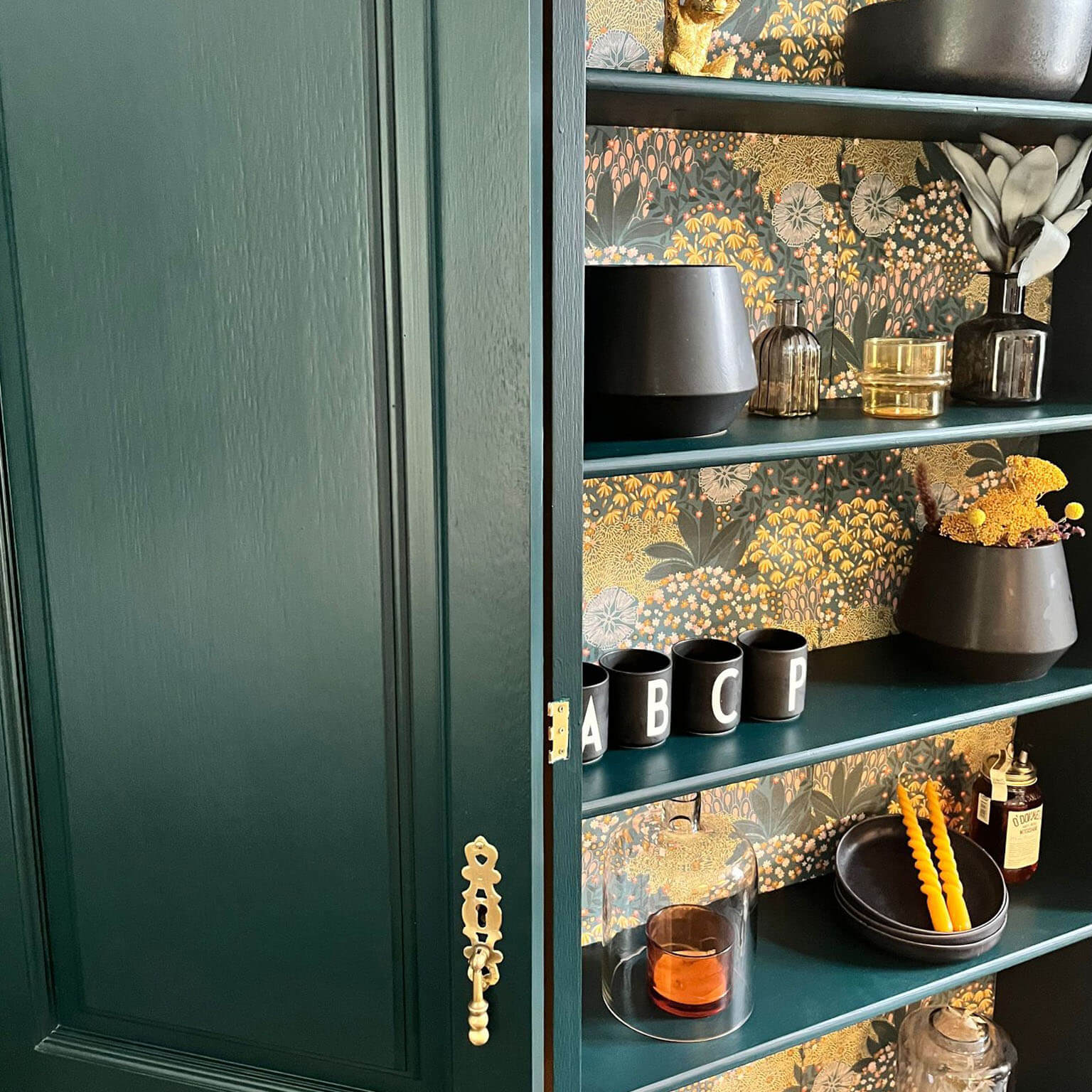
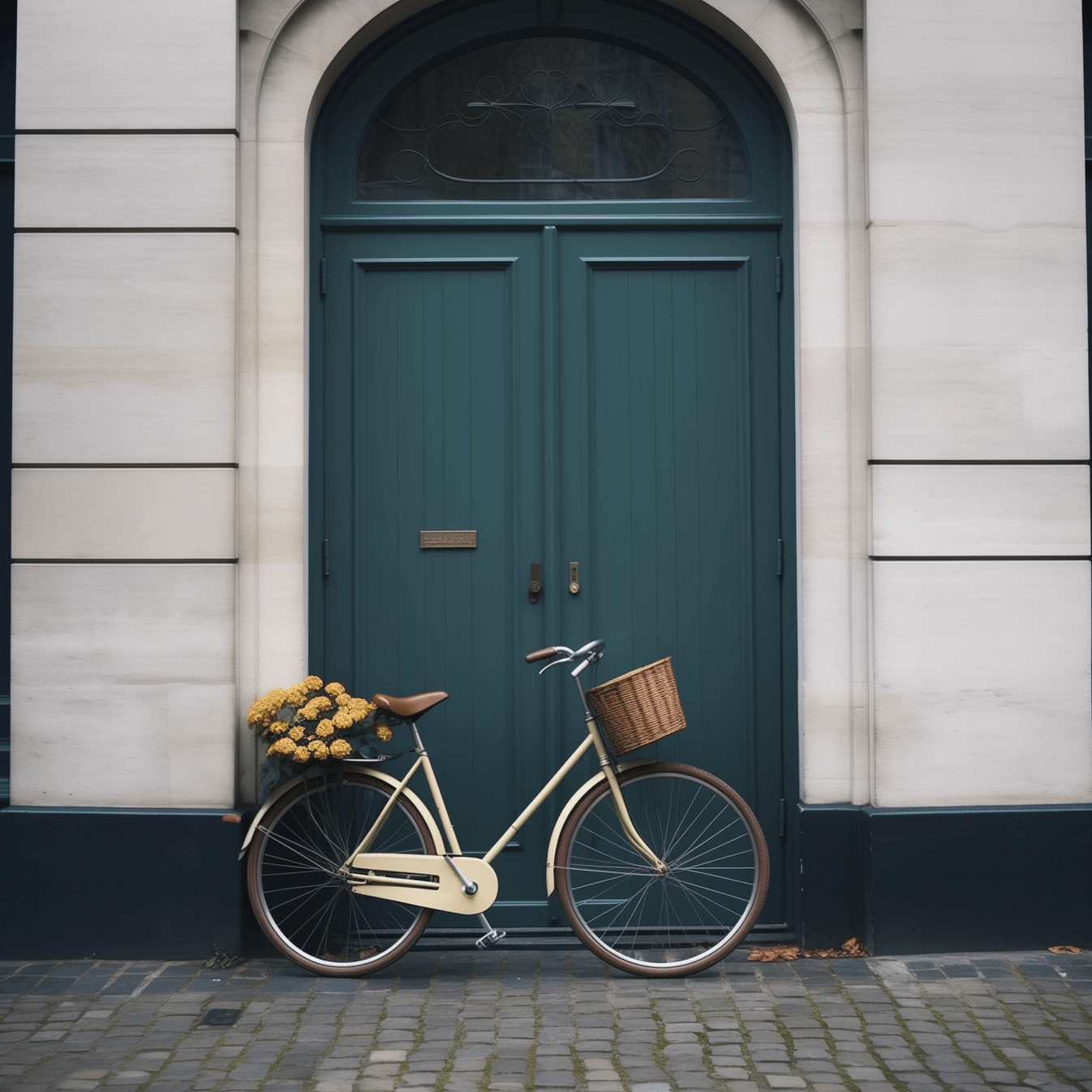
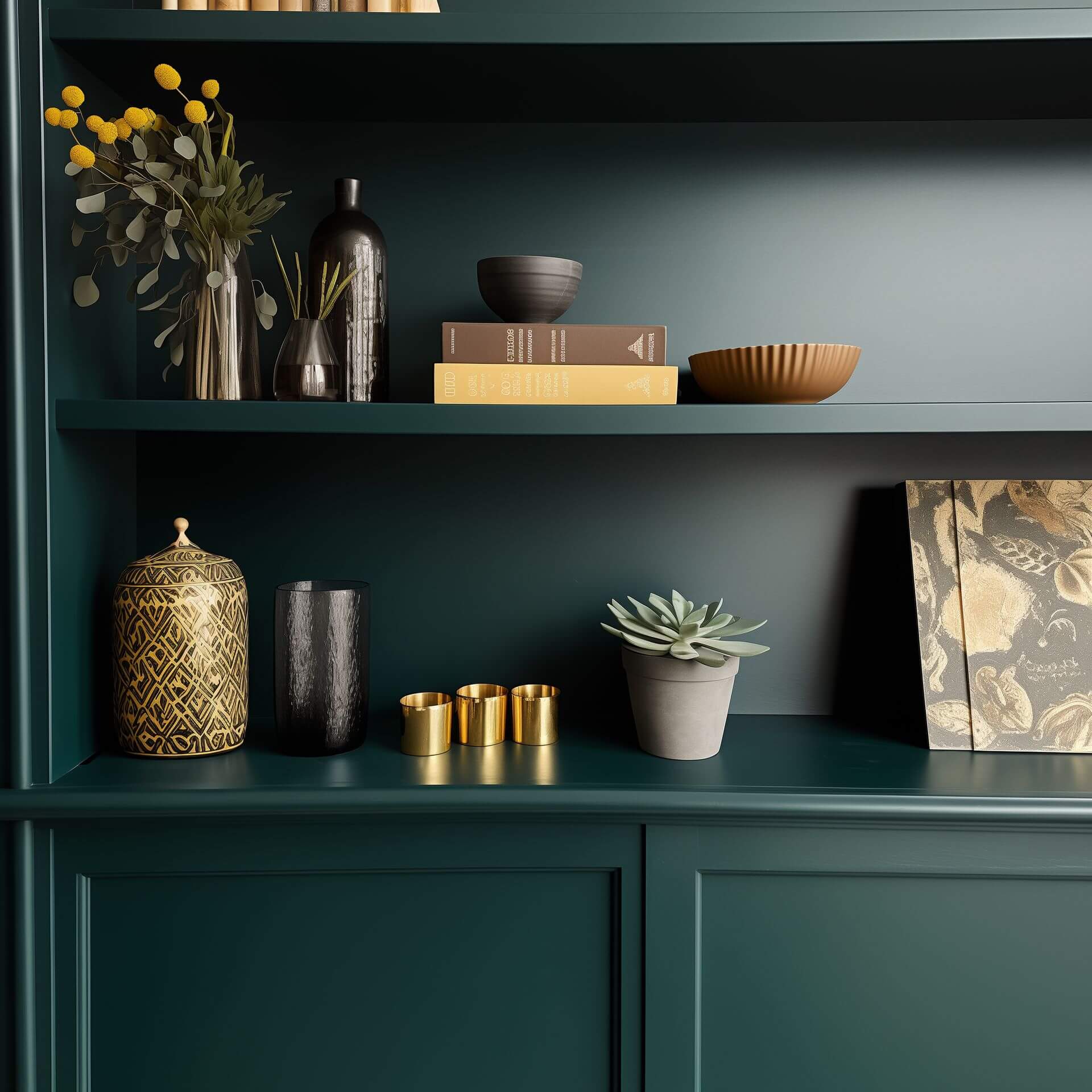
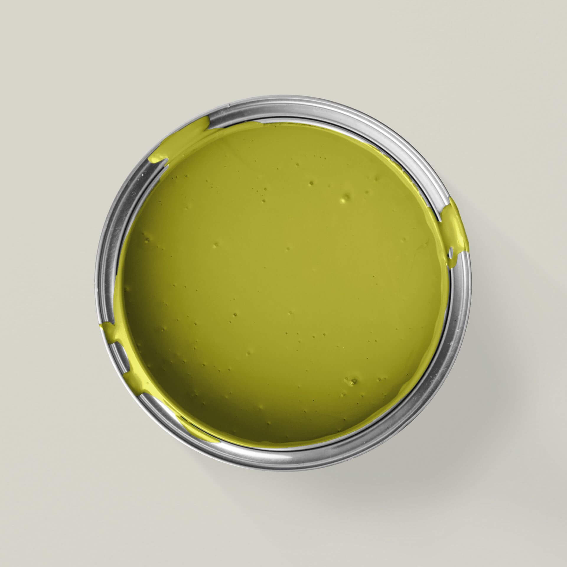
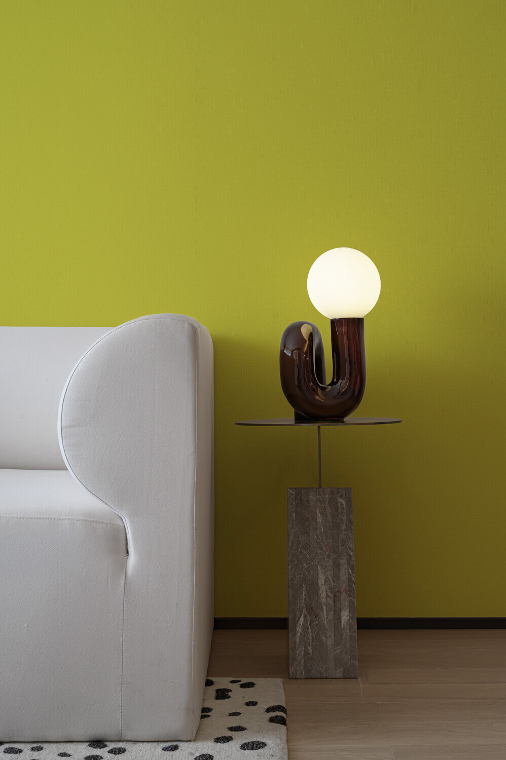
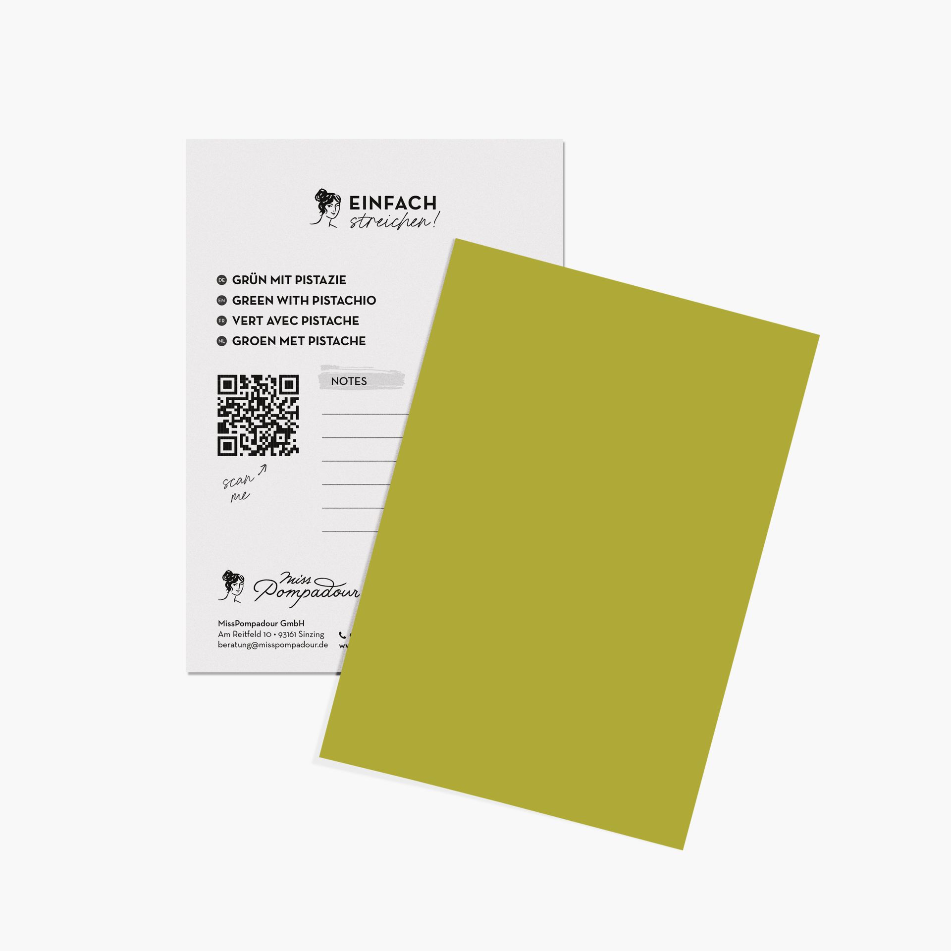
The most important facts about the colour green
We associate the colour green with the awakening of nature in spring. For us humans, green is the colour of life and annual renewal. Green is the colour of hope, balance and joy
Effect of green colour
Due to its proximity to nature, green exudes calm and harmony, in contrast to the stimulating effect of its complementary colour red. Its positive healing effect was already recognised in the Middle Ages. It is well known that spending time in the forest has a relaxing effect and supports all forms of recuperation. Green is also a pleasant contrasting colour, for example on blackboards at school or on billiard table playing fields. Green is pleasant for the eyes and enhances the contrasting effect of other colours. In road traffic, the colour green signals a clear road ahead. Escape routes are also always marked in green colour shades.
The colour symbolism of green also stands for hope, confidence and the strength and freshness of youth. Cultures and religions all over the world attribute a harmonising effect to this colour. In China, green symbolises yin, the female principle of fertility and energy. Green is also the cult colour of Islam. Here in Germany, people bring some green into their homes in winter in the form of the evergreen Christmas tree and on the green island of Ireland, green symbolises Catholicism.
Green room design
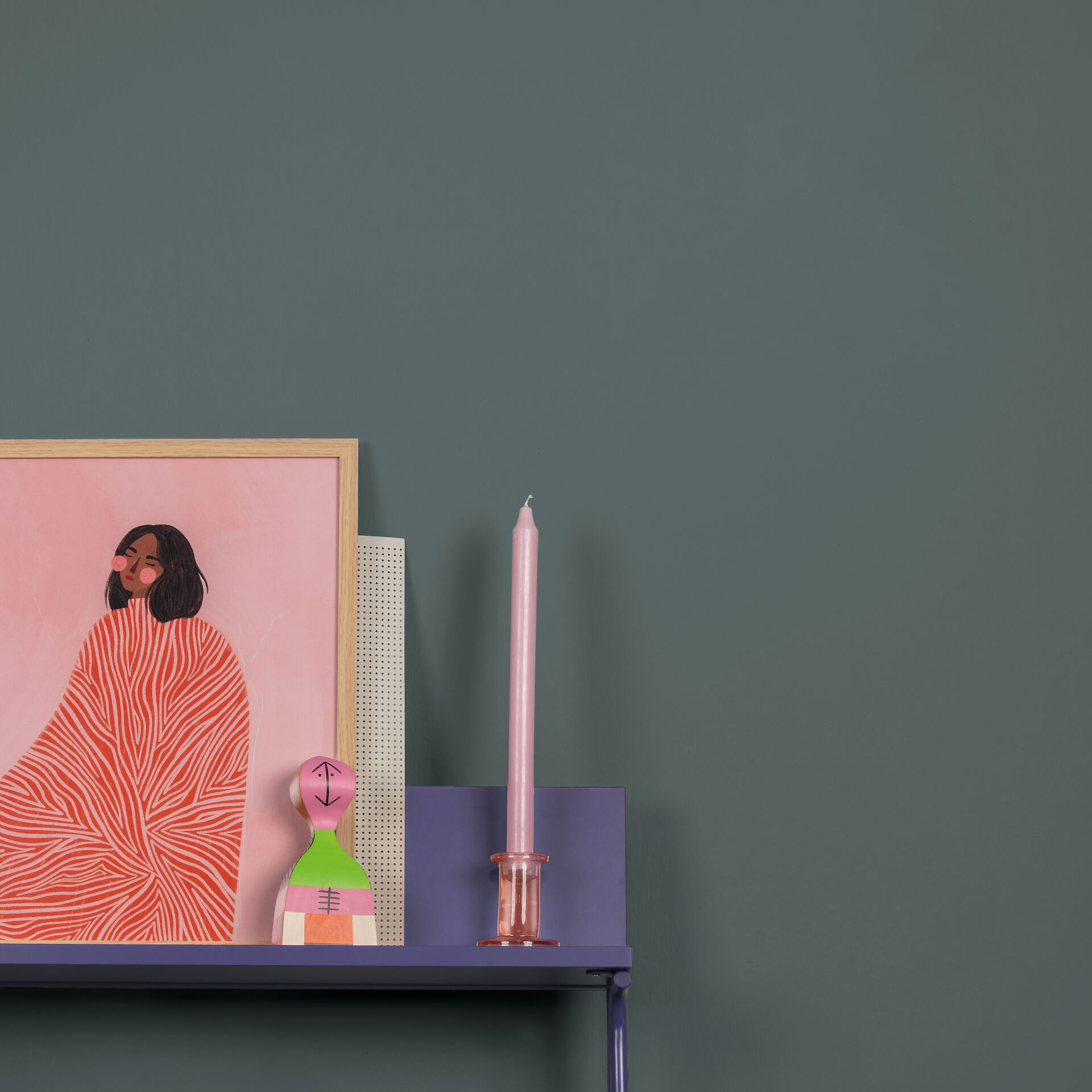
Colour psychology shows that green interior design in our homes is not just a question of aesthetics, but also of well-being. Green wall paints have a calming and relaxing effect and create a harmonious atmosphere. Thanks to their naturalness, they provide a balance to our stressful lives outside our own four walls. A green sofa or green armchairs can transform a room into an oasis of well-being. A fresh and healthy environment can also be created in kitchens or dining rooms, especially with light shades of green or green wallpaper.
There are endless shades of green: from very delicate, light colour shades with lots of yellow pigments that look like fresh shoots in spring, to olive green with brown colour components that radiate warmth. But the green palette also includes light aqua tones with a little blue through to almost black, rich dark green. Not forgetting the many colour shades in which the combination of green and grey creates a harmonious combination.
You should avoid green here
There are also shades of green that should be used sparingly. A so-called "poison green" can have an invigorating effect if it is skilfully placed as an accent in the room. However, it should be used carefully and skilfully.
Alternatives to green colour
There are beautiful shades of grey that contain umber. They are a good alternative to real green tones and can be combined well.
What would you like to paint?

Just paint





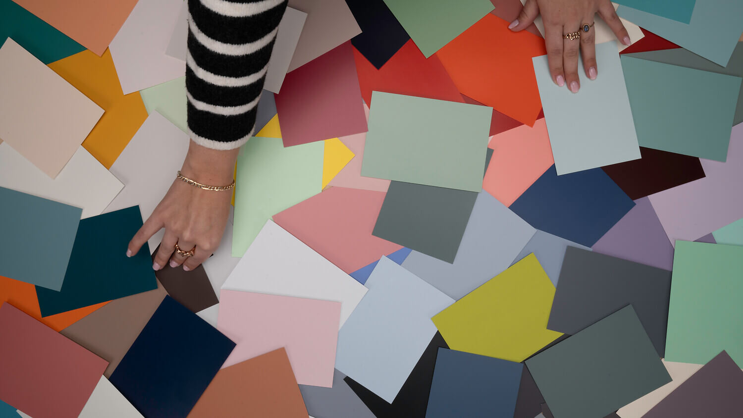
Green evokes many positive associations: this colour transports us to nature, symbolises freshness, diversity, and life itself. It's only natural, then, that green can play a part in almost any interior style. The colour green is a versatile classic in home décor – and we're here to show you how to beautifully incorporate it into your space.
Shades of Green
Green is often the first colour that comes to mind when we think of nature. As such, it comes in a vast array of variations and shades. From bright, slightly greyish, and subtle sage green to vibrant, light apple green, and deep, dark forest green. Naturally, there are countless intermediate shades and combinations too, such as olive, khaki, turquoise, and lime. Combined with red and earthy tones, shades can emerge that appear almost brown.
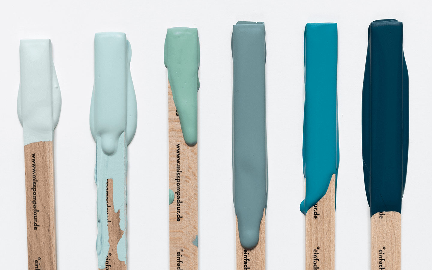
Our colour samples feature a multitude of green shades. You'll find aqua shades where blue tones dominate, and lime shades where yellow prevails. From bright, understated green variations like Linden Green to deep dark green reminiscent of tropical foliage, you're sure to find your perfect match. As you can see, with green, your ideas know no bounds.
The Impact of Green Shades
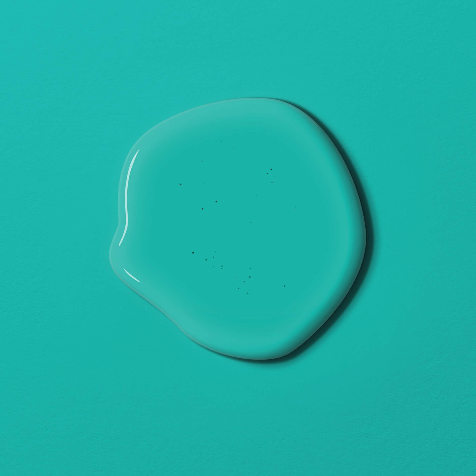
Green shades exude harmony and serenity, creating a calming effect. The colour is also associated with life, nature, contentment, and hope. Forest and leafy green hues offer balance and promote harmony. Aqua shades signify freshness and rejuvenation, while yellowish greens are invigorating and stimulating.
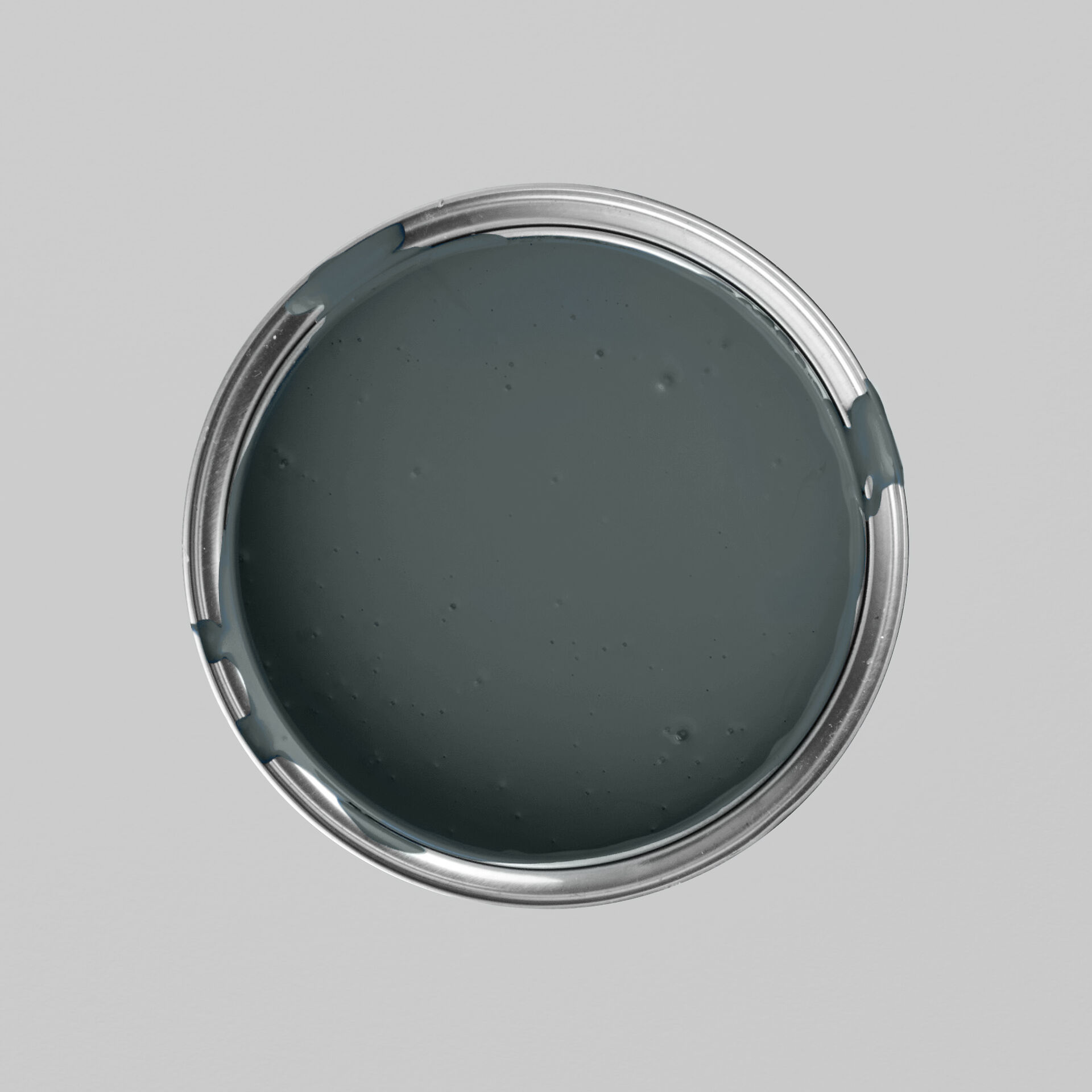
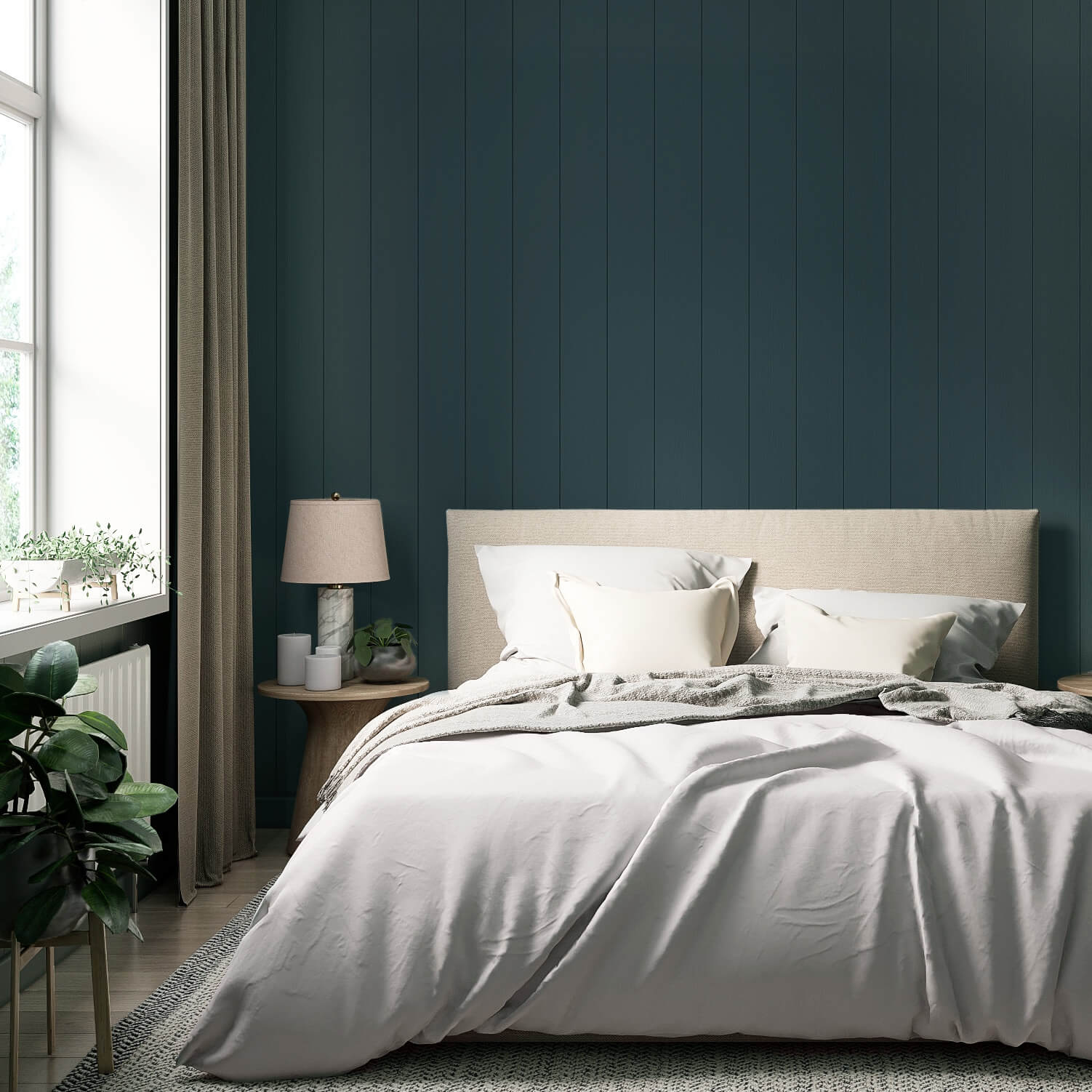
If you decide to buy green wall paint, don't be afraid to be bold! For instance, choose a dark green shade like Green with Mud from our Just Paint collection, a rich olive green. Alternatively, opt for a deep dark green wall paint to create a cosy, calming atmosphere with an accent wall. For example, the beautiful Green with Forest is an excellent choice for your living room or bedroom walls. Sage green wall paint also has a relaxing effect, as you can see with Green with Sage.
Green Paint for Every Room
Thanks to their positive attributes, green shades are truly suitable for every room in the house. Both cooler and warmer hues contribute positively to a healthy living environment, depending on the space.
- A bathroom painted in aqua shades can help you start the day on a positive note.
- A bedroom painted in delicate sage green calms the senses, promoting restful sleep.
- Living areas painted with mint green wall paint also exude vitality, being both invigorating and relaxing.
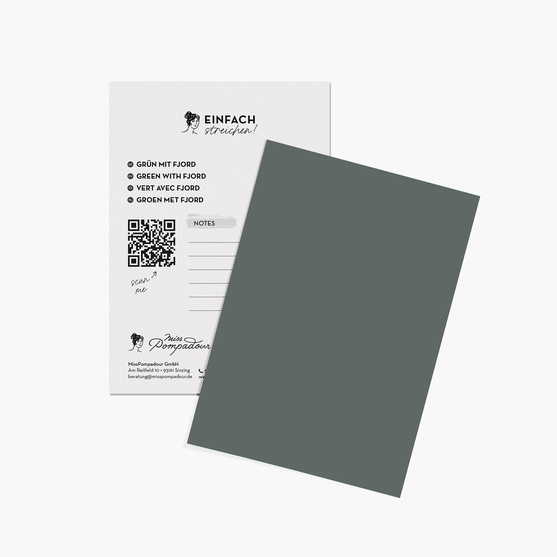
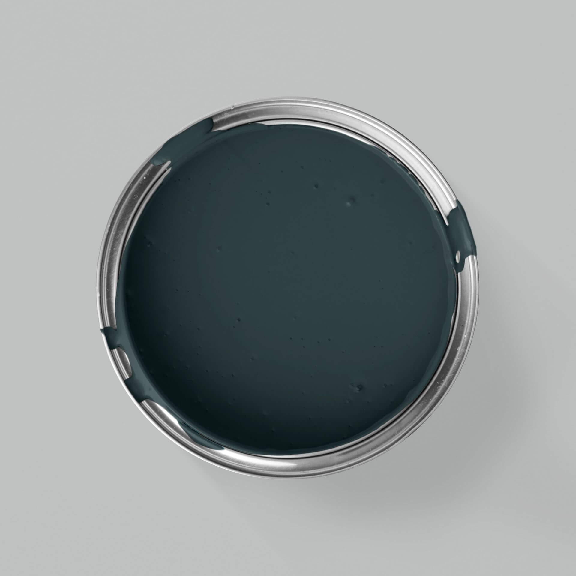
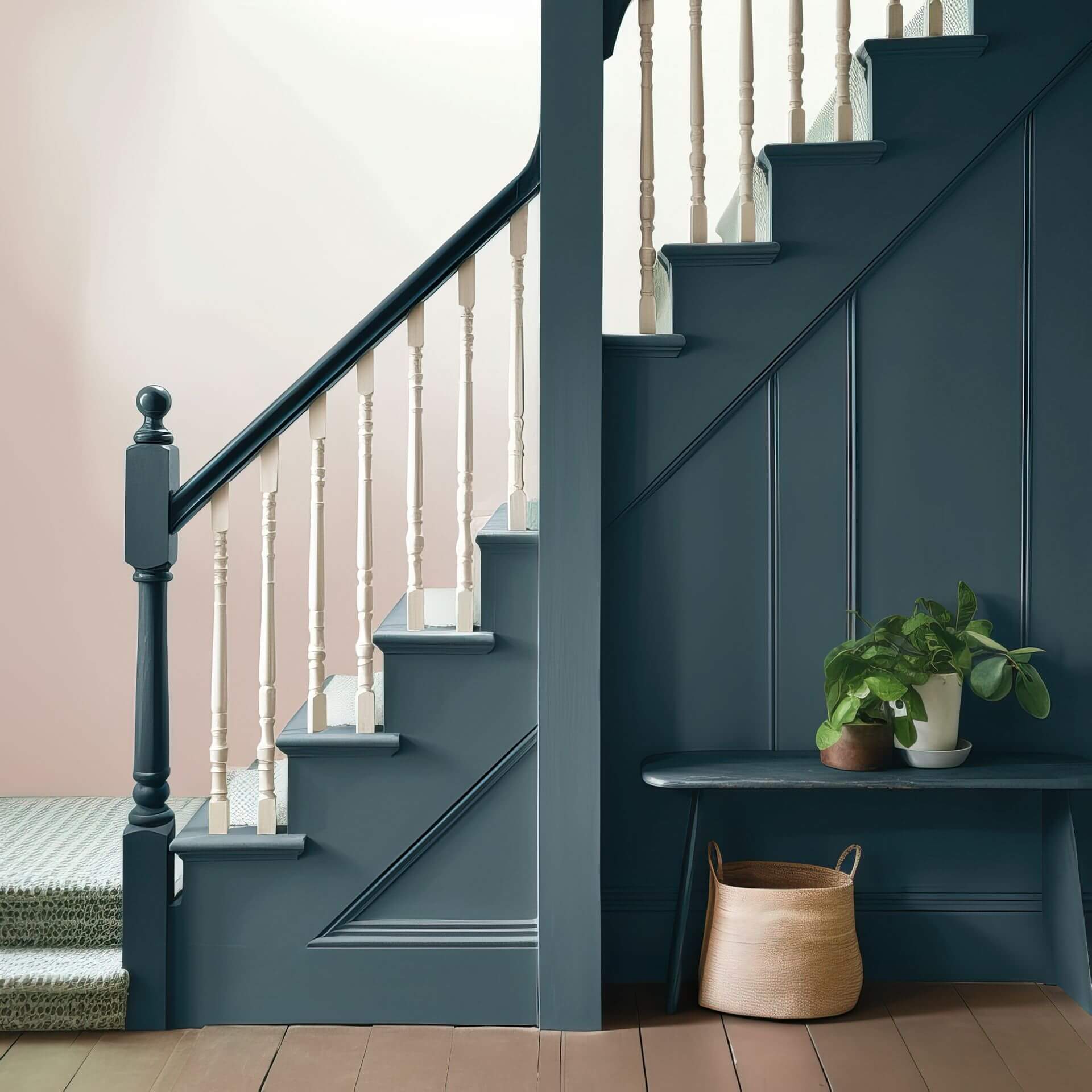
If you prefer a dark, deep green shade like Green with Fjord, you can paint a single accent wall in your living room or bedroom, then apply a delicate, very light green shade like White with Linden Green to the remaining walls. This way, you'll also achieve a relaxing atmosphere and bring tranquillity to your home, without having to forgo strong colours.
Green Shades: Styles and Trends
Green never goes out of style! Overall, green conveys freshness and vitality. Delicate green shades like Green with Birch or Green with Lime will make your walls shine and bring a breath of fresh air into your rooms. In the classic English country style, green is extremely popular and beautifully accentuates the rustic chic of the country house style. It's also used in the Boho style. In this case, an intense green shade can act as a powerful energy booster.
In the Urban Jungle style, green is, of course, the primary choice. Green on the walls, combined with plenty of plants and green accent furniture, creates a natural, fresh living environment where you'll simply feel at home.
Green is also perfect for embracing the popular Dopamine Decor trend. Here, feel free to combine an intense green with its complementary colour, red!
Combining Green Shades
You'll find green shades with blue, brown, red, and yellow undertones. Virtually all colours complement blue-toned greens – whether yellow, pink, or red. If you want to paint a room that incorporates many different colours, green with blue undertones is always the best choice. For green shades with other undertones, it's best to combine them with colours that echo that specific undertone.
Green shades pair particularly well with all natural and earthy tones. If you've applied Green with Olive as a wall paint, combining it with the warm Beige with Cashmere will create an atmosphere of peace and relaxation. You can use it to paint the other walls in the room or to refresh your furniture.
If you've used Green with Sage as your wall paint, combine it with reddish elements. Add cherry wood furniture or decorate the floor with a reddish-brown rug. Bright, clear Green with Apple, when combined with a strong pink, can create a lively effect, perfect for a romantic style. Turquoise also perfectly complements an apple green.
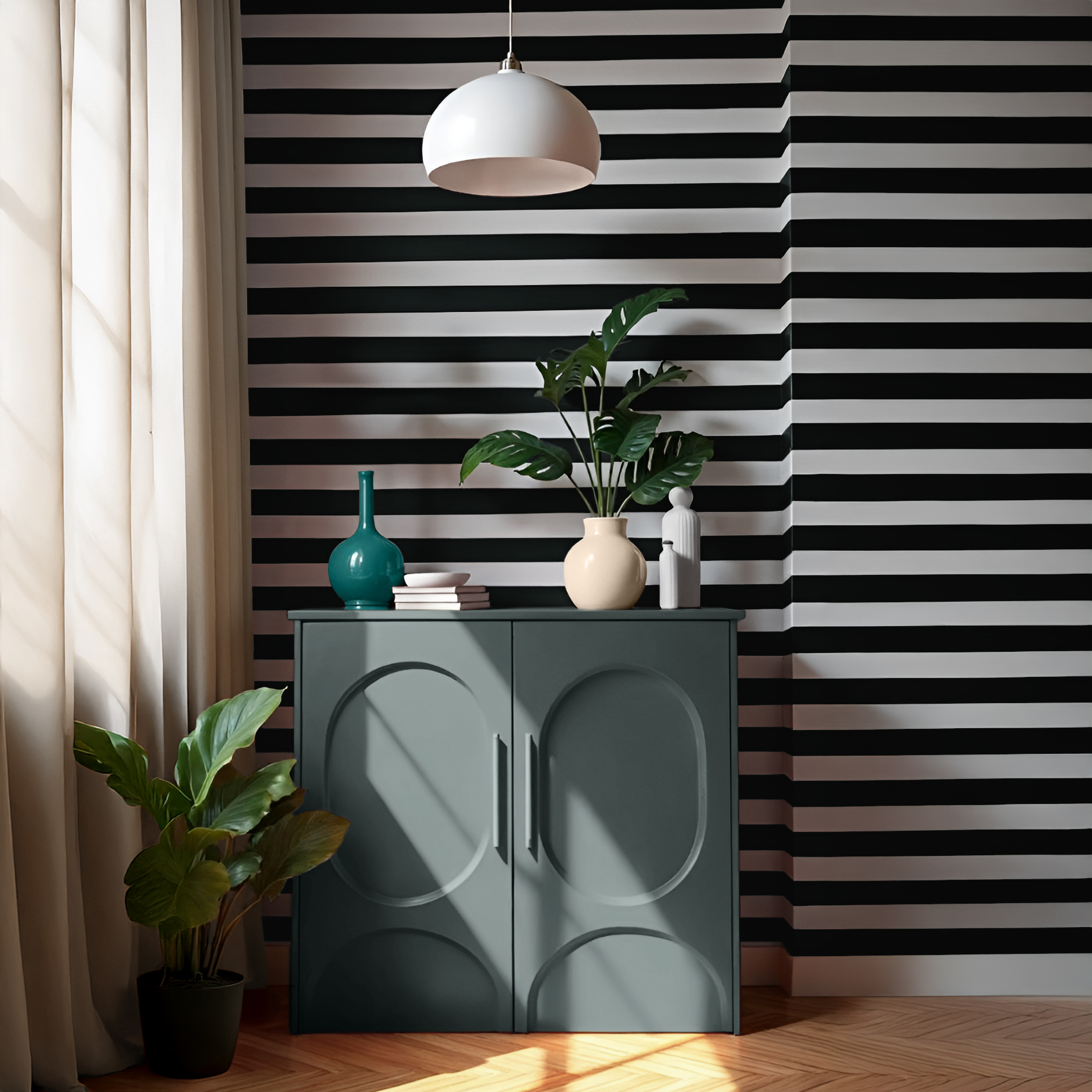
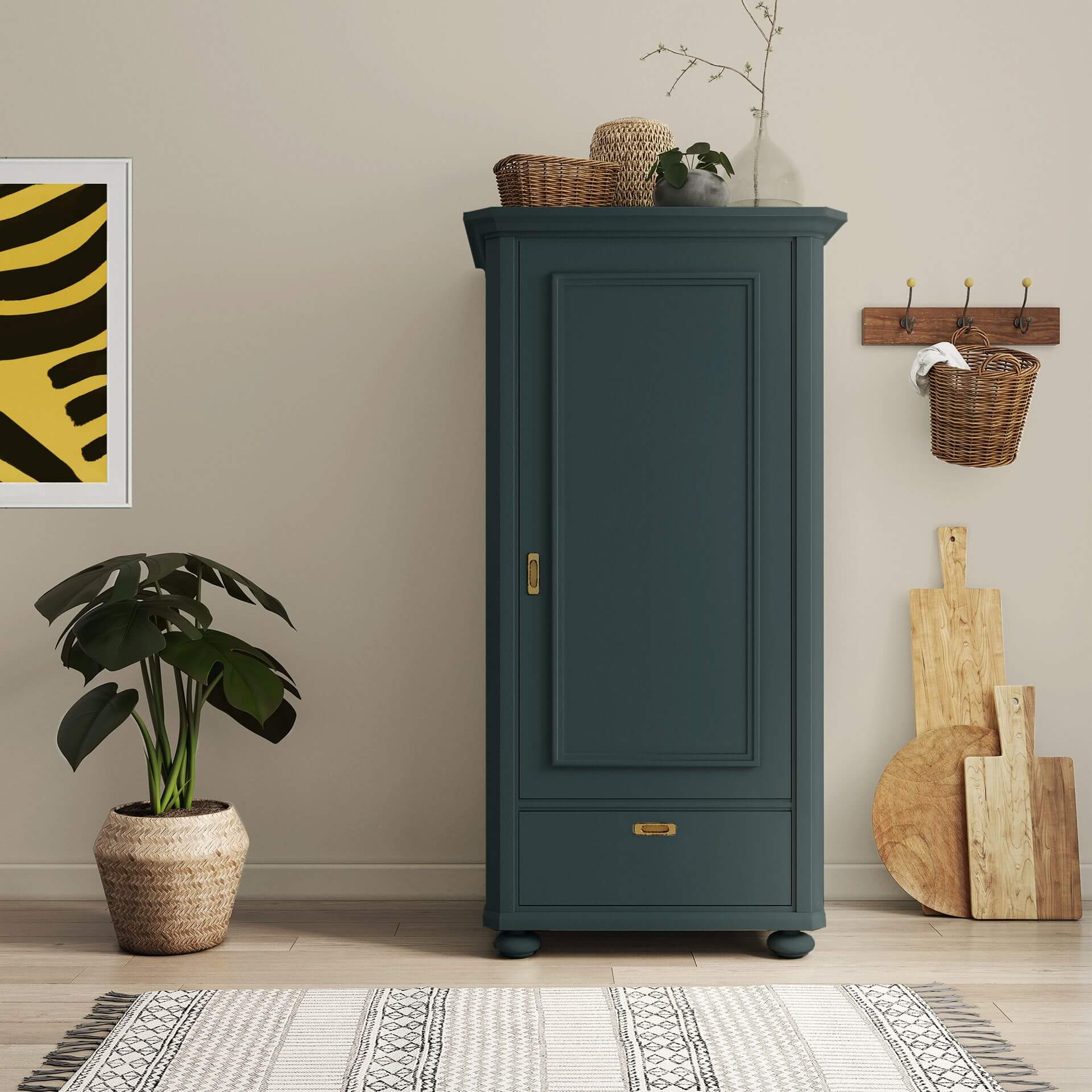
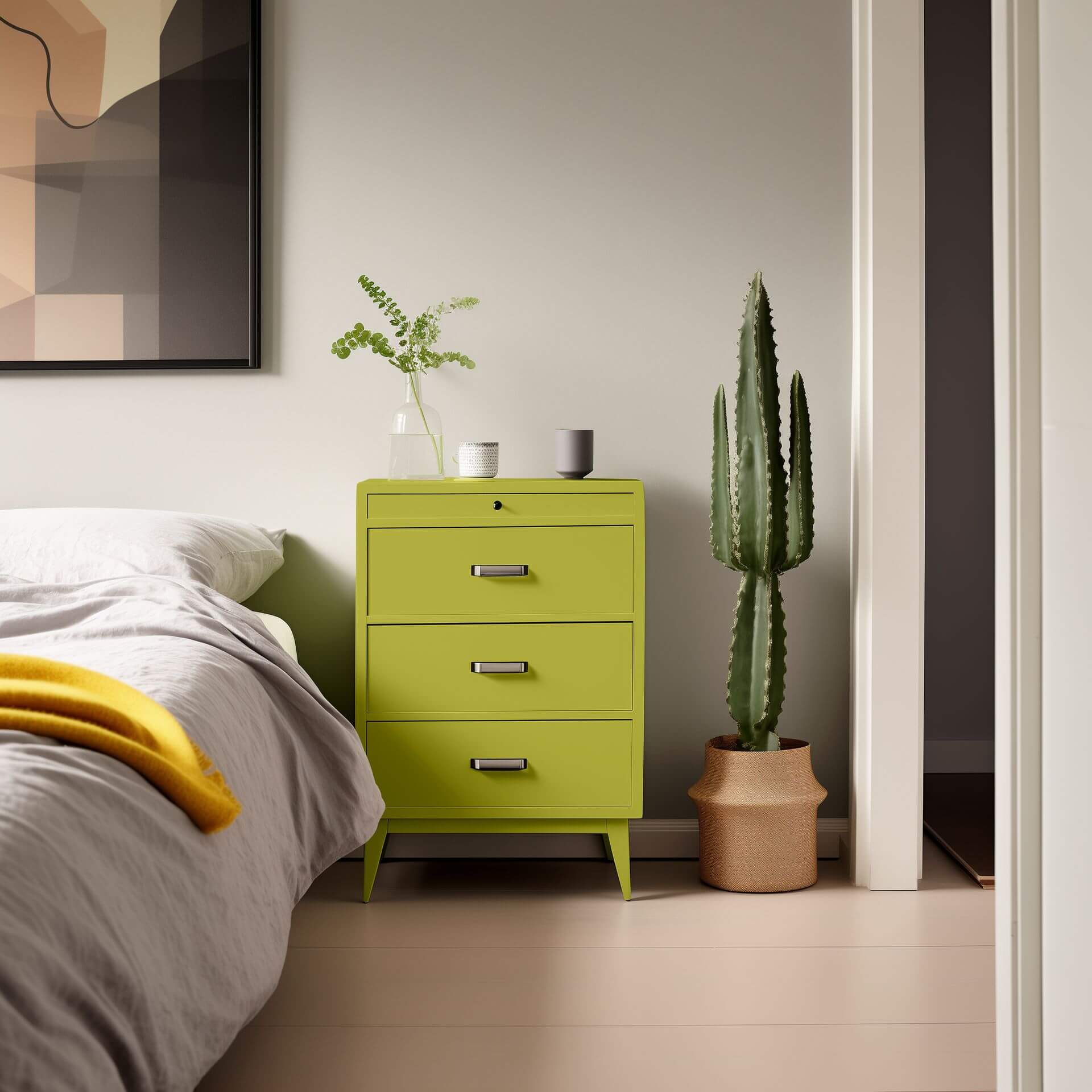
Alternatively, you can paint your walls in an understated rosé like Rose with Almond Blossom and place a dark green painted chest of drawers in front – with a few golden accents, you can easily achieve a very elegant look using green paint. This is especially suited to a romantic, French interior style.
Aqua shades create a wonderful effect alongside pastel tones like a delicate pink or a light sand shade. The delicate Fairy Green always combines beautifully with light, warm cream tones. Blue and petrol shades truly shine when paired with forest green tones like Green with Forest. Combine Green with Moss and Blue with Cloud to achieve both a vitalising and relaxing impression. Green with Lagoon and Green with Aqua are ideal green tile lacquers if you want to create a refreshing yet calming spa-like area.
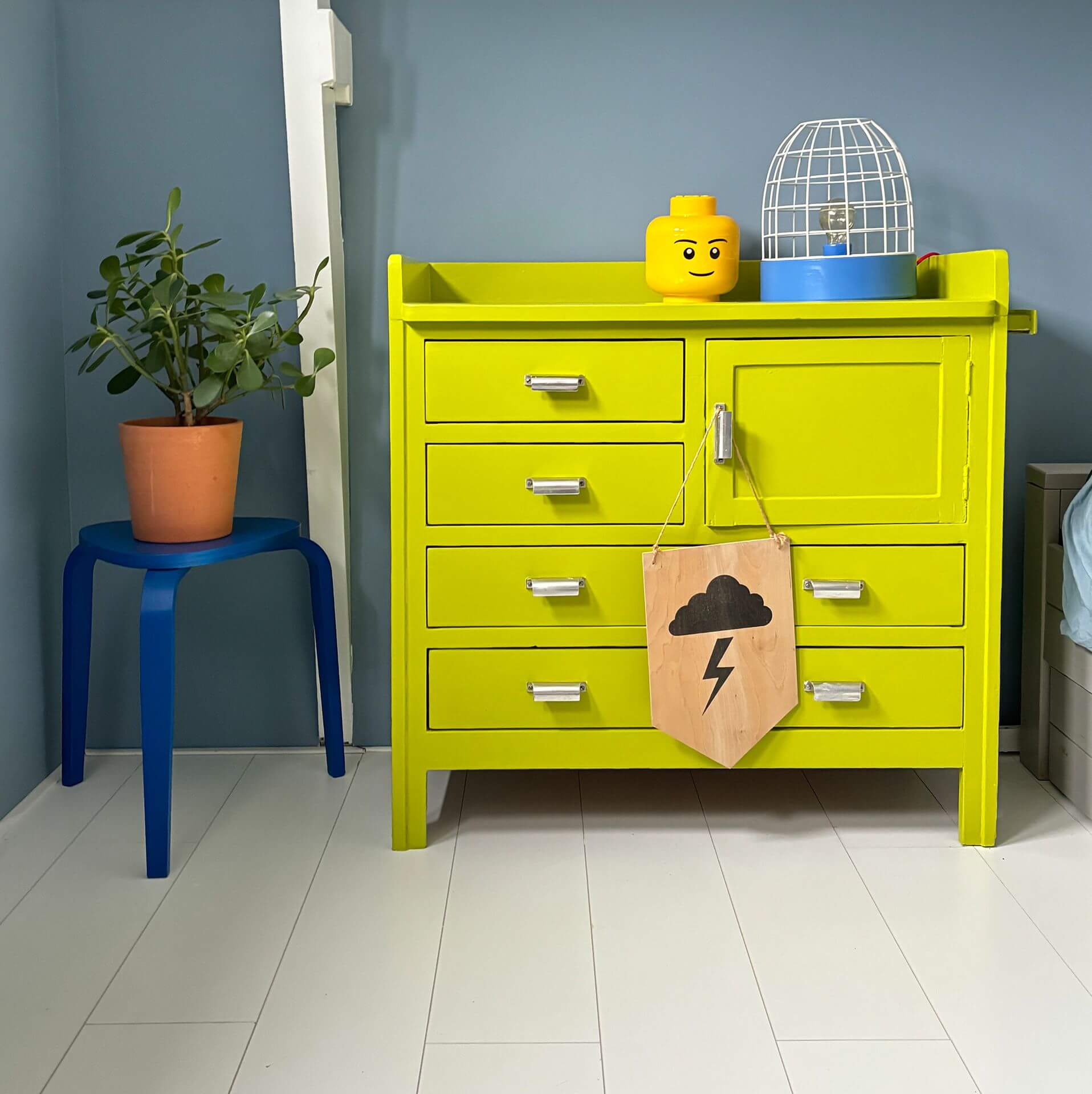
You can achieve an exciting contrast by pairing green with a bold accent colour like orange or yellow. In the MissPompadour colour samples, you'll find the fantastic Orange with Goldfish or Yellow with Saffron. These shades, combined with Green with Avocado, create an amazing wow factor! A yellow wall with a green painted chest of drawers brings freshness and vibrancy to your home. Here, the accent colours can serve as striking details alongside the green shade.
Honey-coloured wooden furniture complements every green shade. Pair them with a few decorative items in a peach-toned rosé. Coupled with gold or brass elements, such as candlesticks or table legs, you'll achieve a lively, harmonious effect. Rose gold, copper, or silver can also be combined with all different green shades. For an elegant style, instead of rosé, you can use a deep wine red, such as Red with Merlot, ideally combined with an olive shade like the rich Green with Bay Leaf.
If you love decorating your living spaces with plants, a bright, fresh, slightly blue-toned green is recommended, as it complements various types of foliage. Take a look at the beautiful Green with Glacier. Similarly, green shades can be combined with rustic wood – this creates a particularly natural and vibrant look. Green with blue undertones is also perfectly complemented by oak, whether as flooring or furniture.
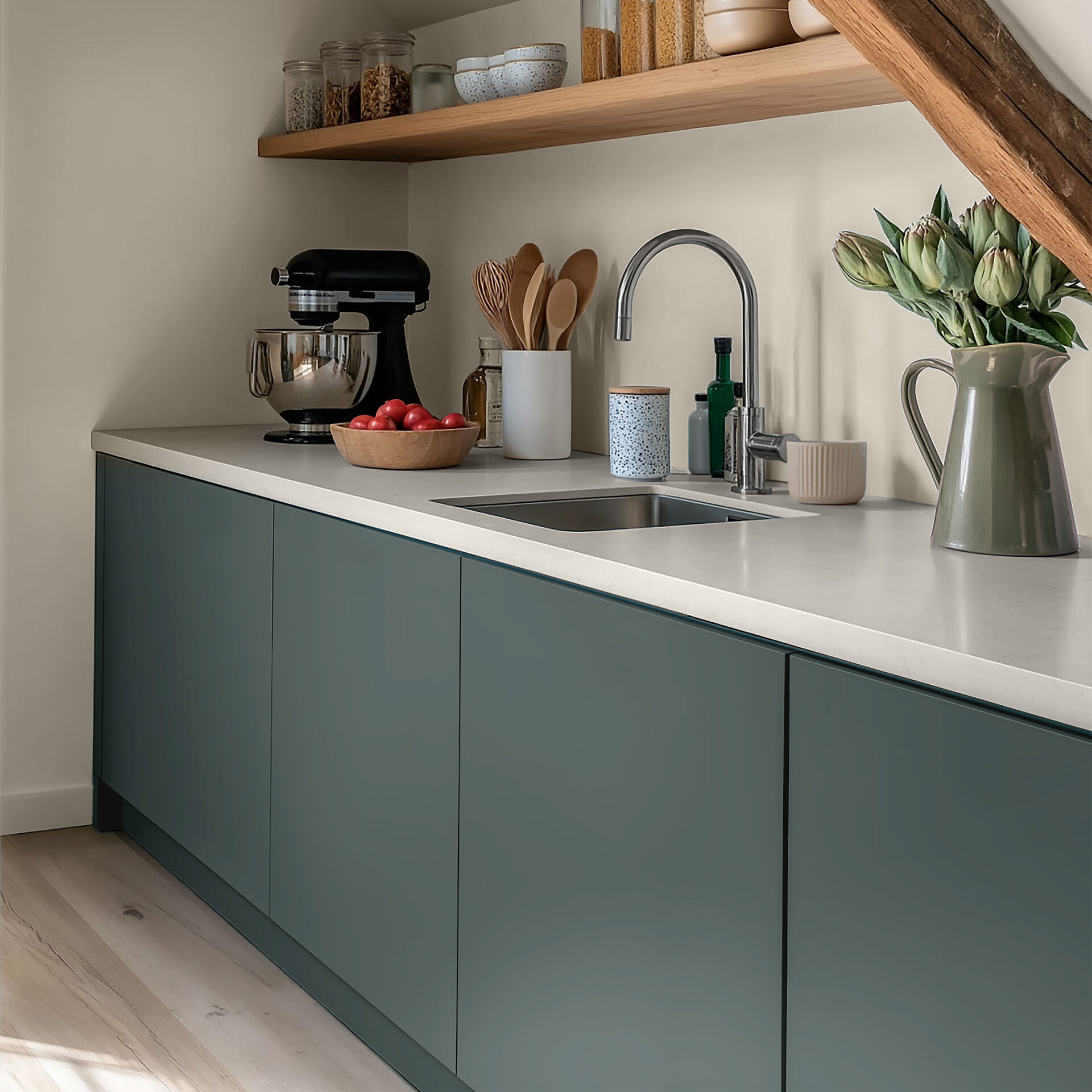
You can order all our green shades as wall paint and also as furniture paint. If you paint the wall and the furniture in front of it in the same shade, you have the option to make your furniture blend seamlessly into the wall. This also brings more tranquillity to the room.
Alternatively – and quite the opposite – perfectly highlight your furniture by painting it with a different coloured lacquer of your choice. This way, you'll create a real focal point and add interest to the room.
MissPompadour's 'Green' Project Guide
Your Green Project: Natural Harmony from Wall to Tile
In our project guide, we'll show you how to bring the calming power of nature into your home. Whether you want to create a relaxing haven in the bedroom or breathe new life into your kitchen with a fresh sage tone, we have the perfect inspiration and products for your project. Discover the versatility of green shades and start your next painting project today!
Green Wall Paint: A Fresh Update for Your Walls
A green wall paint instantly creates a more vibrant look in any room. While light shades like Green with Sage lend spaciousness and calm, darker hues like Green with Rosemary introduce powerful colour accents into homes and flats. Our matte wall paints adhere perfectly to plaster and wallpaper, are washable, and offer excellent coverage.
Green Tile Lacquer: Spa-Like Serenity Without Renovation
With green tile lacquer, you can transform your bathroom into a personal sanctuary. Aqua shades, in particular, such as Green with Aqua or Green with Ocean, appear invigorating and fresh in the right light. With our tile lacquers, you can paint without sanding. Our lacquers will adhere after thorough cleaning and priming with To Bond & Block, with no laborious sanding required.
Green Furniture Paint: Distinctive Statement Pieces
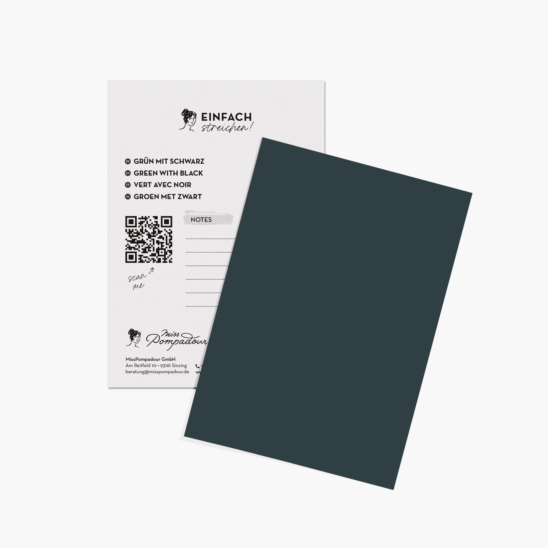
Green furniture paint is the ideal choice to give chests of drawers or kitchen cupboards a distinctive character. How about the fresh Green with Eucalyptus or the deep, dark Green with Black for a sophisticated look? Our paints can be applied to almost any surface without tedious sanding. You can even use them on smooth IKEA furniture or bleeding wood after priming with To Bond & Block! Whether in a modern Urban Jungle look or as an elegant focal point against a neutral wall – green paint turns your furniture into true design highlights.
Green Wood Paint: Natural Protection & Scandi Flair
Green wood paint protects your wooden surfaces while preserving their warm appeal. Particularly soft olive shades are a lovely complement to the popular Scandi Style, as they focus on natural materials. Our Green with Grey is a fantastic paint for any piece of furniture. Whether in the study or the hallway – green paint on wood looks timeless and elegant.
You can also paint outdoor wood with our durable Outdoor Lacquers. Our Balcony & Garden Paint is especially suitable for this. It's also available in two rich green shades.
Green Chalk Paint: Velvety Matt for a Boho Look
For anyone who loves a truly homely feel, green chalk paint is a must-have. Its powdery texture perfectly suits the chic Japandi Style or the classic English country style. Combined with natural materials, it creates harmonious surfaces that radiate cosiness and ensure a relaxed atmosphere.
Order Green Paint from MissPompadour Online
Once you've found your perfect green, simply order it to your home. We ship within a few days with DHL GoGreen, so you'll have your desired paint ready to use at home as quickly as possible. Should you need help choosing the right shade or the most suitable finish, our friendly and expert customer service team is here for you via WhatsApp, email, phone, and live chat!
What effect does the colour green have in a room?
In colour theory, the meaning of green is closely linked to renewal and the awakening of nature. Depending on the lighting and the chosen shade, the ambience of your rooms will change: while a deep, elegant emerald green, such as our Green with Emerald, creates a luxurious look, a natural moss green provides a sense of cosiness. It is only with the right light that the depth of our highly pigmented paints and wall paints really comes into its own.
How best to combine green?
Successful colour design thrives on harmonious contrasts. In our wide range, you will find everything from a delicate hint of green to bold, dark tones. You can create an exciting contrast to opposites on the colour wheel using magenta or reddish earth tones. For a serene wall design, combinations with warm greys or a soft taupe are ideal. In our range, you will find the perfect complement for every style.
Is green paint suitable for the bathroom?
Absolutely! Especially in the bathroom, a fresh mint or mint green, such as Green with South Sea or Green with Mint, brings daily joy and a sense of cleanliness. Since many people look to their homes as a sanctuary for relaxation, green is the ideal choice for a vitalising atmosphere.
Is green a modern living colour?
Shades of green are classic home colours and therefore timelessly modern. In Germany in particular, green is at the top of the wish list when it comes to interior design
What roller does the colour symbolism of green play in interior design?
Colour psychology clearly shows that green is far more than just a trend: it embodies a timeless aesthetic that represents harmony all over the world. In almost every culture, the symbolism of green is linked to fertility, waxing, and the origin of life. When we paint our walls green, we bring the freshness of spring directly into our homes. Depending on the undertone, the colour conveys different feelings: while cool mint is refreshing, olive-toned shades, such as Green with Autumn or Green with Pepper, provide a cosy warmth that allows us to unwind immediately after a long day.