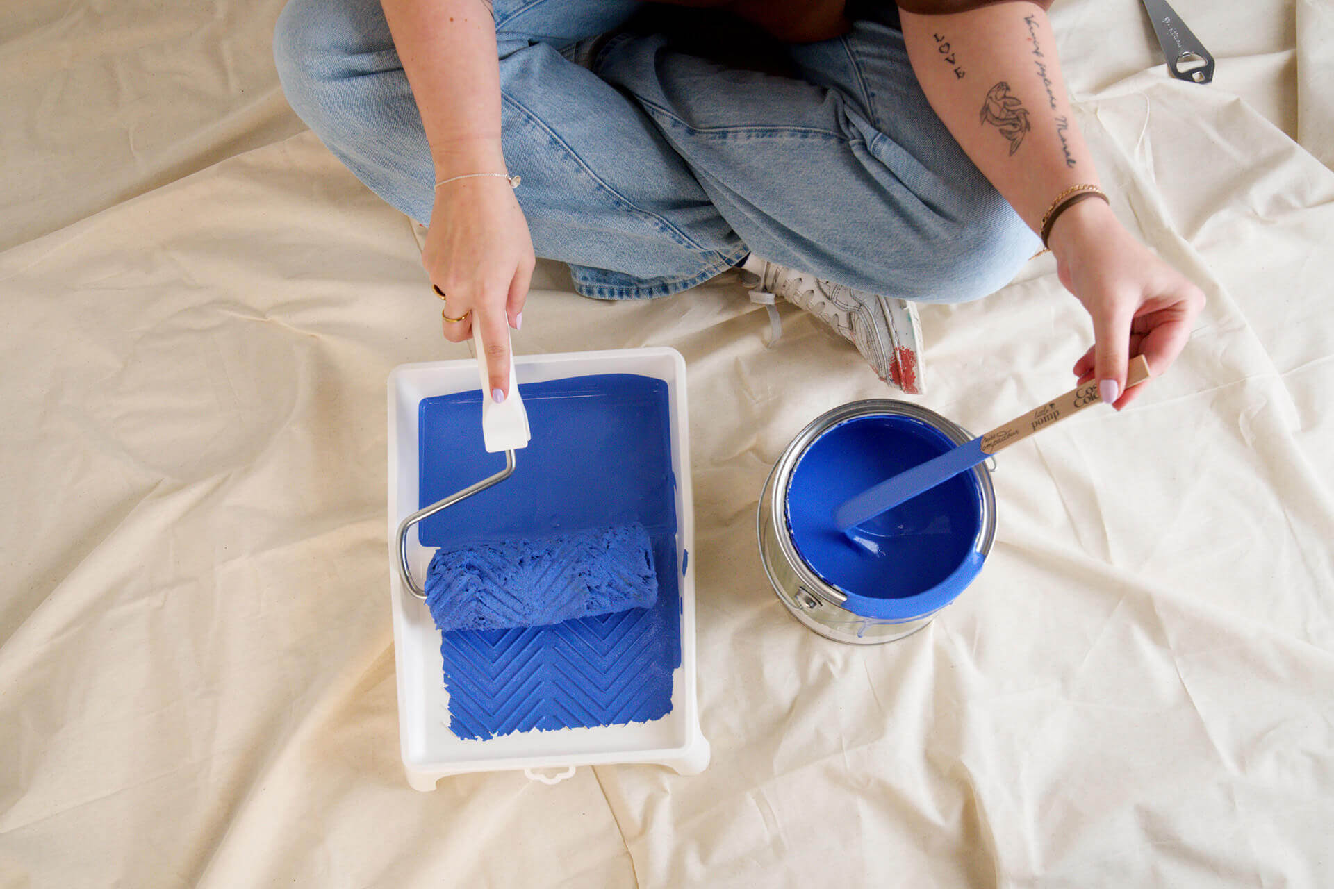


wall paints & paints in
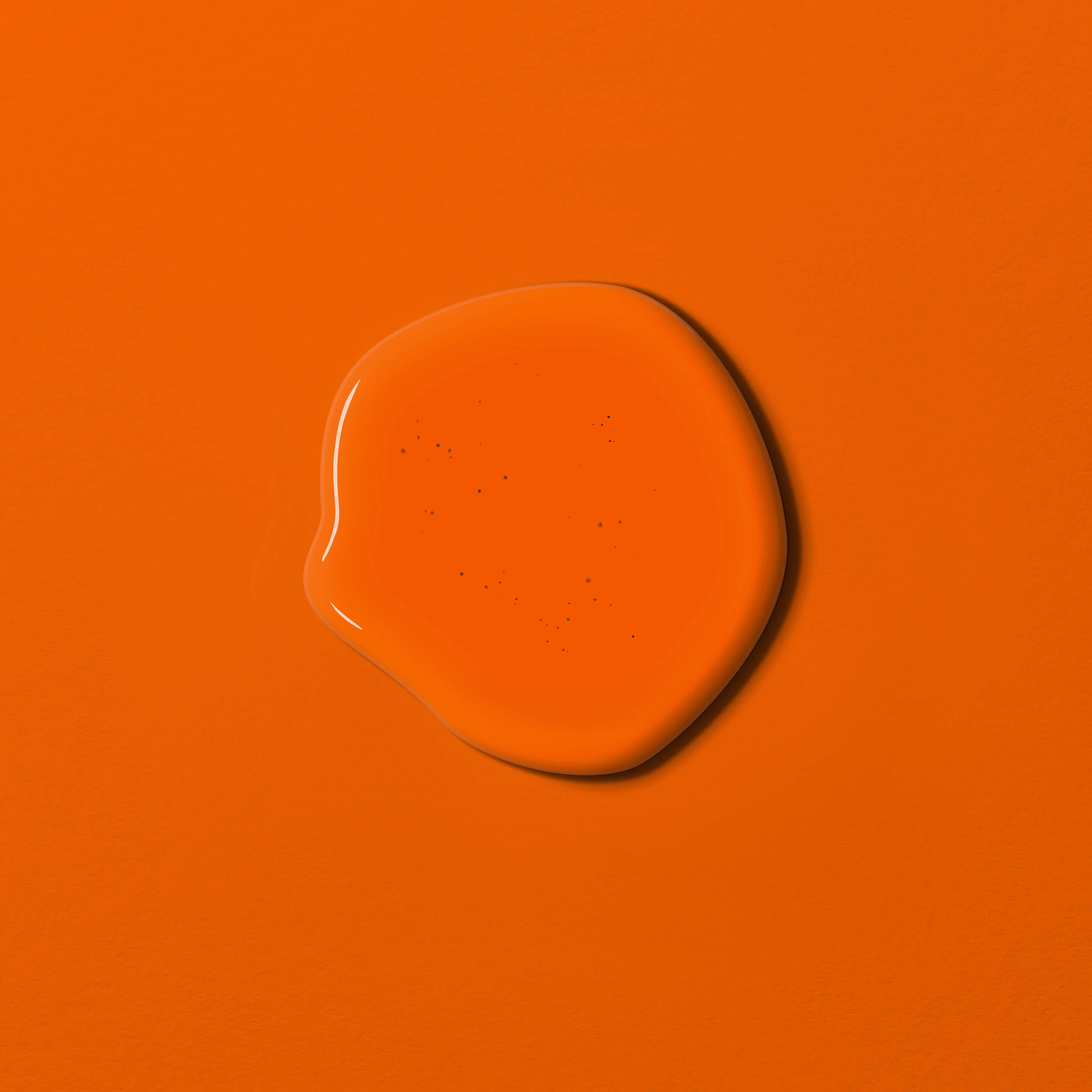
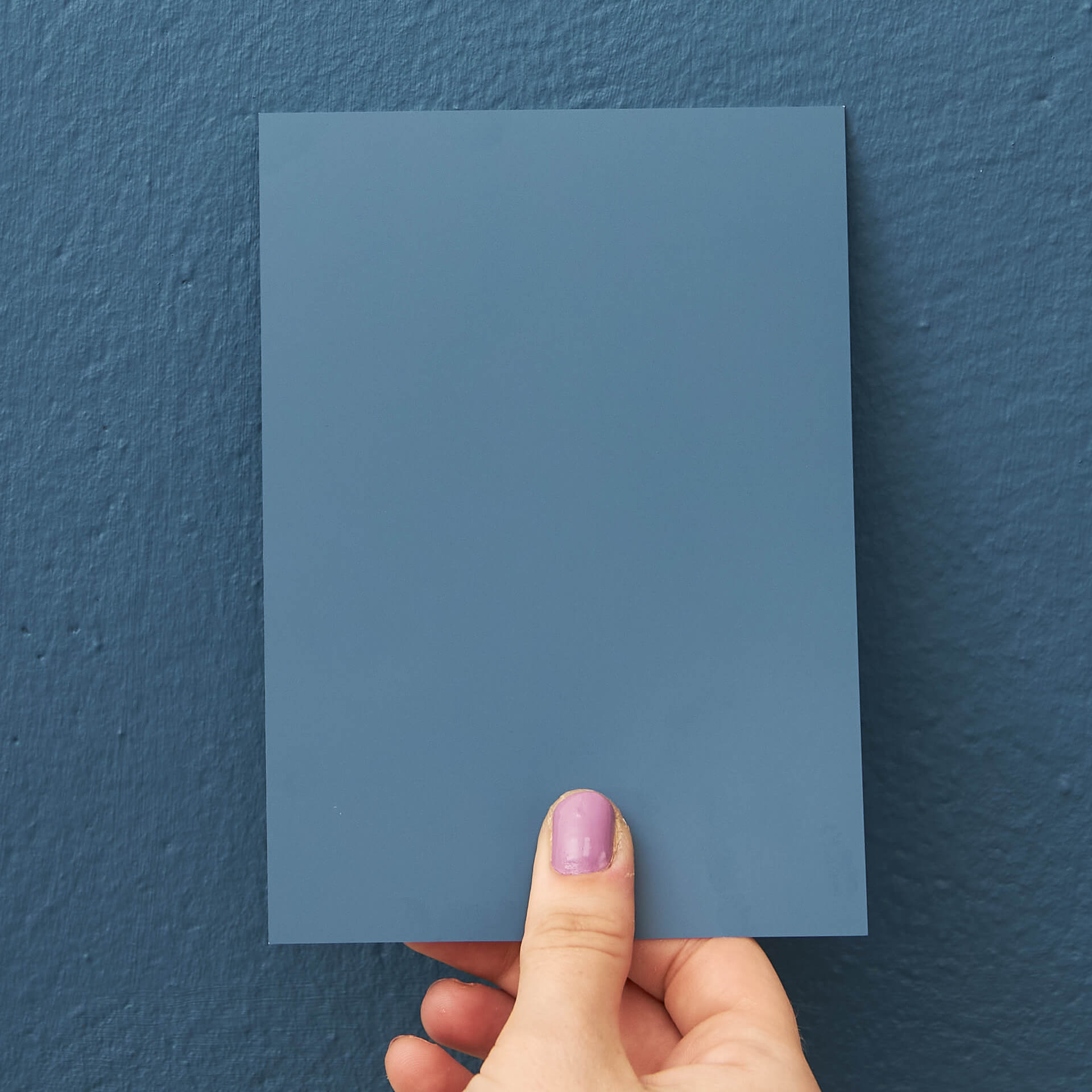
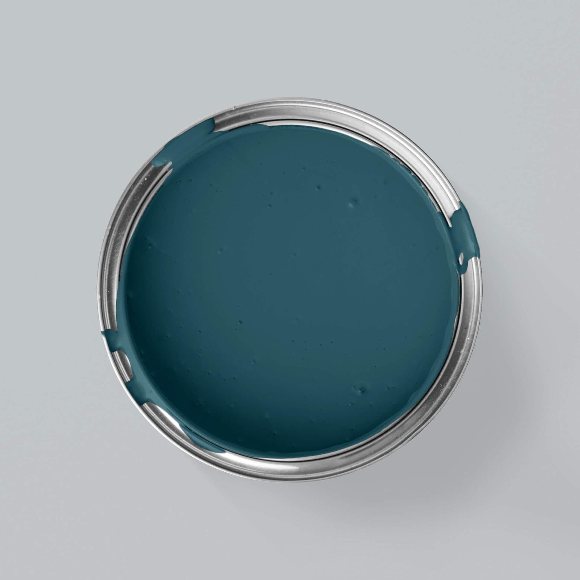
Petrol
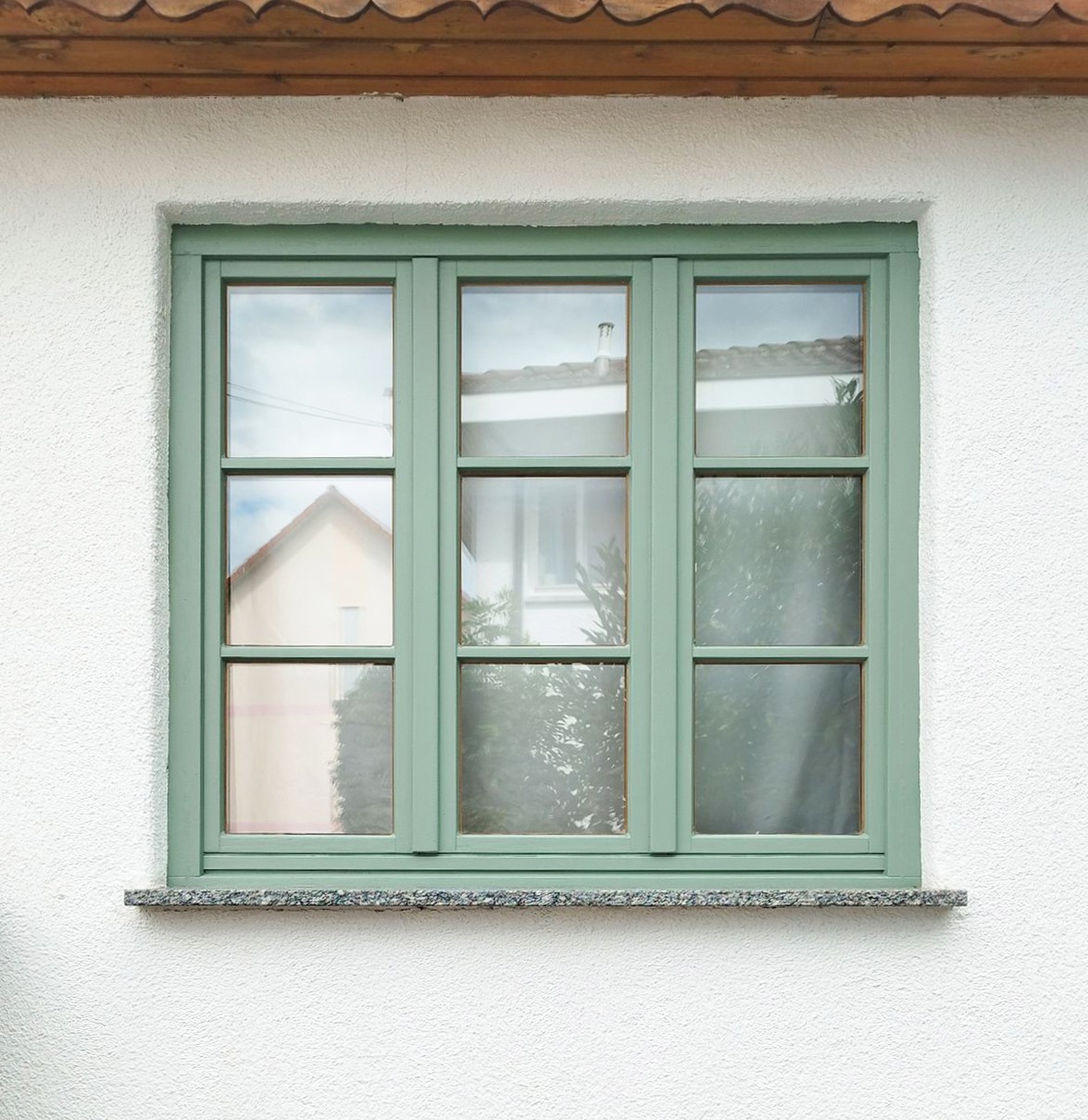
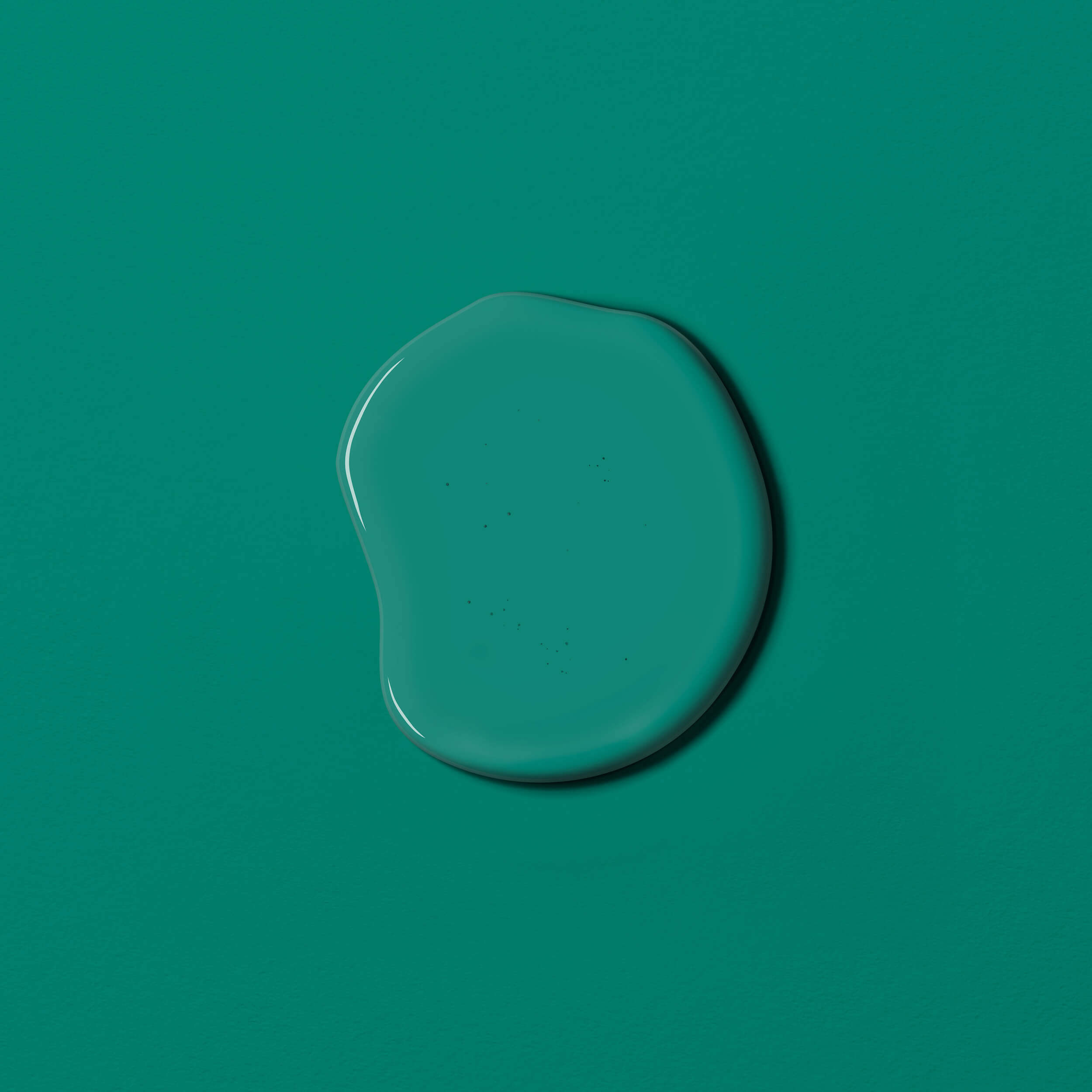
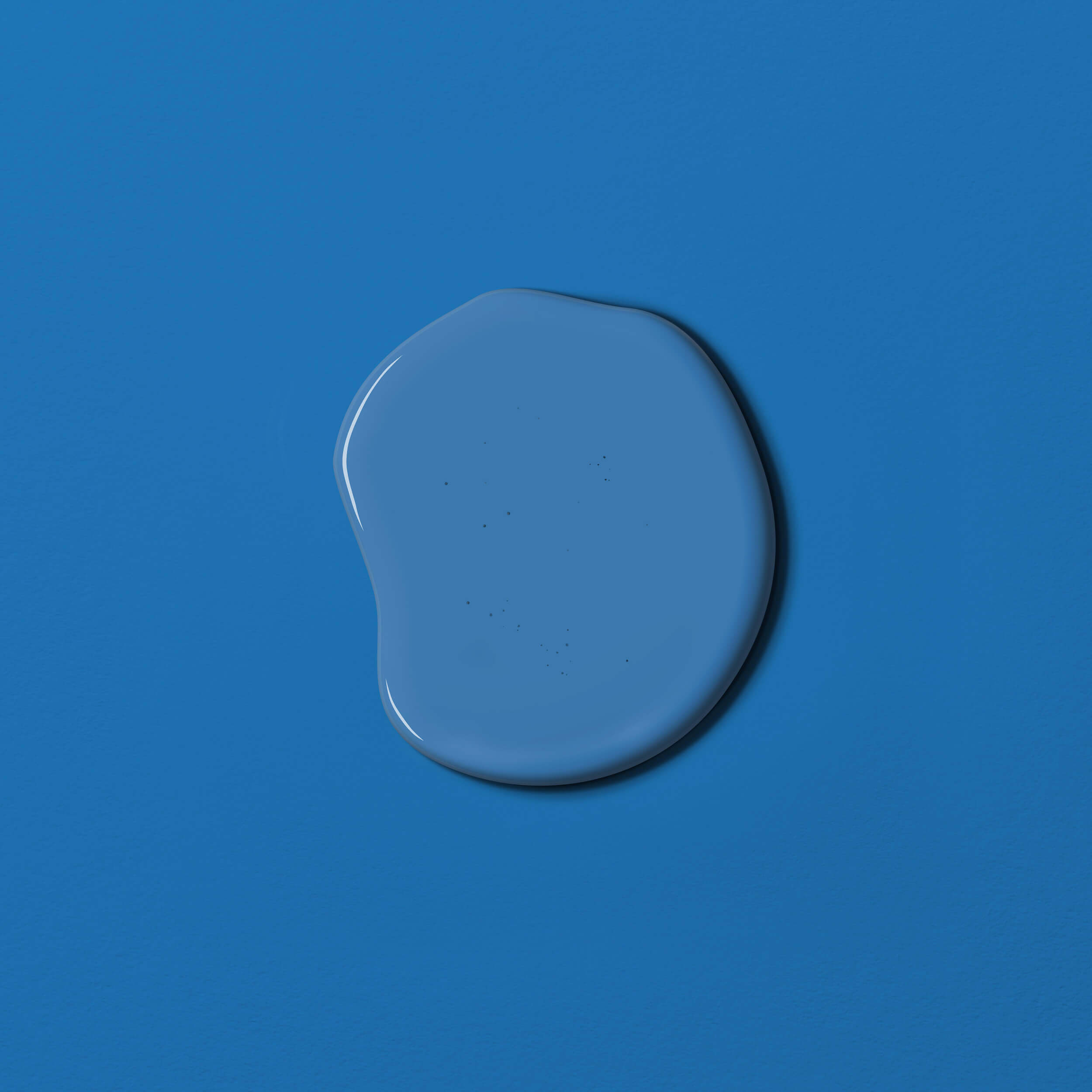
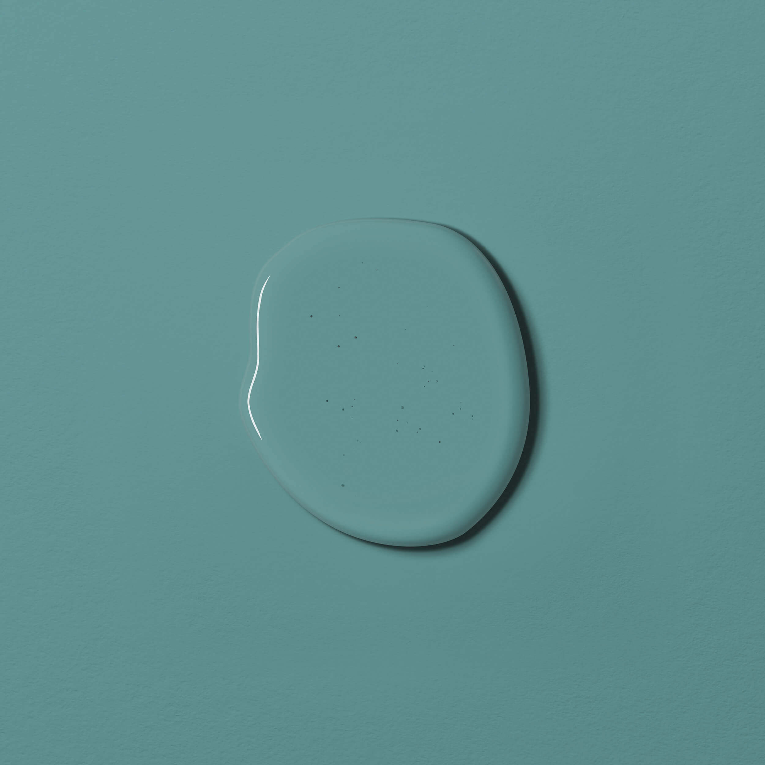
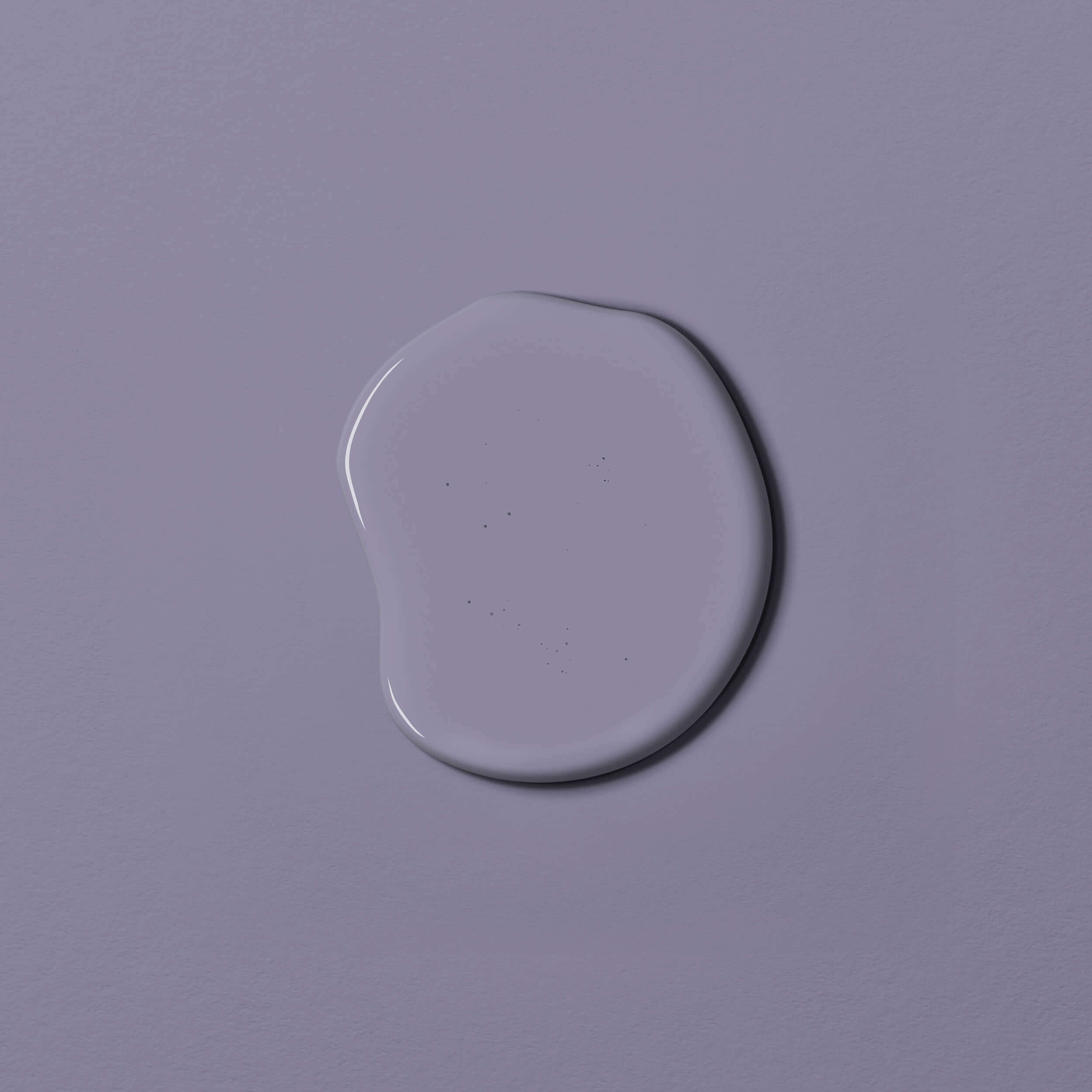
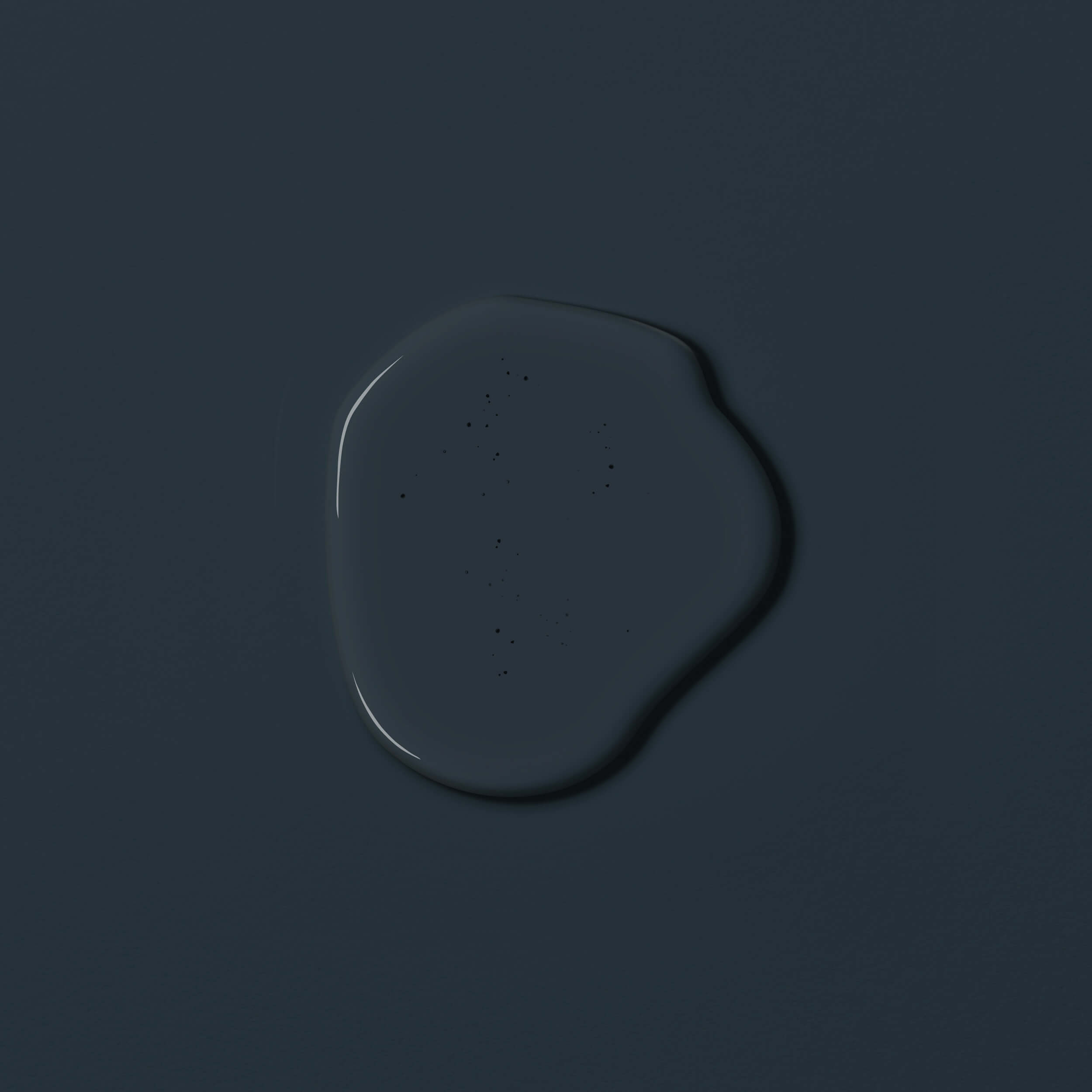
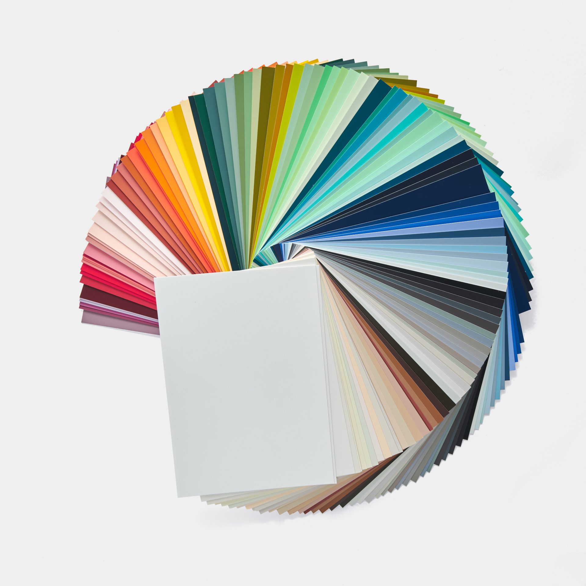
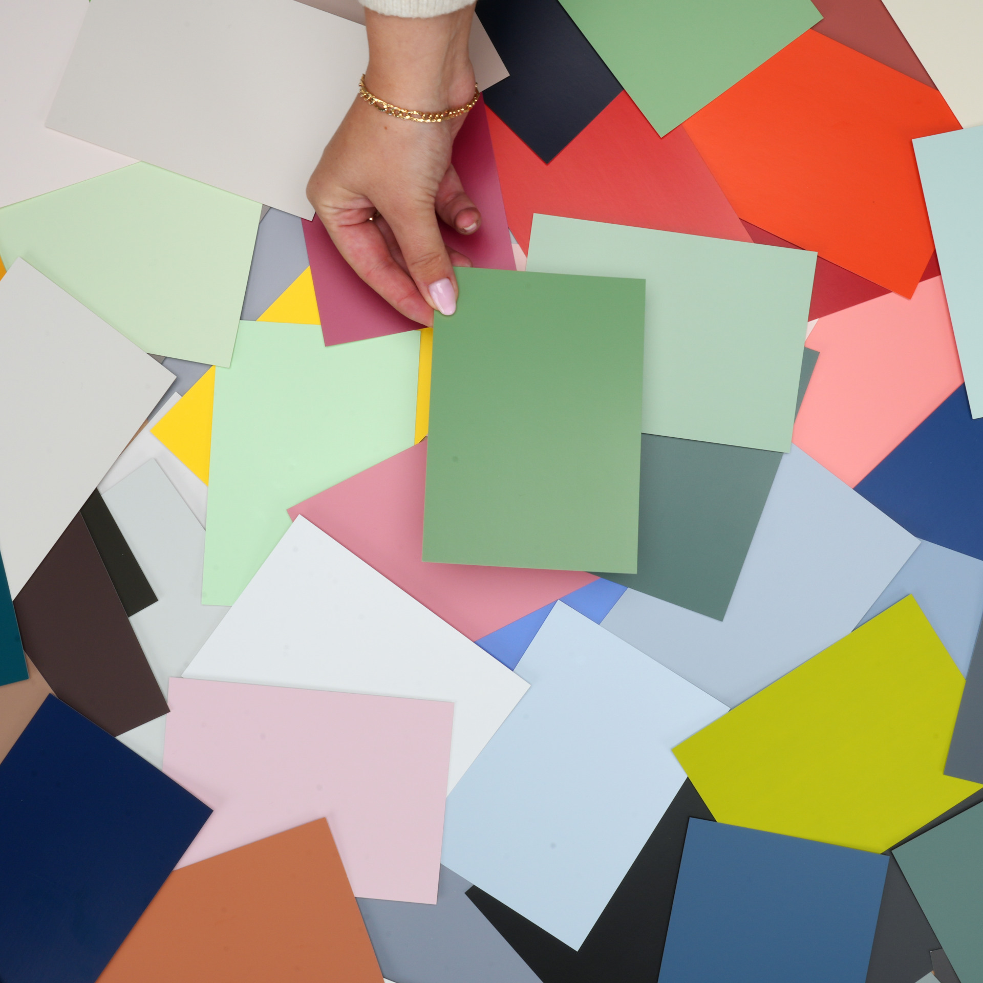
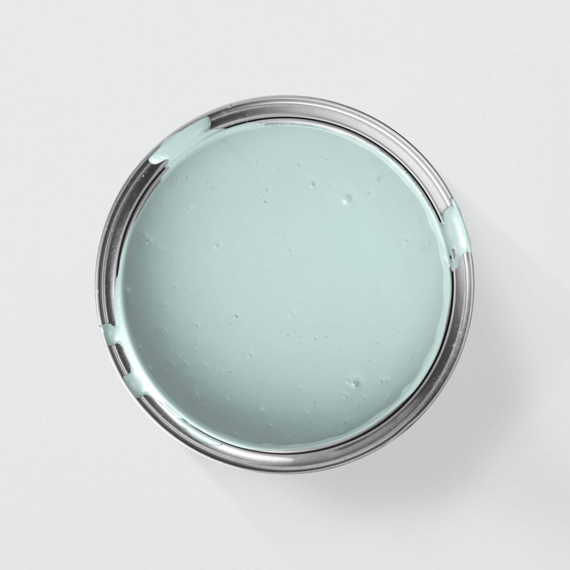
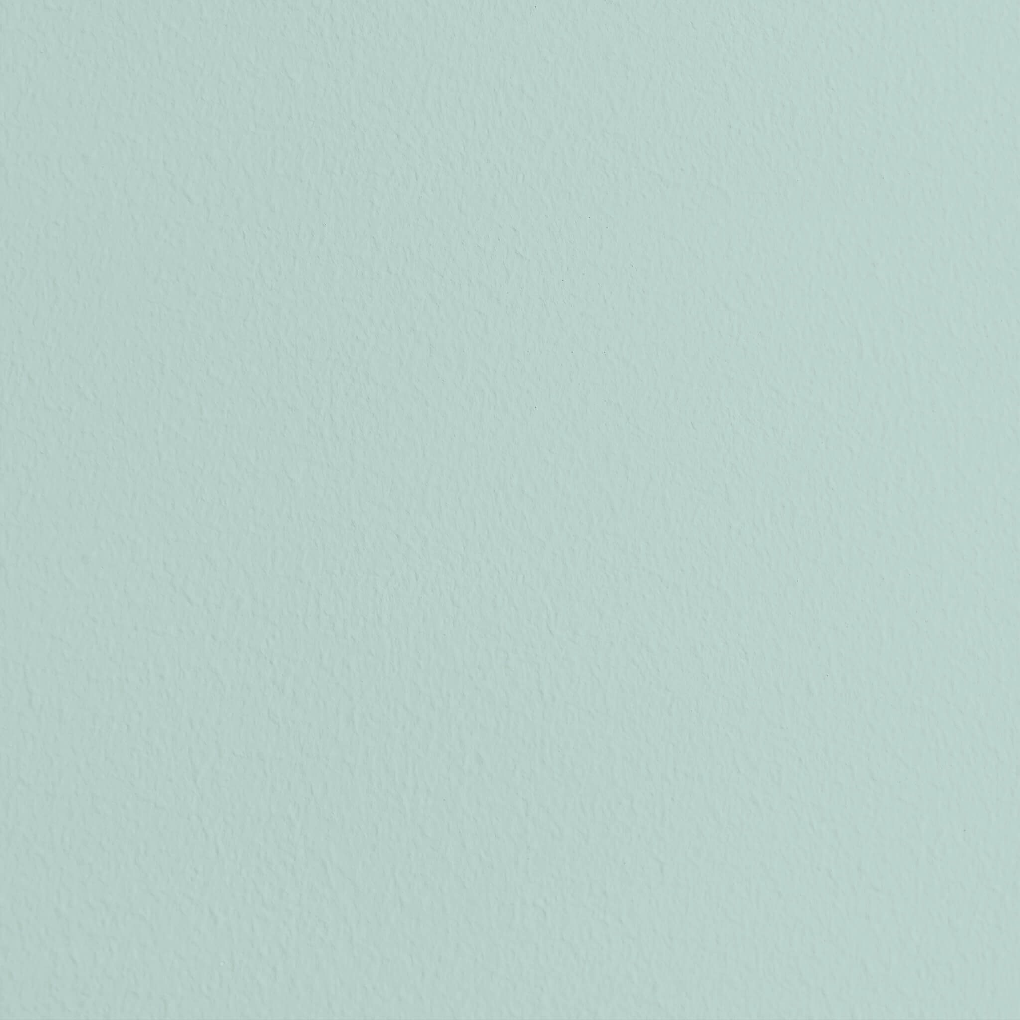
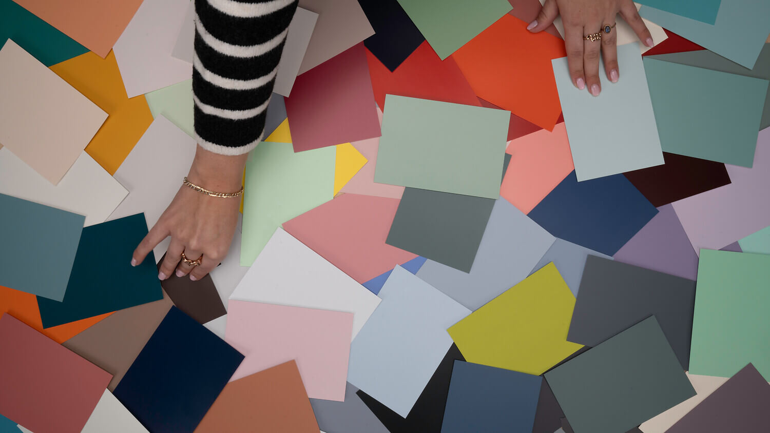
Our petrol colours

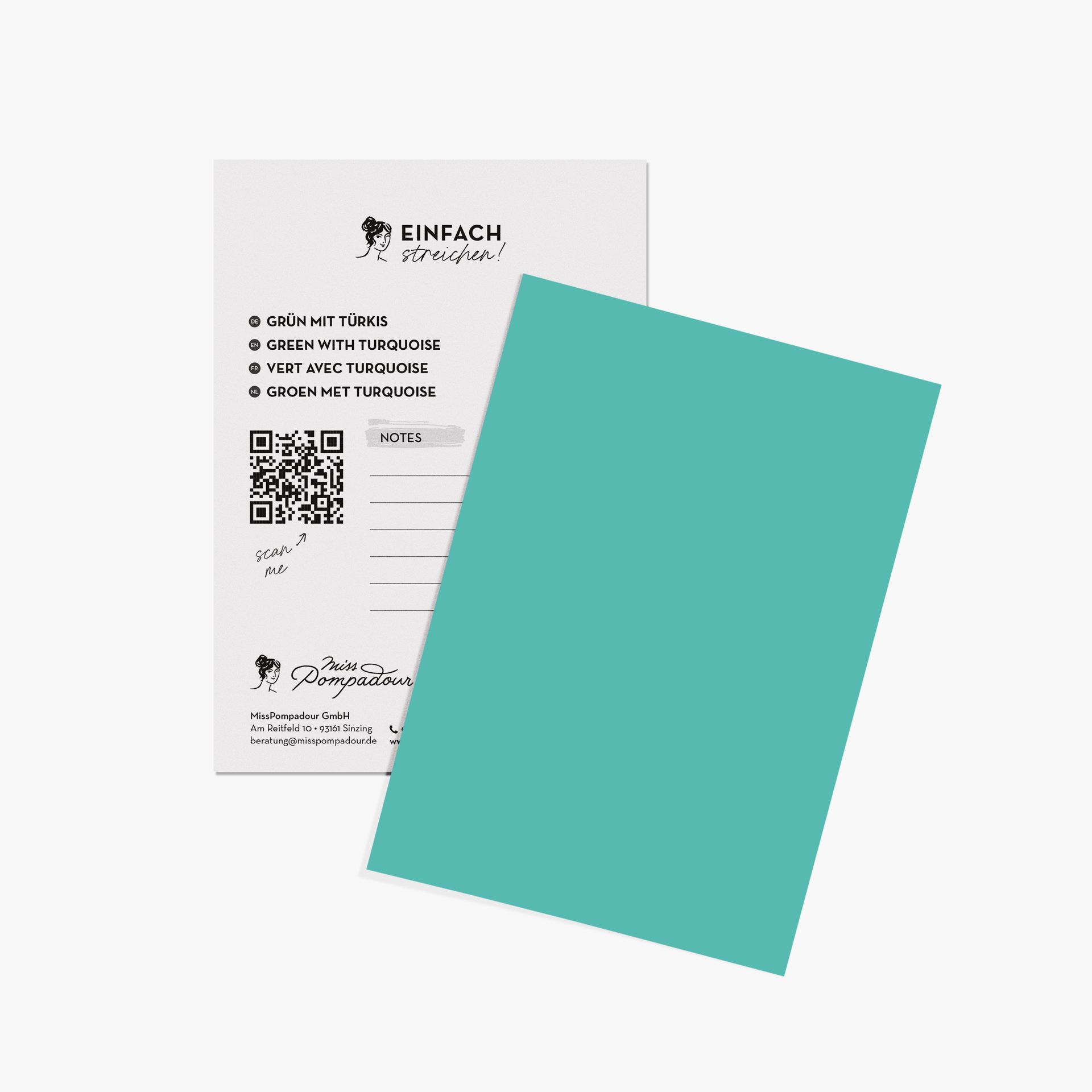
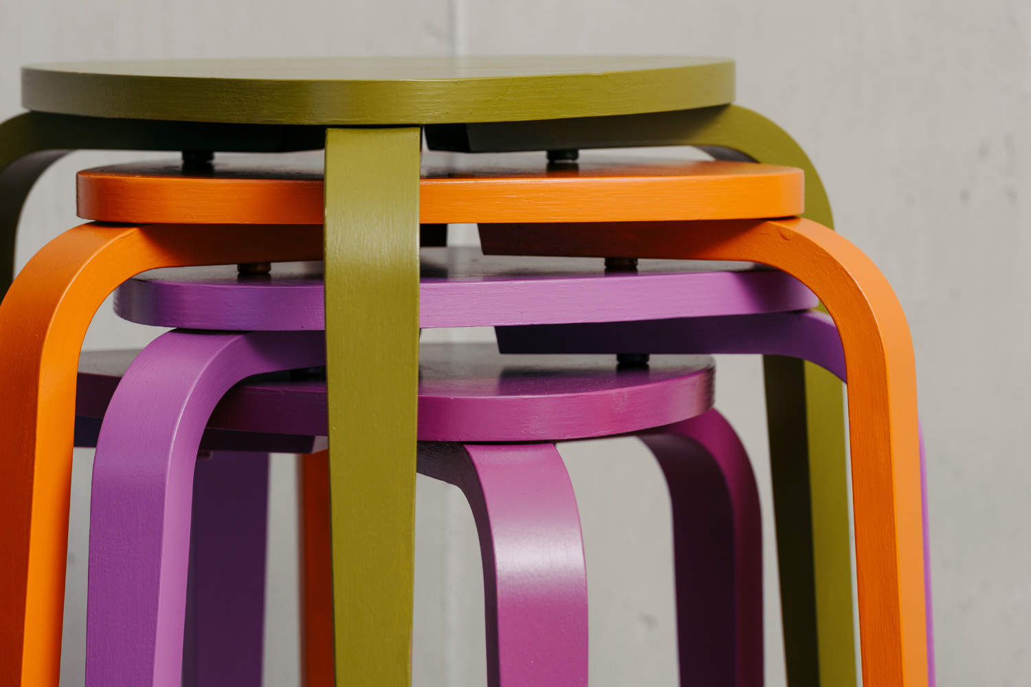
Everything for your project in one set


Everything you need to know about the colour petrol
Petrol is a deep, rich shade that sits at the intersection of dark blue and green. It feels elegant and calming.
The effect of the colour petrol
Unlike lighter turquoise, petrol has a much higher blue and black content, giving the colour a mystical, intense, and incredibly sophisticated depth. It often evokes the unfathomable depths of the ocean.
Thanks to its strong blue undertones, petrol radiates a deep calm, confidence, and visual stability. While bright turquoise encourages light, easy communication, petrol is grounding and aids concentration. It helps to focus the mind and ease mental stress.
In colour psychology, petrol combines the emotionally healing qualities of green with the soothing depth of blue. While it is less energising than yellow-green blends, it is wonderfully balancing, elegant, and deeply comforting when you are feeling restless.
Designing rooms with petrol blue
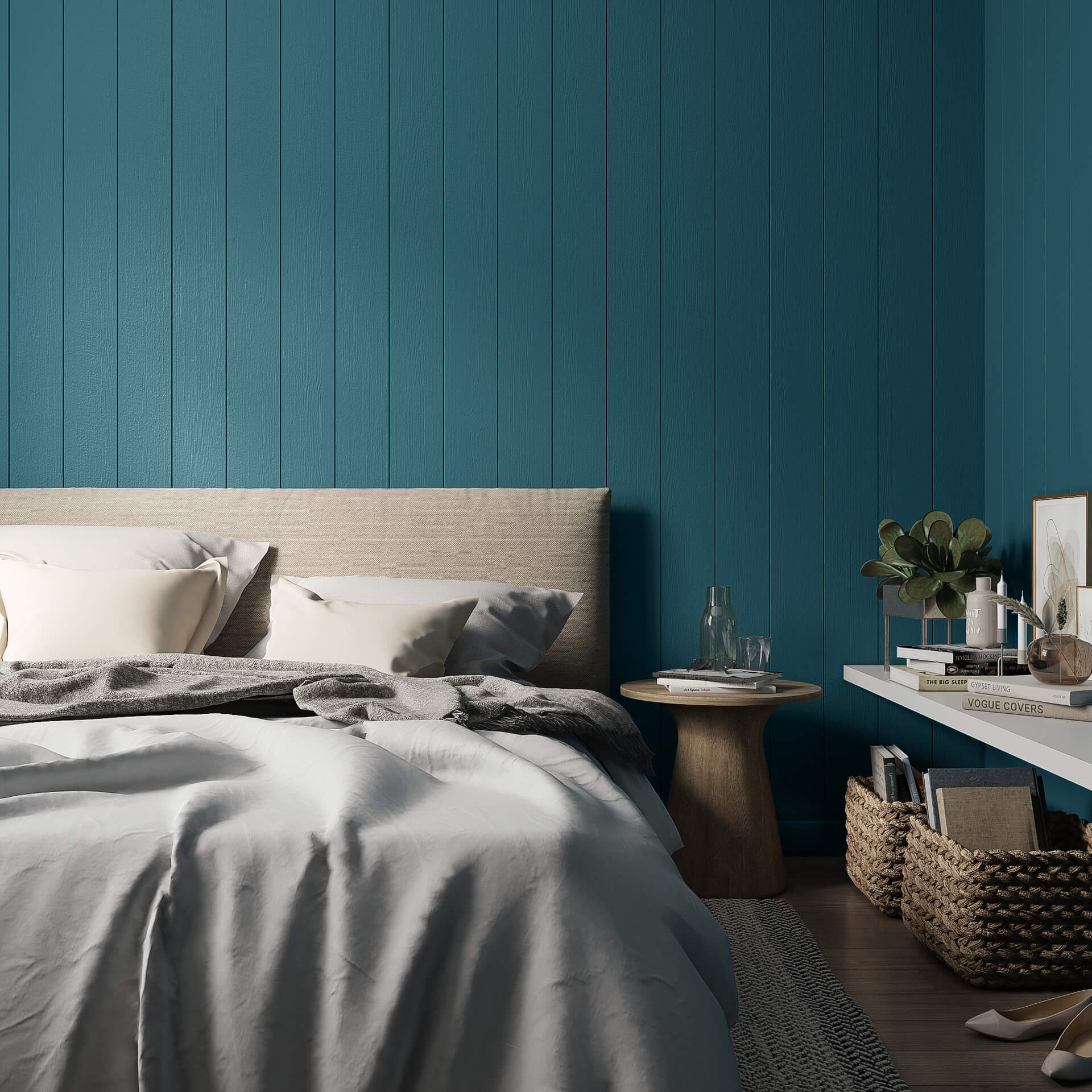
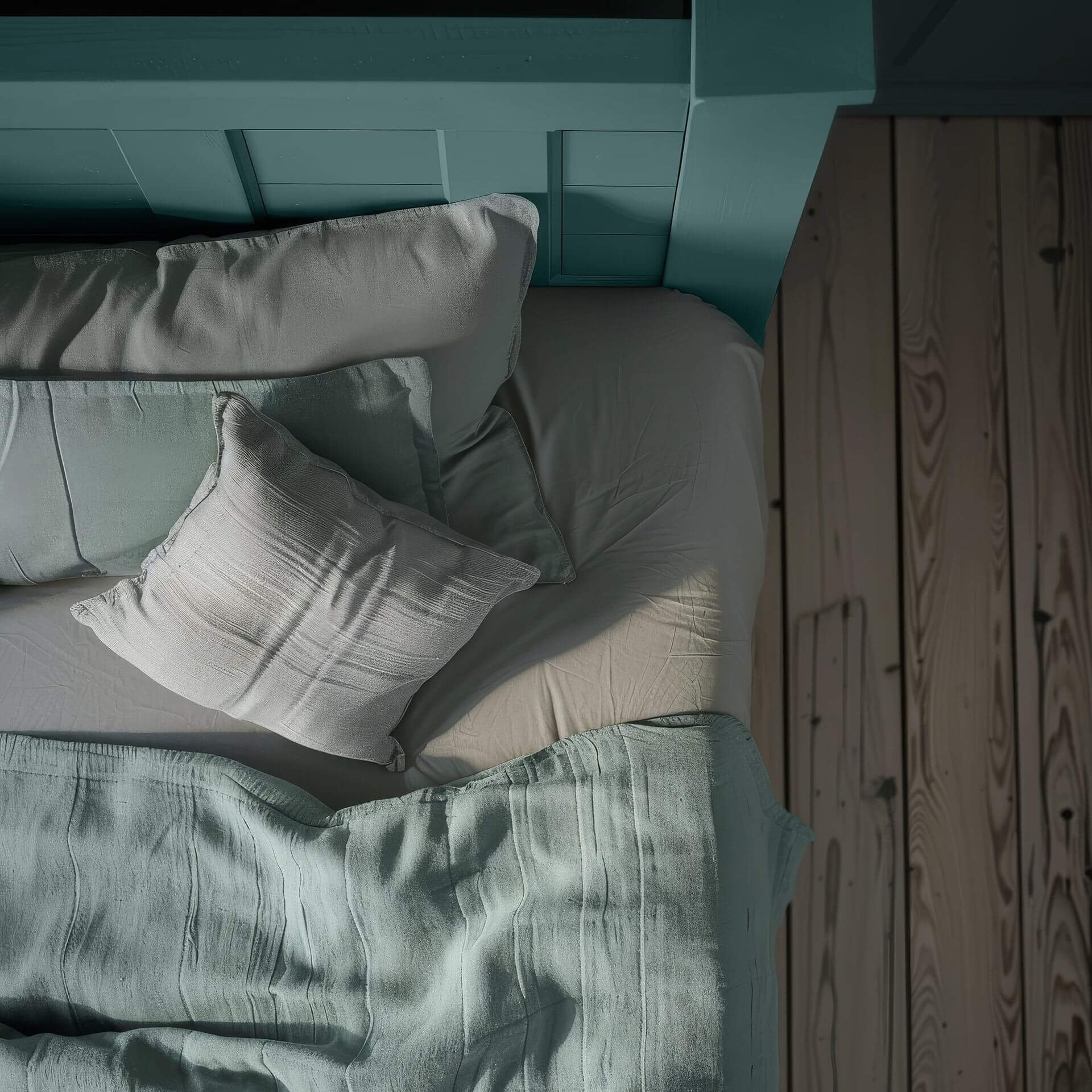
Since petrol is a deep shade, it doesn't make rooms look visually larger like light turquoise does. Instead, it creates a sense of comfort, cosiness, and a touch of luxury. It also has a noticeably cooling, calming effect in sun-drenched rooms, so it is best used in larger, well-lit spaces.
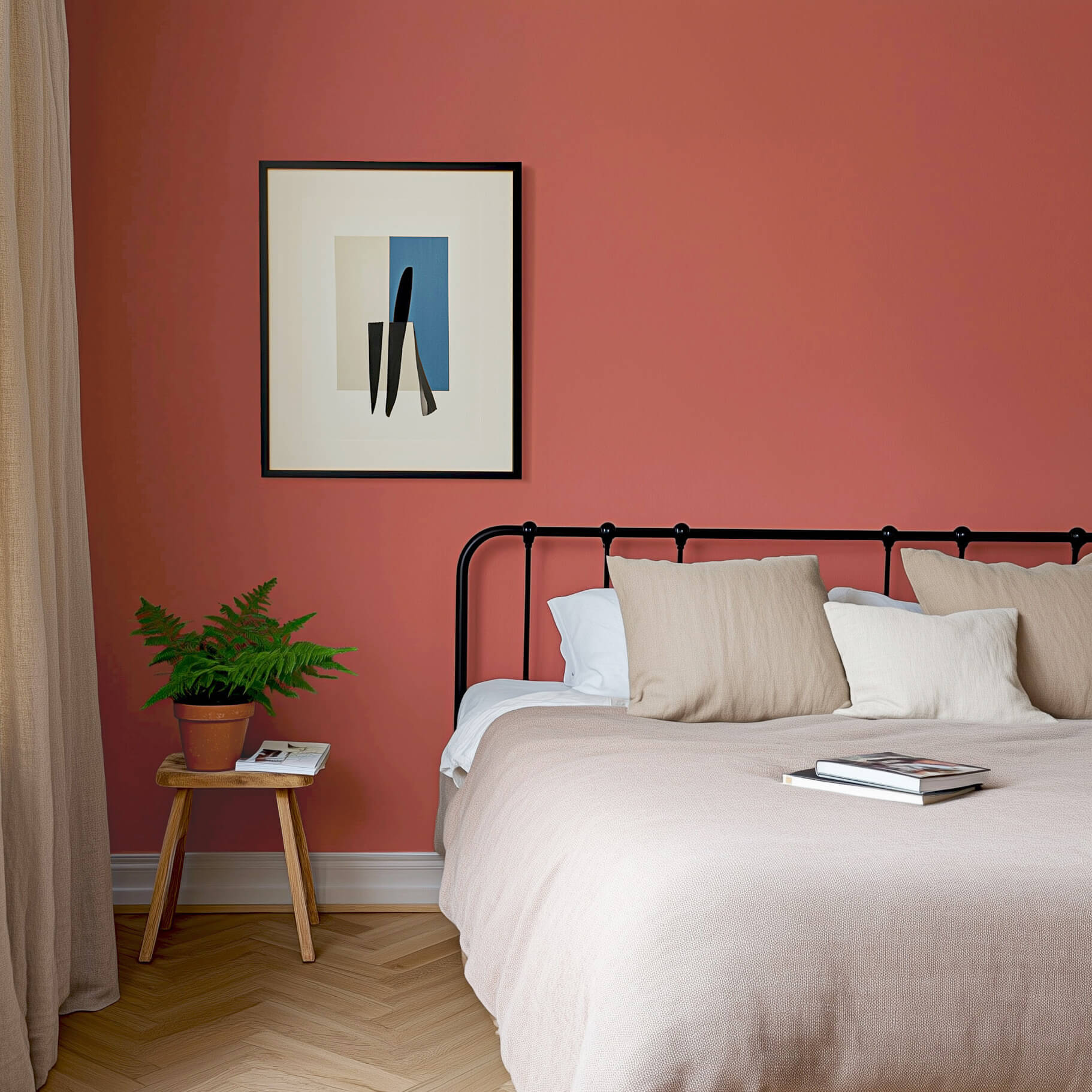
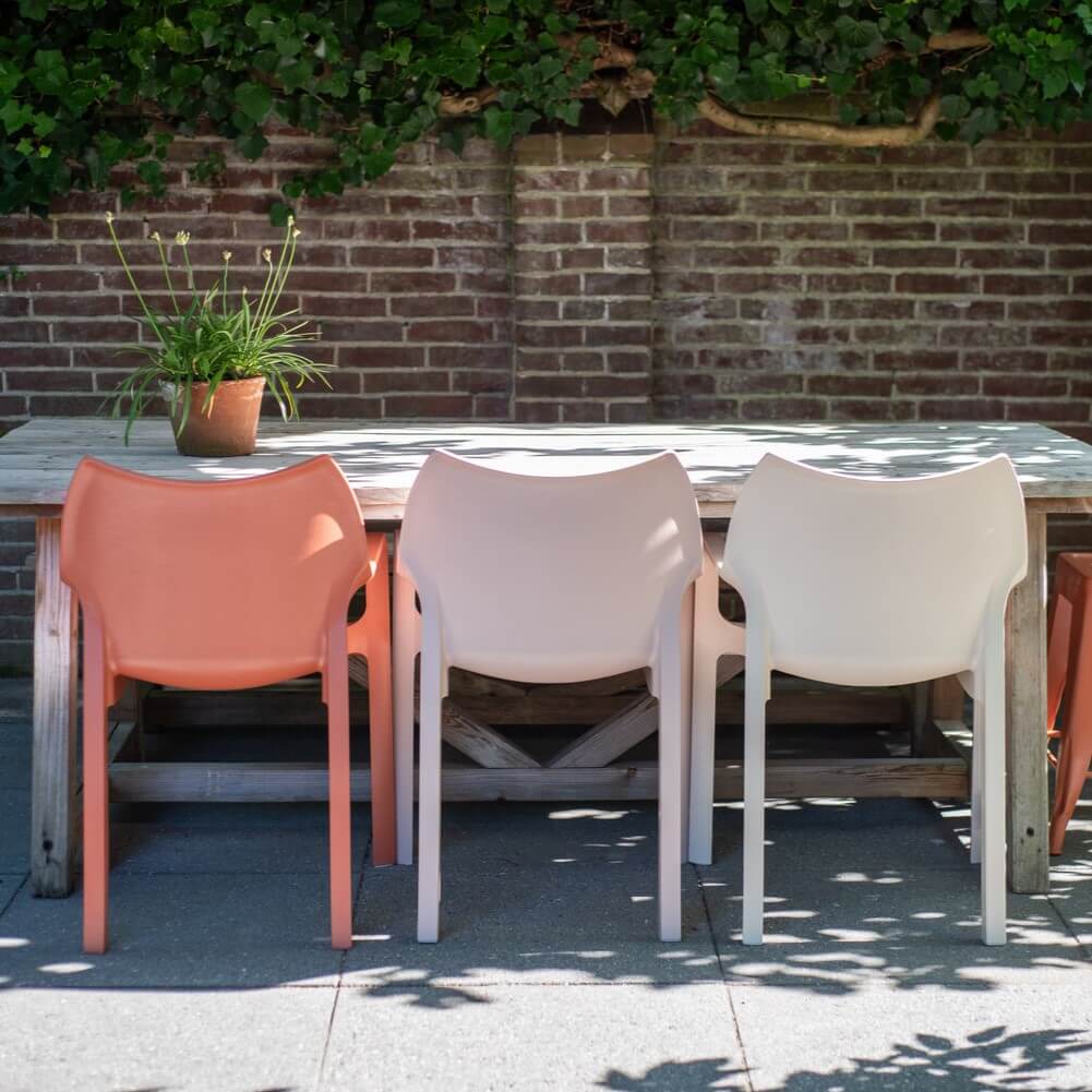
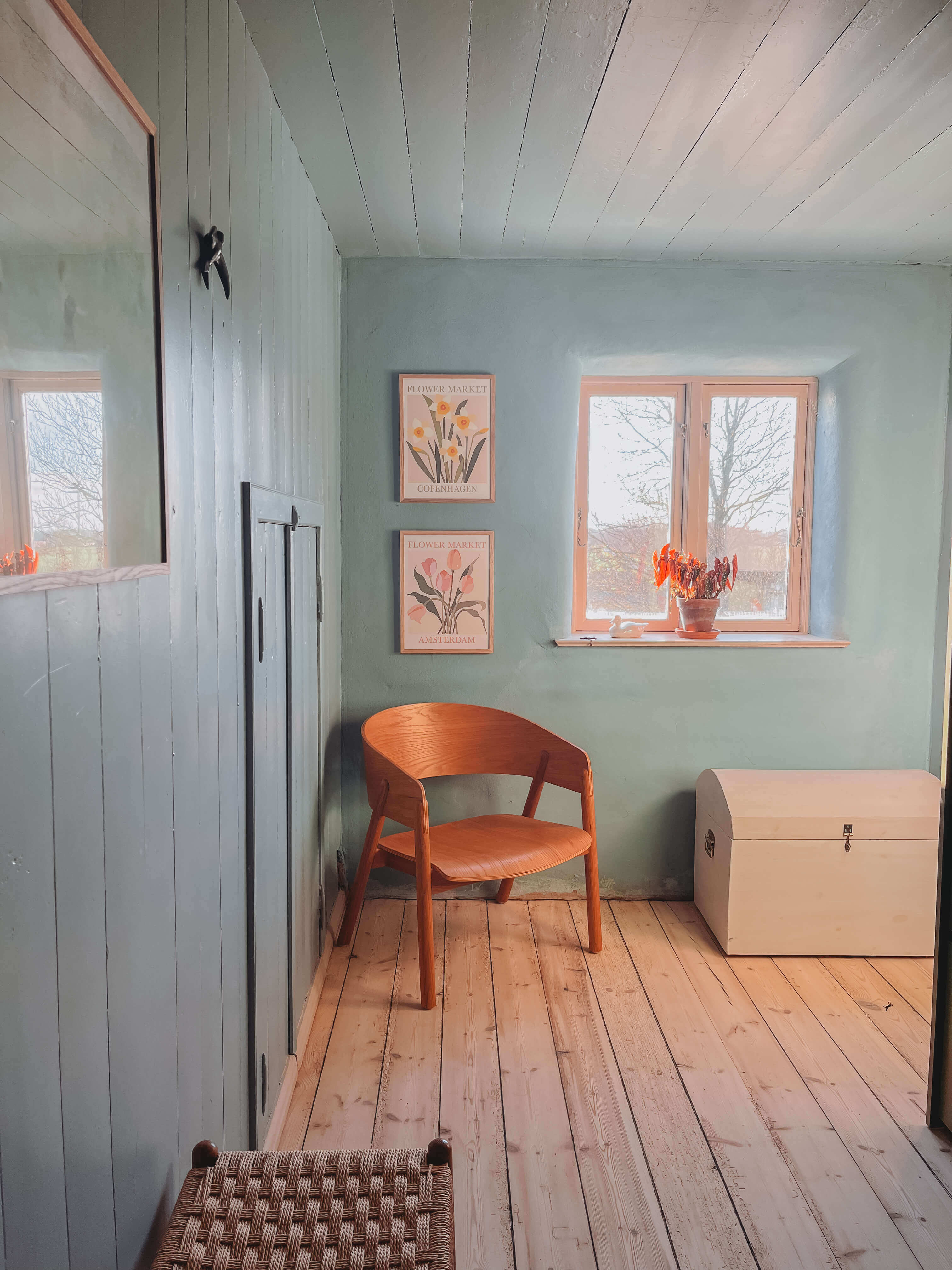
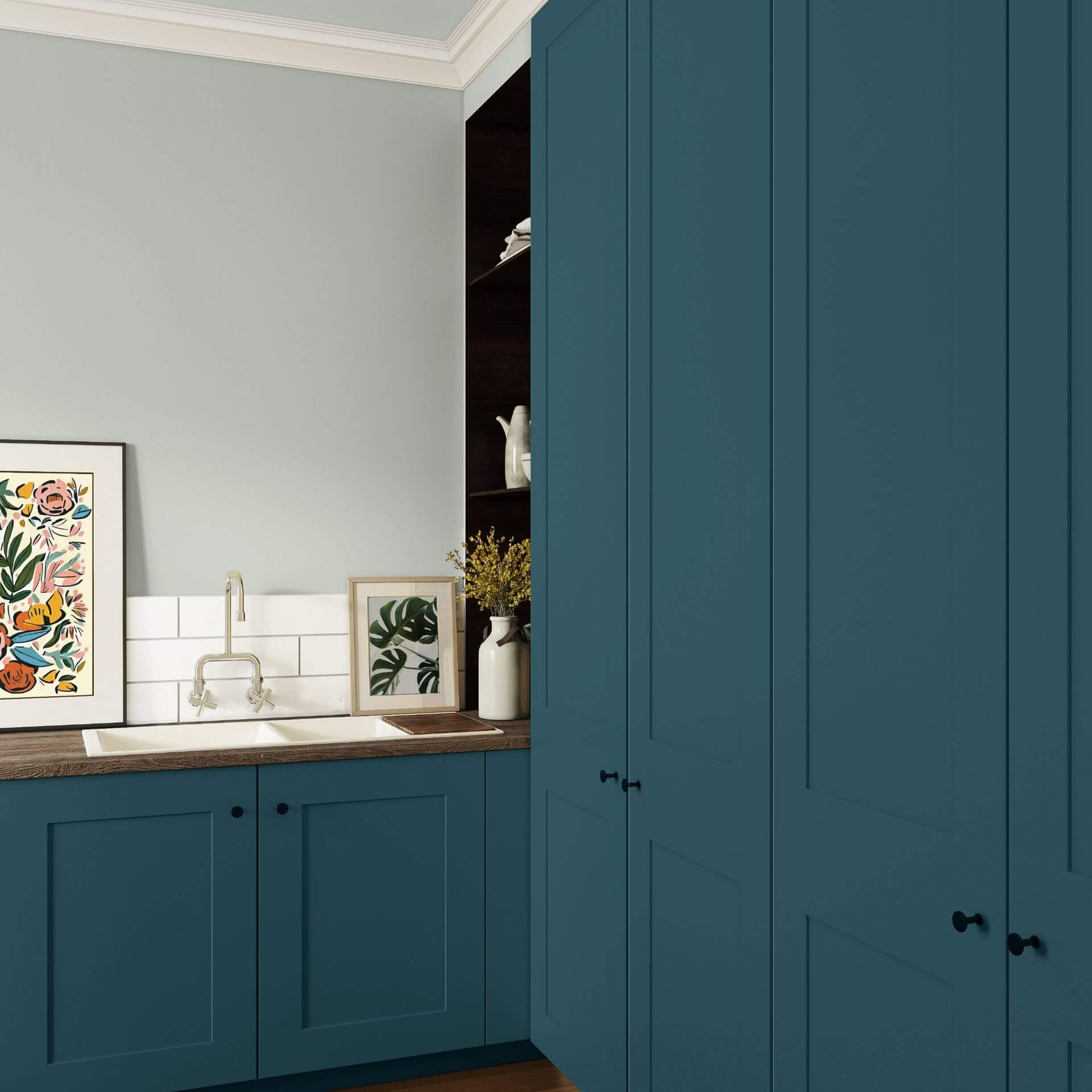
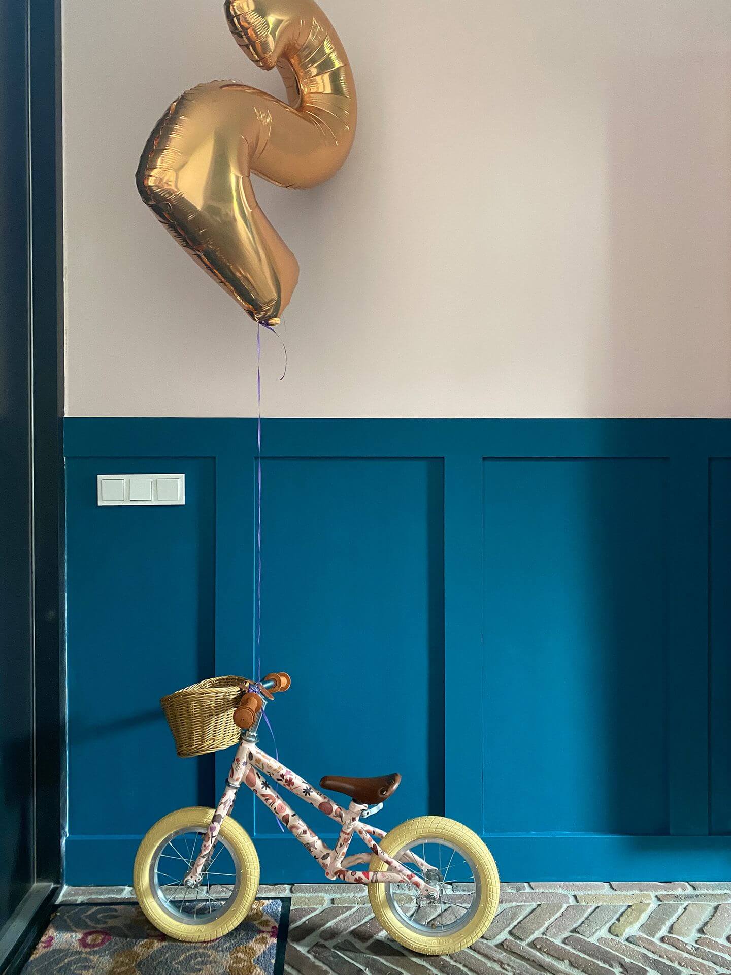
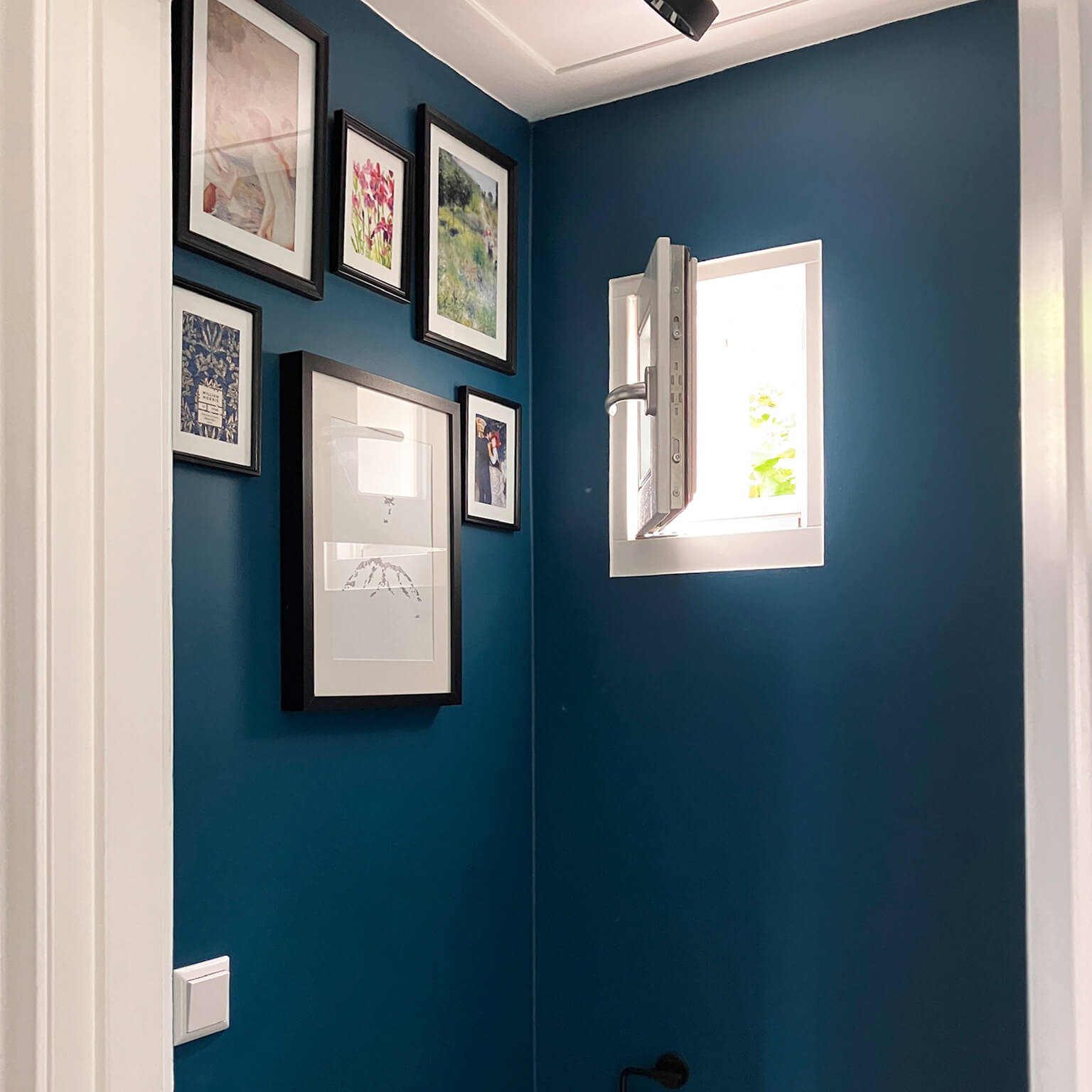
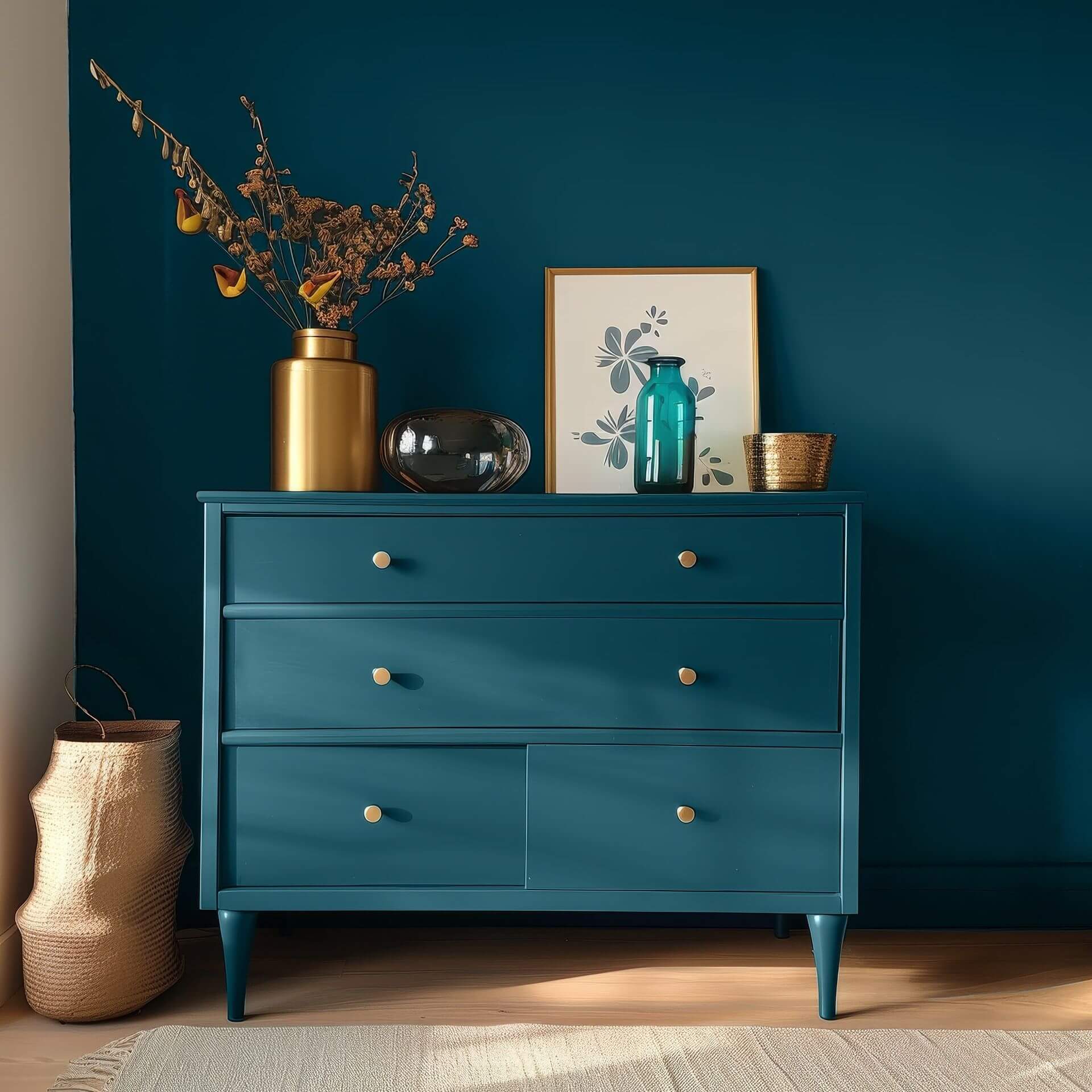
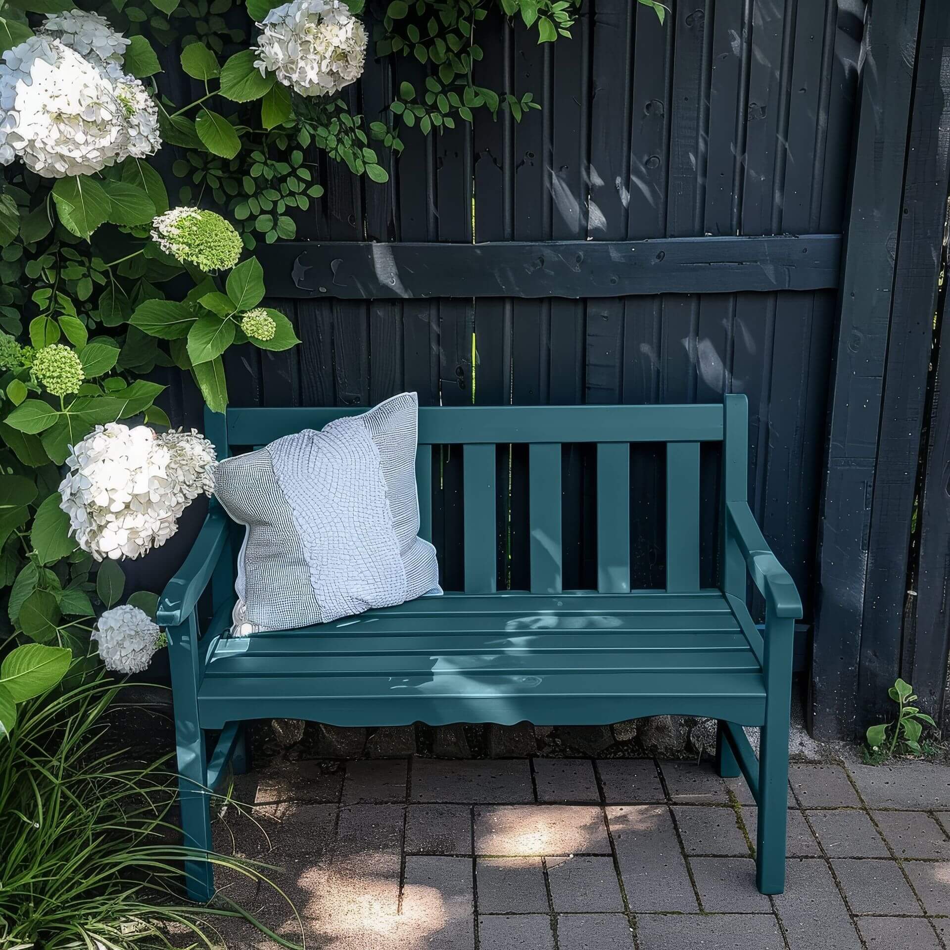
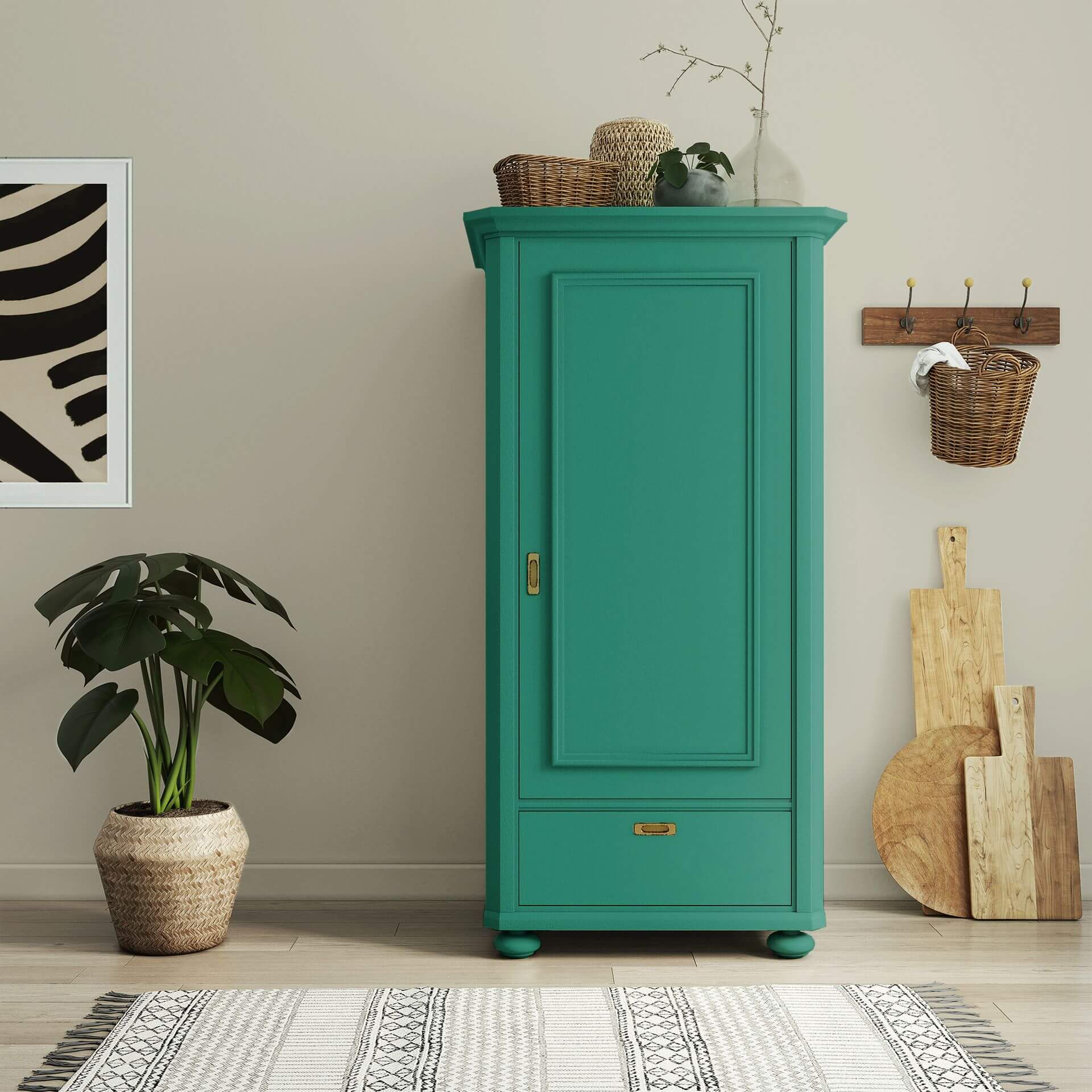
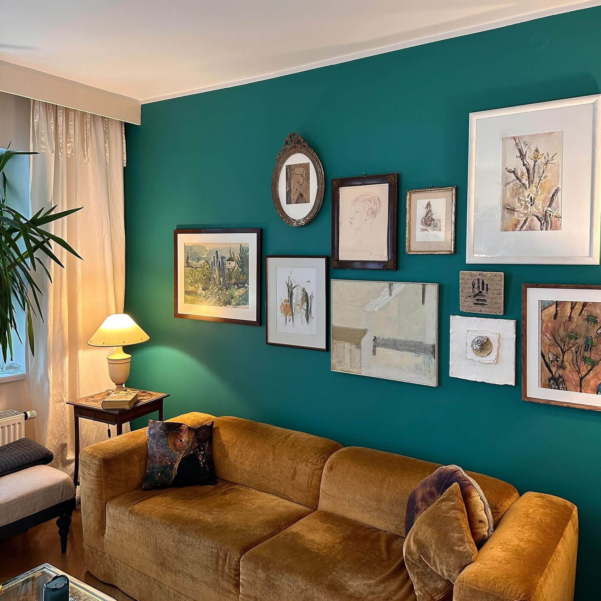
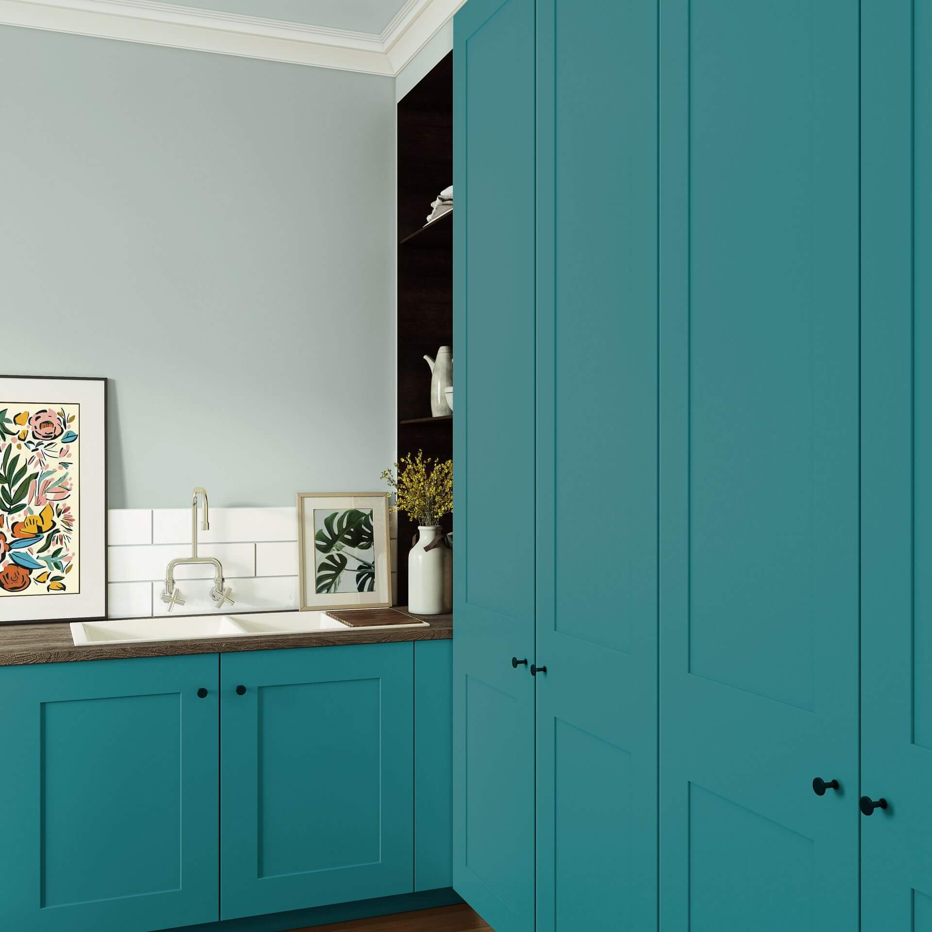
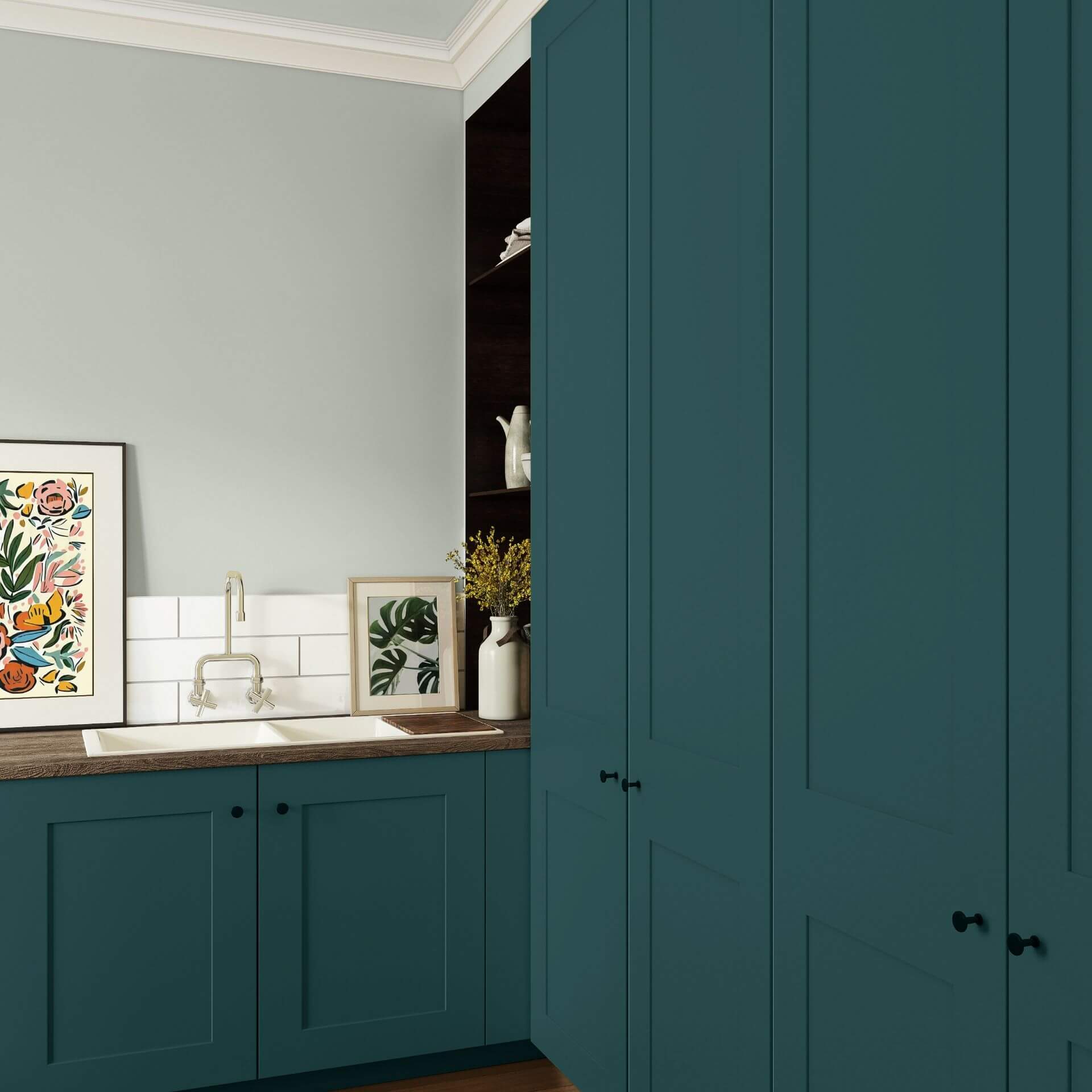
Because of its intensity, petrol is perfect for a single feature wall. Against this dark, sophisticated backdrop, artwork and gold or wooden accessories will really stand out.
Since petrol fosters an atmosphere of concentration and depth, this elegant shade is ideal for home offices or libraries. In fact, it works beautifully in any room where focus is key.
Where you should avoid petrol
In small, already dark rooms or those that are purely north-facing, petrol shouldn't be used over large areas as a wall paint. Without enough light, the shade can look gloomy, heavy, or almost black, and lose its elegant blue-green nuance.
Alternatives to the colour petrol
If you're looking for the calming effect of petrol, but without the intensity and darkness of this shade, you can opt for soft green shades (without any blue undertones) or fresh, yellow-toned olive hues instead. These feel lighter, more open, and friendlier, while still creating a calm, relaxed atmosphere.

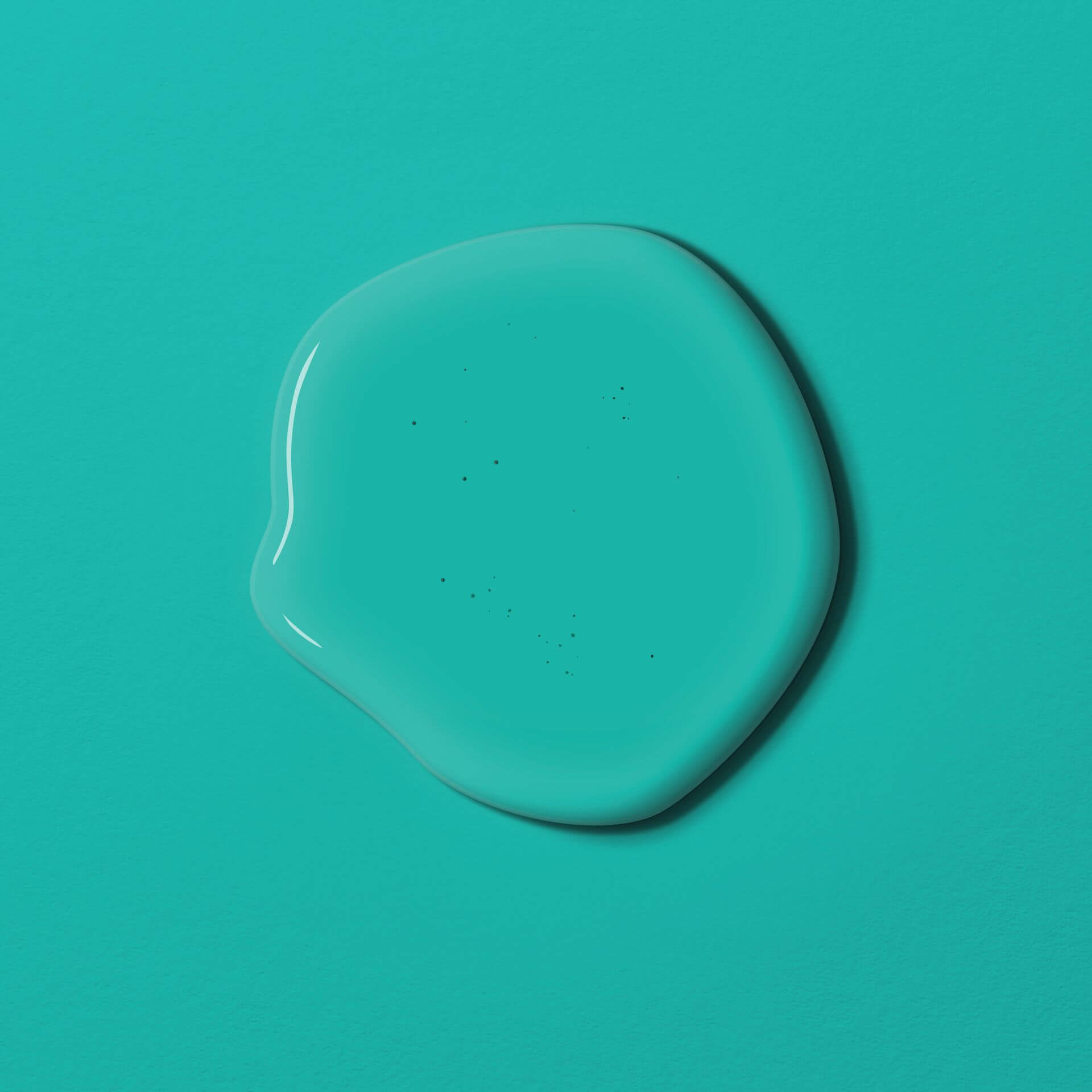
A diverse range of teal shades
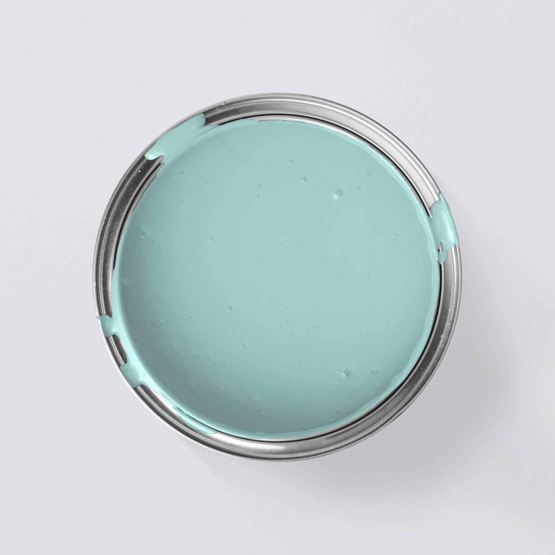
Essentially, teal is a shade that mixes green and blue. Within the colour family, this shade is also referred to as an aqua tone.
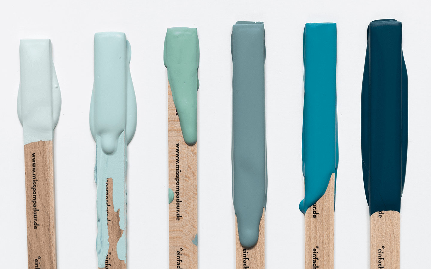
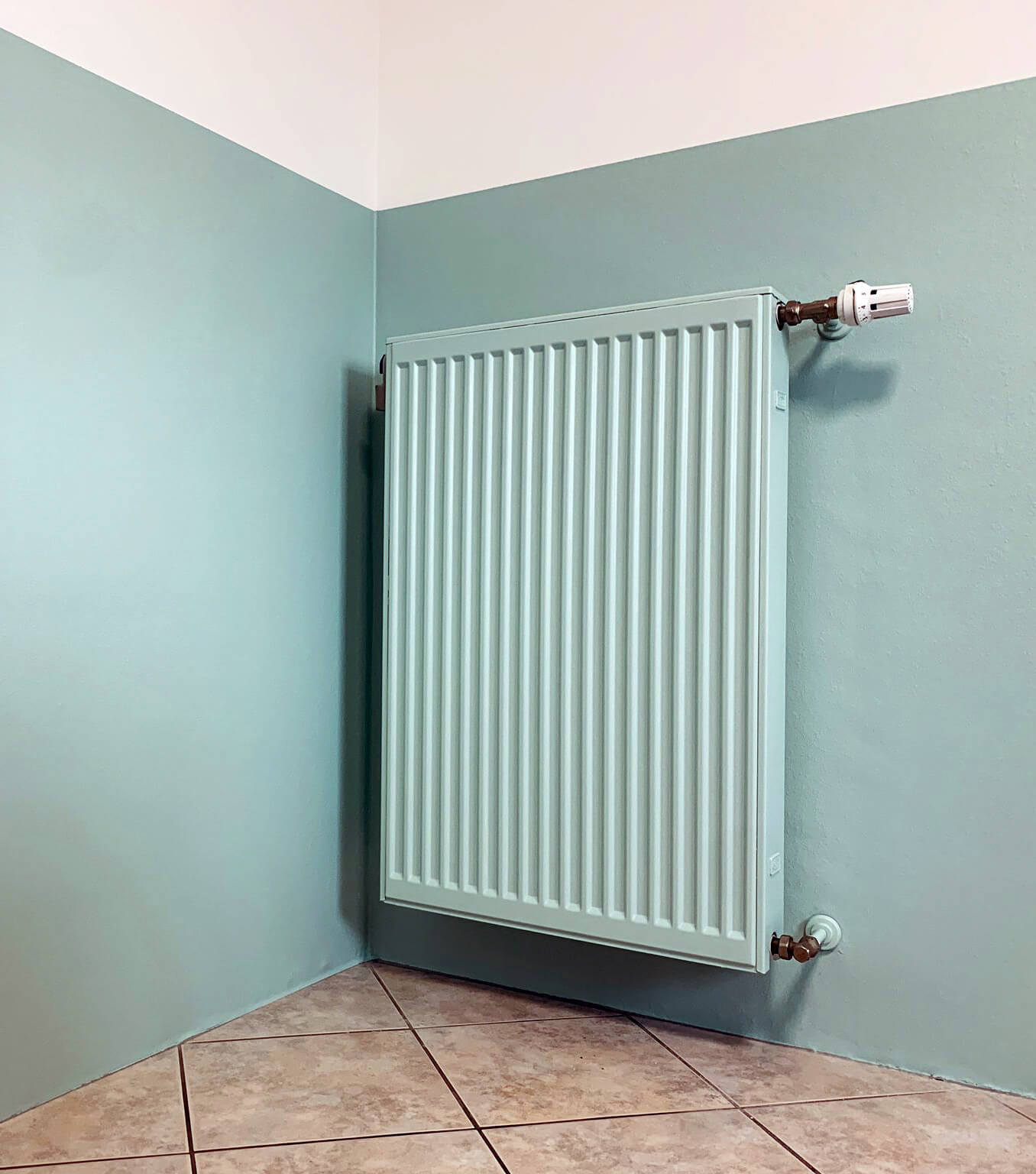
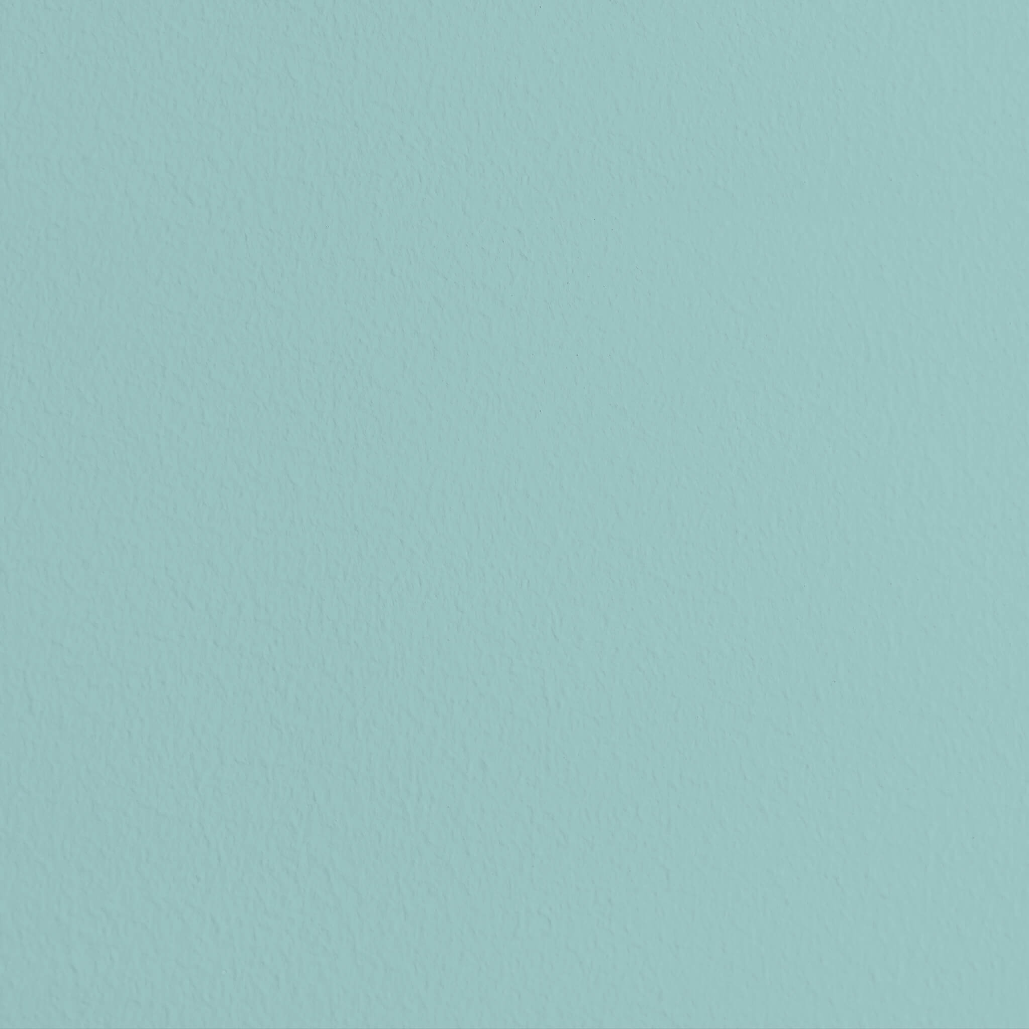
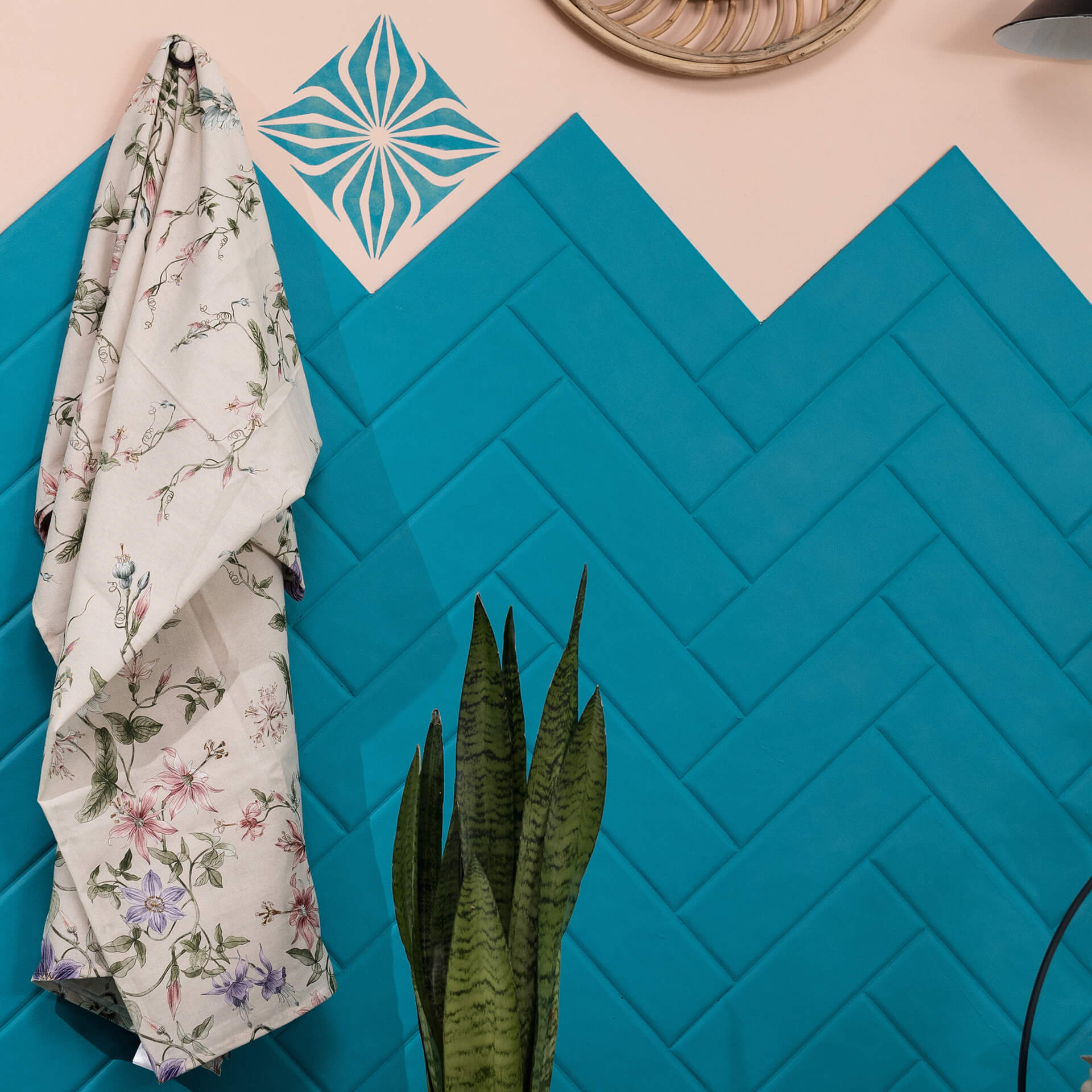
The term teal is used to describe the deeper, darker shades of the aqua family. Other names for this colour family include blue-green or sea green. Teal comes in many different nuances. Depending on whether blue or green is the dominant component, the shade has a different effect. The intensity also varies, meaning you can cover the entire spectrum, from soft, muted tones to a bold accent colour, with teal paint.
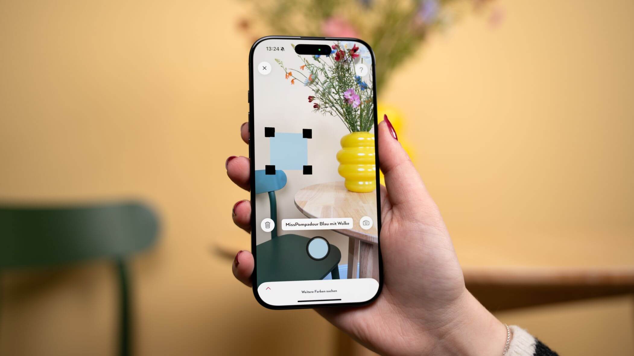
The different nuances are characterised by their very own distinctive composition. They contain a finely balanced ratio of blue and green pigments which, depending on the mix, create a completely different feel in a room. Examples from the MissPompadour range show just how versatile and expressive this shade can look on your walls.
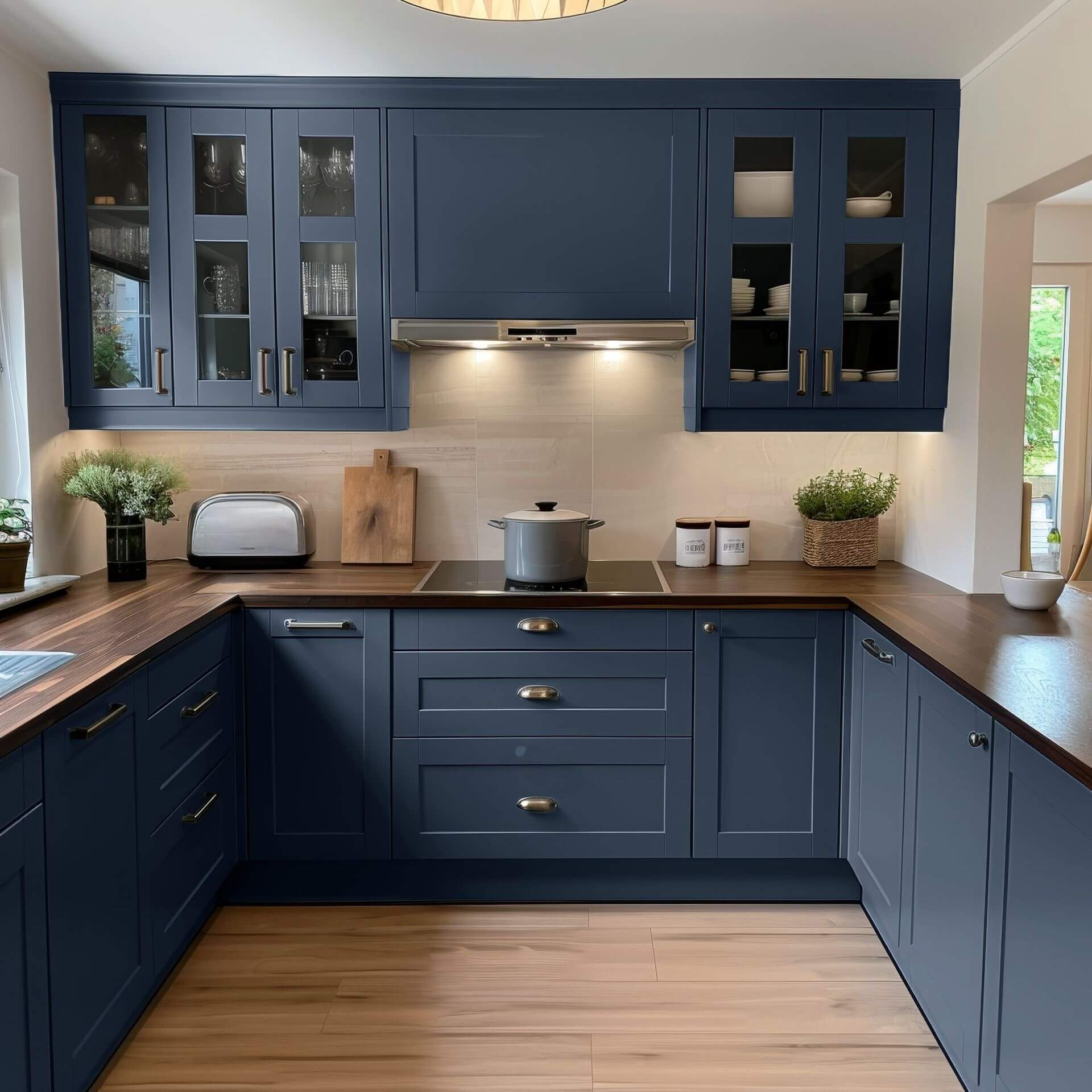
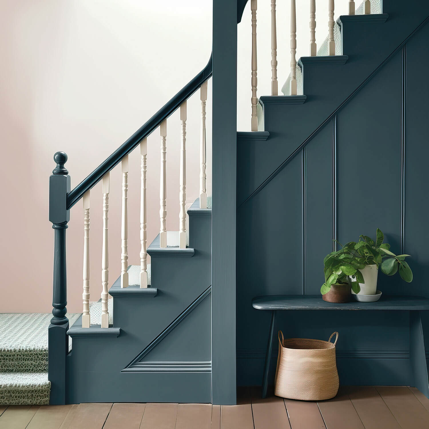
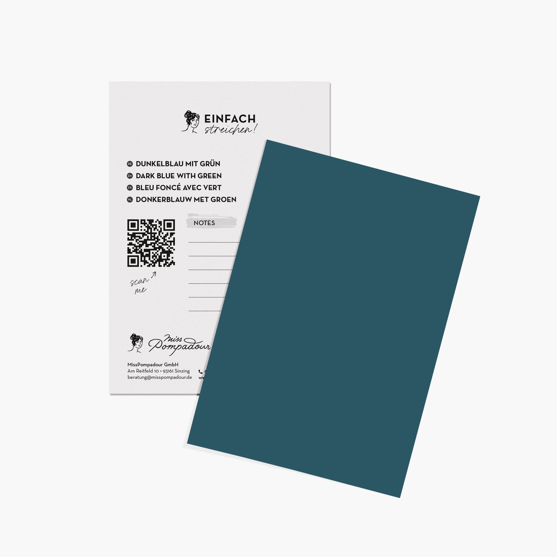
In some teal shades, blue is the dominant component, making it feel more like a deep, greenish blue. These shades include Dark Blue with Green from our collection. If green pigments dominate, they create a mysterious, dark aquatic shade, such as Green with Teal or Green with Lagoon.
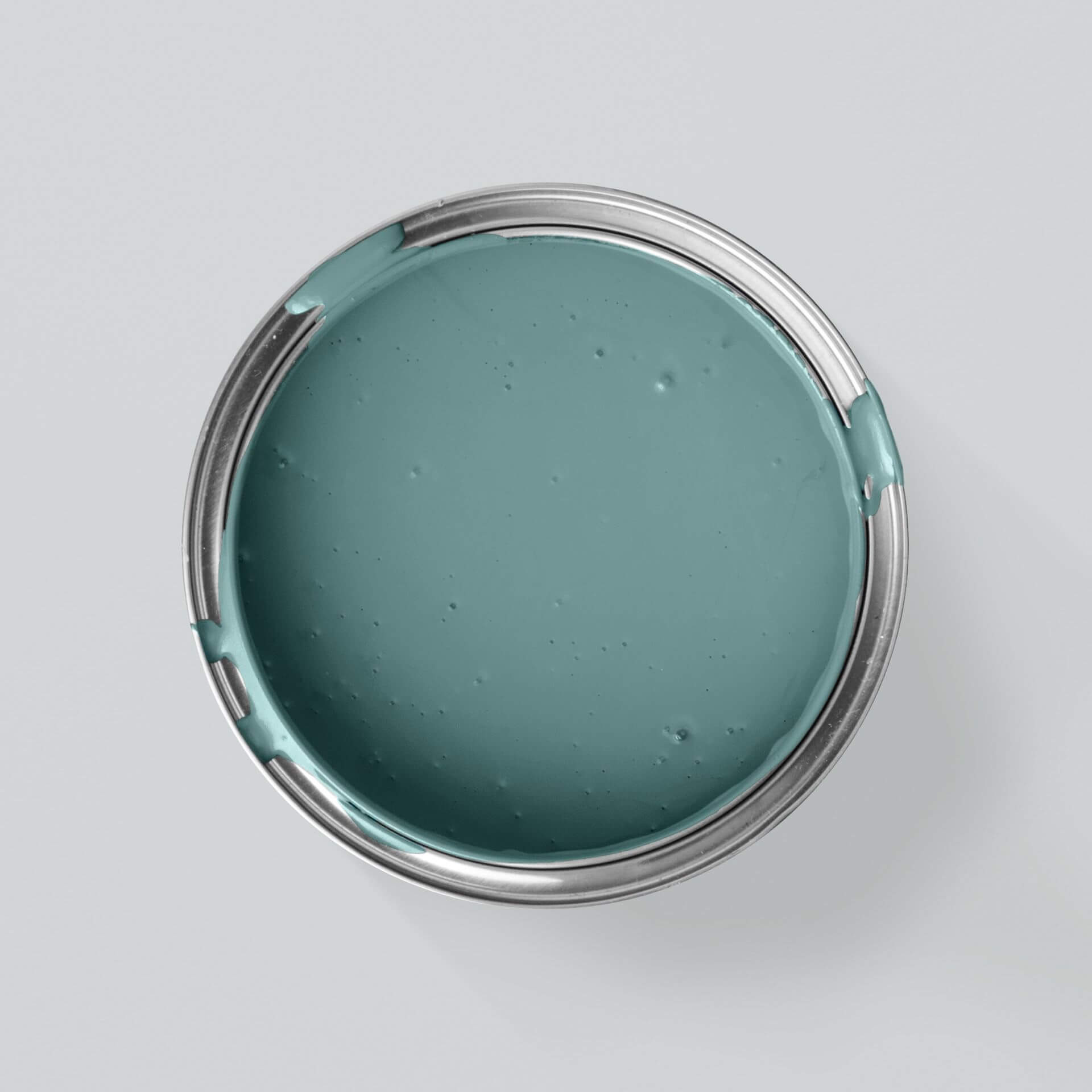
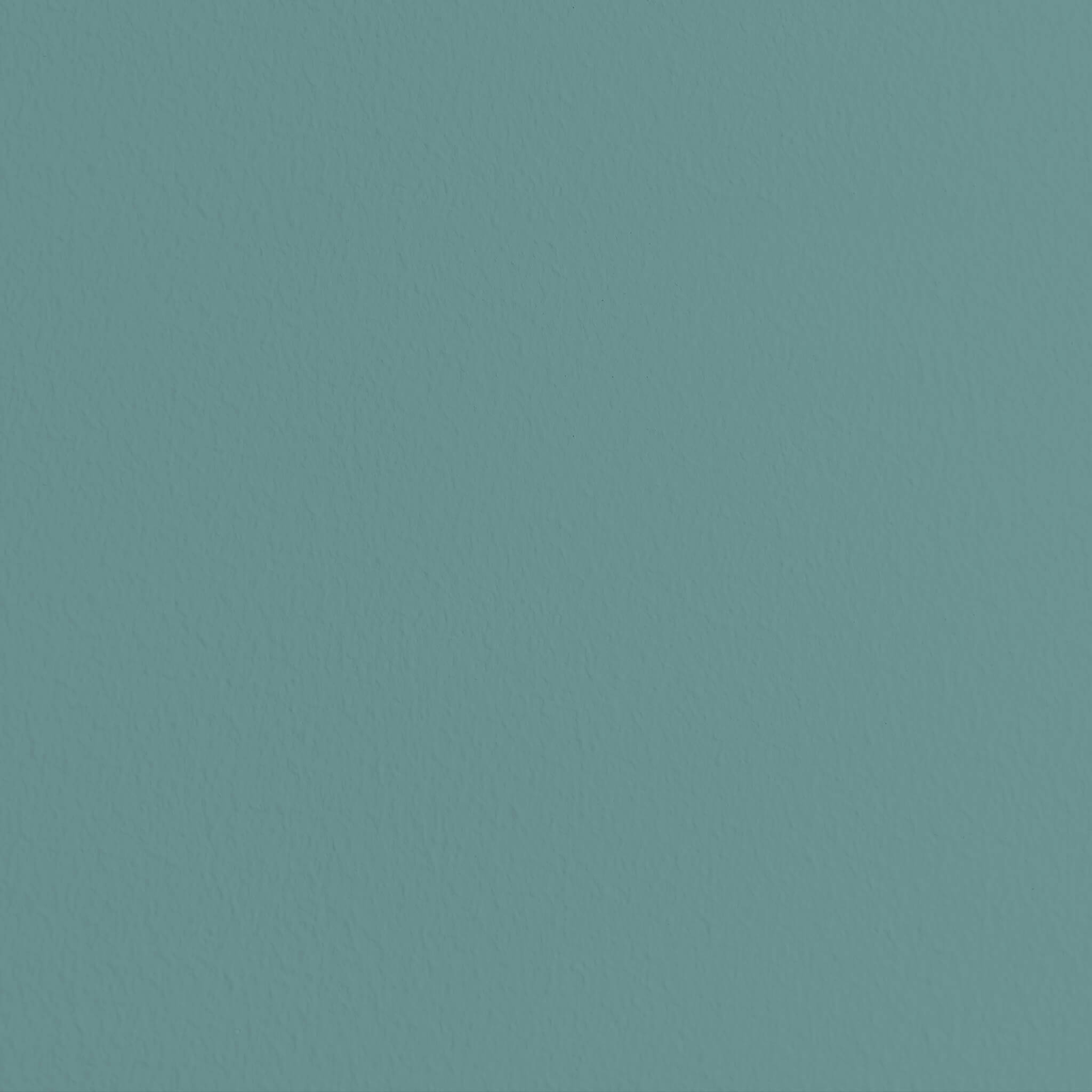
Muted with grey and therefore less intense is, for example, the cosy Green with Ocean. On the other hand, the radiant Green with Emerald is mixed to be both expressive and bright.
The effect of teal
If you decide to buy teal as a wall paint, you can use it to create wonderful accents. Above all, this shade radiates a powerful sense of calm and has a relaxing effect on the viewer. Teal is exceptionally elegant and profound. Its effect varies depending on which component dominates.
Teal-blue wall paint stimulates thought and aids concentration. With teal-green wall paint, you can add an elegant atmosphere to any room. Greenish teal shades in particular also radiate a feeling of safety and comfort. On furniture, teal immediately creates an eye-catcher, while in the kitchen, its richness makes it intense yet calming.
Teal paint for many rooms
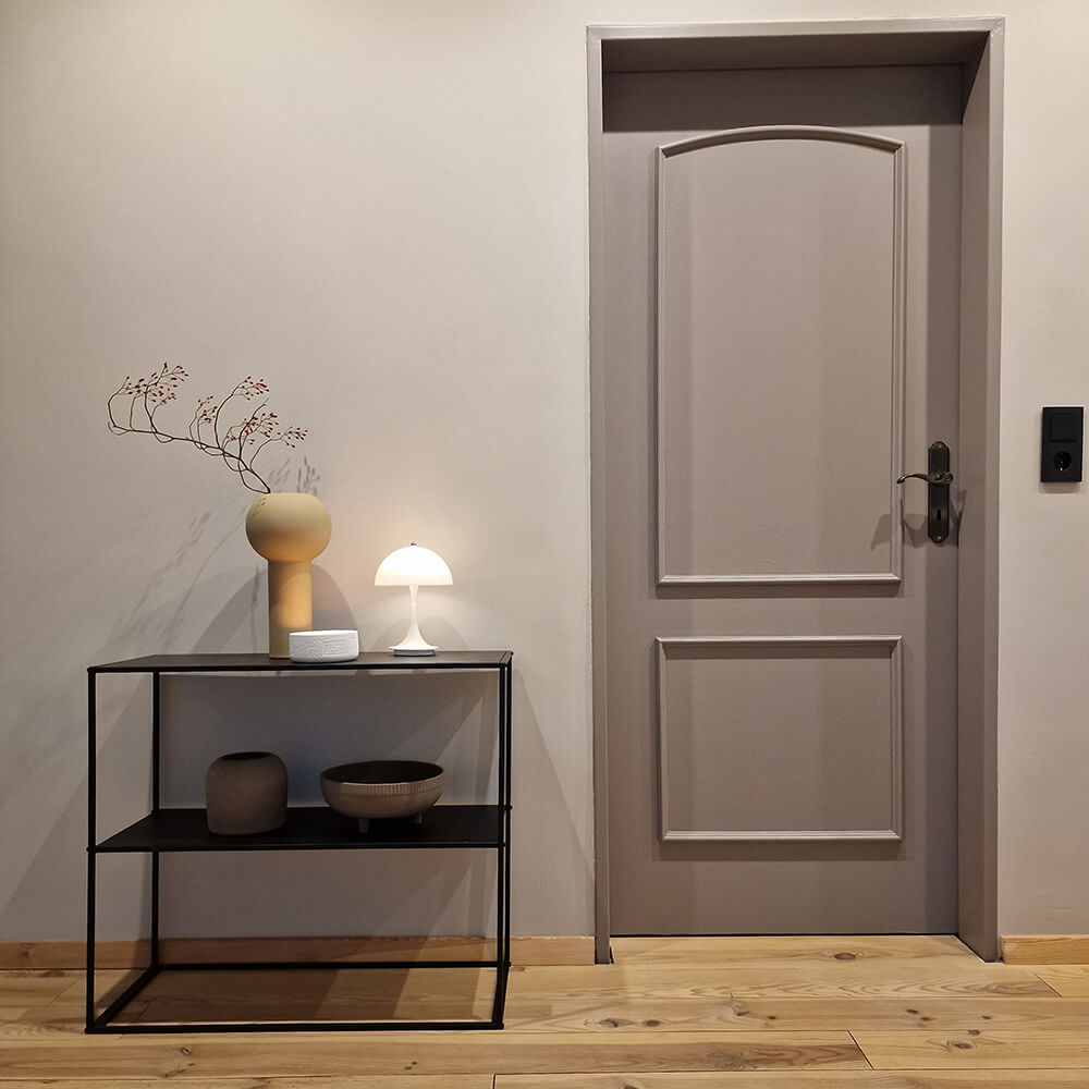
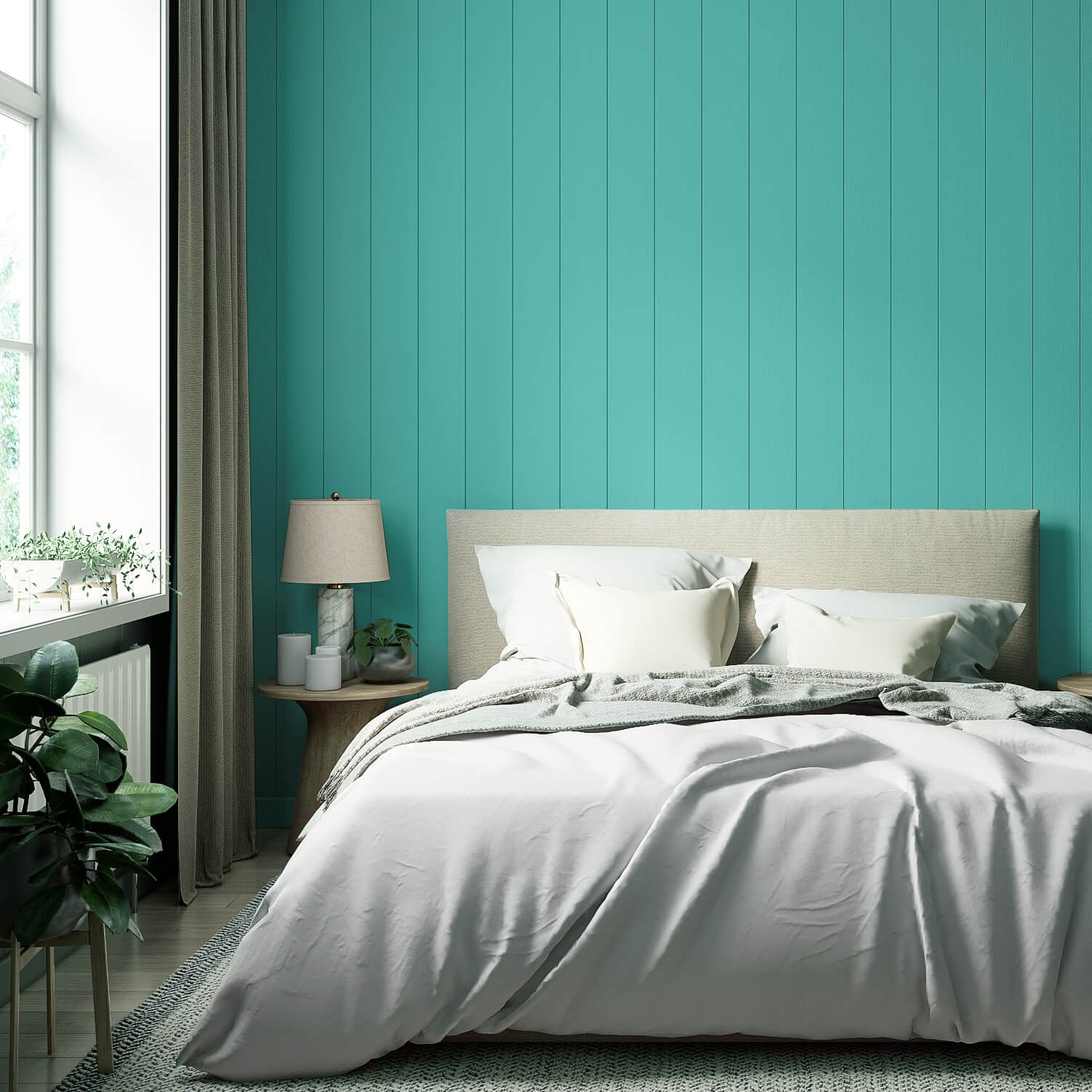
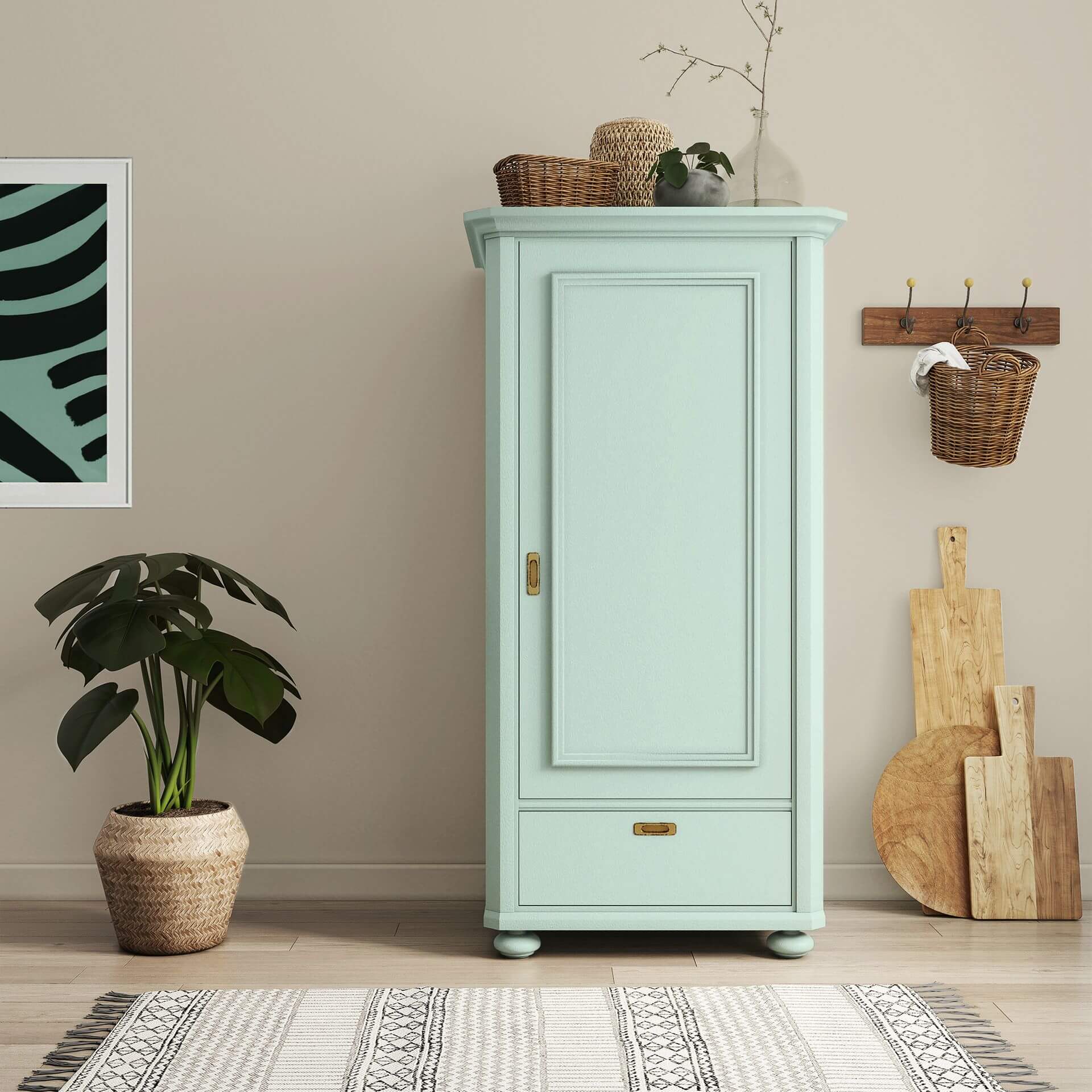
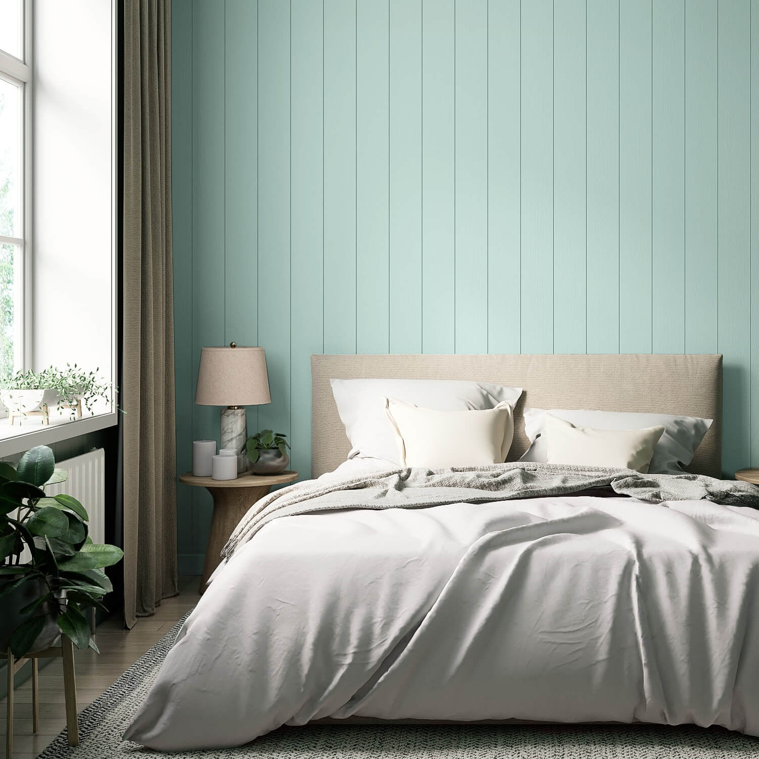
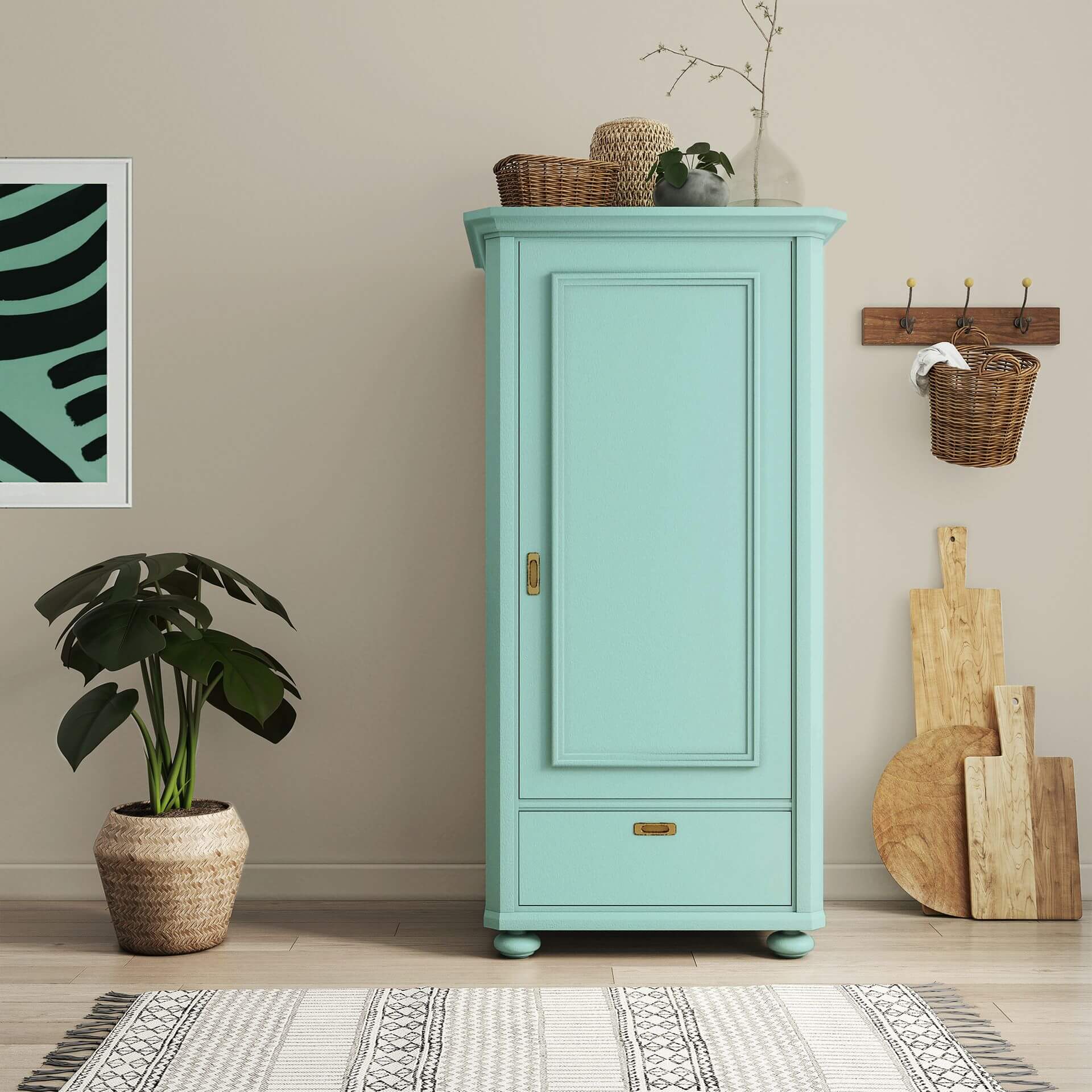
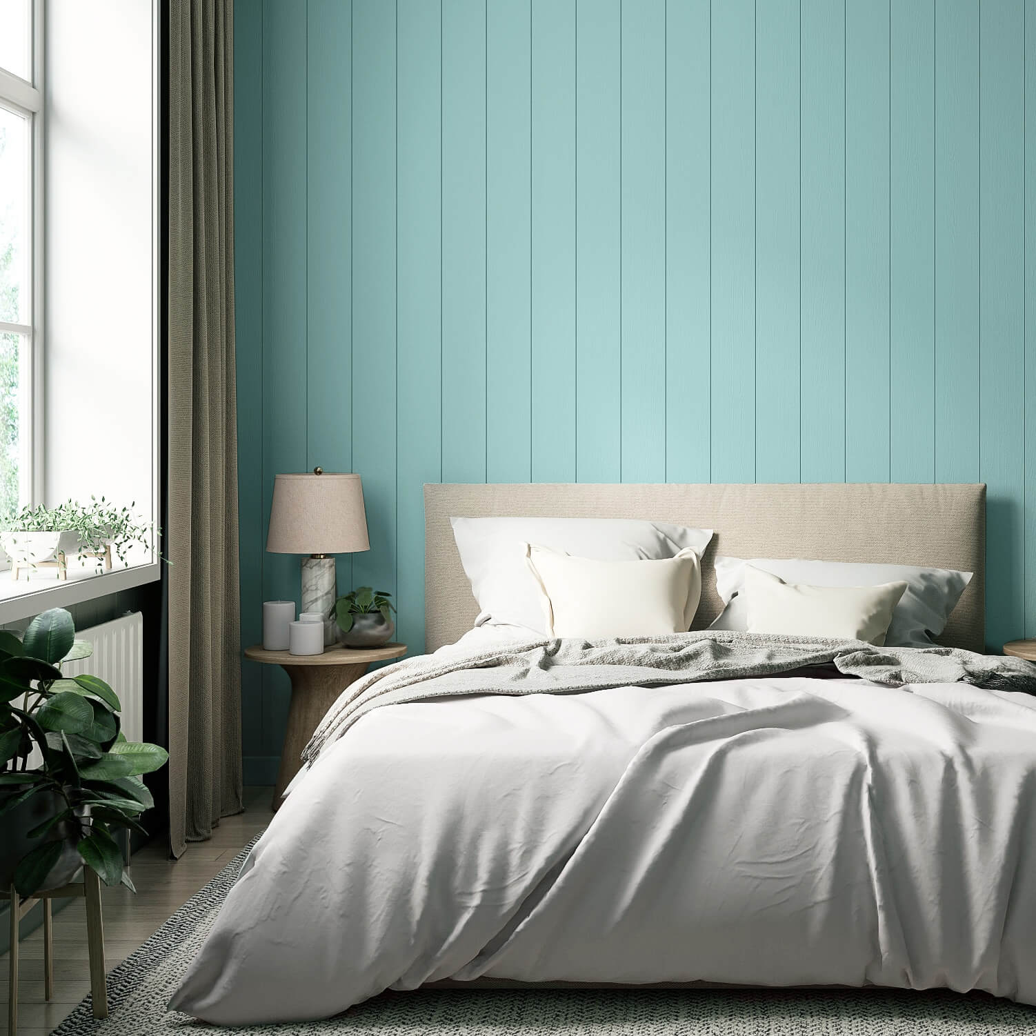
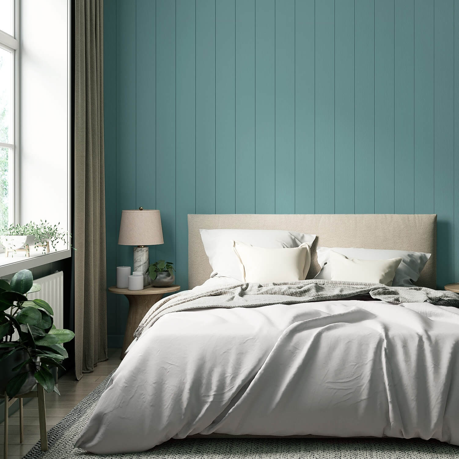
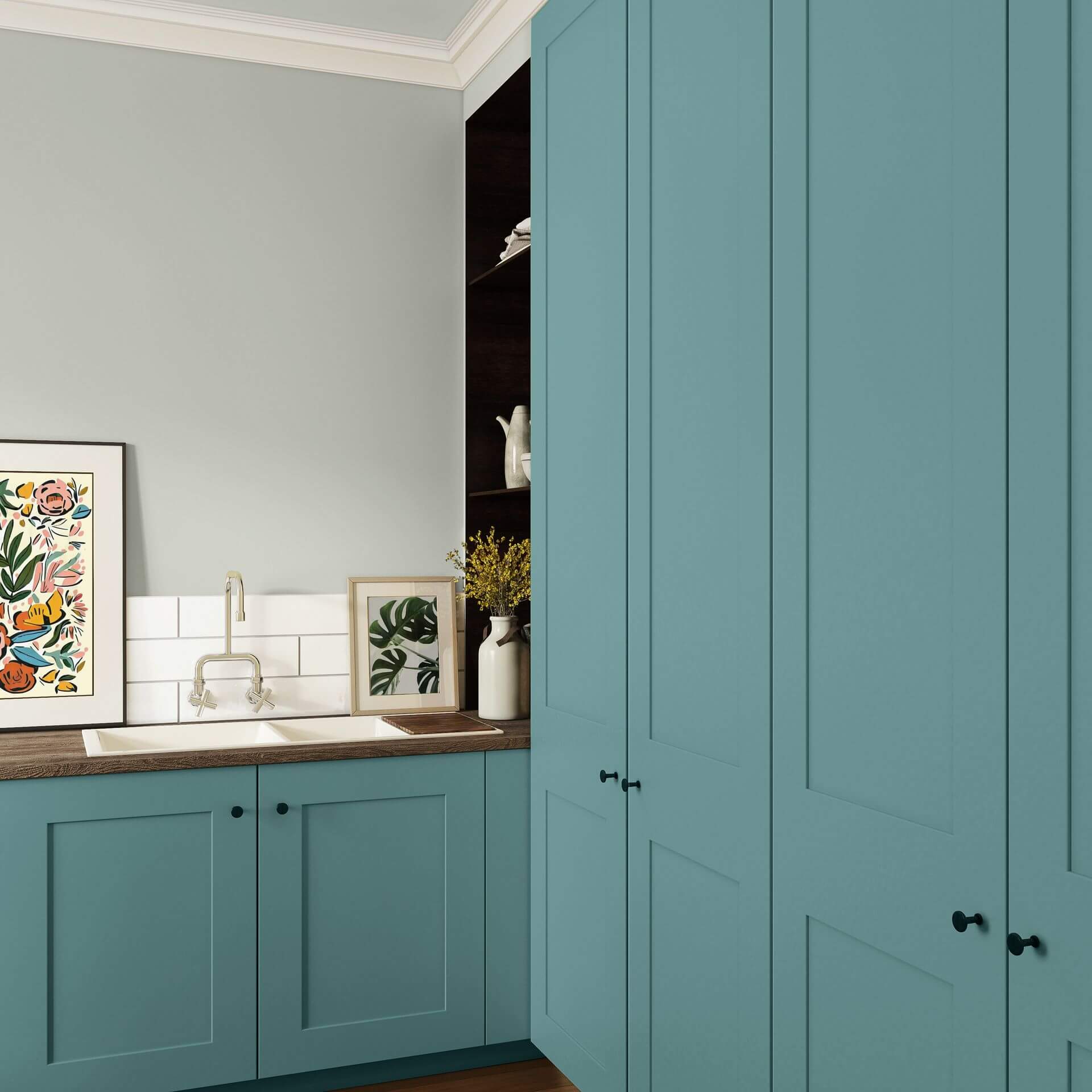
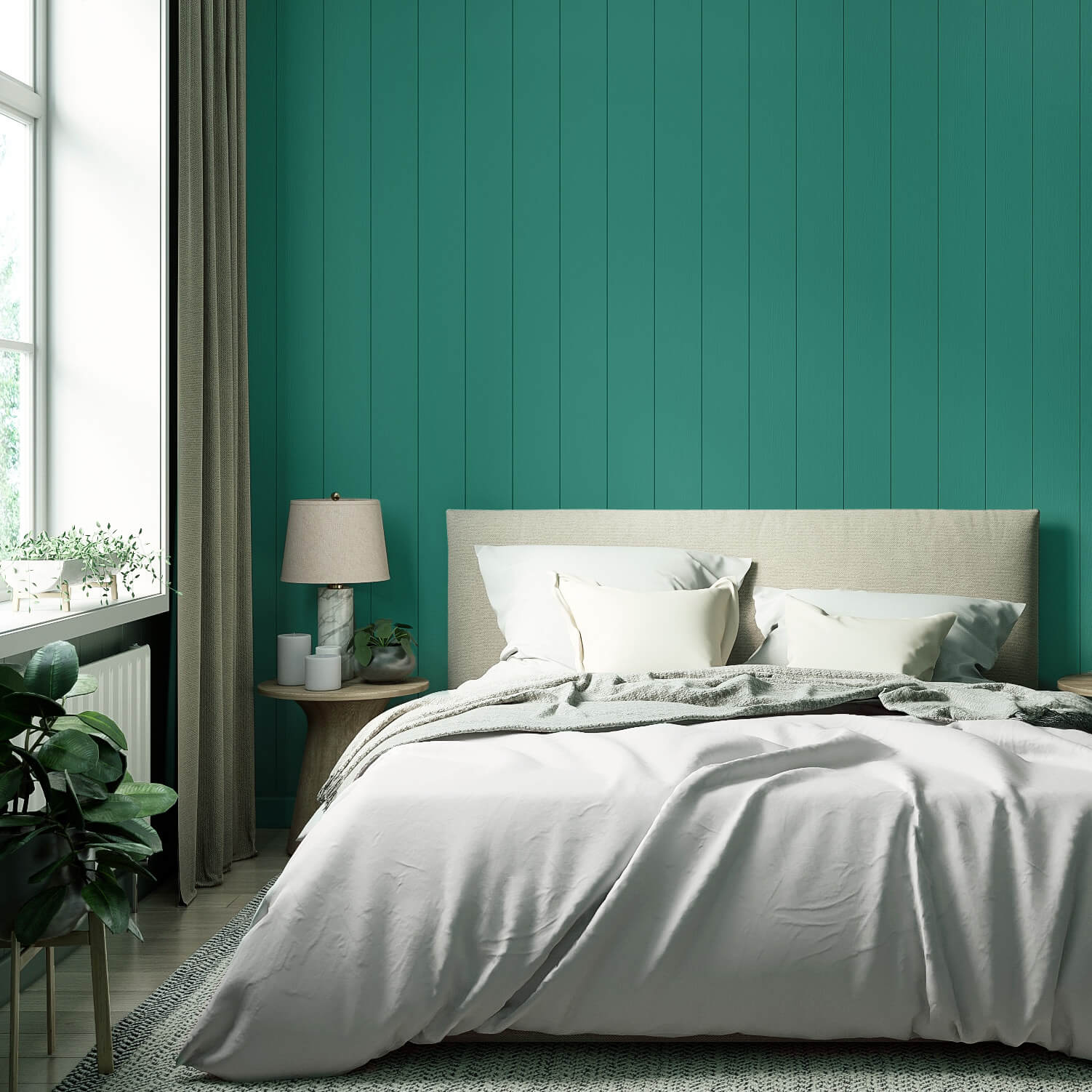
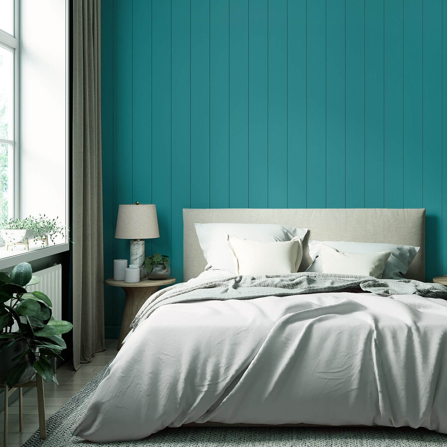
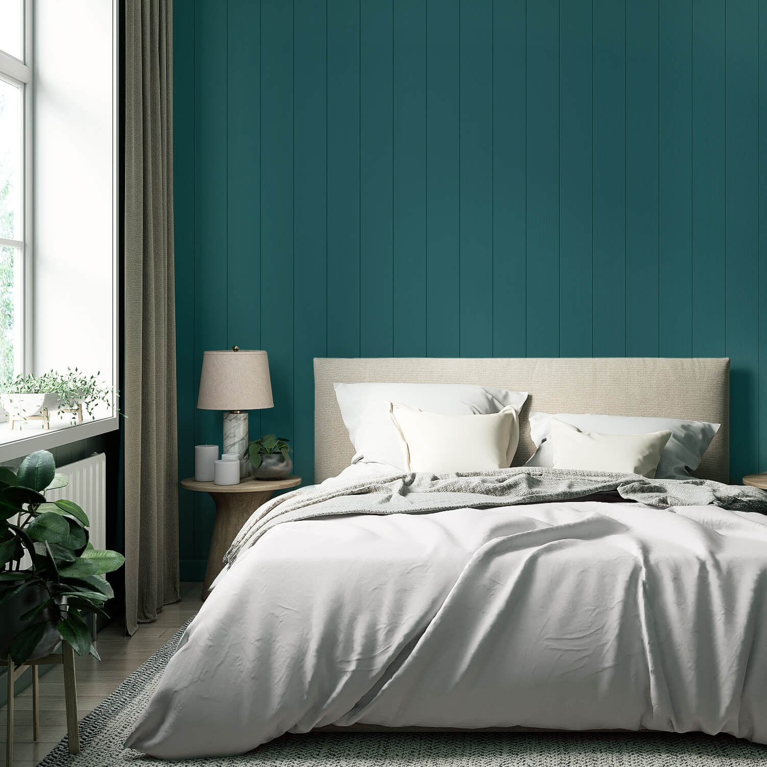
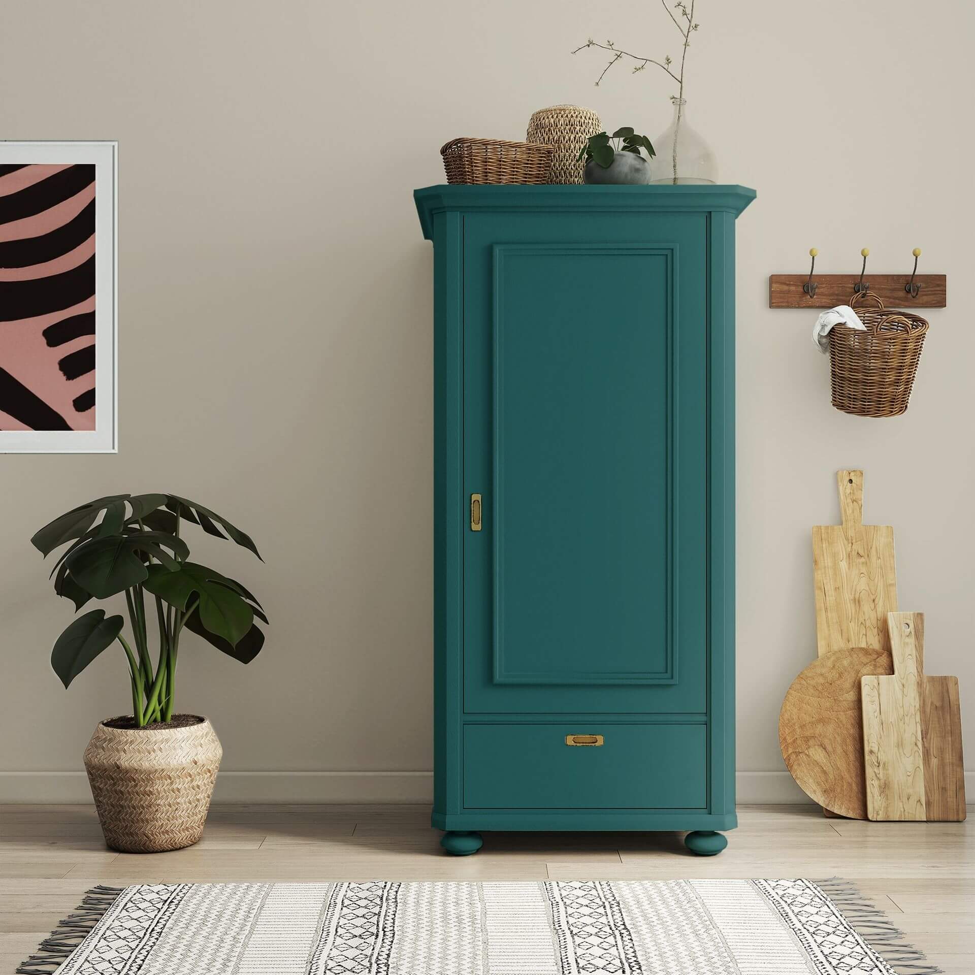
In the bedroom, teal radiates cosiness as well as elegance when used as a dark contrast – for example, on a single feature wall or a painted wardrobe. In combination with warm white or light grey wall paints, you can achieve a very special atmosphere.
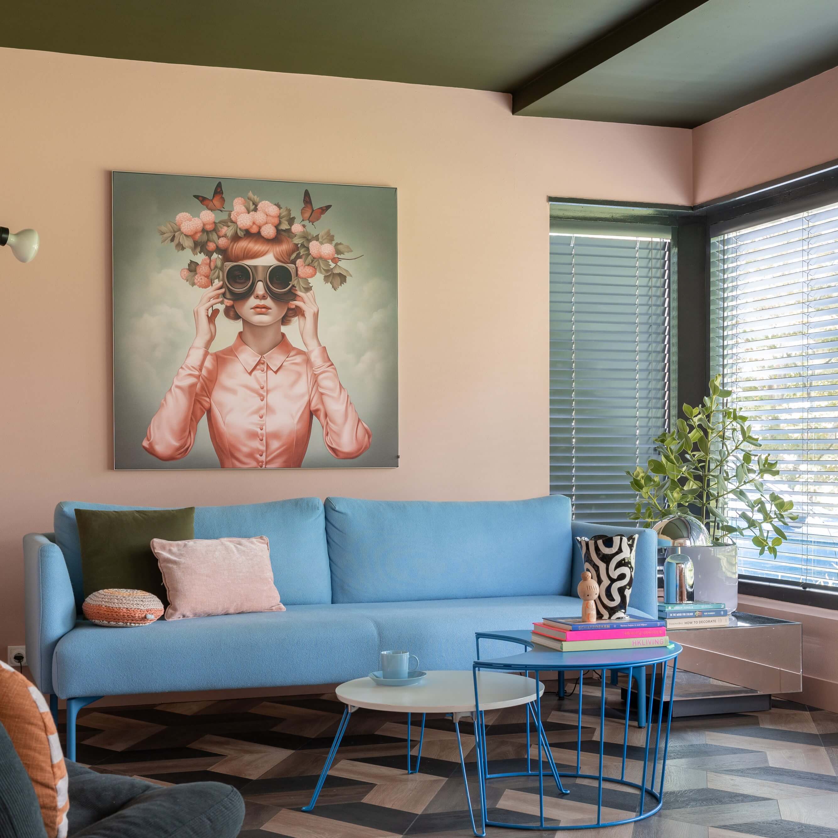
Teal also works brilliantly as a deep shade in the living room. Combined with furniture in light, natural wood tones, it creates a cosy feel. Gold or copper accessories emphasize the elegant effect of this colour.
Teal walls also provide the perfect backdrop for all kinds of art. From modern and abstract to classical works in gold frames, a dark teal makes pictures stand out beautifully.
Lighter shades are more commonly used in the children's room. They create balance and calm. On furniture, they look both lively and stimulating for playtime, while helping children wind down in the evening.
When used in the office or home office, the objective and clarifying effect of teal comes to the fore. In workspaces, a bright, fresh teal can be combined with crisp white to create a focused atmosphere that is perfect for getting things done.
Tips on the elegant trend colour teal
As an exciting alternative to pure blue or green, you can use teal to create a real wow factor in your home.
Interior styles and trends in teal
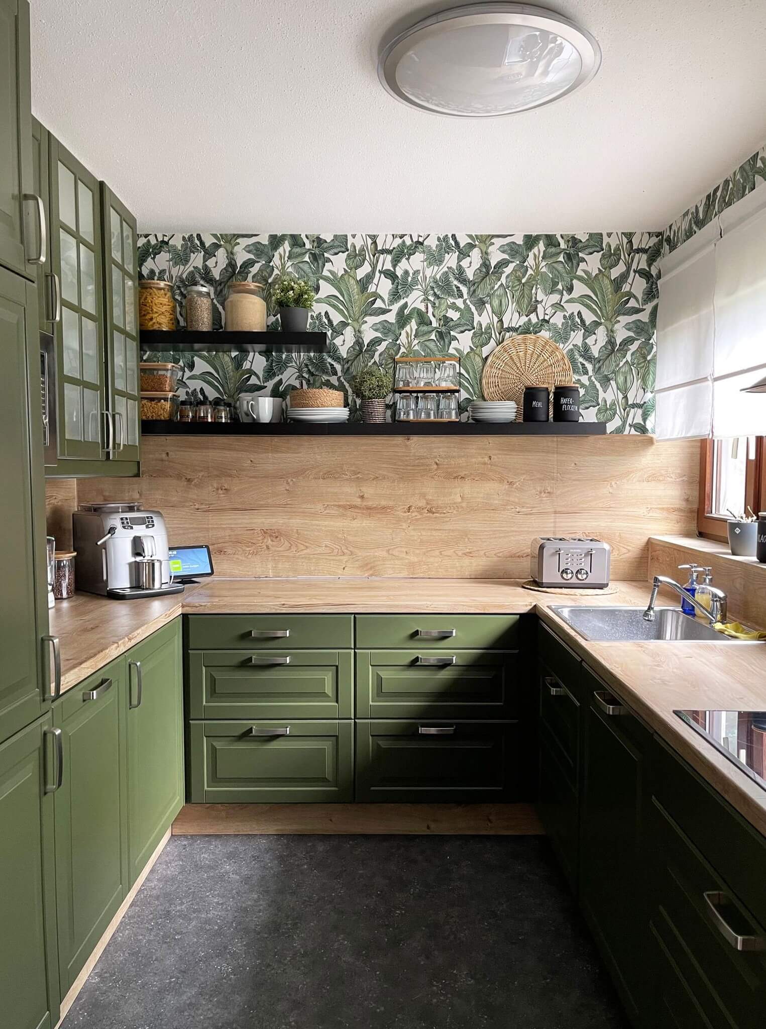
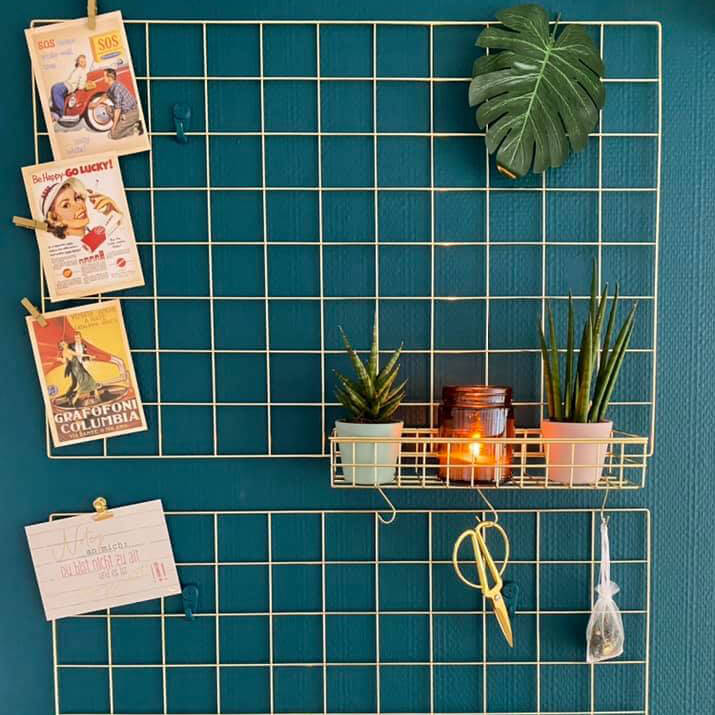
Teal perfectly complements the Midcentury Modern style. Combined with teak furniture and a few brass elements, you're guaranteed a successful look. Teal is also a must-have for the Urban Jungle style. This rich shade makes a wonderful backdrop for bright green plants. And in Dopamine Decor, teal is always highly recommended!
Teal shades fit just as well into a classic setting with antiques as they do into a modern interior with clean lines. Anyone who appreciates a natural style will find what they're looking for in teal, as will those looking to showcase their art collection on the walls.
Harmonious combinations with teal
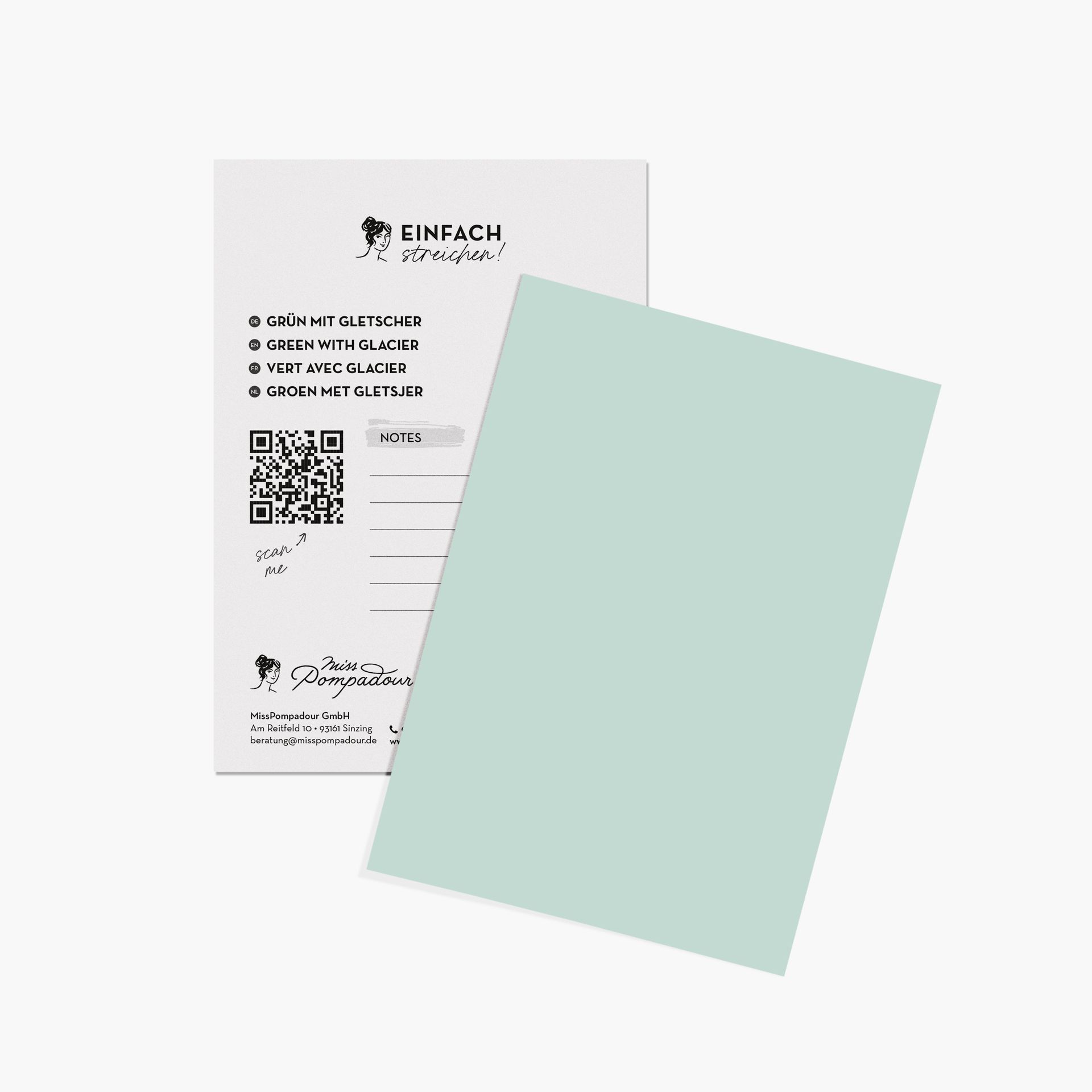
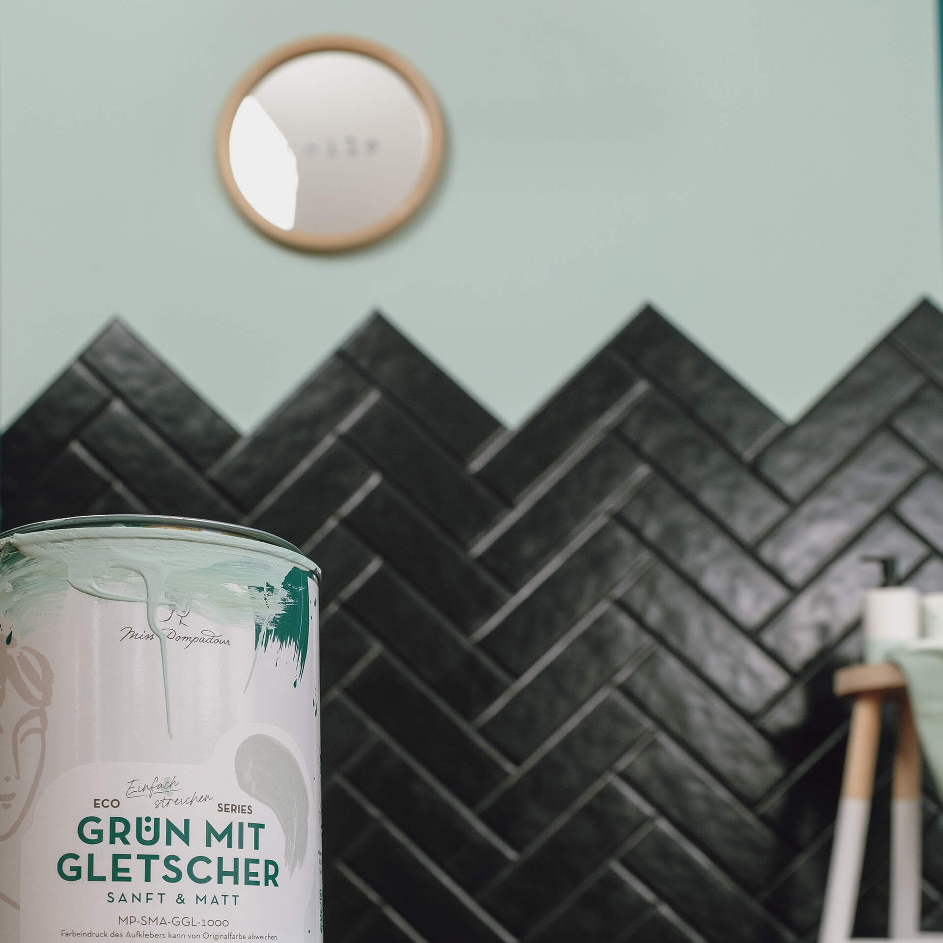
Thanks to its adaptability, teal can be combined with a wide range of shades. When used as an accent colour, dark teal paint pairs beautifully with all cool, light tones. For instance, Green with Glacier goes wonderfully with all teal shades.
As an aqua tone, teal forms an almost magical connection with all other aqua shades. You can achieve an exciting look by combining it with colours like Green with Aqua, Green with Turquoise, or even Green with South Sea. These shades stand out beautifully against a teal backdrop like Green with Lagoon.
Teal also works brilliantly with pastel tones. Try combining it with shades like Purple with Lavender or our delicate Yellow with Sun. Or perhaps paint an accent piece of furniture on the outside in Rose with Cherry Blossom and on the inside in a teal shade?
The MissPompadour "Teal" Project Guide
Deep elegance and striking accents, perfectly executed
In our project guide, we'll show you how to use the magical combination of blue and green to bring depth and tranquillity to your home. Whether you want to create a focused atmosphere in your home office or transform your bathroom into a luxurious wellness oasis: we have the right inspiration and the perfect product. Discover the world of teal and start your next painting project!
Teal wall paint: Depth and comfort for your walls
A teal wall paint instantly lends elegance to rooms and has an extremely relaxing effect. While teal-blue nuances aid concentration, deeper, greenish teal tones bring a sense of security and comfort to your home. Our interior paints adhere brilliantly to plaster and wallpaper, providing impressive coverage for a luxurious, matt finish.
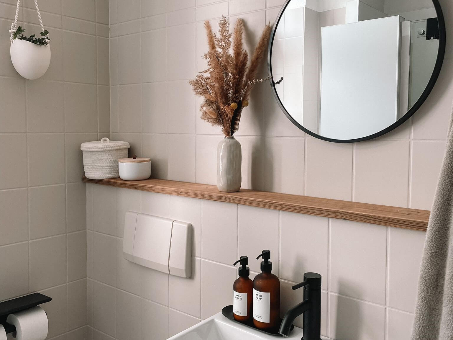
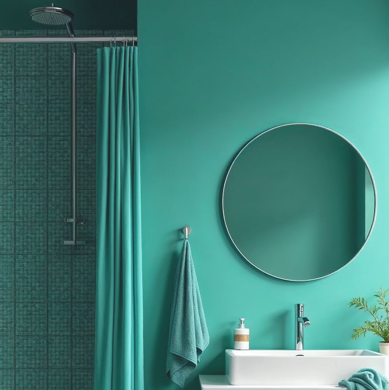
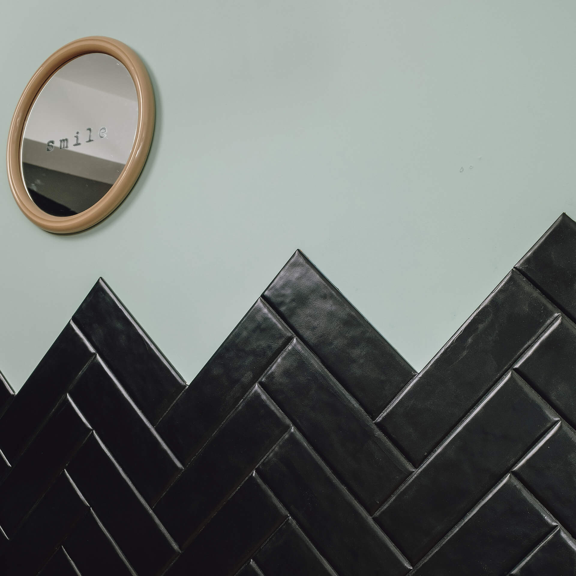
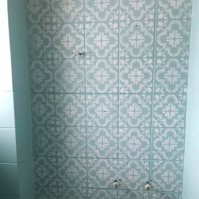
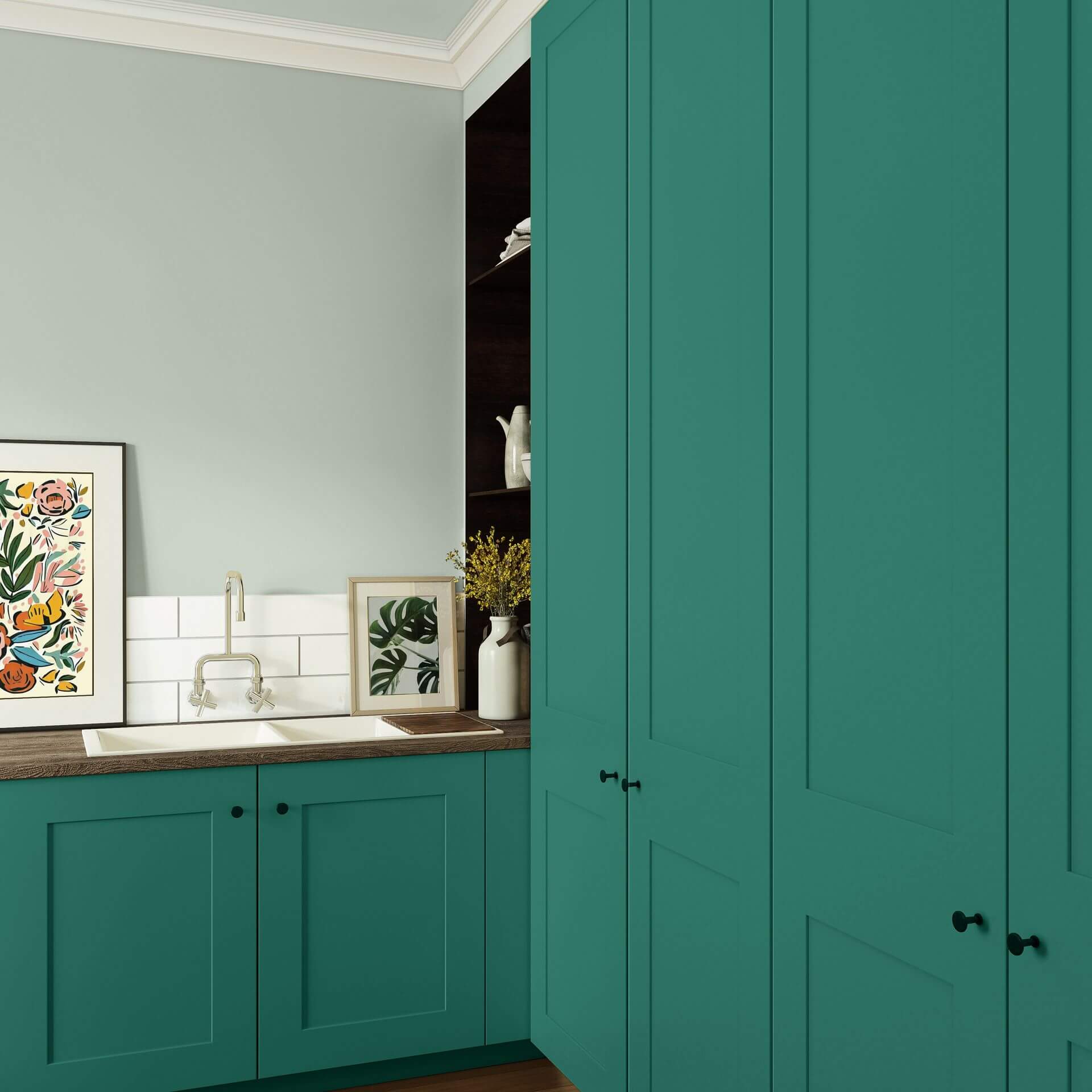
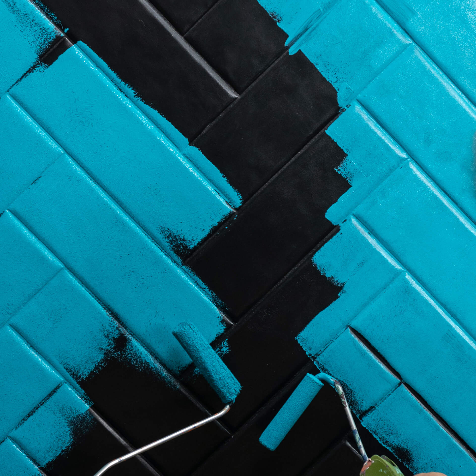
Teal tile paint: A sophisticated boutique feel in the bathroom
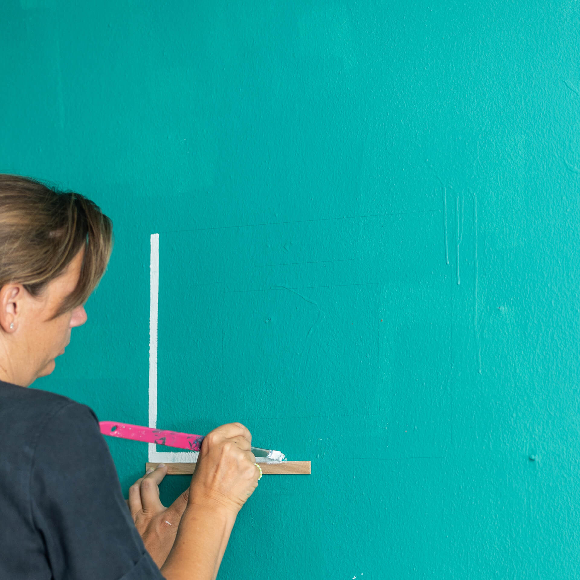
With tile paint, you can transform an old bathroom into a modern retreat without the mess of a building site. In the right light, a dark aquatic shade like Green with Teal looks incredibly elegant and profound. For a great colour combination, try Blue with Breeze on the ceiling. If you are painting tiles, start your project with a thorough clean followed by a primer using To Bond & Block. You can find detailed instructions in our blog post Painting tiles.
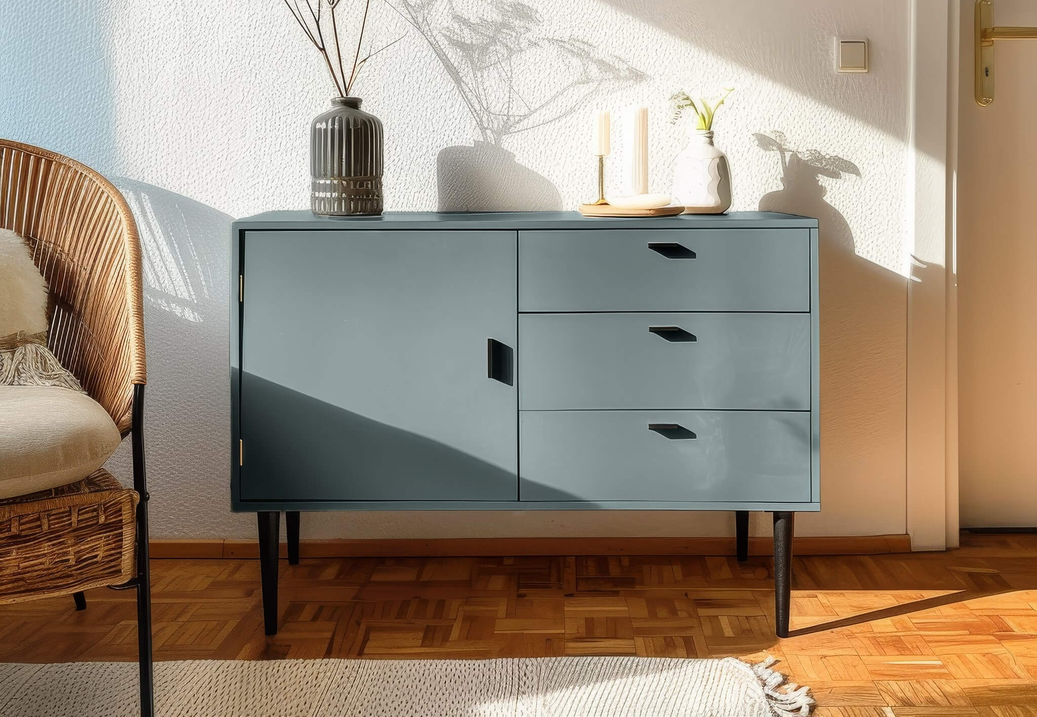
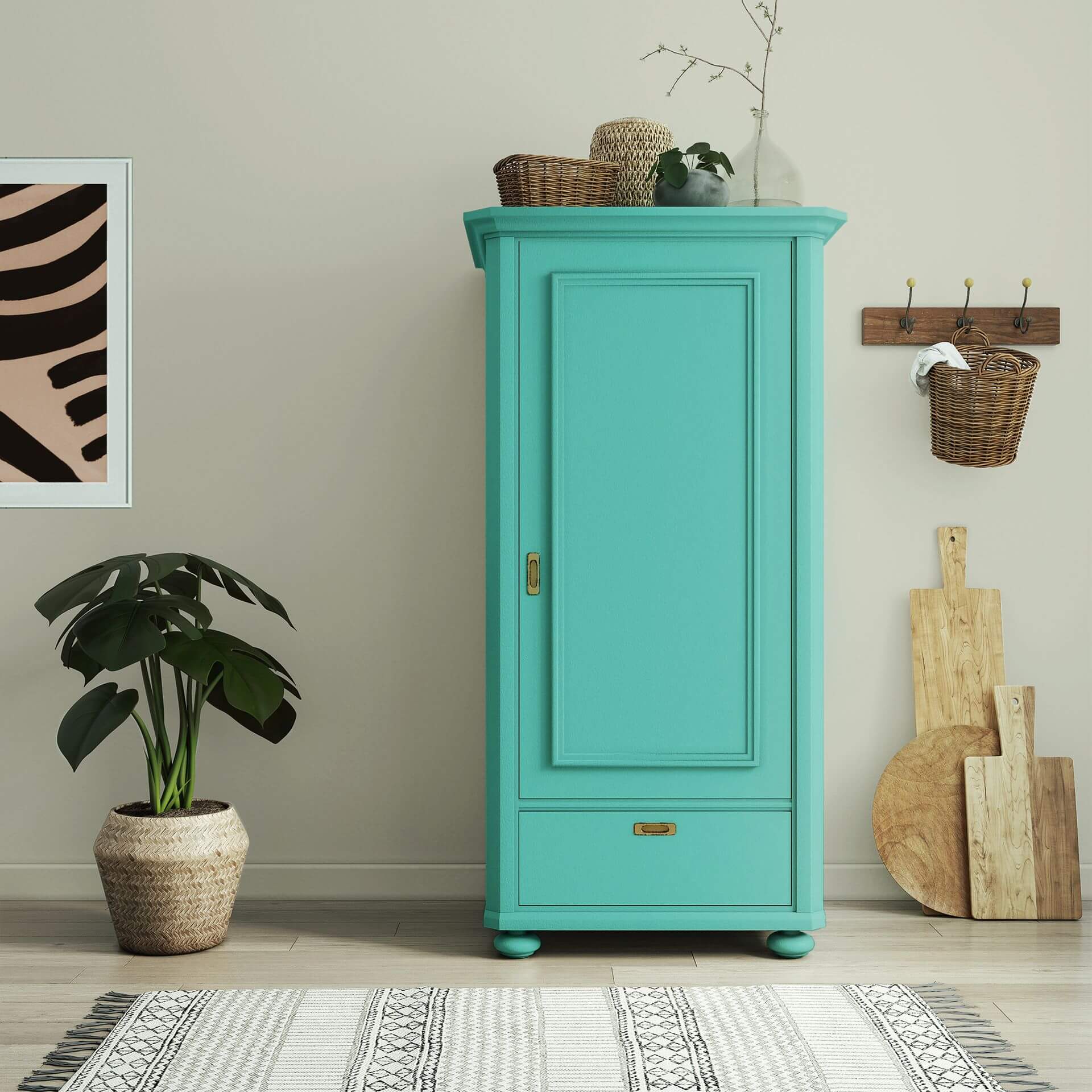
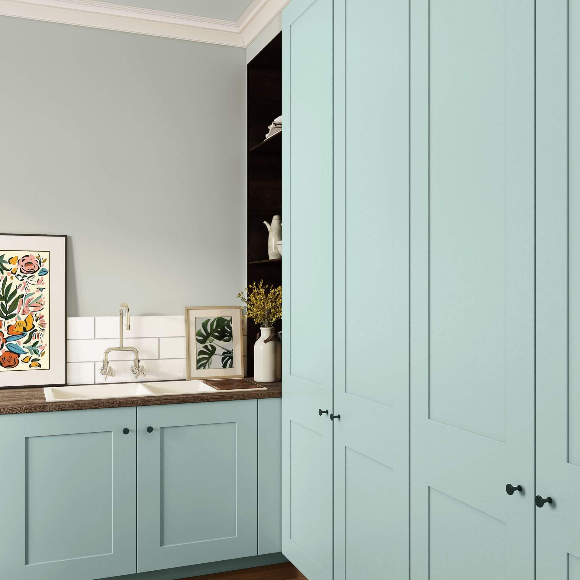
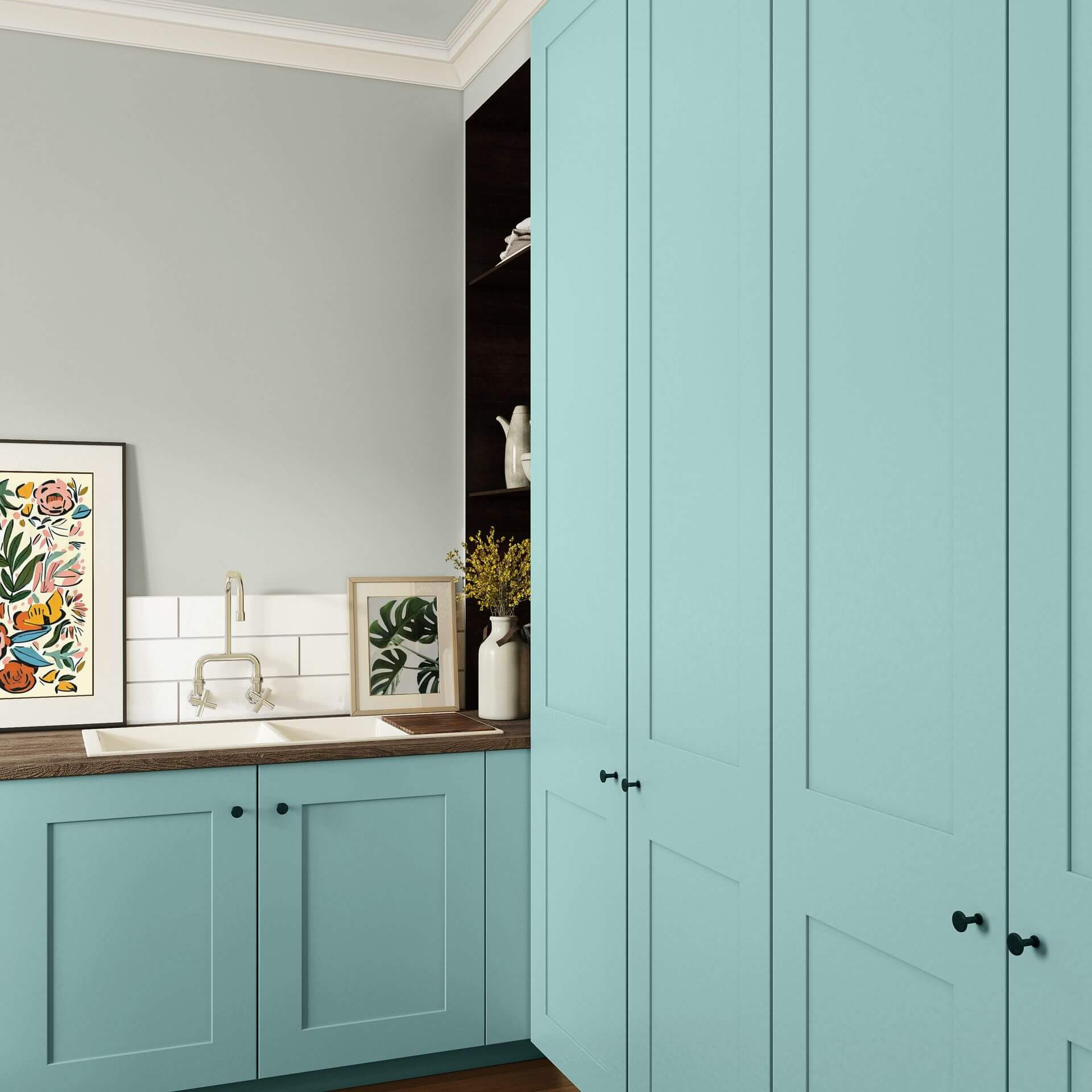
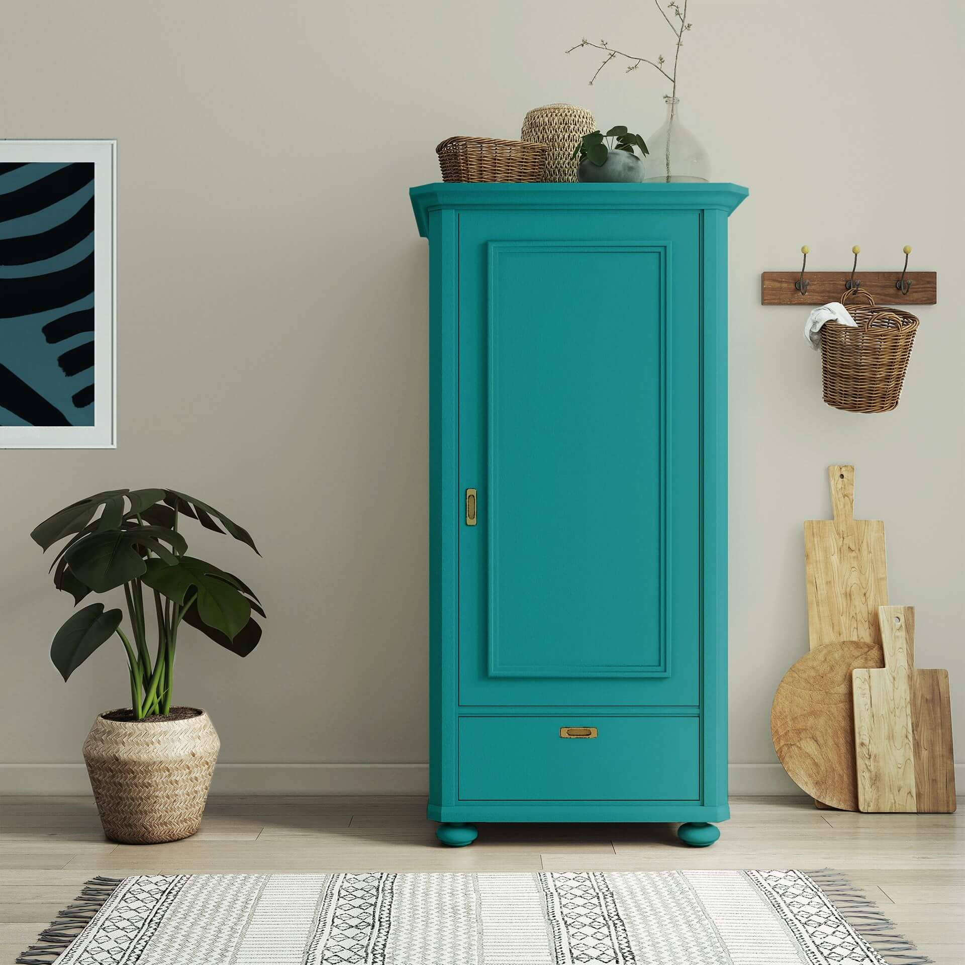
Teal furniture paint: A sophisticated eye-catcher in the room
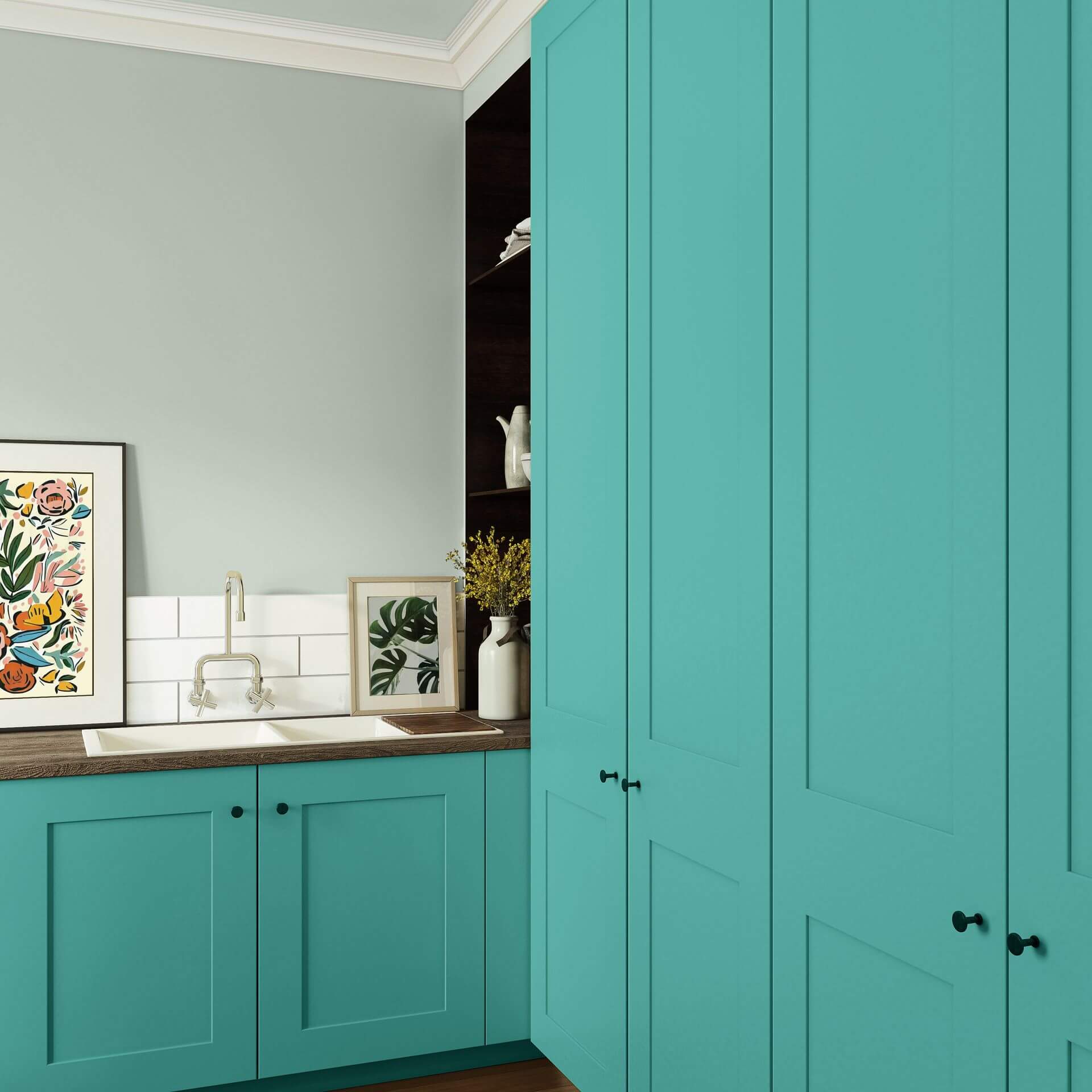
Our teal furniture paint is the secret to furniture with a wow factor. A painted wardrobe or chest of drawers in this rich shade instantly becomes the centrepiece of any room. Our paints adhere to almost any surface without the need for tedious sanding - you can even paint smooth surfaces like IKEA furniture after applying a primer with To Bond & Block. Perhaps you could paint the outside of a wardrobe in Dark Blue with Green and use a beautiful floral wallpaper on the inside? Combined with gold, copper, or brass accessories, you can create modern colour accents that elevate your interior.
Teal wood paint: Vibrant accents for the Urban Jungle
Teal wood paint is the perfect choice for the eclectic Urban Jungle style. On a plant shelf, for example, the dark, forest-like tones provide the ideal backdrop for your plant collection. The intense colour finish gives your interior a high-quality, almost mystical look.
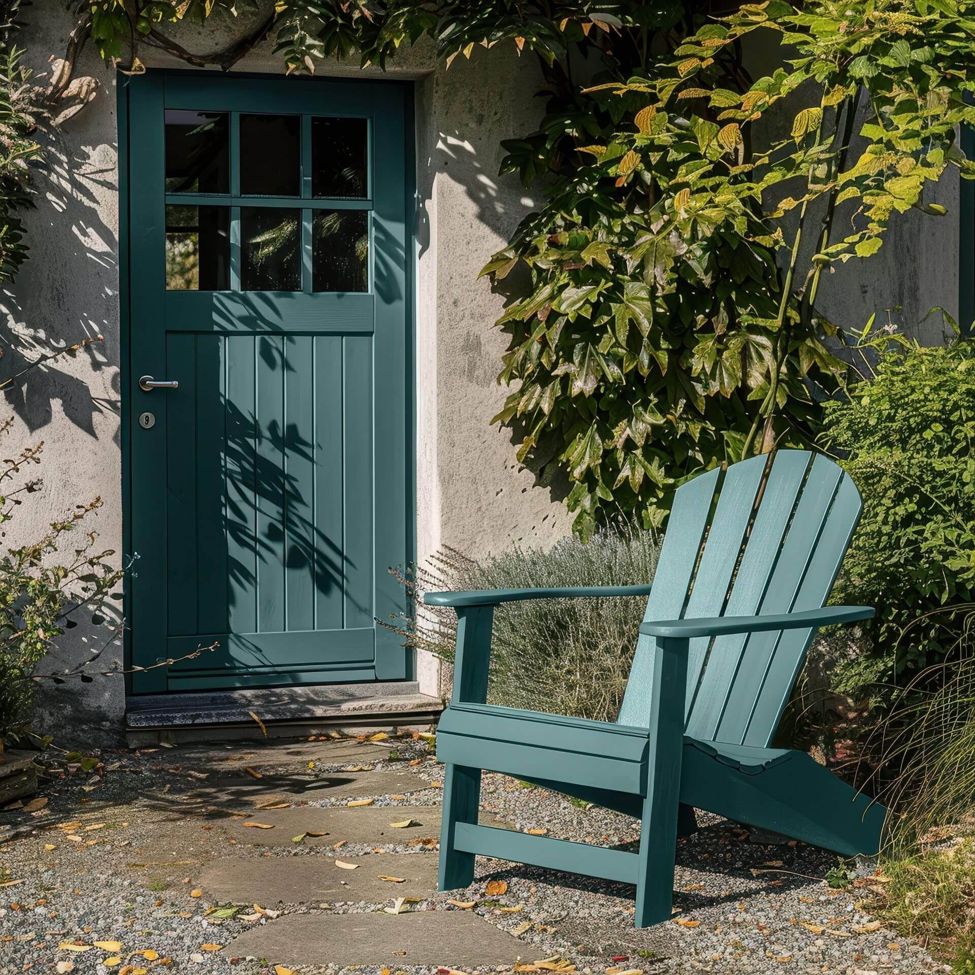
Teal wood paint is also a classic choice as an outdoor paint. Thanks to its blue undertones, this shade stands out slightly from the green surroundings without being overpowering. This allows your garden furniture to blend harmoniously into your garden.
Order teal paint online at MissPompadour
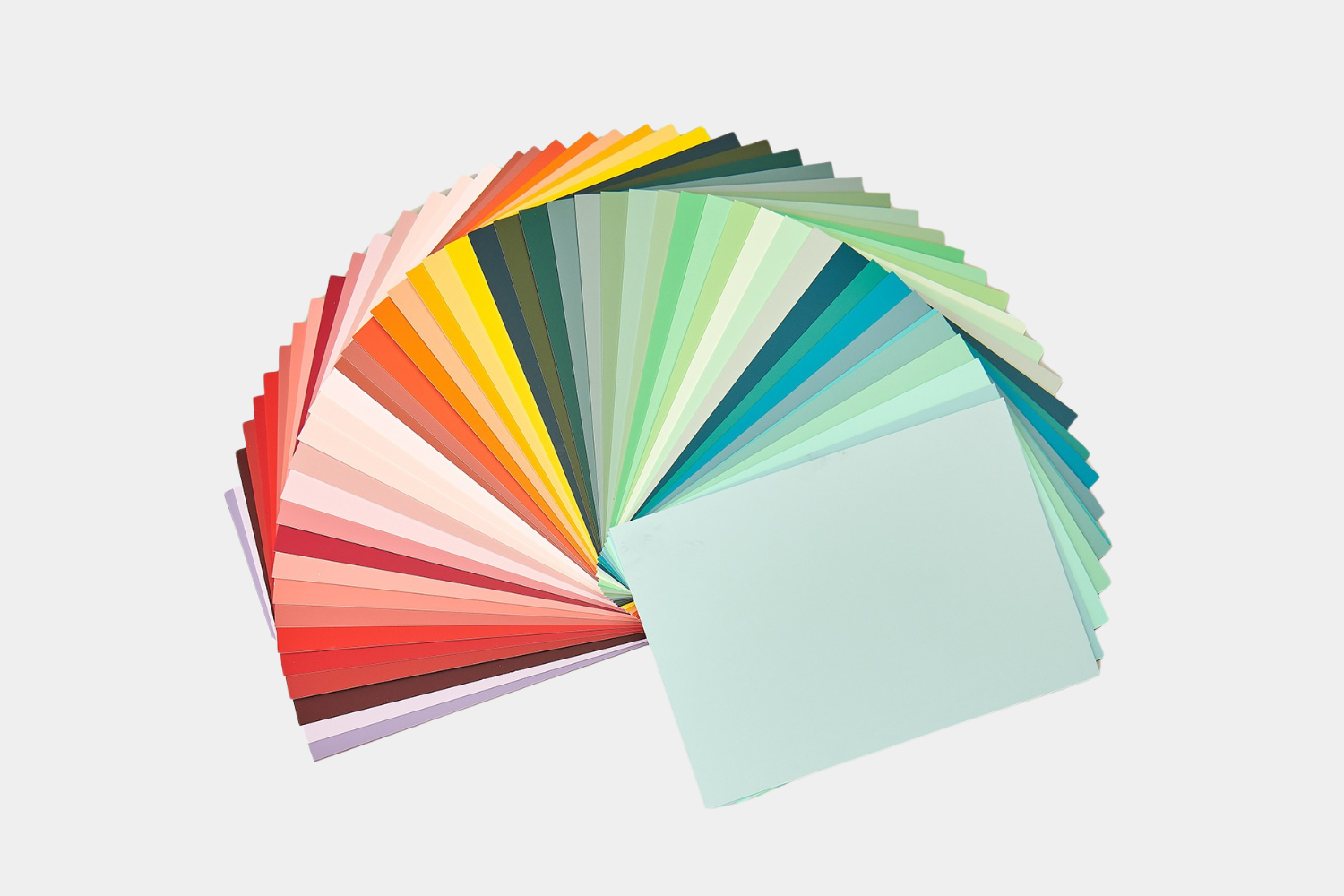
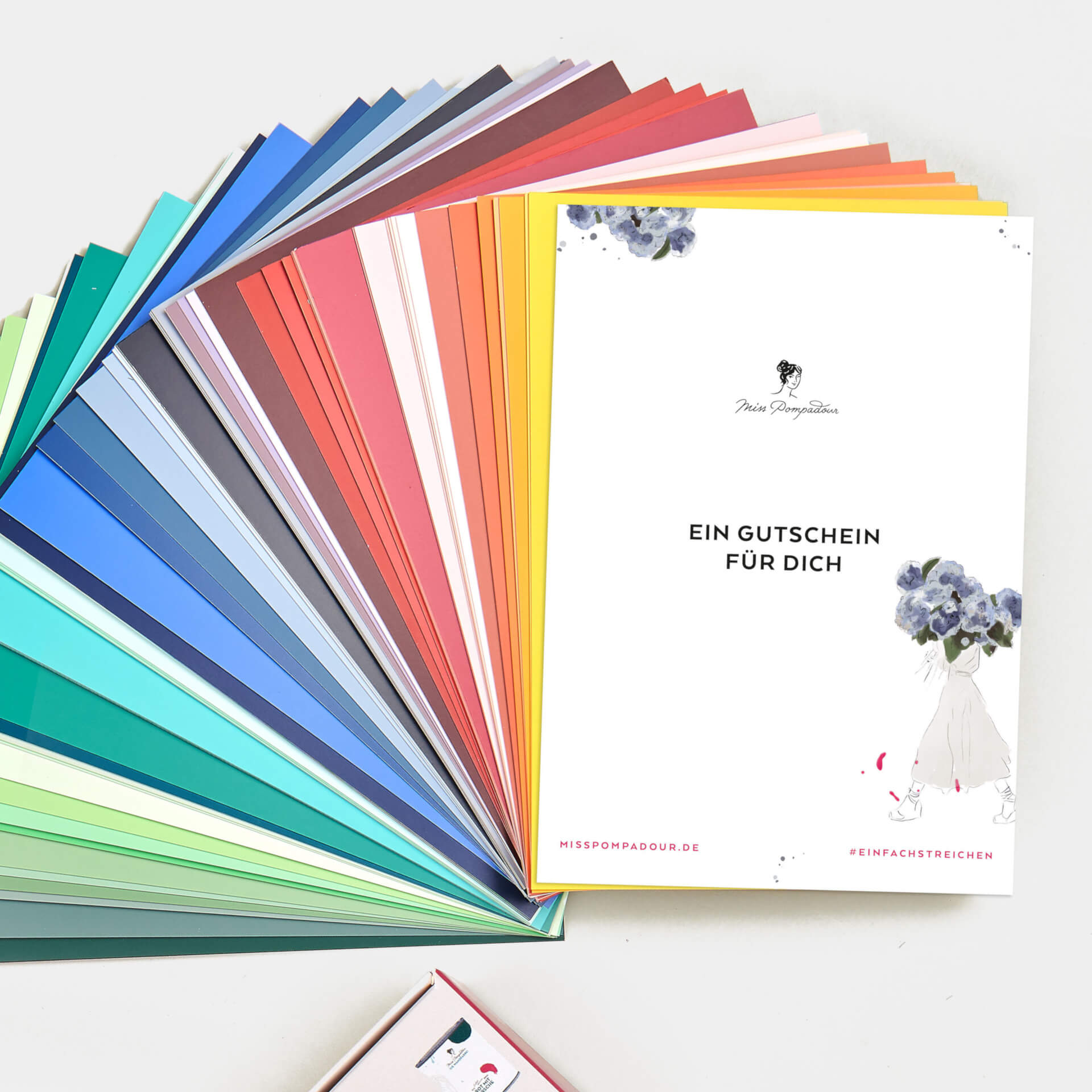
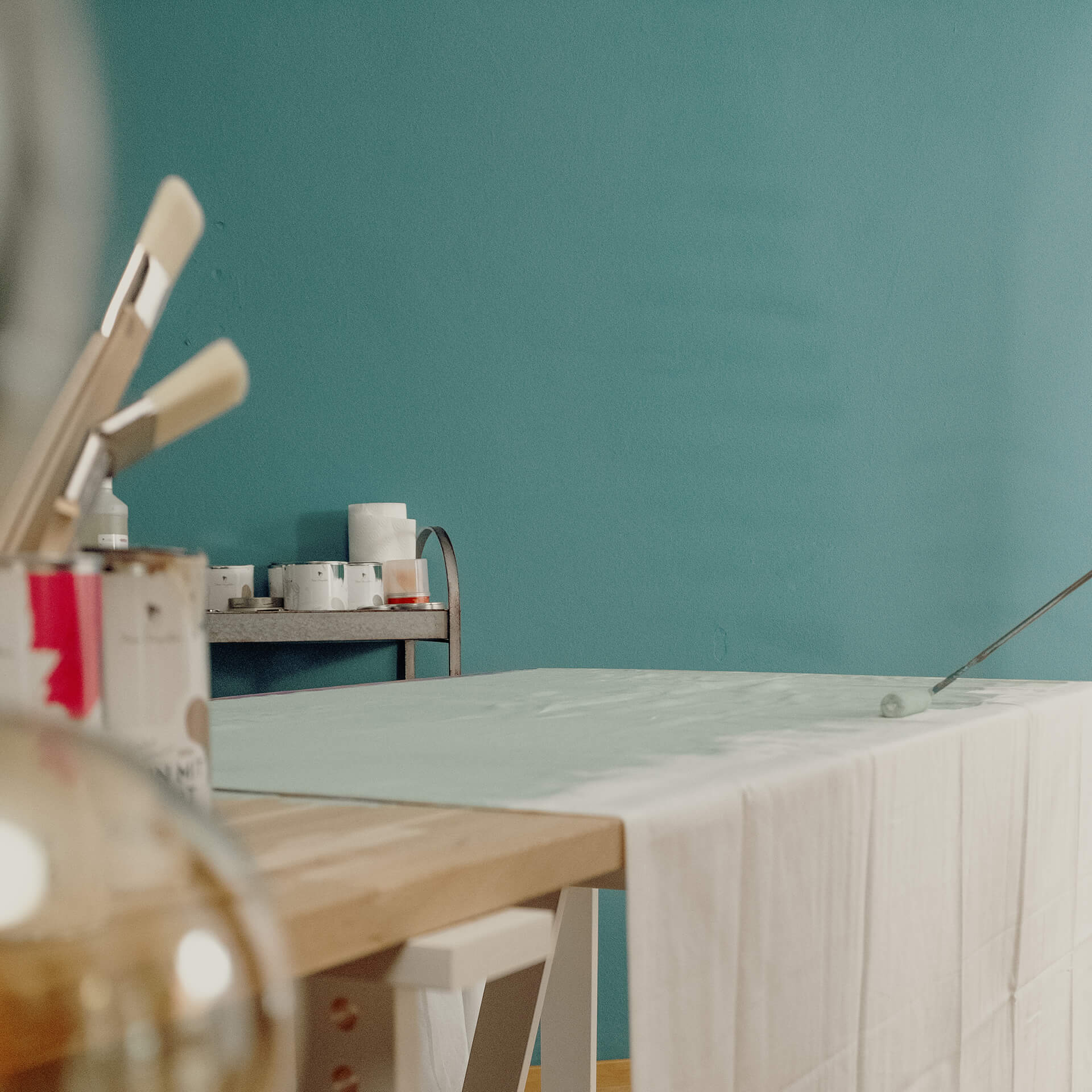
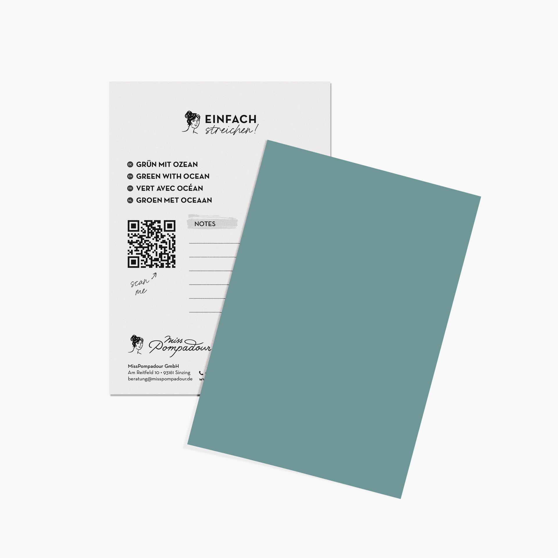
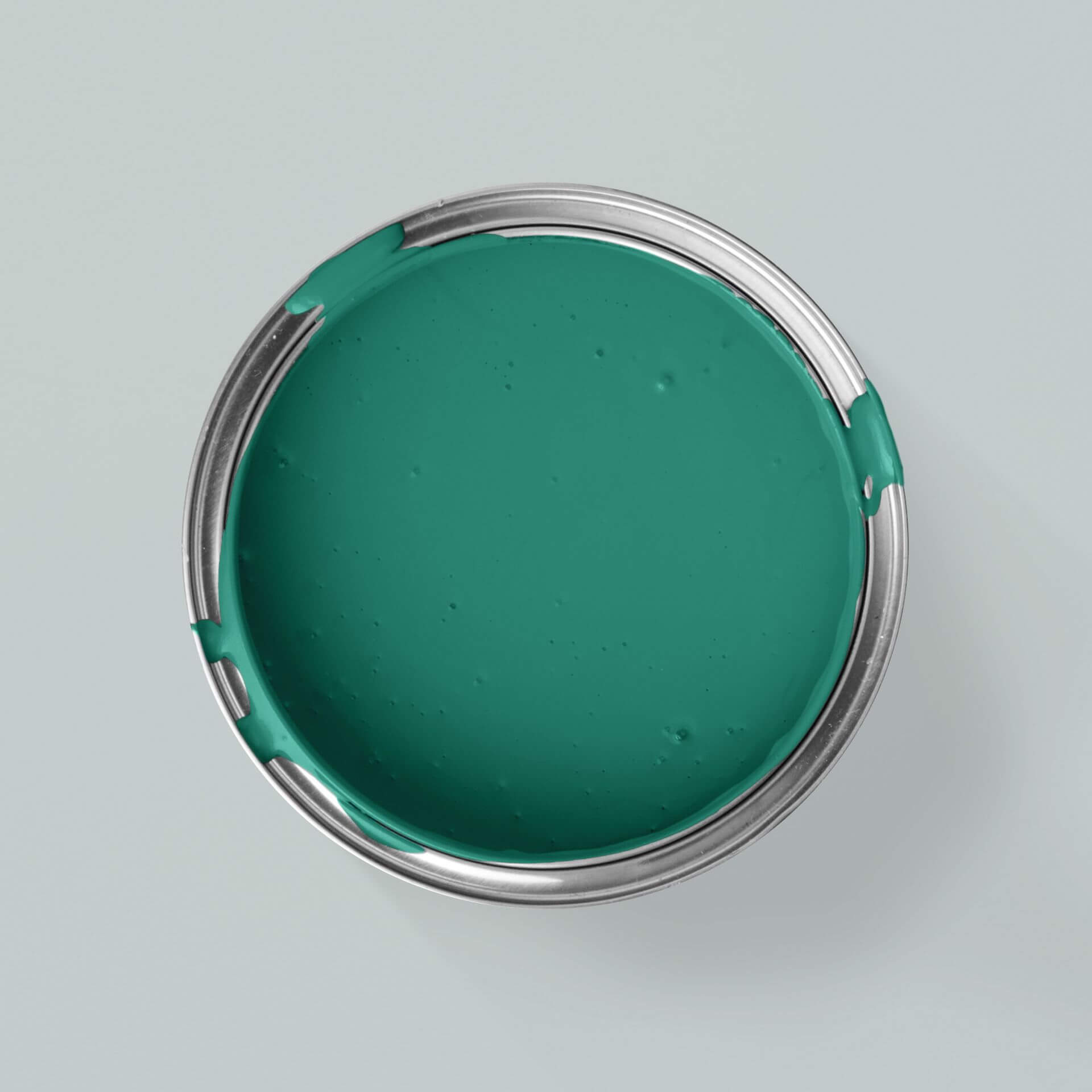
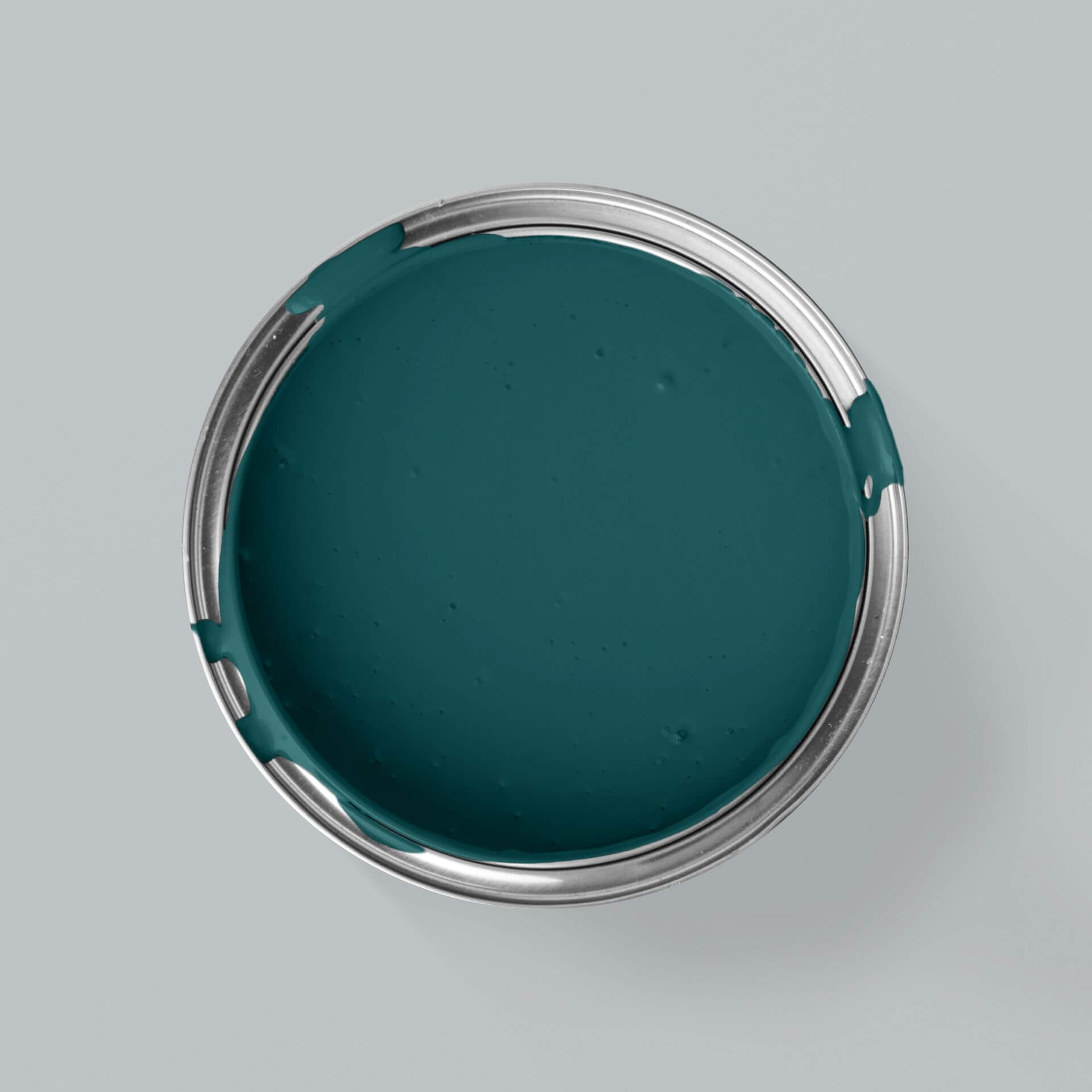
We pack your order securely and as resource-efficiently as possible. We avoid plastic as much as we can and use paper instead. We shred old cardboard boxes to use as packaging filler, and even our parcel tape is plastic-free. Do you need help with such a wide selection? We recommend ordering our colour cards first. This allows you to test your favourite shade directly on your wall or painting project and see how it looks under different lighting conditions. If you still have questions, feel free to contact our expert customer advisory service! - we are always happy to help with any questions you may have.
Is petrol a warm colour?
Since both blue and green come in warm and cool variations, there's no simple, one-size-fits-all answer. Depending on which undertones dominate, petrol can feel either warm or cool. Either way, petrol shades almost always have a wonderfully multi-layered character.
Is petrol blue still on-trend?
Petrol is a true classic shade, meaning it never goes out of style. Depending on the colour scheme you pair it with, petrol can feel calm, sophisticated, elegant, or wonderfully understated. While deep, green-toned shades wrap a room in a cosy sense of sanctuary, lighter, blue-dominant variations bring a crisp, modern freshness to your home.
What can I pair with petrol?
As petrol blue is such an elegant shade, it looks especially sophisticated when paired with metallic accessories. Combining gold and petrol blue creates a stunning focal point in any room, particularly the living room. Luxurious materials like leather or velvet also pair beautifully with this shade. If you pair petrol blue with soft pastel shades, natural materials like linen, rattan, and natural wood make a beautiful, harmonious addition. If you're using petrol blue in a home office, try complementing it with clean, sleek elements—such as white furniture, chrome details, and bright green plants—to enhance the calming and clarifying effect of the shade.
Is petrol blue or green?
Both! Petrol is a deep aqua shade sitting right where blue meets green. Depending on the pigments, petrol blue can feel quite cool, while petrol green radiates an earthy warmth. These shades evoke the depths of deep water and magically shift in character depending on the light. It's this versatile, ever-changing quality that makes them a firm favourite in modern design.
What is the difference between turquoise and petrol?
Turquoise is the name given to the lighter mixtures of green and blue. Often grey, yellow or other pigments are also added. Petrol is darker
How do I use petrol as a feature wall?
An accent wall in petrol is a bold choice that always pays off. For the perfect look, we recommend keeping the remaining walls in light, neutral shades to let the petrol wall paint take centre stage. Why not paint your accent wall around the corner for a unique effect? Find out how to do it on our blog.
Which metals go best with aqua shades?
To create luxurious highlights, metal is the perfect partner. Warm, glowing brass or gold creates a fantastic contrast with the cool depth of petrol. But chrome or silver also look incredibly elegant and modern in this combination. These materials bring a touch of glamour to your rooms, creating a beautifully harmonious feel.
Does petrol also suit the country house style?
Yes, absolutely! Although petrol is often associated with modern lofts, it brings a fresh, coastal breeze to country-style homes. Combined with rustic wood and light linen fabrics, it creates a contemporary look that perfectly blends cosiness and a light, airy feel. The styling possibilities are virtually endless.