wall paints & paints in
Red
Our red colours
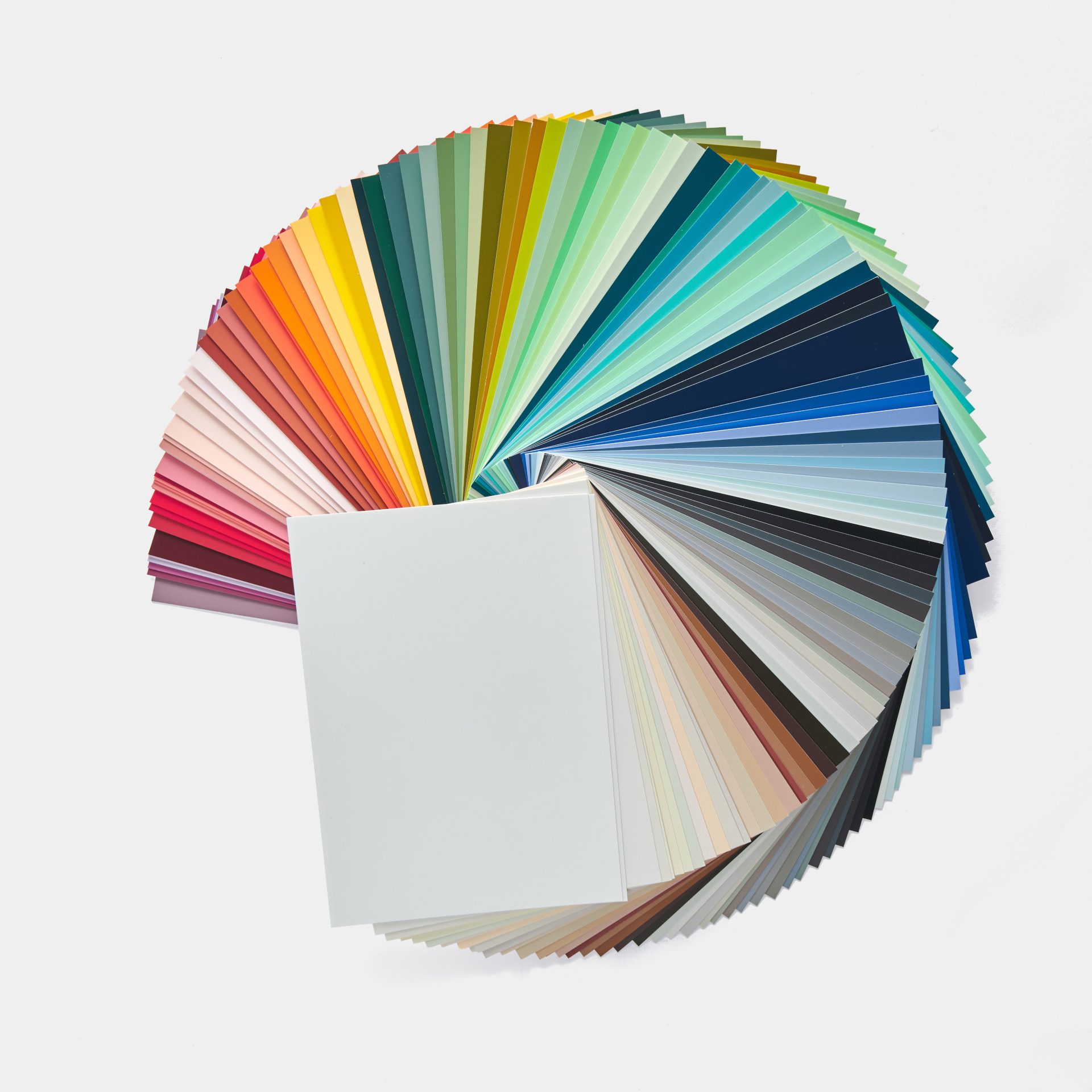
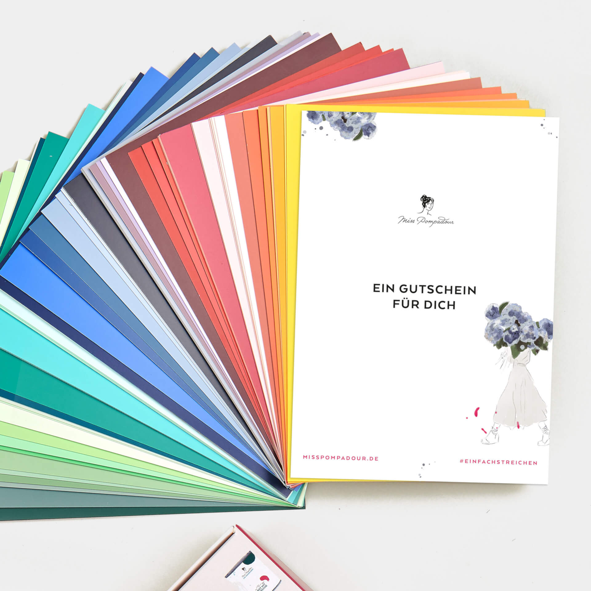
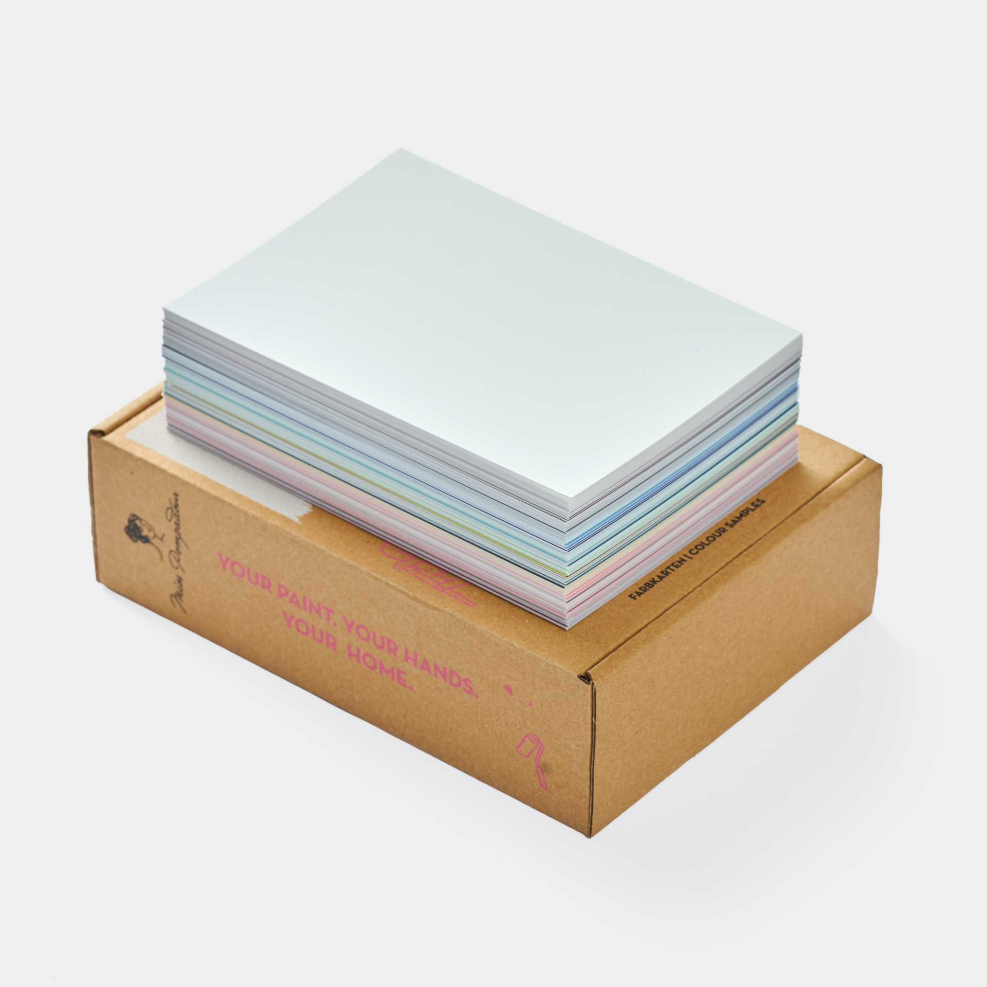

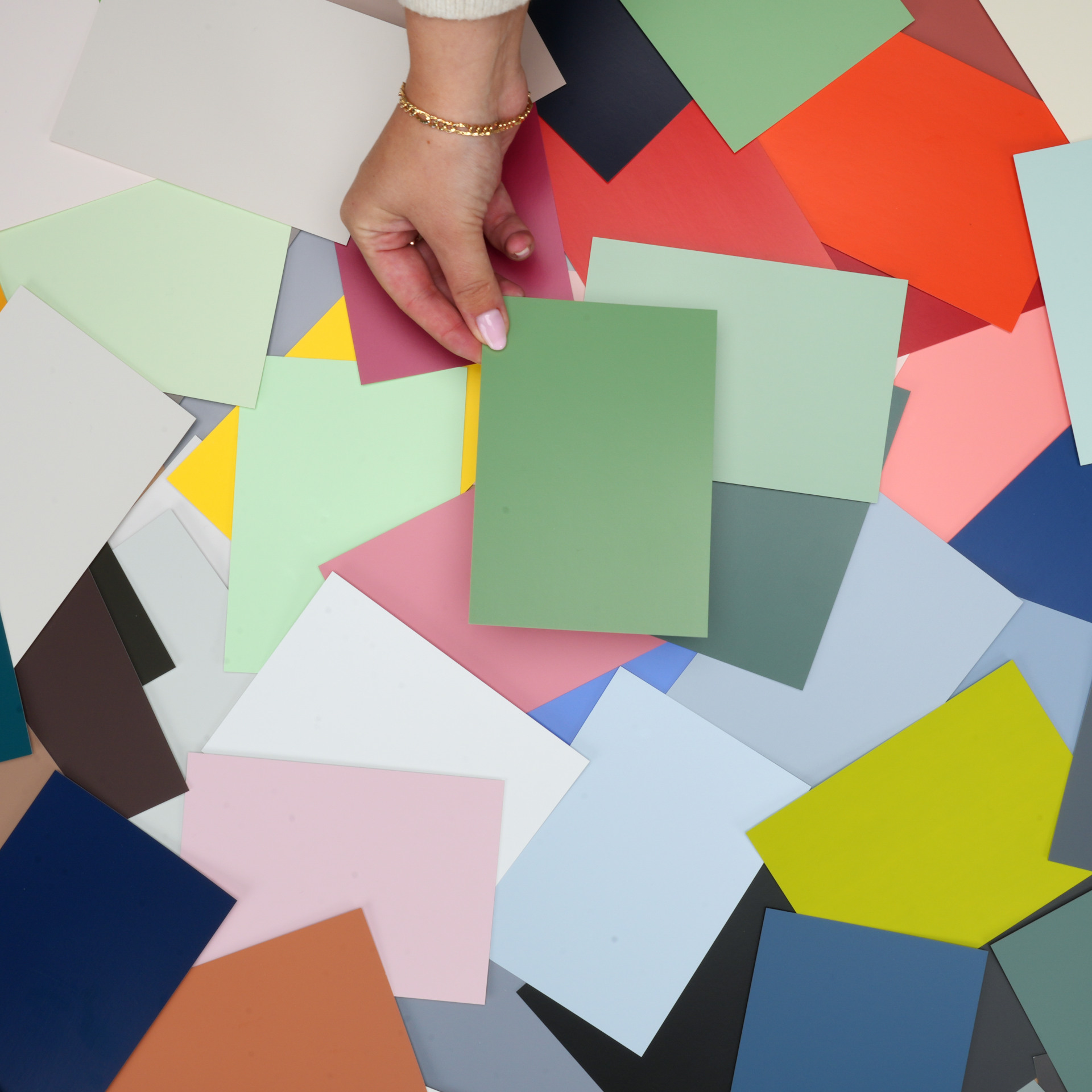
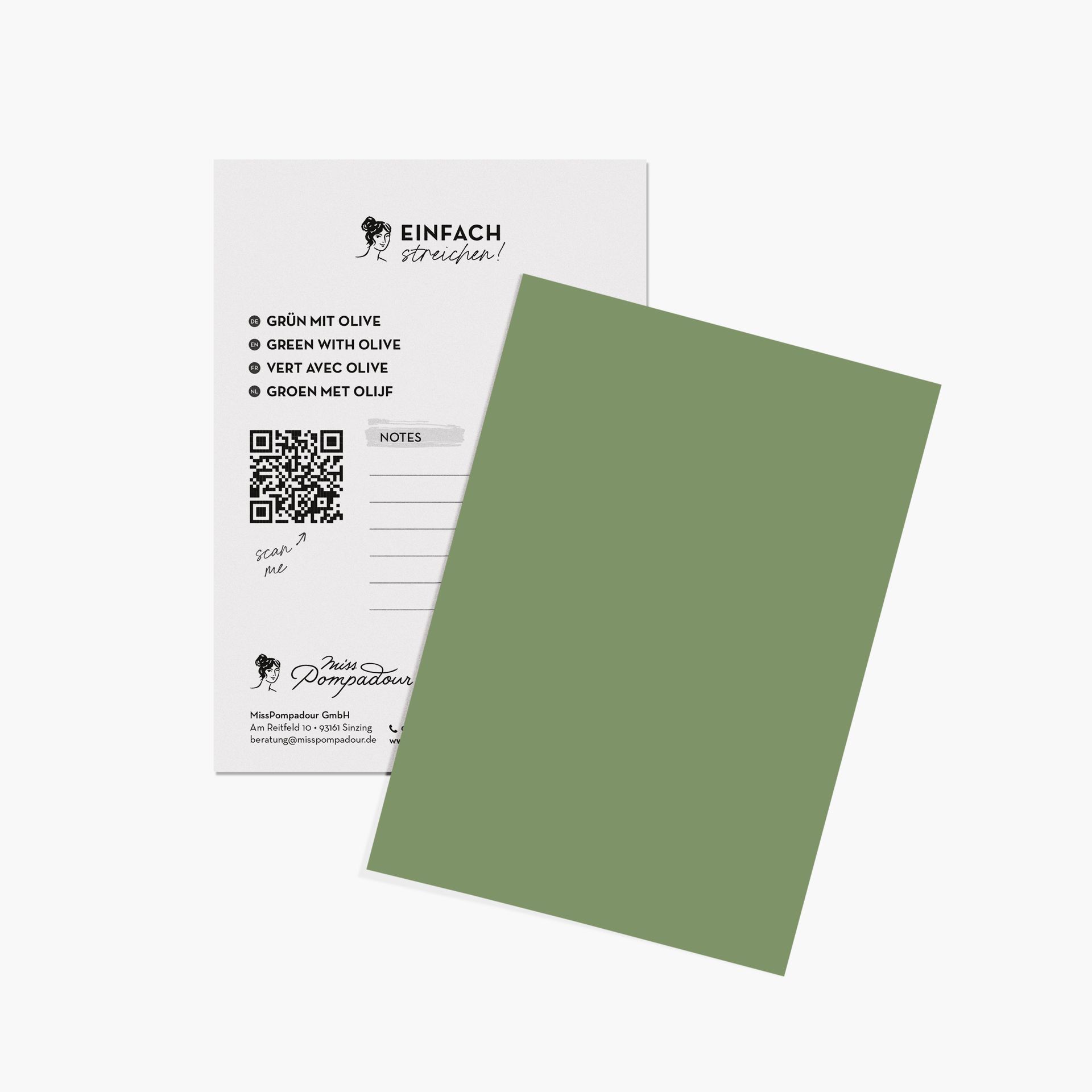
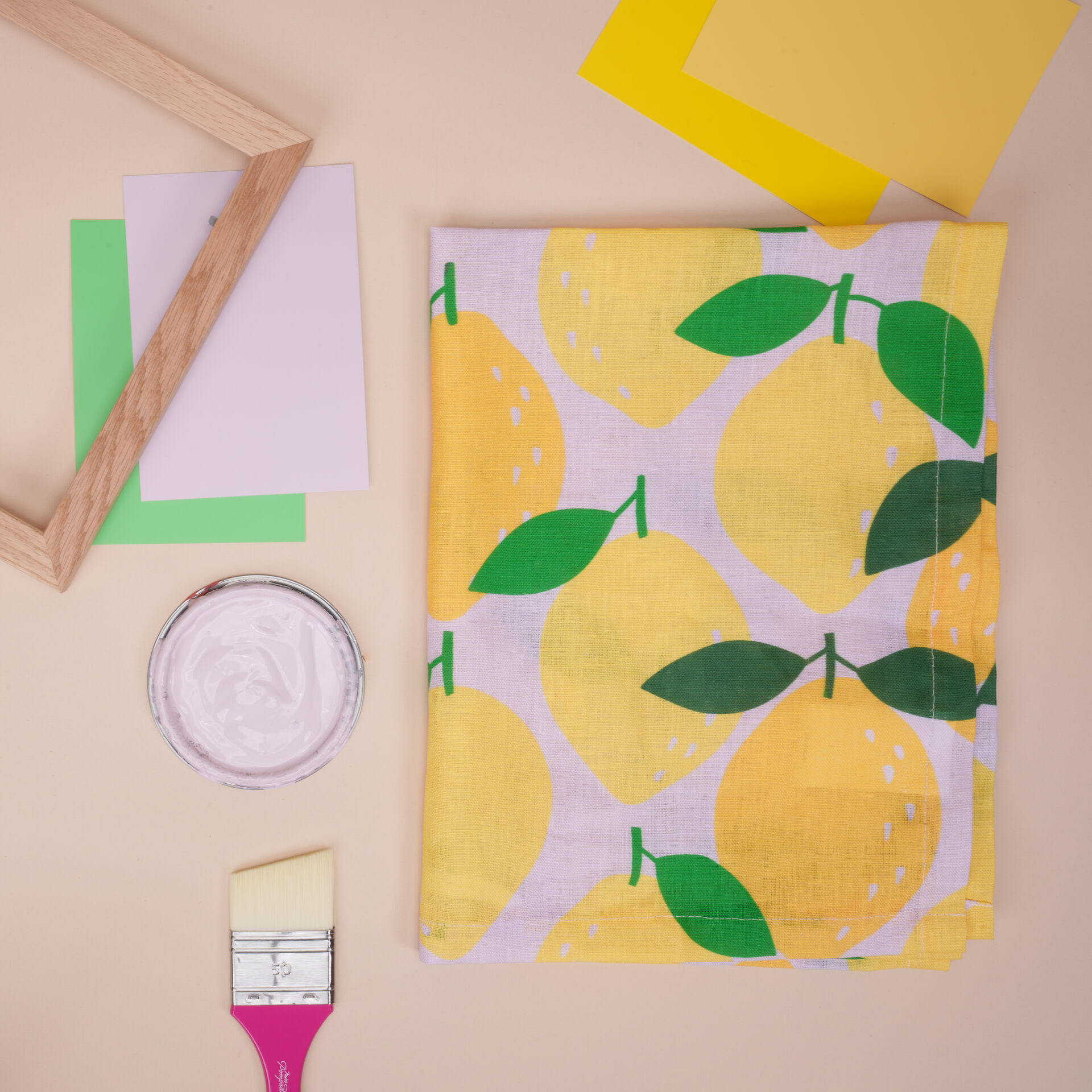
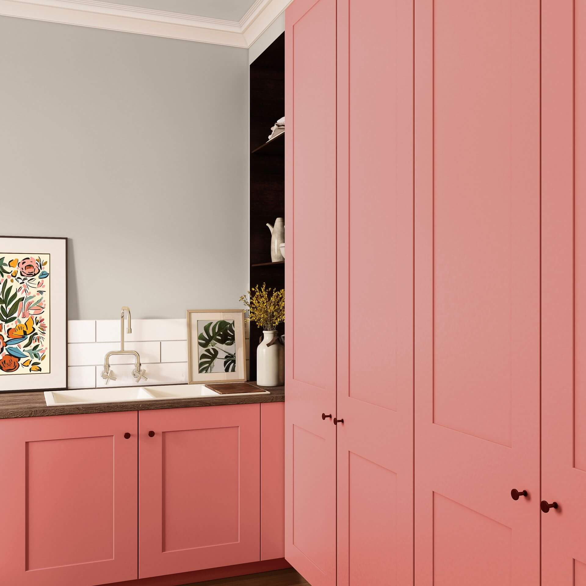
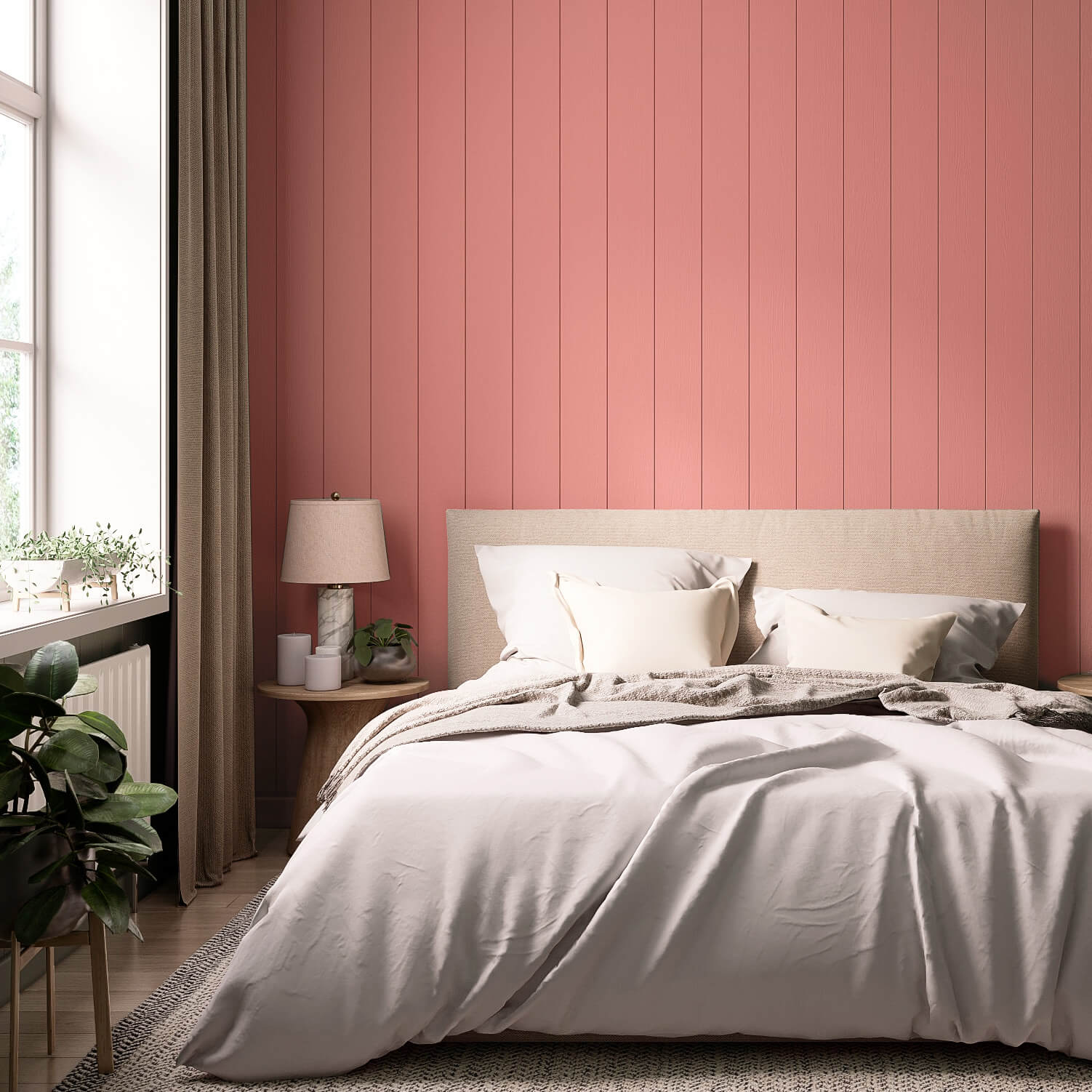
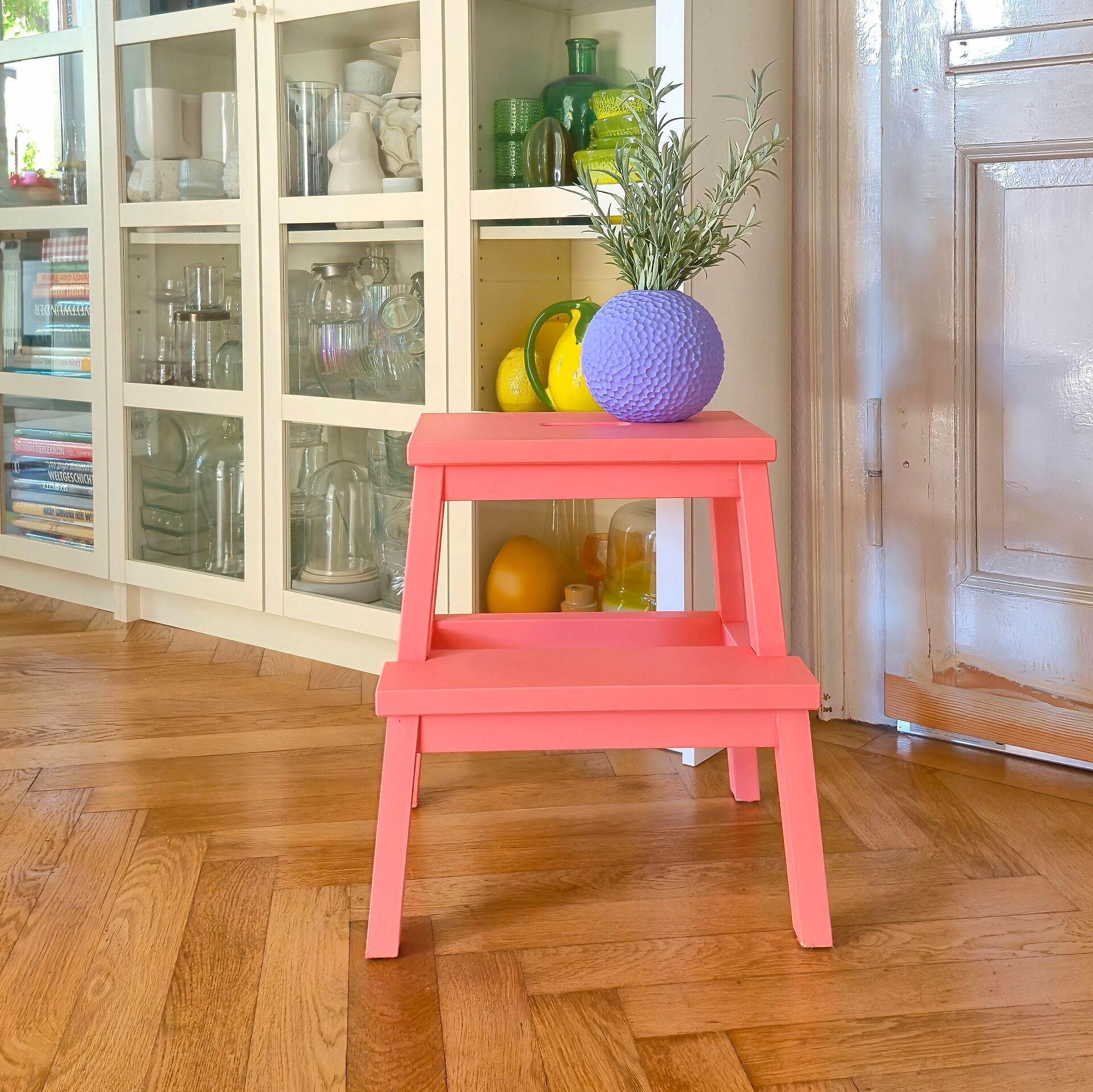
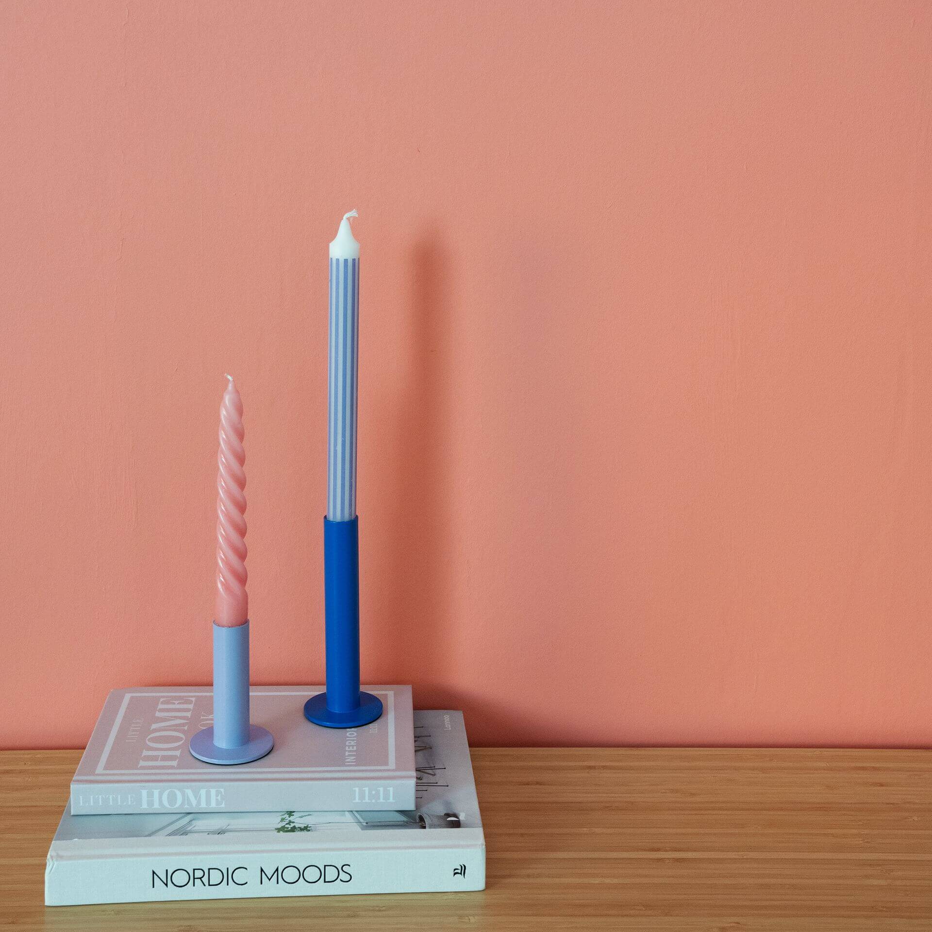
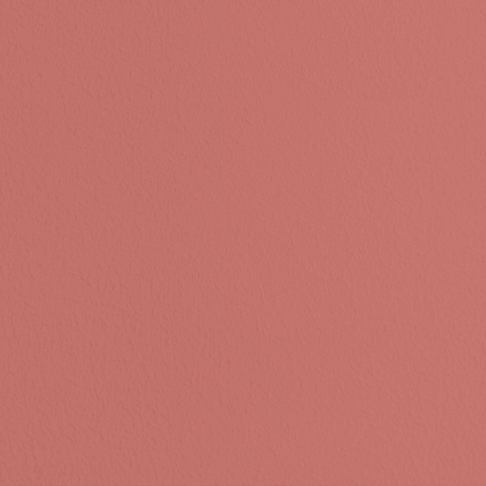
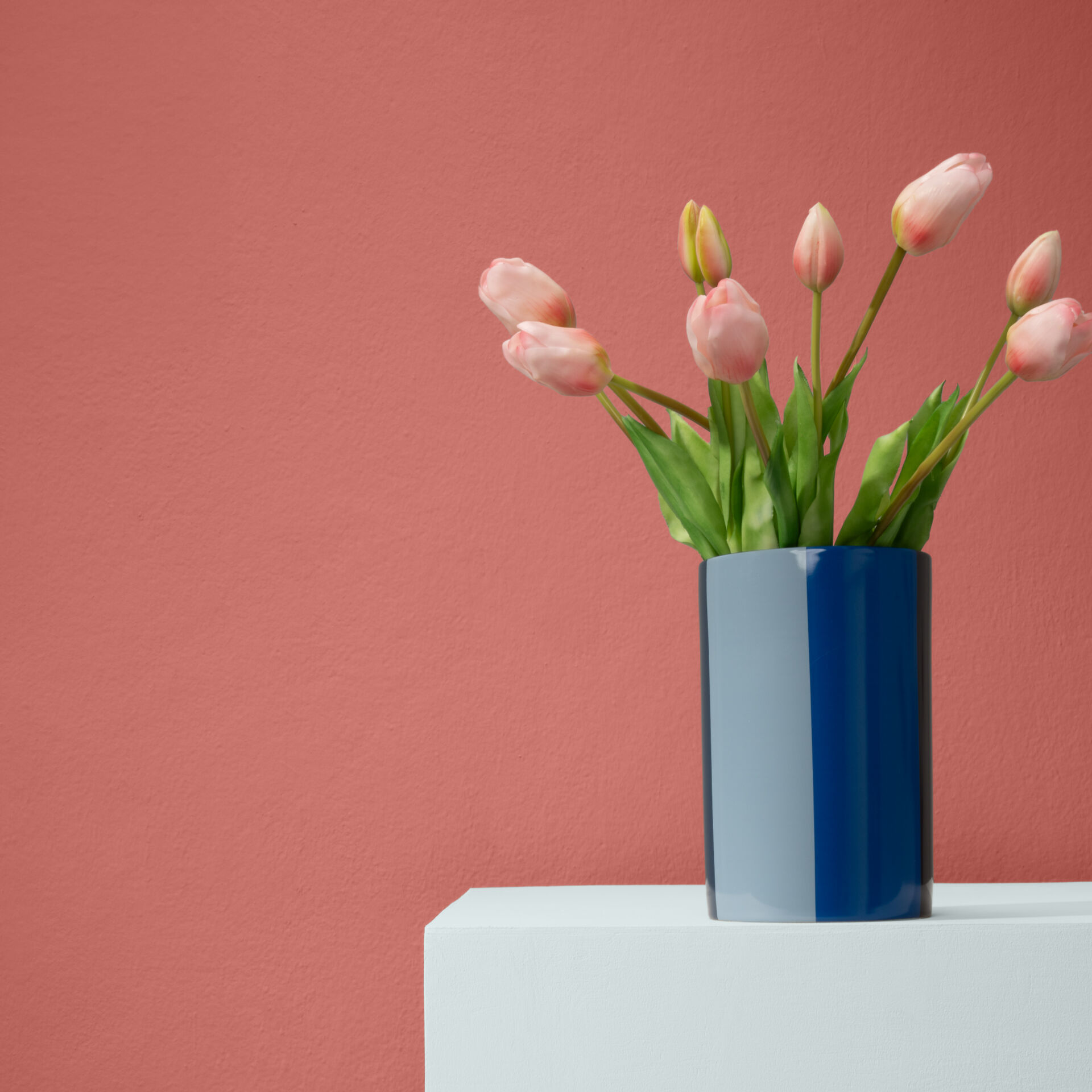
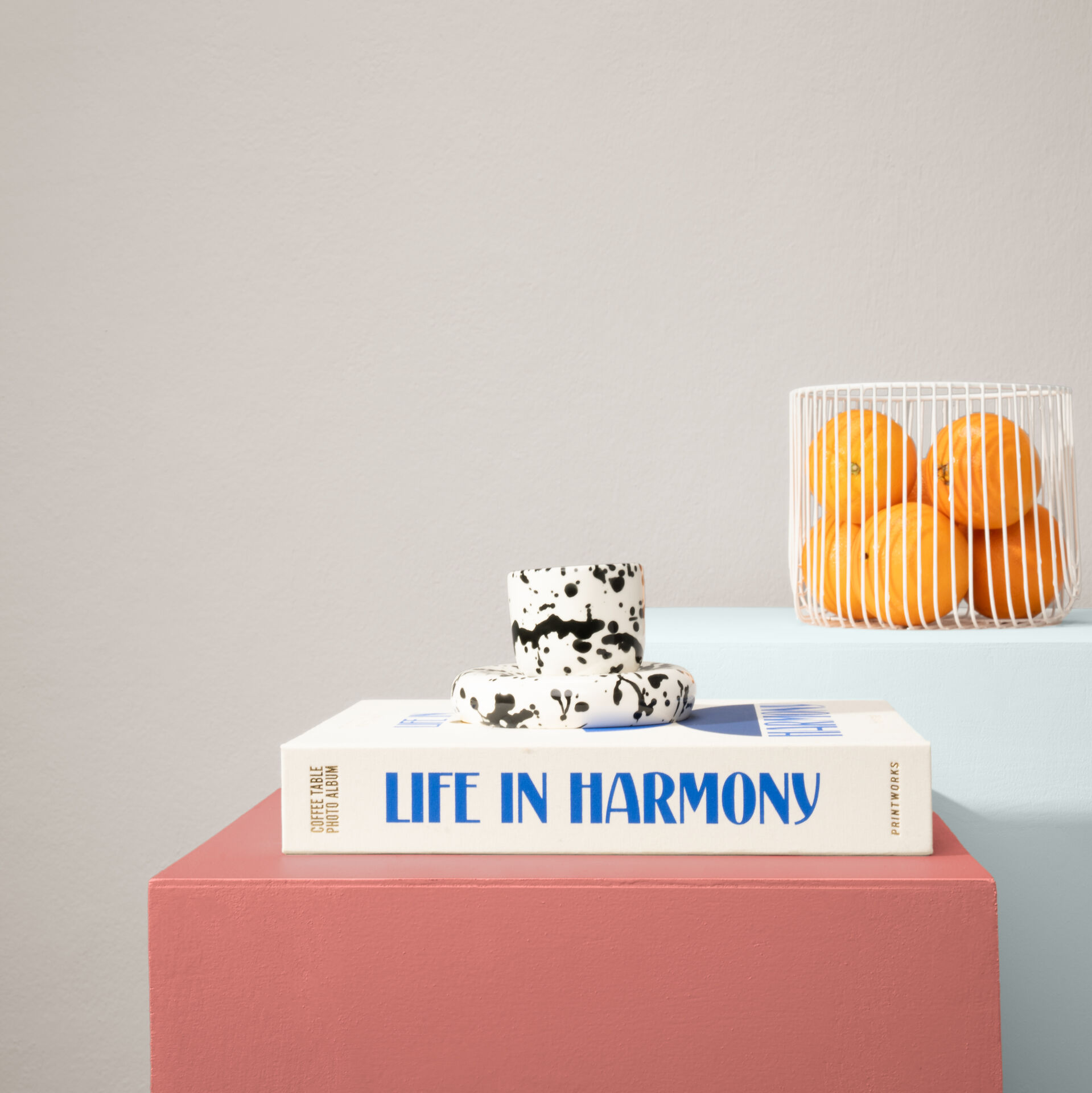
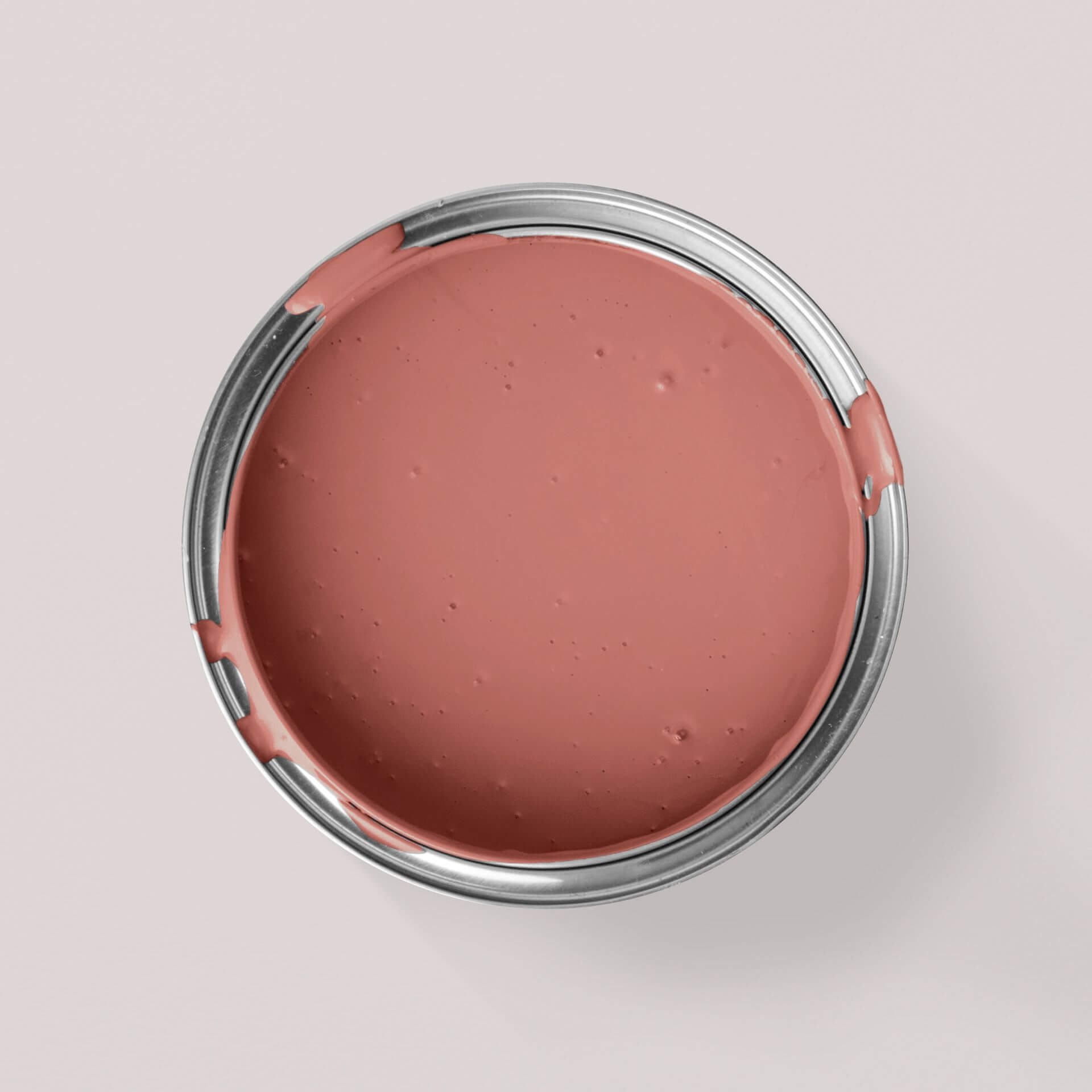
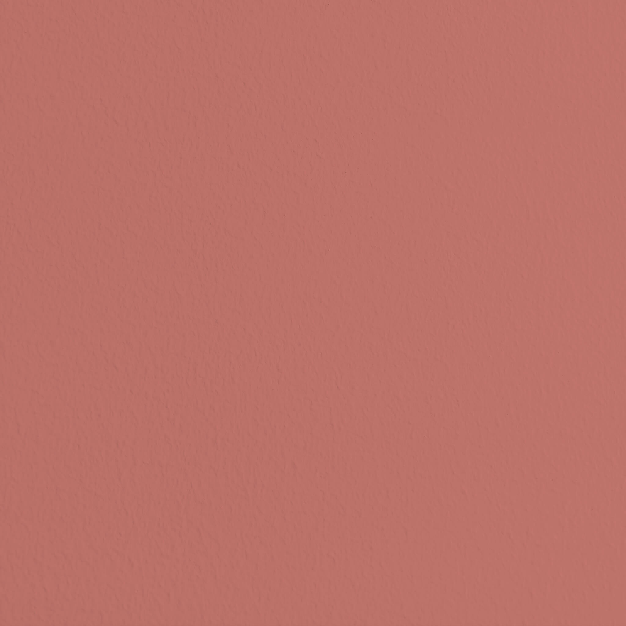

Everything for your project in one set





What would you like to paint?

Just paint






Explore our Red Shades
In colour symbolism, red is known as the shade of passion, love, and even anger. We associate this hue with strong emotions, power, and wealth. It has a noticeable impact on people – which is exactly why red is such an incredibly exciting colour for your home!
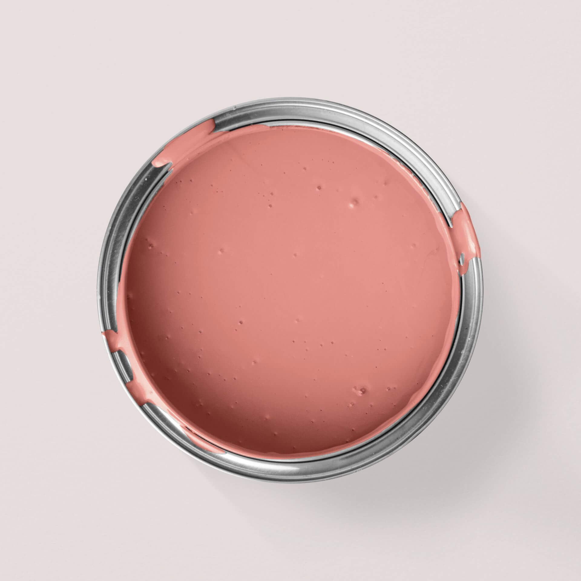
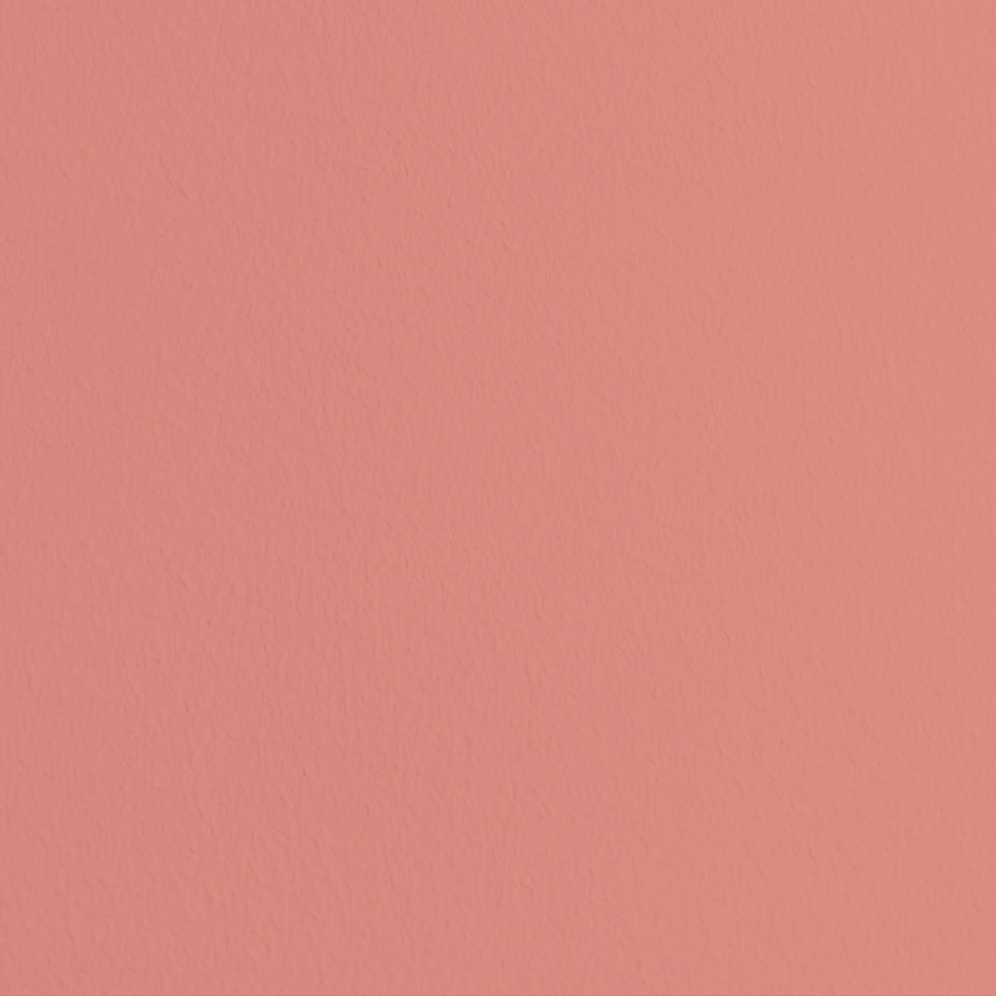
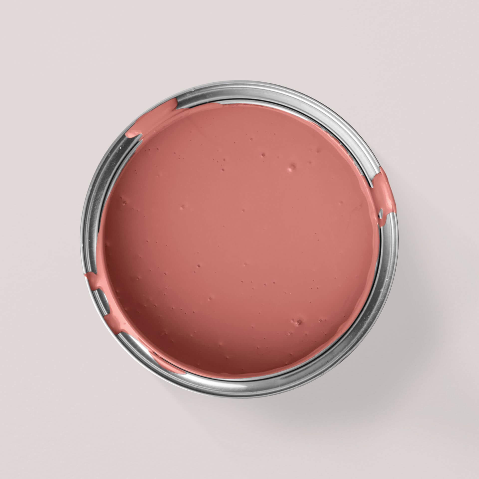
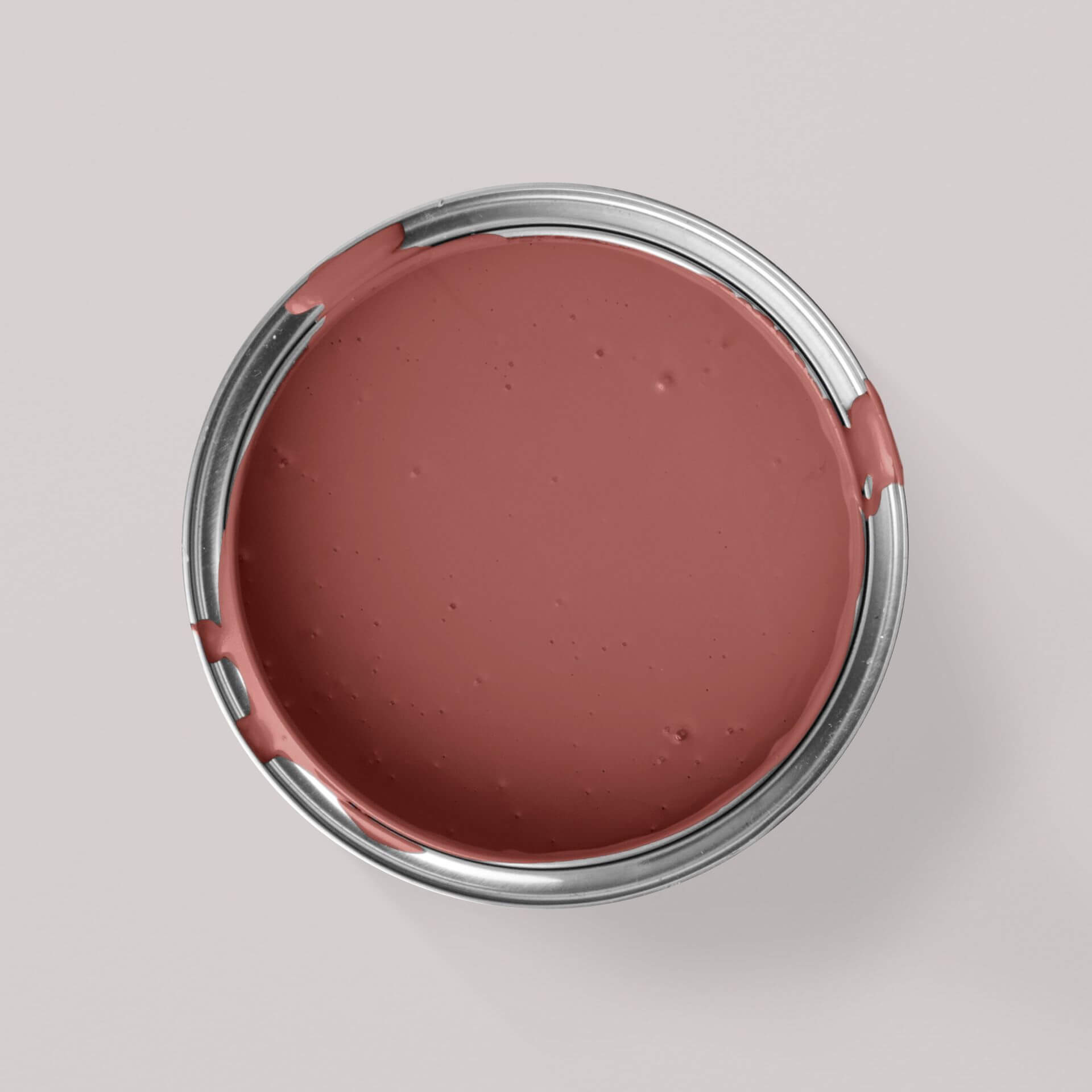
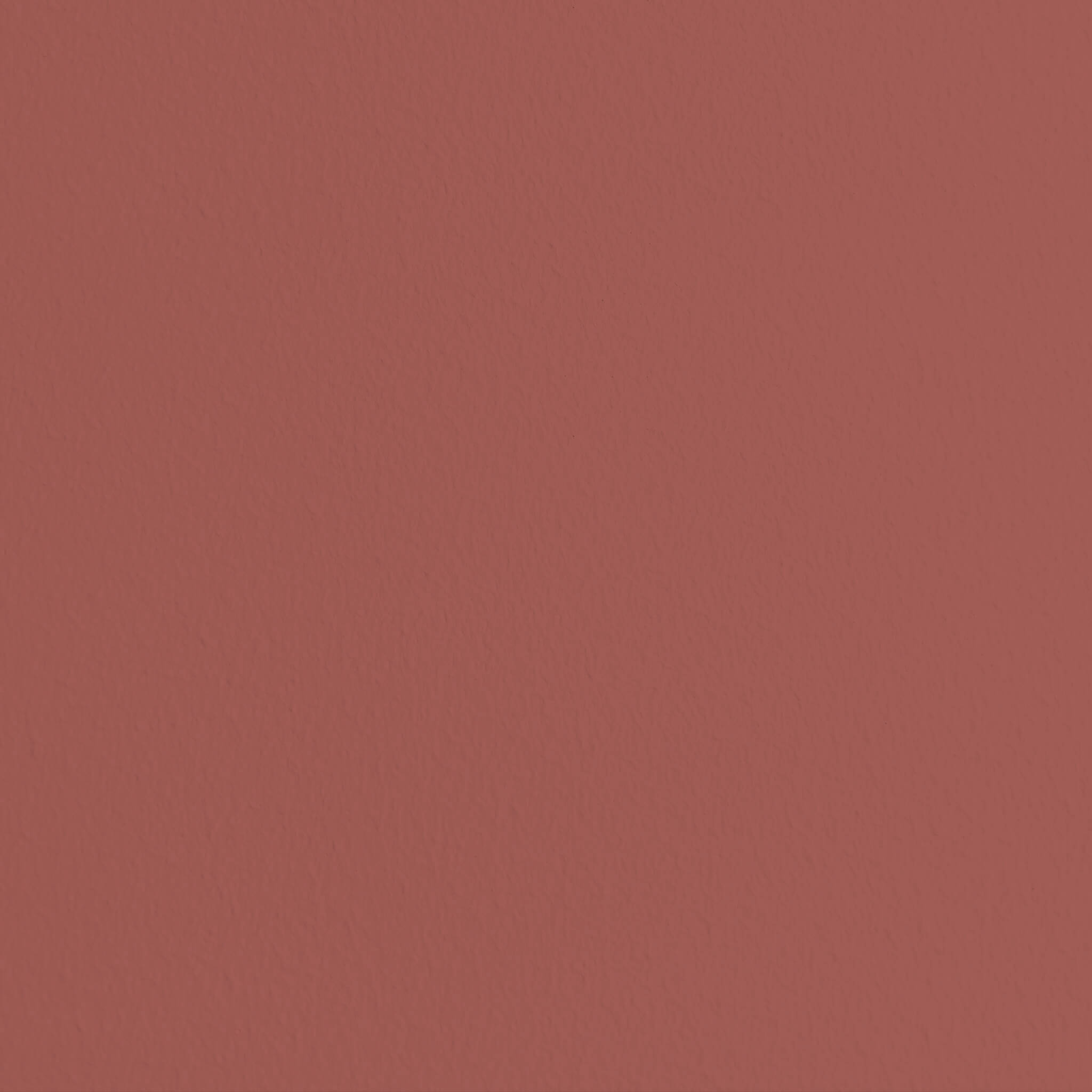
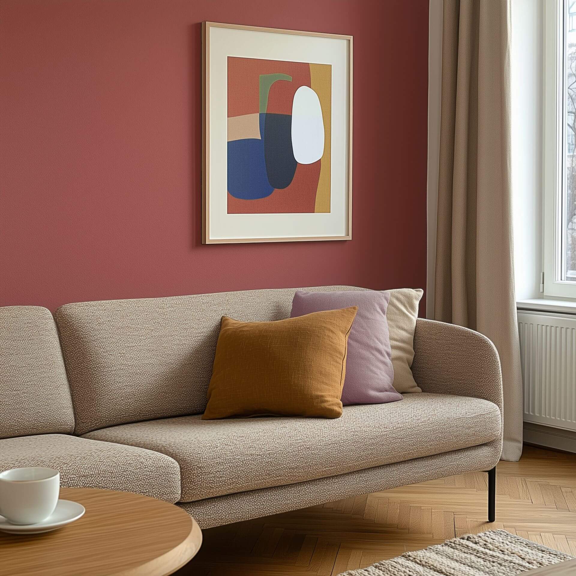
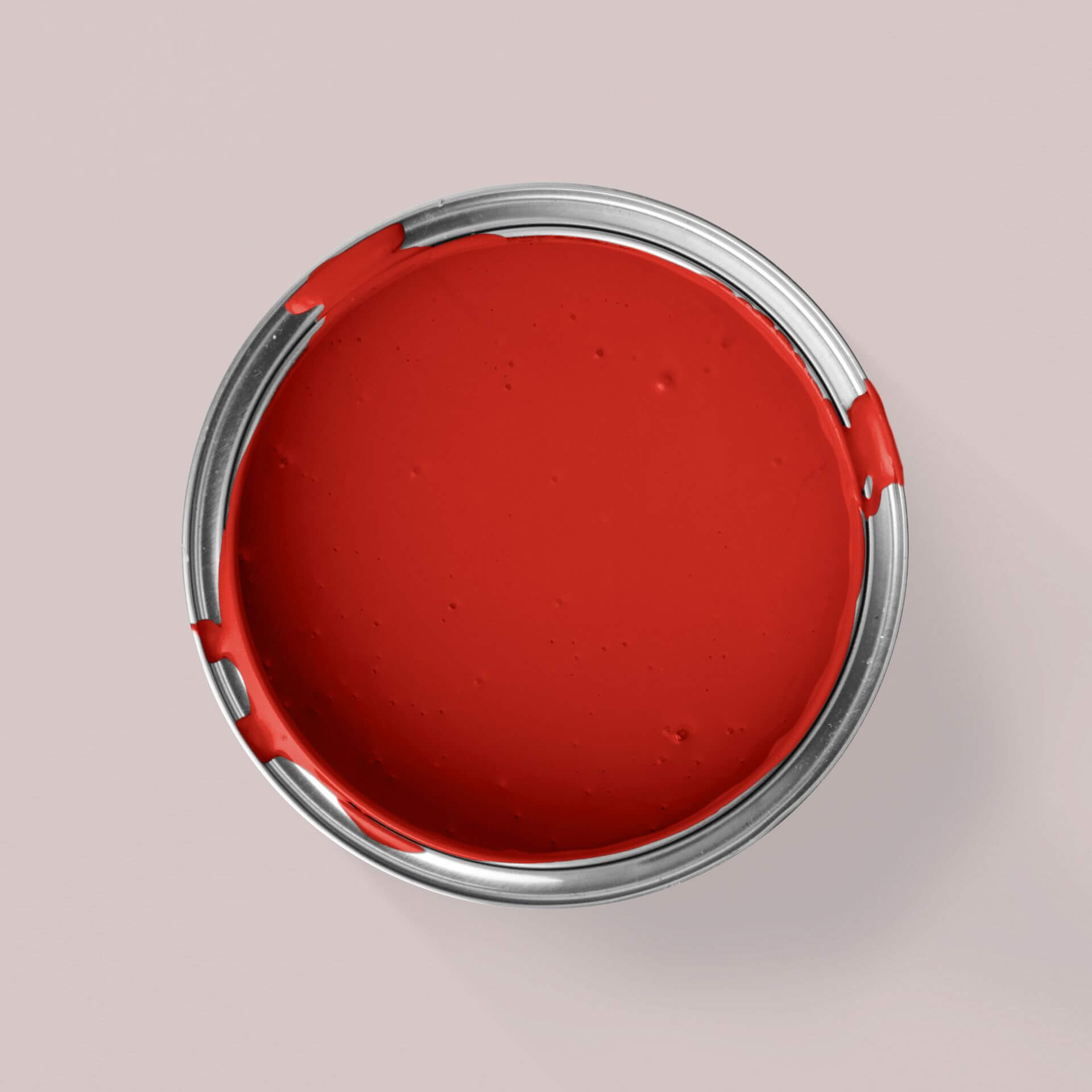
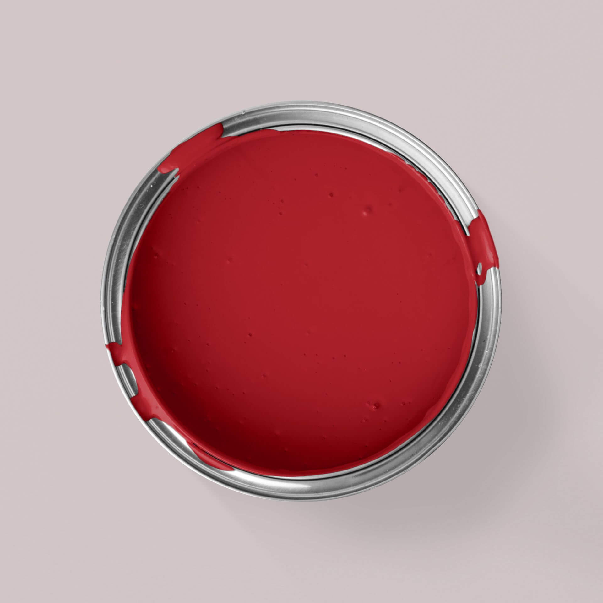
Our red colour samples range from rich Bordeaux and wine reds to deep dark reds, bright cherry reds, and lighter hues. Depending on the space you're decorating and the mood you want to create, a warm or cool red might be the perfect choice. You'll find many shades in our shop, so you can dive straight into your red-themed project.
Discovering Red's Nuances
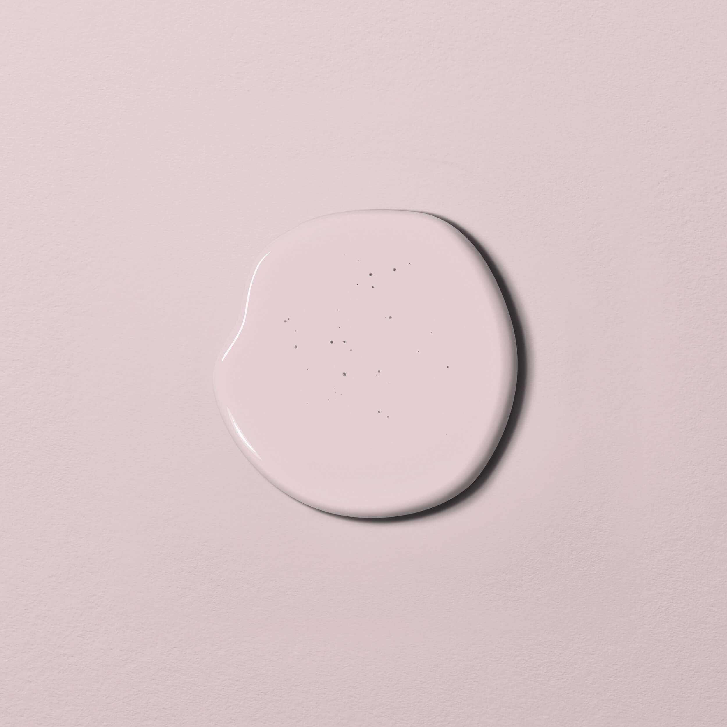
Lighter red shades can take on a completely different character with the addition of various pigments. For instance, consider these hues from the Just Paint collection:
- MissPompadour Red with Coral
- MissPompadour Red with Flamingo
- MissPompadour Red with Raspberry
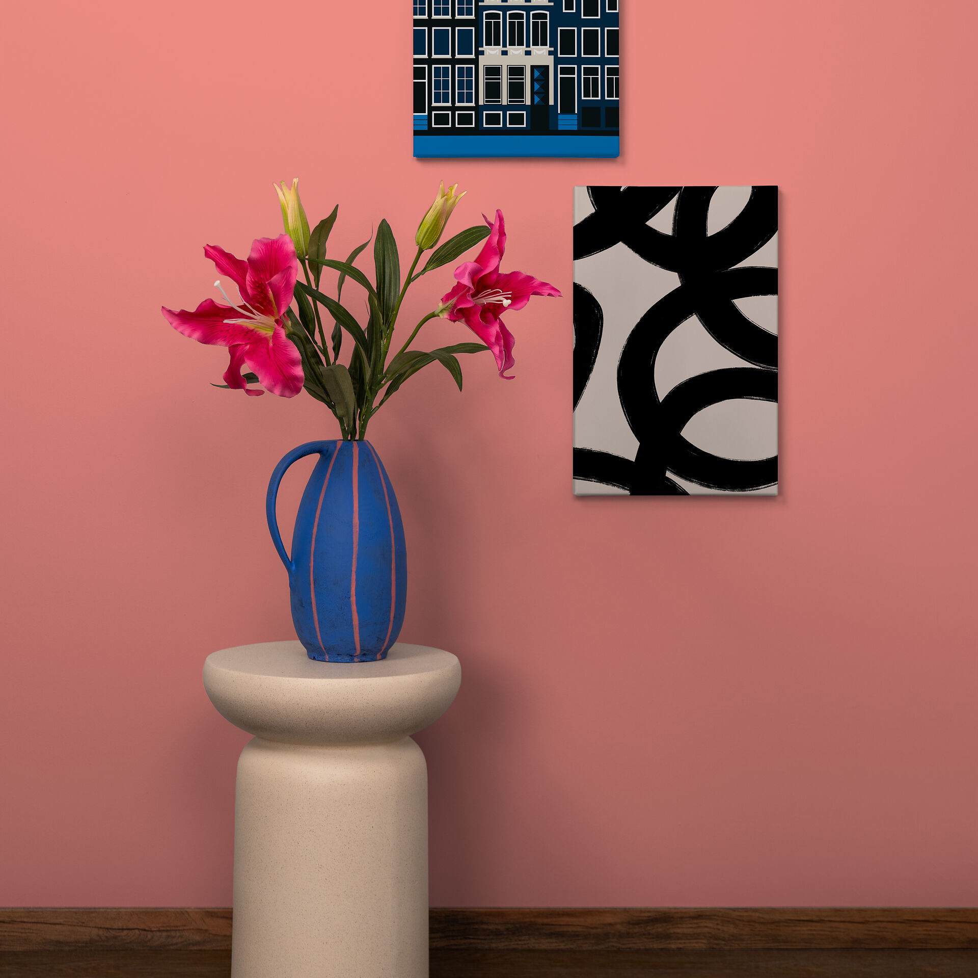
All of these shades are subtle, warm reds that can be used as inviting accent colours in many rooms, such as a bedroom or living room, without dominating the space.
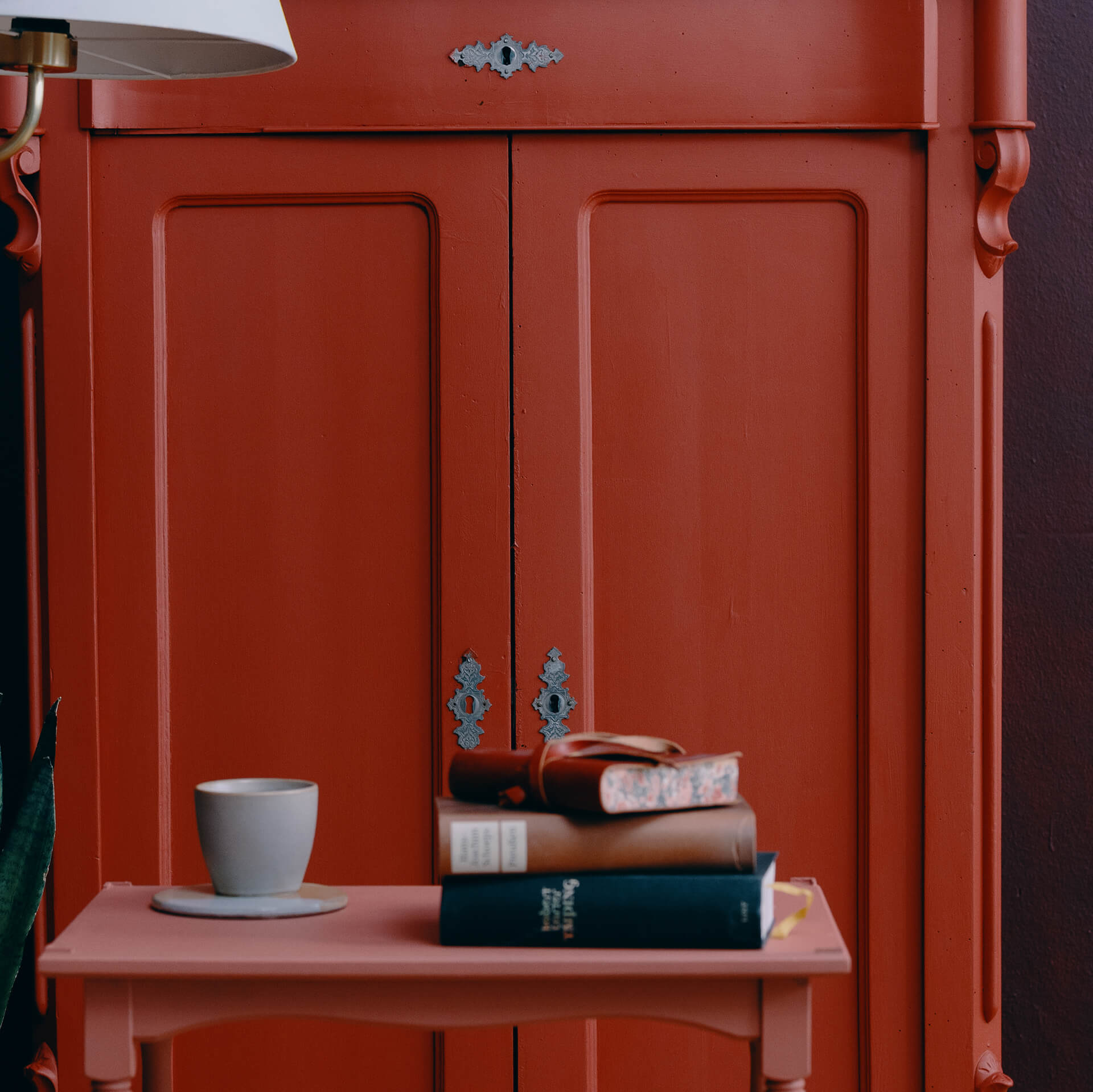
Bold, warm red shades create a cosy, stimulating, and inviting atmosphere. They are ideal for designing your dining room, for example. A perfect example is the warm, rich Red with Sweden, which brings to mind charming wooden houses in Sweden.
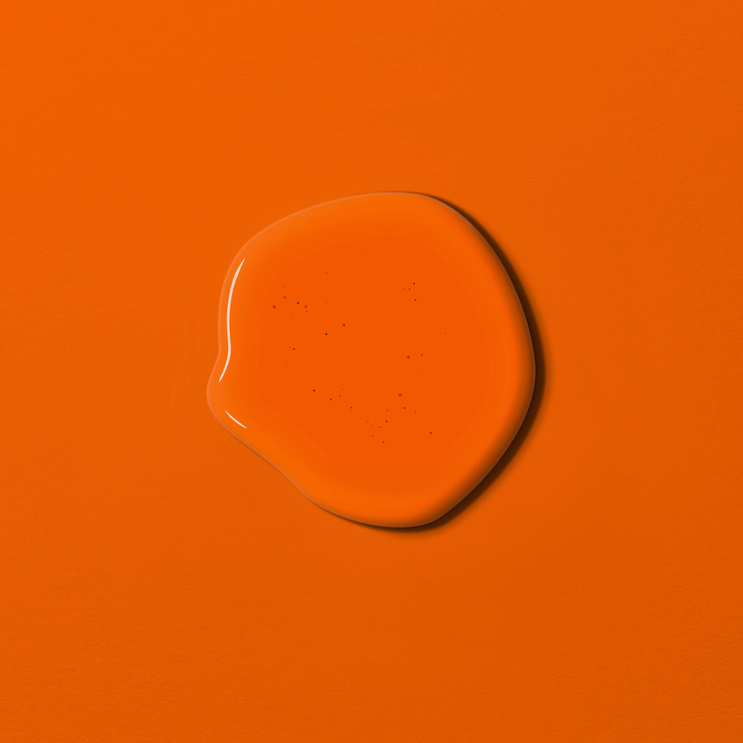
For a truly ‘fiery’, intense red with subtle yellow undertones, try Red with Chili. And the crisp, slightly cooler, yet equally vibrant Red with Cherry is a rich shade that pairs beautifully with other hues.
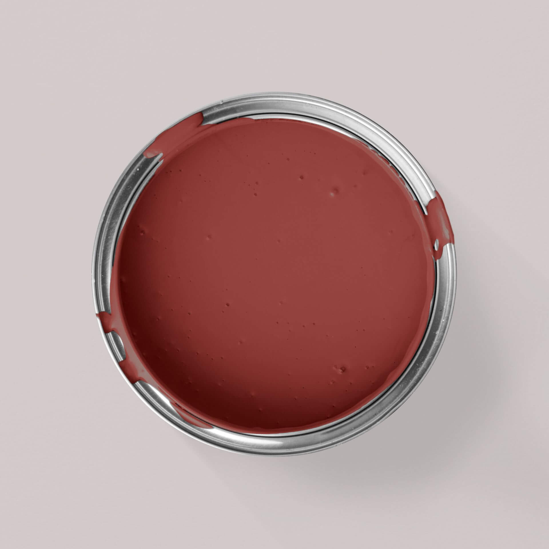
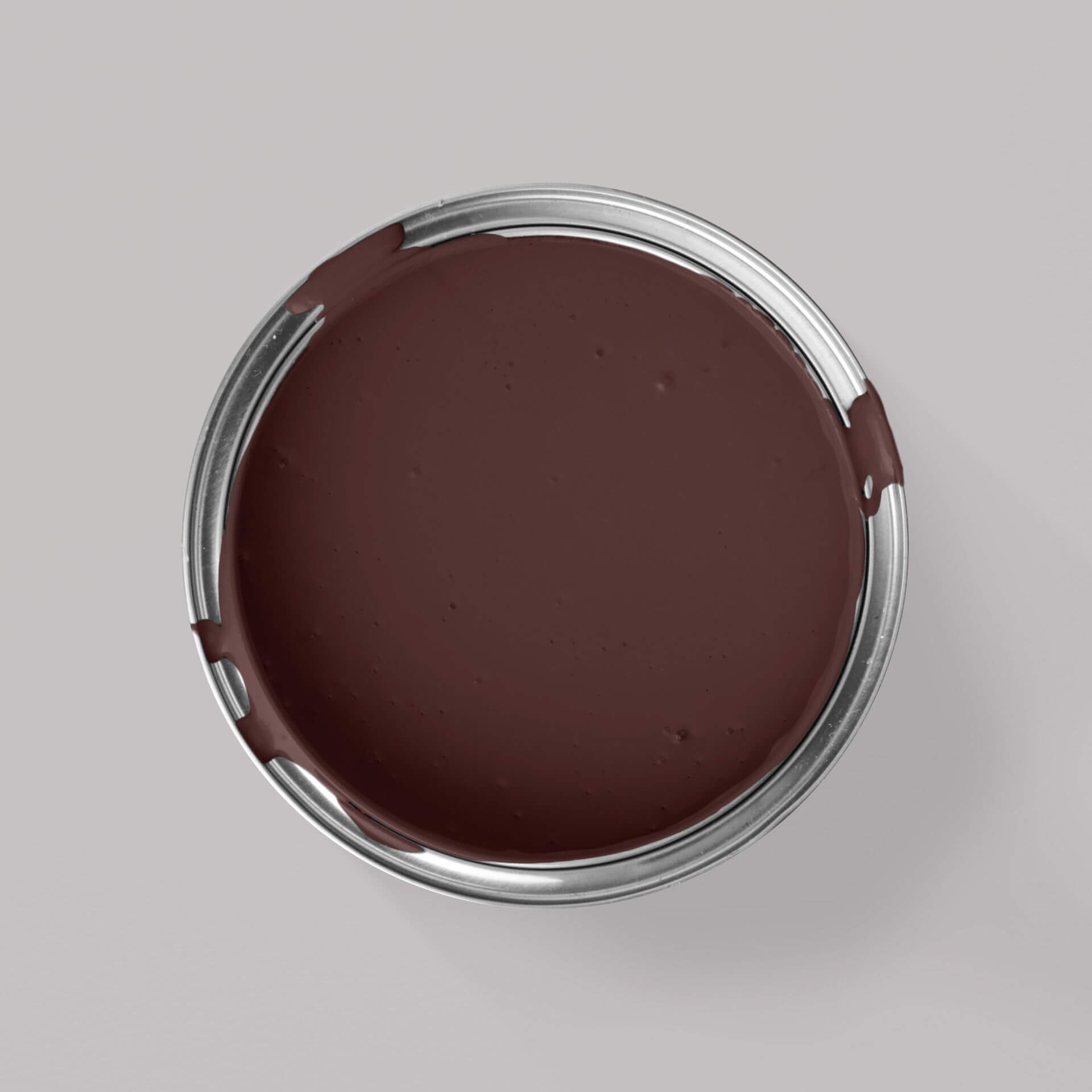
For a darker, almost mystical aura, consider wine red hues subtly shaded with black and violet. Red with Merlot is a fantastic example of this sophisticated blend.
The Impact of Red Wall Paint
The effect of a red wall paint varies depending on its specific hue and composition. Primarily, red is stimulating; it radiates positive energy and can encourage both appetite and lively conversation. If you’re looking to create an environment that buzzes with energy and vitality, be sure to incorporate red accents into your rooms.
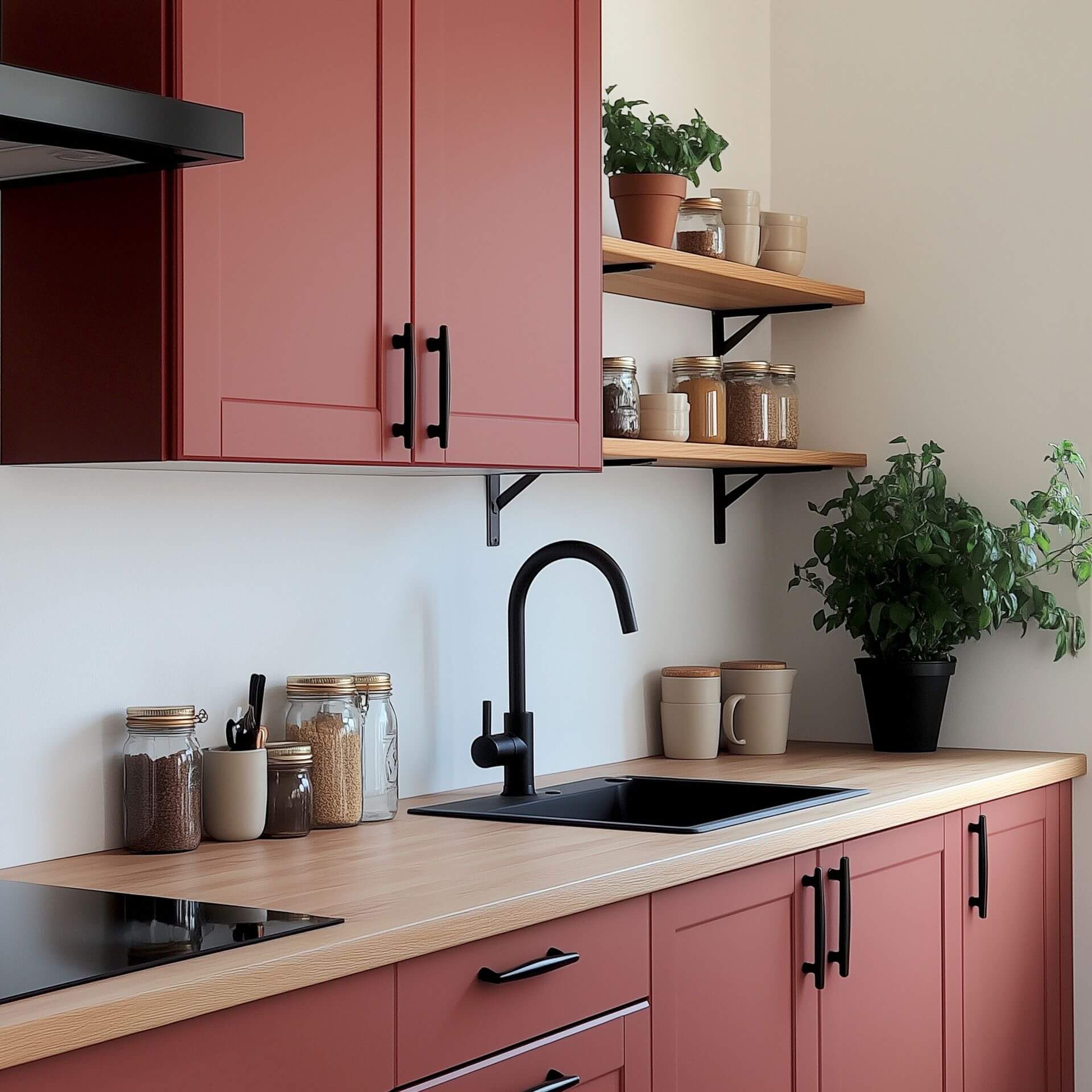
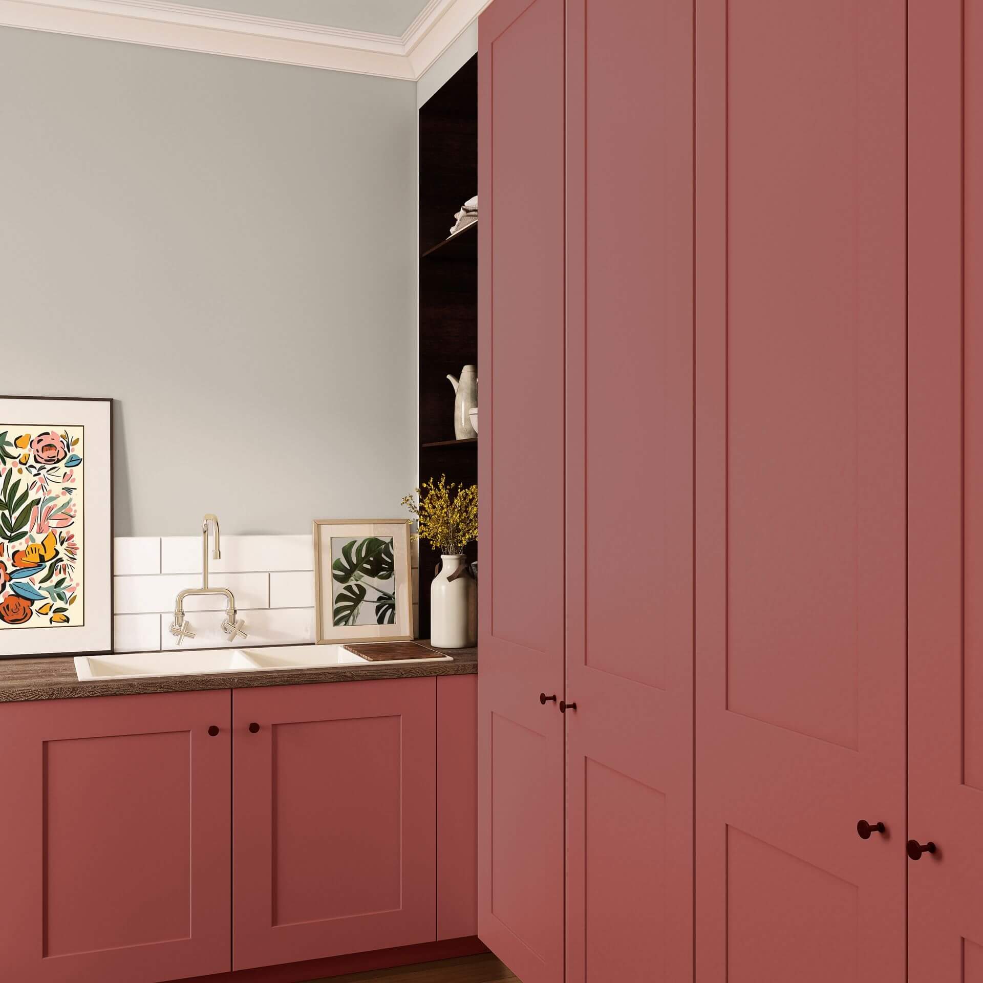
Thanks to their appetite-stimulating qualities, shades from our red colour samples are particularly ideal for dining rooms and kitchens. For instance, Red with Raspberry would make a wonderful dining room shade.
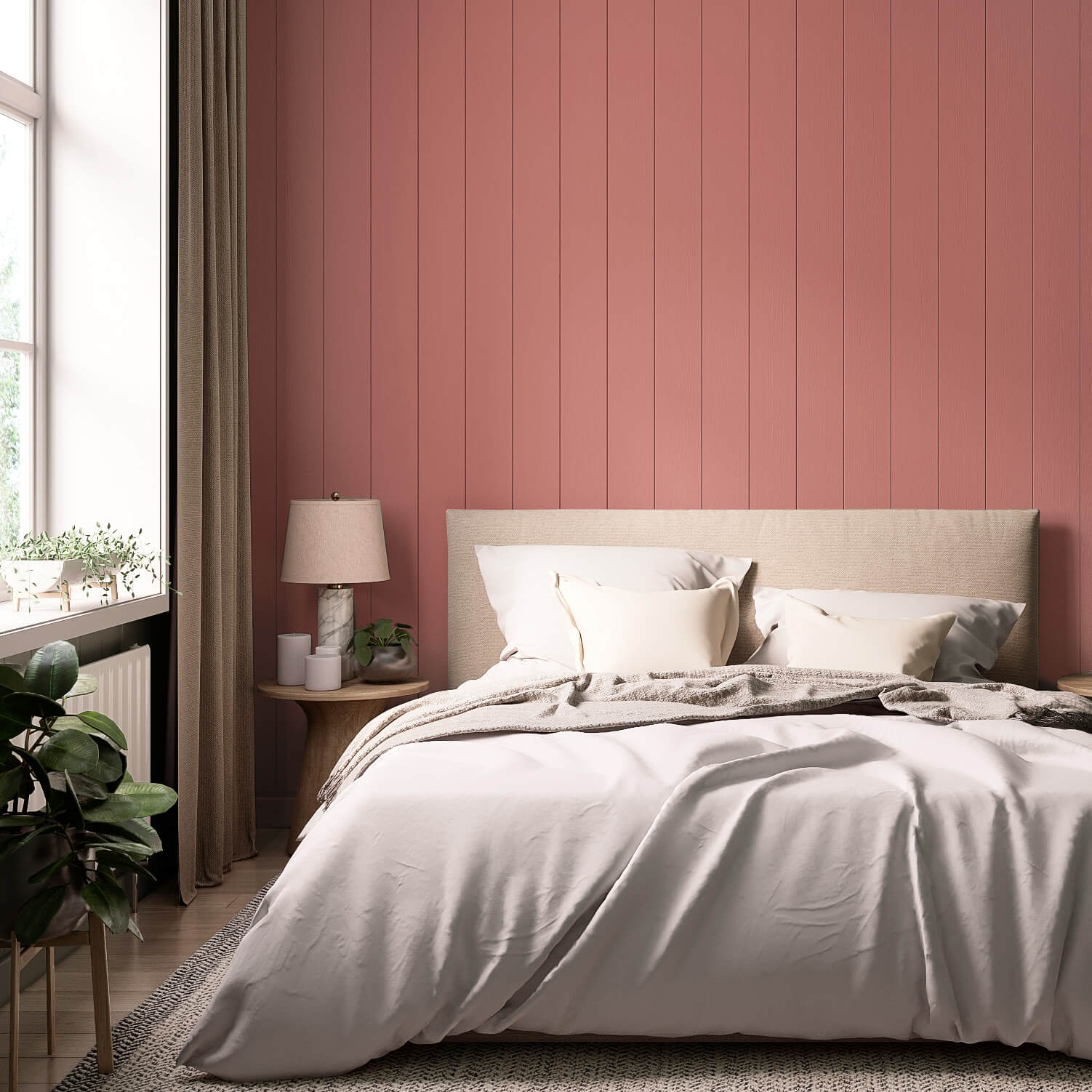
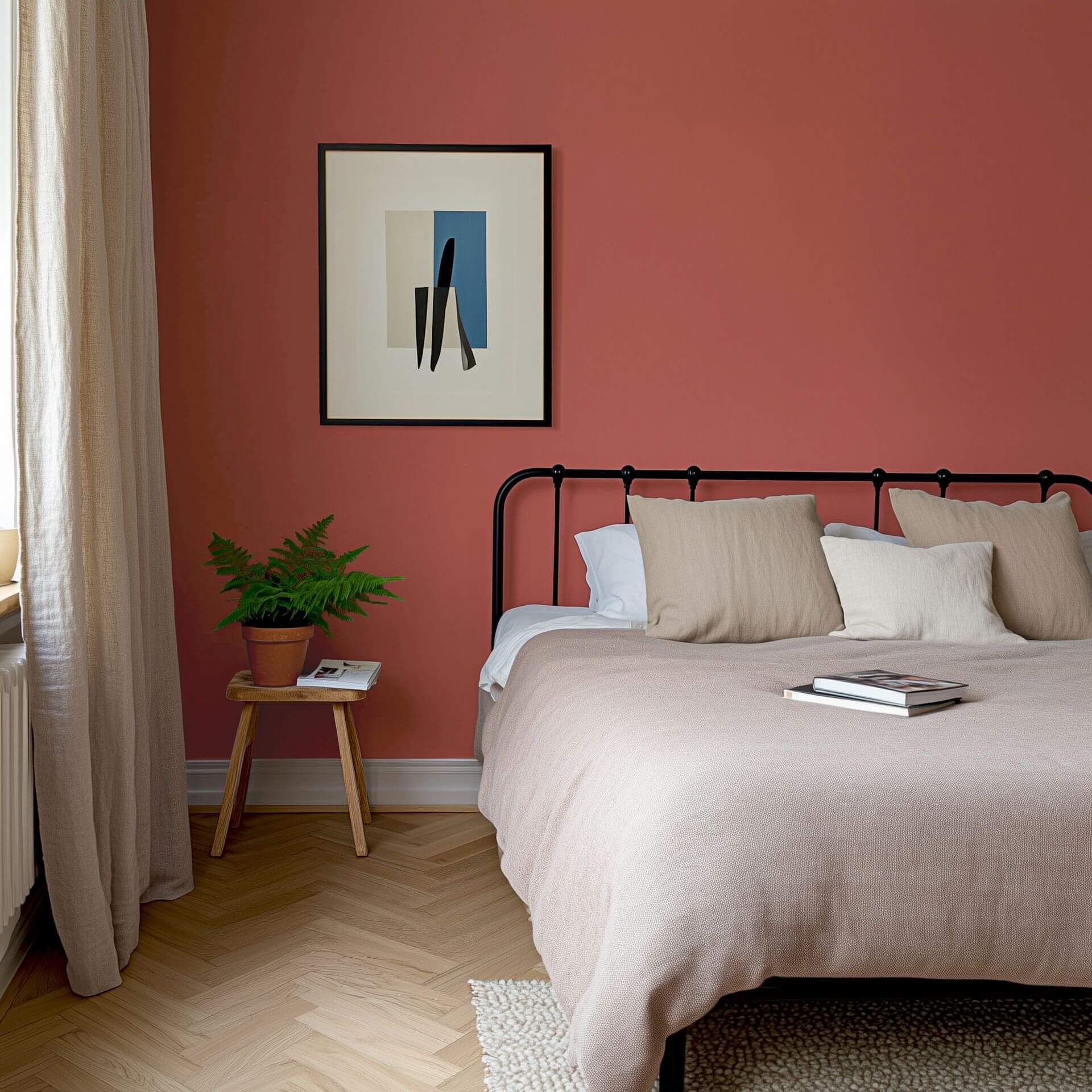
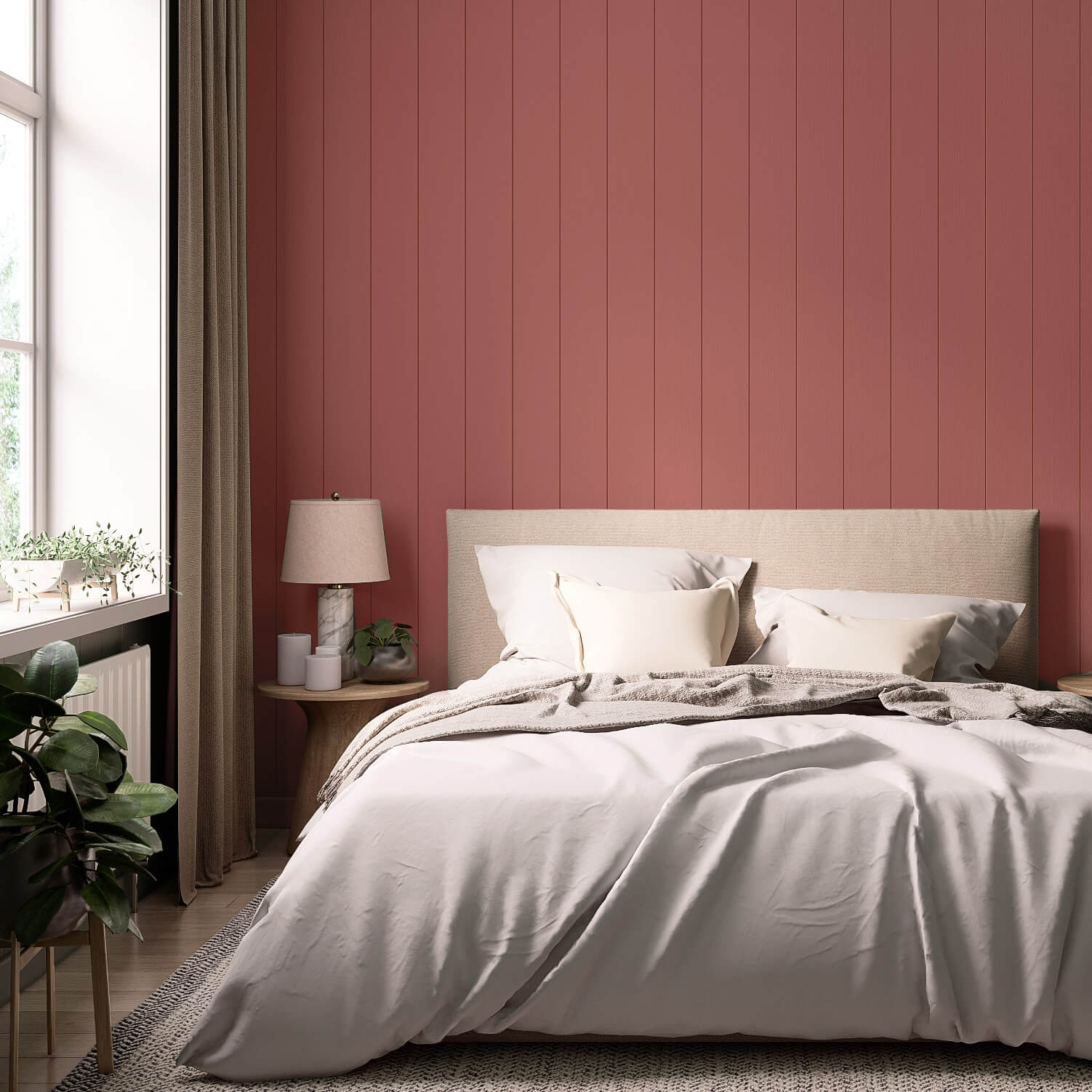
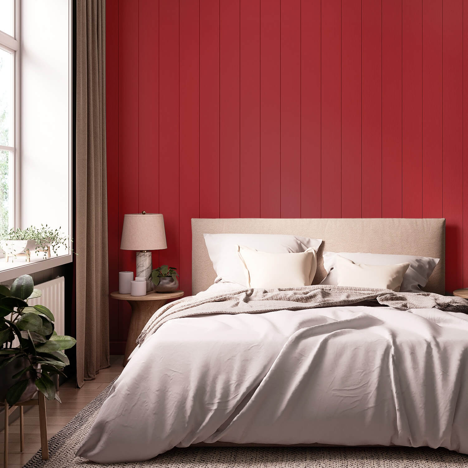
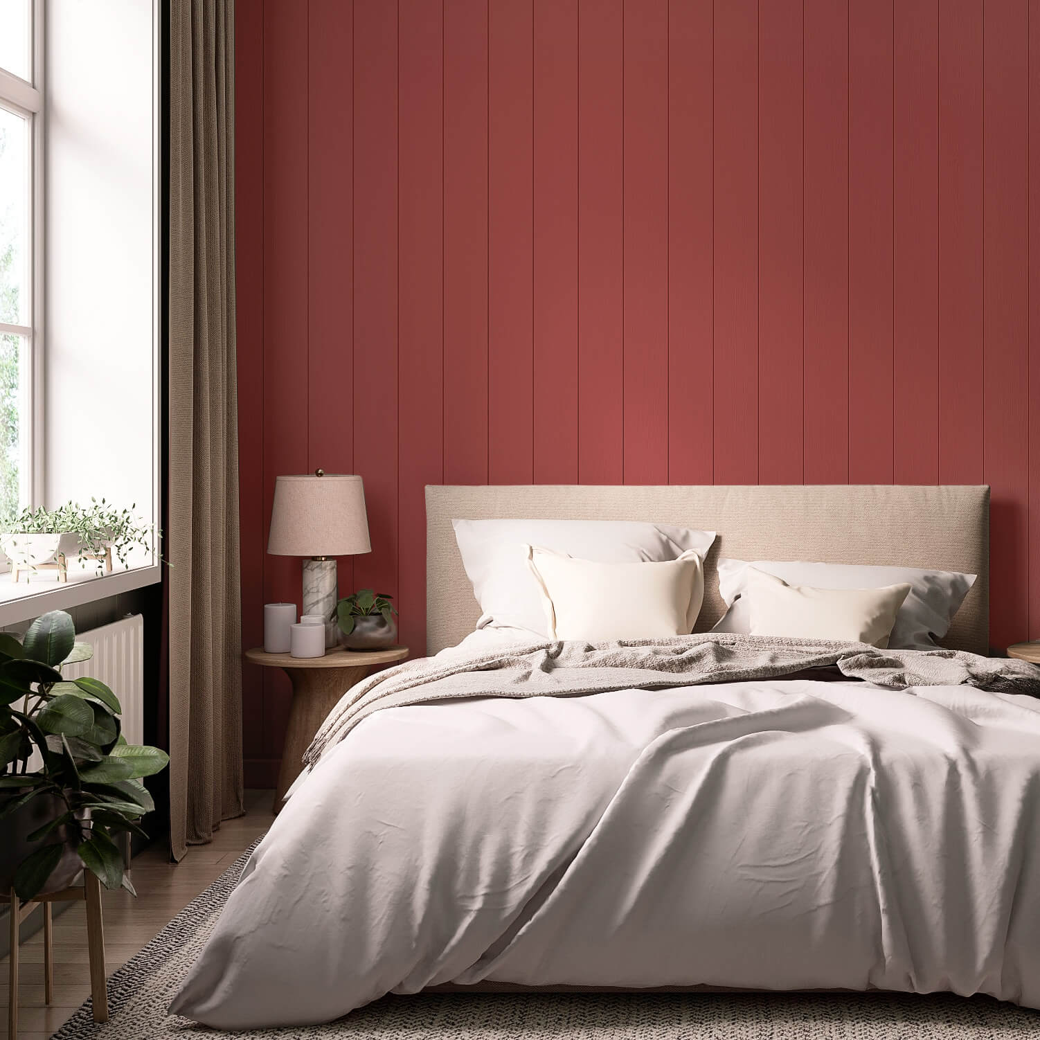
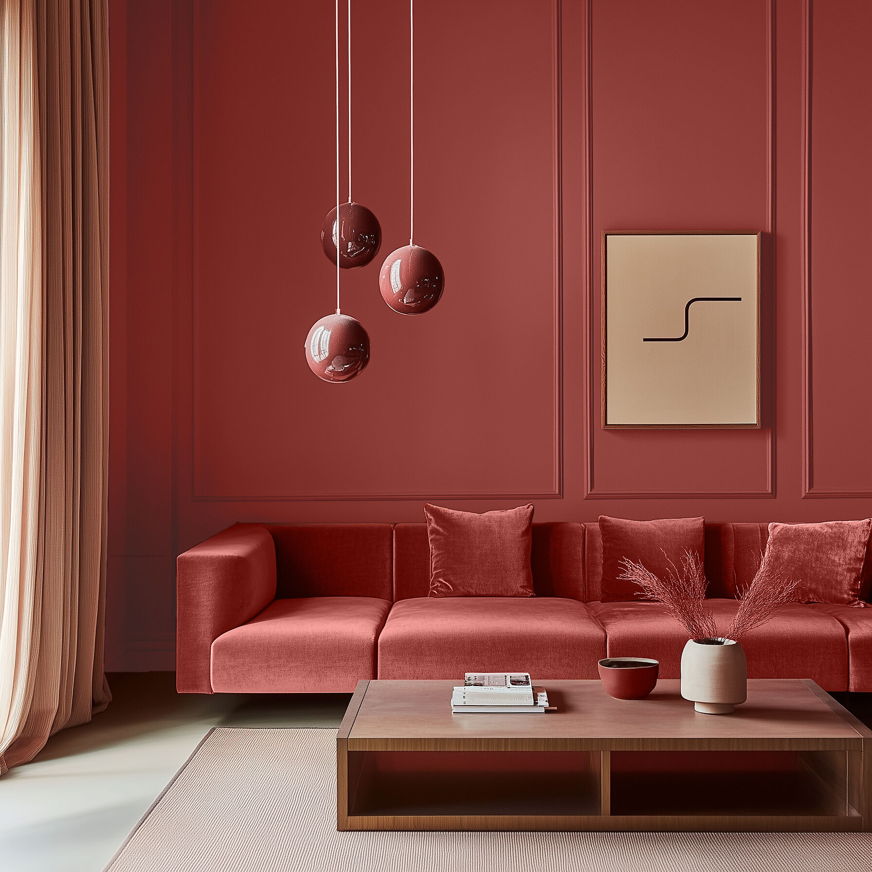
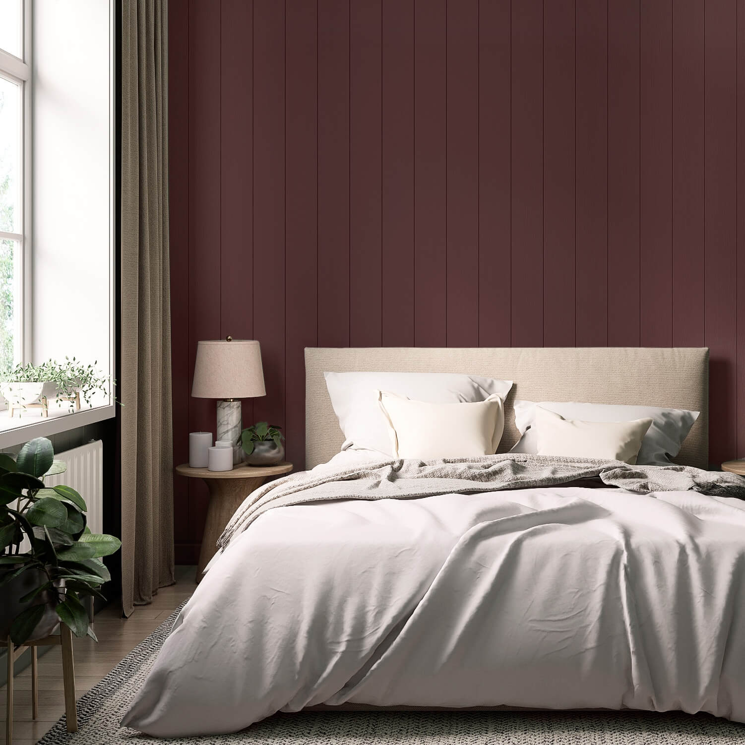
In the bedroom, red paint feels sensual and warm. A wine red accent wall can create an elegant and cosy atmosphere in your personal sanctuary.
In the living room, red shades, when used with the right balance and intensity, can also contribute to your well-being. Opt for a friendly, inviting coral red or the fresh Red with Flamingo to create a truly individual ambience.
Red Paint for Furniture & Tiles
As with all colours, not all reds are created equal. Take a look at our extensive range of red paints and let yourself be inspired! You'll discover countless wonderful ways to use red in your home. Especially as an accent, red in its various nuances can truly bring your living spaces to life.
Your MissPompadour 'Red' Project Guide
From Soft Powders to Bold Swedish Reds: Energise Your Home
In our Project Guide, we'll show you how to harness the symbolism of red to infuse your rooms with vitality and warmth. Whether you're planning an appetite-stimulating kitchen or aiming for elegance with a deep wine red in the bedroom, we have the perfect inspiration and product for you. Explore shades from Coral to Merlot and start your next painting project today!
Red Wall Paint: A Powerful Statement for Your Walls
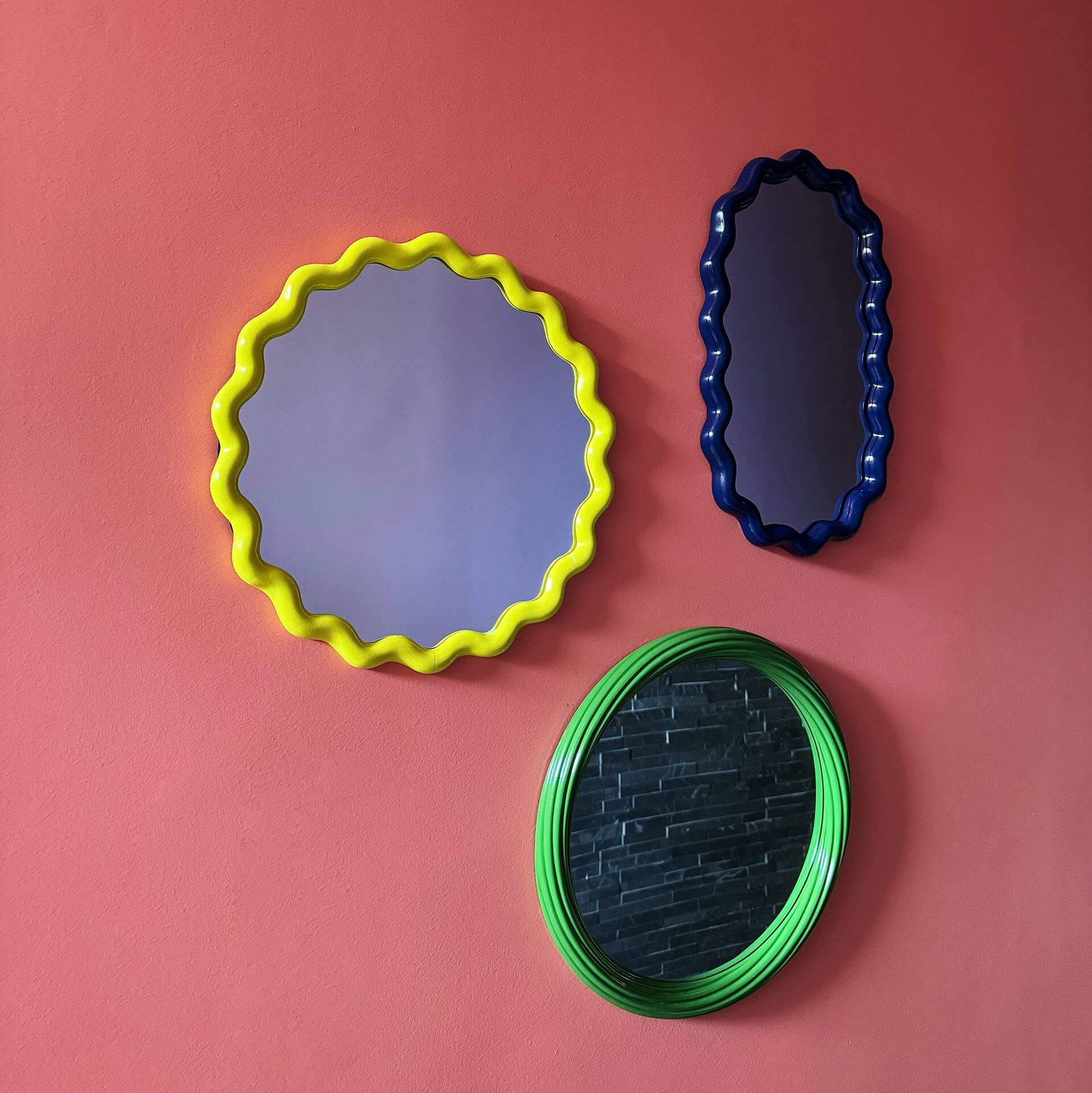
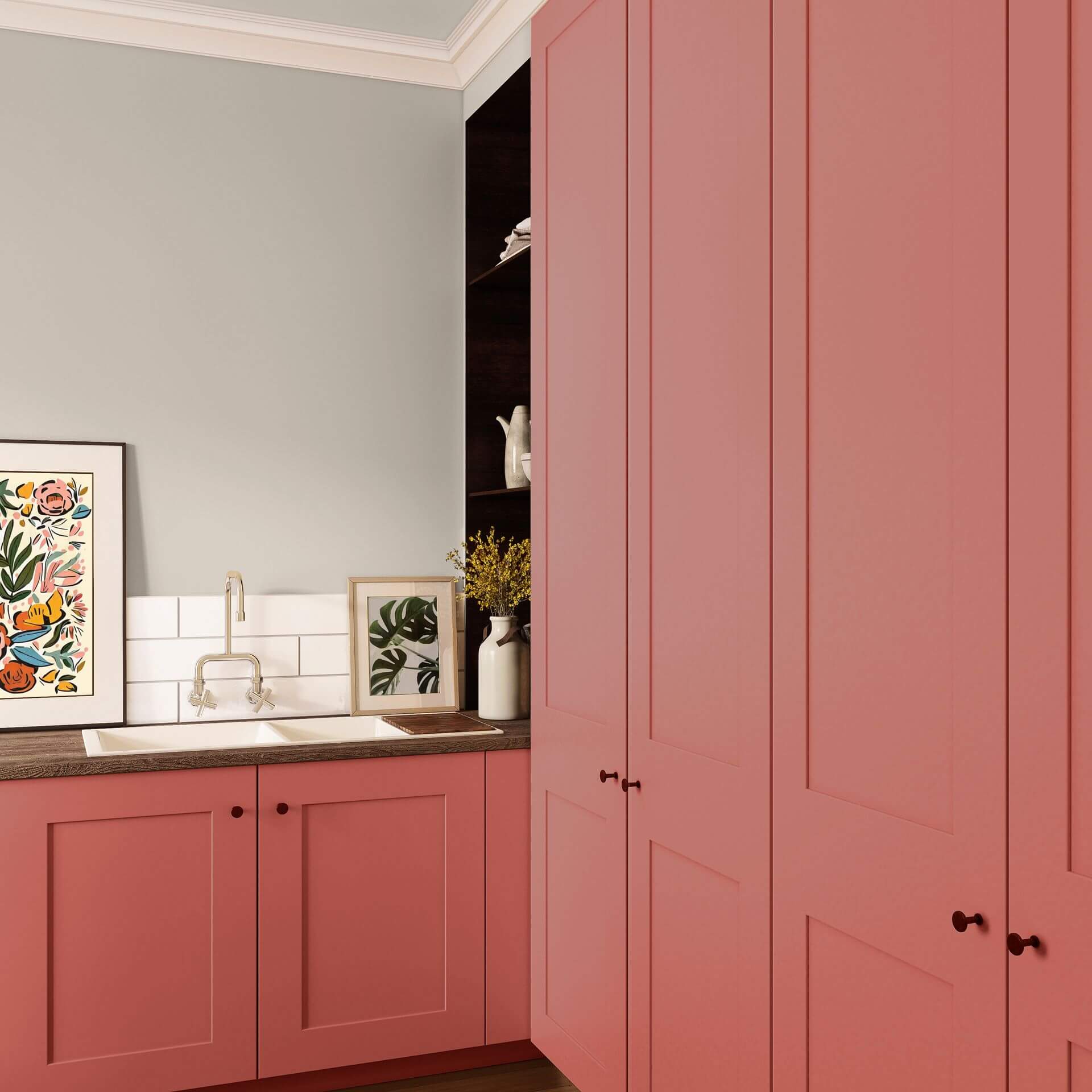
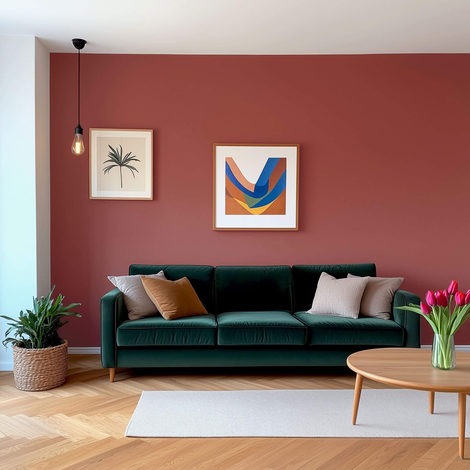
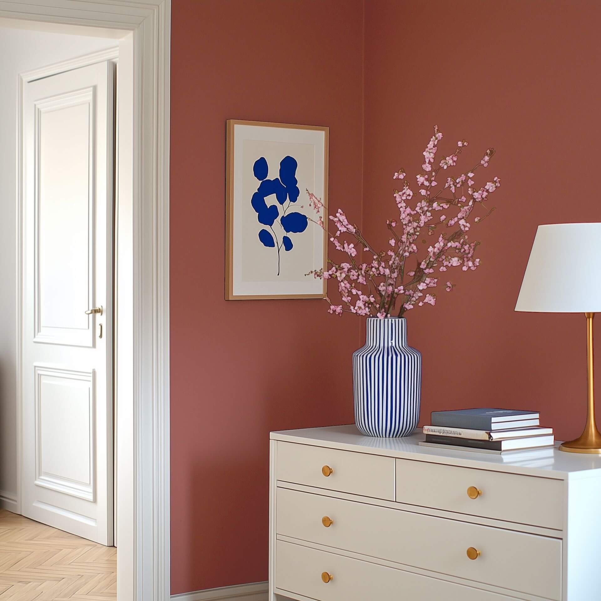
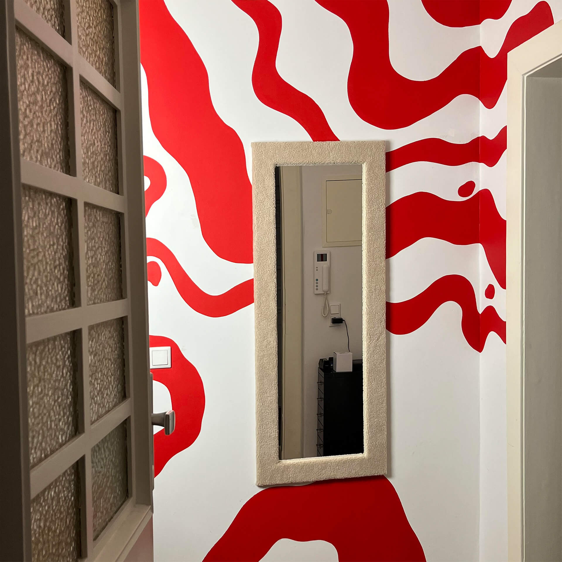
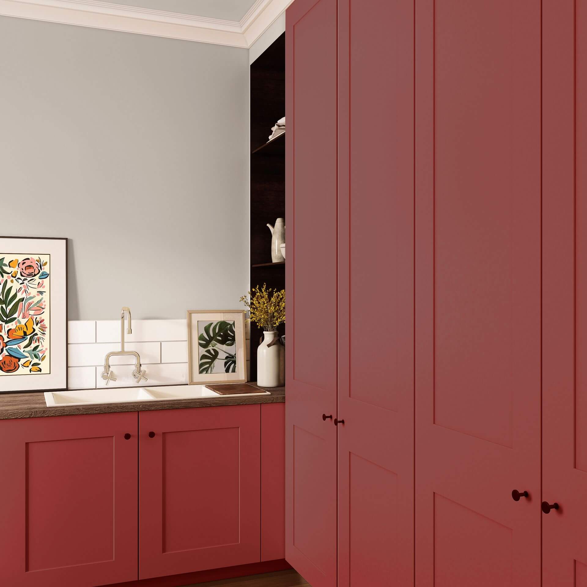
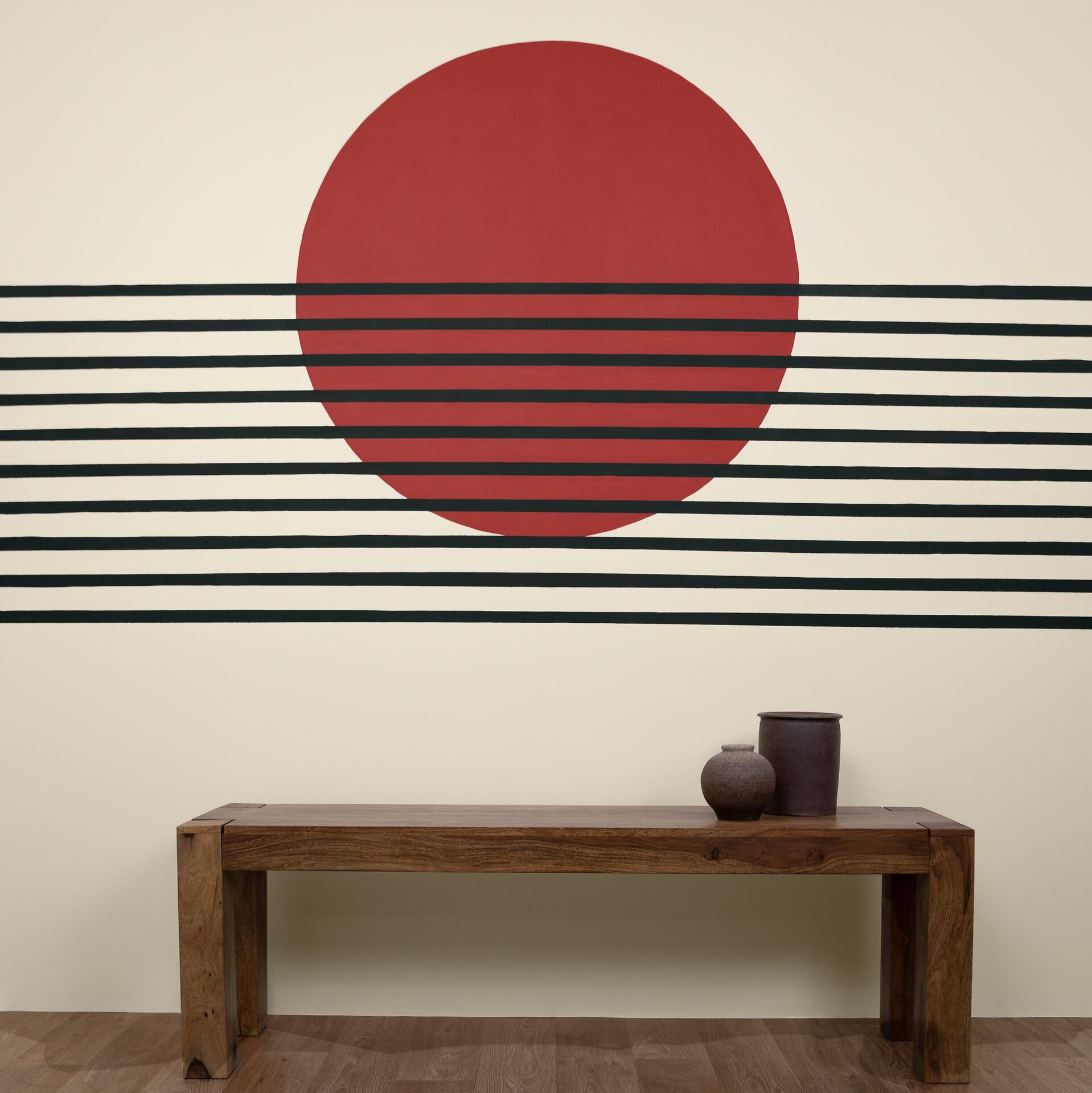
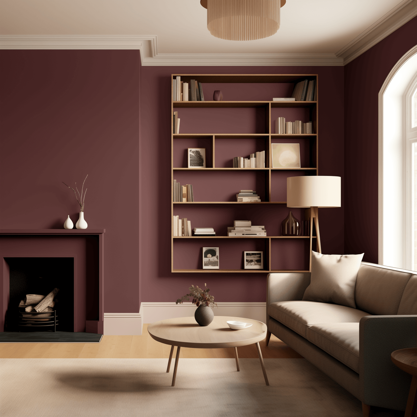
A red wall paint is a true powerhouse of energy. While lighter shades like Red with Clay create a friendly feel, a rich Red with Sweden instantly brings cosiness. Our matt wall paints adhere perfectly to plaster and wallpaper. Thanks to their high pigmentation, they offer excellent coverage, transforming your walls and ceilings with a fresh new look. Red paint is often used for an accent wall, allowing lighter walls to balance the strong colour statement. Is your dining table tucked into a corner? You might consider painting an accent wall around the corner to perfectly define your dining area.
Red Tile Paint: A Bold Design Statement
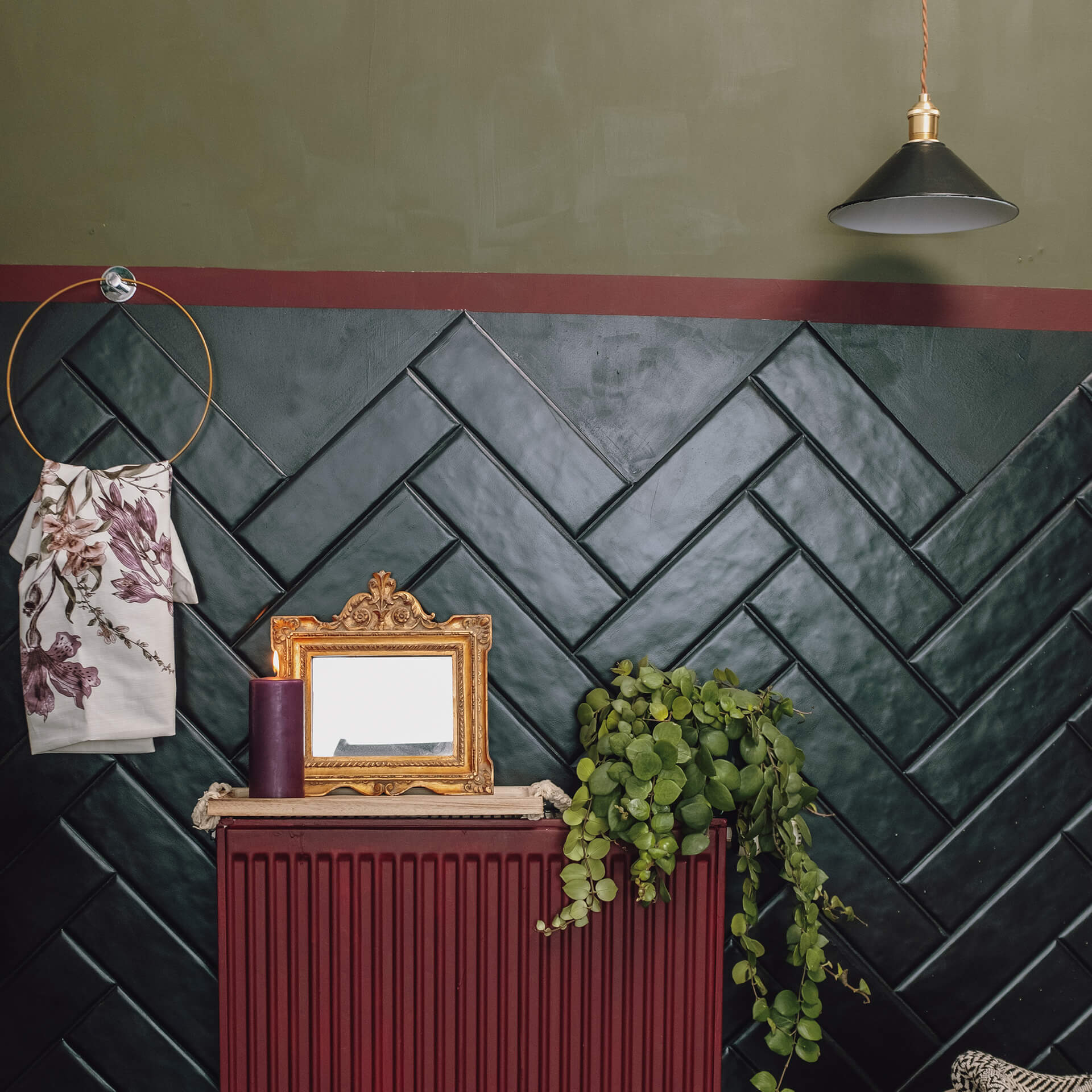
With red tile lacquer, you can create an unmissable accent in your bathroom or kitchen. The rich Red with Merlot, in particular, looks incredibly elegant, evoking the feel of exclusive boutique hotels. You’ll achieve a robust surface, free from dust and building mess, offering top quality and daily protection.
Red Furniture Paint: A Striking Centrepiece for Your Home
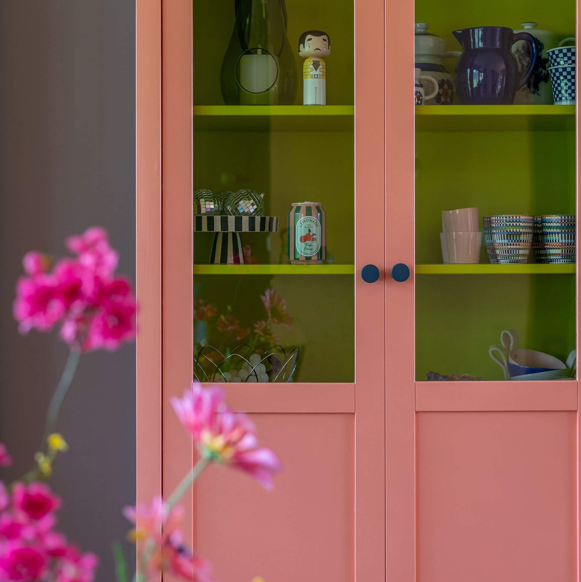
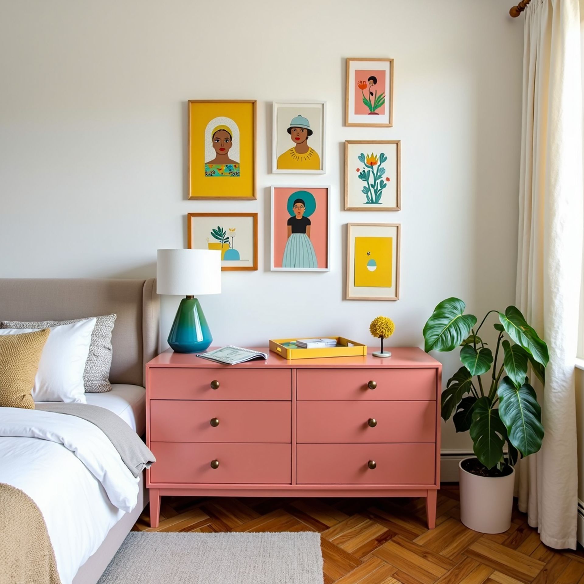
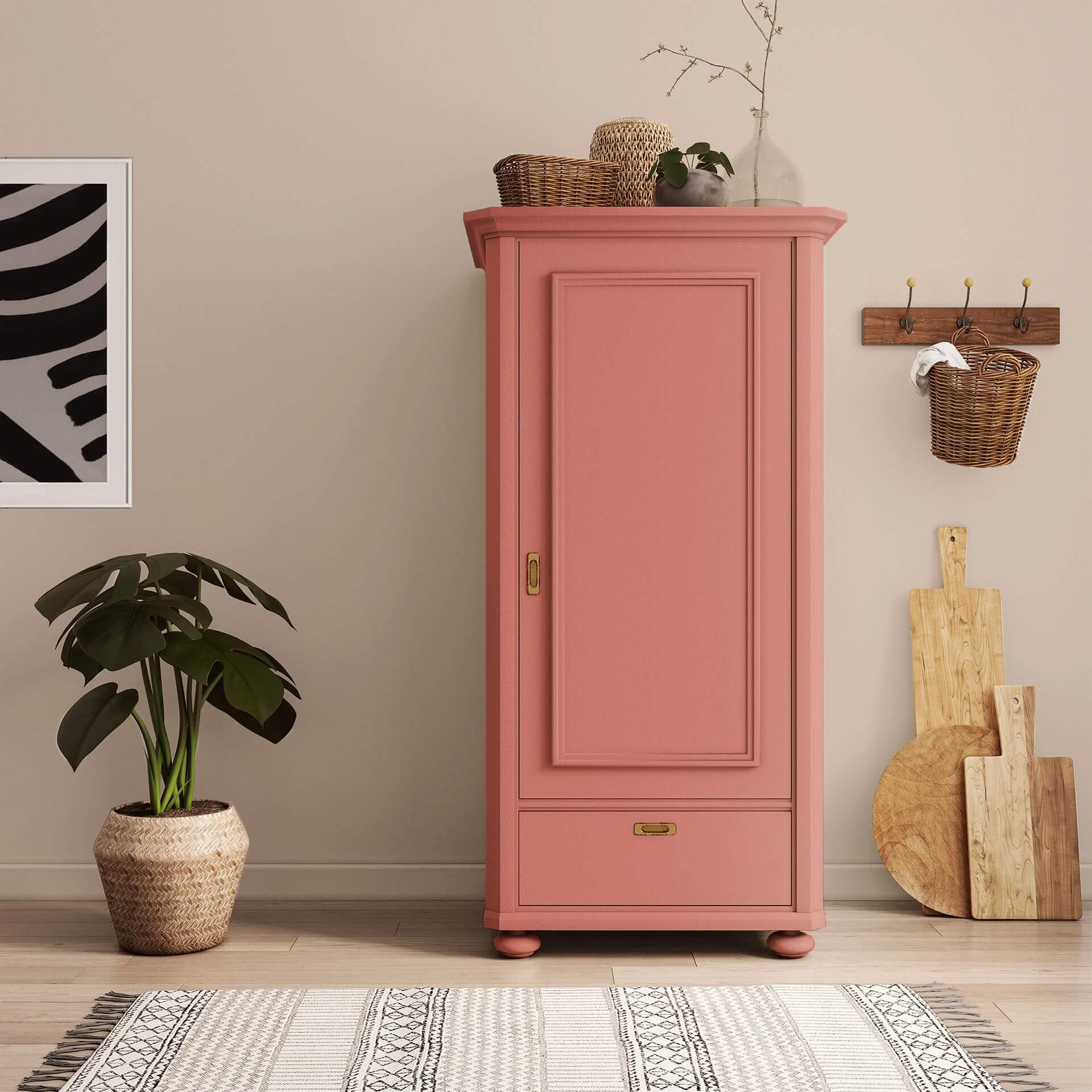
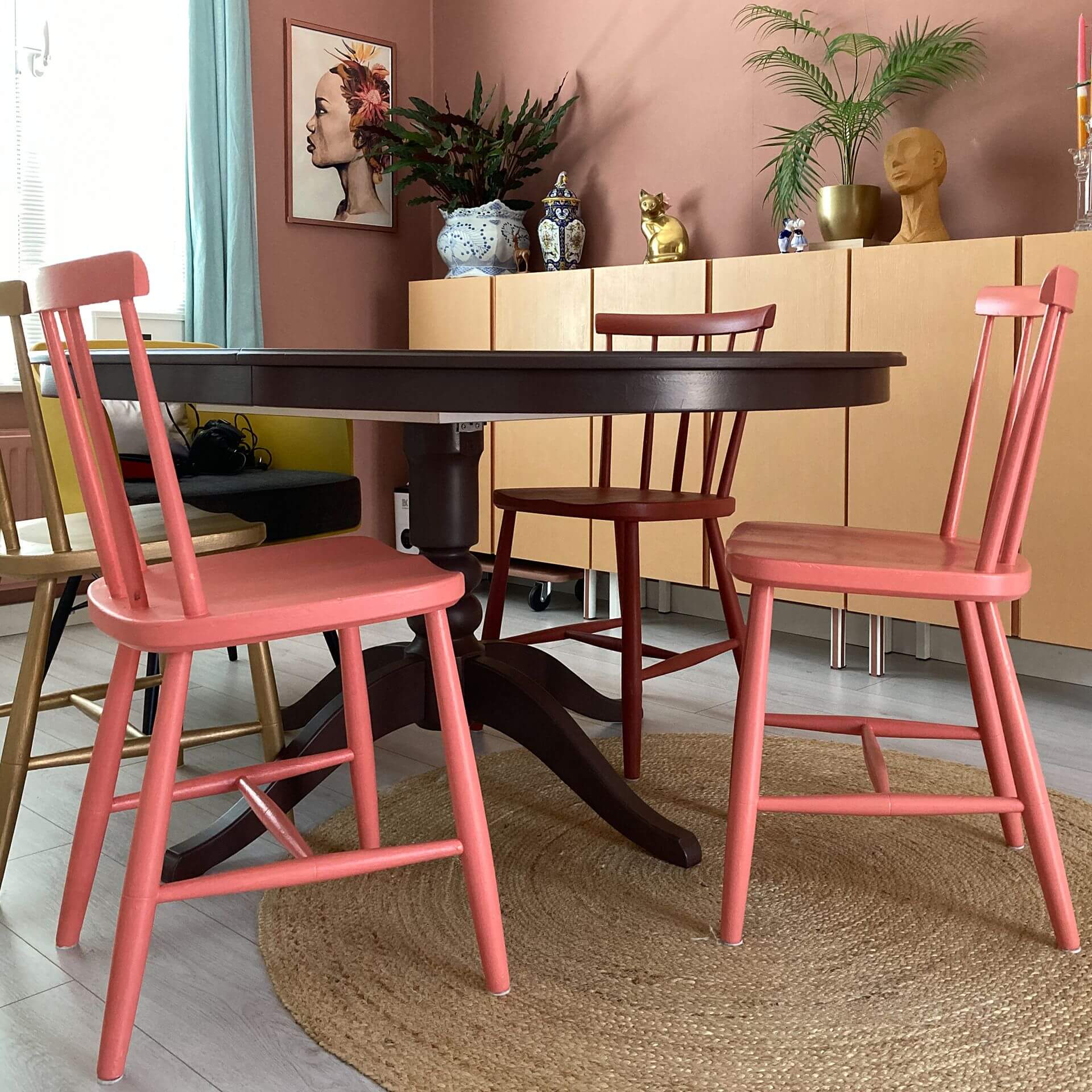
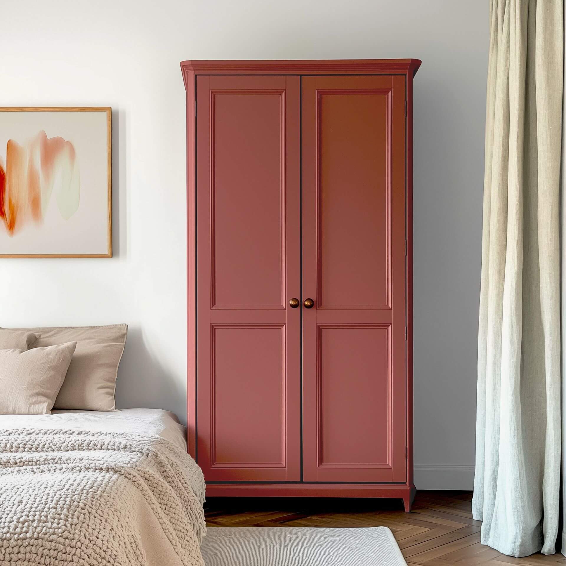
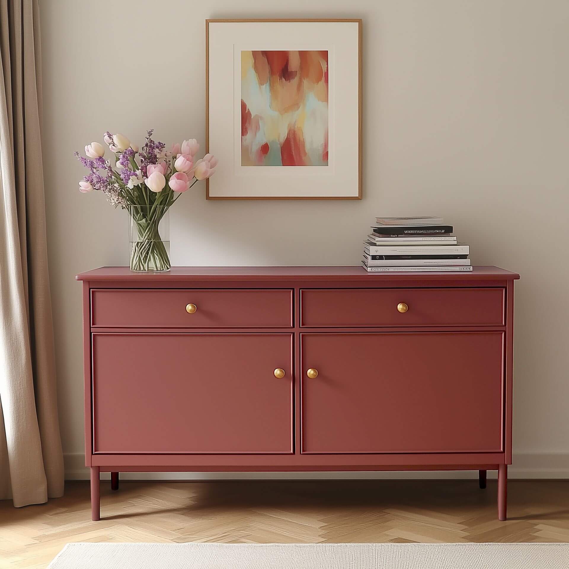
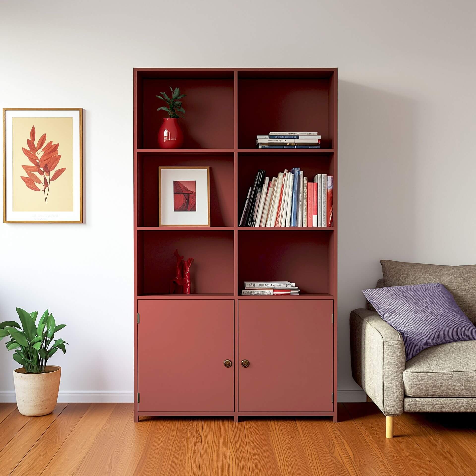
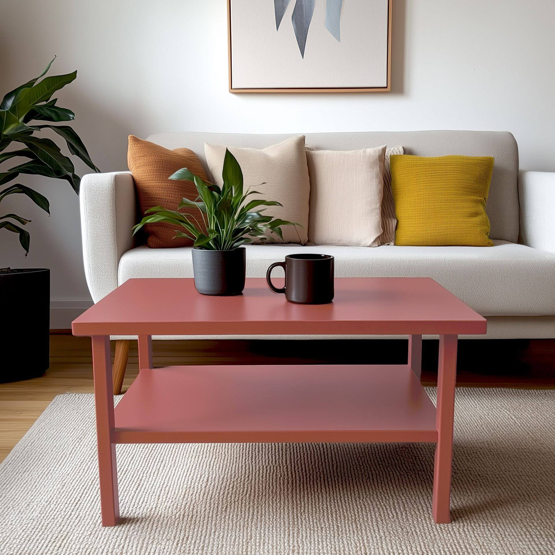
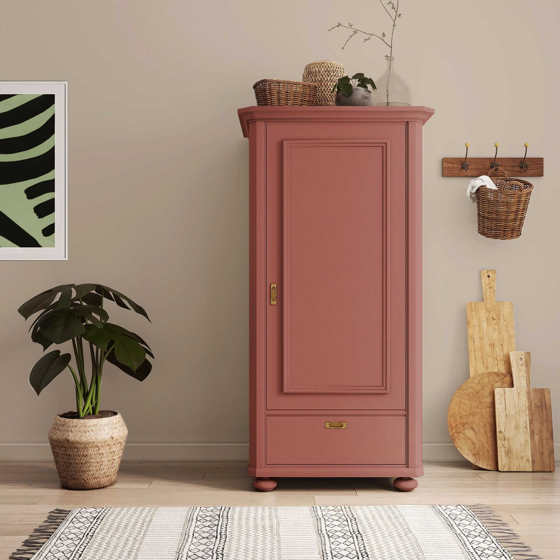
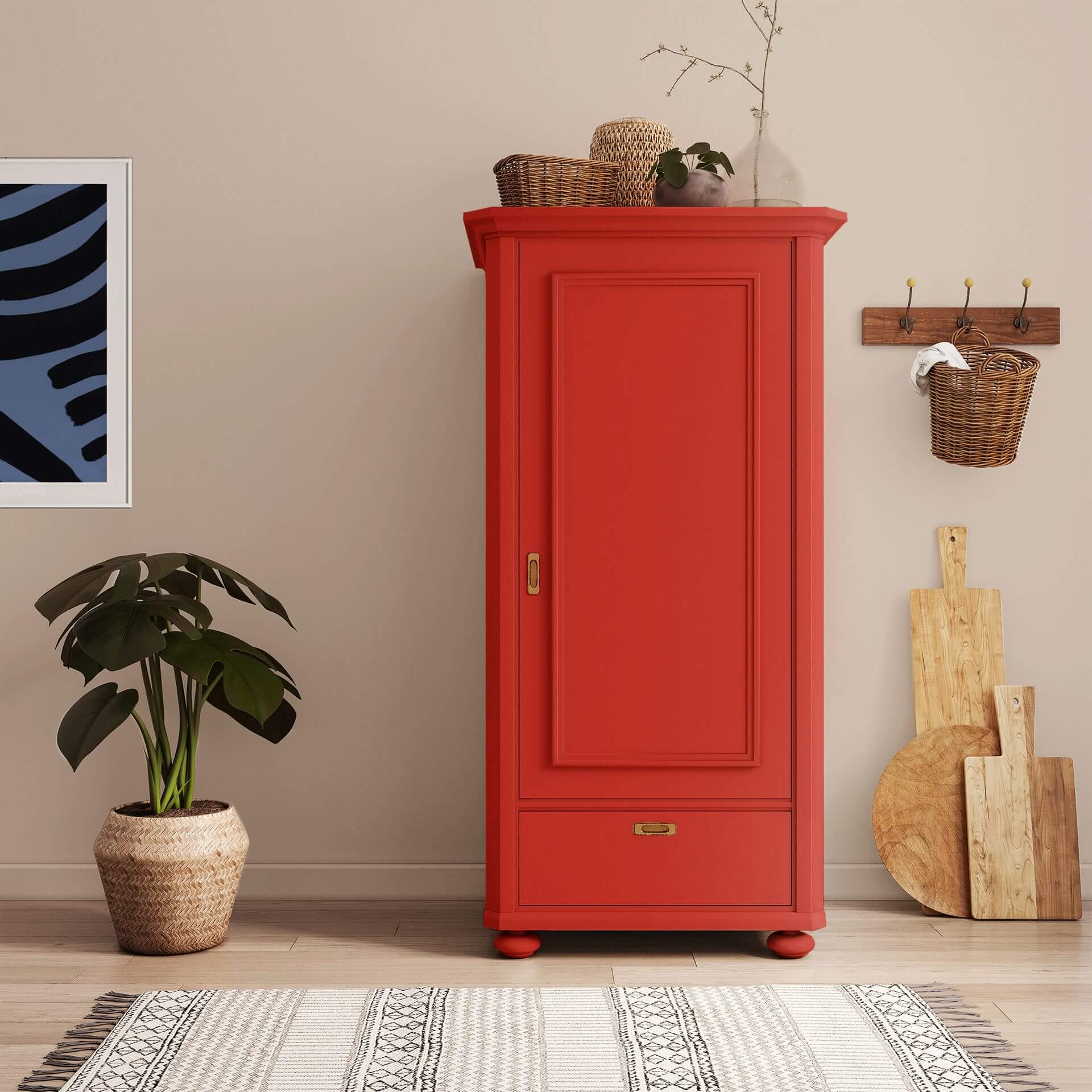
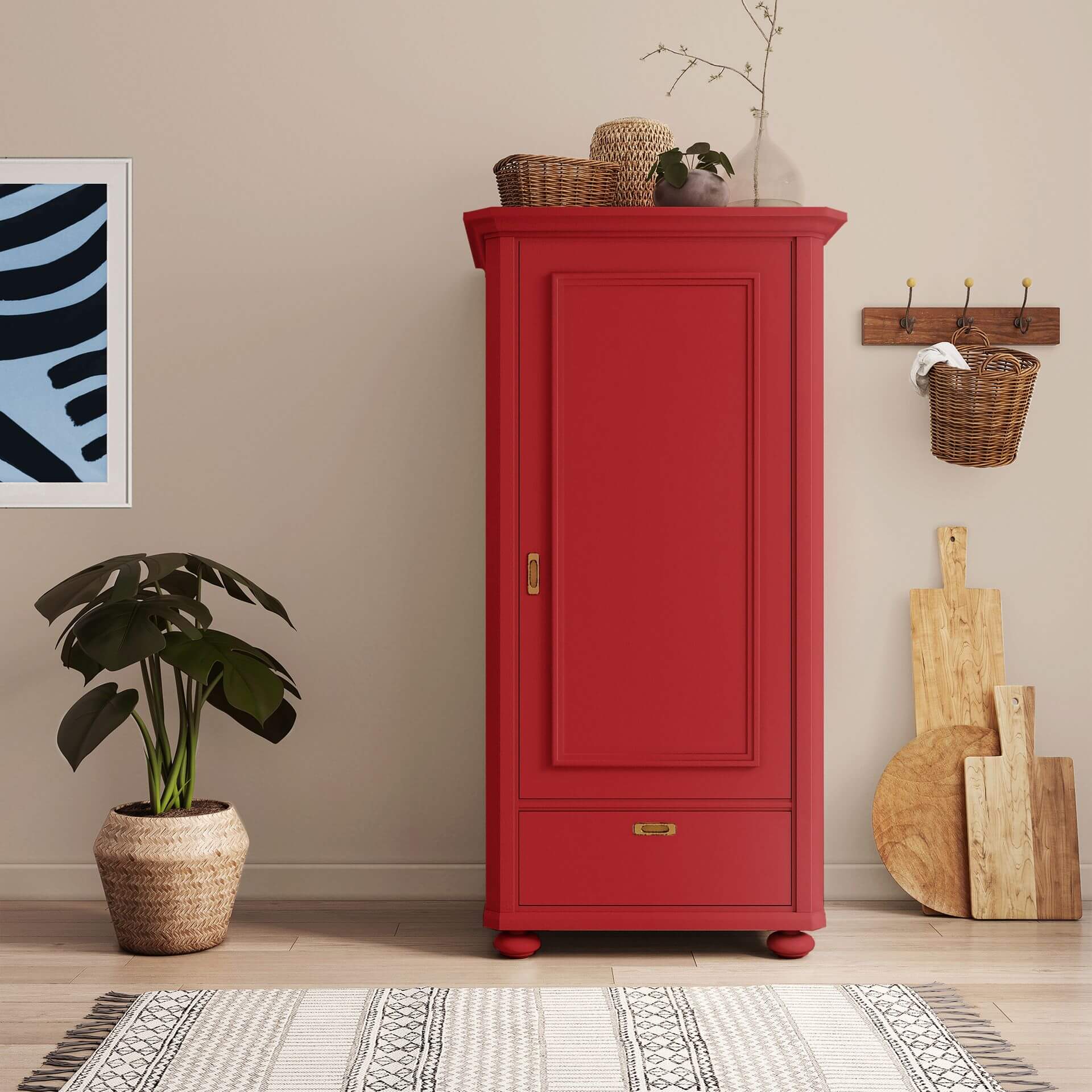
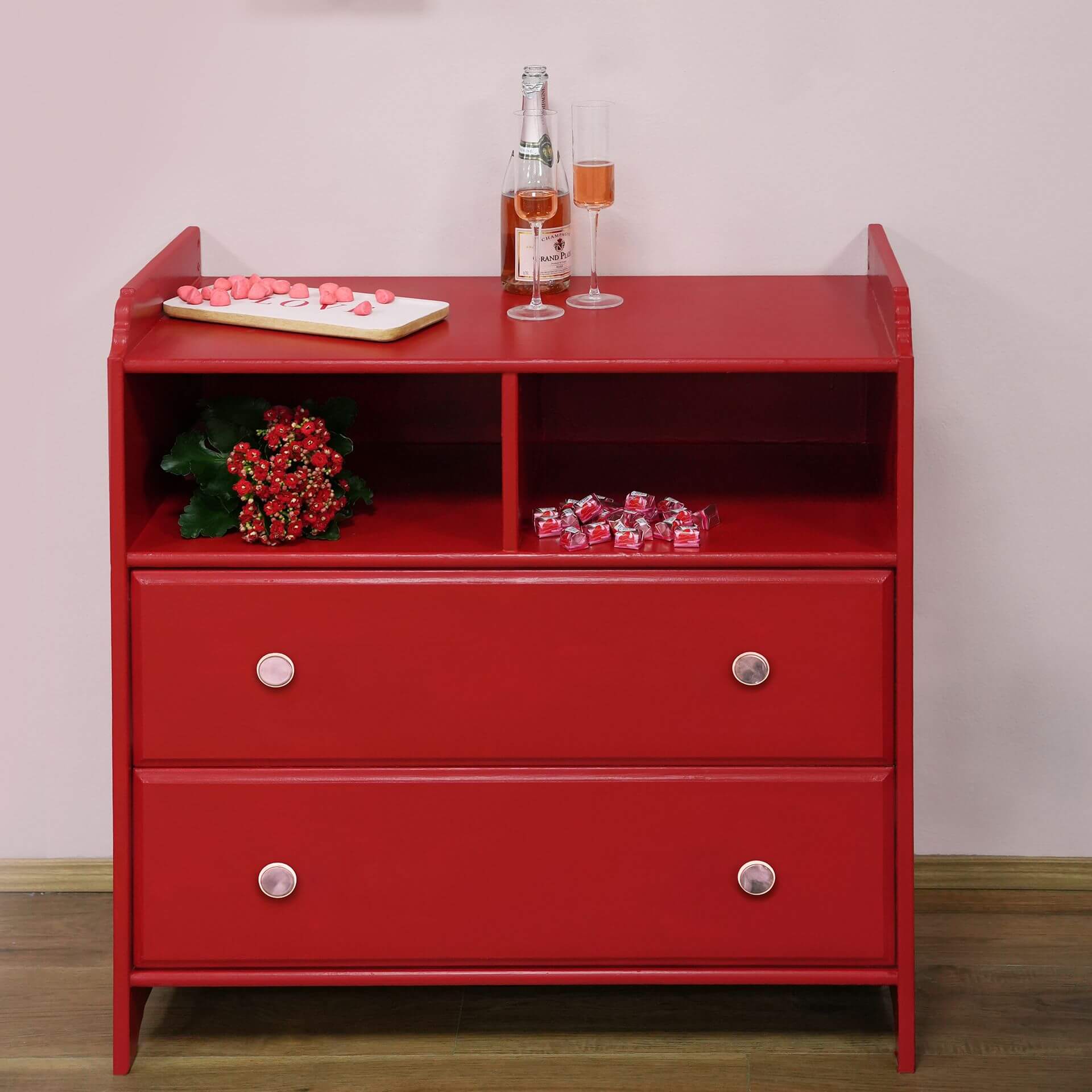
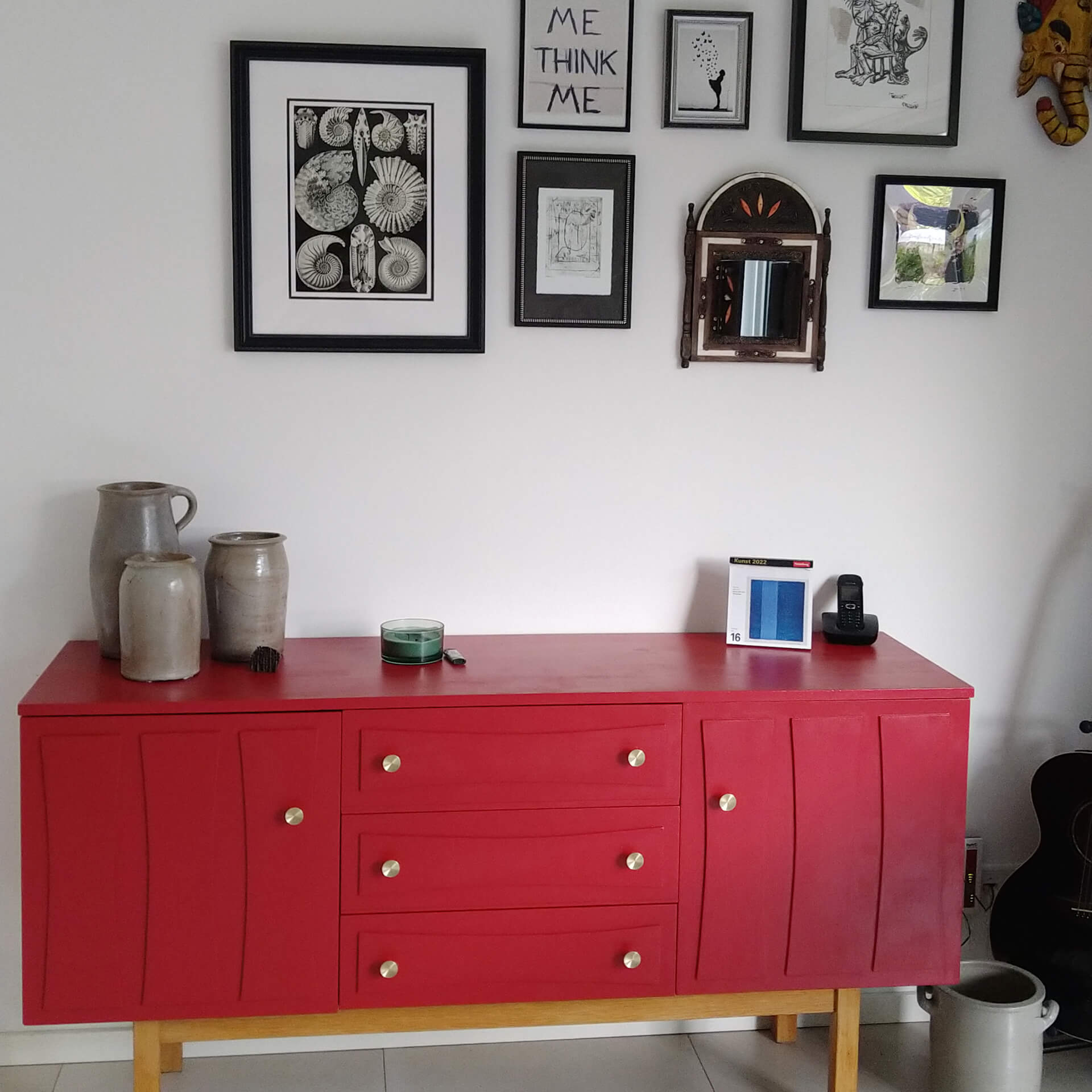
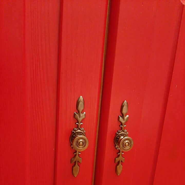
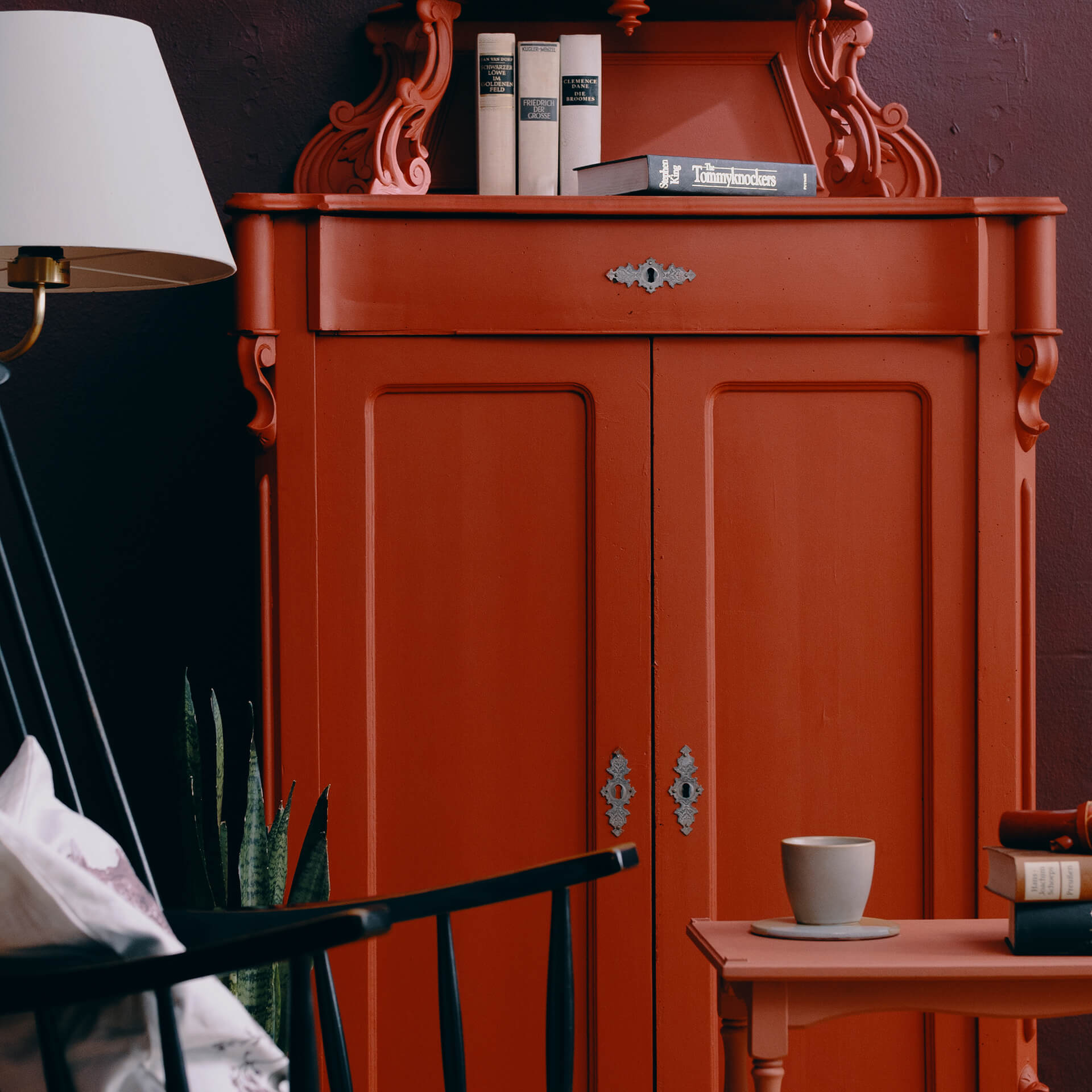
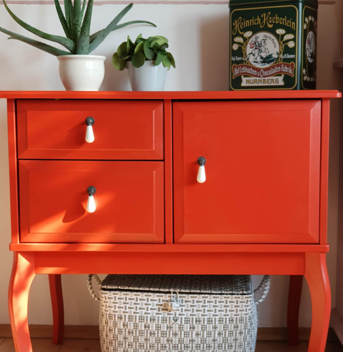
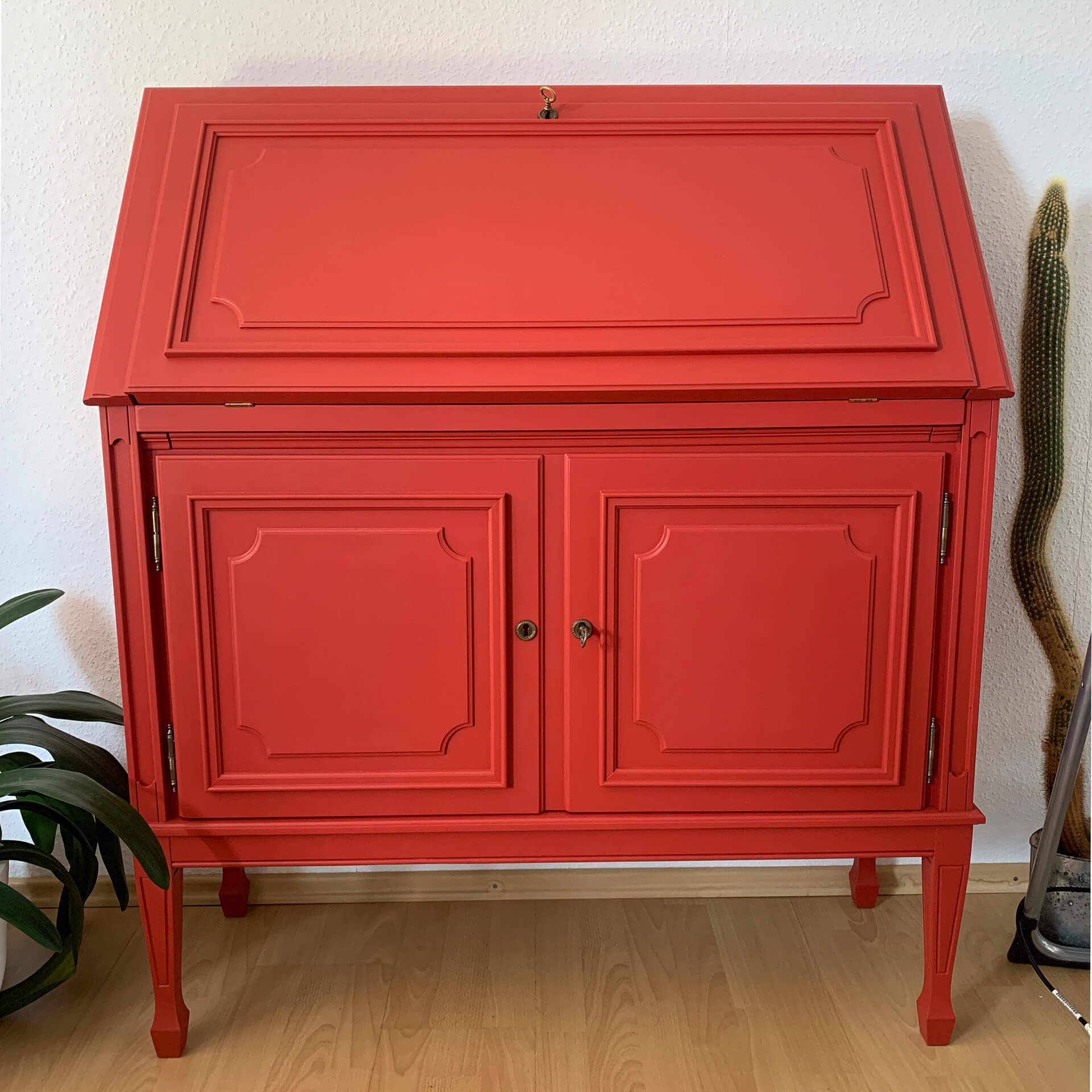
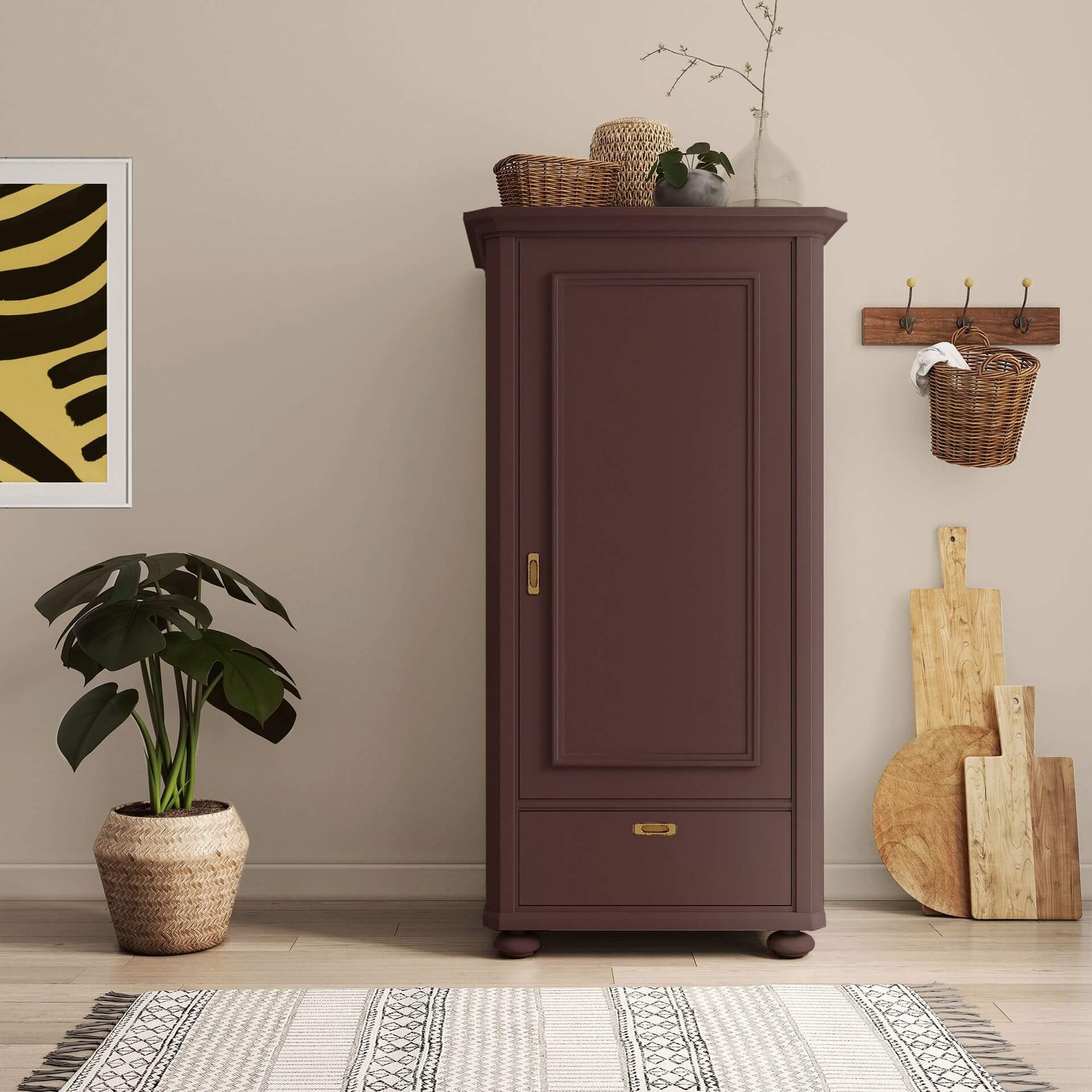
Our red furniture paint transforms any ordinary cabinet into a true statement piece. Red with Chili on a chest of drawers will draw every eye and inject passion into a room. It's also intriguing to combine two different red shades. Perhaps you could paint the exterior of an open shelf in Red with Sweden and the interior in Red with Clay – or vice versa? Our paints adhere to almost any surface without tedious sanding, giving your furniture a high-quality, durable look. You can even use them on IKEA furniture or other smooth surfaces. For these, your first step is to apply our primer To Bond & Block to ensure excellent adhesion for the paint.
Red Wood Paint: Pure Joy for Dopamine Decor
Red wood paint is the ultimate energy boost for the popular Dopamine Decor style. This trend embraces colours that evoke happiness – and few hues convey more vitality than a bold red on wooden surfaces. Red lacquer creates a positive, lively atmosphere, making red wood paint particularly well-suited for your garden or balcony.
Red Garden Furniture
In the outdoor area, red wood paint is an absolute classic. Inspired by the charming houses in Sweden, you can also paint your garden shed with red wood lacquer. If your home’s interior is decorated in the Scandinavian style, a careful touch of Red with Sweden is a must. Use this warm shade to add subtle accents. This warm red pairs beautifully with wall paints in natural tones or delicate greys, and never feels overbearing.
For extra durability and weather resistance when painting garden furniture, fences, or even exterior doors and gates, choose our Balkon & Garten Lack. Feuerglut Rot blends seamlessly into its surroundings, creating an eye-catching feature without being overpowering.
Shop Red Paint Online at MissPompadour
You can choose from a wide range of payment options. We dispatch your paint quickly, prioritising the reuse of materials in our packaging and almost entirely avoiding plastic.
If you're unsure about your colour choice, our fantastic colour cards and complimentary consultation are guaranteed to guide you. We're also here for you every step of the way as your project progresses. This means you're fully supported throughout the entire process, should you have any questions or require assistance. So, nothing is stopping you from living life in glorious red!
Which colour shades go with red?
When it comes to combinations, the colour red is a real all-rounder. The question of what to pair with red depends entirely on the effect and mood you want to achieve. Naturally, all white and natural tones pair beautifully with red.
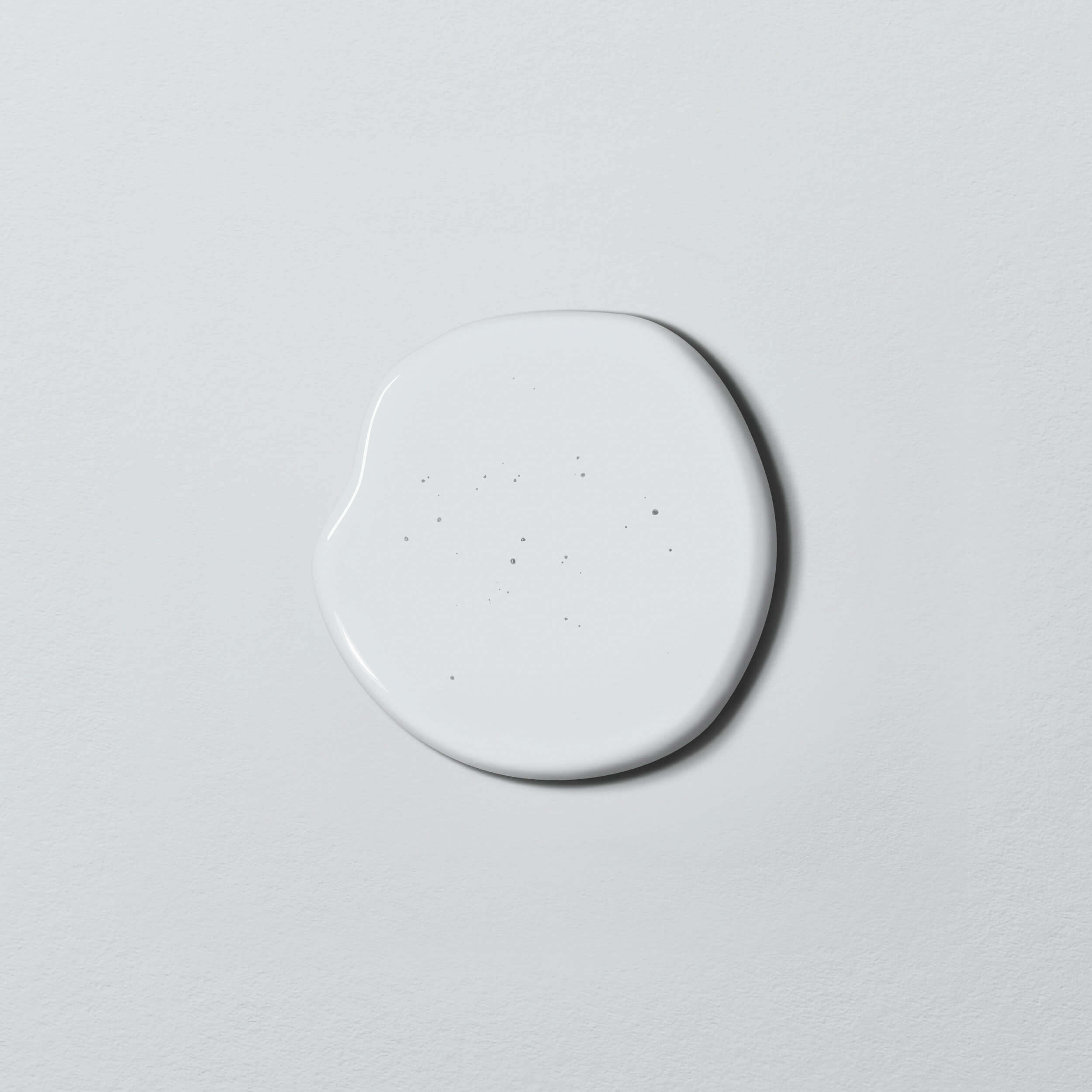
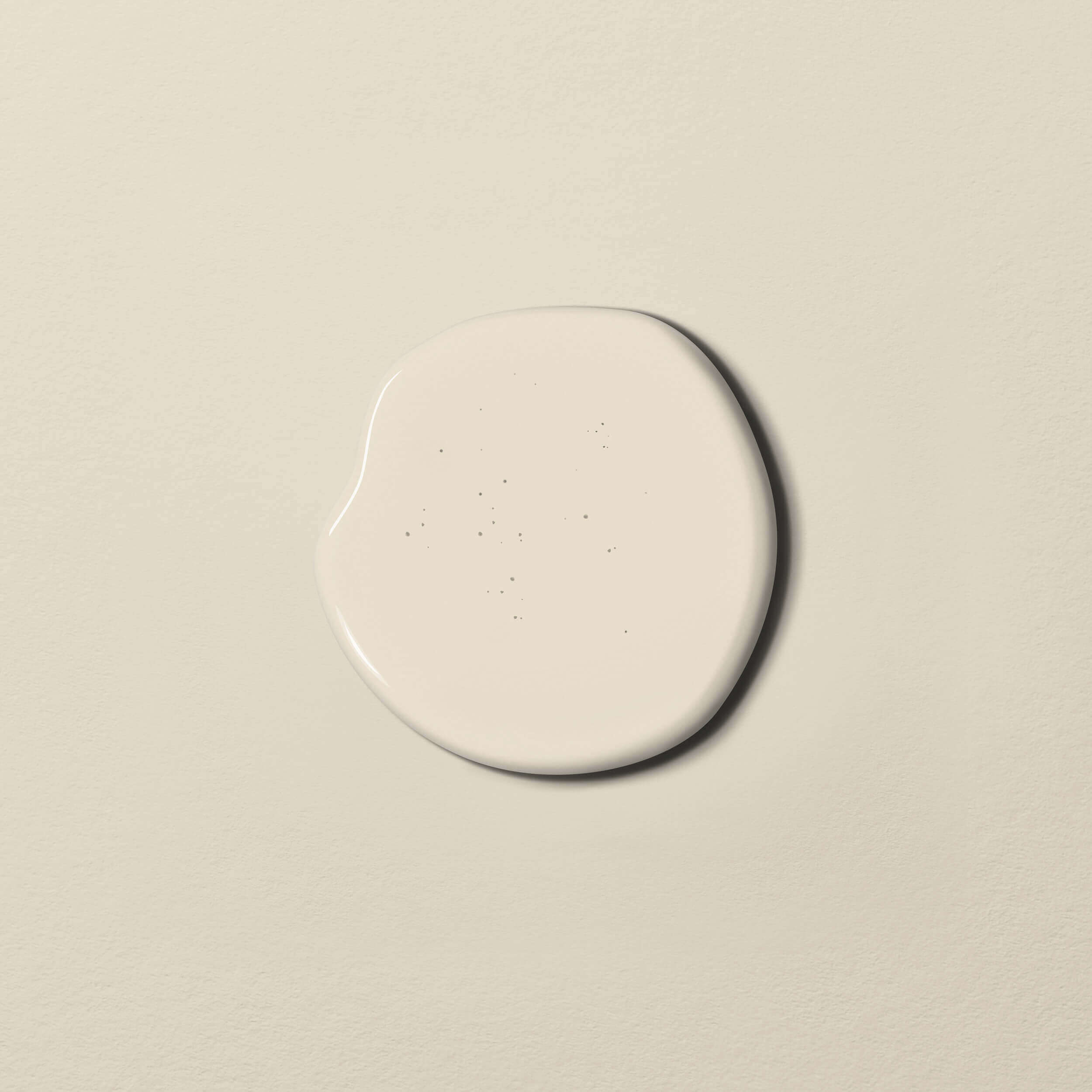
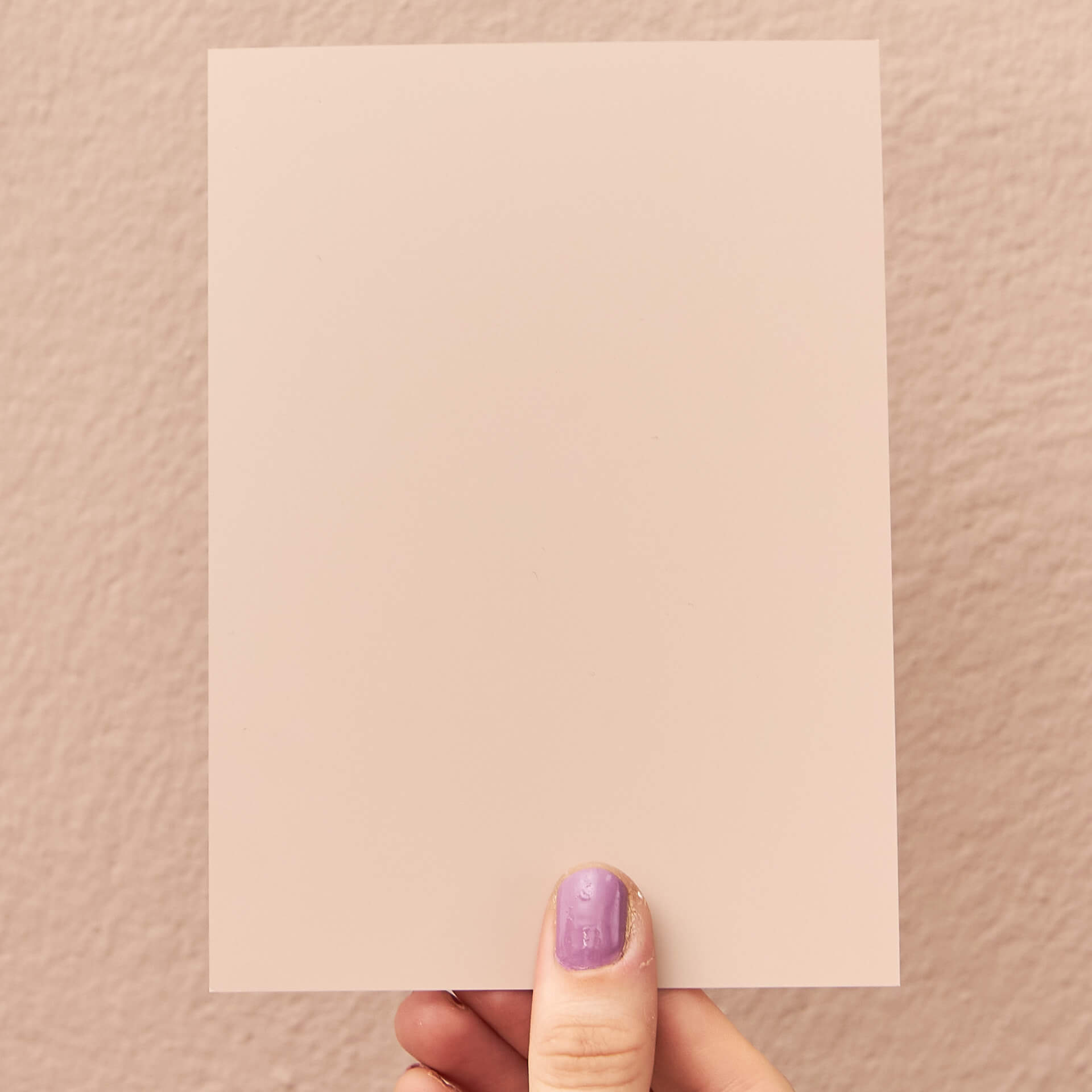
For the best results, look for a neutral tone that contains red pigments. White with Powder is just such a neutral shade from the Just Paint collection. Our eyes subconsciously draw a connection between the pigments in different colours, which helps you achieve a harmonious overall finish.
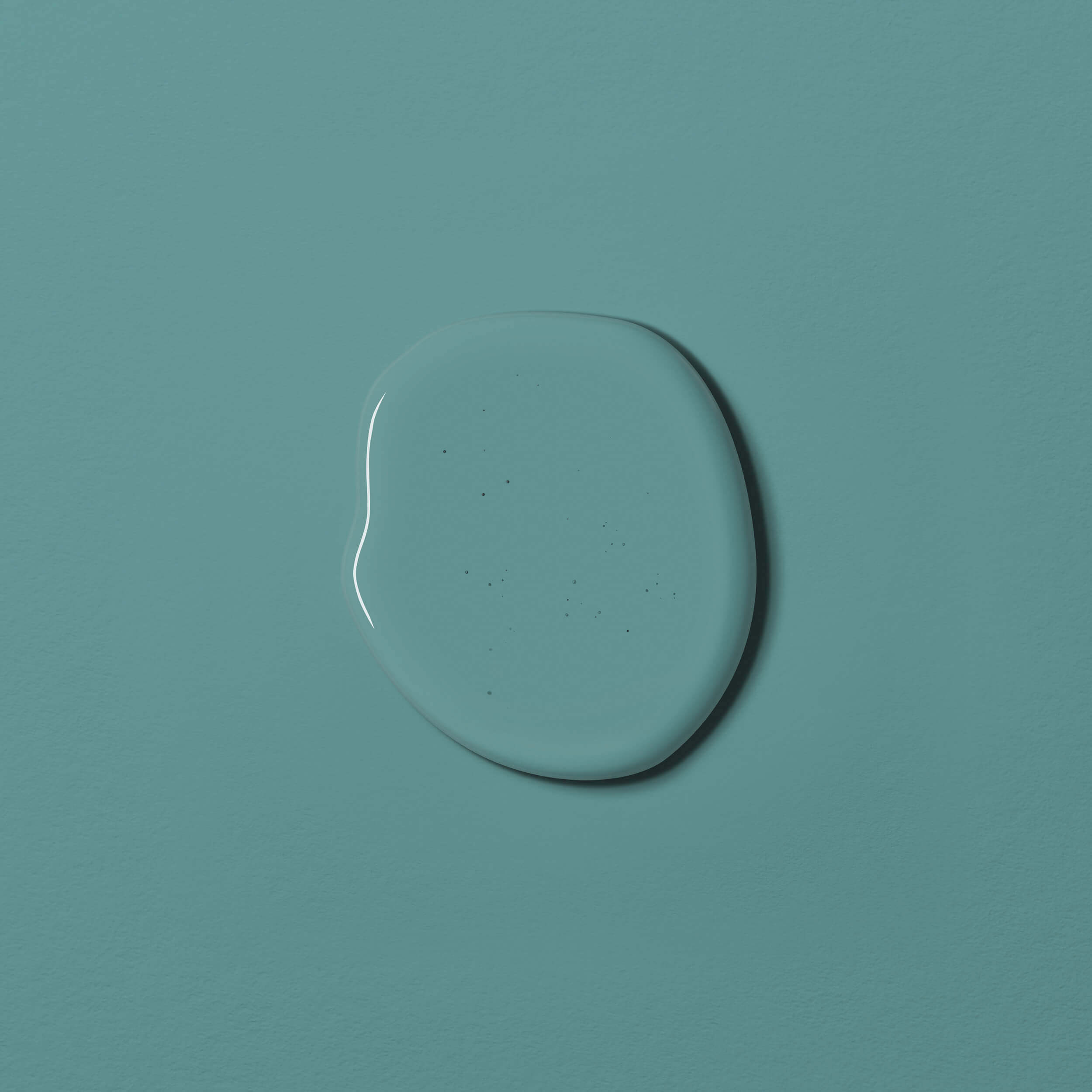
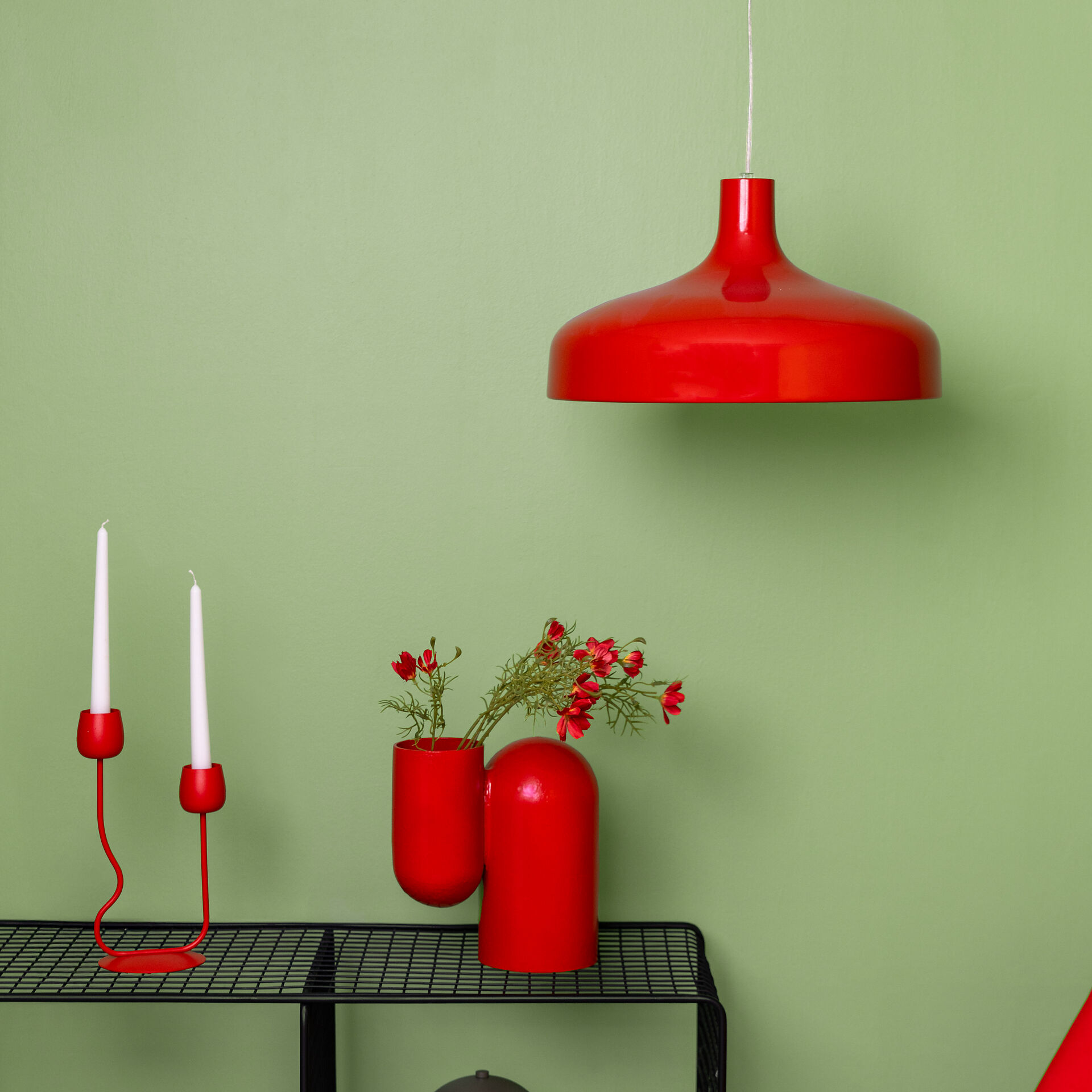
Light red shades combined with light beige tones feel warm, summery, and close to nature. Red also complements its complementary colour, green, very well. For example, an accent wall painted in the deep wine-red Red with Merlot will really make a chest of drawers in Green with Sage stand out.
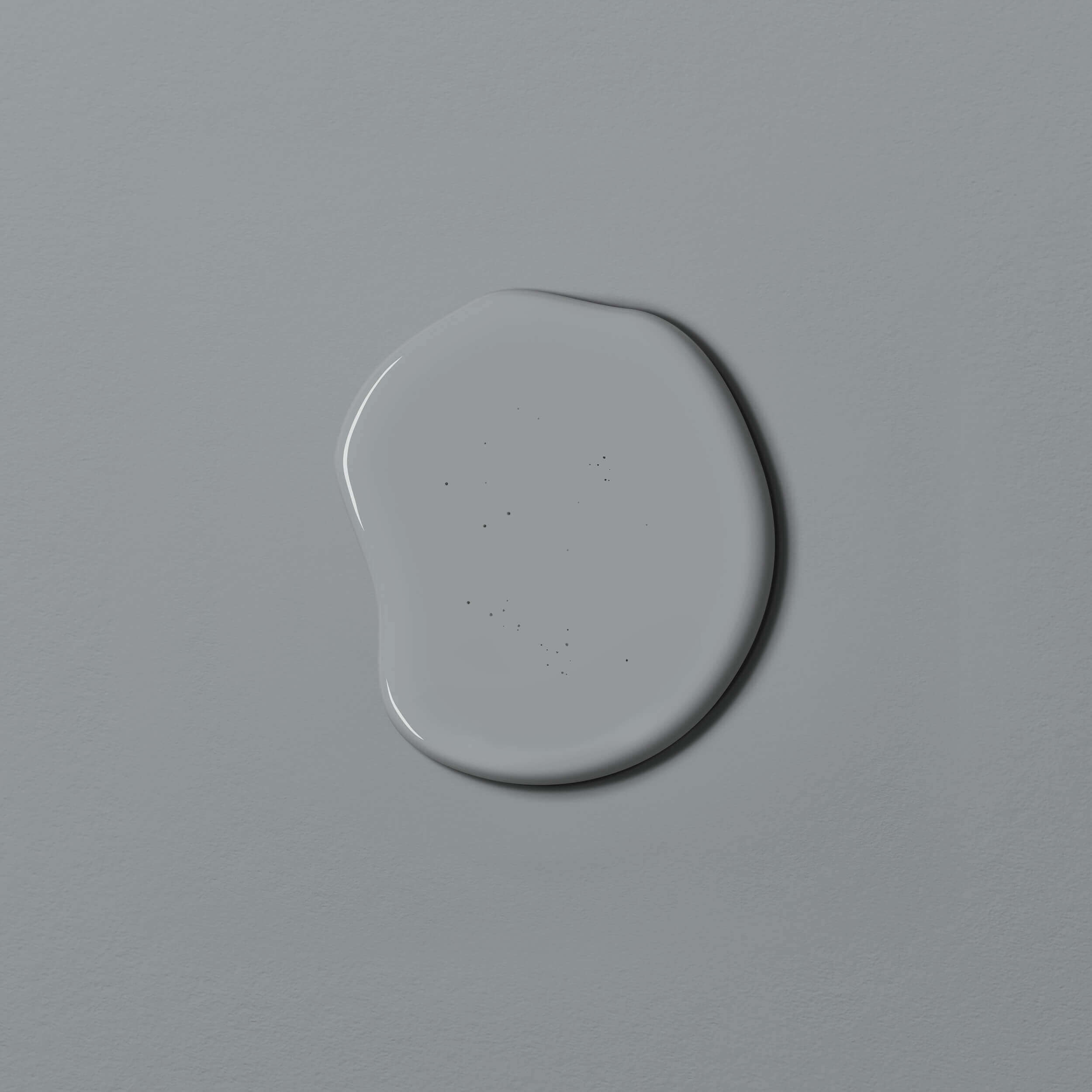
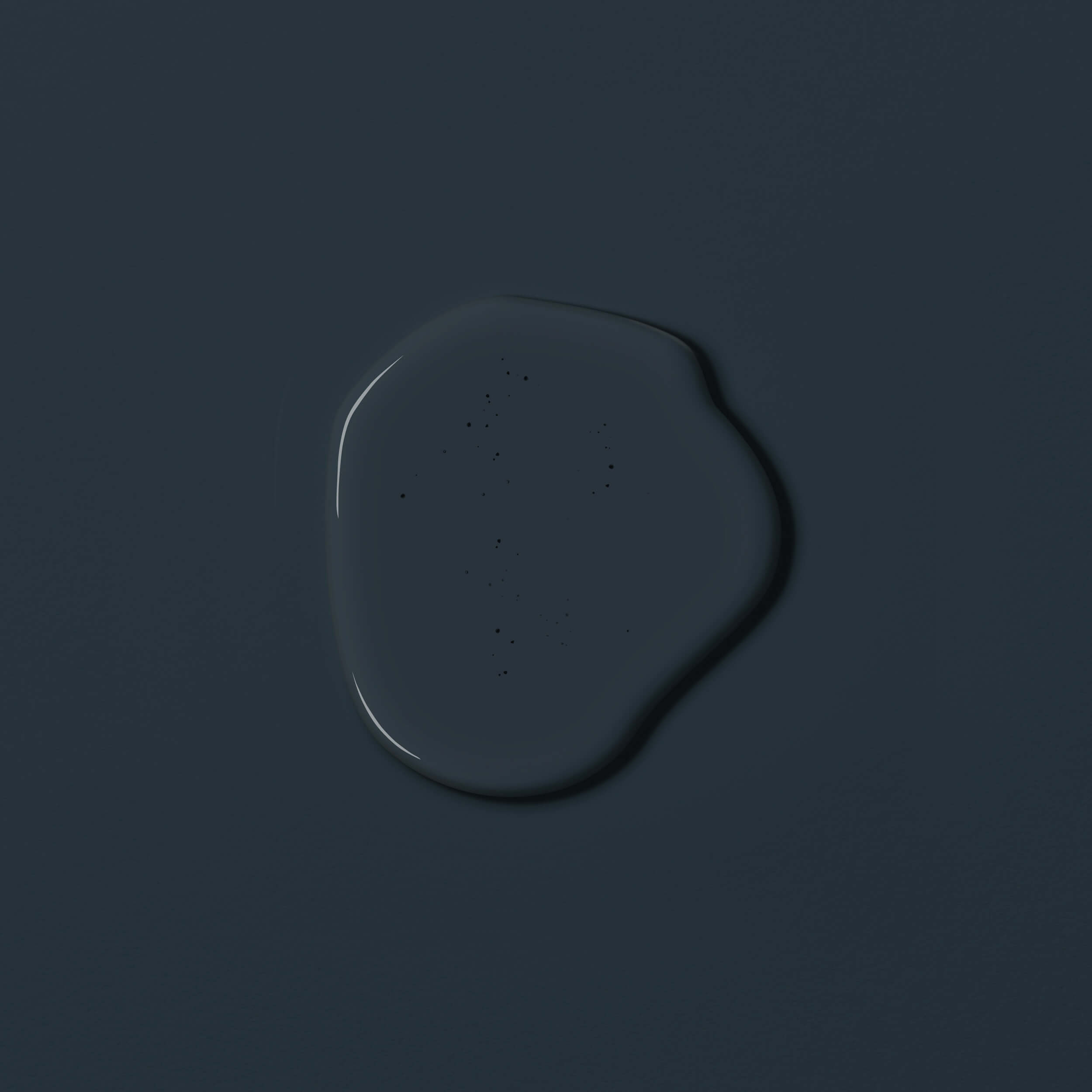
All shades of grey, whether light or dark, form a perfect partnership with red. Mouse grey (e.g., Grey with Green) makes red look particularly intense, while dark grey (e.g., Grey with Peat) softens the impact of a bold red. For a relaxed and stylish home, grey and red make for an exceptional colour combination.
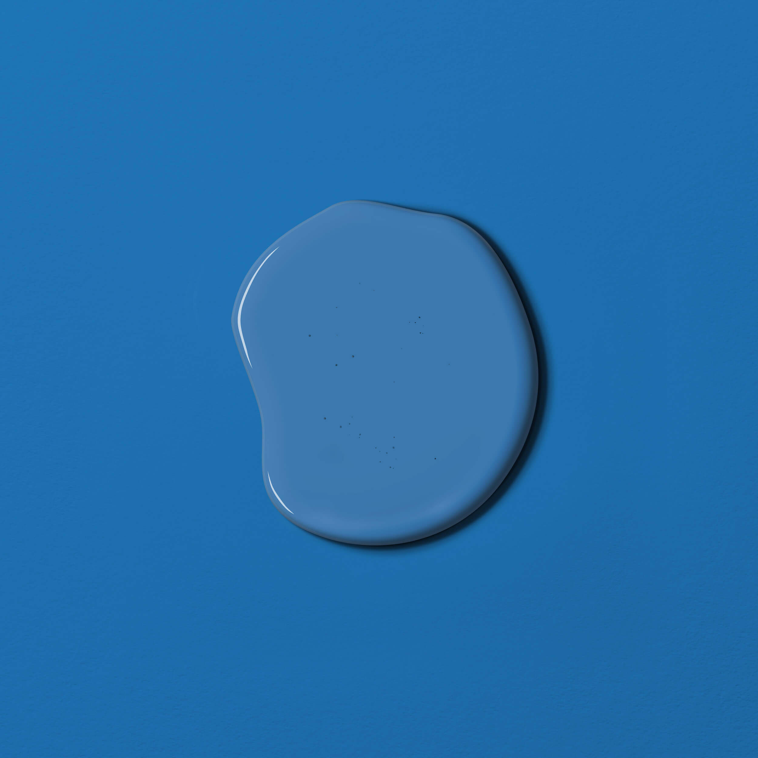
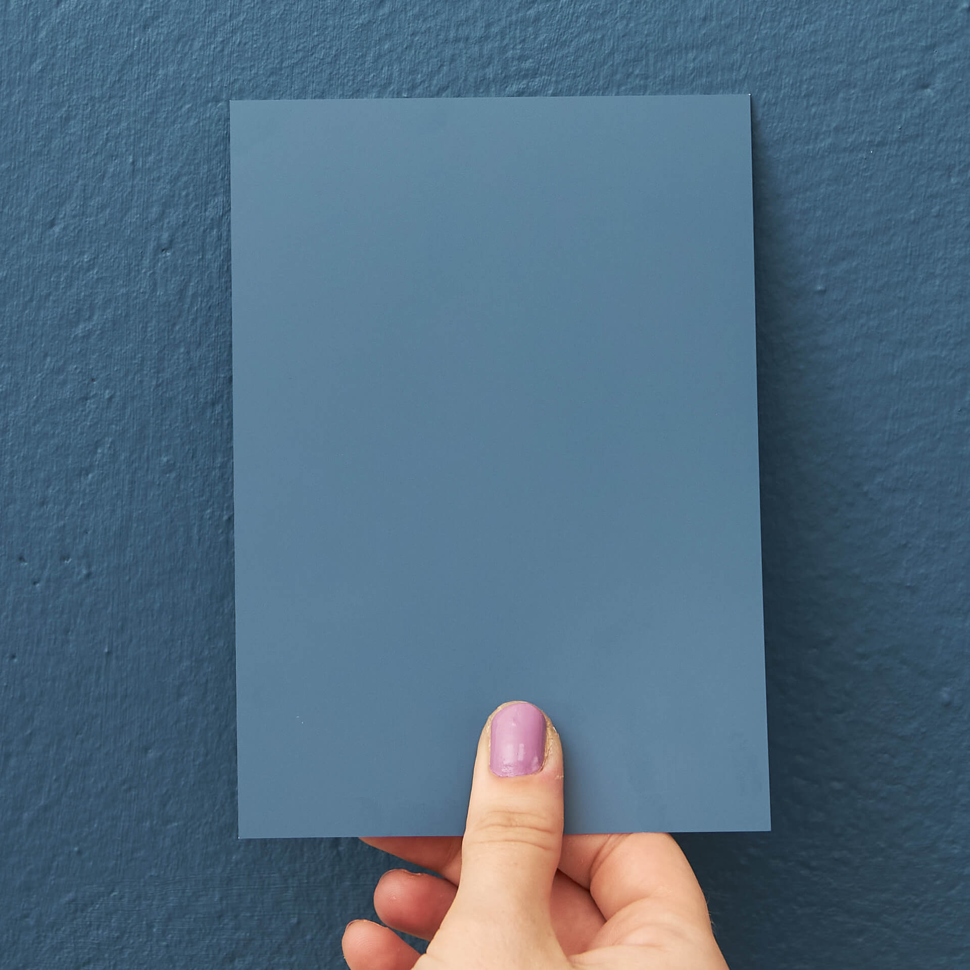
The colour combination of red and blue is practically a classic: this warm-cool pairing is incredibly expressive and makes both colours appear more striking. A firm favourite is the combination of the vibrant Red with Cherry with the rich Blue with Jeans. A light blue or aqua-blue wall with a deep red sofa in front of it creates a surprising arrangement that is sure to be a highlight in your home.
Last but not least, red can also be beautifully combined with pastel shades. This means you can even use red tones in a child's room. Have you ever considered pairing red with pink? You’ll be amazed at how wonderfully these hues harmonise with one another.
What can I stylishly combine red colours with?
Just as the various shades of red are diverse, so too are the materials you can pair with them.
If you use Swedish Red for a Scandi style, natural woods are a particularly good match. Complete this style with cosy cushions and blankets, candles, and faux fur rugs.
The combination of antique furniture made from dark woods and red walls looks especially sophisticated. With a bold red shade, antiques can find a visual bridge to the modern day.
If you prefer a more glamorous approach to red, gold accents and accessories made from velvet and silk will suit your interior style. Baroque-style picture frames truly come into their own against a red wall, enhancing that refined atmosphere.
Of course, you can also use red for a modern, minimalist Industrial style interior. Here, it is a great idea to refresh the dominant black and white with eye-catching red details, such as a statement piece of furniture. For a Retro style, on the other hand, graphic patterns and furniture with clean lines work perfectly.
Which colours go well with bright red?
If a bright red is intense and contains yellow undertones, such as Red with Chili, it is best combined with neutral shades. Beige and grey tones are ideal. If the bright red is warm and welcoming, like Red with Coral, it pairs beautifully with green in addition to neutrals. Red shades with blue or black undertones go well with grey, while a warm, light red like Autumn Red complements earthy tones as well as olive.
What effect does bright red have in a room?
The effect of a bright red depends on the pigments it contains. Generally, a bright red feels invigorating, stimulates the appetite, and sparks creativity. However, too much red can also feel hectic or stressful – as they say, it can make you "see red". As always, the secret is finding the right balance!
Which wall goes well with furniture in light red?
Red furniture paint turns a simple piece of furniture into an eye-catcher. Furniture in a light red shade pairs particularly well with beige tones, grey tones ranging from light to dark grey, and green tones from olive to turquoise on the wall.
Is bright red a warm colour?
This depends on which pigments have been added. Red with pigments in beige or white has a warm effect
What is the significance of red in colour theory and culture?
In traditional colour theory, red is considered a primary colour that cannot be created by mixing other tones. The origin of the colour lies deep within the archaic elements of humanity: we instinctively associate it with the glow of fire and the life-giving power of blood. These powerful associations give red wall paint an immense sense of presence and impact. Across many religions and cultures worldwide, red symbolises everything from divine love to heroic struggle and determination.
Why is red so prominent in business and everyday life?
It is no coincidence that many companies and global brands choose red: the colour signals bodily vitality, but also evokes associations with danger or stop signals. In the market, red is used strategically to trigger impulse buys. We also encounter the word "red" constantly in our daily communication – whether in idioms like the proverbial "red rag", "rose-tinted glasses", or the "red carpet". In Germany and many other languages, the meaning of red is firmly linked to power and politics.
What roller do historical pigments like carmine red or ochre play?
The use of red pigments dates back to the Stone Age, when earth colours like ochre were first used. Later, high-quality dyes were often extremely expensive, which established the exclusivity of shades such as purple-red, vermilion or carmine red. Today, the world of modern interior design offers countless ways to adapt these tones—from classic Bordeaux red to modern mixtures with yellow for a warmer feel. When you order from us, you receive a high-quality product at a fair price that is appreciated by everyone as a stylish highlight, whether in modern lofts or classic interiors.