wall paints & varnishes in
Rosa & Pink
Our colours in rose & pink
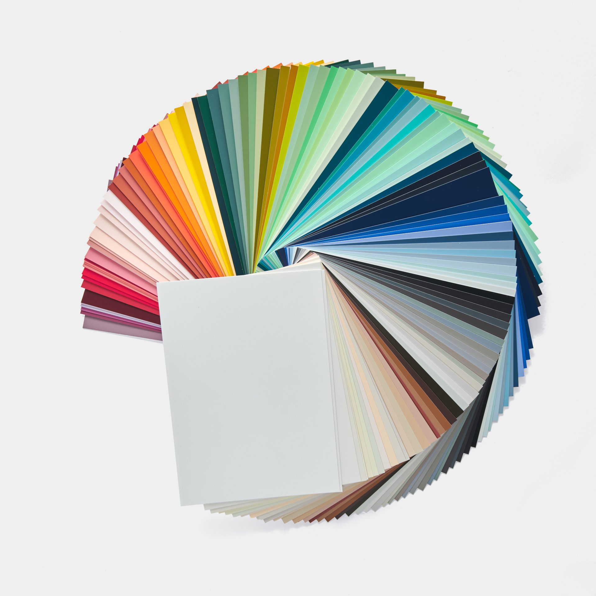
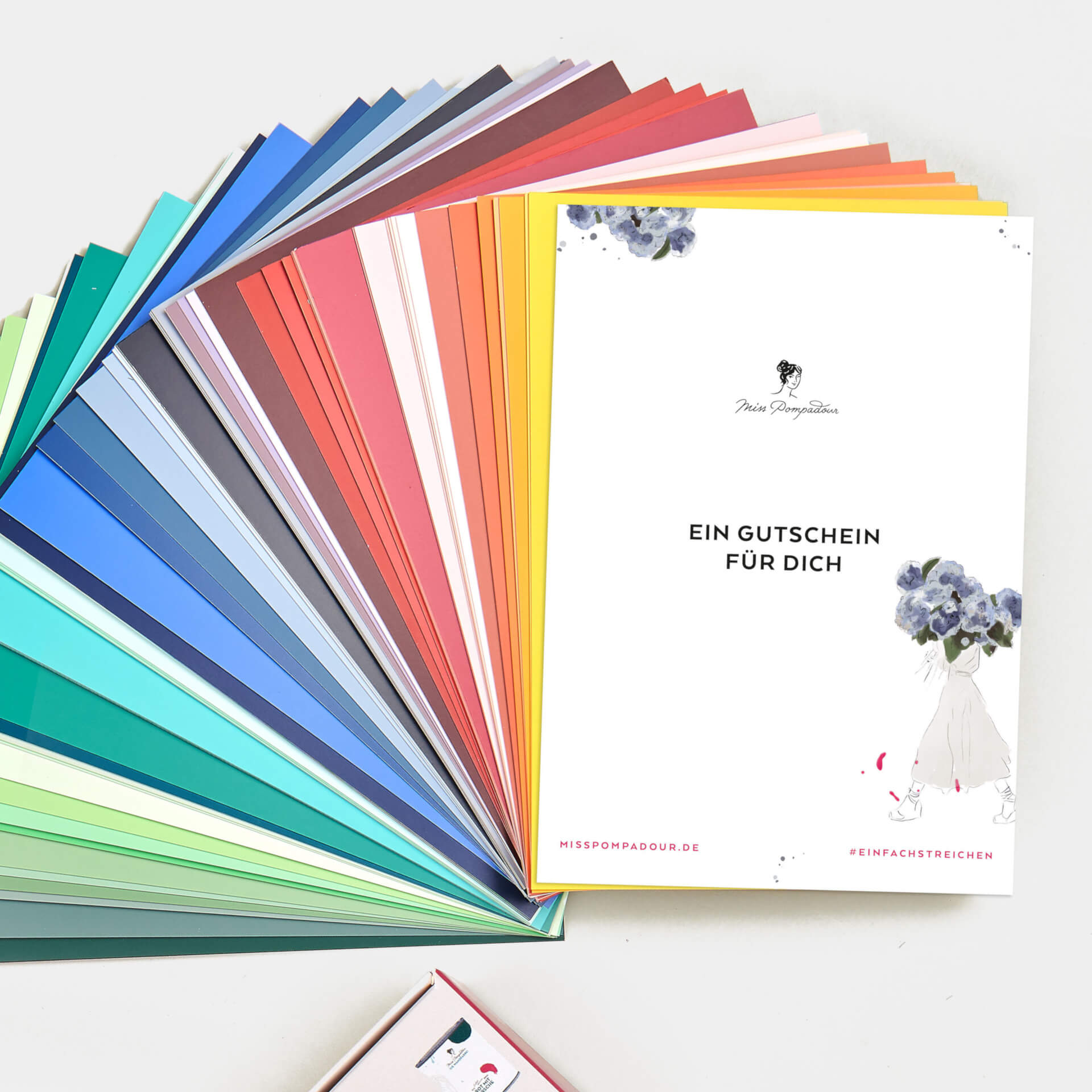
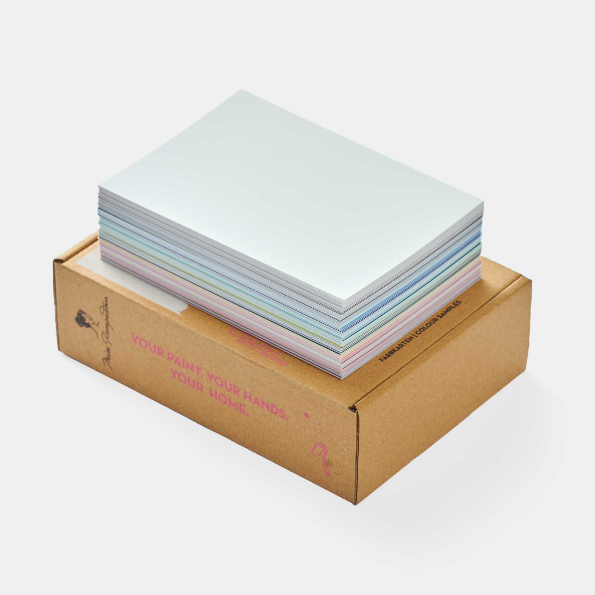

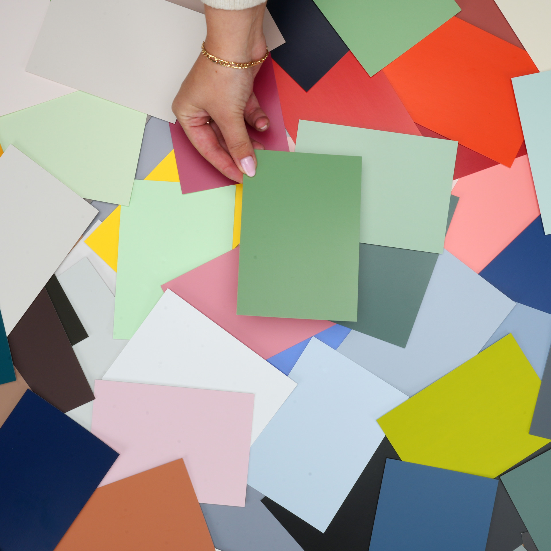

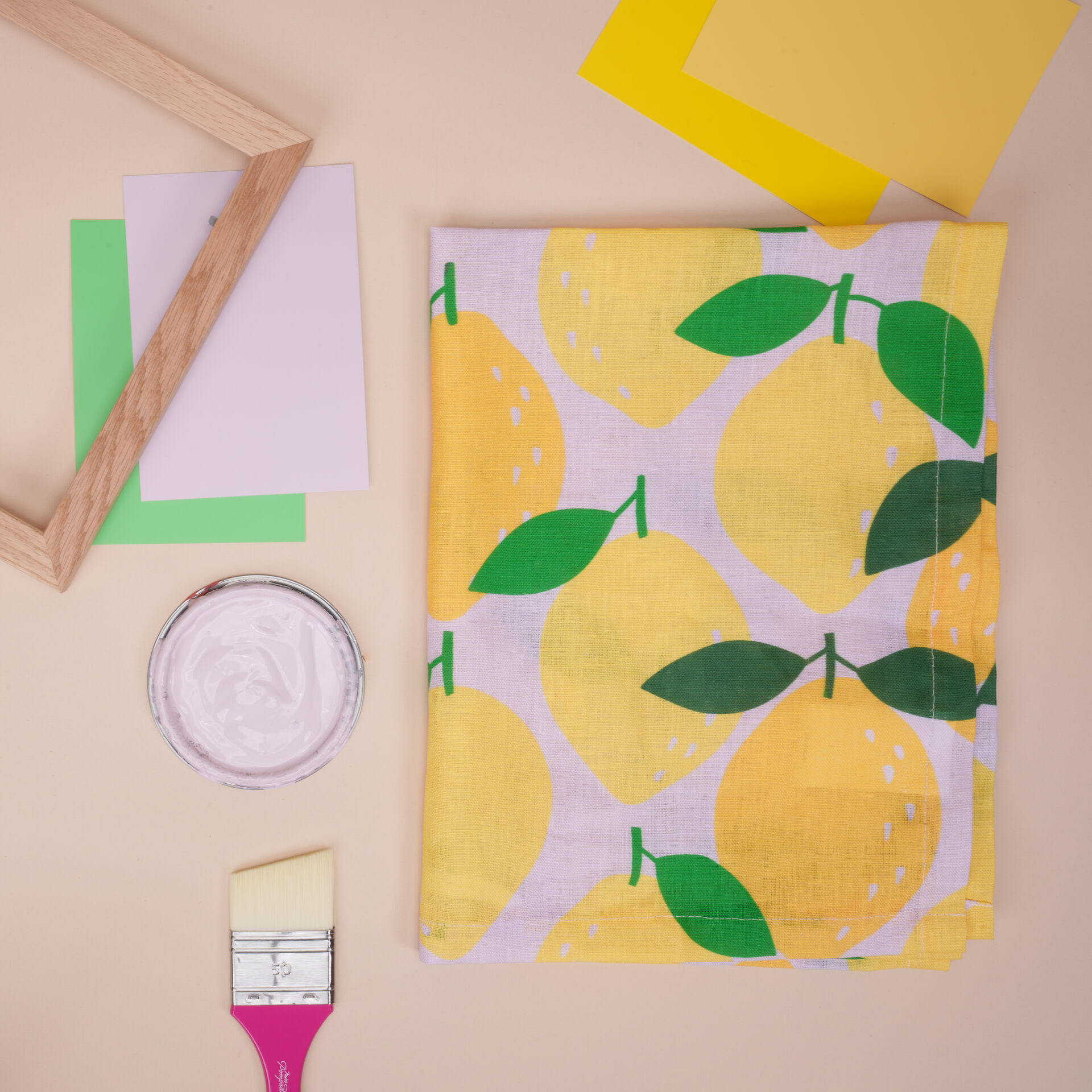
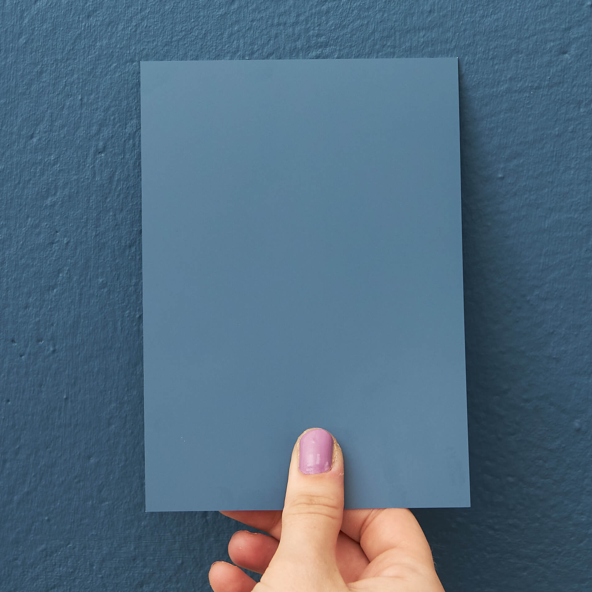
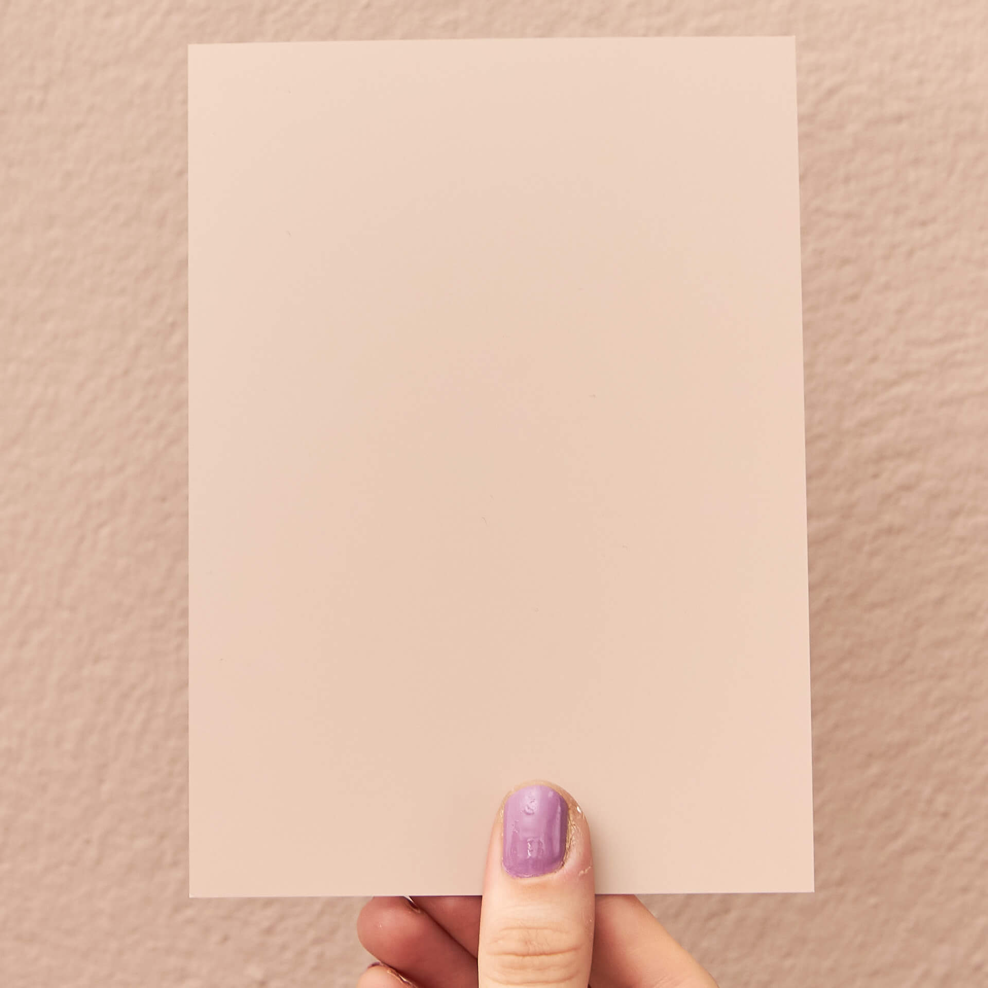
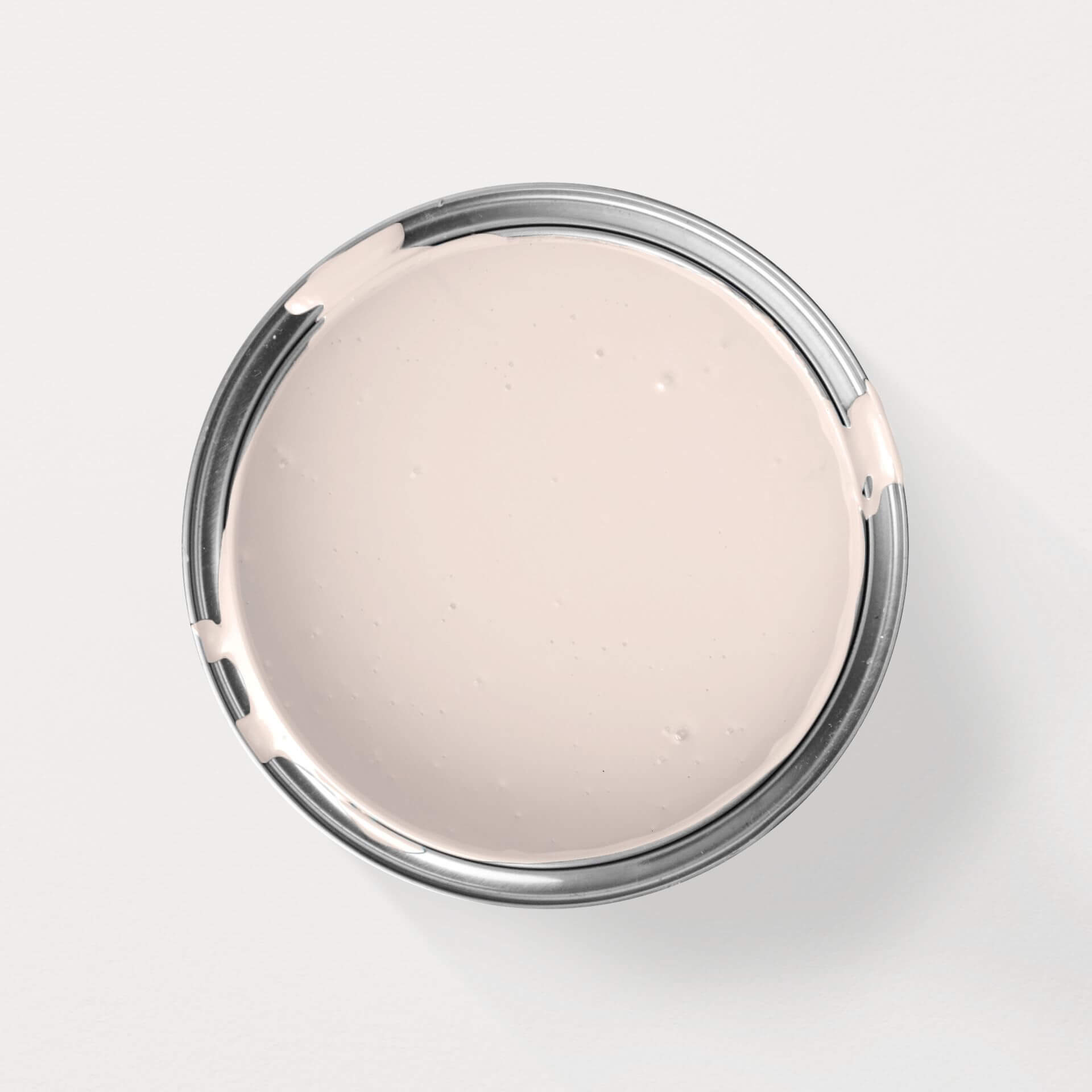

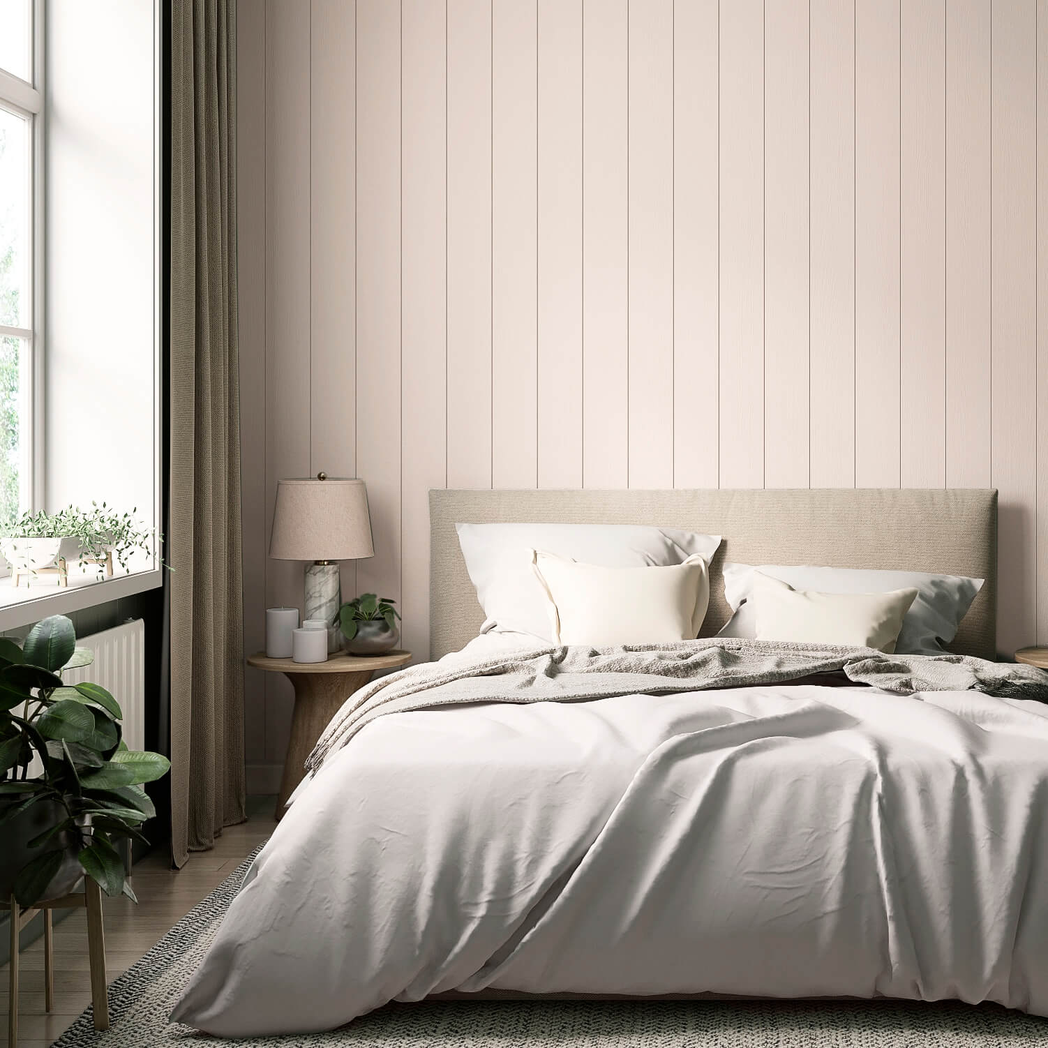
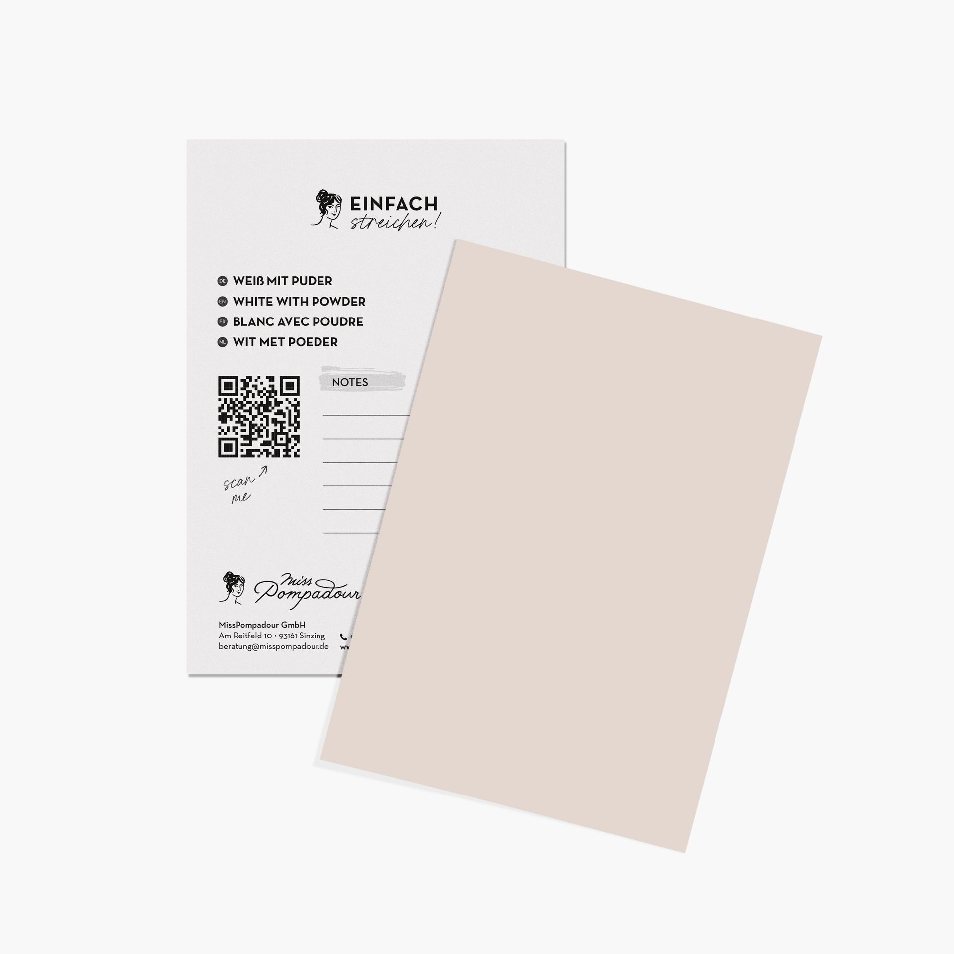
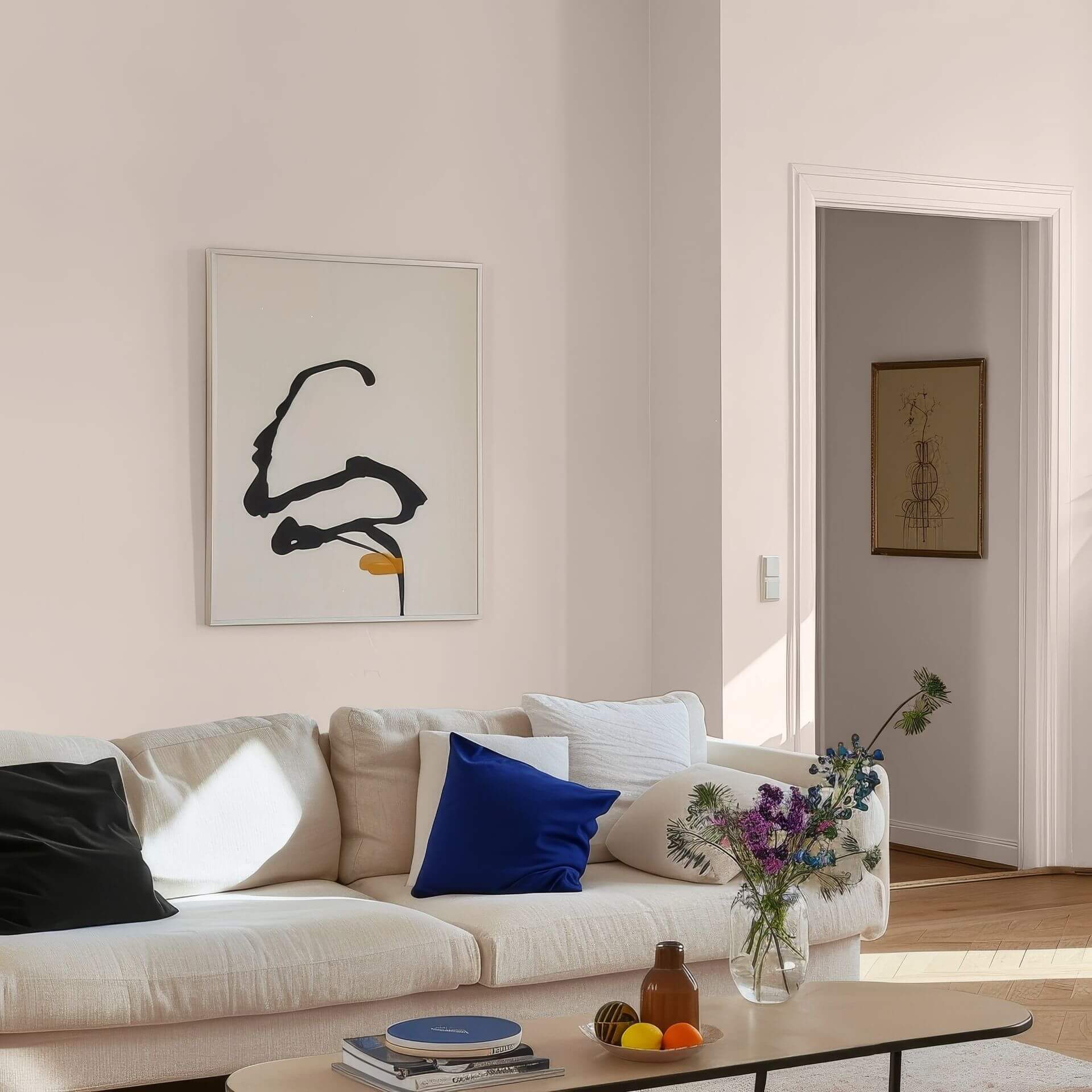
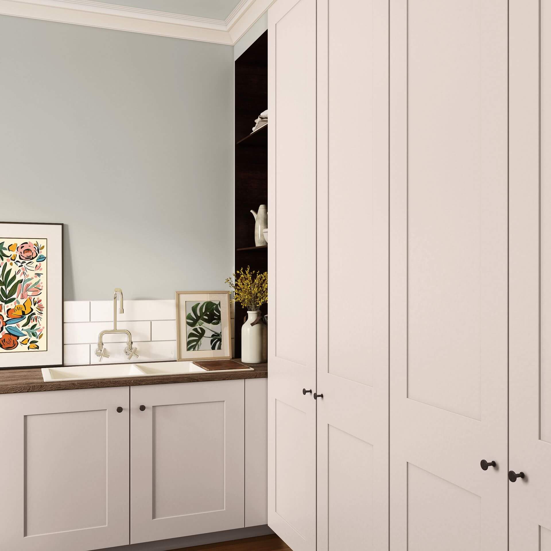
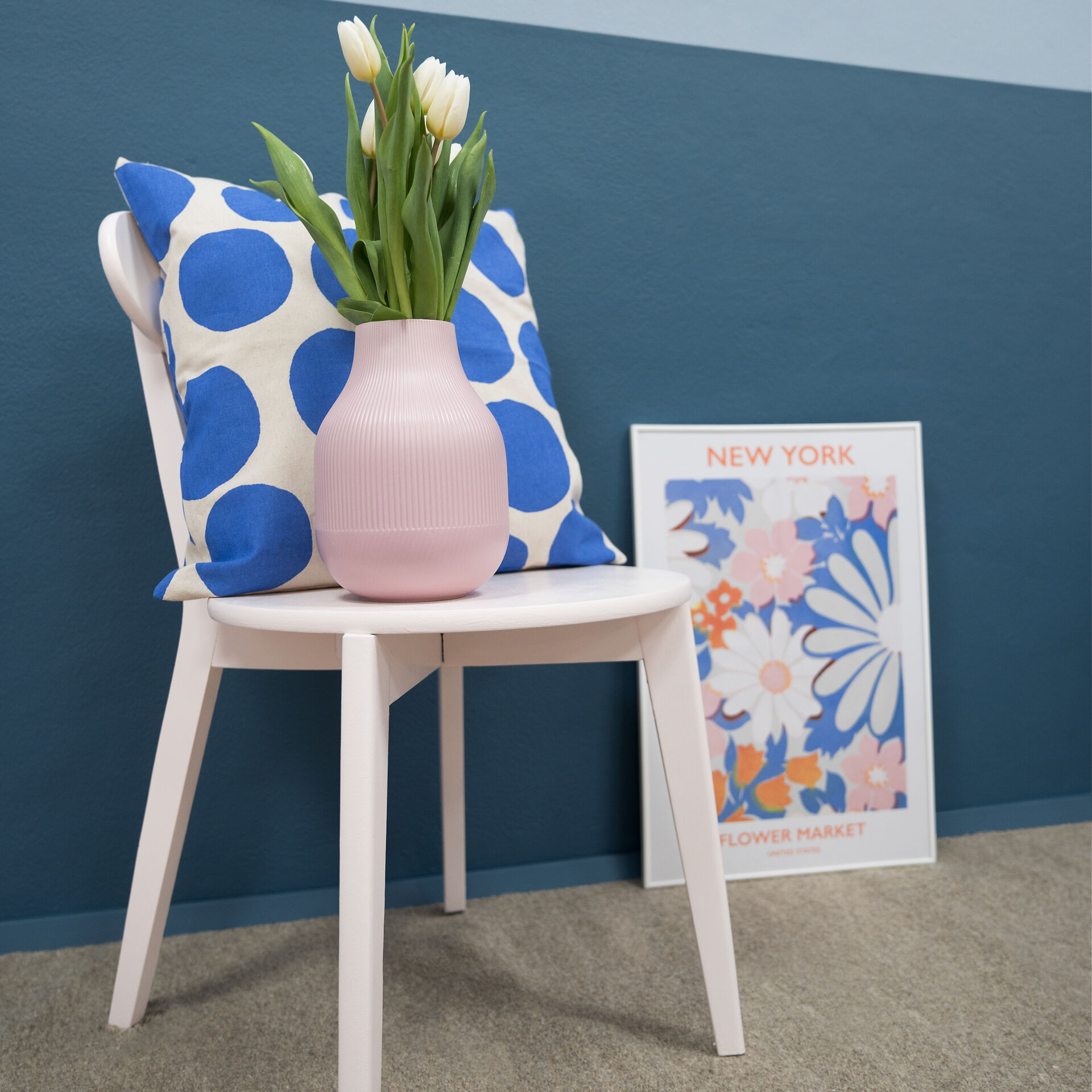

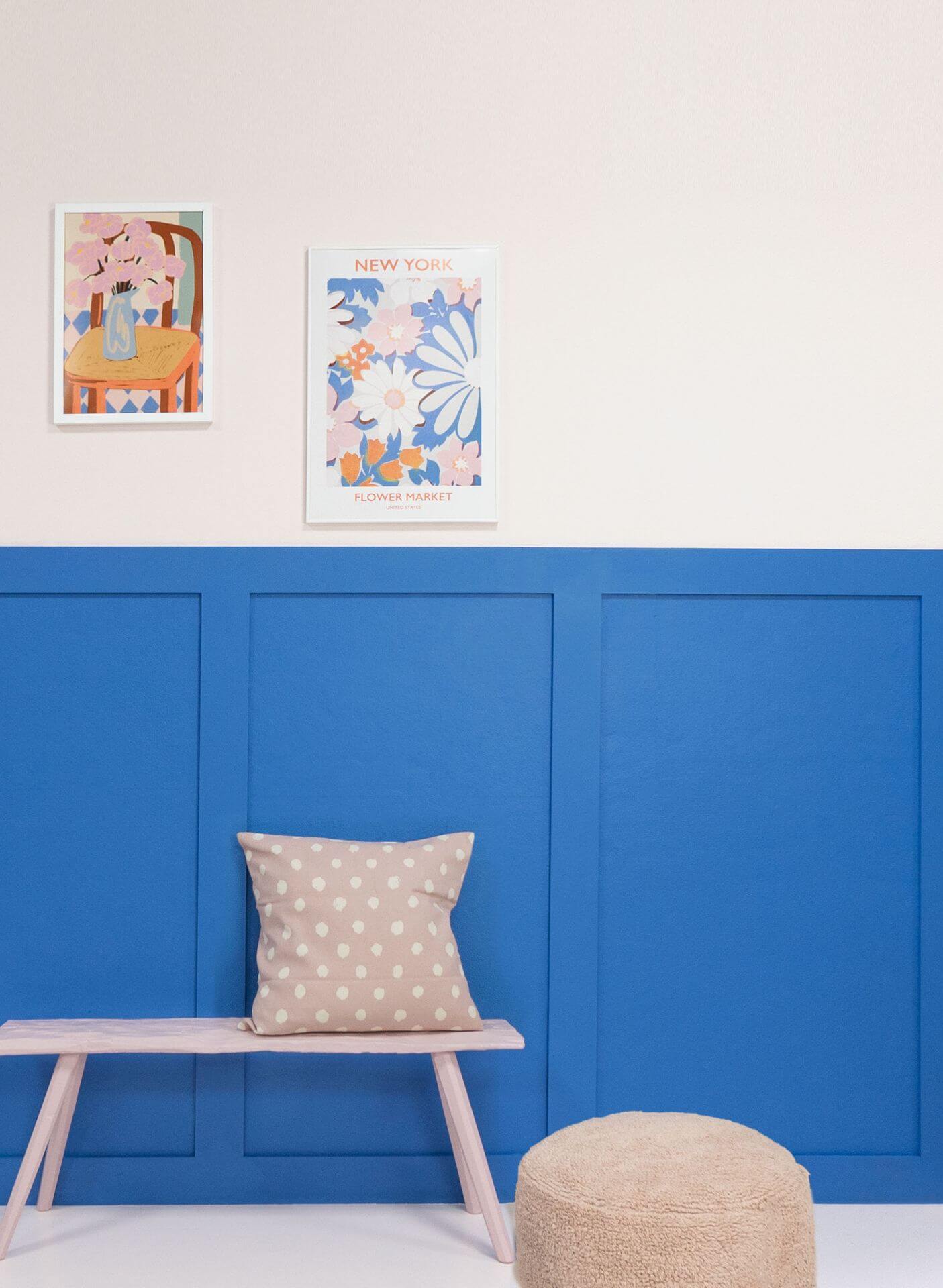
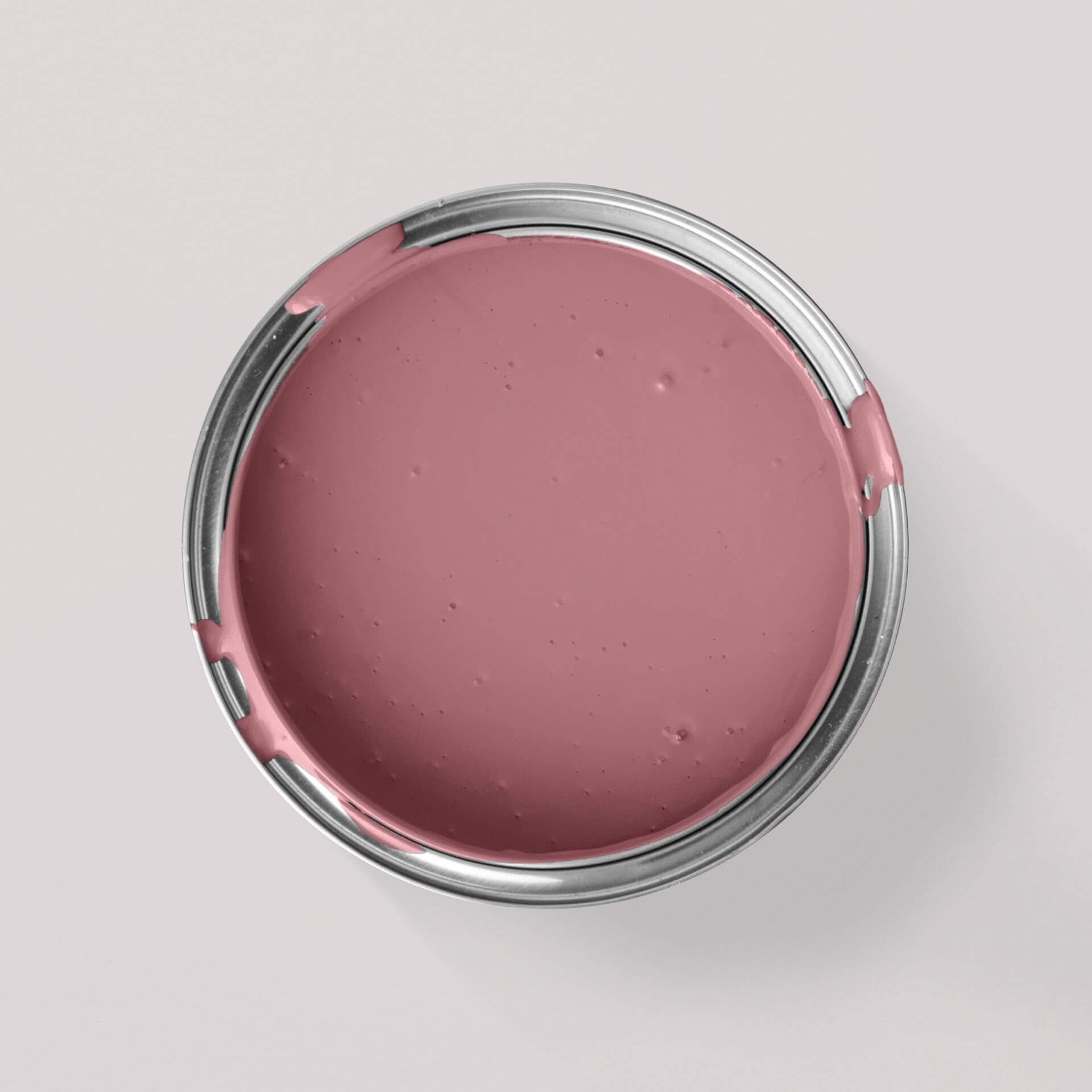

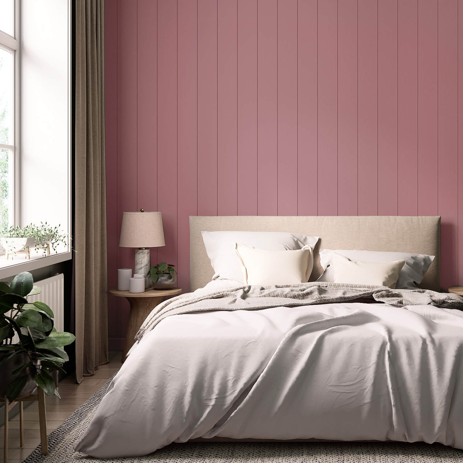
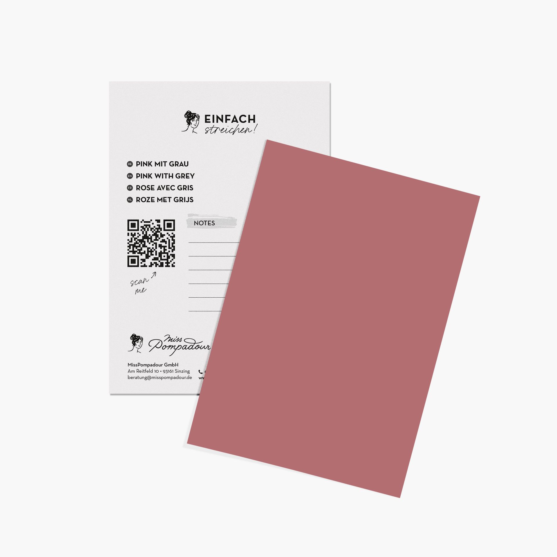
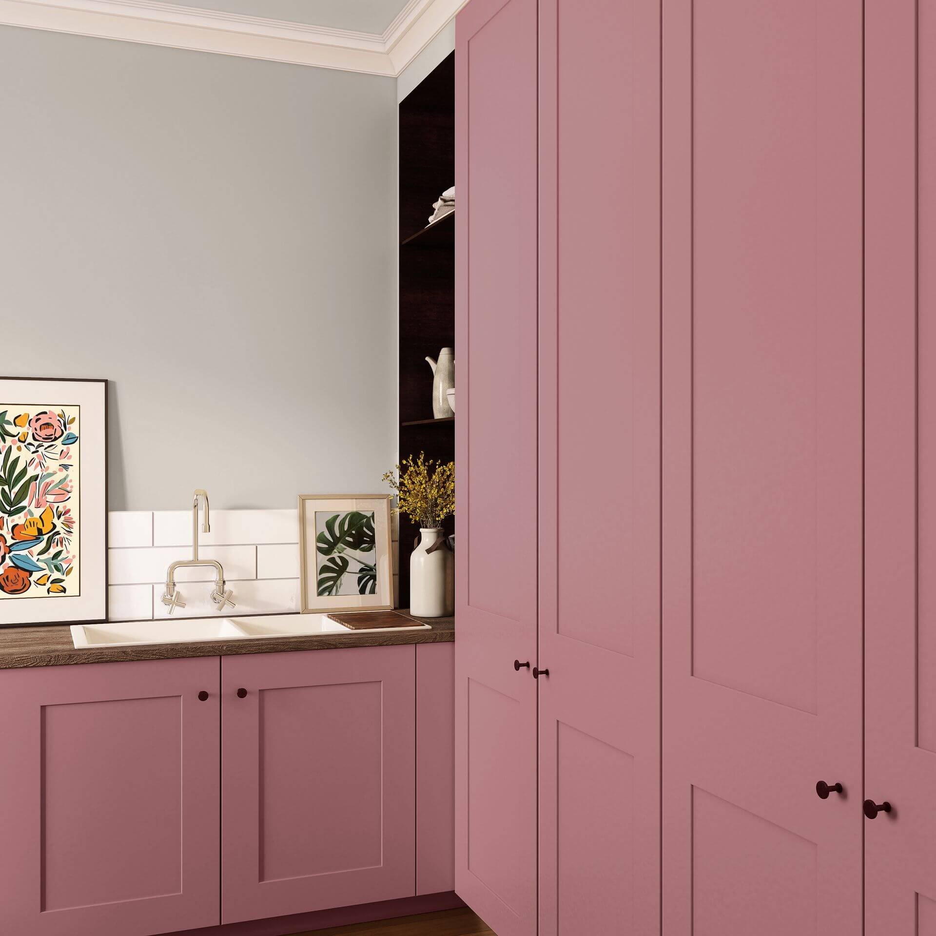
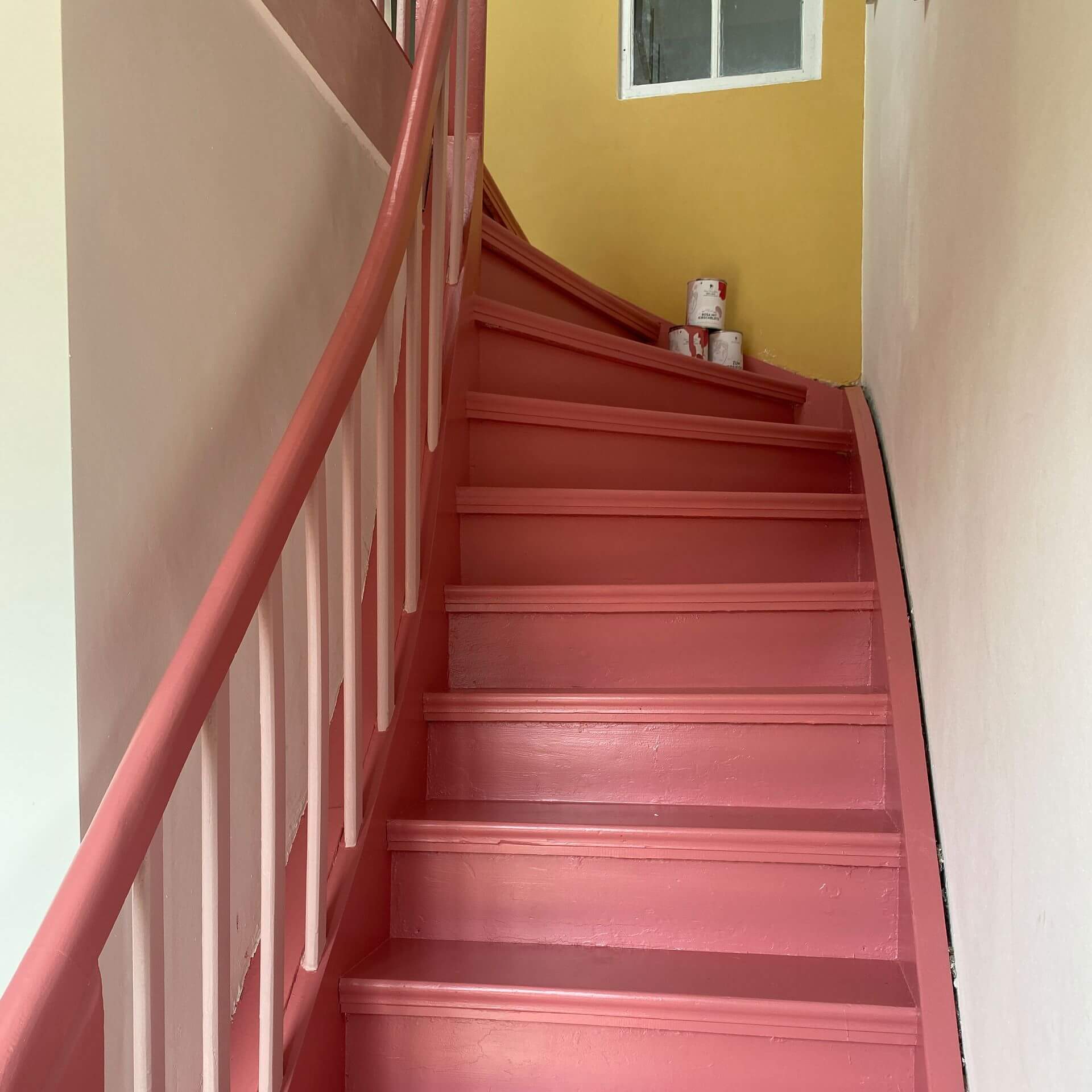
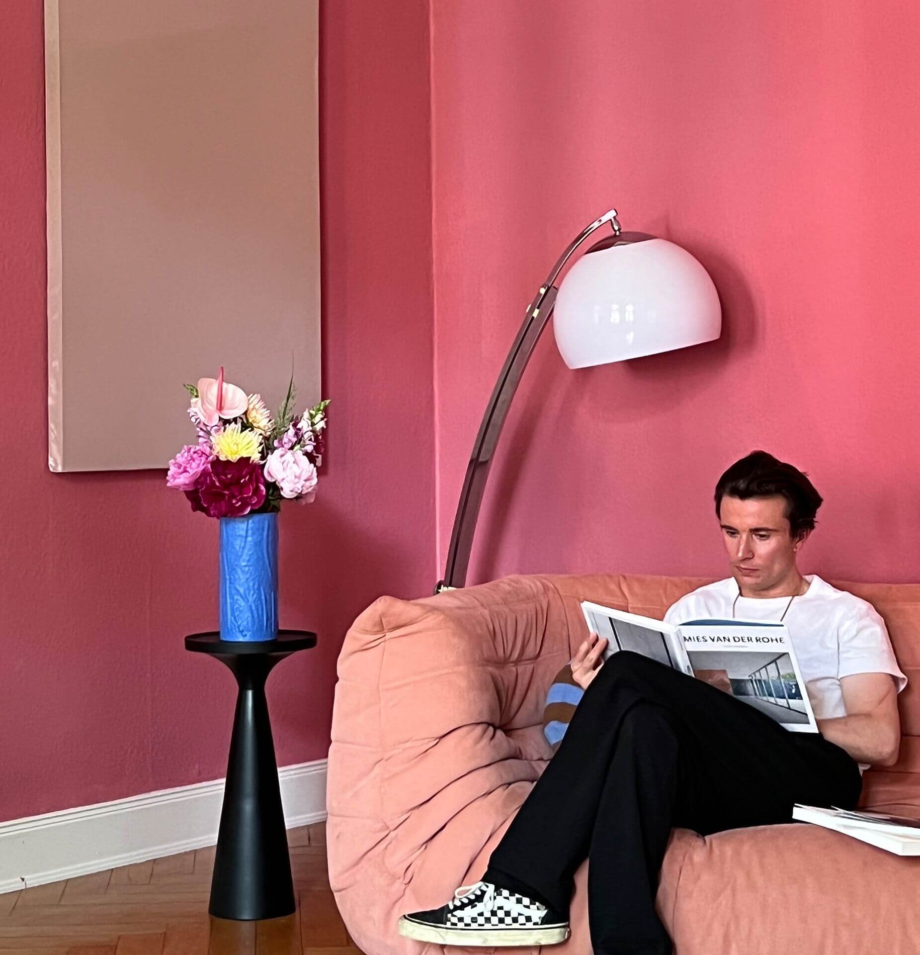
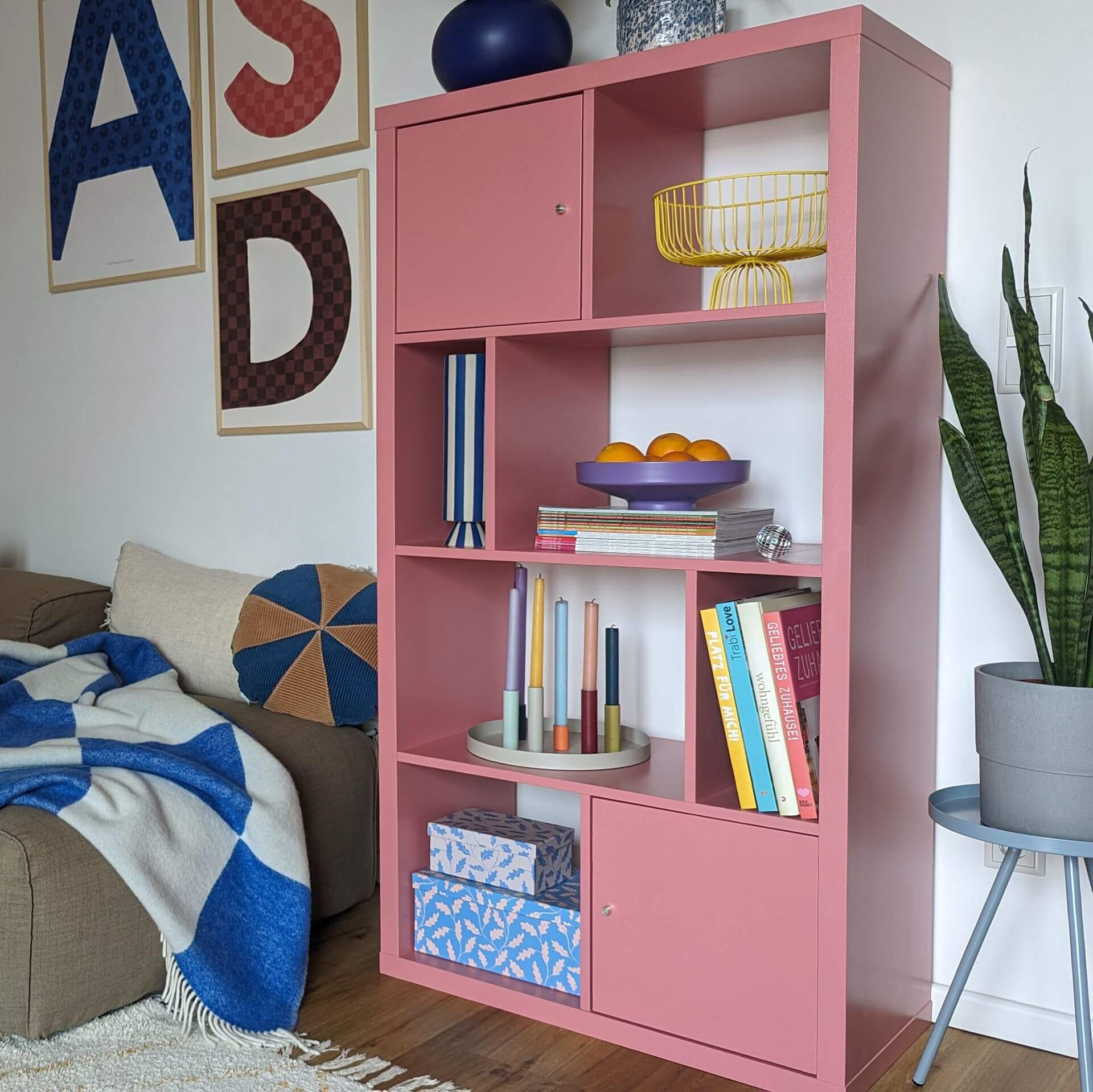
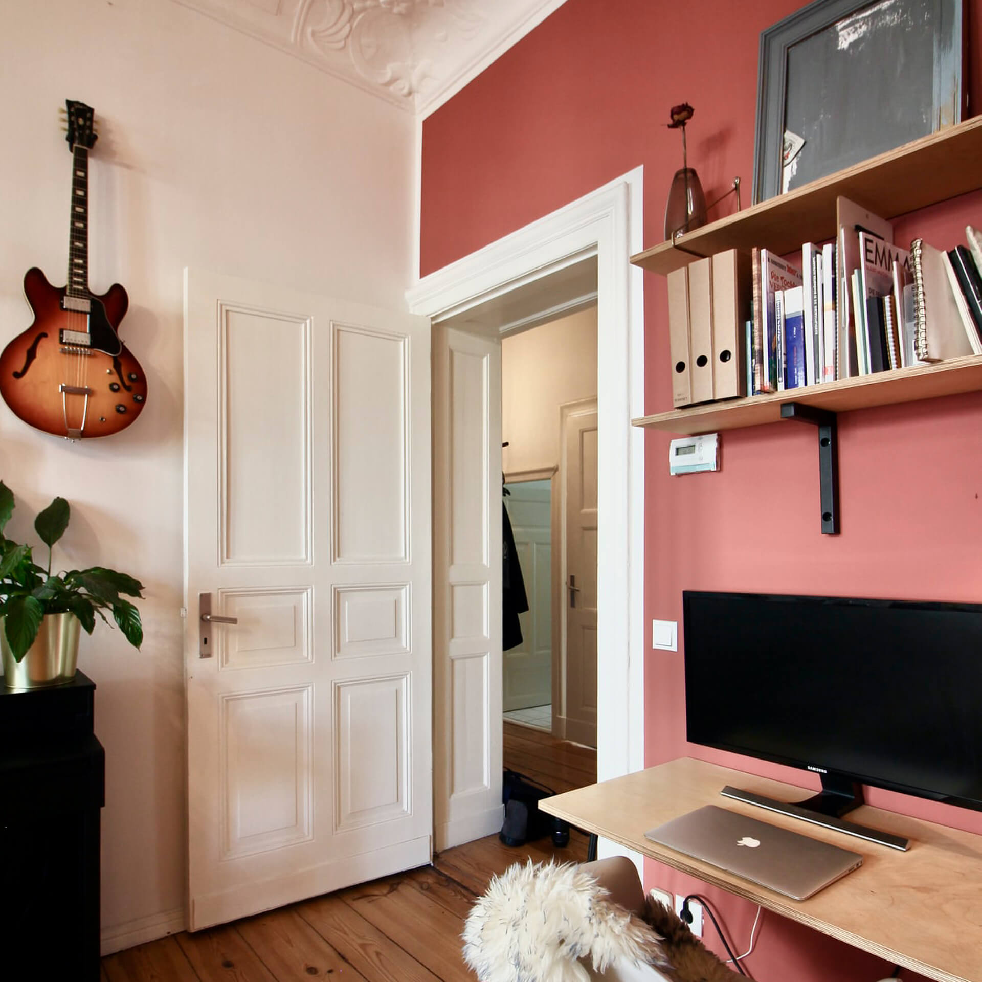
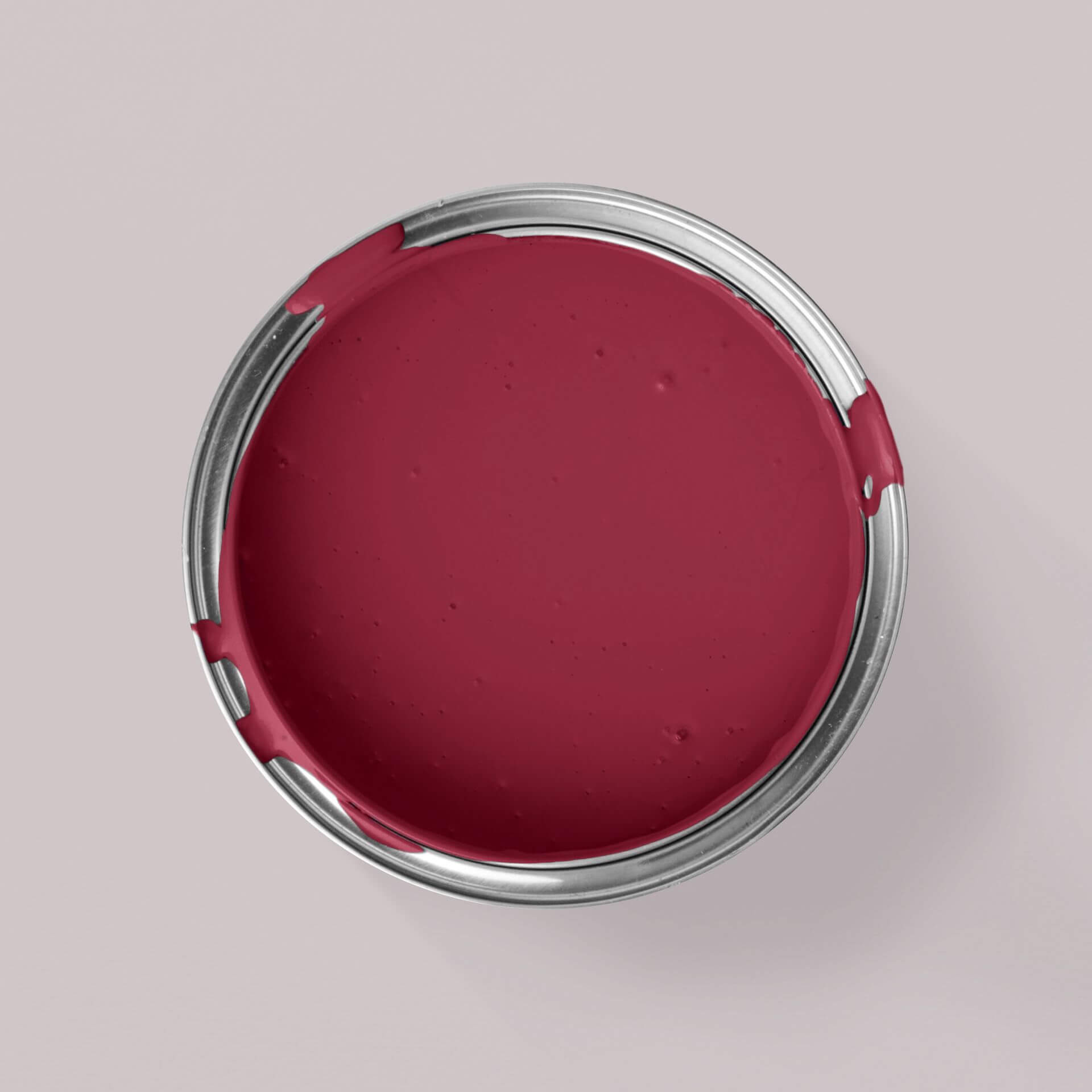



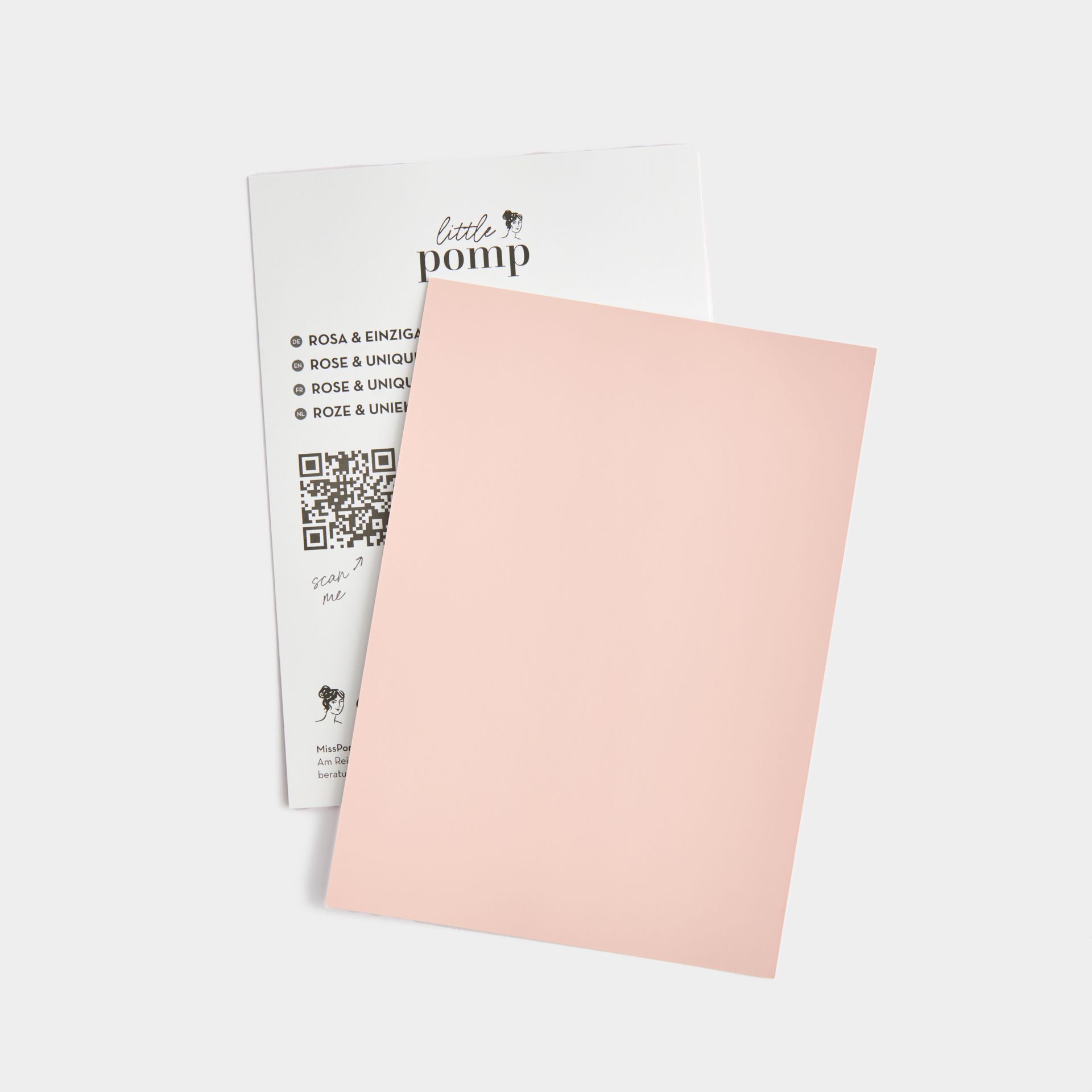
Everything for your project in one set

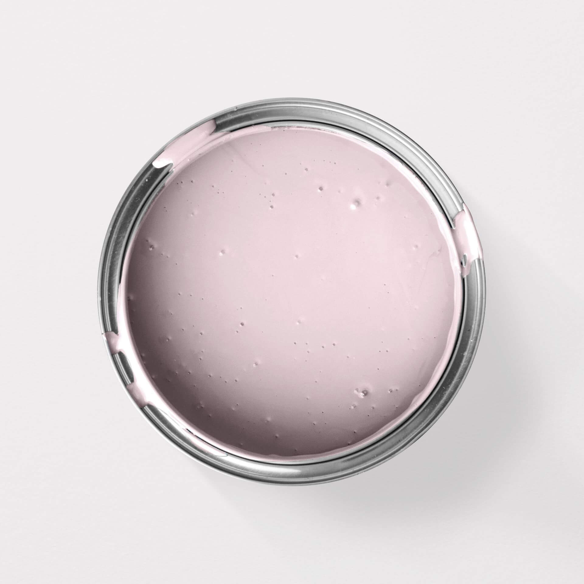

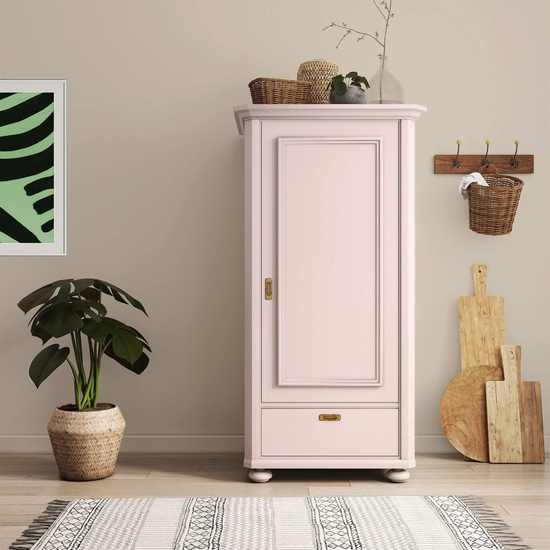
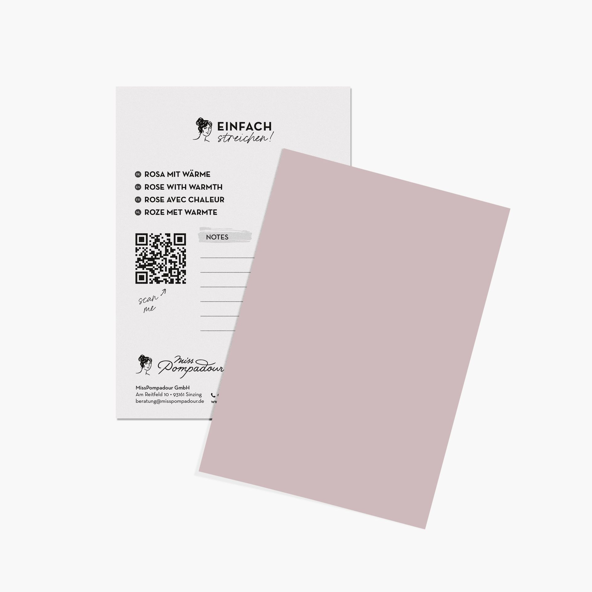
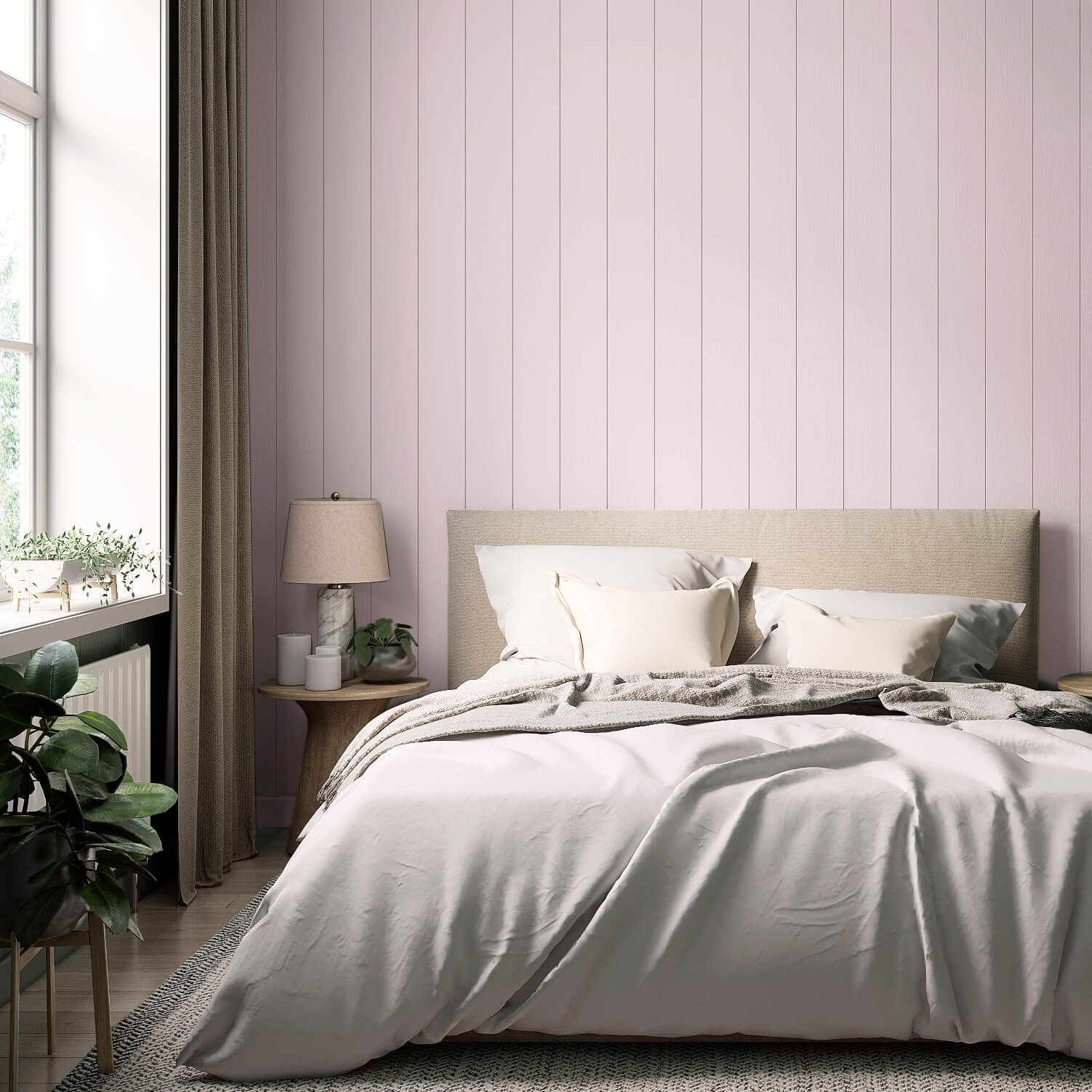


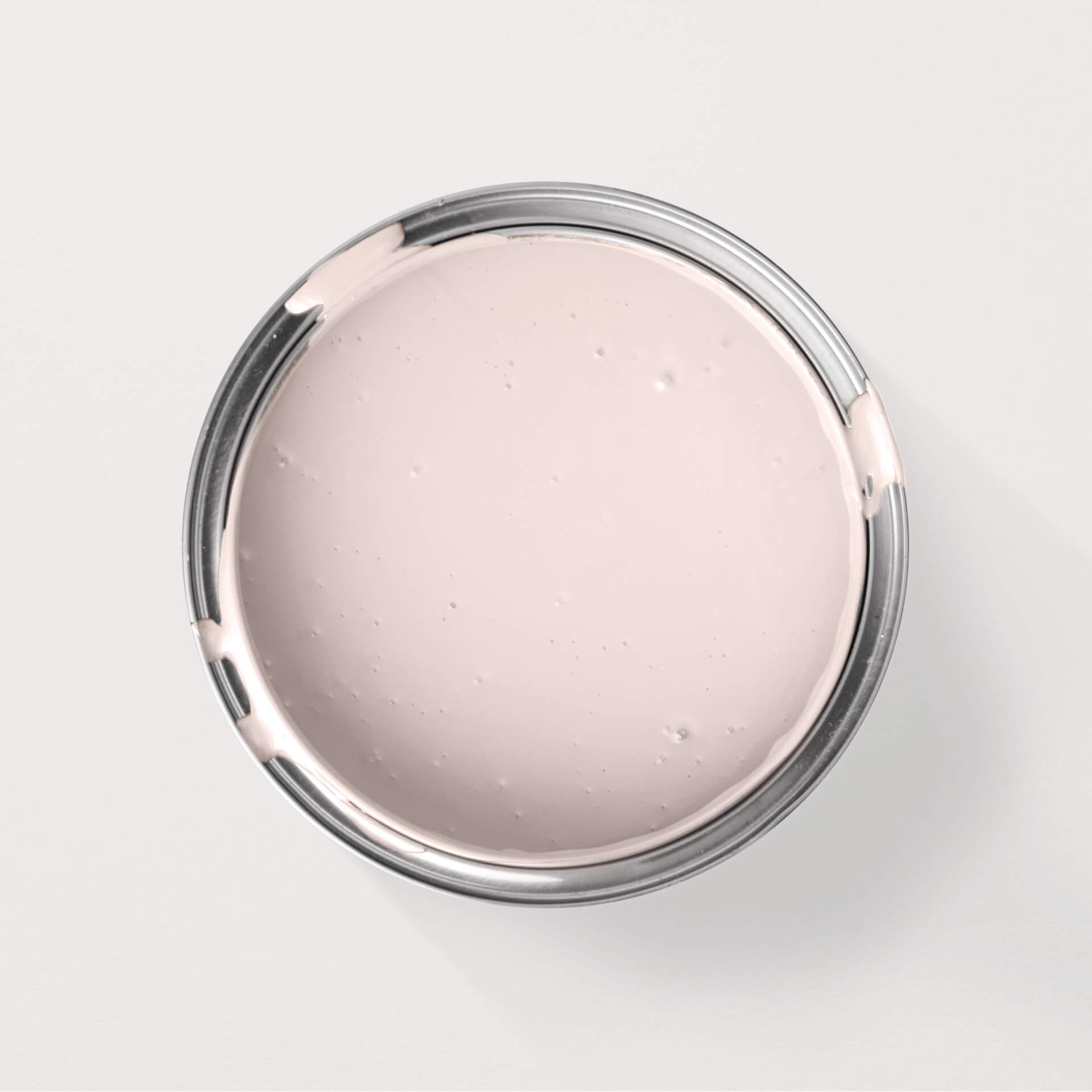

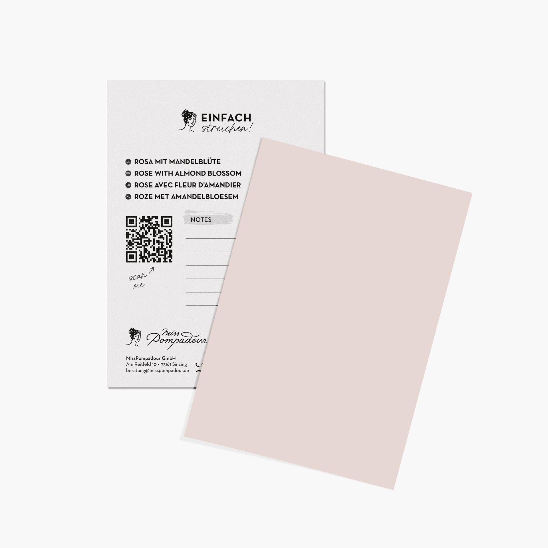







The most important things about the colours rose & pink
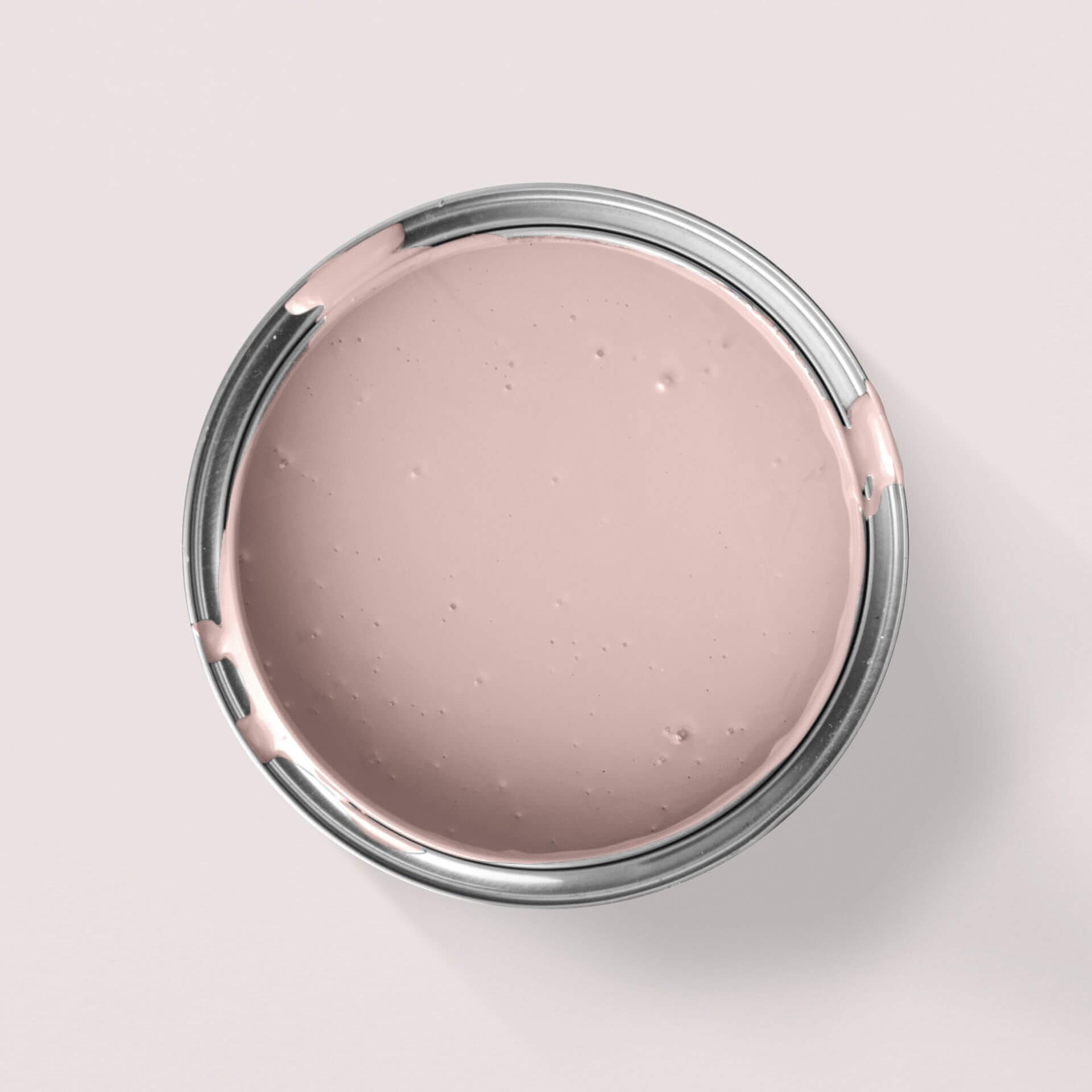
Basically, the colour pink is always a mixture between red and white. Other pigments, which are added to a shade of pink, create a large colour scheme of pink nuances
Effect of pink colour
In our culture, pink stands for everything that is cute and sweet. It is the typical little girl colour for girls' clothes and the nursery. That wasn't always the case, by the way, because since the Renaissance pink has been considered the little red colour. And red stood for everything masculine. Pink was therefore a colour for boys. Pink is also popular in other parts of the world. In the Orient, for example, pink is still considered the colour of masculinity today.
In this country, the colour pink stands for everything feminine, tranquillity and romance, for compassion and care. In colour psychology, pink has two aspects: The white part of the colour symbolises purity and innocence, while the red stands for energy, passion and sensuality. In the case of pink, the aggressive aura of red tones is muted by the loving, gentle energy of white. Very strongly pigmented, gaudy variants are called pink.
Design rooms in pink
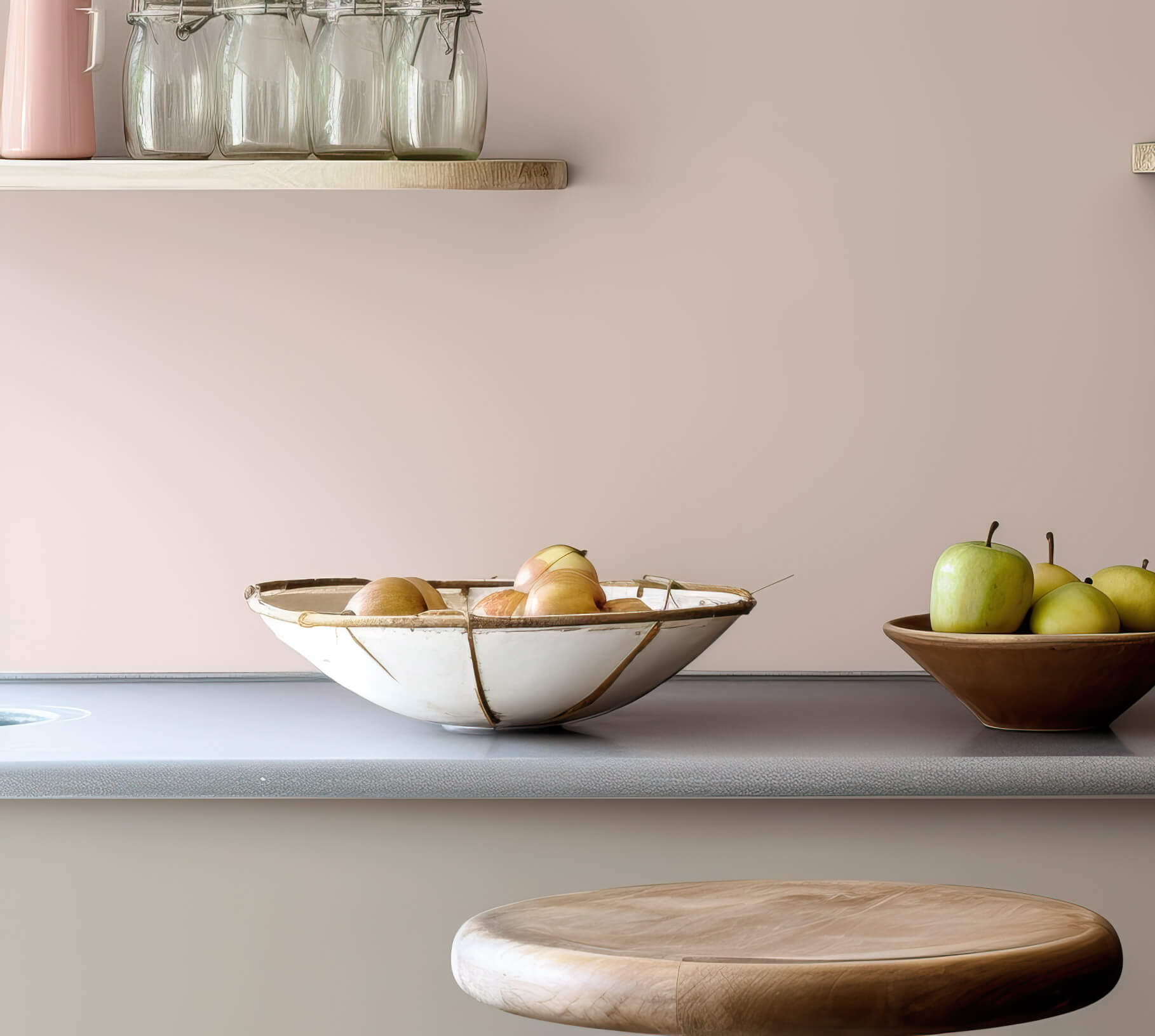
Pink is a great wall paint in all its nuances. The versatile palette of pink tones ranges from warm, powerful rosewood tones to delicate, light and soft floral colours, from subtle grey-pink tones to almost purple shimmering pale pink or bright pink.
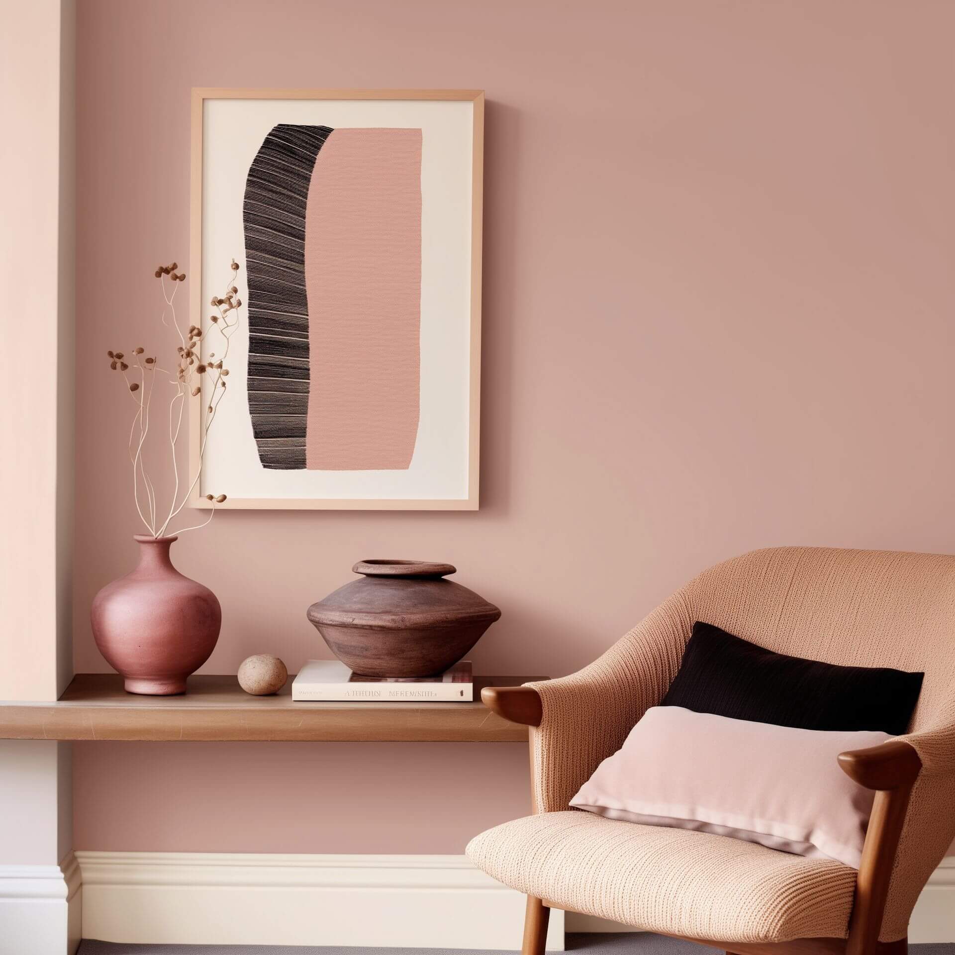
If you add a few brown pigments, the result is a soft, warm rosé tone; if you use more, you get an earthy, present rosewood tone. If you add blue pigments to pink, you get a cool, fresh rose tone. Particularly sophisticated shades of pink can be achieved by adding grey pigments to a pink shade. This creates sophisticated colour shades that are not at all kitschy or feminine, but very subtle. It's not just women who like these shades of pink.
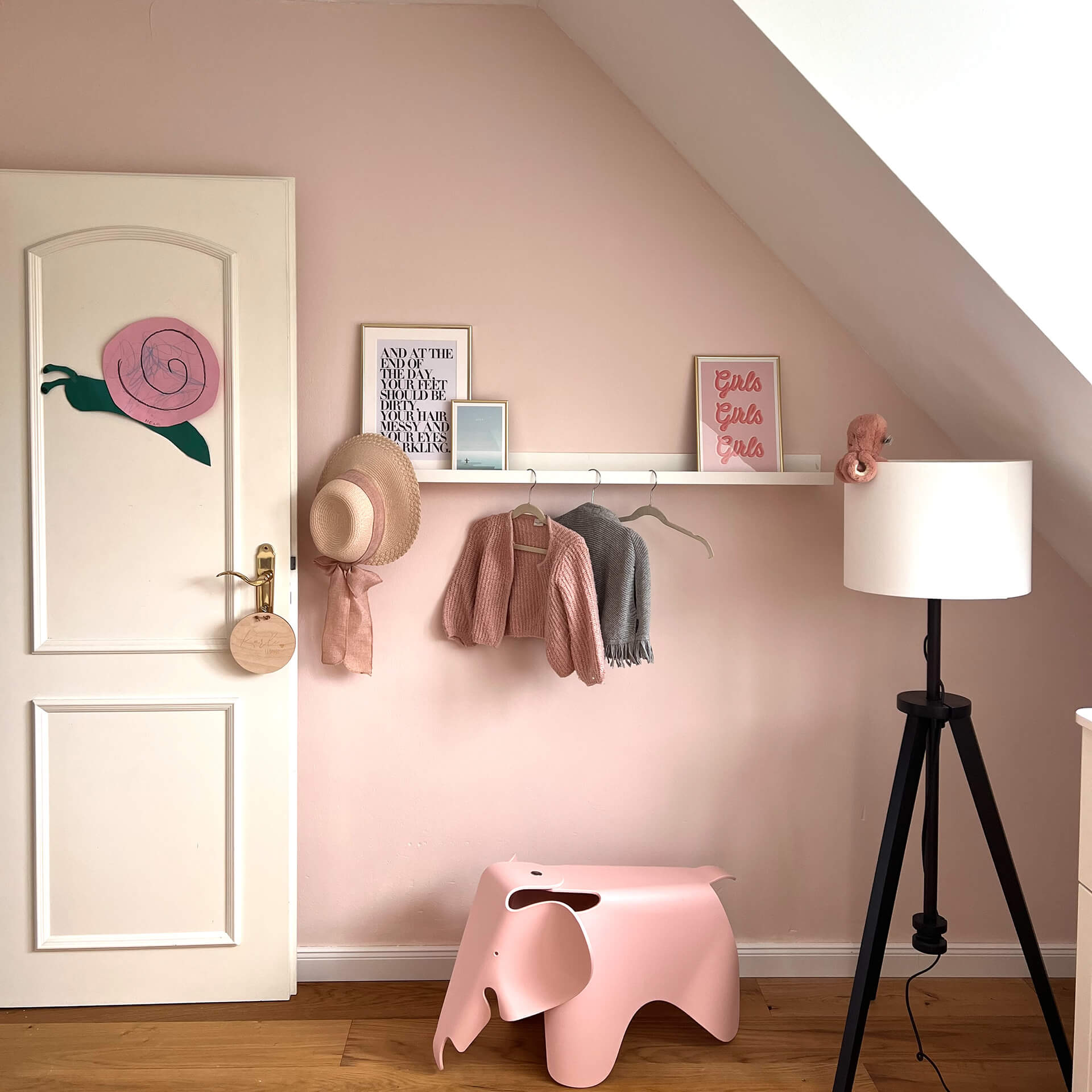
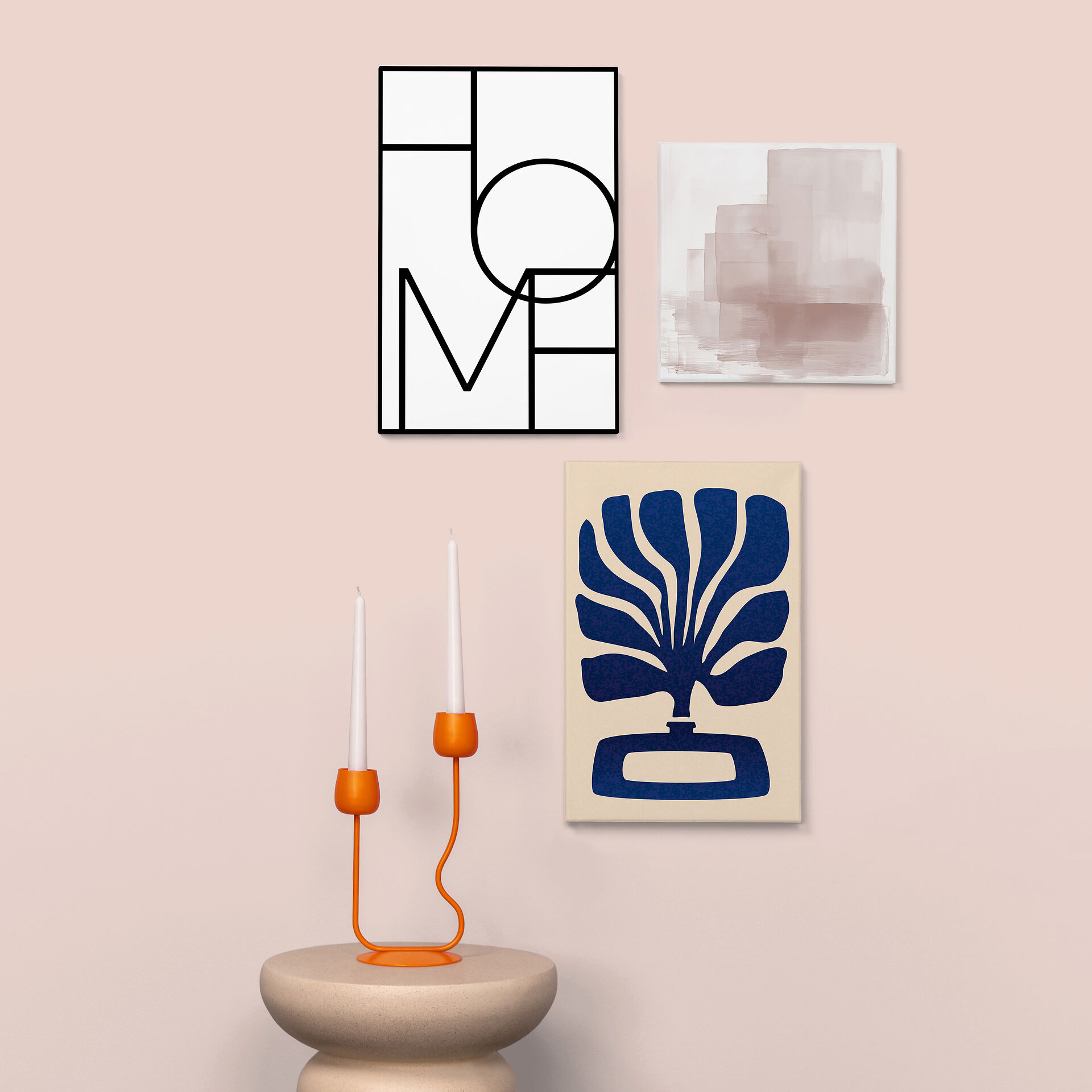
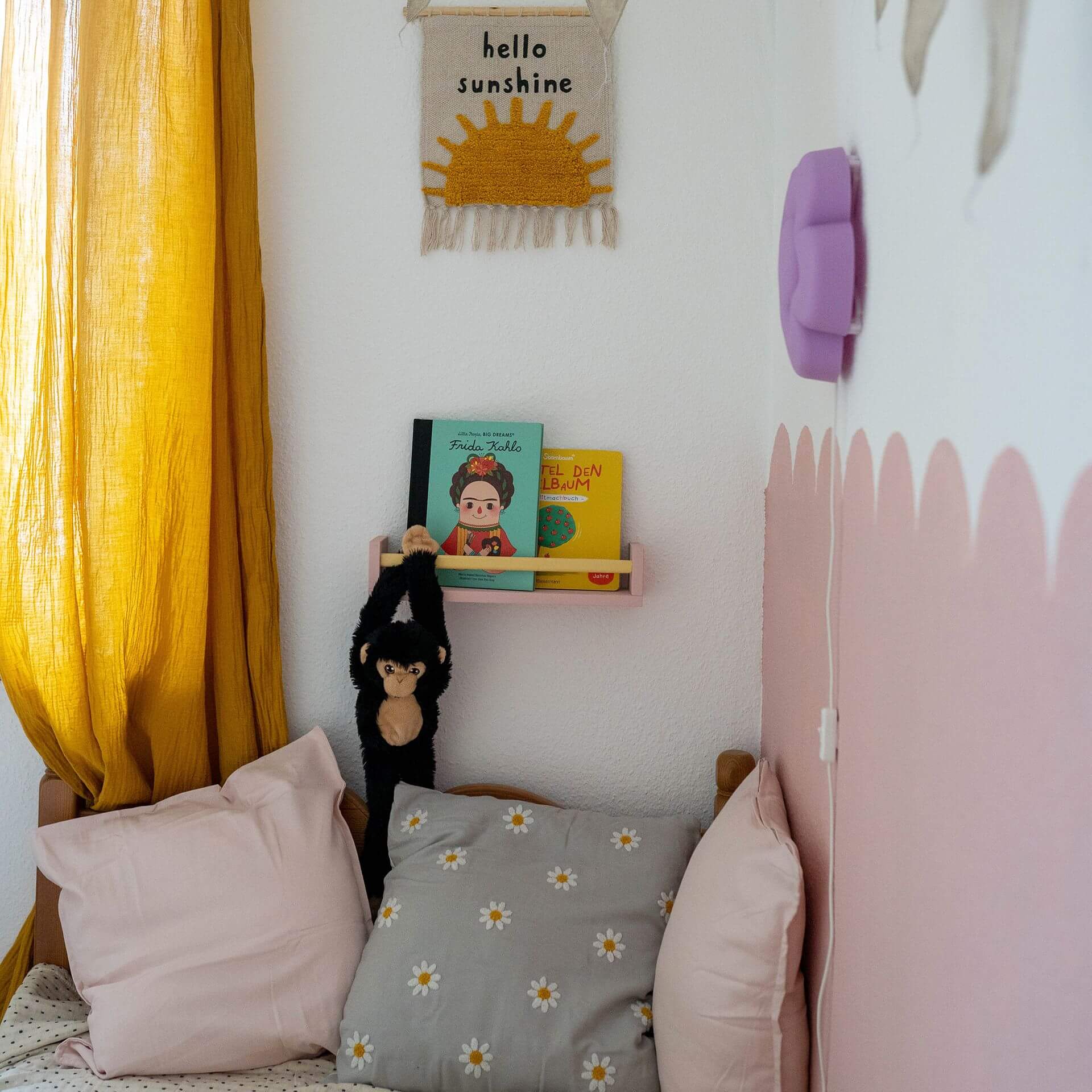
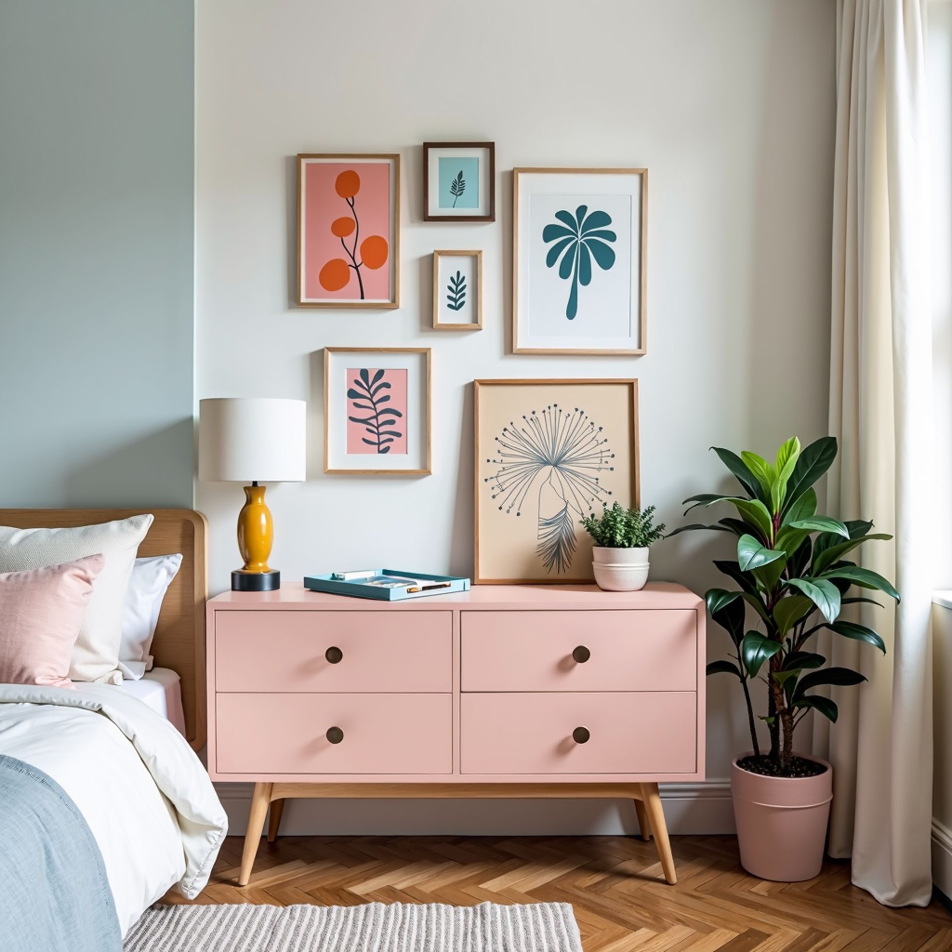
The colour pink always spreads a positive mood and a cheerful atmosphere in the room. Use it as a powerful accent on a wall or design an accent piece of furniture that catches everyone's eye. Perhaps use a powerful shade of pink for this?
You should avoid pink here
Basically, pink can be used in any room - the colour just sometimes arouses prejudices. So if you don't want it to look too pink, go for a pink mixed with grey. Even sceptics will be won over by this muted colour!
Alternatives to pink colour
A light apricot colour has a similarly friendly effect to shades of pink and can therefore be a good alternative for your home.
What would you like to paint?

Just paint










Pink & Rose Hues: From Dusty Pink to Vibrant Magenta
Pink is always a blend of red and white. From delicately tinted whites with a hint of rose to rich, dark fuchsias, there's an endless array of pink shades. This means pink hues can create vastly different moods in a room.
A Colour Palette from Soft Rose to Bold Pink
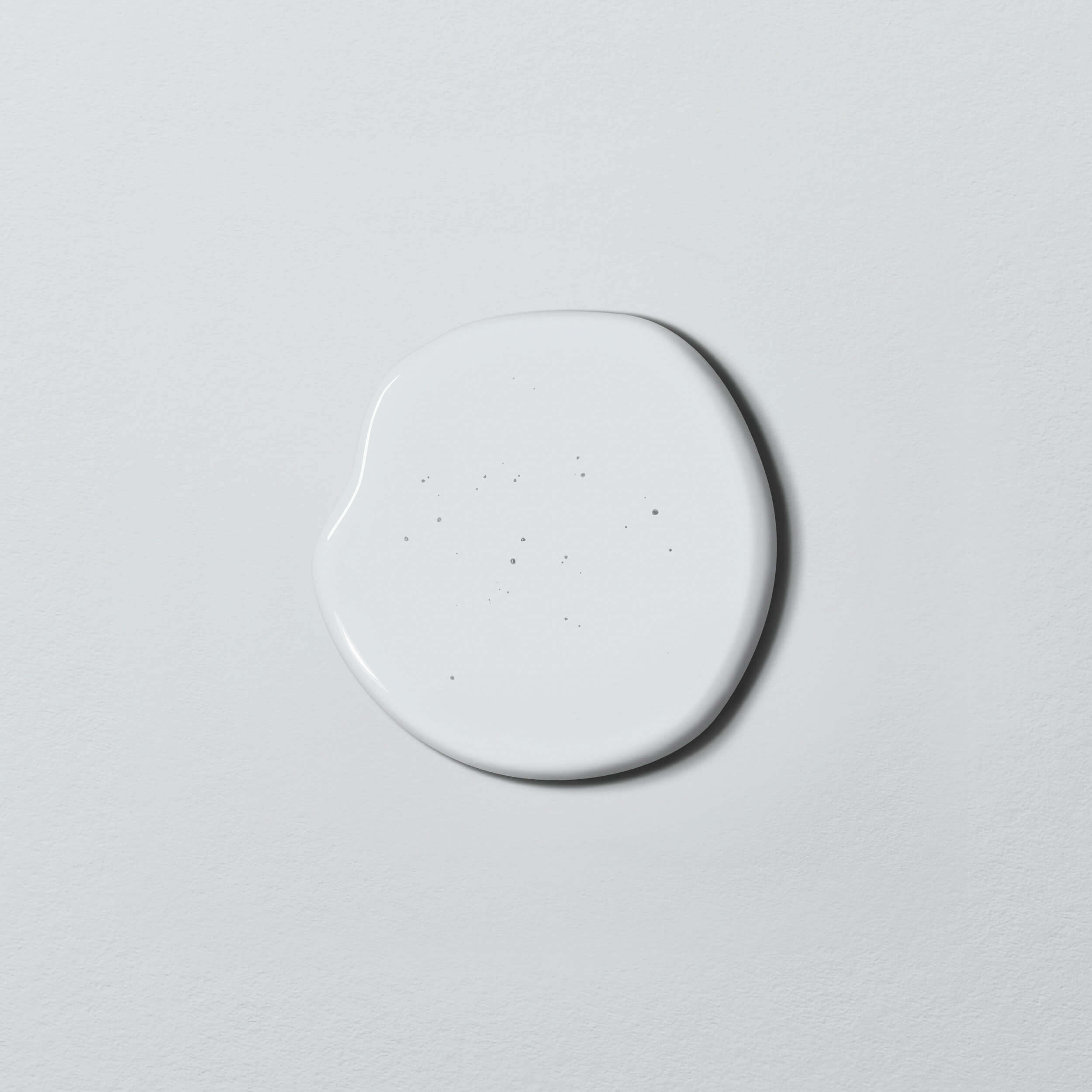
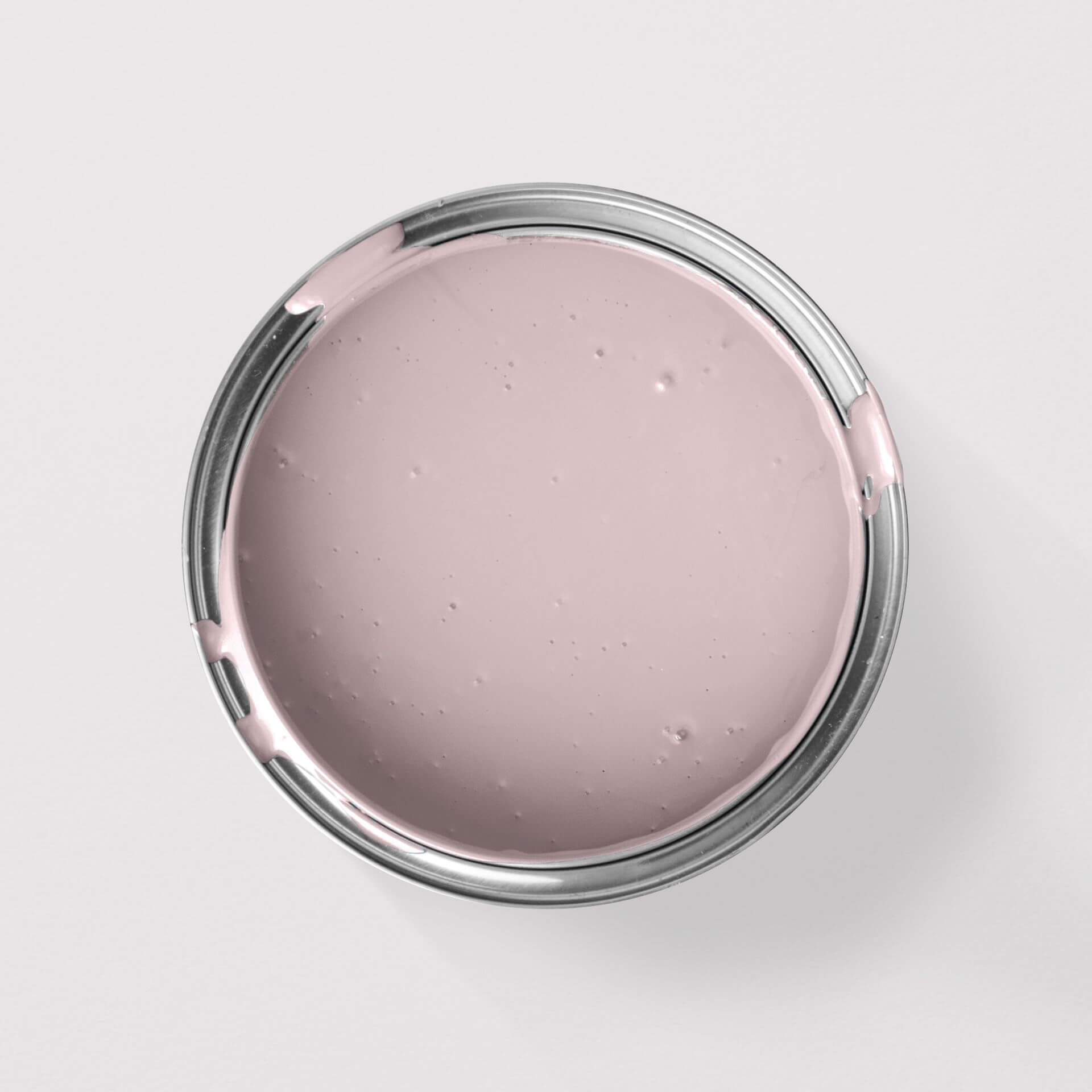
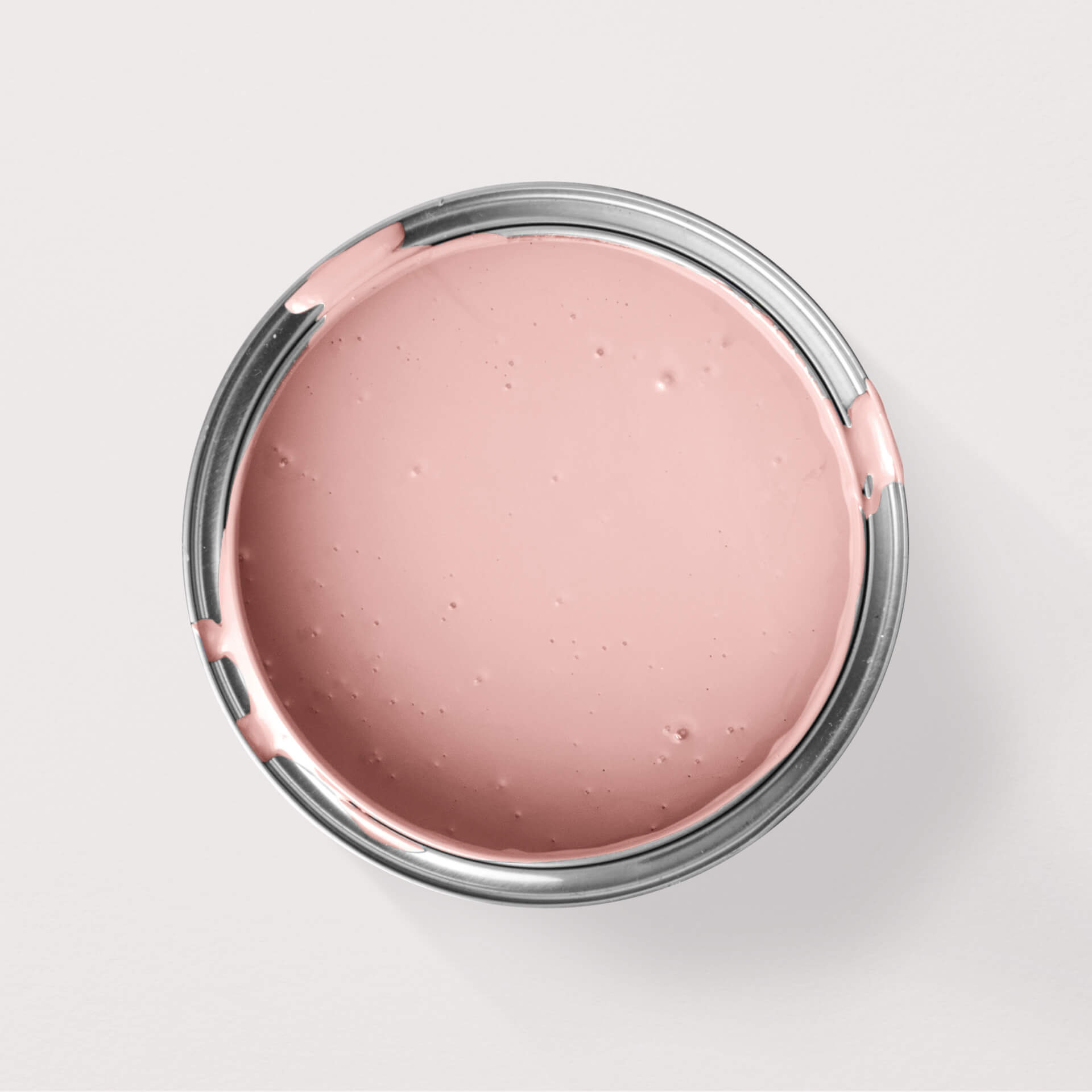
The palette is vast! Let's start with shades that have the faintest hint of pink, such as White with Powder from our Just Paint Collection. This almost white shade is subtly tinted with a soft, reddish terracotta, creating its delicate rose tint. This hue is also known as powder pink.
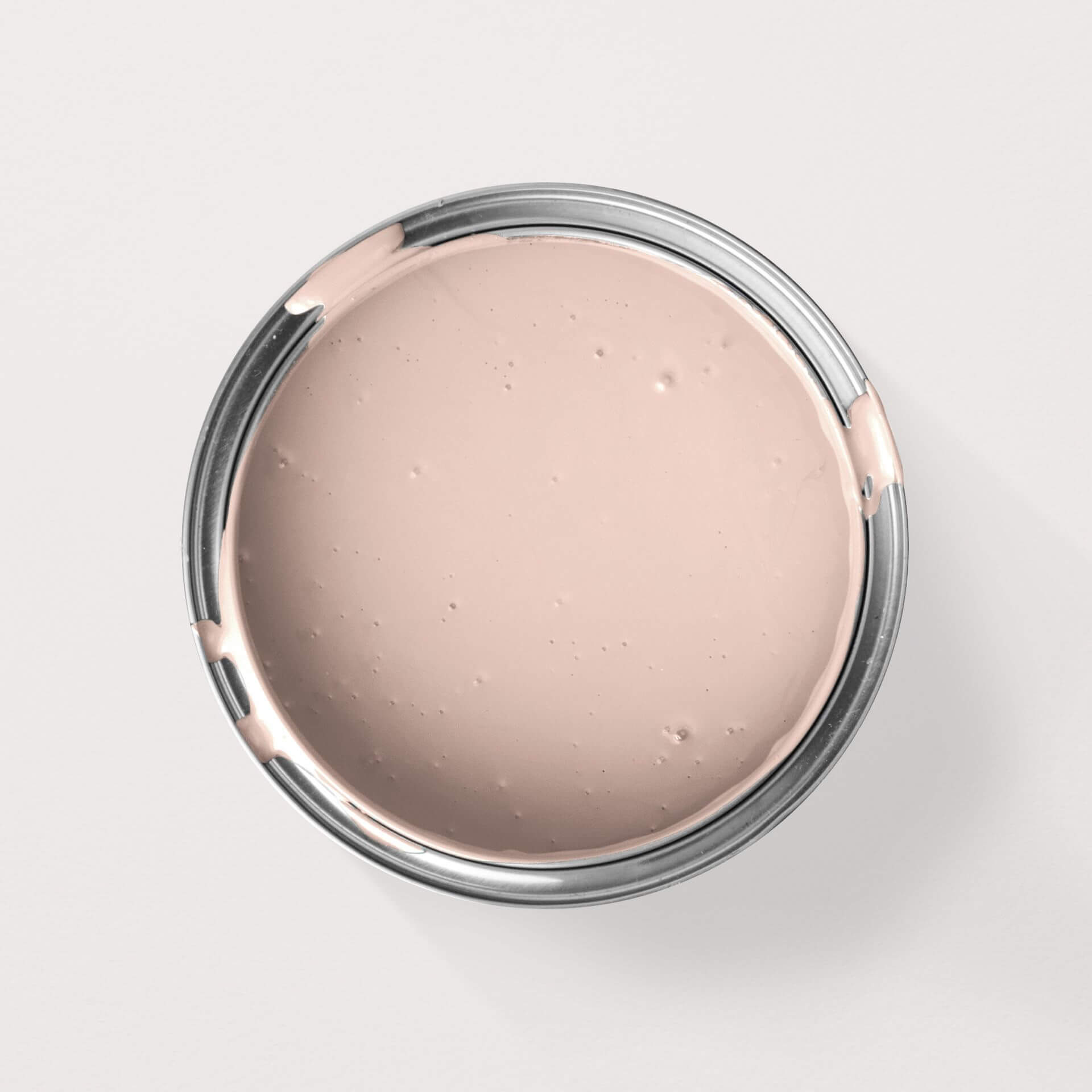
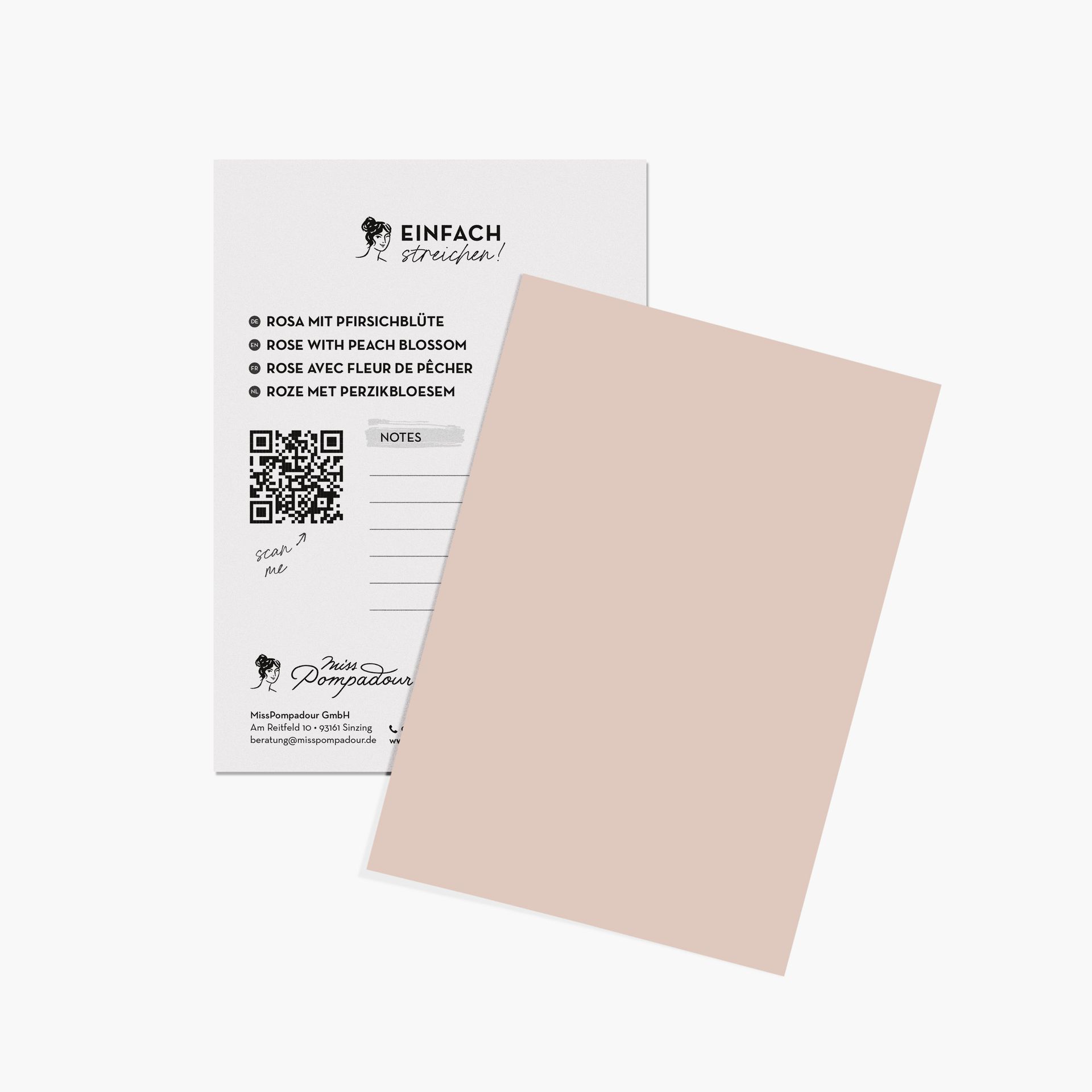
Next, we move to pastel pinks. These include Rose with Warmth or Rose with Peach Blossom. They have a high white content, yet you'll clearly perceive them as pink.
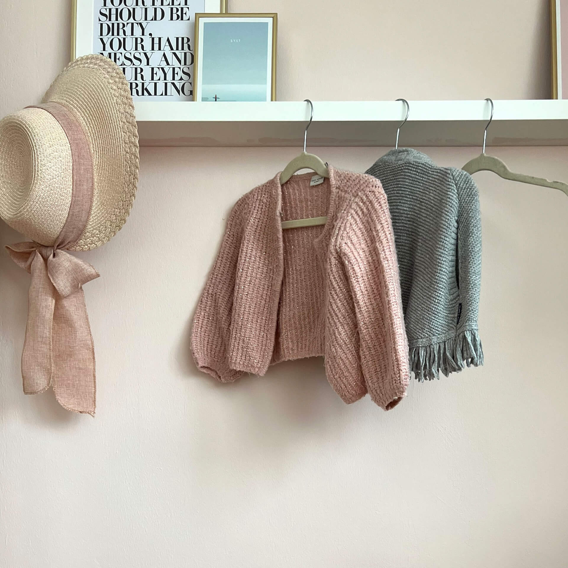
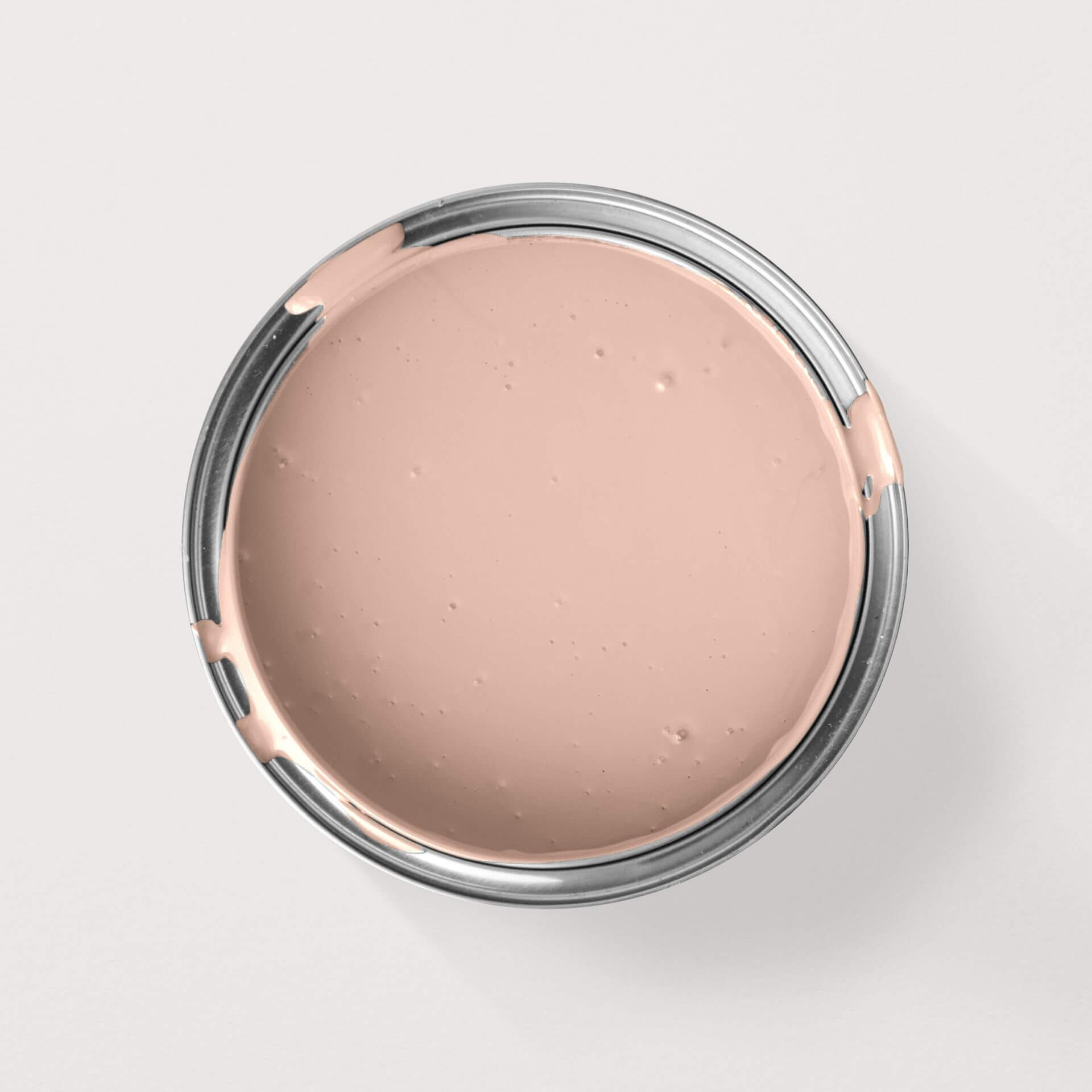
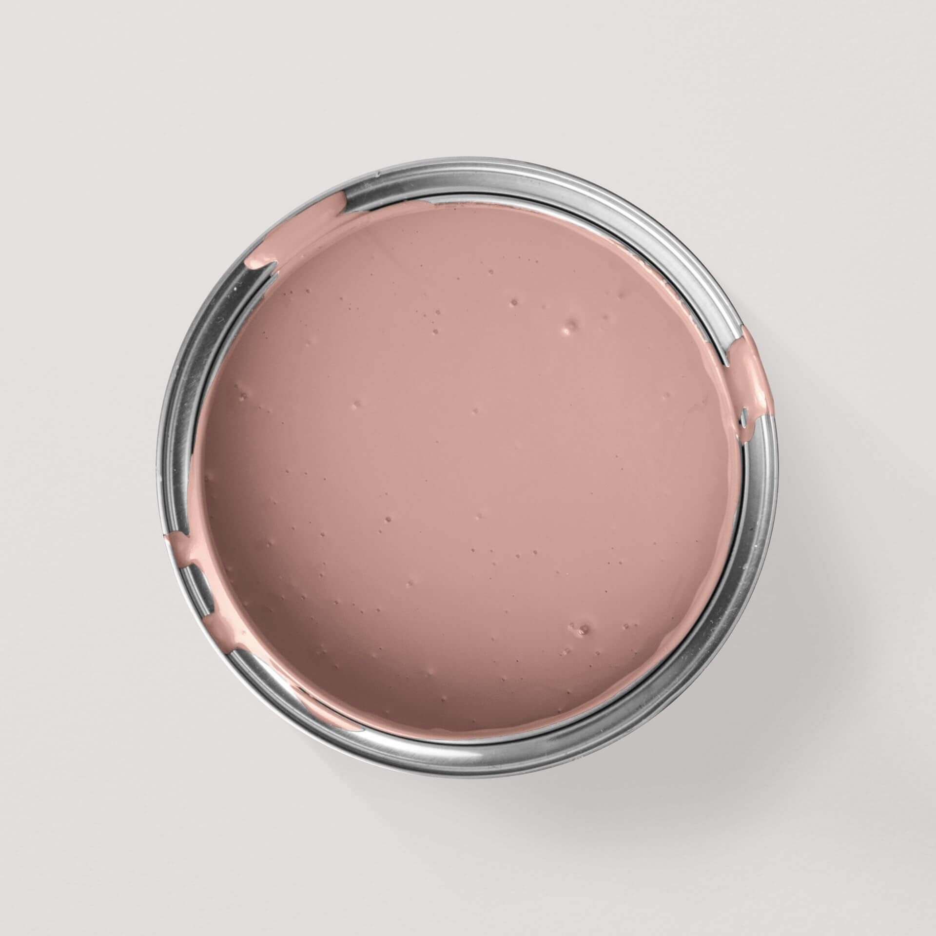
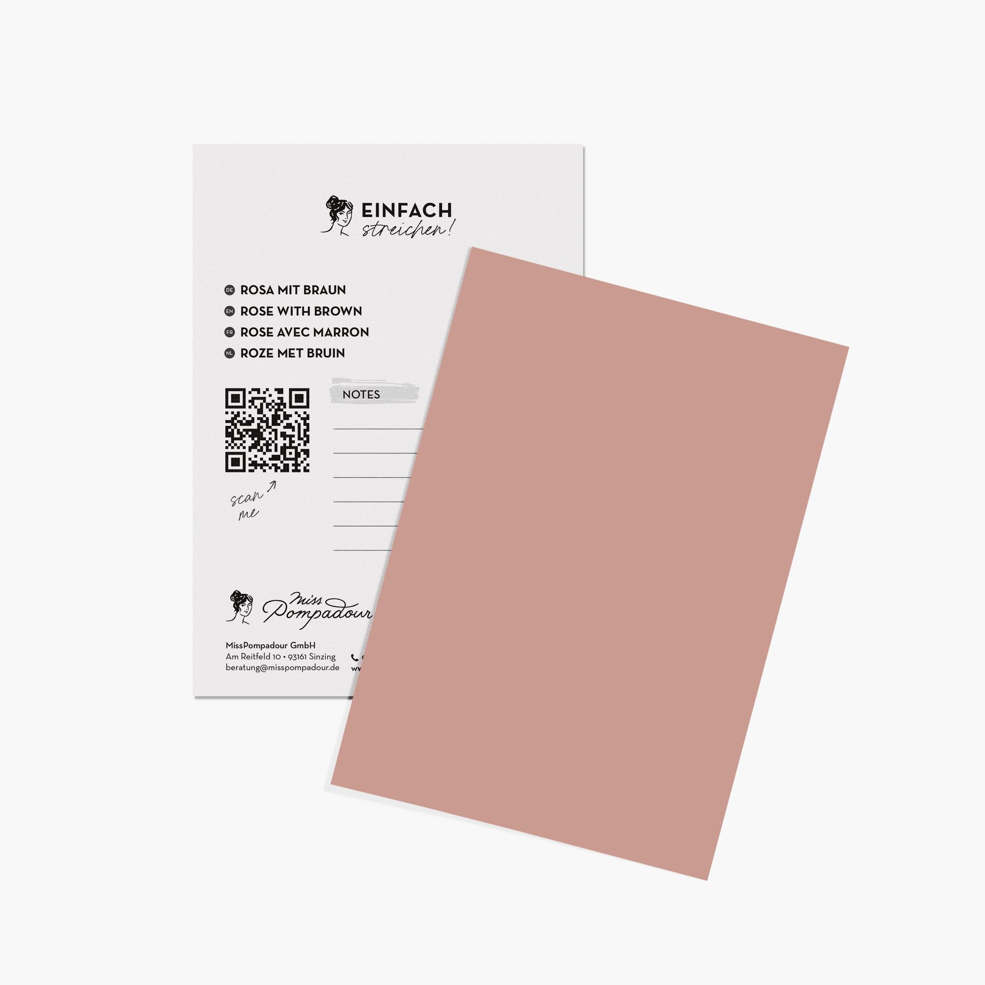
Old rose refers to light or even vibrant pink shades that contain a touch of brown or beige. The shade Rose with Brown is a beautiful example. All these colours are perceived as warm pinks. In lighter versions, these hues are also called nude. An example of such nude shades is Rose with Peach Blossom.
Dusty pink goes in a similar direction. These often very subtle shades are usually tinted with grey pigment, giving them a cooler and more 'grown-up' feel. These pink shades sometimes also contain hints of violet, with seamless transitions between them.
The pink colour family also includes vibrant pinks. Some of these appear almost like magenta. Strictly speaking, magenta is indeed a very strong pink. Different variations arise depending on the pigments added. Pink with Grey's allure is in its name. Pink with Peony is a vibrant, warm pink with bluish pigments. An accent wall in pink paint is sure to be a showstopper!
The Effect of Pink Hues
Pink is often seen as an exclusively feminine colour. However, pink is by no means just for little girls. As a trend colour, it has matured and is truly popular. In a room painted pink, you'll feel balanced and calm. It feels fresh and light, reduces aggression, and can even be mood-enhancing. You can confidently paint large walls in pink and enjoy the carefree spirit of pink wall paint.
Versatile: Using Pink in Various Rooms
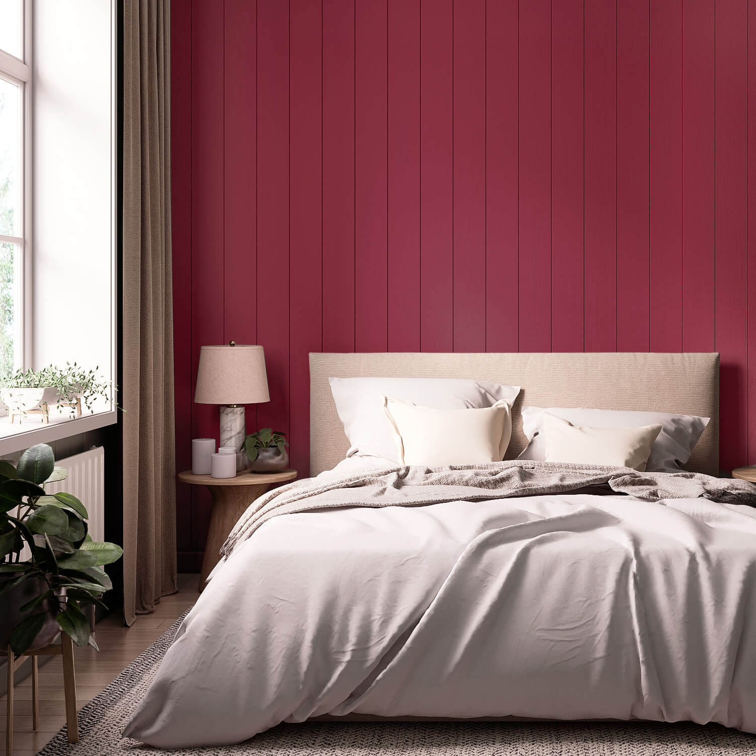
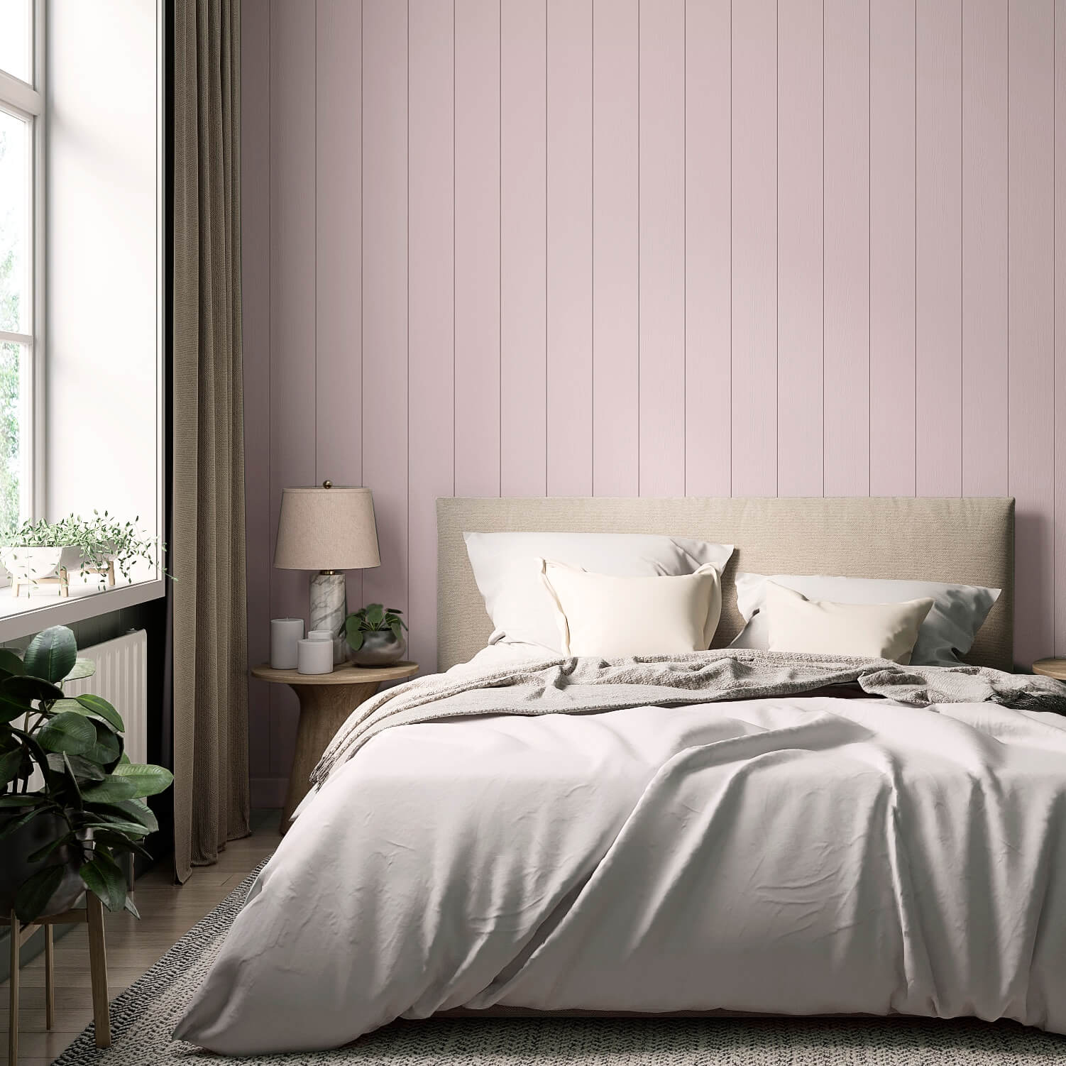
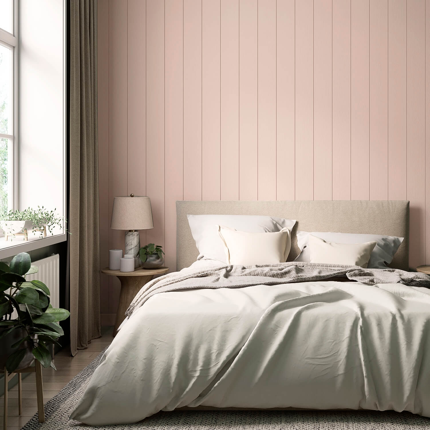
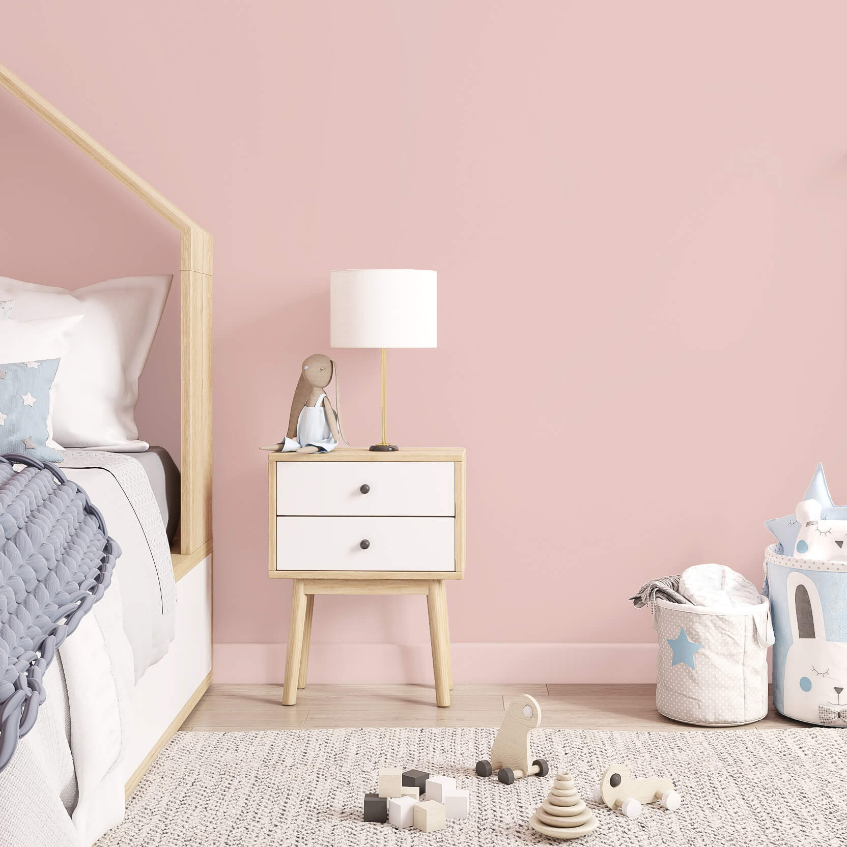
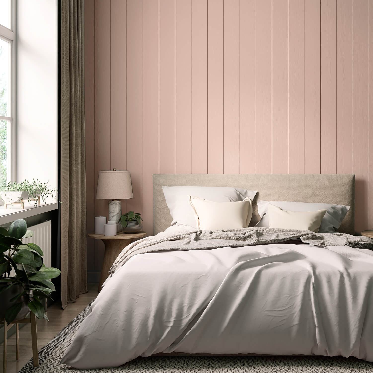
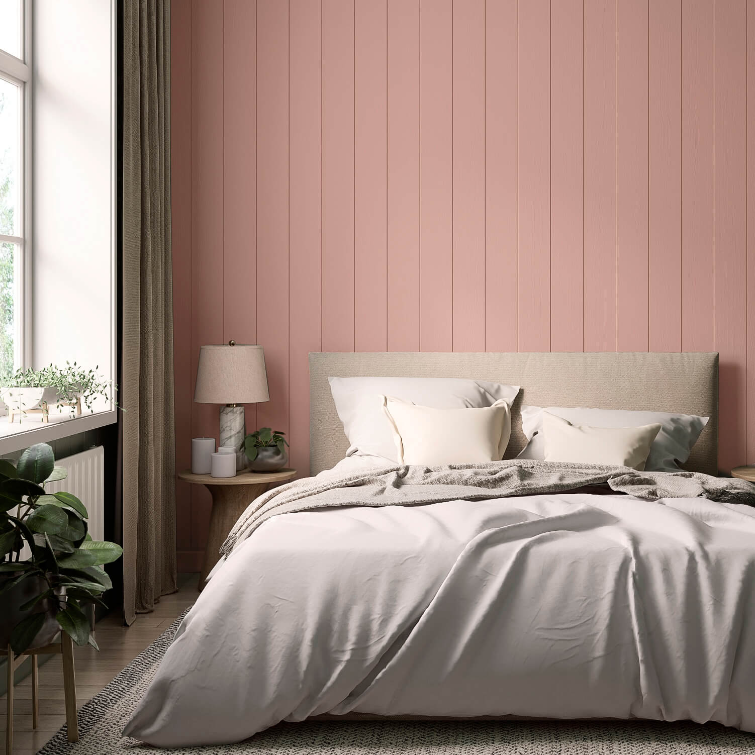
Since pink boasts a very broad colour palette, this versatile shade is suitable for almost all living areas. Simply let your ideas flow freely! Its sleep-promoting properties and the sense of calm that pink hues evoke make it an ideal interior paint for the bedroom.
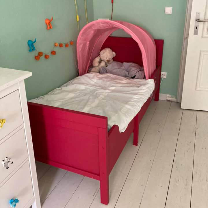
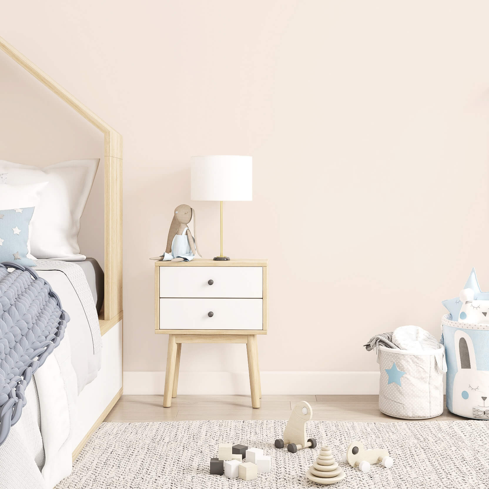
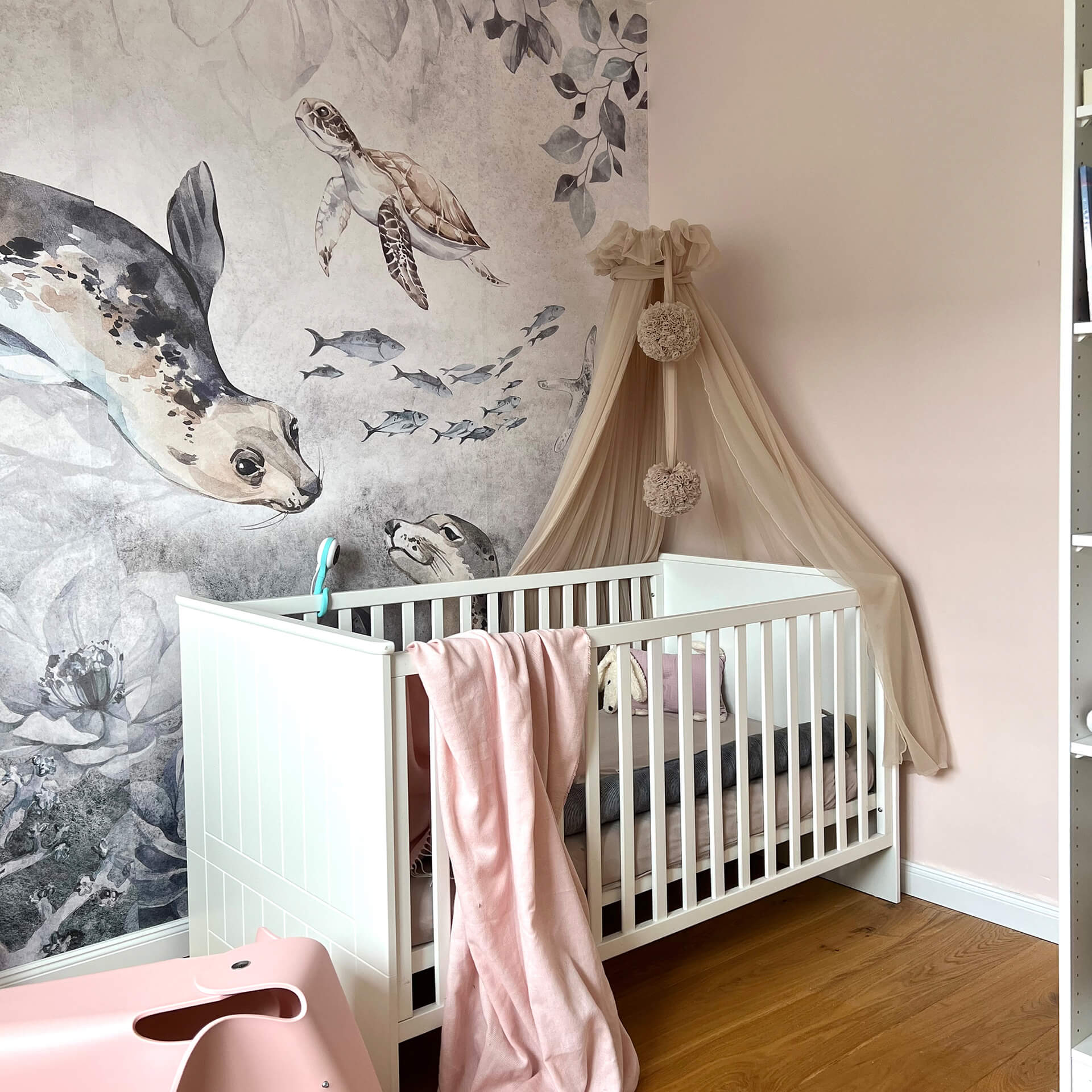
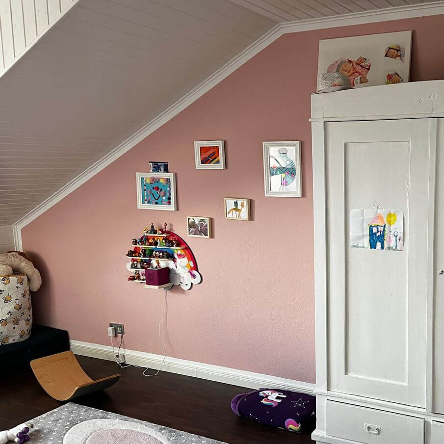
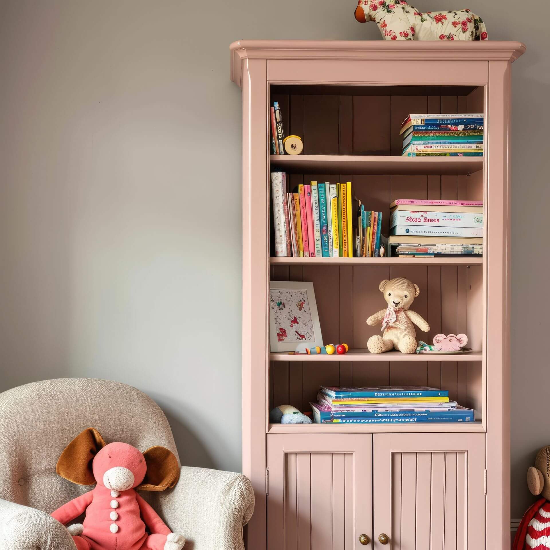
Pink is also an excellent choice for children's rooms, thanks to its calming effect. Aside from being probably the most requested colour by little girls, babies also settle well in a pink-painted room.
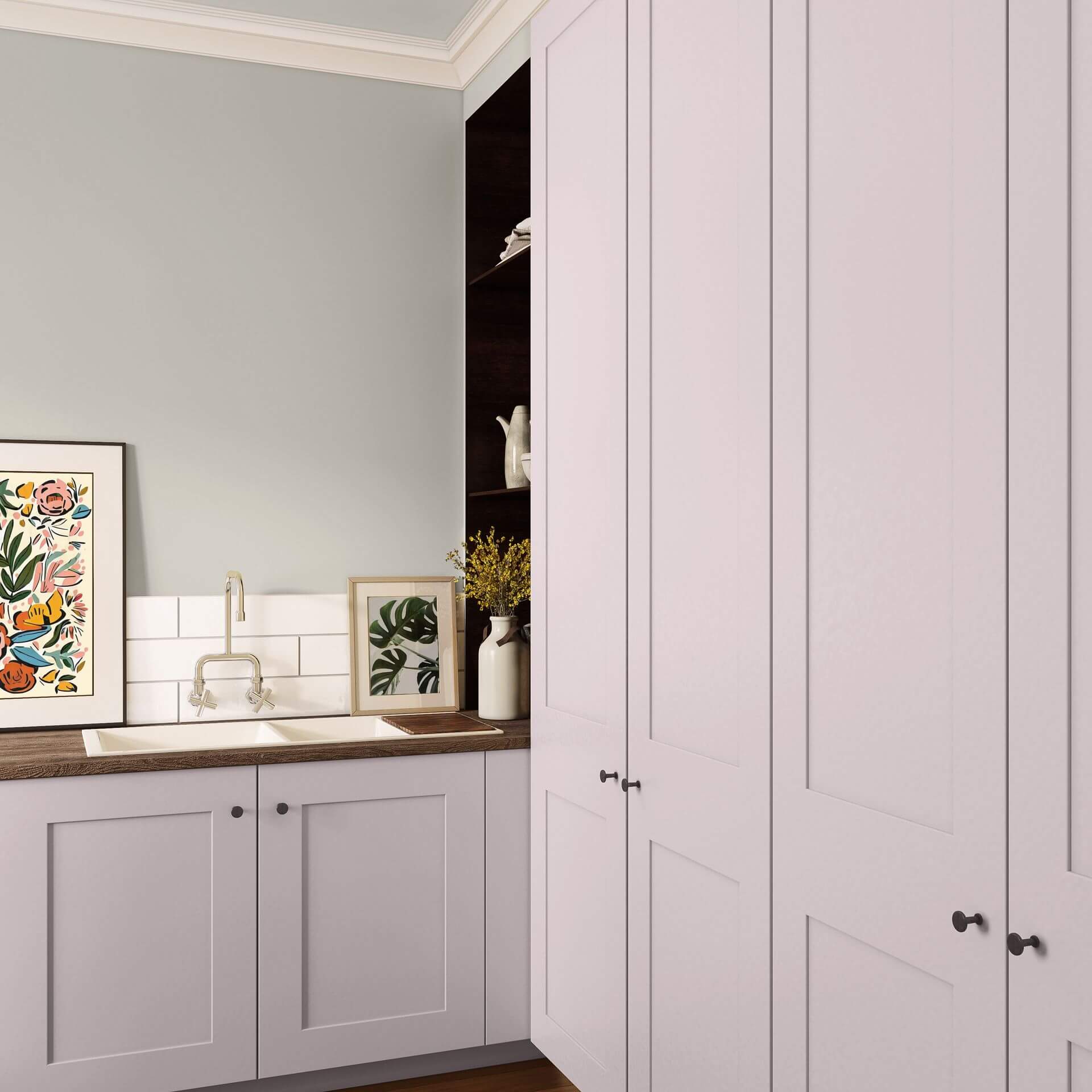
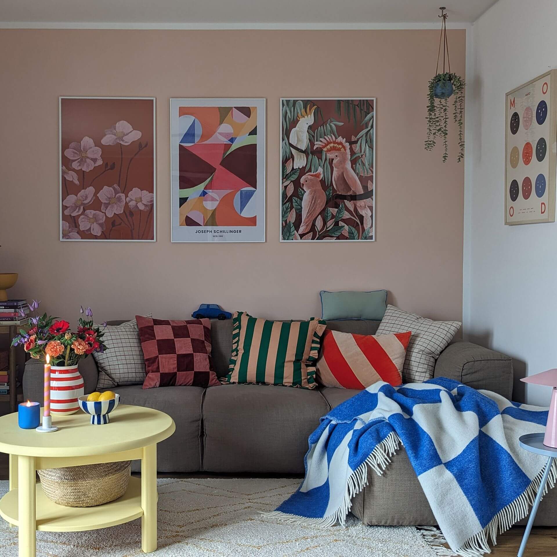
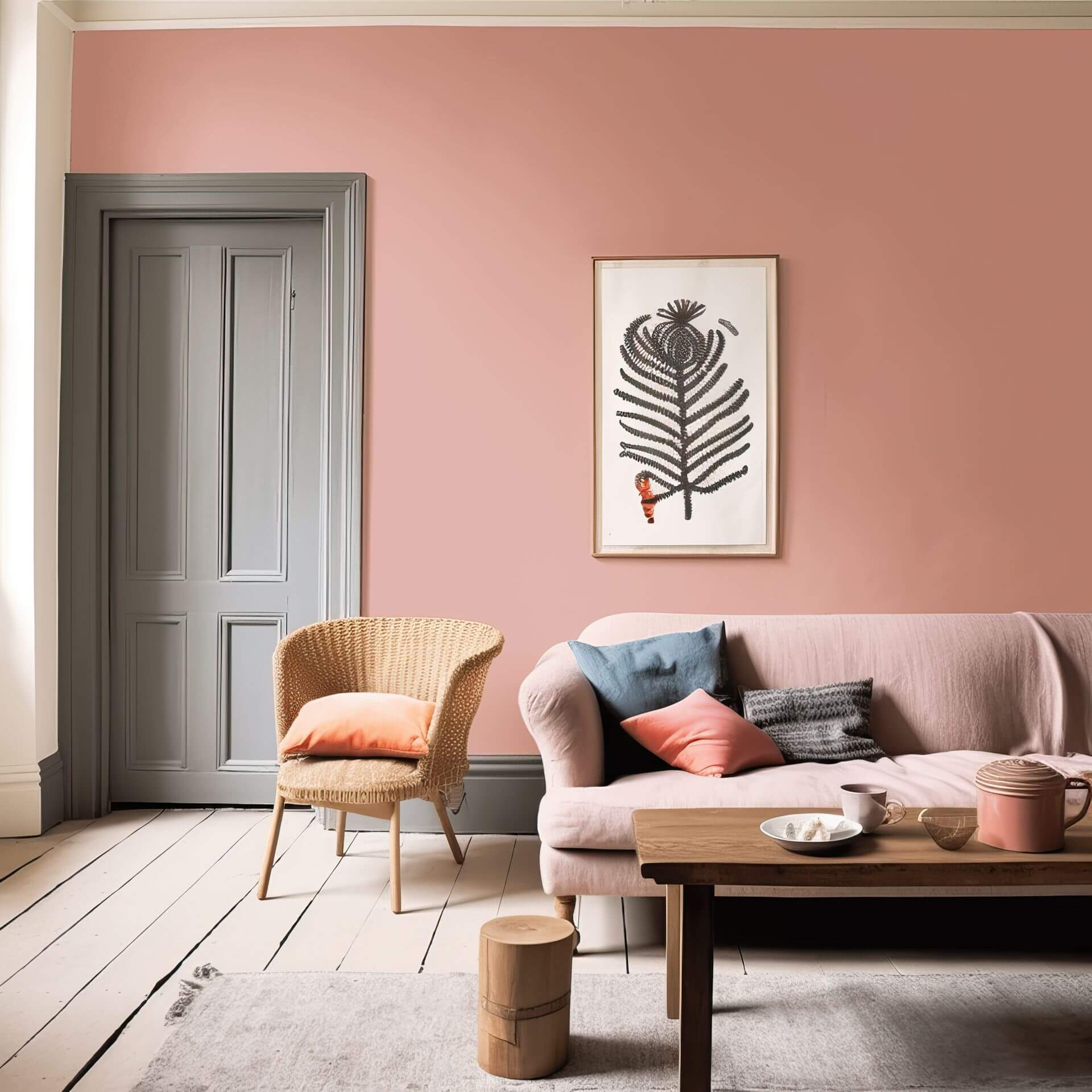
In the kitchen and living room, pink-painted walls can create a beautiful ambience. Combine pink walls with grey or black shades to achieve a refined and sophisticated character.
Tips for the Trend Colour Pink
Such a versatile colour can be used anywhere. Be it the living room or bedroom, bathroom or kitchen – pink enhances any space.
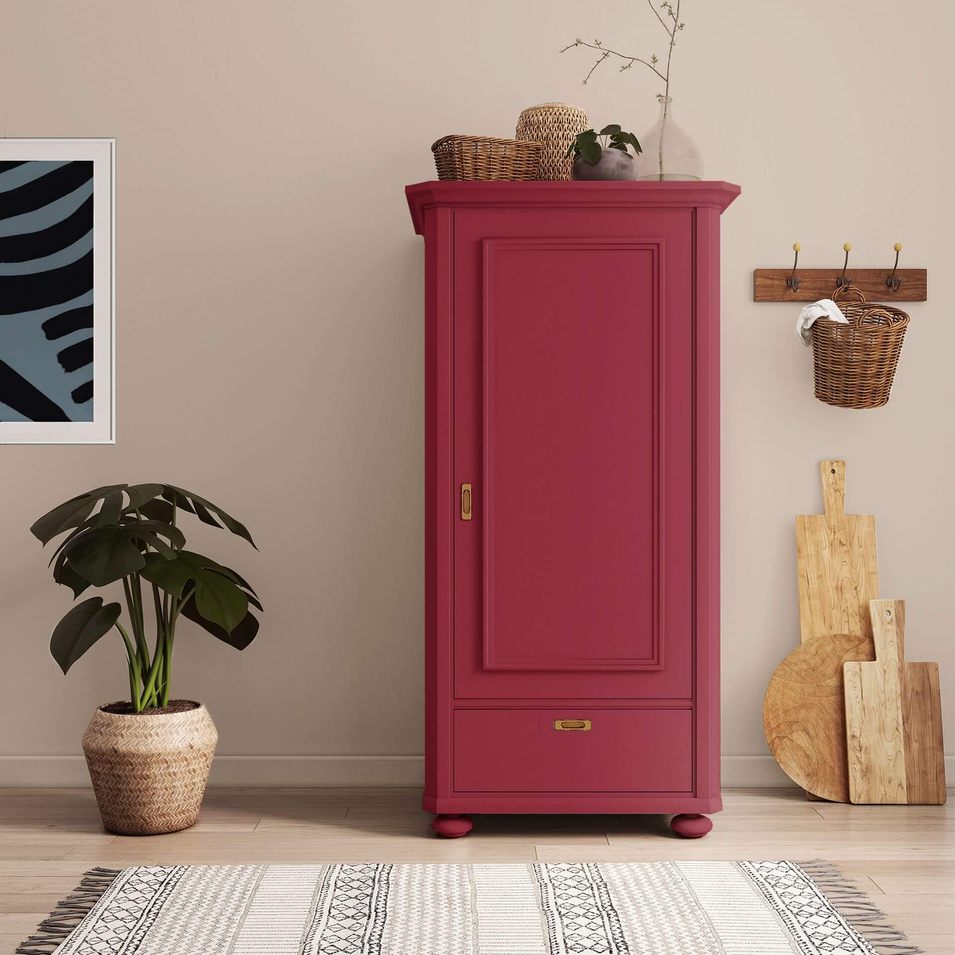
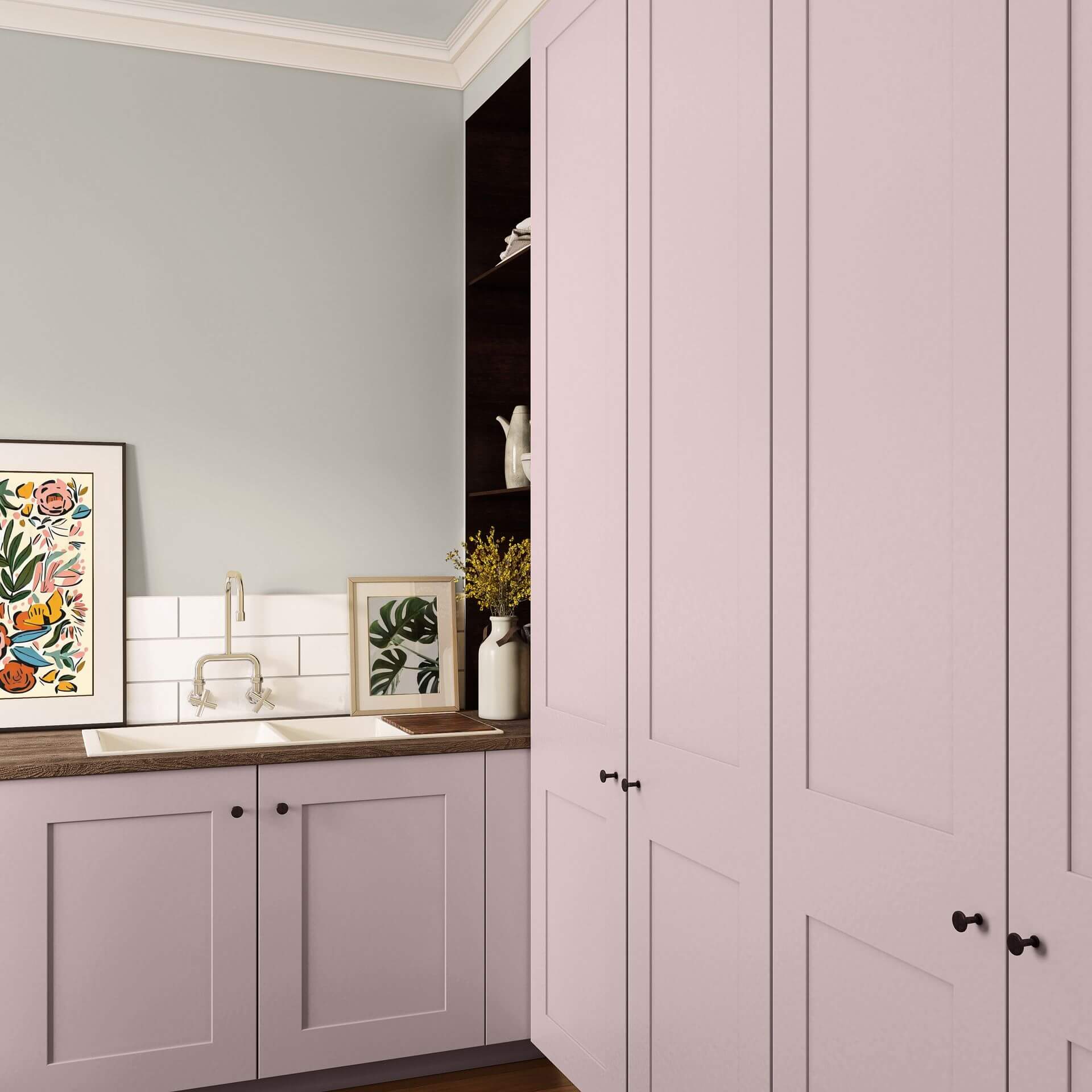
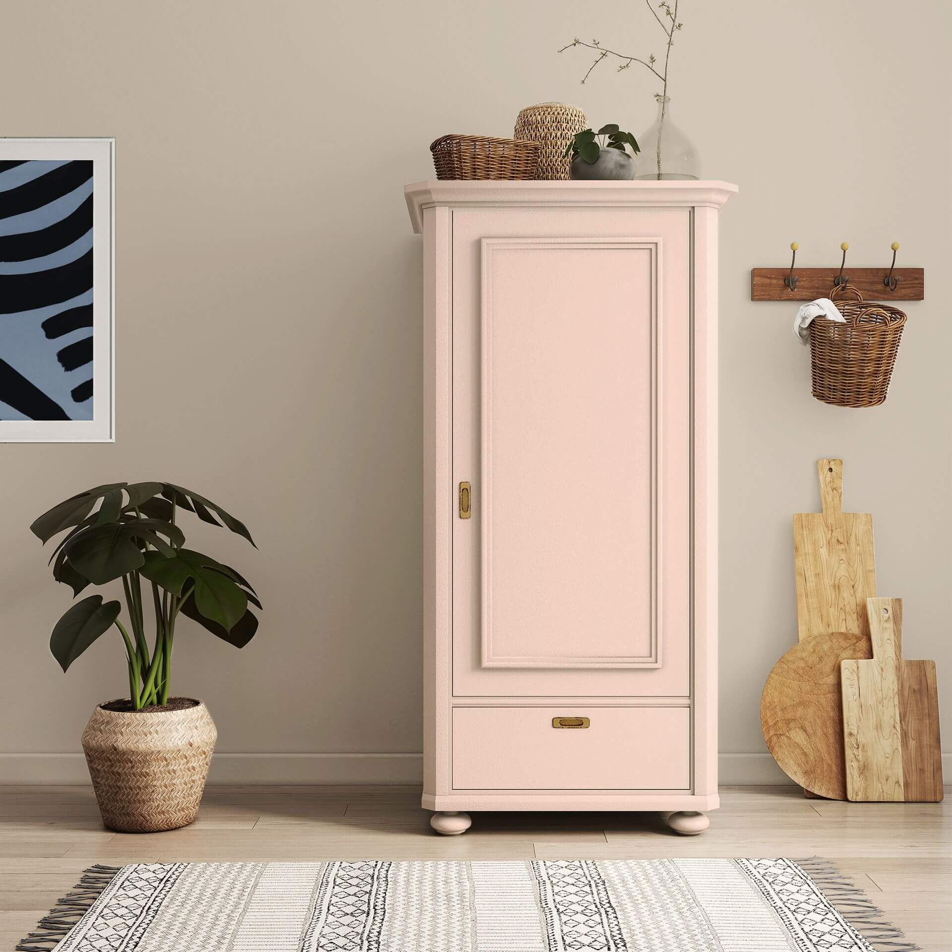
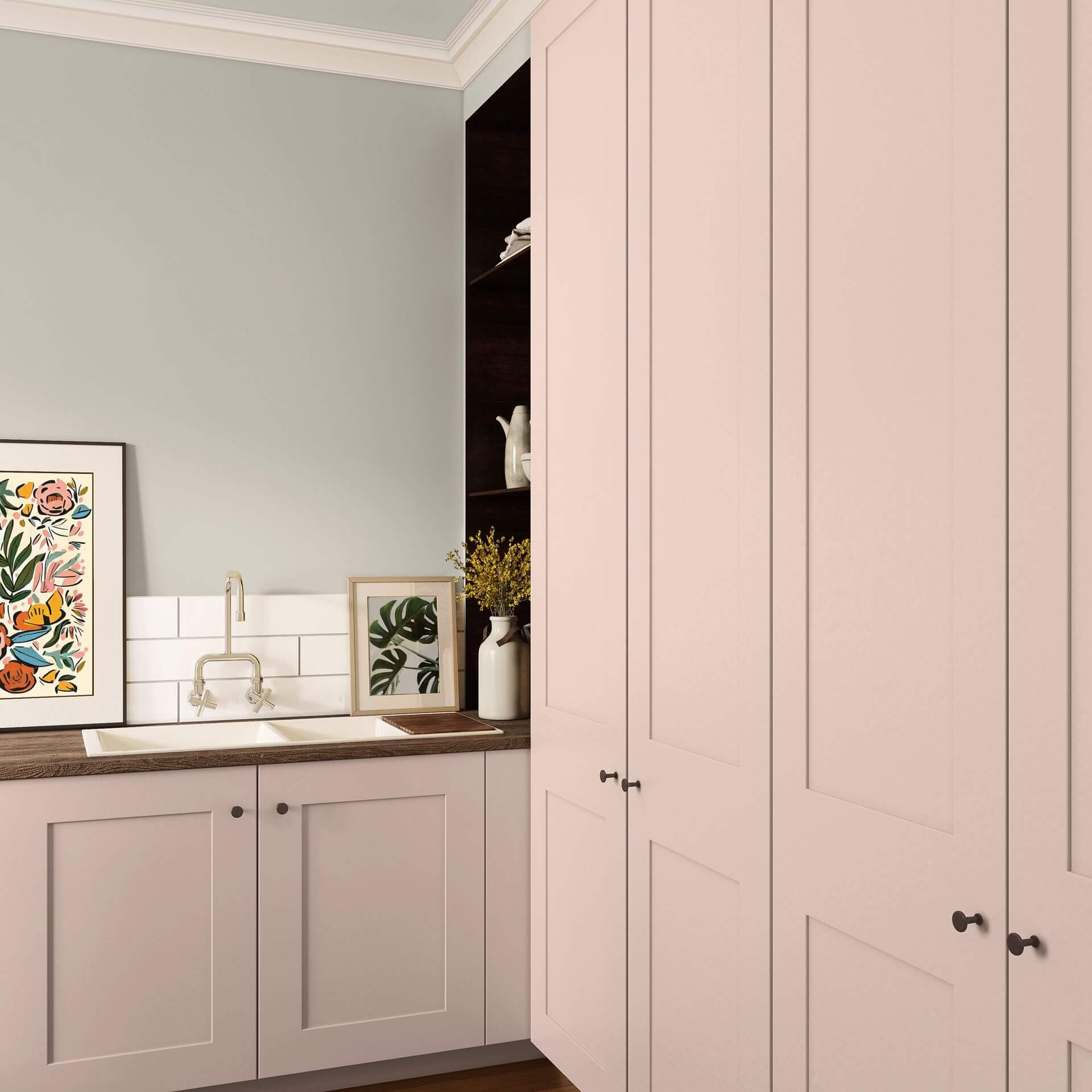
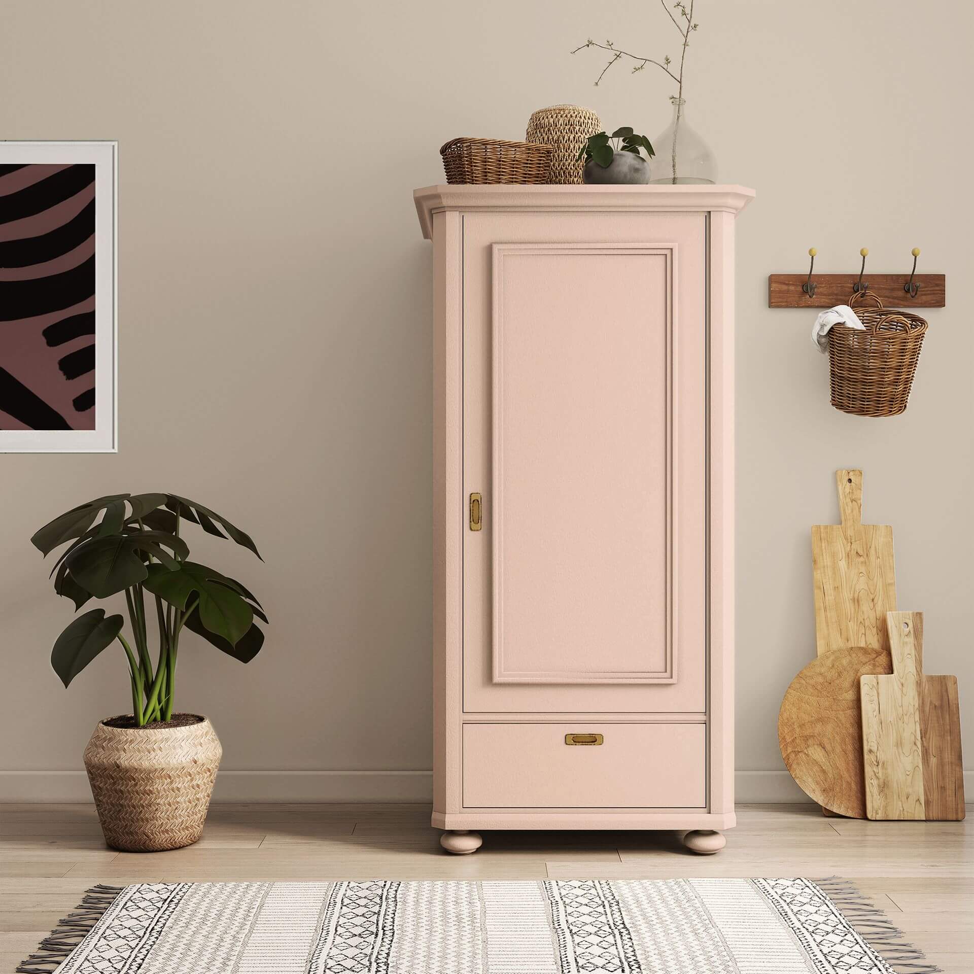
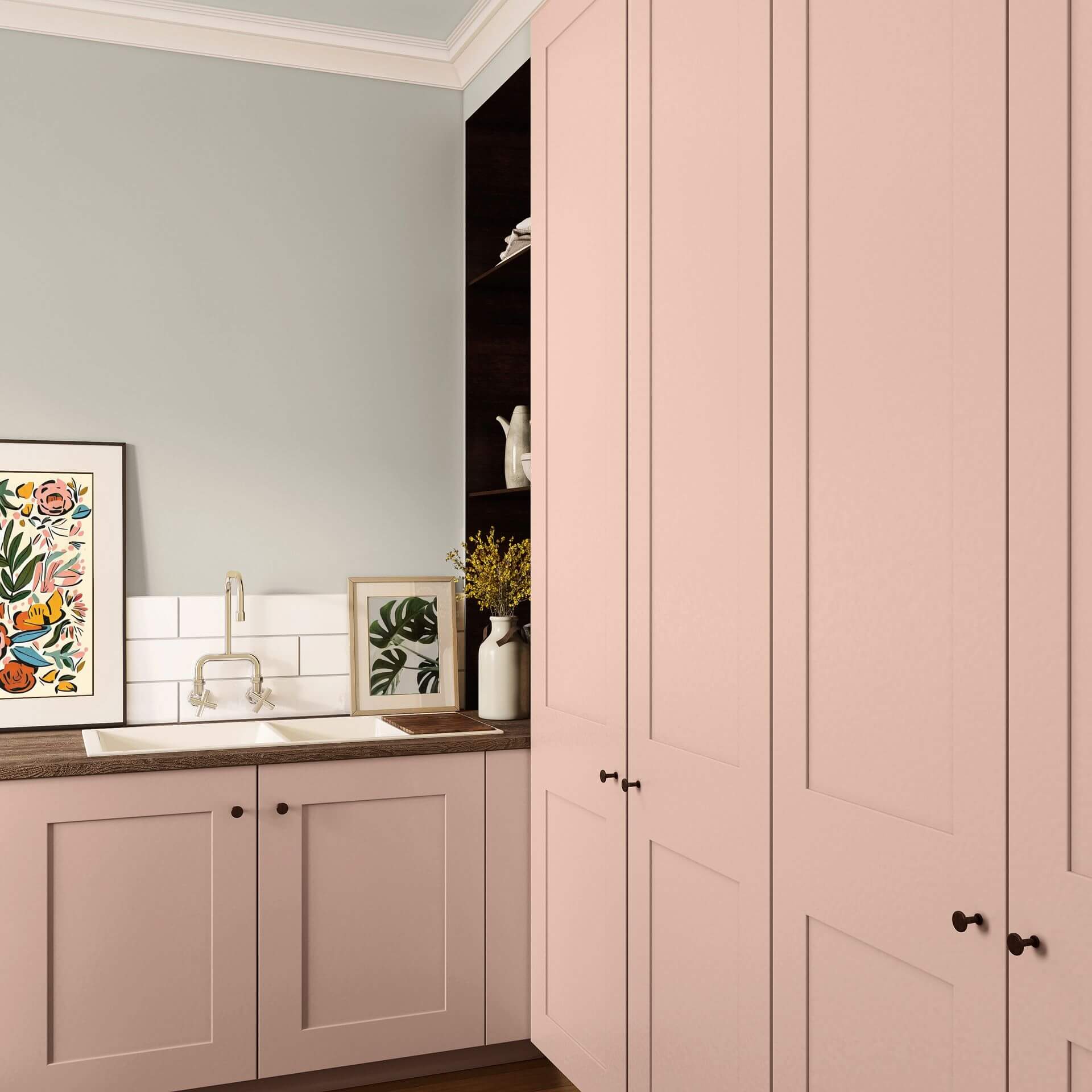
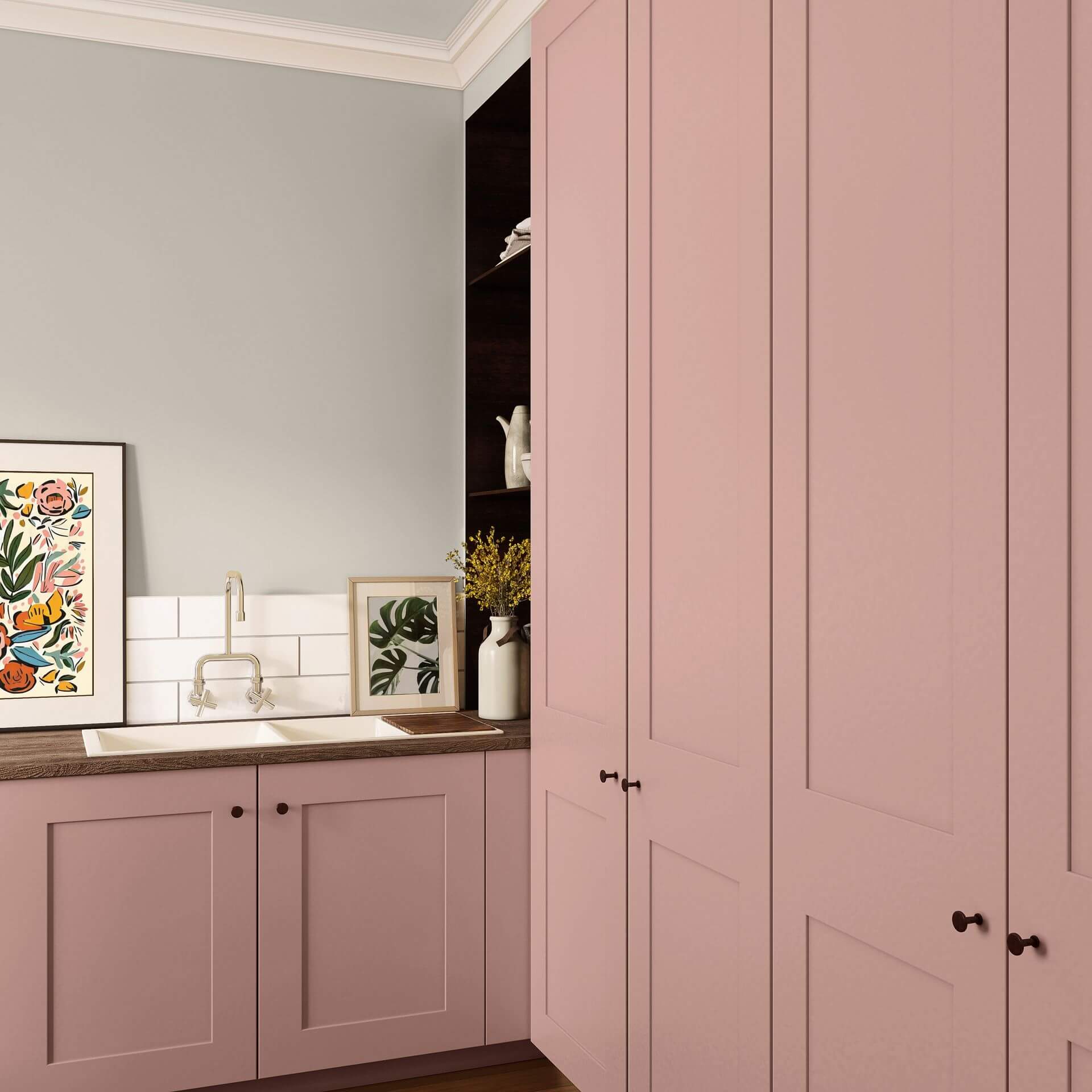
Coloured lacquers in pink create an appealing accent but can also be applied to larger areas. Choose a pink lacquer to highlight a fitted wardrobe or your coffee table. Their silky matte finish particularly brings out the velvety colour of these coloured lacquers.
Interior Styles and Trends in Pink Hues
Due to its versatility, pink can be integrated into various interior styles, which is why it should definitely be used more often.
Perhaps a romantic pastel interior style comes to mind first. Here, pink finds a perfect setting alongside other pastel shades, lace fabrics, and playful accessories. Additionally, use gold or silver elements to create elegance. With suitable decoration, you can avoid a kitschy impression. After all, pastel colours are known for their relaxing and gentle effect.
If Shabby Chic has already found its way into your home, use a delicate pink like Rose with Almond Blossom to add colourful accents between white and grey.
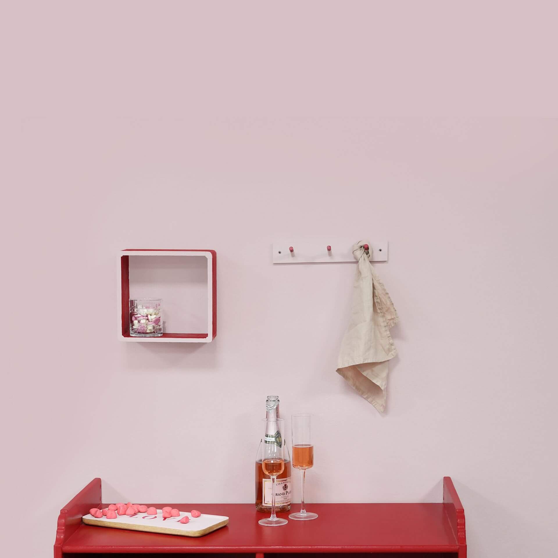
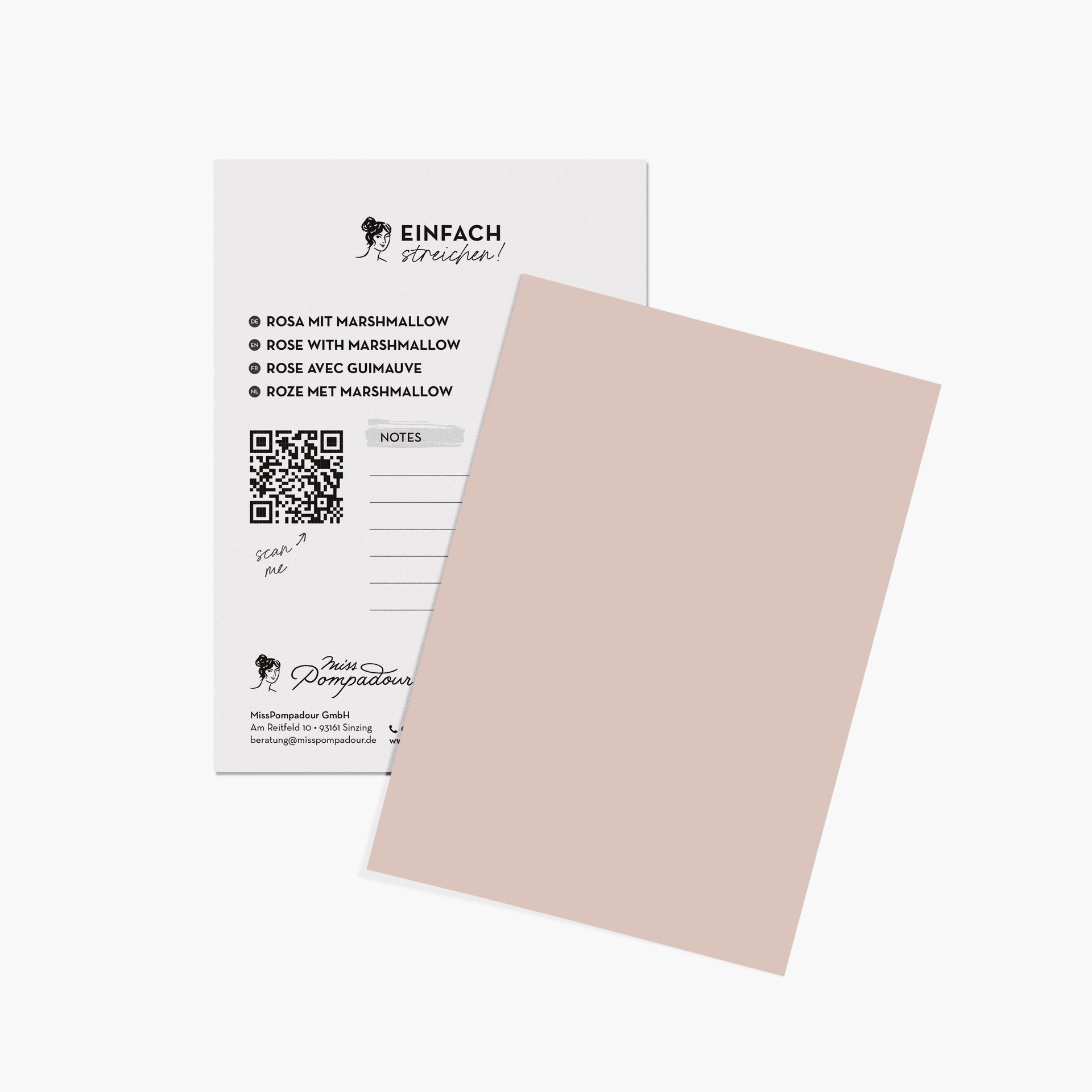
A pink accent wall with Rose with Marshmallow also skilfully highlights the Monochrome Style. If you paint an area with pink wall paint and the furniture in the same shade, this accent is sure to catch everyone's eye.
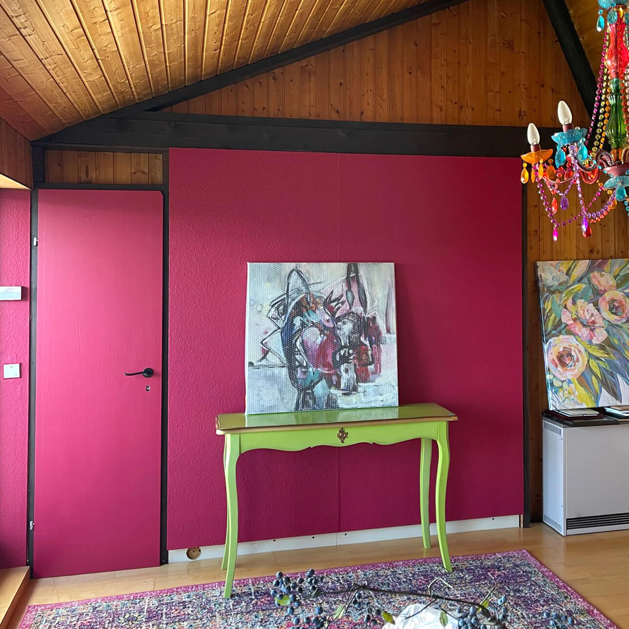
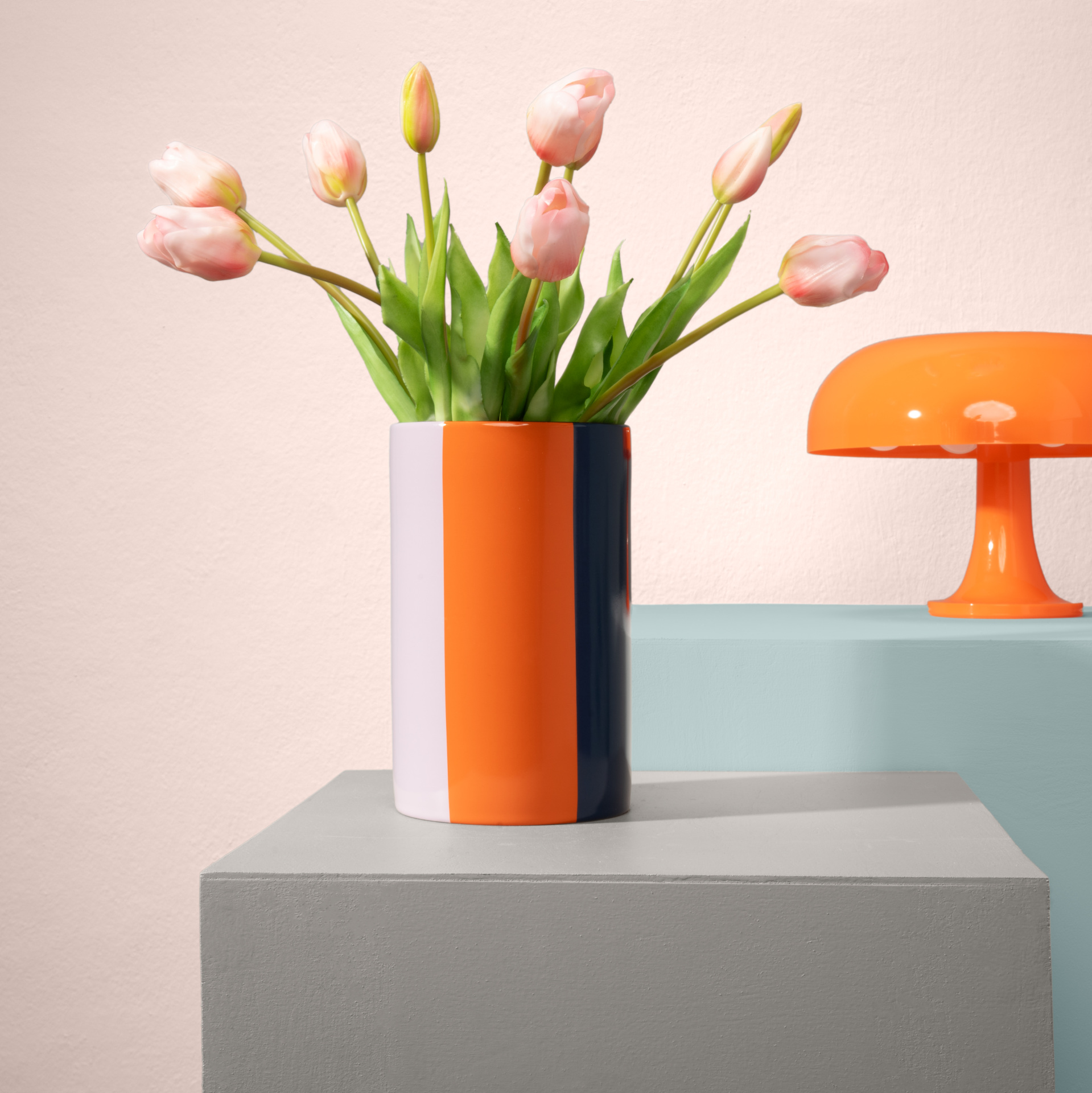
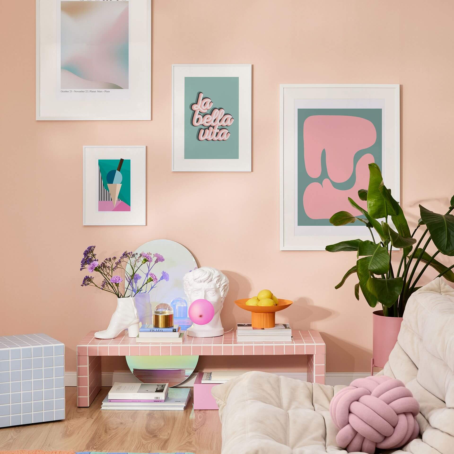
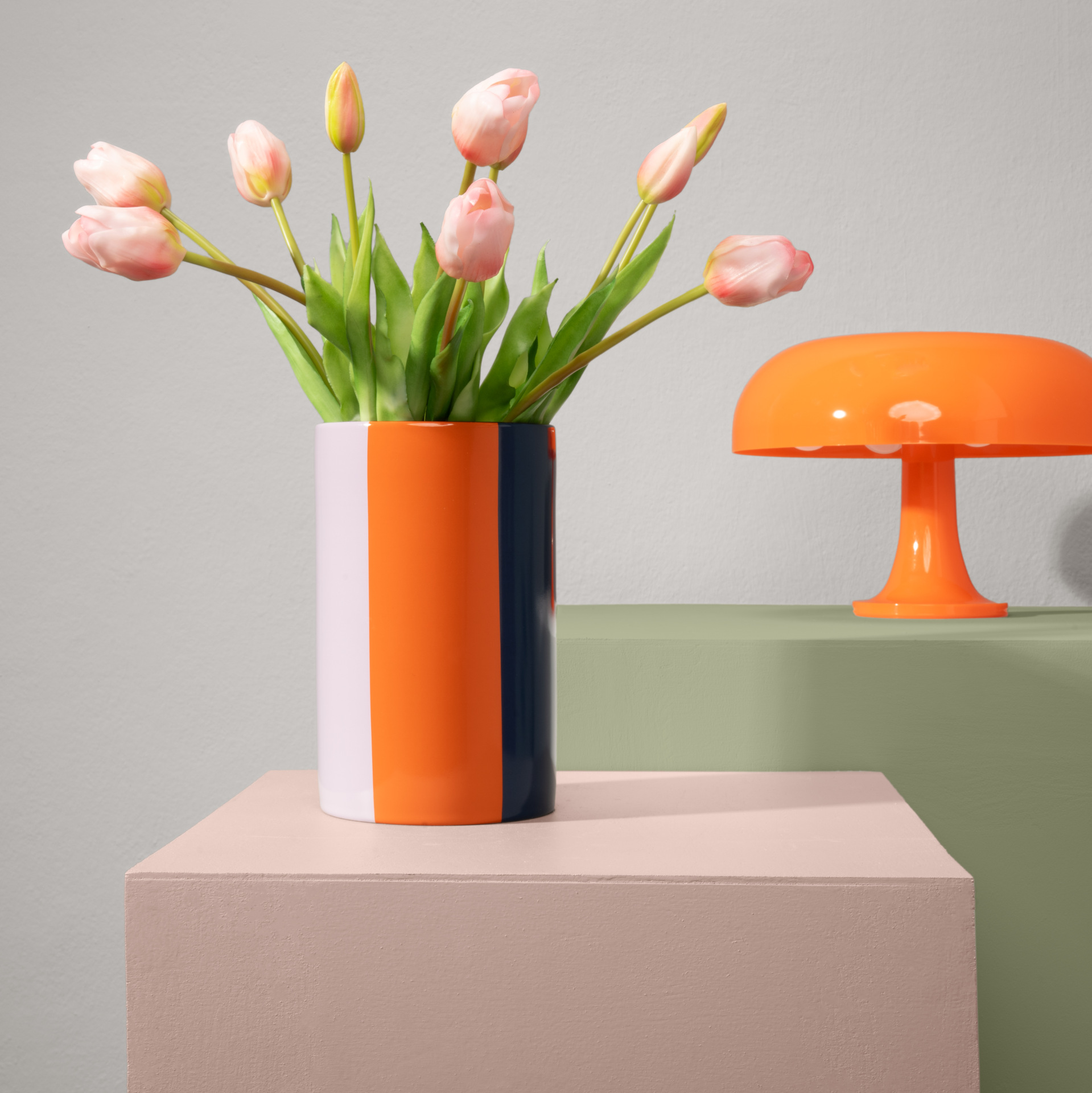
The Dopamine Decor trend is all about saturated colour – and pink fits right in! A bold pink hue combined with other strong colours like blue and green creates a chic, eye-catching effect here. Pink with Peony is a fantastic shade here, with that certain something!
If you prefer a modern style like Industrial, then pink is the perfect choice. With the trend colour pink, you can create perfect accents even in a linear style. A clean, minimalist interior style can be given an interesting addition with an intense pink wall paint.
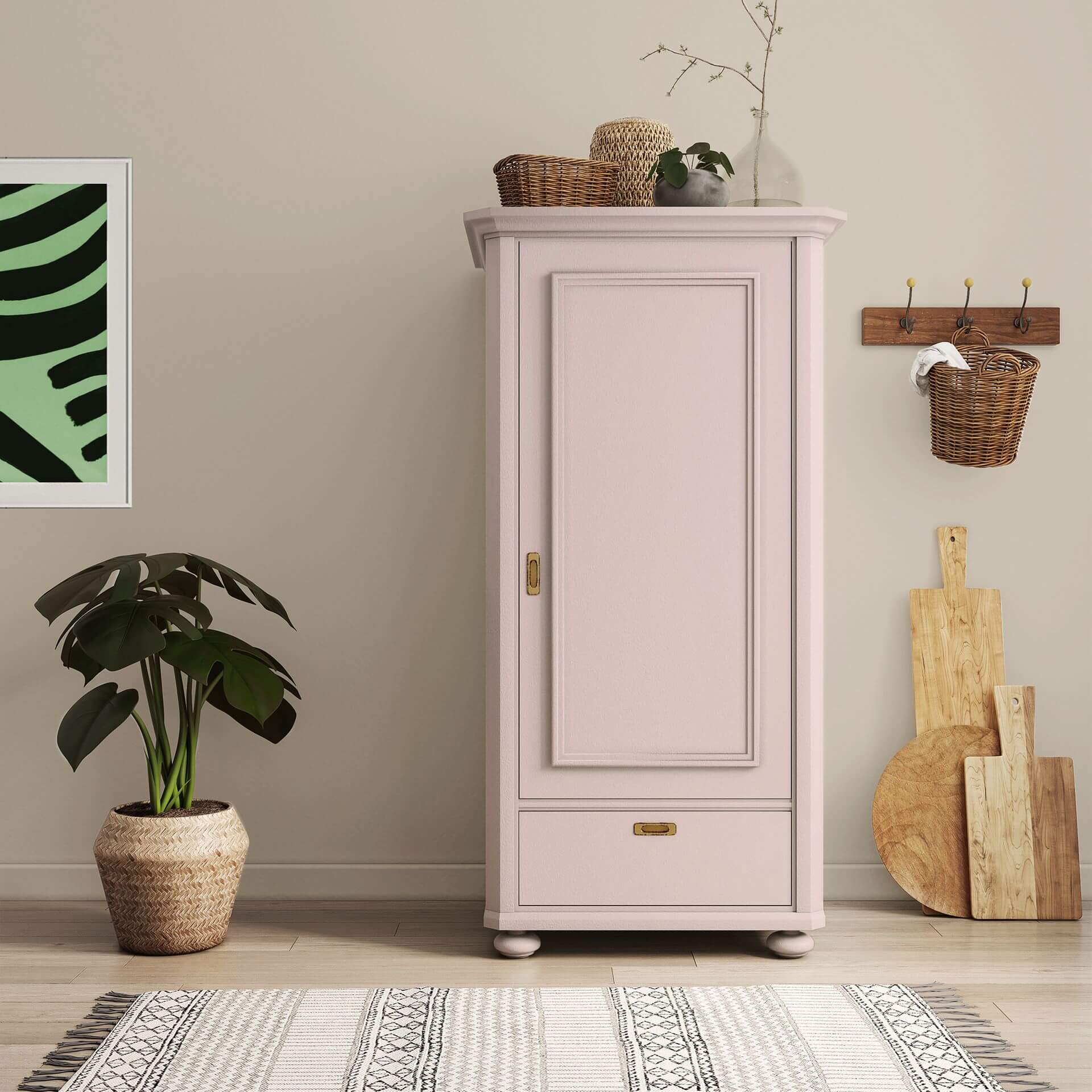
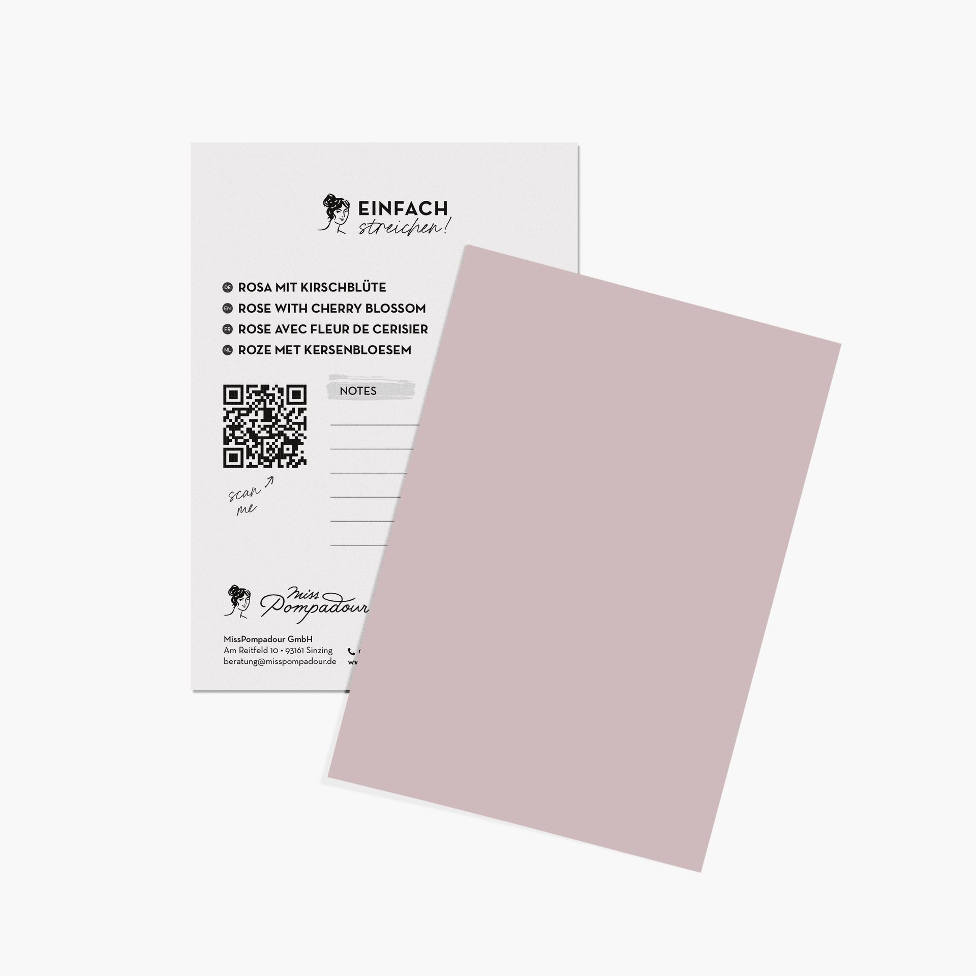
Light, brownish pink shades like Rose with Cherry Blossom perfectly complement natural elements and materials such as wicker and rattan in the Boho Style.
Pairing Colours for Pink & Co.
Pair pink with grey and beige shades if you want to achieve a harmonious and calm effect. Dark anthracite and black emphasise the gentle effect of pink. If you like pastels, the complete colour palette of pastel shades is at your disposal.
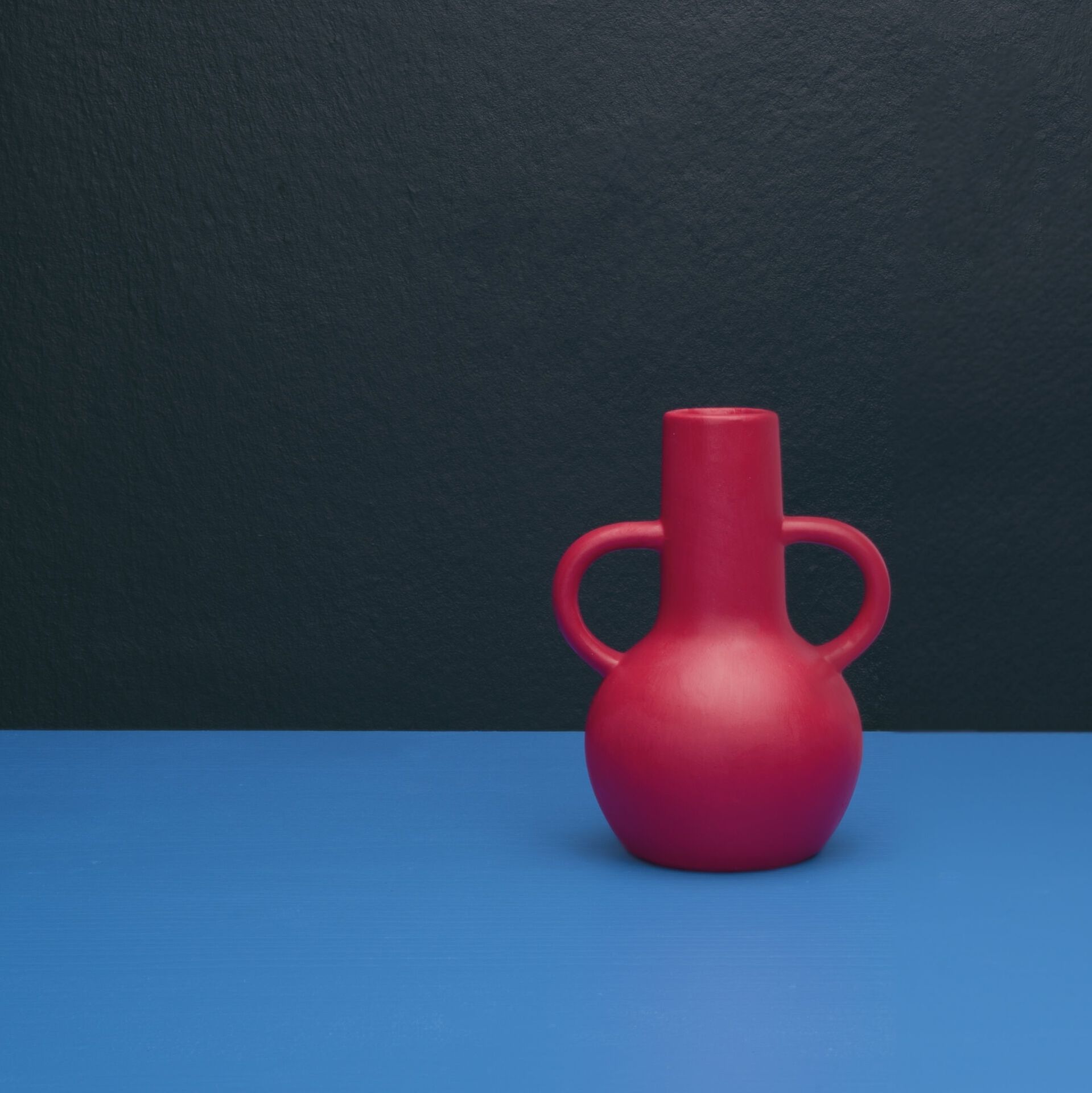
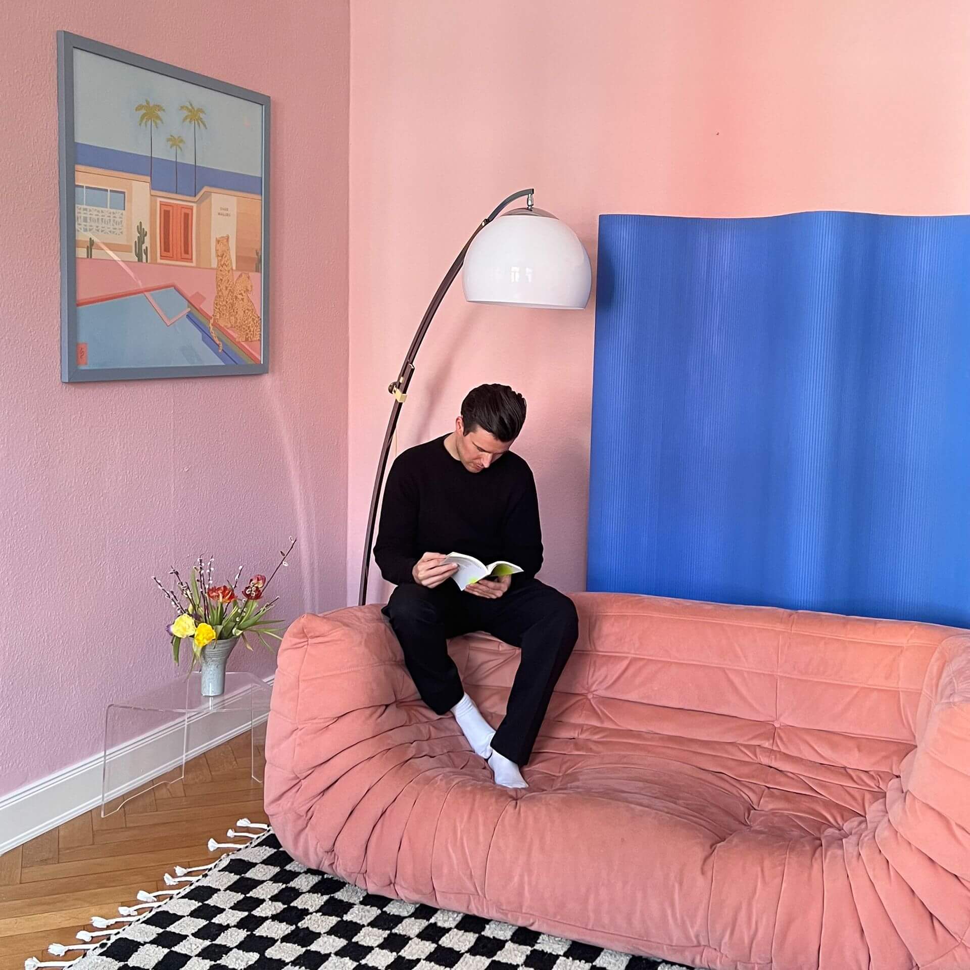
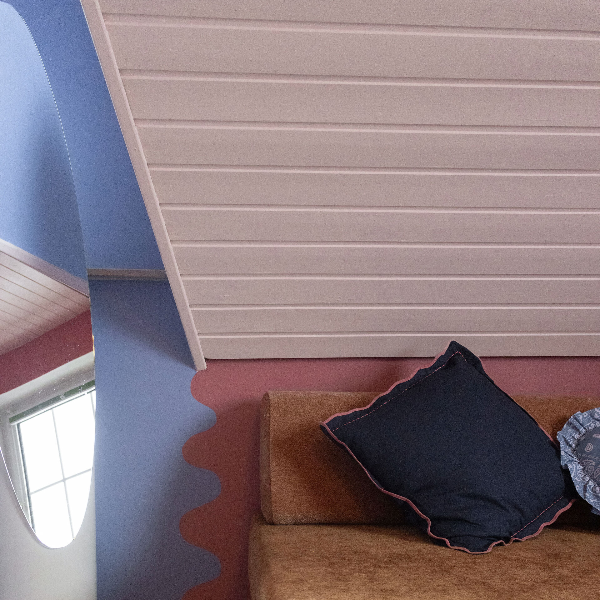
Generally, both vibrant and less intense colours suit pink. If you want to emphasise pink, it's best to combine it with strong colours like a vibrant blue. If you're aiming for depth of colour, paint an accent wall in a powerful, dark blue, such as our Blue with Ink, and place a piece of furniture in front of it that you've painted with pink lacquer. Choose a pastel pink for a perfect combination.
The complementary colour green also enhances the luminosity of this expressive shade. For example, combine olive green with pink to achieve an exceptional look.
Pastel shades like a delicate yellow or green also lighten up pink. However, avoid too many bright shades in a small space, as this can quickly create a garish effect.
The MissPompadour 'Pink & Rose' Project Guide
From Soft Powder to Vibrant Magenta: Perfectly Using Colour with Character
In our Project Guide, we'll show you how to use the entire spectrum from delicate pink to energetic pink to bring joy into your home. Whether you want to create a calming atmosphere in the bedroom or make a bold design statement with a vibrant pink, we have the perfect inspiration and the right product. Discover the versatility of these power colours and start your next painting project!
Pink & Rose Wall Paint: Mood-Setters for Your Walls
A pink wall paint is a classic for creating a soft, comforting atmosphere. If you prefer something bolder, opt for a confident pink to bring accent walls to life. Our matte wall paints adhere excellently to plaster and wallpaper. Thanks to their high pigmentation, they offer excellent coverage, perfectly showcasing both delicate pastel shades and intense pink.
Pink Tile Paint: A Bold Statement for Your Bathroom
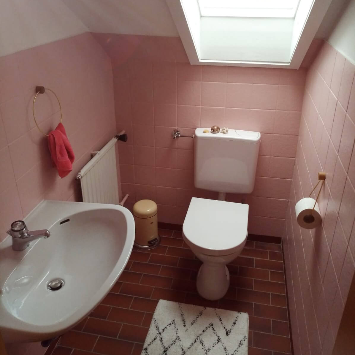
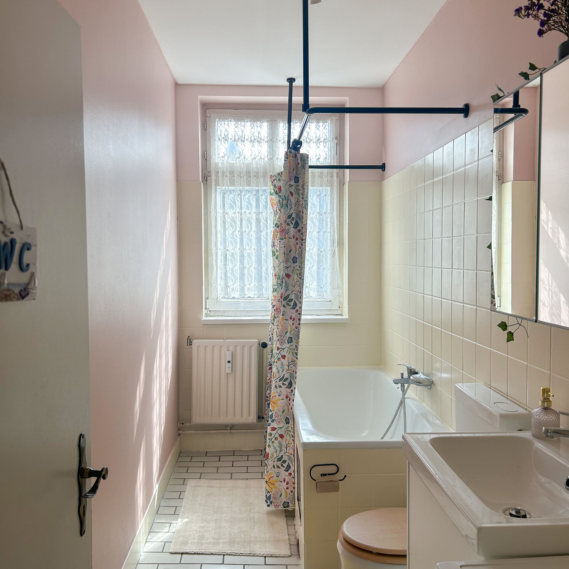
With pink tile paint, you can transform a dreary guest toilet into a true design hotspot. Especially when combined with black fittings, a vibrant pink looks extremely modern and high-end. You can also create accents with pink or rose in the bathroom. With our high-quality and durable lacquers, you'll save yourself the hassle of sanding tiles: simply clean thoroughly, apply a coat of To Bond & Block, and then paint with your desired colour!
Pink Furniture Paint: Gentle Highlights for Your Interior
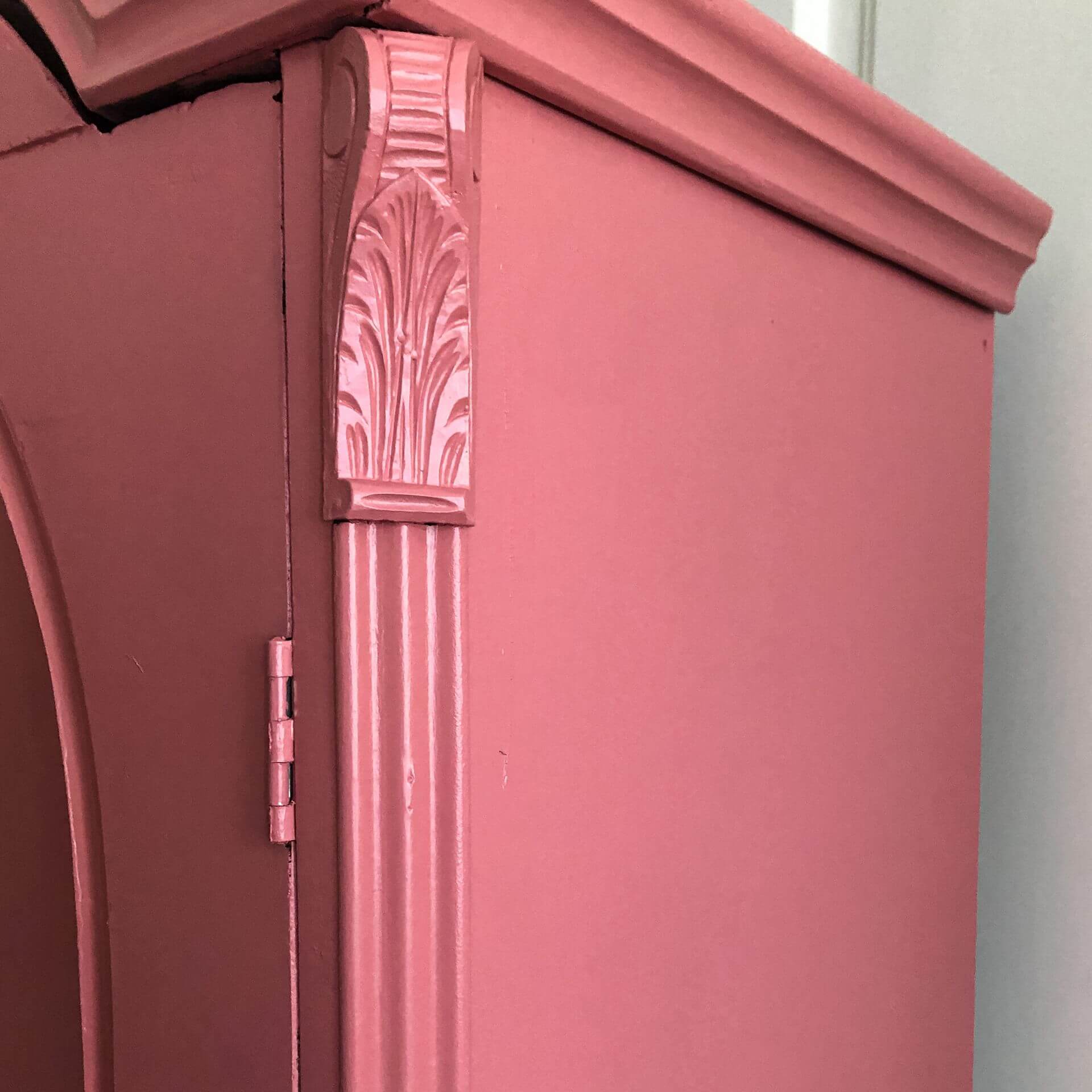
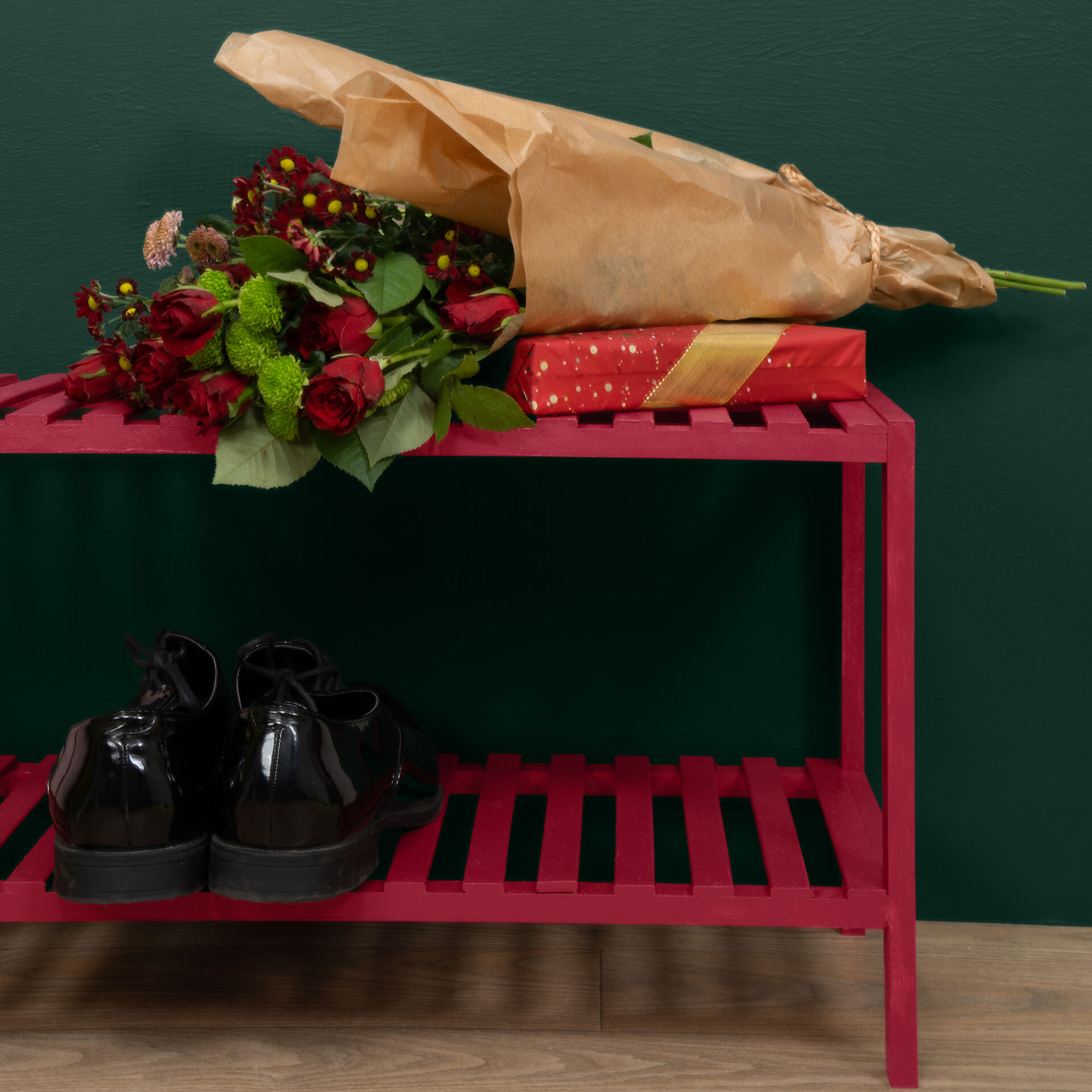
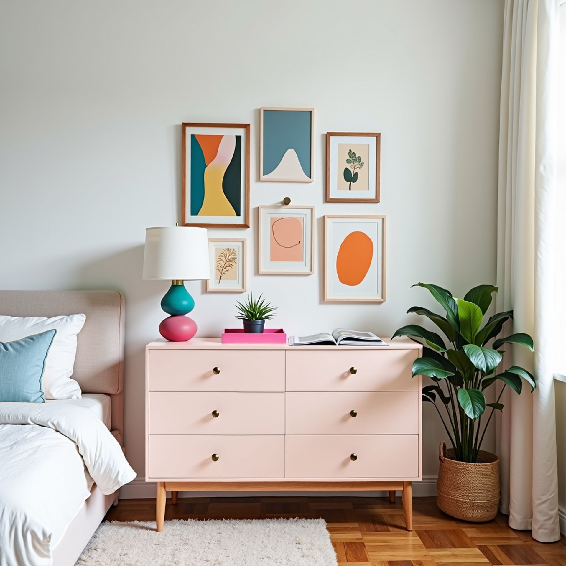
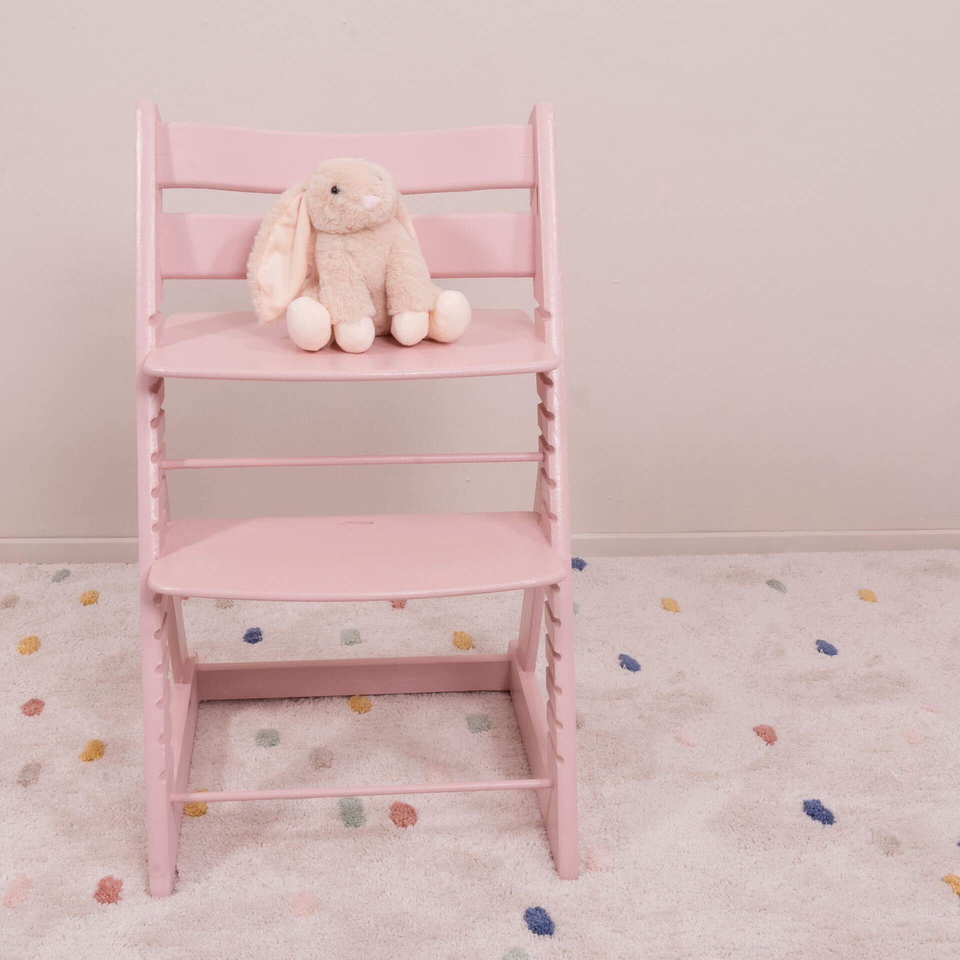
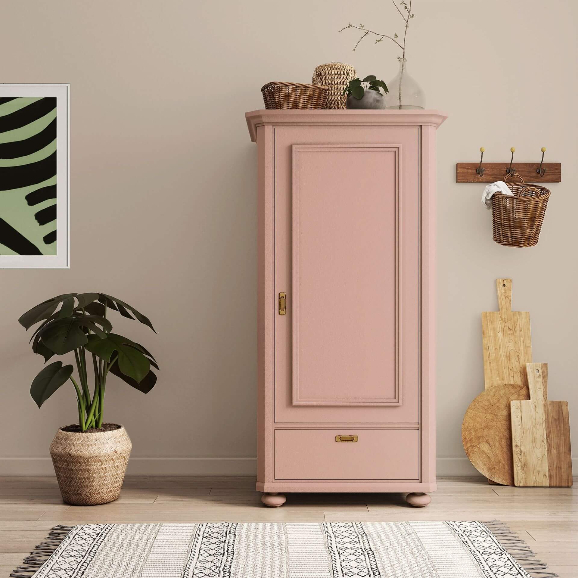
Our pink furniture paint is ideal for giving old chests of drawers or chairs a fresh, romantic look. The lacquers adhere to almost any surface without tedious sanding. You can also paint smooth surfaces or bleeding wood with it. Here, you'll first use our primer To Bond & Block. Afterwards, the **pink furniture paint** will adhere even to IKEA furniture. While a light old rose exudes calm, you can create exciting contrasts in your interior with small accents in vibrant pink.
Pink Wood Paint: The Star of Dopamine Decor
Pink wood paint is the secret ingredient for the trendy Dopamine Decor style. This trend focuses on colours that make you happy – and a vibrant pink on wood surfaces is perfect for that. The lacquer reliably protects the wood from wear and tear, while providing an unparalleled, positive radiance.
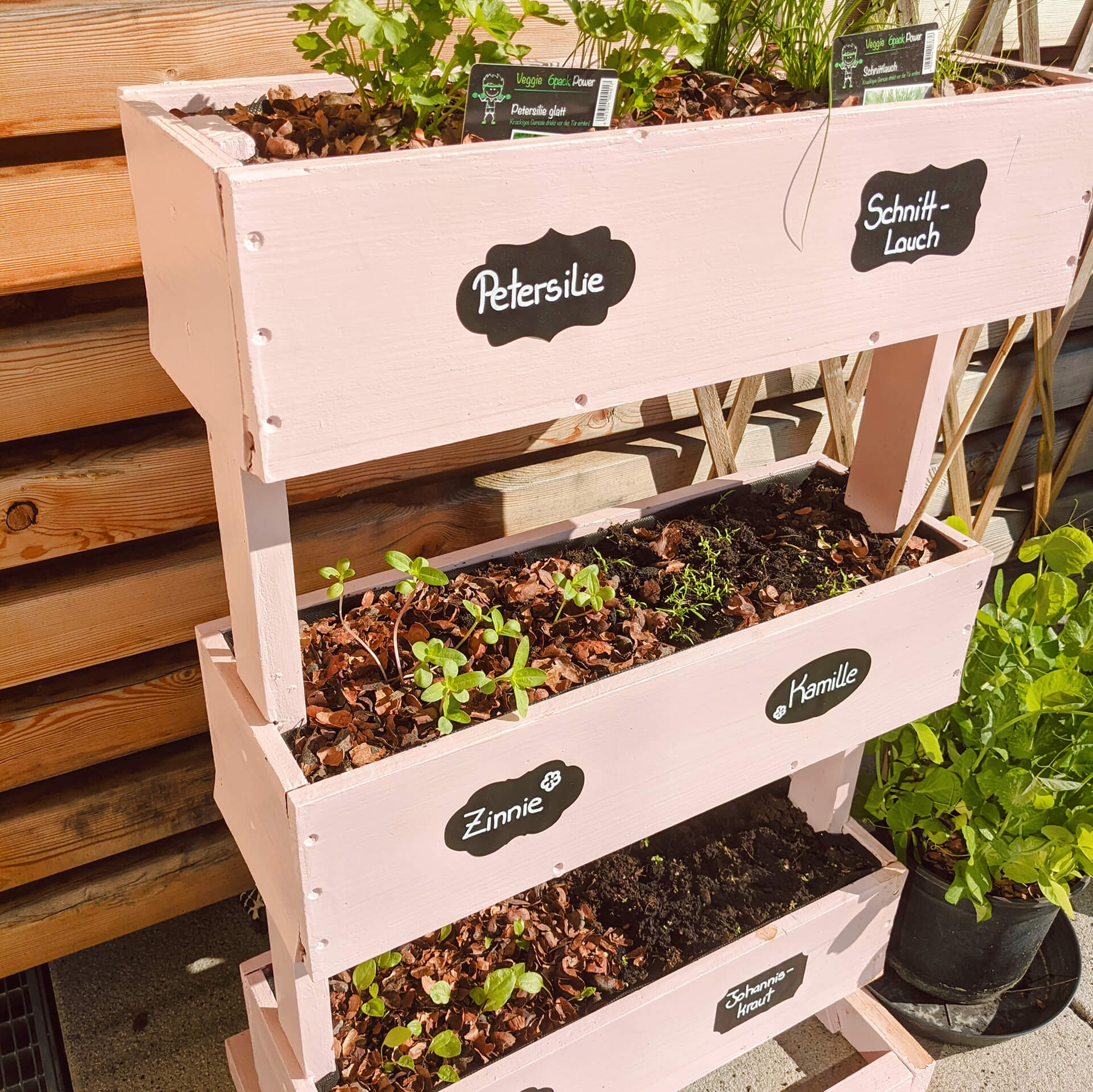
Pink wood paint is also a hit in the garden. With our outdoor lacquers, you can simply paint your garden furniture in your desired colour!
Specifically for your balcony and garden furniture, our Balcony & Garden Lacquer was created – as the name suggests. It is characterised by particularly good weather and UV resistance. The gentle Evening Sun Rose blends perfectly into natural environments.
Shop Pink & Rose Paint at the MissPompadour Online Store
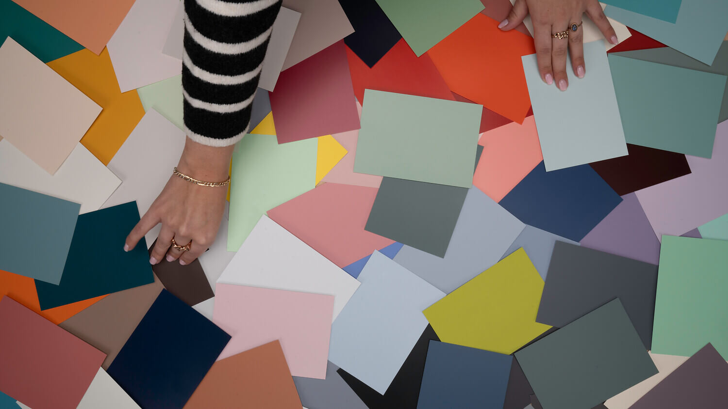
We recommend that you first order colour cards so you can test the shade directly on your project. If you need help choosing pink or rose shades, simply get in touch with our free colour consultation service. Our team will be happy to help you with your selection and advise you on your painting project. That way, you'll also know exactly what else you need.
Once you've ordered your paints, we'll send them to you carefully packaged and as quickly as possible via DHL GoGreen. You can pay us in many ways, including by invoice. Go ahead and simply start painting!
What is the difference between pink and rose?
Pink refers to very strongly pigmented colour shades with more red components. Pink usually also contains blue and grey colour components. Pink, on the other hand, is always more or less tinted with white. The best known of these is the delicate pastel pink. Pink and rose can both be mixed with grey, brown, orange or blue pigments. A warm pink colour can be achieved by adding a little brown pigment
Which colour looks warmer: pink or rose?
This depends on which pigments are added to a shade of pink. Pink often appears cooler due to blue colour components. However, there are also cool, light shades of pink.
How do you combine rose and pink?
Depending on the style of living, shades of pink can be combined in a variety of ways, from so-called achromatic colours such as black, white and grey to all shades that are contained as pigments in the respective pink.
If you like it playful and romantic, combine lace fabrics and floral prints with pink. Natural elements such as wood, linen or grasses are ideal if you have a boho style interior. If you prefer straight lines, combine pink with Grey and black or silver metal elements. Copper, gold and rose gold - used sparingly - look elegant with pink.
What makes the effect of pink so special?
In colour psychology, pink represents softness, delicacy, and deep tenderness. The symbolism of the colour is associated worldwide with positive emotions such as innocence and hope. We often speak of seeing the world through "rose-tinted glasses". This sense of lightness can be perfectly translated into your home: a delicate Pale Pink or an elegant Rosé creates a calming atmosphere that invites you to relax. Every description of our shades on this page will help you find the exact nuance that reflects your personality.
Where do the various shades of pink and rose come from in nature?
Nature is our greatest source of inspiration. We find colour in the delicate petals of a classic rose, the vibrant plumage of a flamingo, or the soft clouds of a sunset. This organic blend of different shades ensures that our colours never look artificial. Whether as a bold rosy red or a subtle addition to neutral tones, pink brings vibrant energy to every aspect of your interior design.
Is pink just a colour for femininity?
The strict boundaries between fashion and interior design have long since dissolved. While pink was once often associated solely with femininity, more and more men are now discovering the power and stylish tranquillity of this colour for themselves. In modern clothing and fashion, pink is a real statement piece. The colour is also used in advertising to attract attention while conveying a modern, open image. A vibrant pink breaks with old patterns and shows the courage to embrace an individual style.
How best can I combine wall paint in dusty pink and pink?
A wall paint in dusty pink is an absolute all-rounder. It harmonises perfectly with natural materials and colours like beige, which gives the room an earthy stability. For a modern look, you can combine different shades of red or create intentional contrasts. Pay attention to the light and brightness in the room: while darker nuances provide a sense of cosiness, a light pink makes the room shine.