


Colour psychology: How colours influence the effect of a room
10 min reading time
The light in the room seems dim, the living room seems too big, the bathroom too small? And the bedroom somehow has a really uncomfortable atmosphere? You can change all that with the right colours. Here you can find out how colours work and how you can use them skilfully to give your rooms the right feel-good atmosphere.
Table of content
1. What is colour psychology?
2. The effect of colours on the psyche
3. The effect of colours on spatial perception
4. Before and After photos from our Painting community
5. The ideal colour for every room
6. Tips and tricks for an optimal colour scheme
7. Frequently asked questions & answers
What is colour psychology?
Colour psychology is the study of what emotions different colours trigger in people and how this affects their behaviour. Scientists investigate how different colours influence our mood, our perception and our well-being. The application of colour psychology can therefore make a significant contribution to interior design. With the right colours, rooms can be made cosier, more inviting and more functional
The effect of colours on the psyche
Which colour actually has which effect on people and can the human perception of colour really be generalised? Of course, the world of colours is almost infinite, but we will try to provide a general overview here. Let's start with the basic colours and begin with the colour red
The colour red
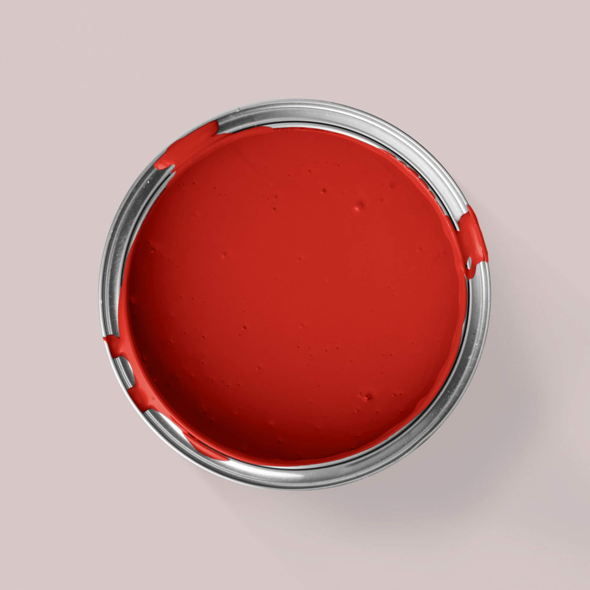
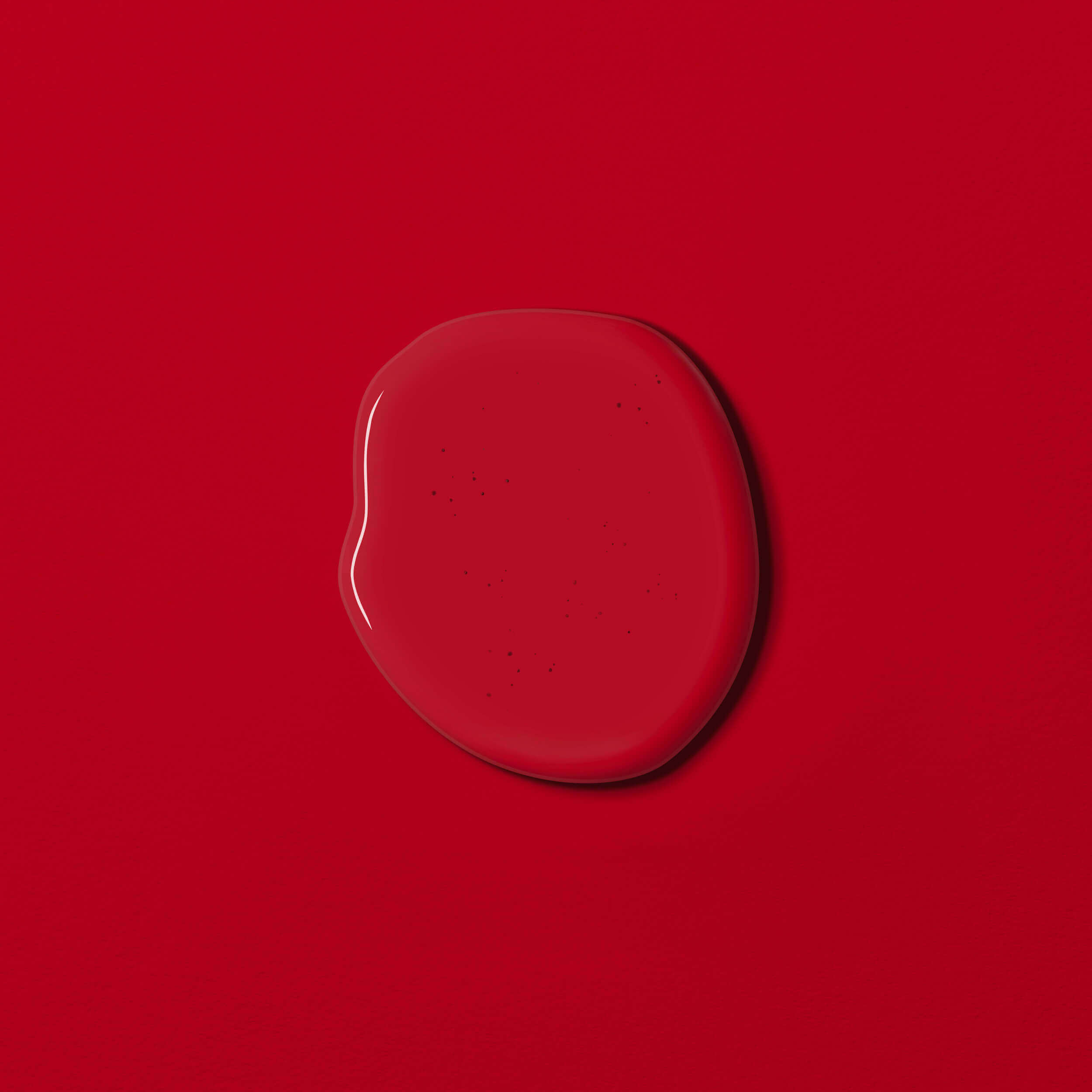
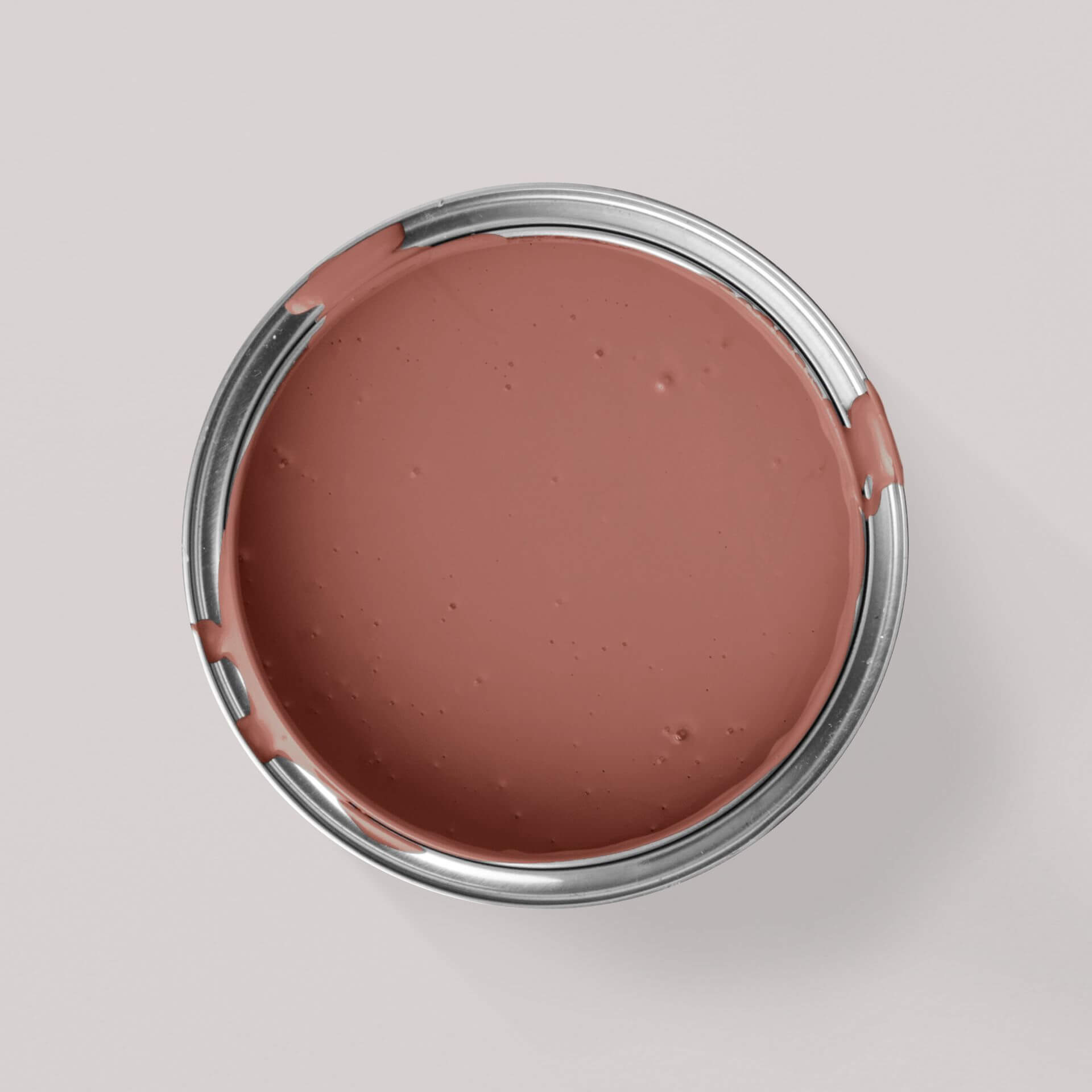
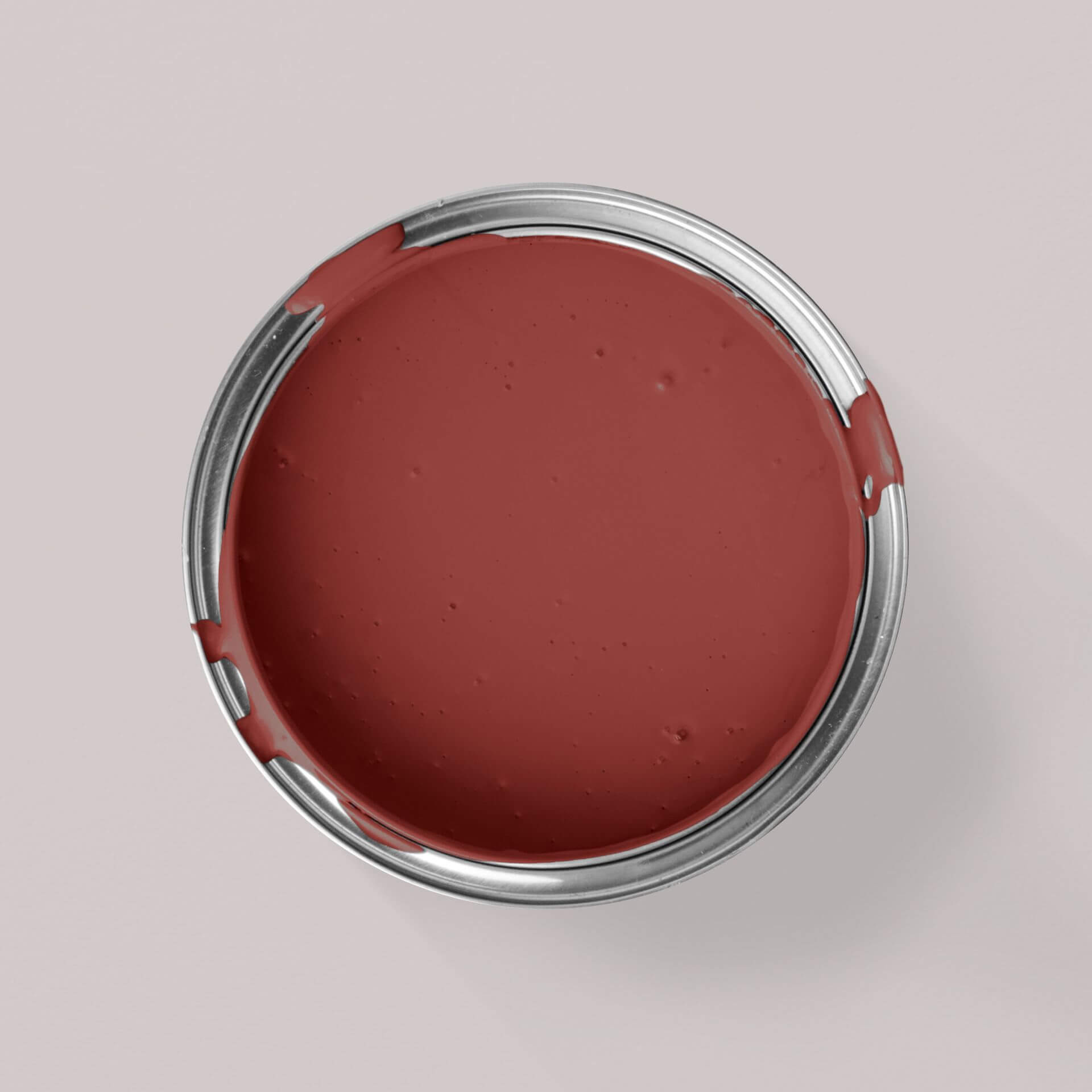
Red is a colour with a strong impact on our emotions and behaviour. This is because it has a stimulating effect and can trigger a variety of reactions. Red is mainly associated with dominance, strength and passion. Red can also evoke aggression and irritability. A bright red colour raises blood pressure and increases the heart rate. Perhaps this is why red is the colour of love, passion and eroticism (red light district), but also the colour of anger and rage. So red can symbolise both love and hate at the same time
Red is also an important signal colour that attracts attention. It can be found on traffic signs, at traffic lights or on the red card in football. In any case, red is a fascinating colour with many different meanings
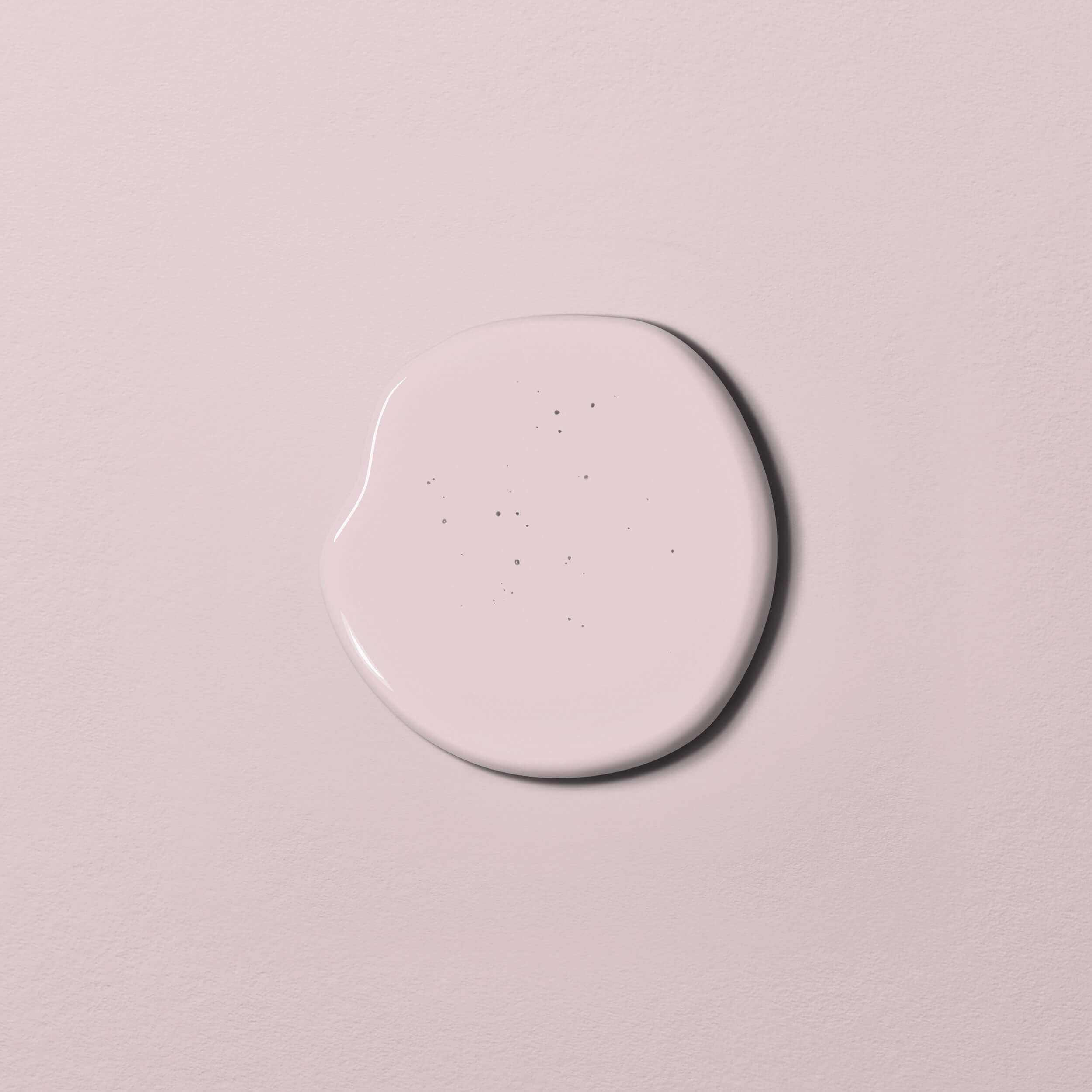
But not every red colour has an aggressive effect. White, beige or brown colour components make it softer, so that a berry shade like Red with Raspberry creates a completely different effect on the wall than the intense Red with Cherry. You can find out all about red colour here
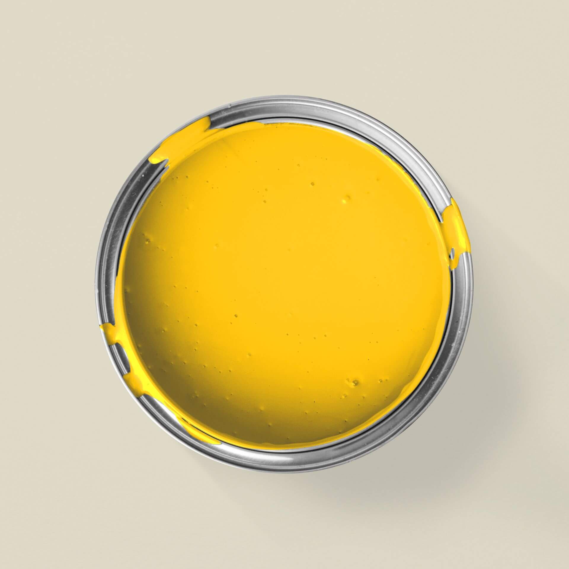
The colour yellow
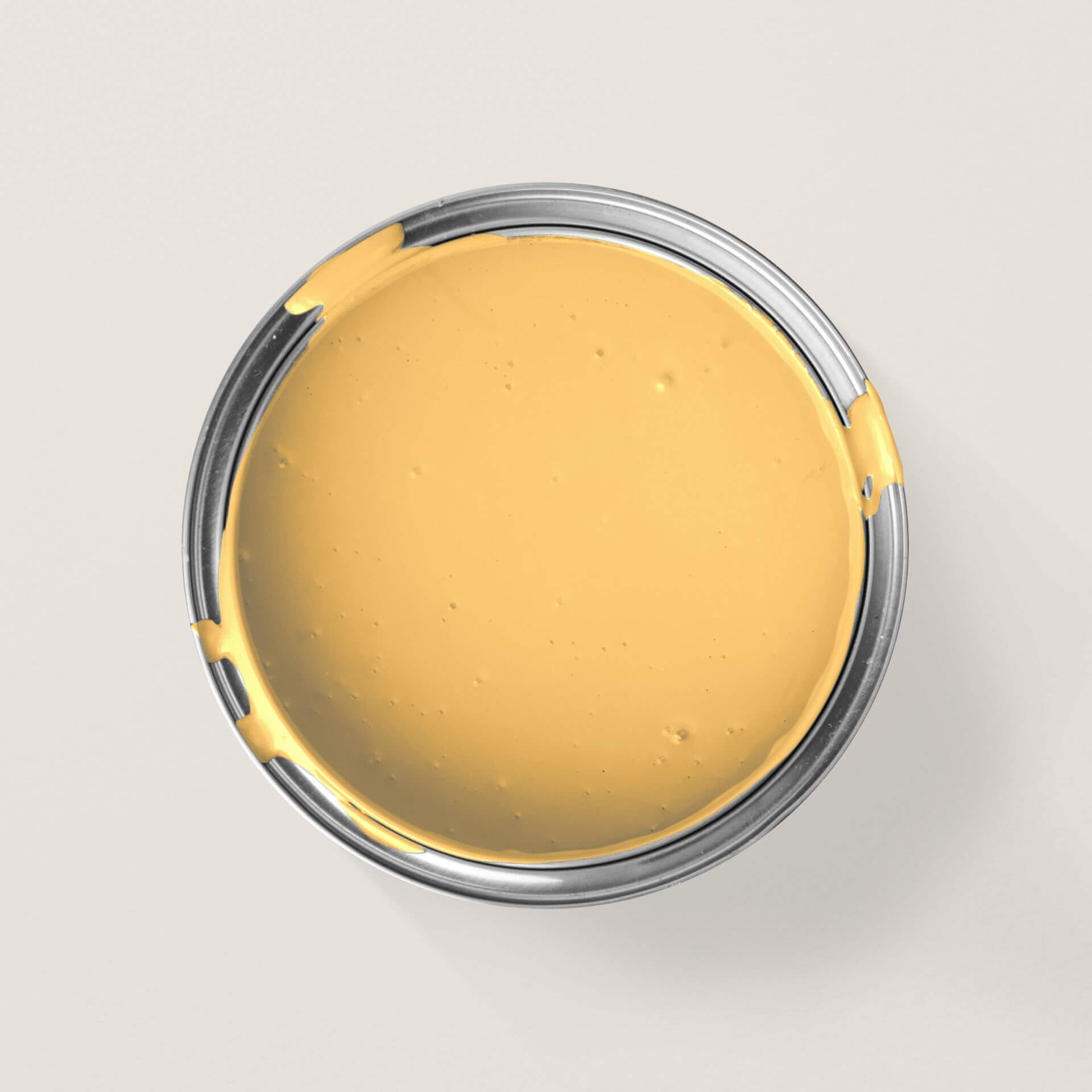
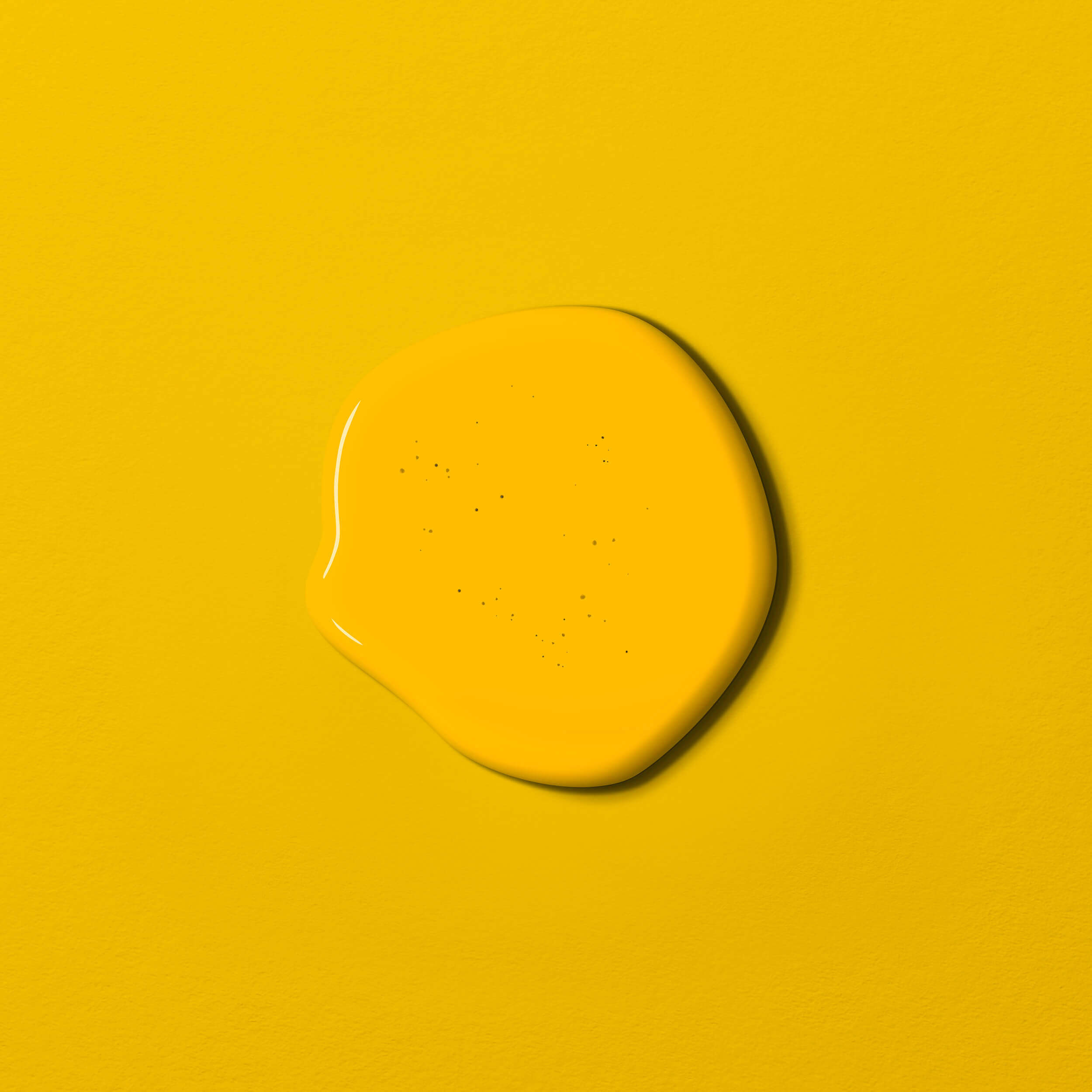
The colour yellow is also ambivalent. It is bright, radiant and attracts attention. We associate yellow with light, sunshine and warmth, with vitality, creativity, cheerfulness, wealth and a positive attitude to life. Yellow with Saffron, for example, radiates the serenity of a summer evening.
At the same time, yellow is also the colour of envy and cowardice. And yellow is also a signal colour that wants to warn: you see it as a yellow card at football, at traffic lights before they turn red and on many warning signs. More details on the colour yellow
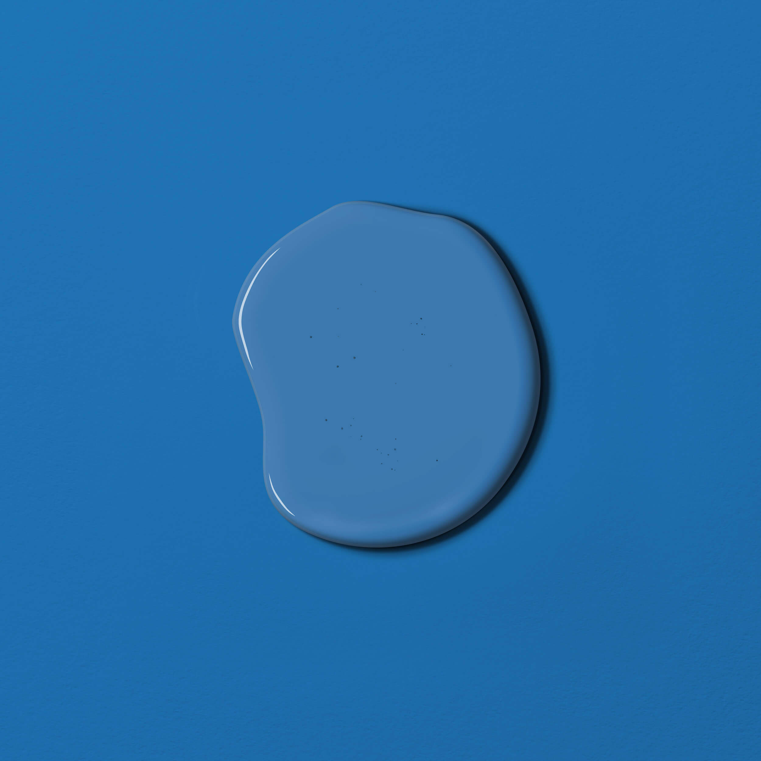
The colour blue
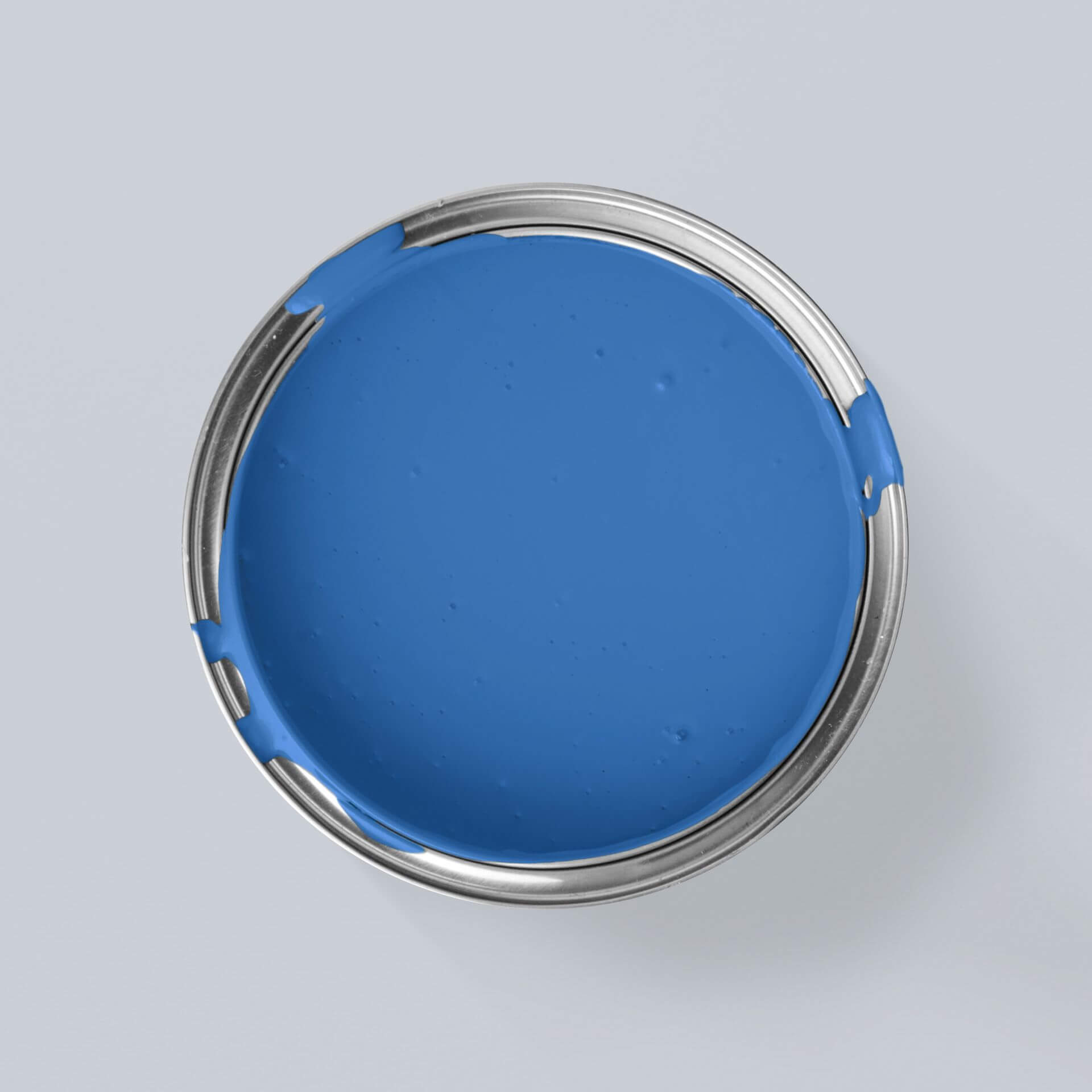
When asked about their personal favourite colour, most people in Germany name the colour blue. We love blue as the colour of the sky and the sea. In terms of colour psychology, blue usually has very positive connotations. Blue stands for calm, trust, peace and stability. Blue is also the colour of romance, as it symbolises boundlessness. You can almost sink into an intense, dark shade of blue like Blue with Night
However, blue can also symbolise sadness and melancholy. Hence the term "having the blues". Shades of blue can express coolness and aloofness, which is why blue also goes well with depression and loneliness. Colour blue in detail
Mixing blue with yellow creates...
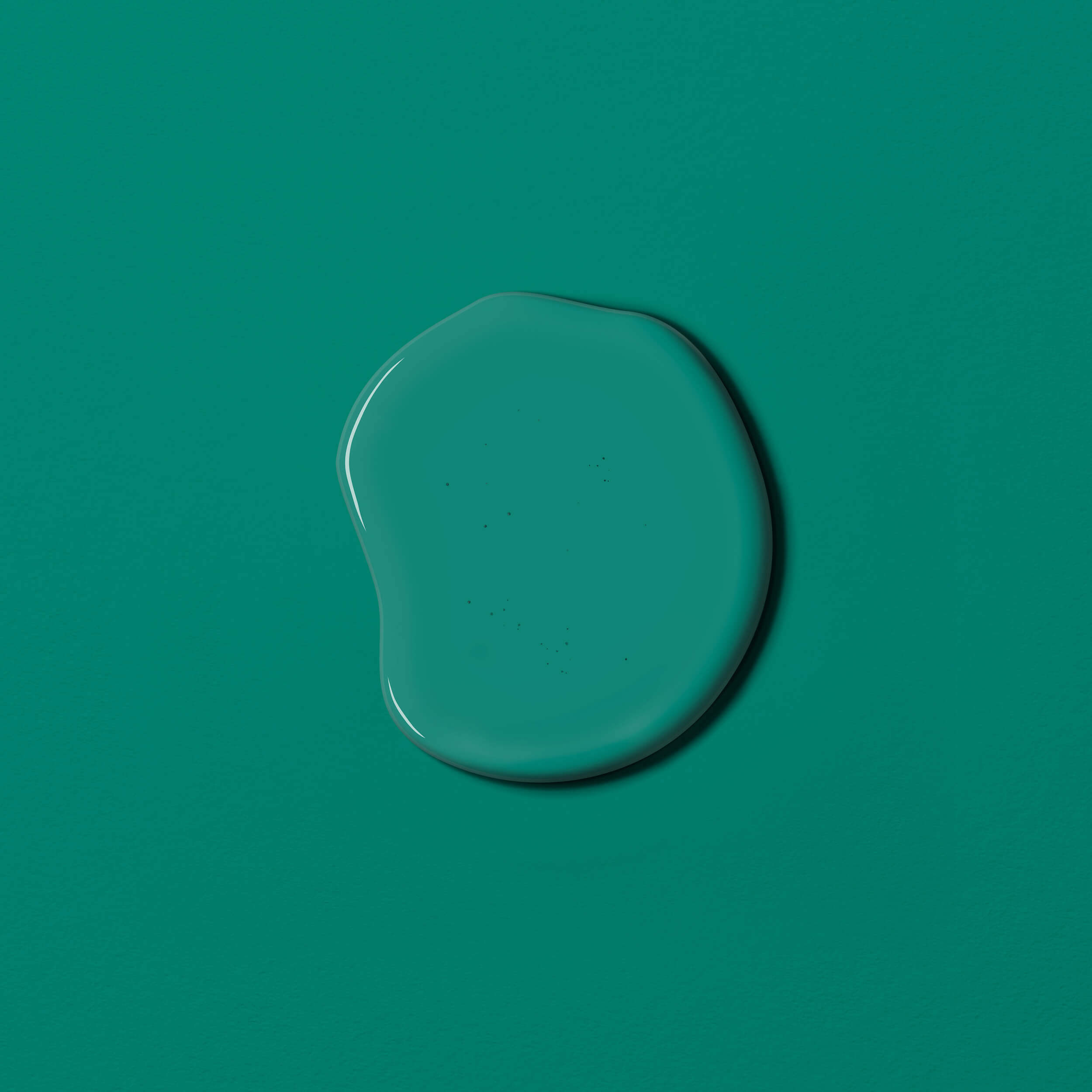
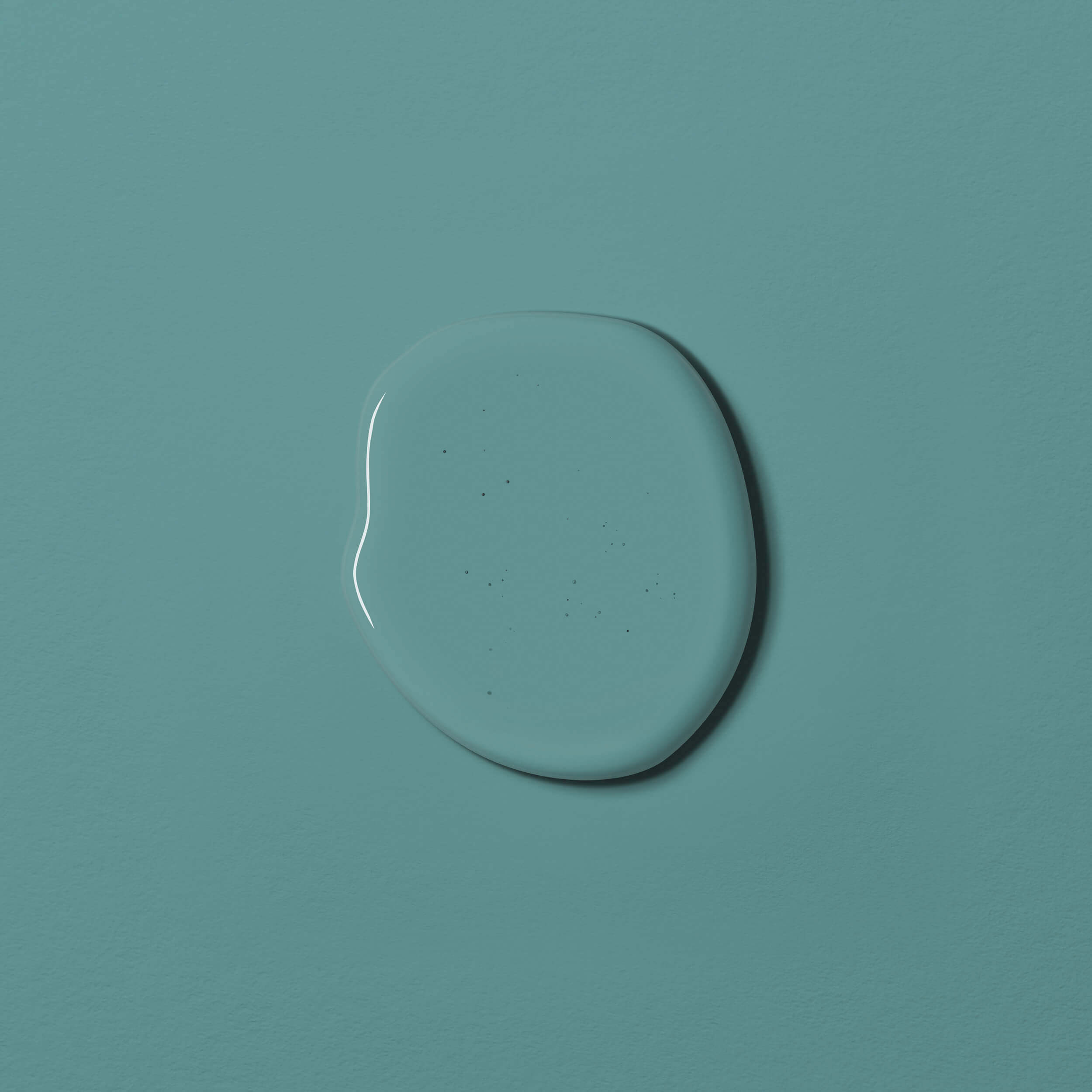
The colour green
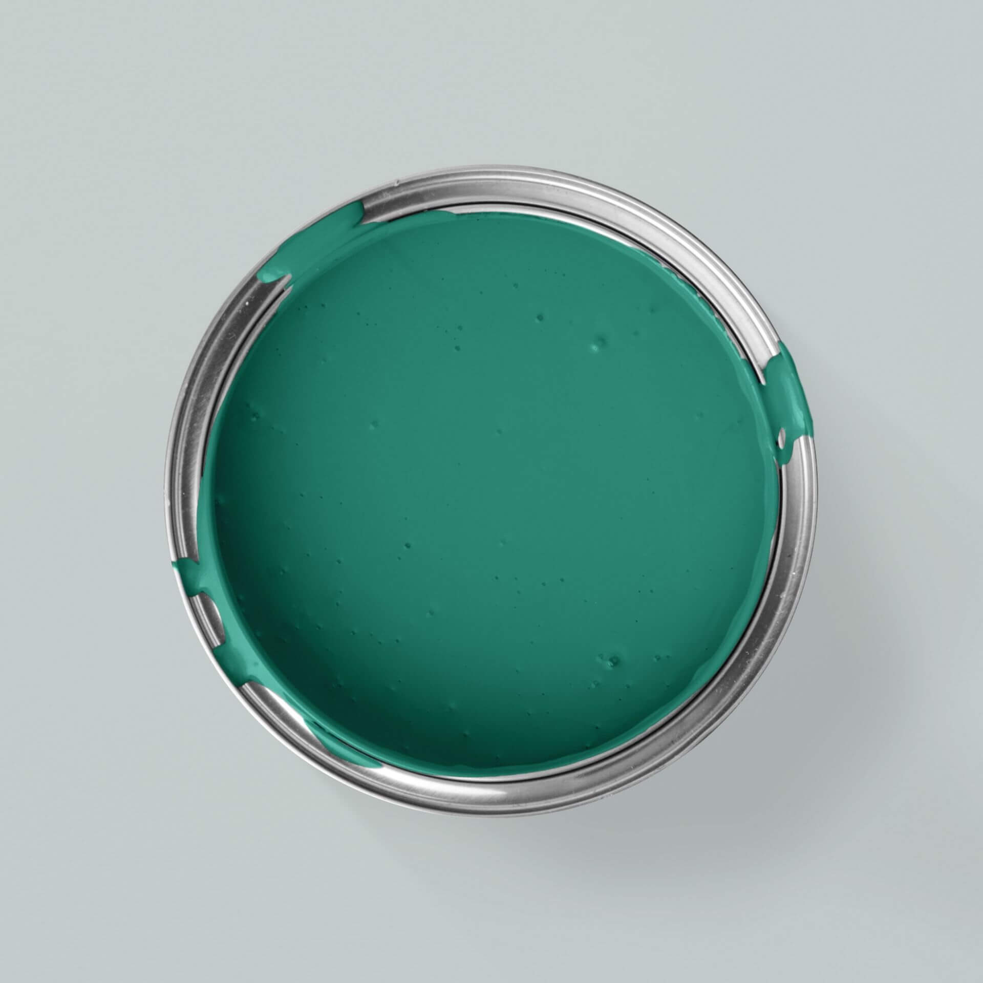
The colour green is not a primary colour, but is nevertheless fundamentally important. In colour psychology, green is a symbol of nature and relaxation. Green is the colour of rest, relaxation and regeneration. It symbolises growth and healing as well as freshness. It is not for nothing that green is also known as the colour of hope. Green can regulate blood pressure and strengthen the immune system. A fresh Green with Apple brings nature into the home
But green can also have negative connotations. For example, green stands for immaturity (green behind the ears) or poison (poison green). Further information on the colour green
Colour shades are always a mixture and have different effects on the psyche
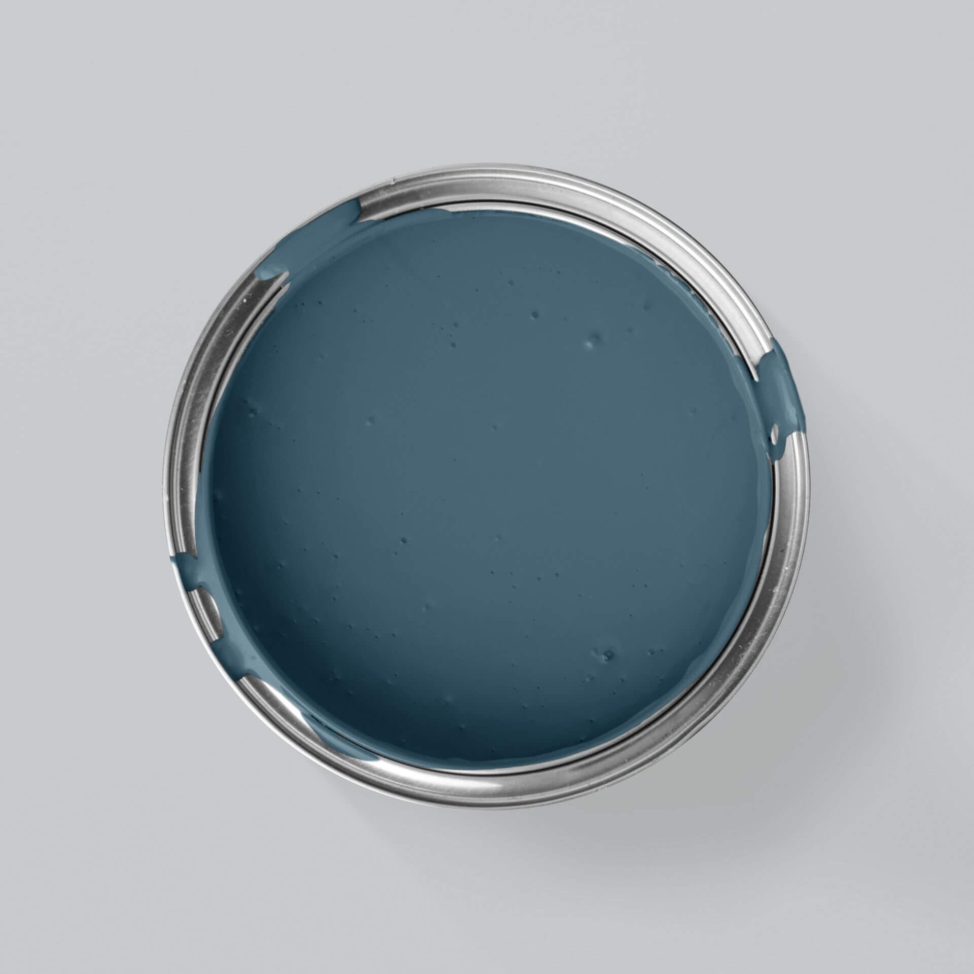
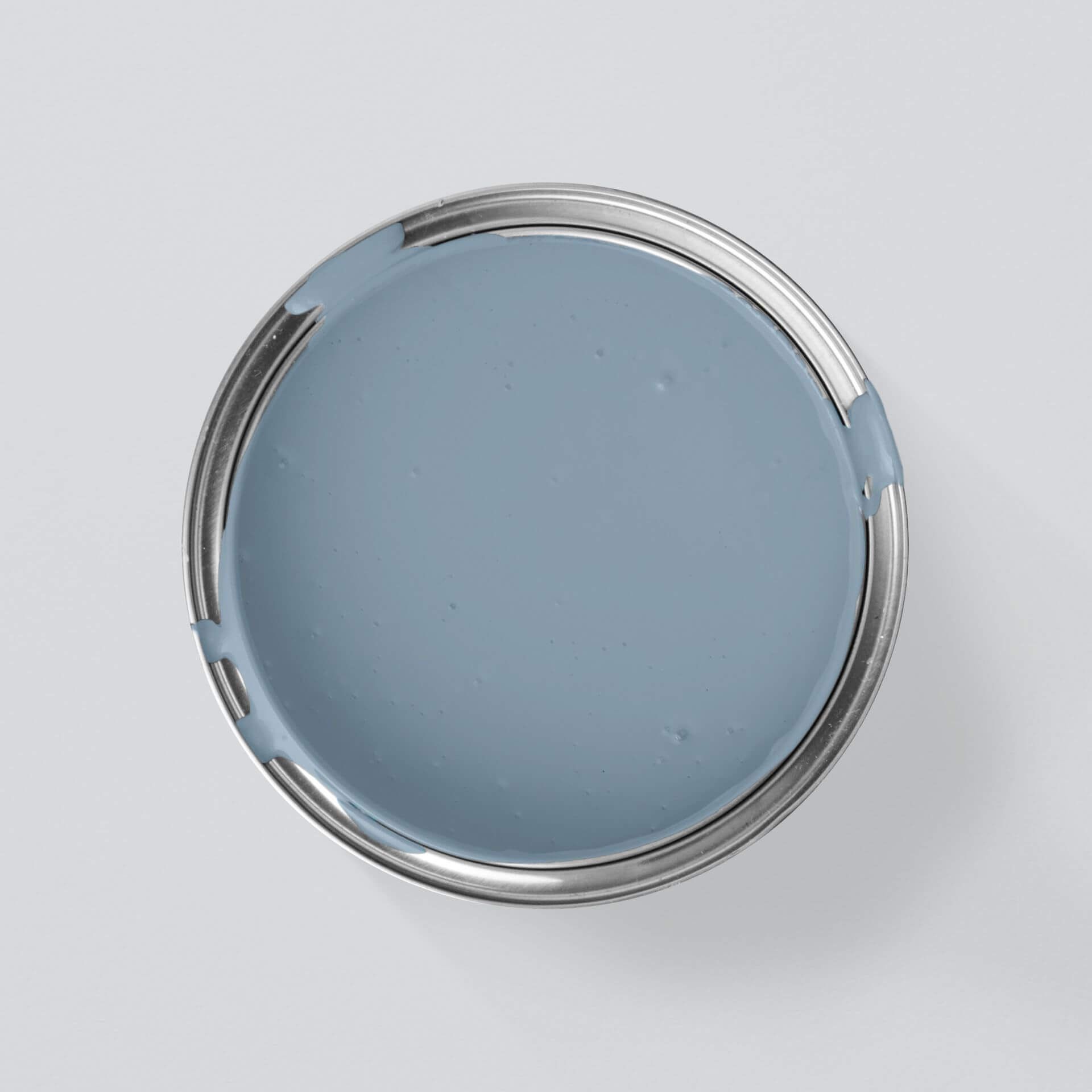
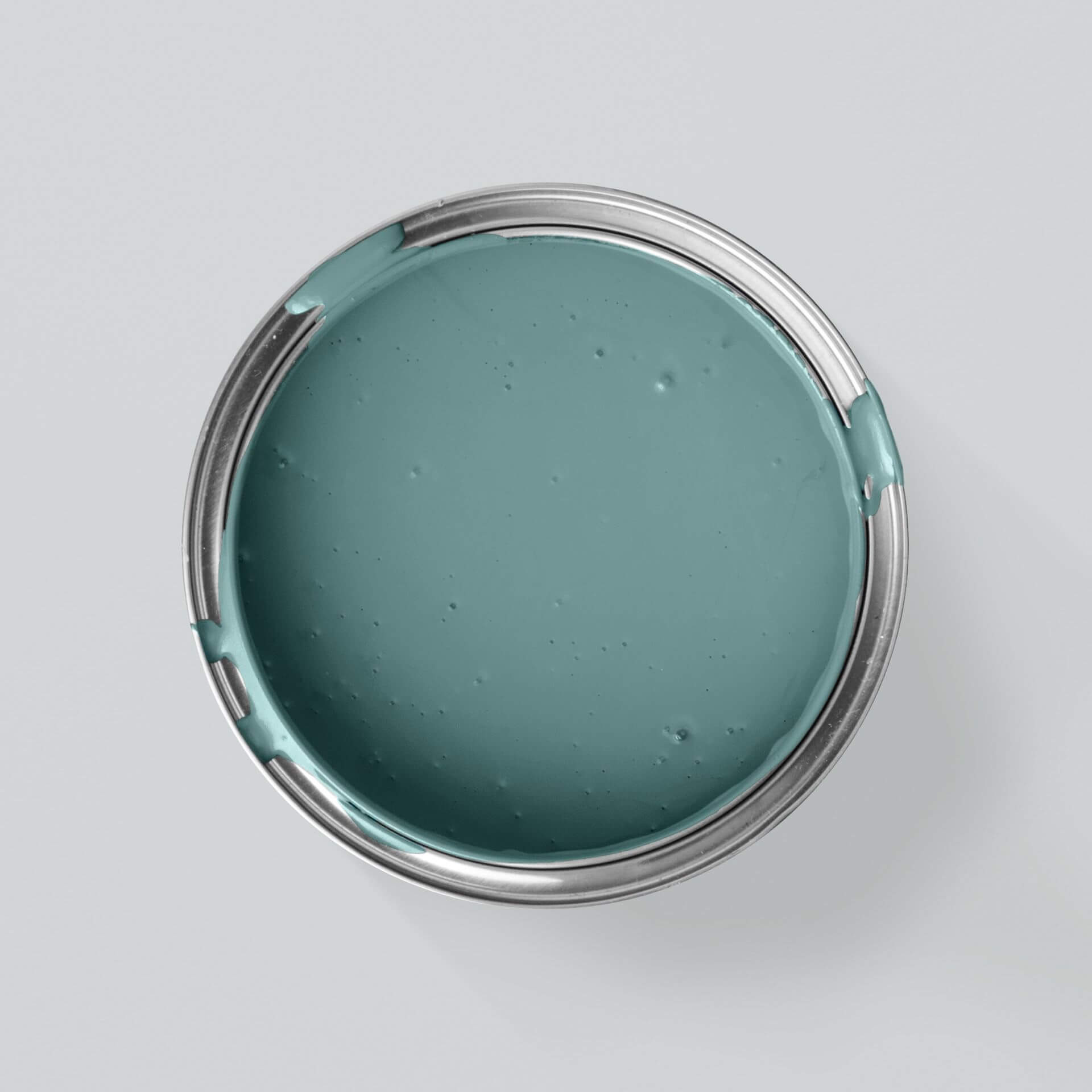
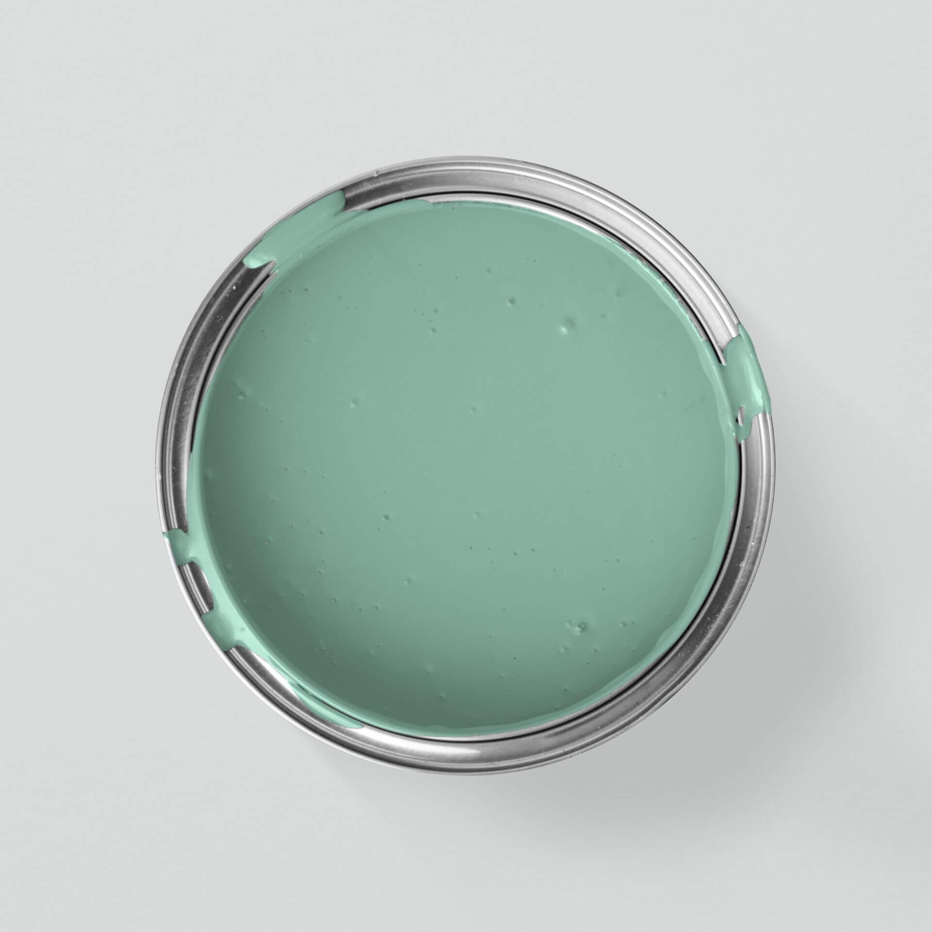
Of course, there are never just pure colours, but an infinite number of colour shades in between. For example, there are countless shades of red ranging from almost violet to bright orange. Yellow can range from fresh, greenish lemon yellow to warm orange-yellow or rich ochre. Green also starts with light, yellowish birch green (like Green with Birch) and ends with dark, almost black forest green (like Green with Forest). If you mix more blue with green, you get many different colour shades from delicate water green to strong turquoise to dark petrol blue or green. Blue, on the other hand, ranges from strong or soft violet with lots of red to strong indigo, from soft blue with cloud to night-black colour nuances
And so the psychological effect of colour and its influence on mood is totally different and cannot simply be reduced to the basic colours
The effect of colours on room perception
The design of interior spaces in the home with different shades of colour offers many opportunities to influence room size and atmosphere. Depending on which colours from the colour wheel you use on your walls, you can show your own individual taste with the coloured walls in your home. We have put together detailed instructions on how to paint walls for you in this blog.
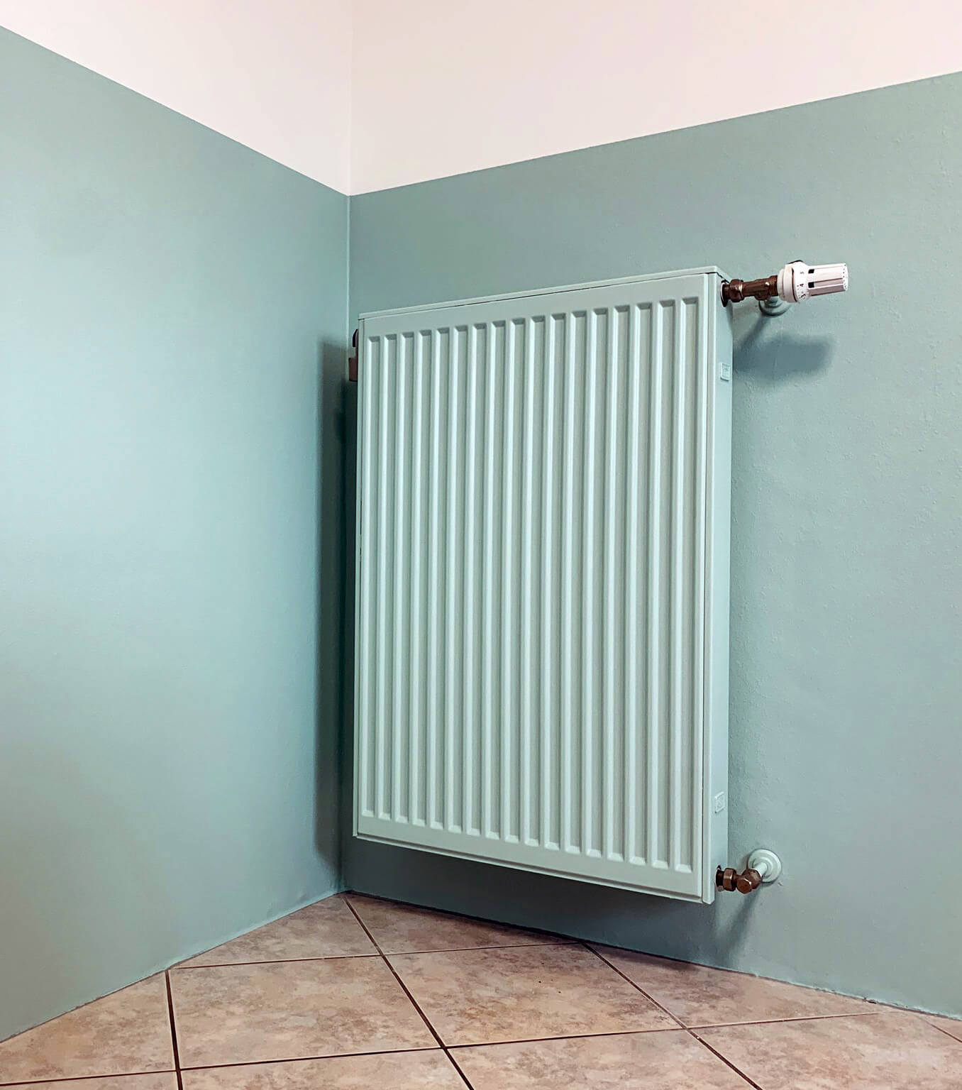
However, one thing is certain: colours can make rooms appear larger or smaller. For example, an elongated room with great depth or a long corridor can be made to look shorter if the walls at the ends are darker than the longer walls
Treating the ceiling of a room in a colour that matches the walls can create a cosy atmosphere. However, this is only recommended if the room has an attractive height, as a coloured ceiling appears lower than a white one. You can find out all the details in our blog "Painting the ceiling in colour"
There is a persistent rumour that dark colours generally make rooms look smaller. With dark colours, the iris opens wider than with white, creating a light effect, while the choice of white causes the iris to contract and can easily create an impression of grey narrowness
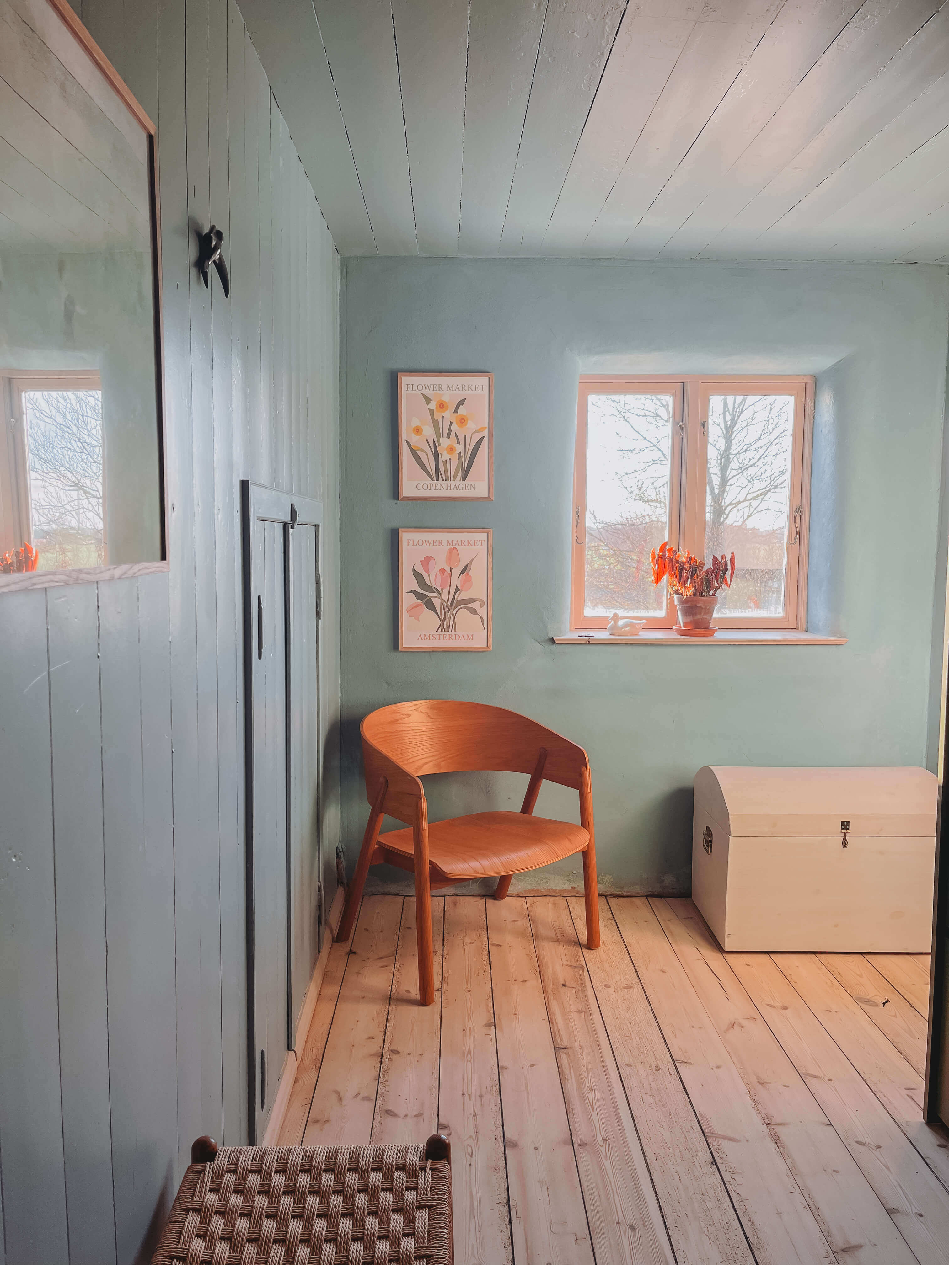
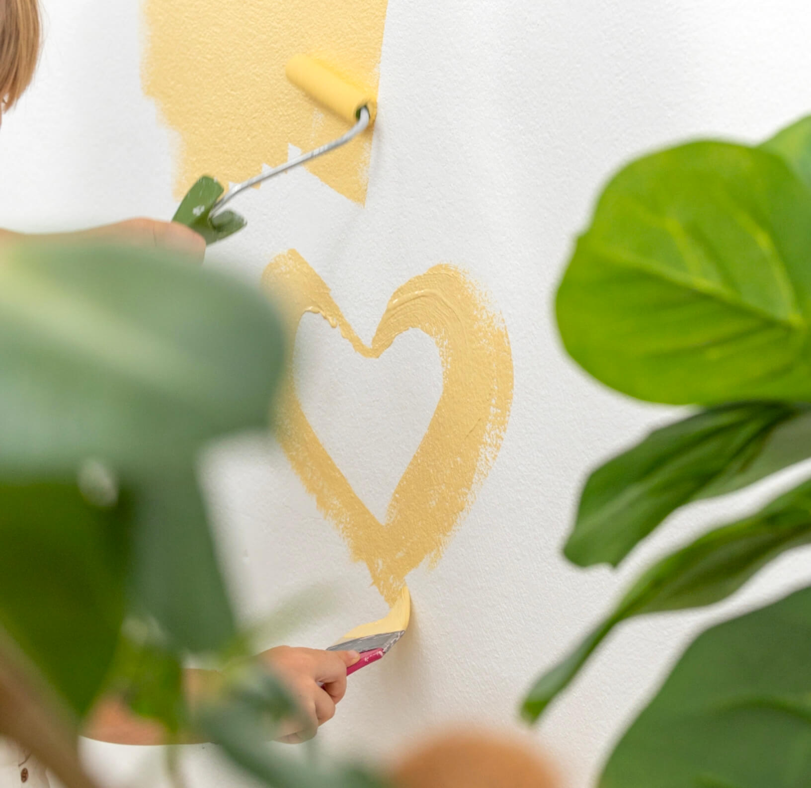
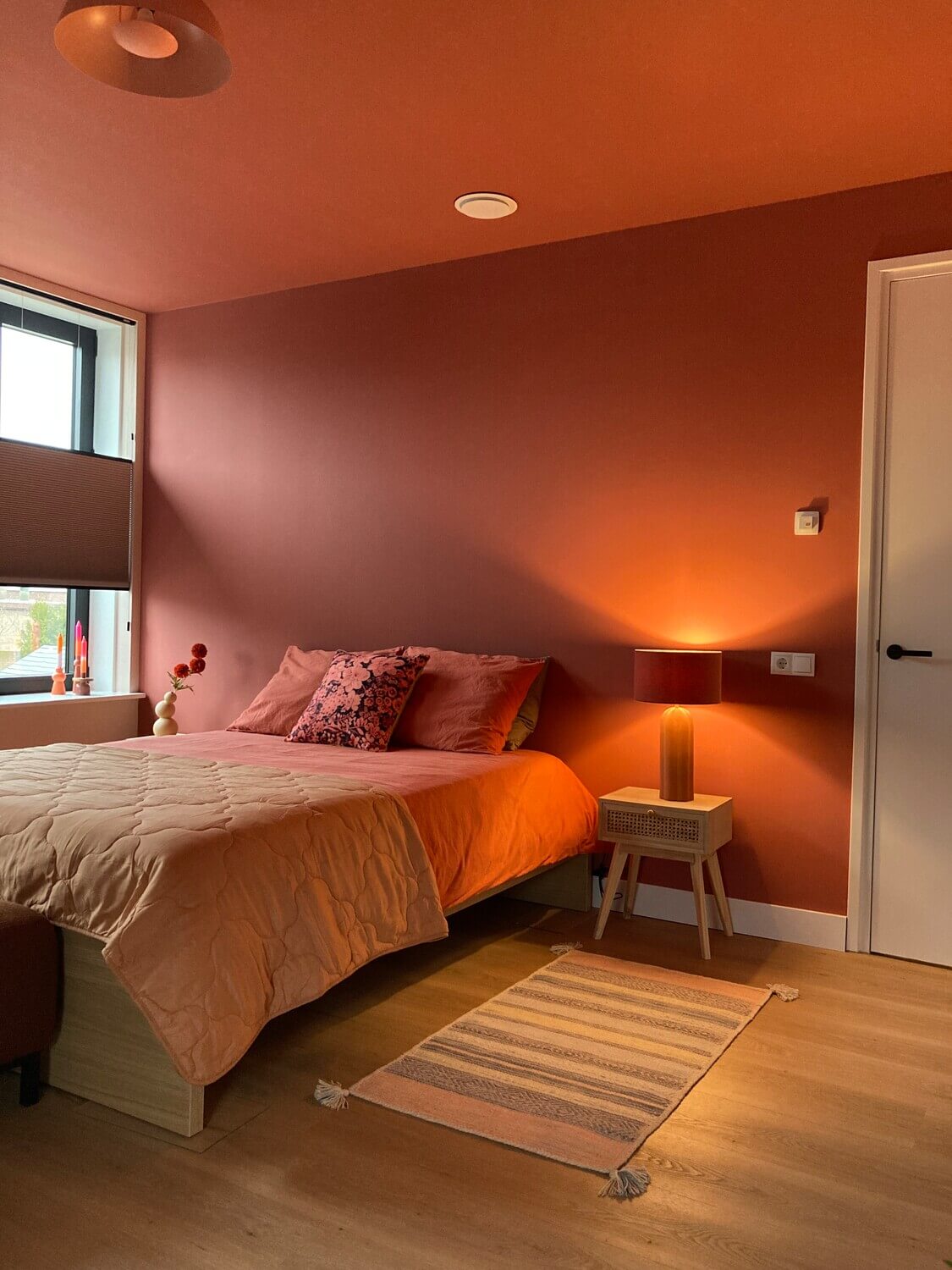
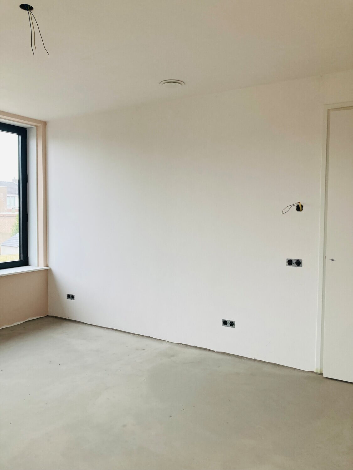
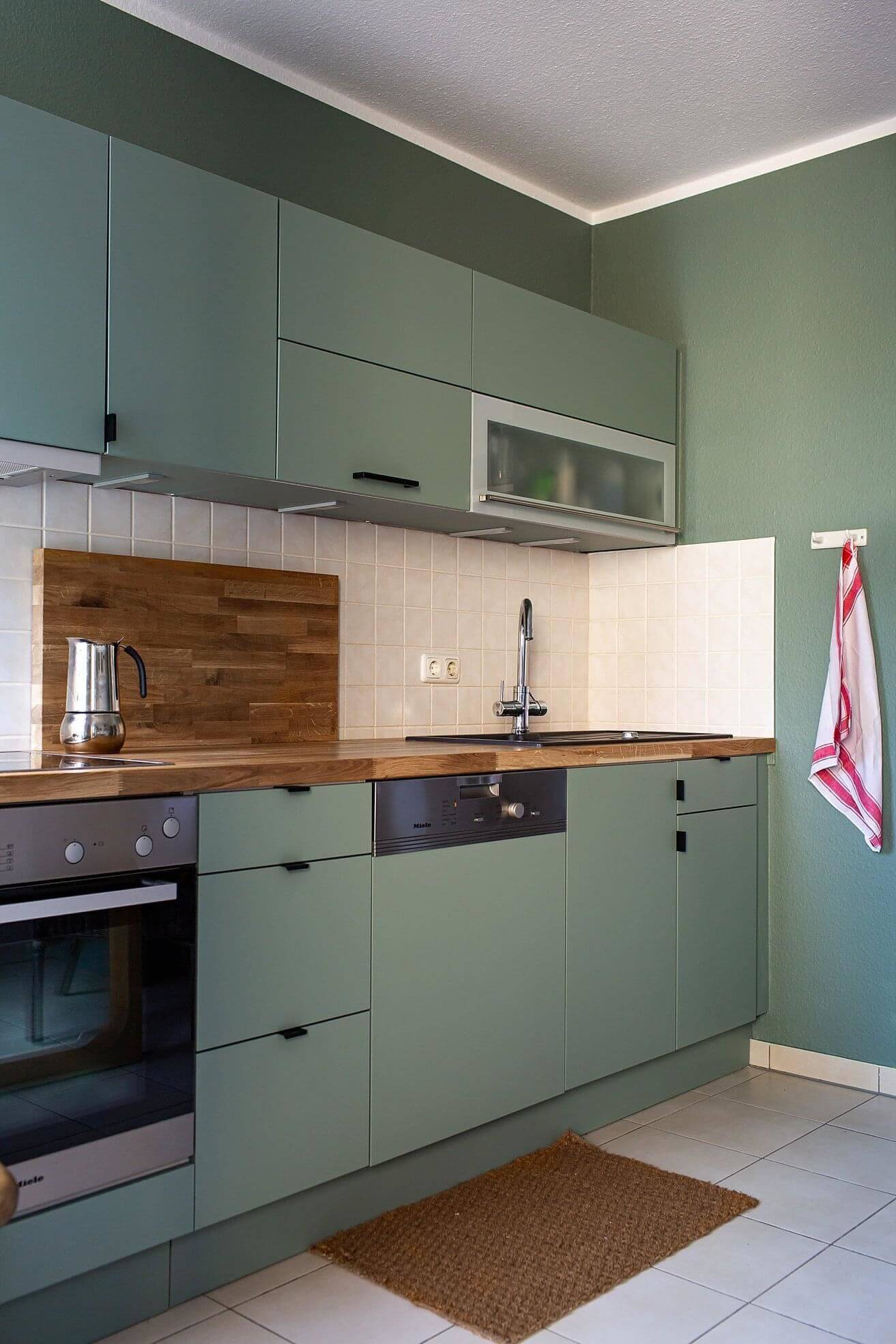
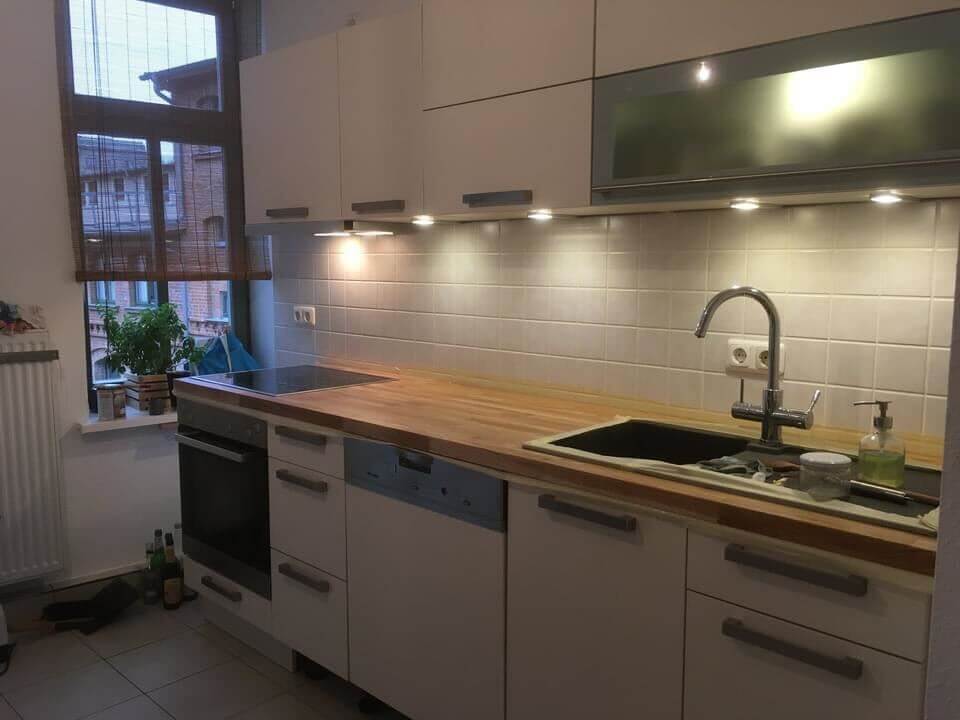
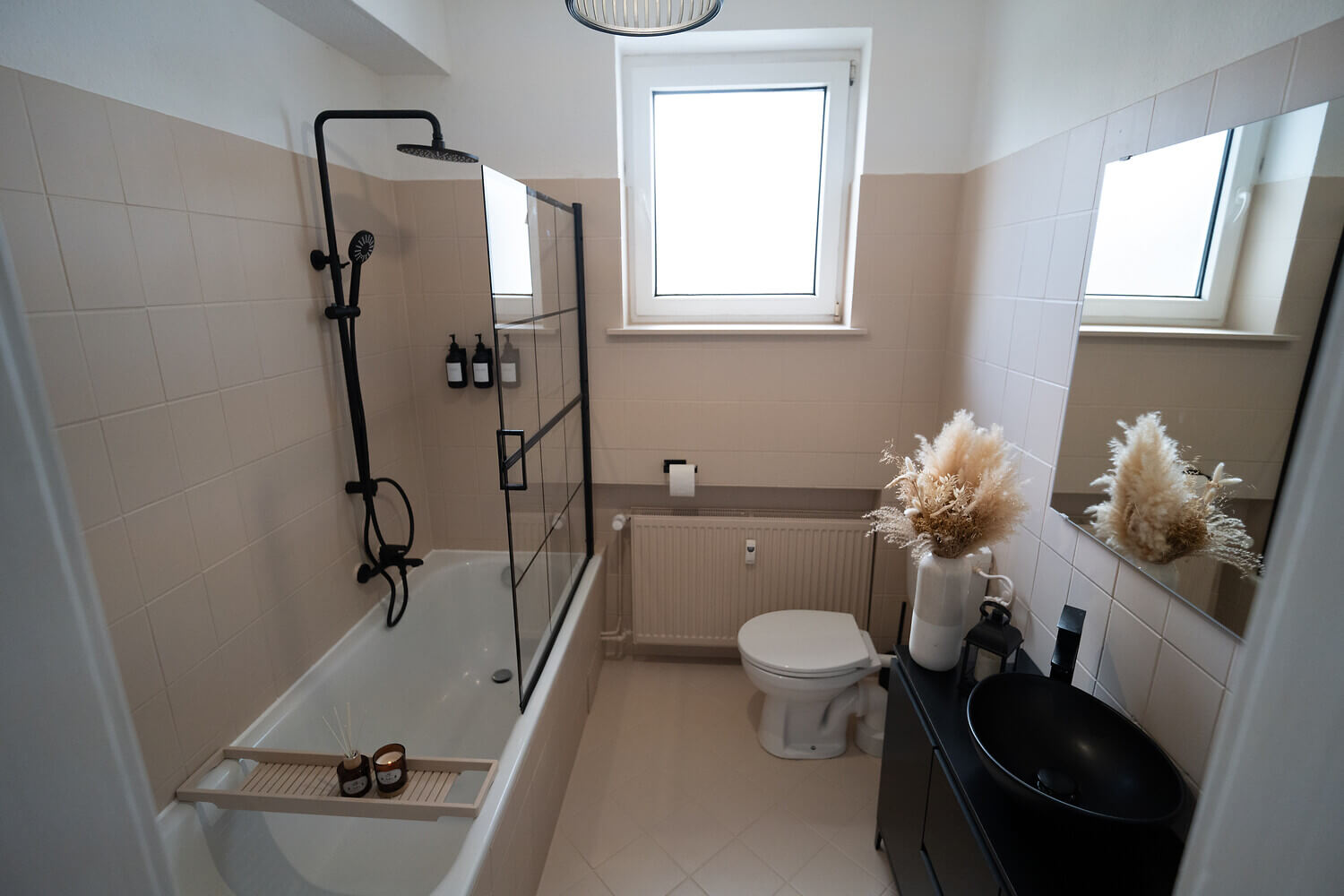
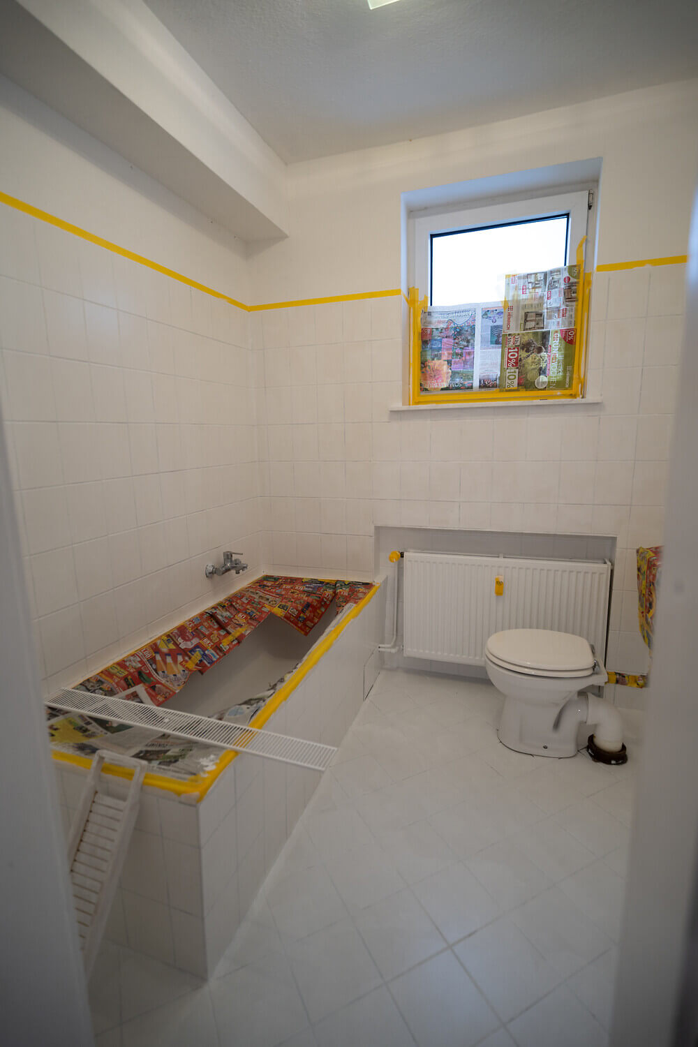
Before and After photos from our Painting community
Be inspired by these successful transformations!
The ideal colour for every room
There is no one ideal colour for every room. Ultimately, the choice of colour always depends on the circumstances of the different rooms, such as their lighting and proportions. And last but not least, the colour scheme of the rooms depends on the individual taste of the occupants. Nevertheless, here are a few tips on how to design the wall and ceiling colours of the different living areas
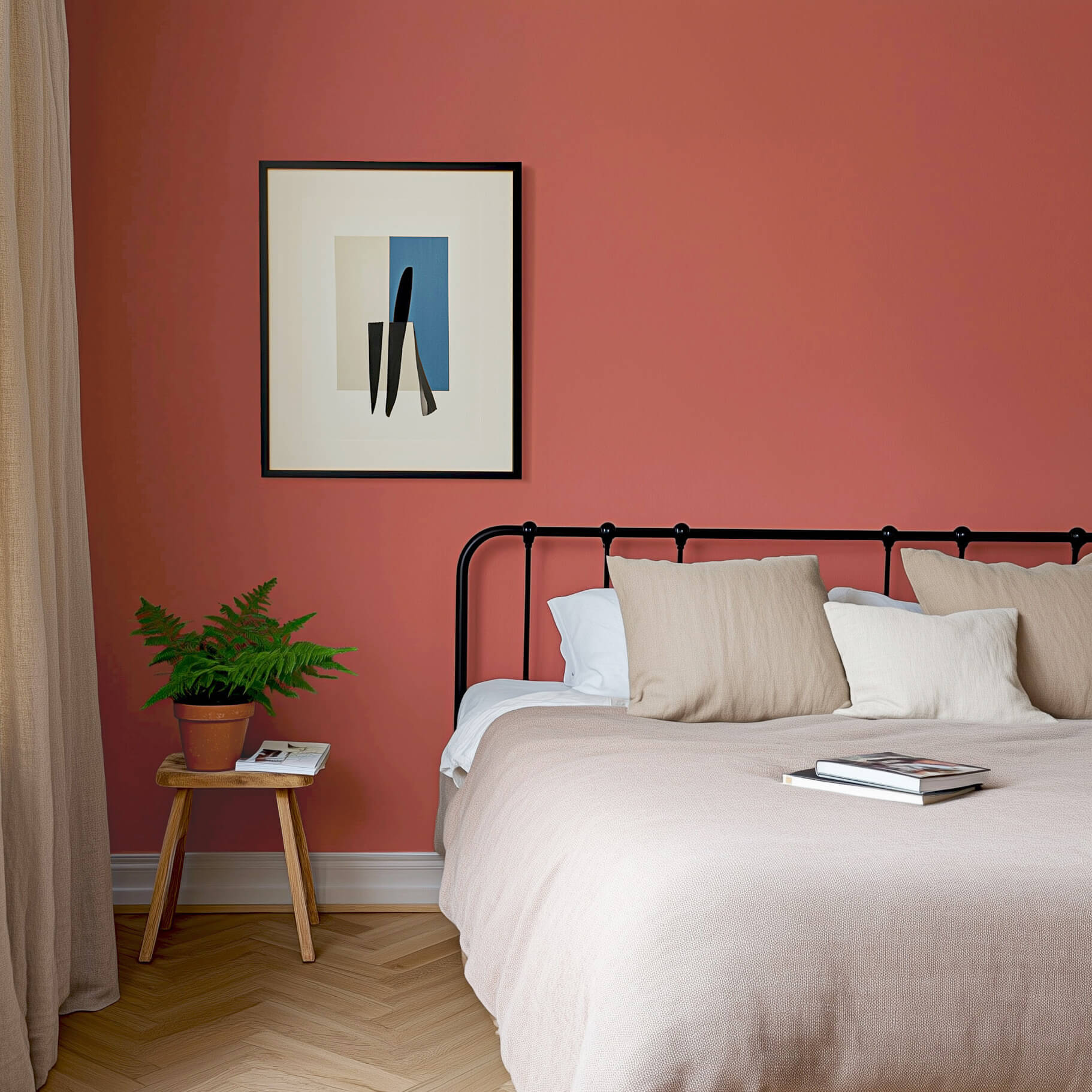
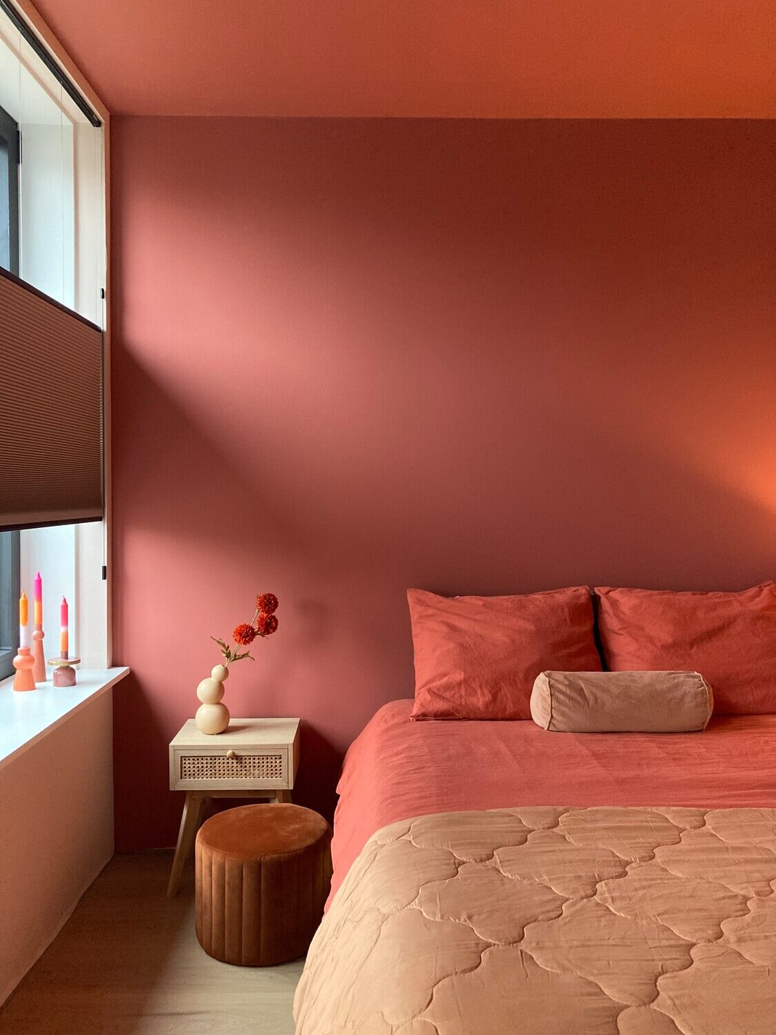
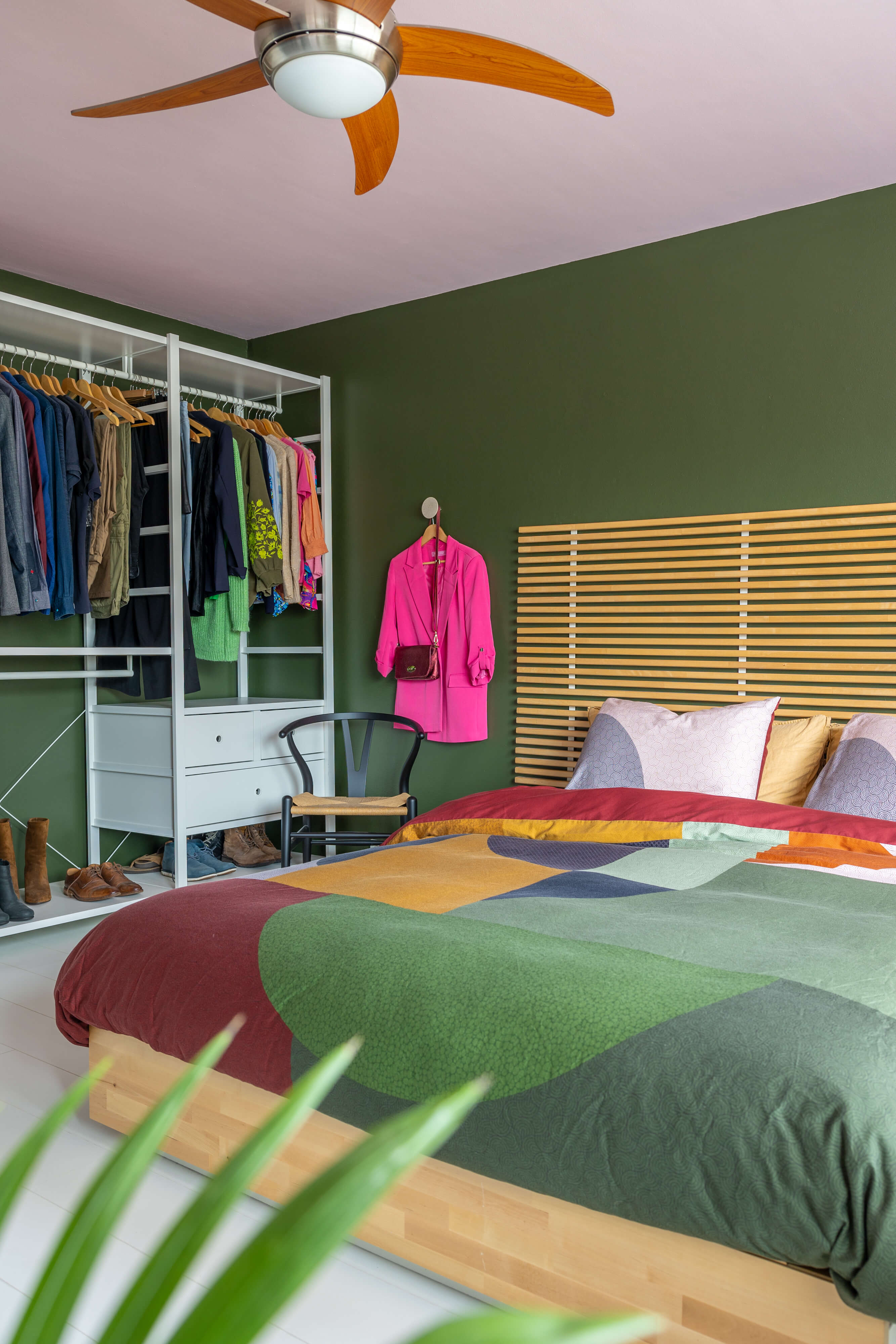
Colour for the bedroom
Calm blue with grey is always a good recommendation for a bedroom because the body relaxes easily in this colour scheme
However, there are people who use a warm orange or an elegant purple in the bedroom and feel very comfortable with it. After all, the choice of wall paints always depends on the personal preference of the occupants. In the bedroom, it can also create a great overall look to decorate the ceilings with wall paint. After all, you always have the ceiling paint in view when you are lying down
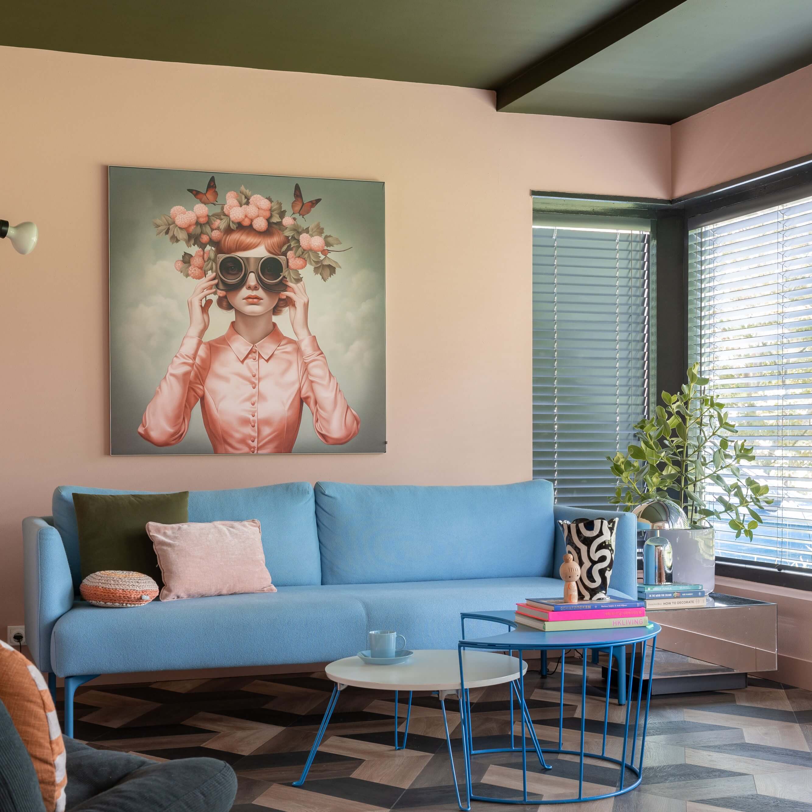
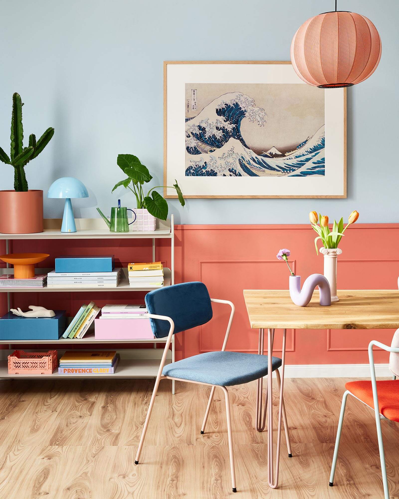
Colour in living rooms
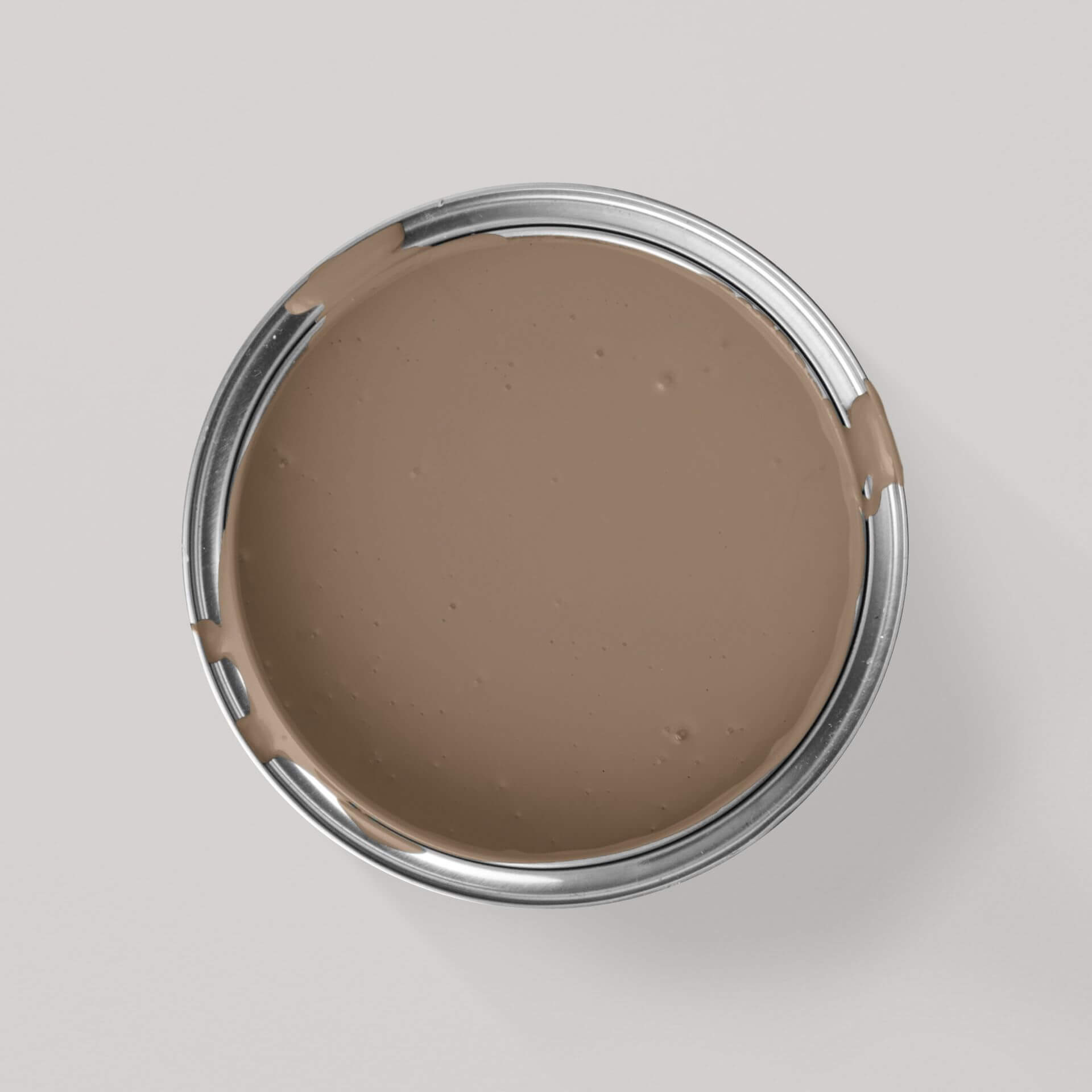
Warm, inviting colours that radiate a certain cosiness are generally suitable for living rooms. This is where you want to spend hours, where stimulating conversations should be possible or where you can read a book or listen to music in an atmosphere of peace and quiet. The colours chosen should not be too intense. After all, guests should also feel comfortable in this room. All wall paints that are inviting and "cosy", such as many natural tones from brown to beige, fit particularly well in a room where all family members should feel comfortable
Colour in the dining room
The walls in the dining room are often painted in soft orange or red tones, as the colour effect of these tones releases energy and is considered to promote communication and stimulate the appetite. Perhaps paint an accent wall here to catch the eye
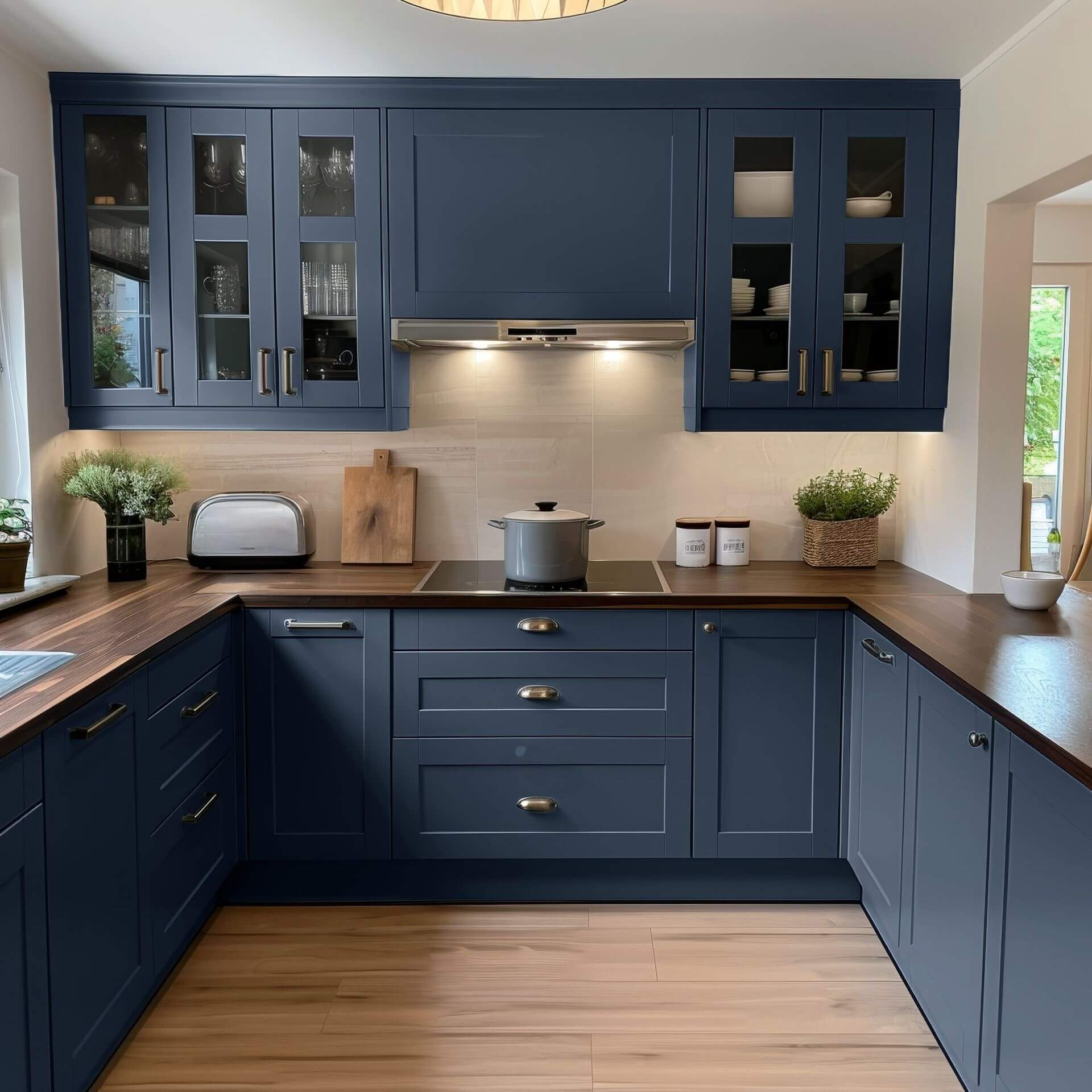
Colour in the kitchen
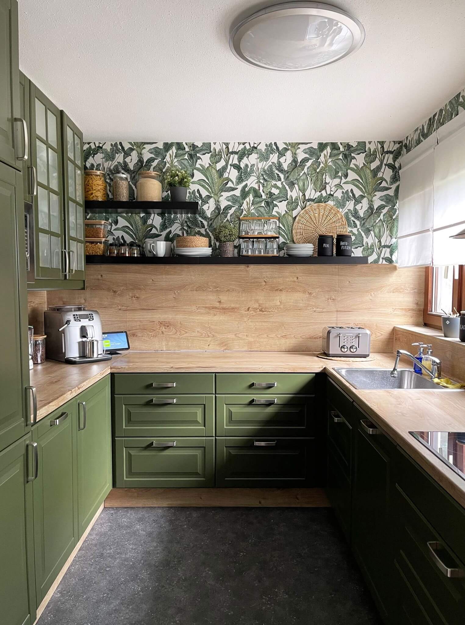
A kitchen is often designed in green colour shades, often in combination with natural wood. Green wall paint signals naturalness and freshness. And we also associate both with healthy food. Here, the wall paints can be a little more intense. After all, cooking is a creative activity
Colours in the hallway and guest WC
Both a hallway and a guest WC are interior spaces that you don't spend much time in
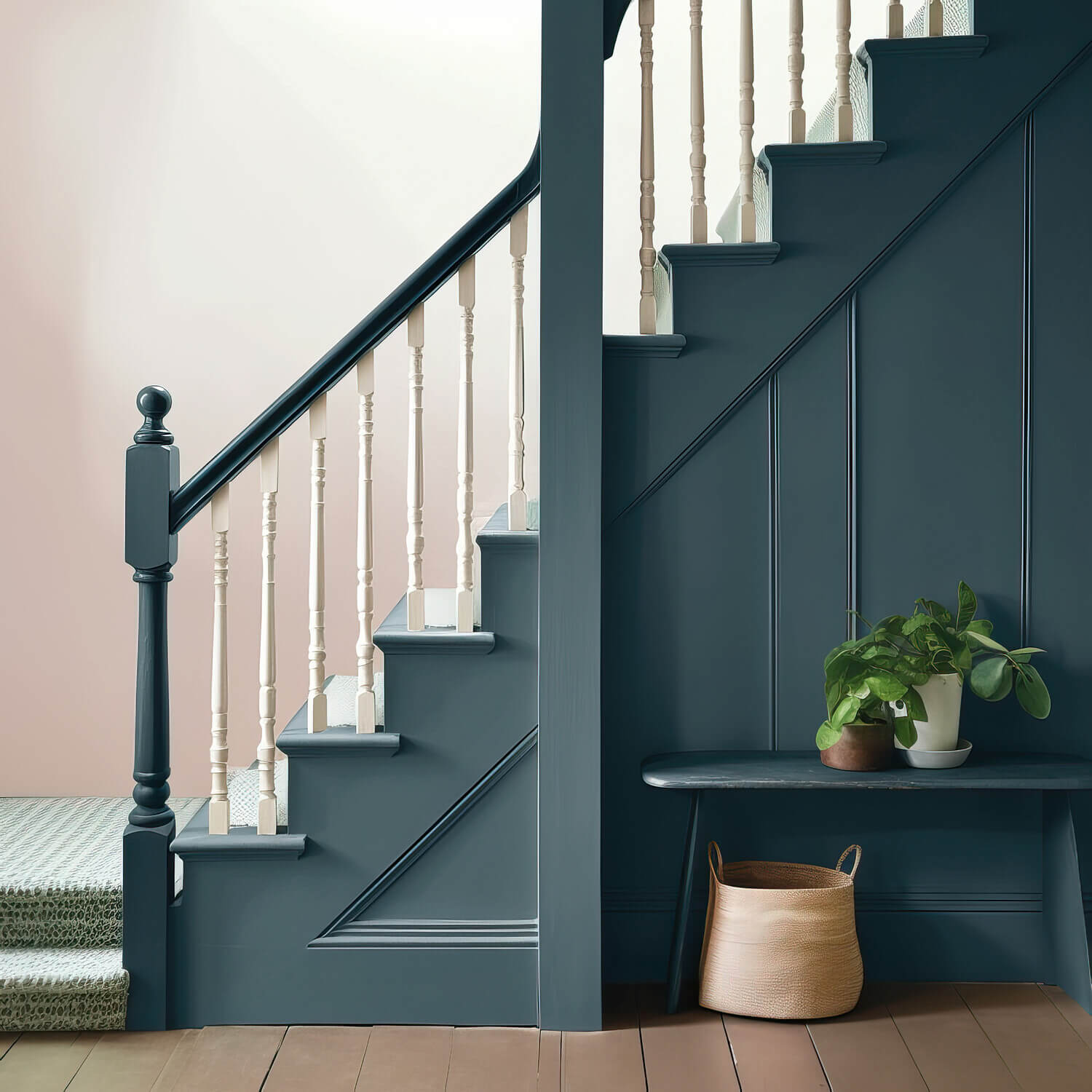
In the hallway, it is important to ensure that the chosen wall paints match the colours of the rooms to which the hallway leads. Who always likes to keep the doors closed? A more neutral colour shade is therefore recommended for the walls in the hallway. Nevertheless, the wall paint in this passageway should be friendly and welcome all guests
The guest WC, on the other hand, can be given a slightly more extravagant colour scheme. Here you can design the walls with one of your favourite colours, which would perhaps be too bold in most rooms. Take courage!
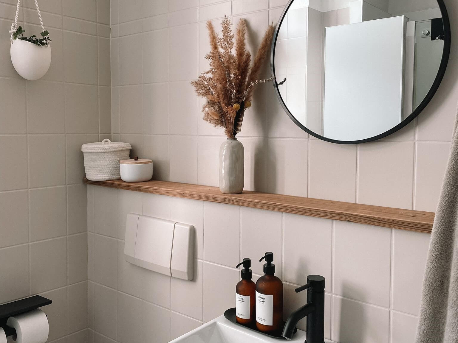
Colour in the bathroom
In the bathroom, a colour shade should be used on the wall to create a beautiful wellness atmosphere. How about a soft aqua shade from the blue-green palette, for example? Or a sandy shade like a light-coloured seashore? A beautiful Caribbean green can also be combined well with a light sandy beach beige. This is how you can bring a holiday mood into your home with colourful interior design
Colour in the office and study
The design of offices and workspaces in the home is becoming increasingly important. Wall paints such as grey and light blue, which promote concentration and at the same time provide energy and calm, are particularly suitable here. This is not about moods and feelings, but the wall paint in the study should still make you feel good at work
Colour in the children's room
In the children's room, MissPompadour Paints has focused particularly intensively on the subject of colours and their effect. This is because the choice of colours in a child's room has a special significance
In collaboration with child psychologists, we have developed a palette of colours that particularly promote children's well-being. These are by no means just pastel colours. The LittlePomp children's collection contains many colours that can be combined with each other to create a stimulating but also calming atmosphere in the children's room. Read our blog "Children's room: colours and their effect"
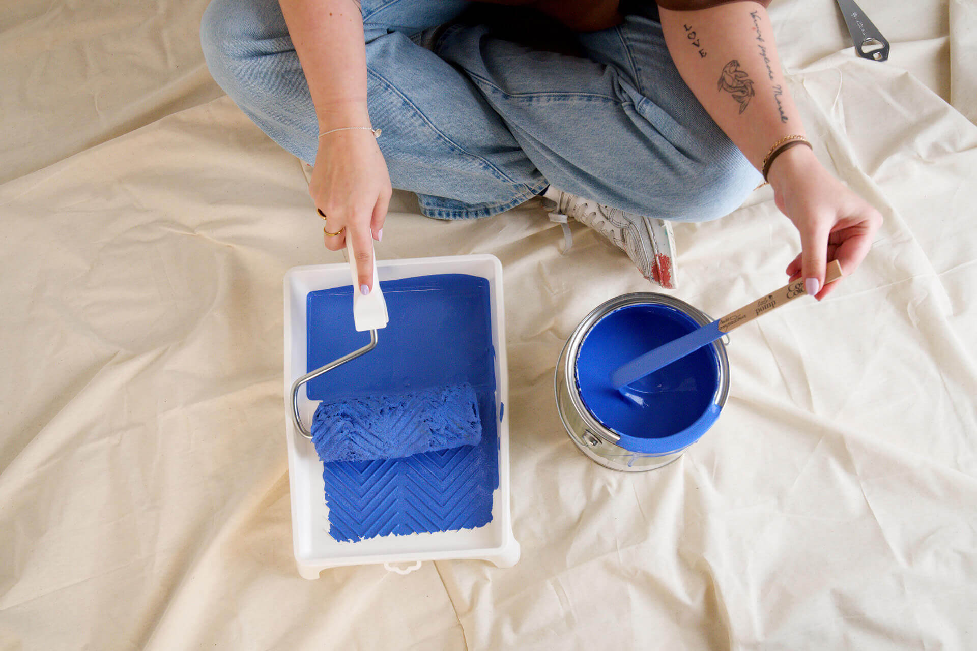
Tips and tricks for an optimal colour scheme
It is important to consider the colour scheme of your interiors:
- The colour scheme should be adapted to the function of the room and the personal preference of the occupants.
- It is important to test the colours and see how they work in different lighting conditions.
- It is just as important to combine the colours and see how they work together.
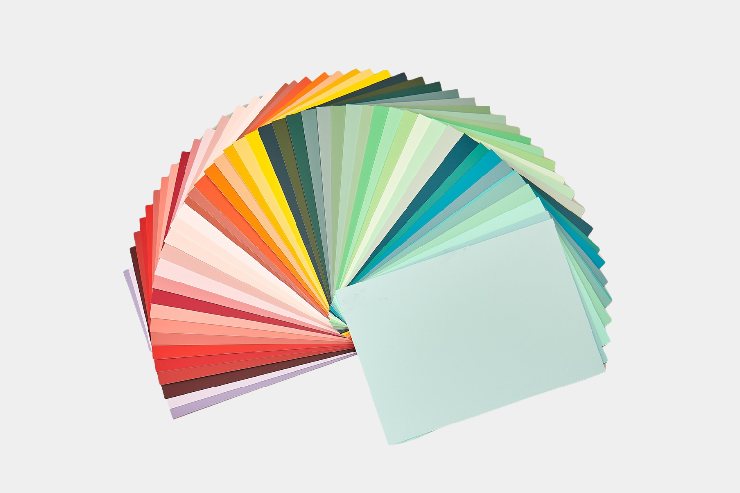
- To do this, order a set of colour cards from your desired colour collection. You can remove the postcard-sized colour cards individually and also attach them to the wall. This gives you the opportunity to assess the colours in any light.
Frequently asked questions & answers
What is the colour effect?
The colour effect in interiors refers to the effect of a wall paint on the proportions and atmosphere of a room as well as the effect of this colour on the mental state of the people living in it
Which wall paints are good for the psyche?
Basically, all colours that make you feel good are good for your psyche. And that varies greatly from person to person
How do I bring colour into the home?
Colourful walls can be painted or wallpapered, but carpets and other home textiles such as curtains and upholstered furniture can also be used to bring colour into the home. You can also paint your furniture in colour - at MissPompadour you will always find a matching furniture paint for your desired wall paints!
Which colour stands for security?
Different people often understand cosiness in very different ways. Warm colours such as brown and beige tones are most likely to convey a sense of security. However, warm red, yellow or blue colours can also do this
Which colour radiates calm?
Shades of blue are said to radiate calm. But the perception of calm is also a question of personal taste
Which colour has an activating effect?
Orange and yellow tones are said to have an activating effect. However, a fresh turquoise colour can also have this effect


Questions ?
We're here to help
We'll help you anytime, via Phone or Live-Chat (Mo-Fr 09-18, Sa until 16 Uhr), via WhatsApp or directly via our Contact Form.