





wall paints & varnishes in
Orange
Our colours in orange
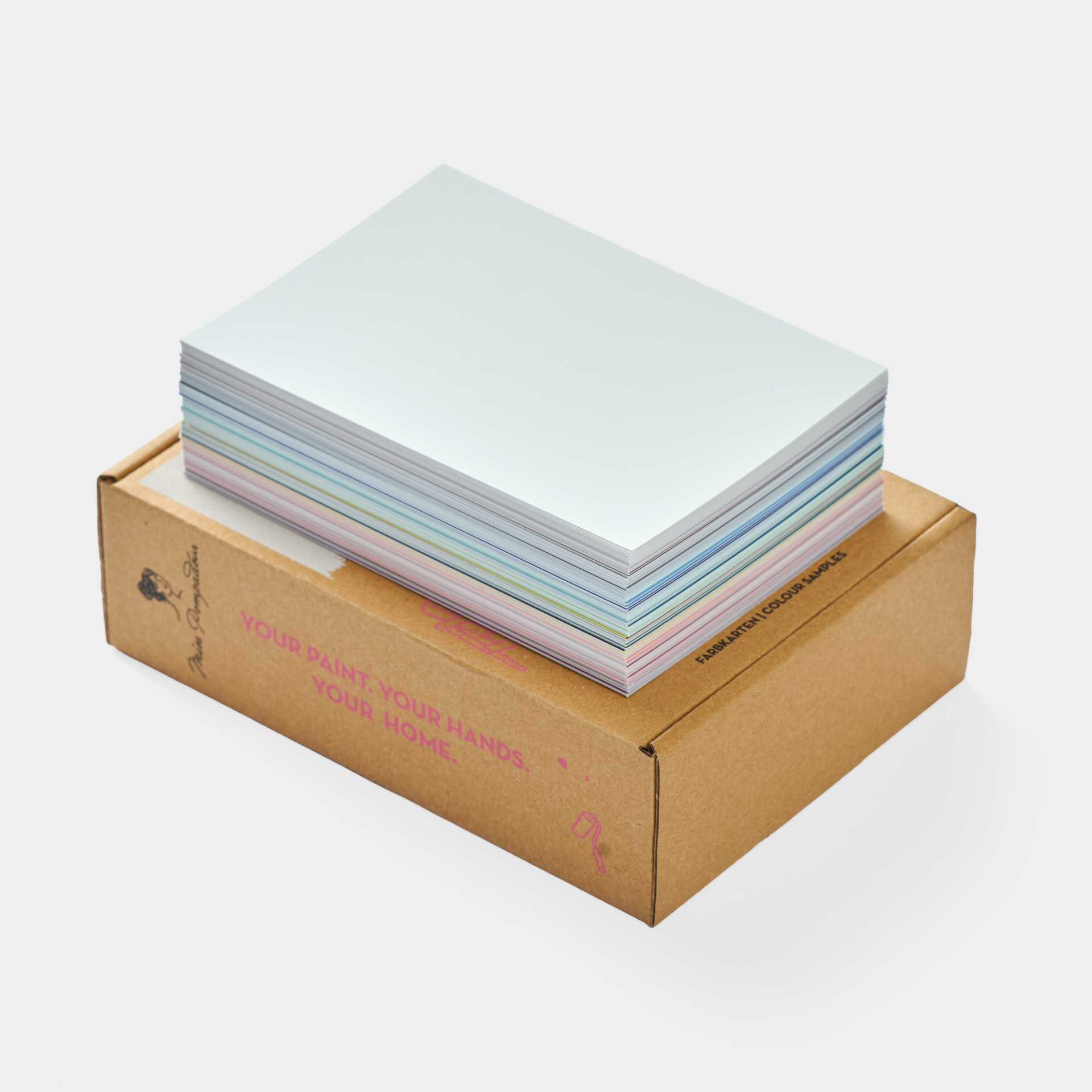

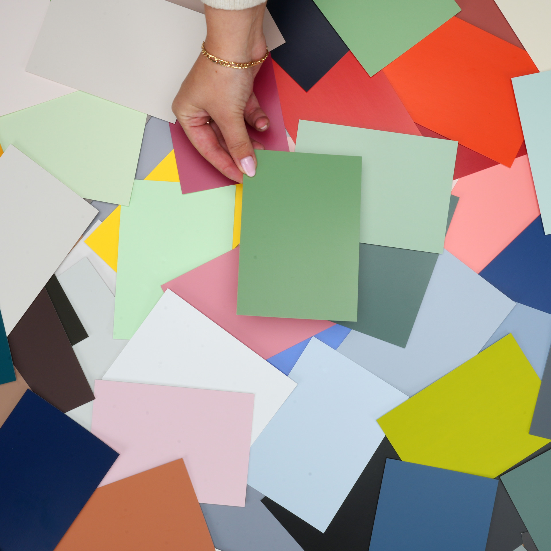
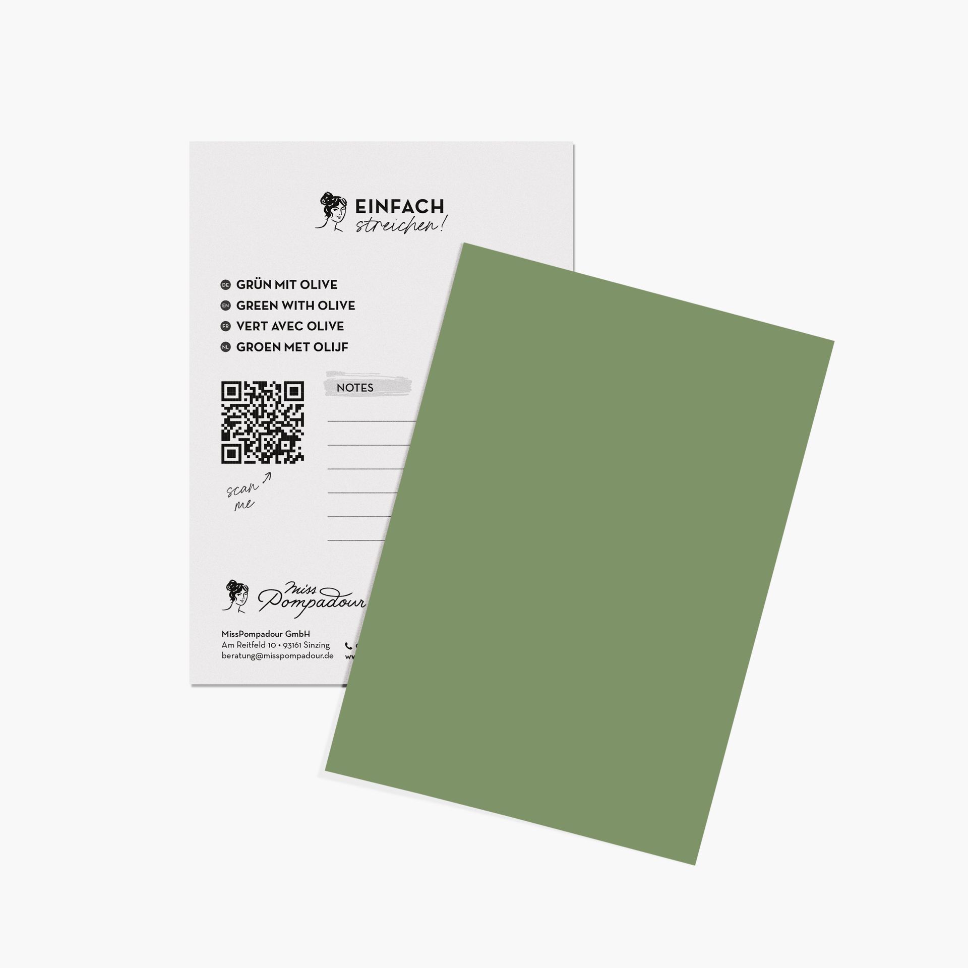
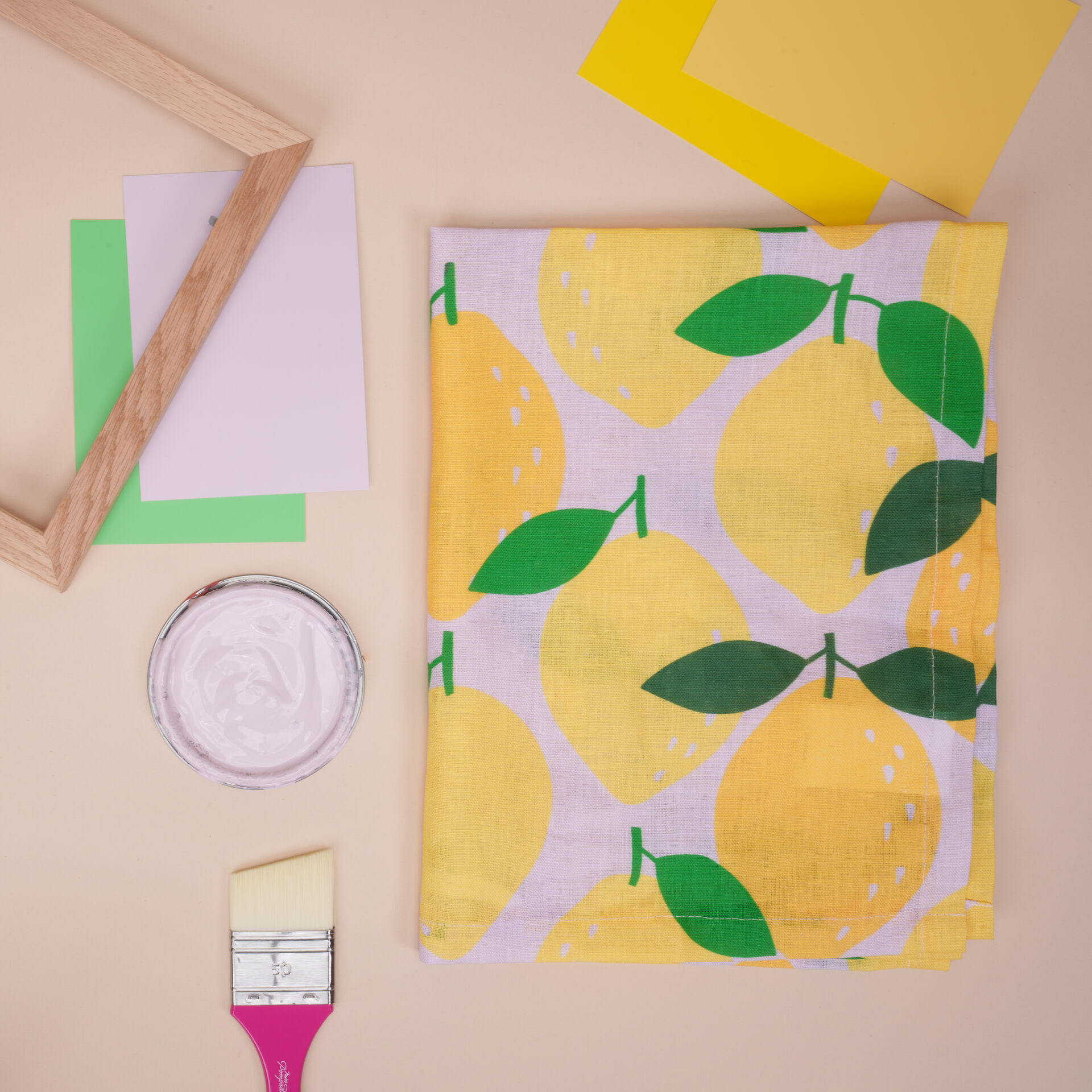
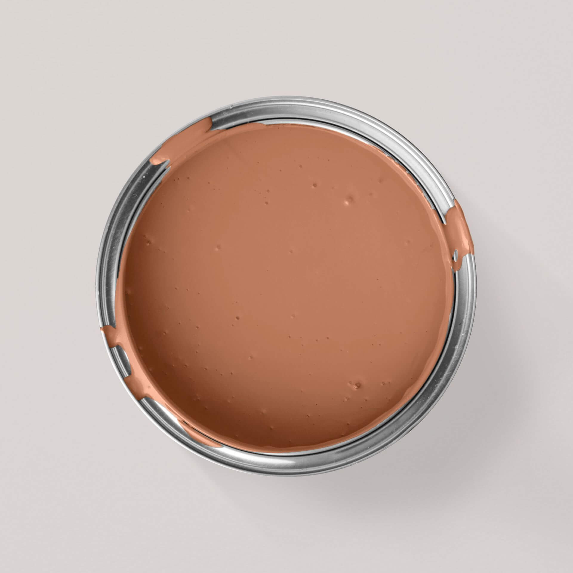
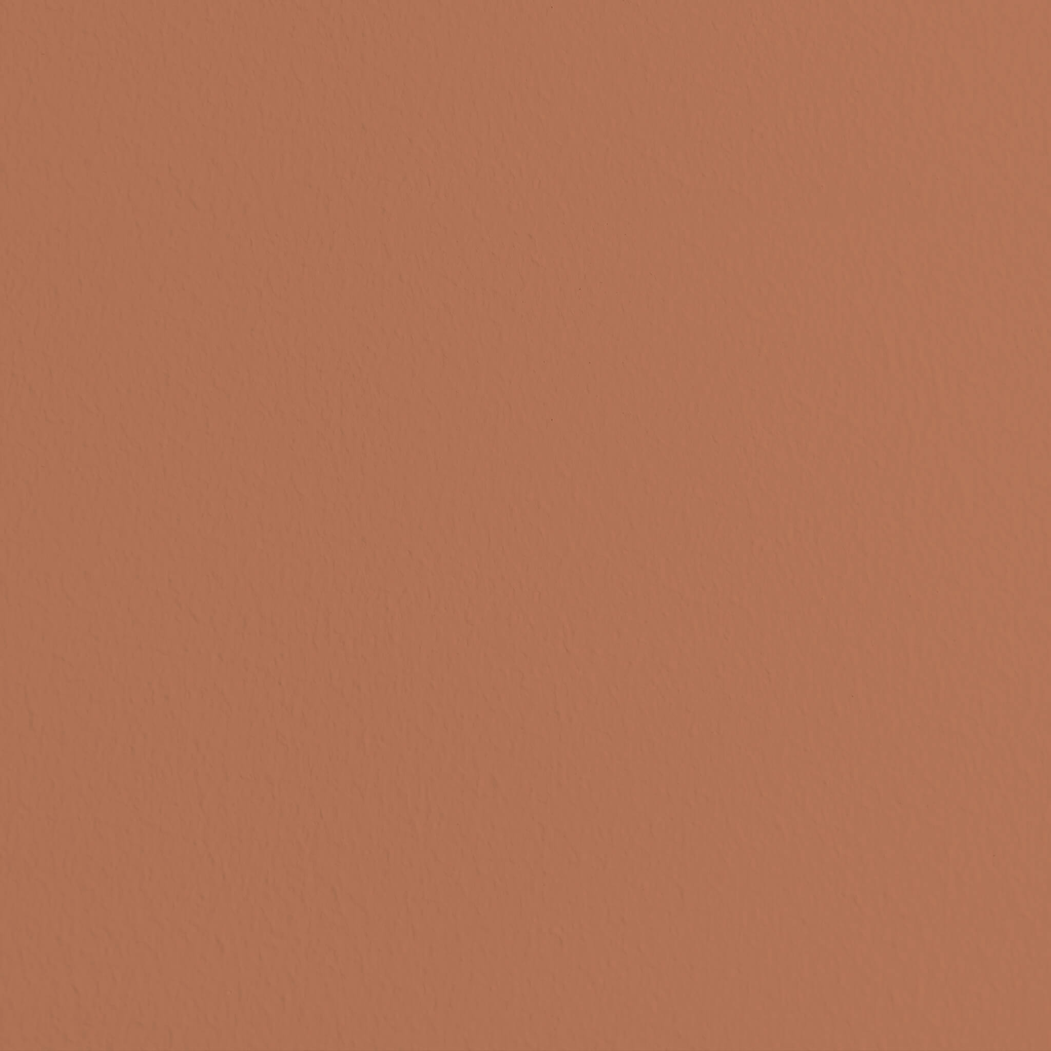
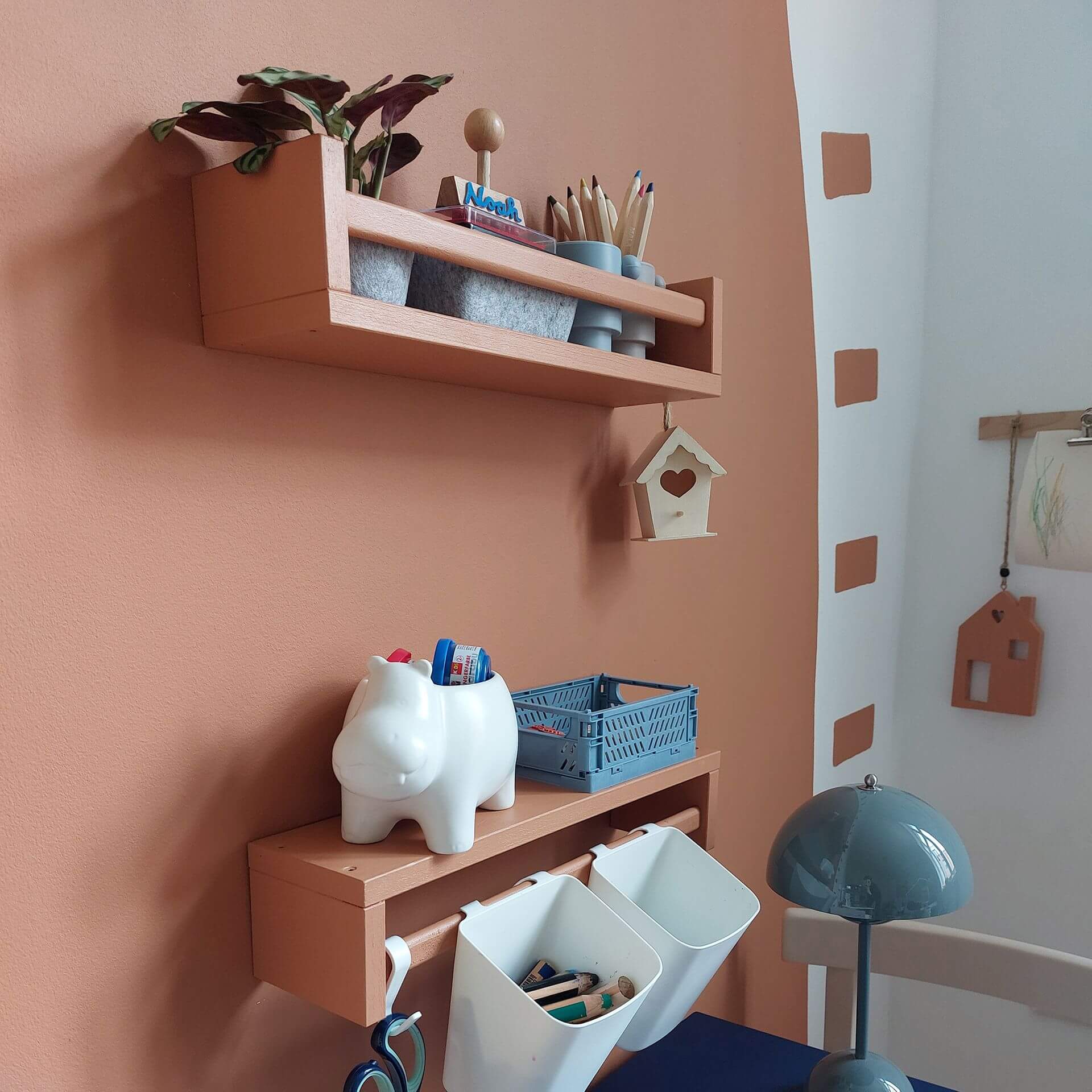
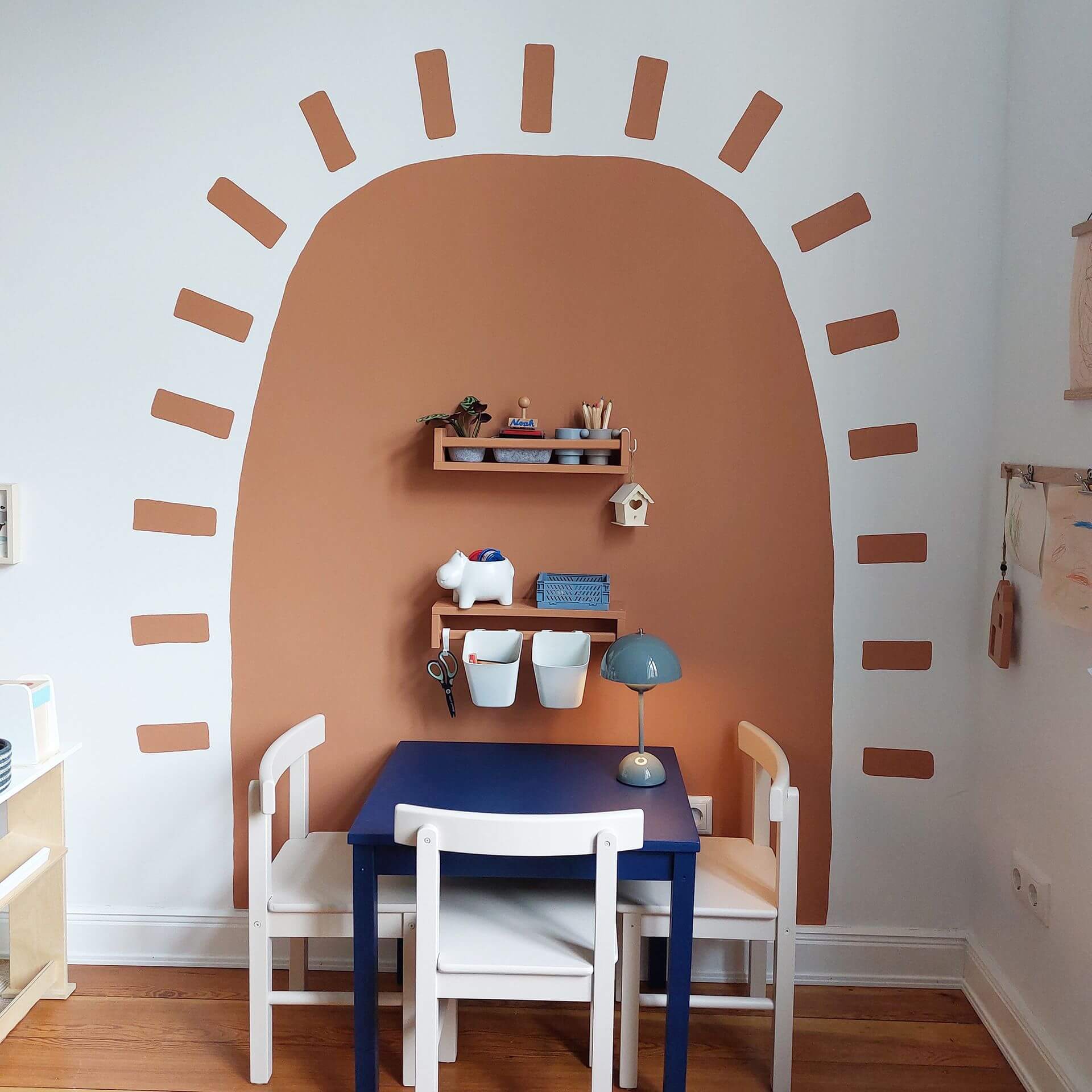
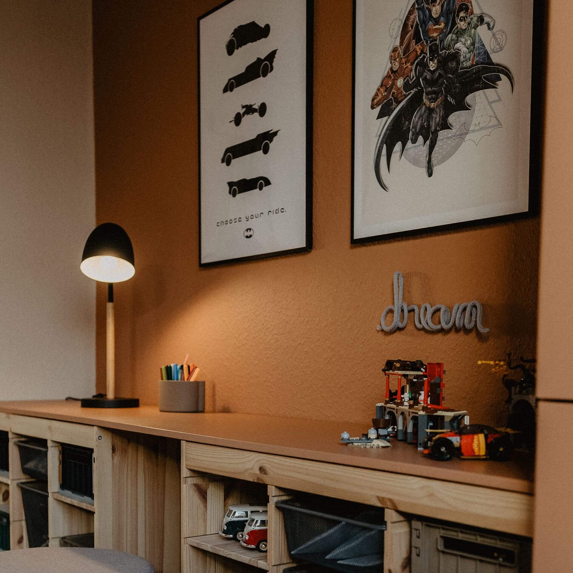
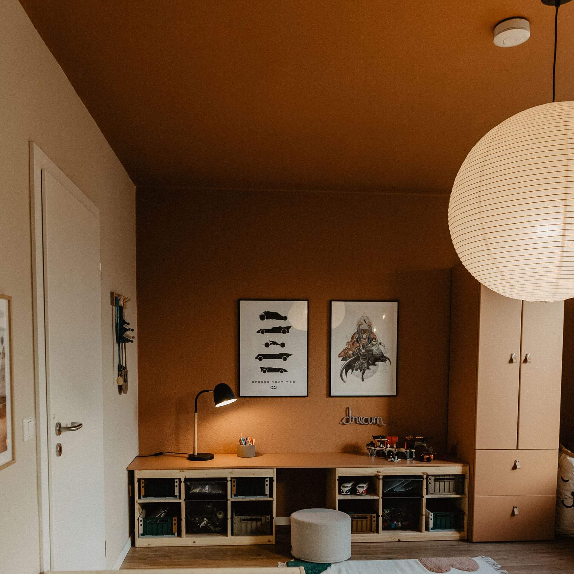

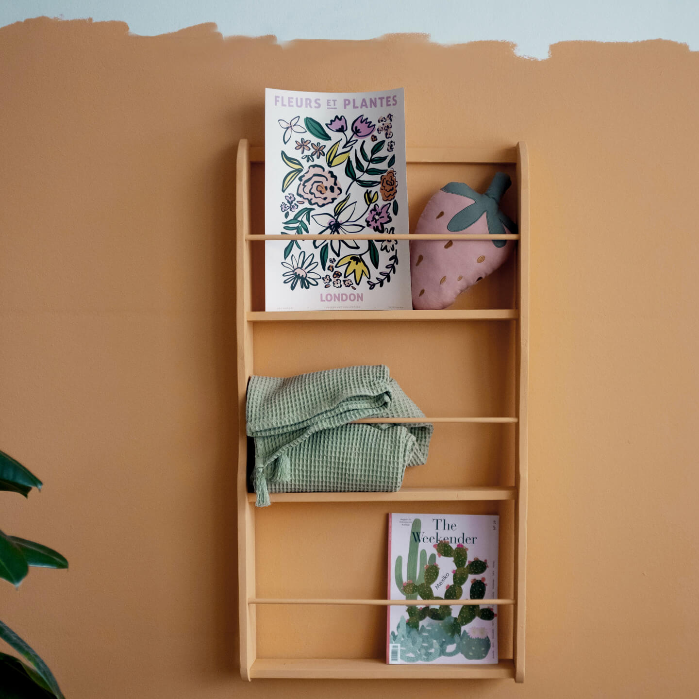
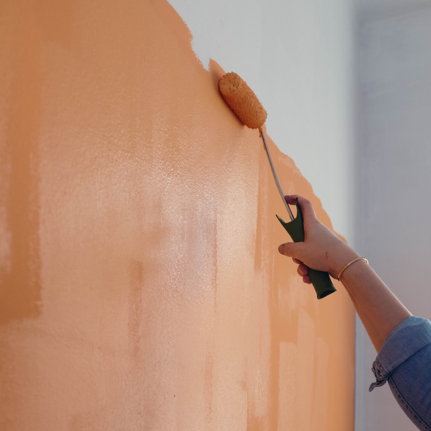

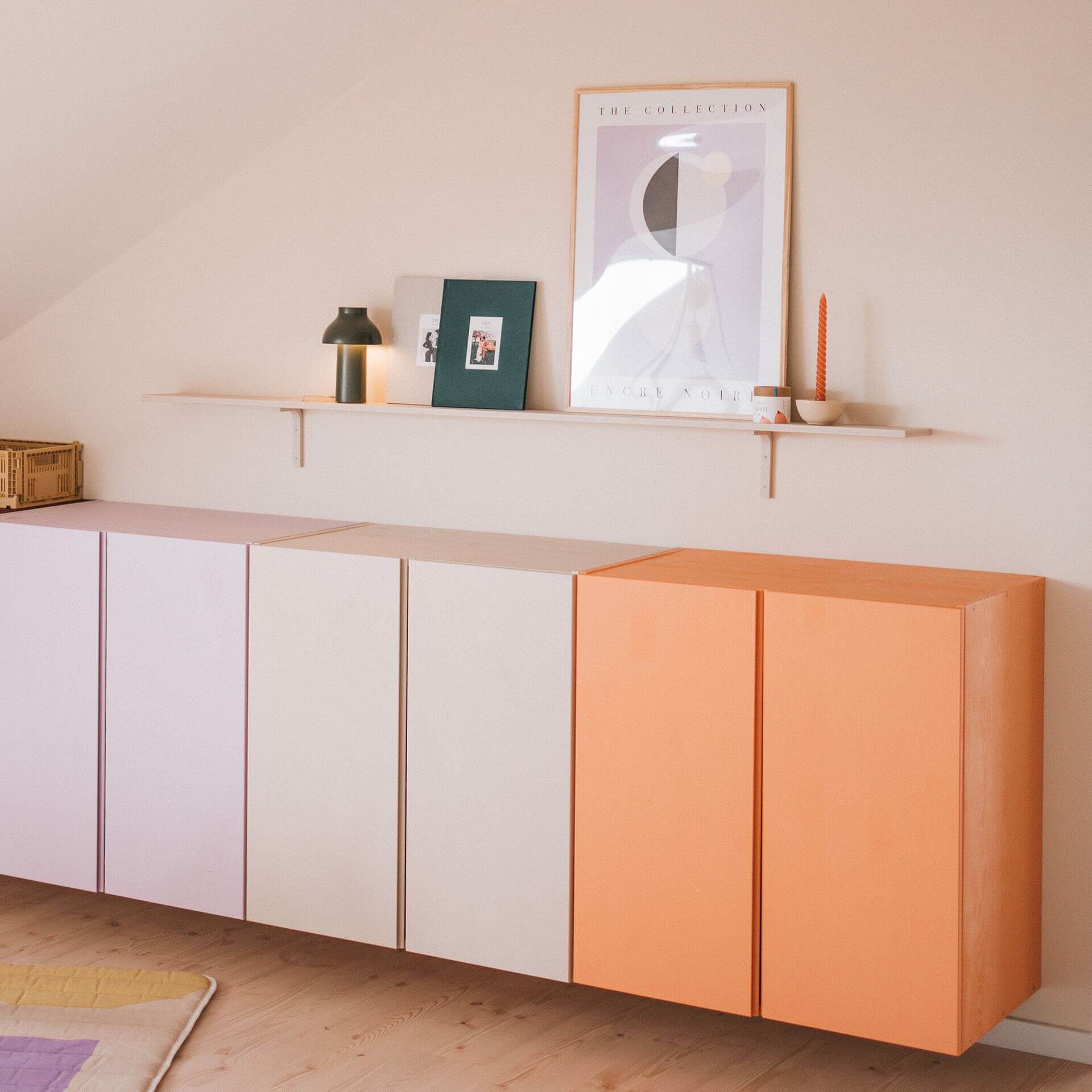
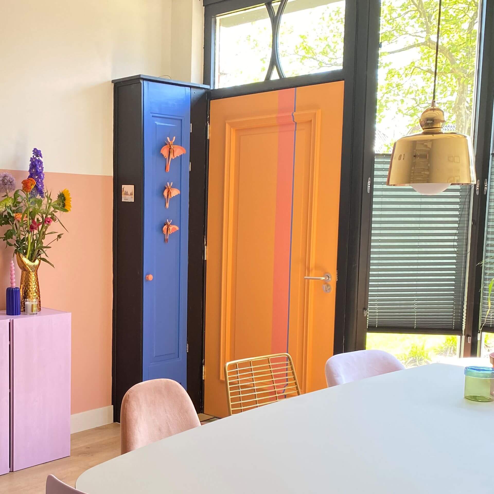
Everything for your project in one set






The most important facts about the colour orange
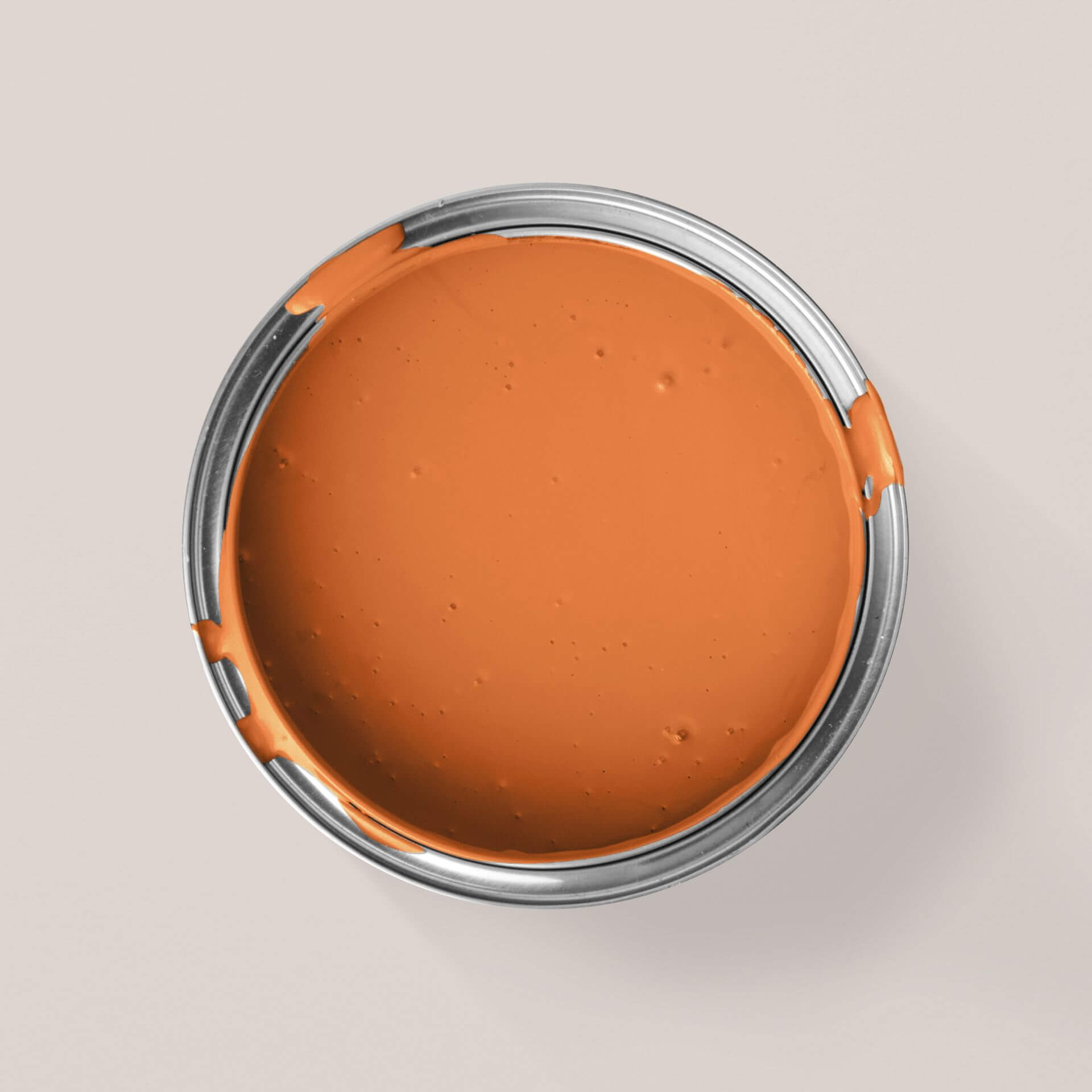
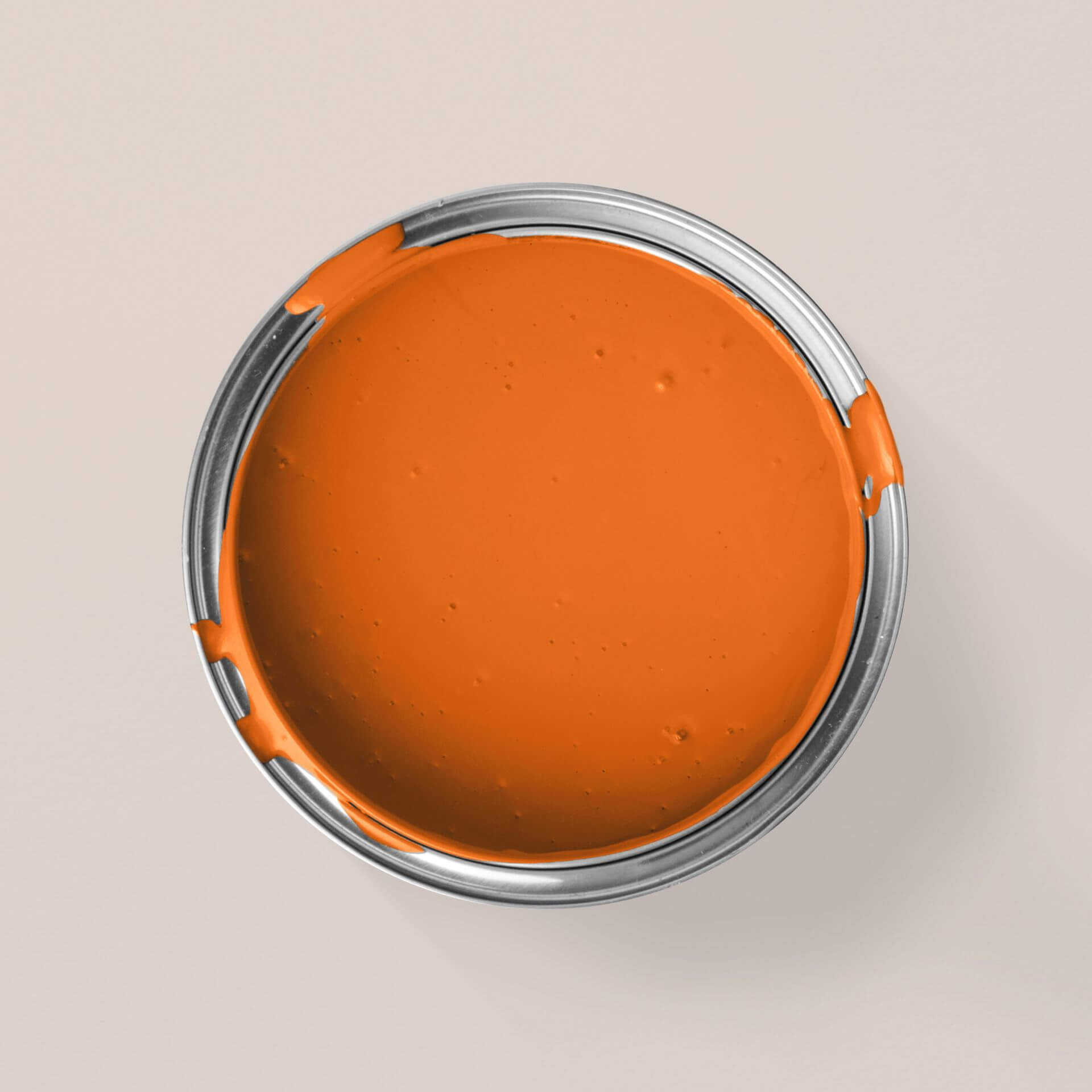
The colour takes its name from the juicy fruit of the same name. Orange is a favourite colour for many people. Orange colours always radiate warmth and cheerfulness
Effect of orange colour
Basically, orange is created by mixing red and yellow. If the red pigments predominate, you get a reddish orange; if the yellow pigments predominate, the colour tends more towards yellow, becomes lighter and has more luminosity.
Adding white or beige creates a soft, light and friendly colour shade that can range from peach to a beautiful apricot. Adding brown creates a subtle colour shade with a rusty appearance, while adding black or grey makes the colour shade dark and heavy. Adding a bright red, almost pink, to orange-red creates a coral or flamingo colour shade.
Orange combines the energy of red with the cheerfulness of yellow. Orange can give us emotional strength and manages to dispel sadness and hopelessness. This is because the colour effect of orange is optimistic, it inspires activity and spontaneity and ensures a positive attitude to life overall. The colour stands for extraversion, enthusiasm, a thirst for adventure and self-confidence.
Design rooms with orange
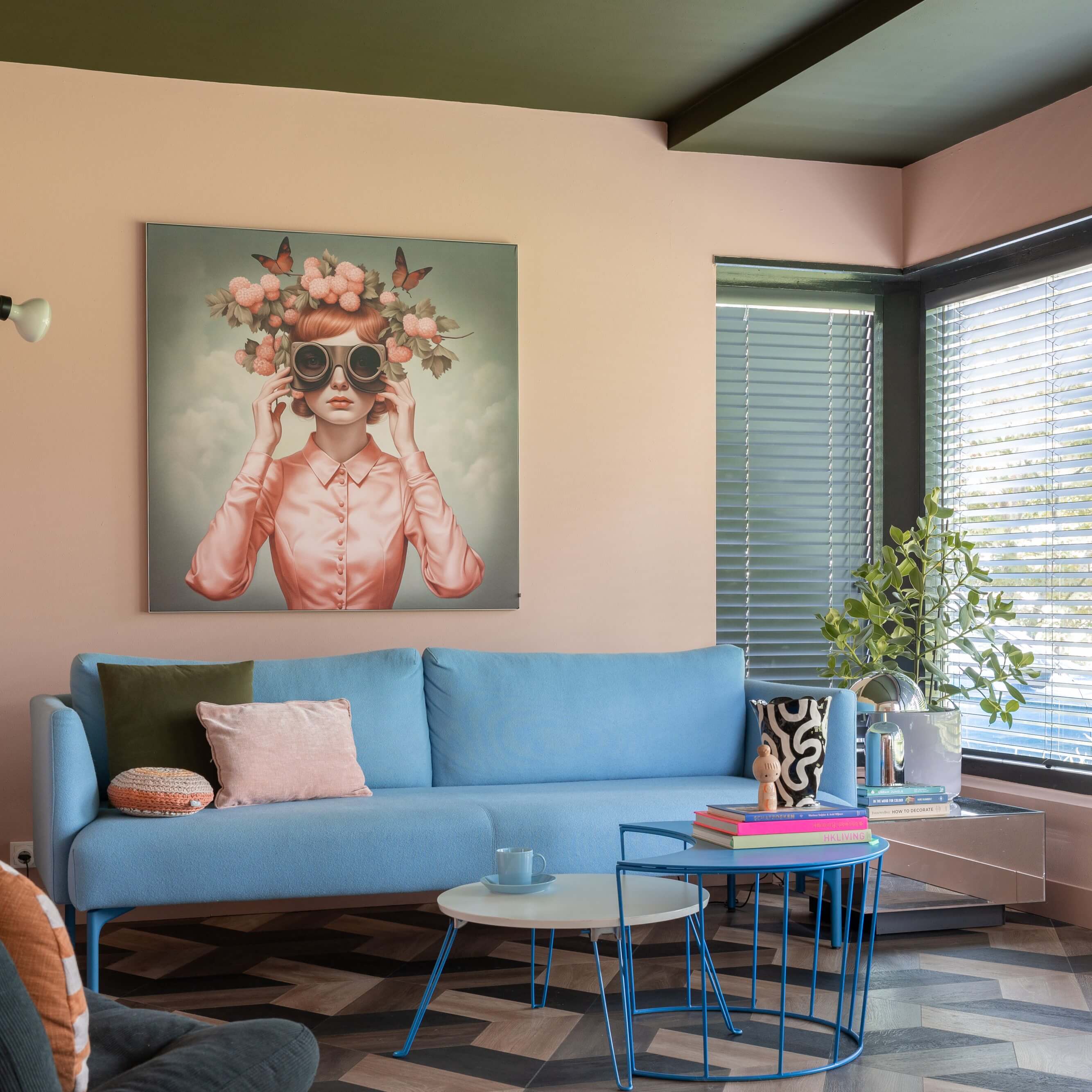
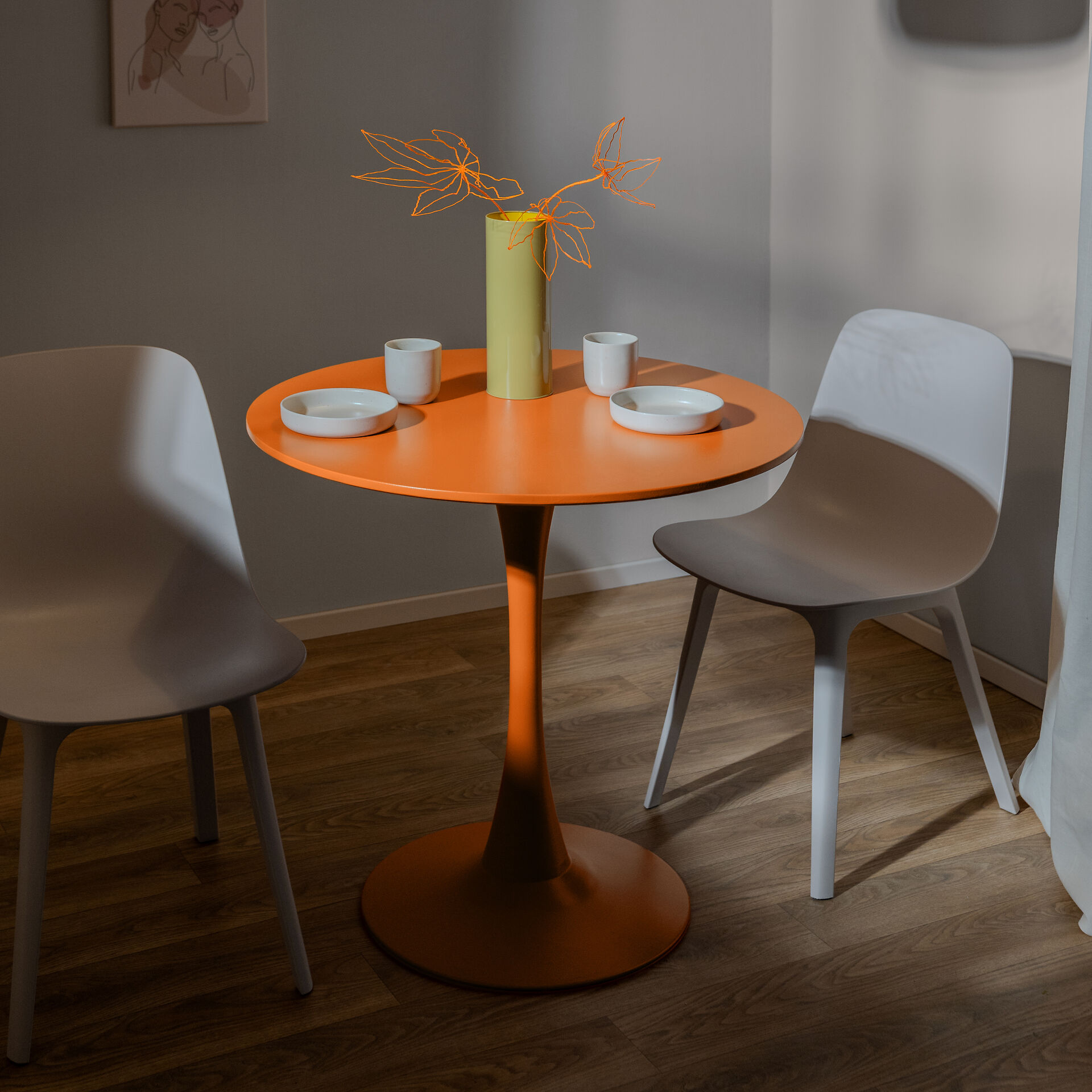
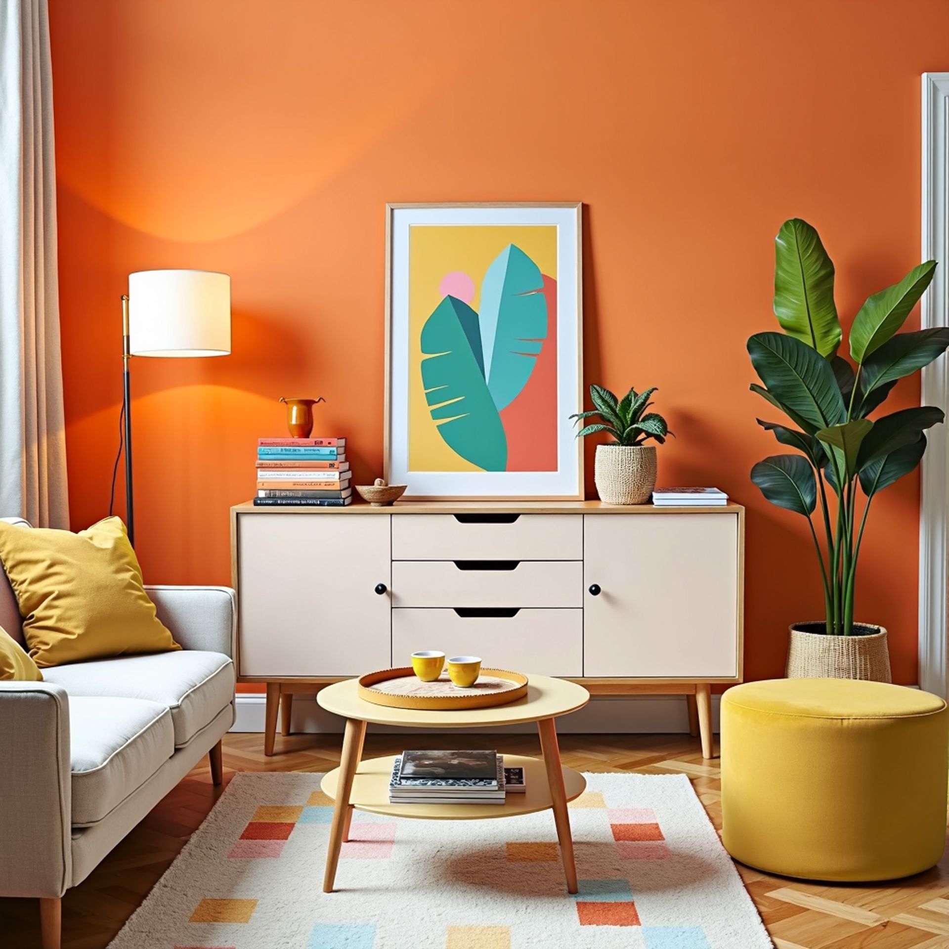
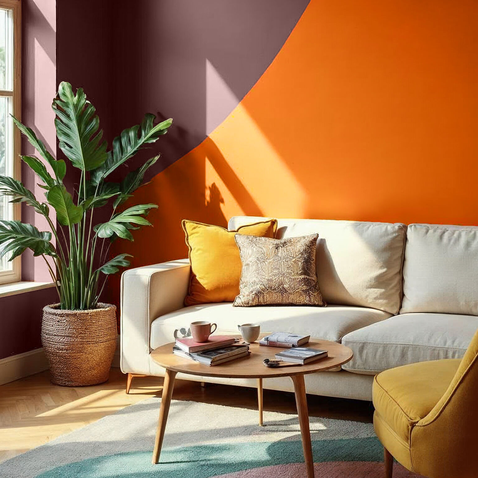
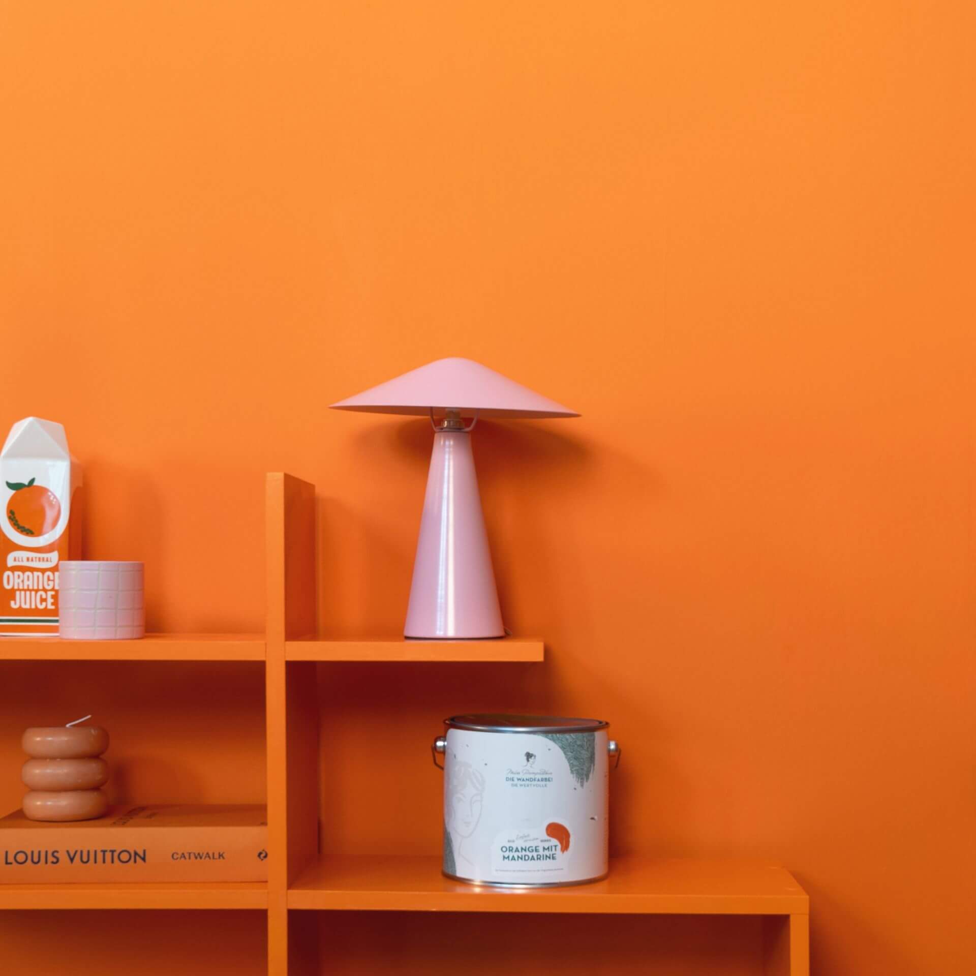
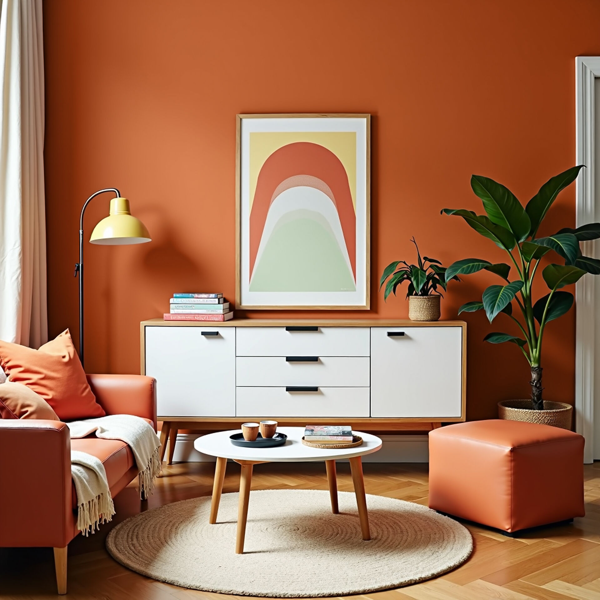
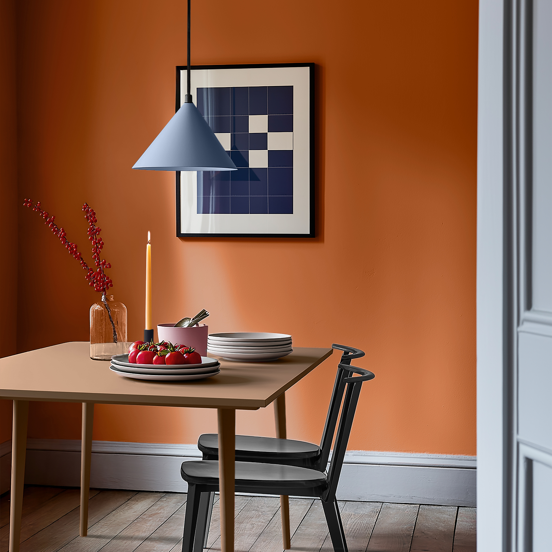
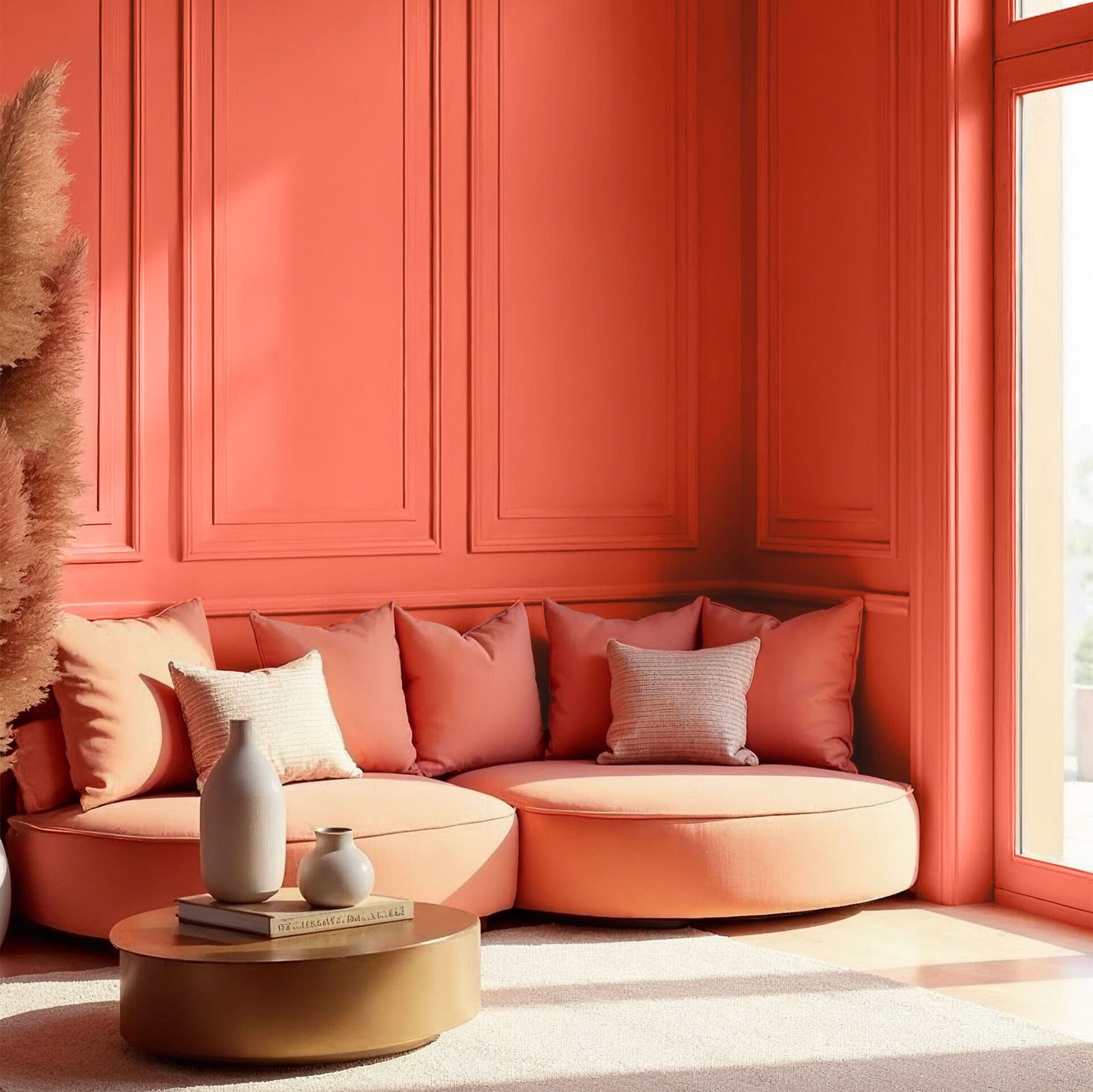
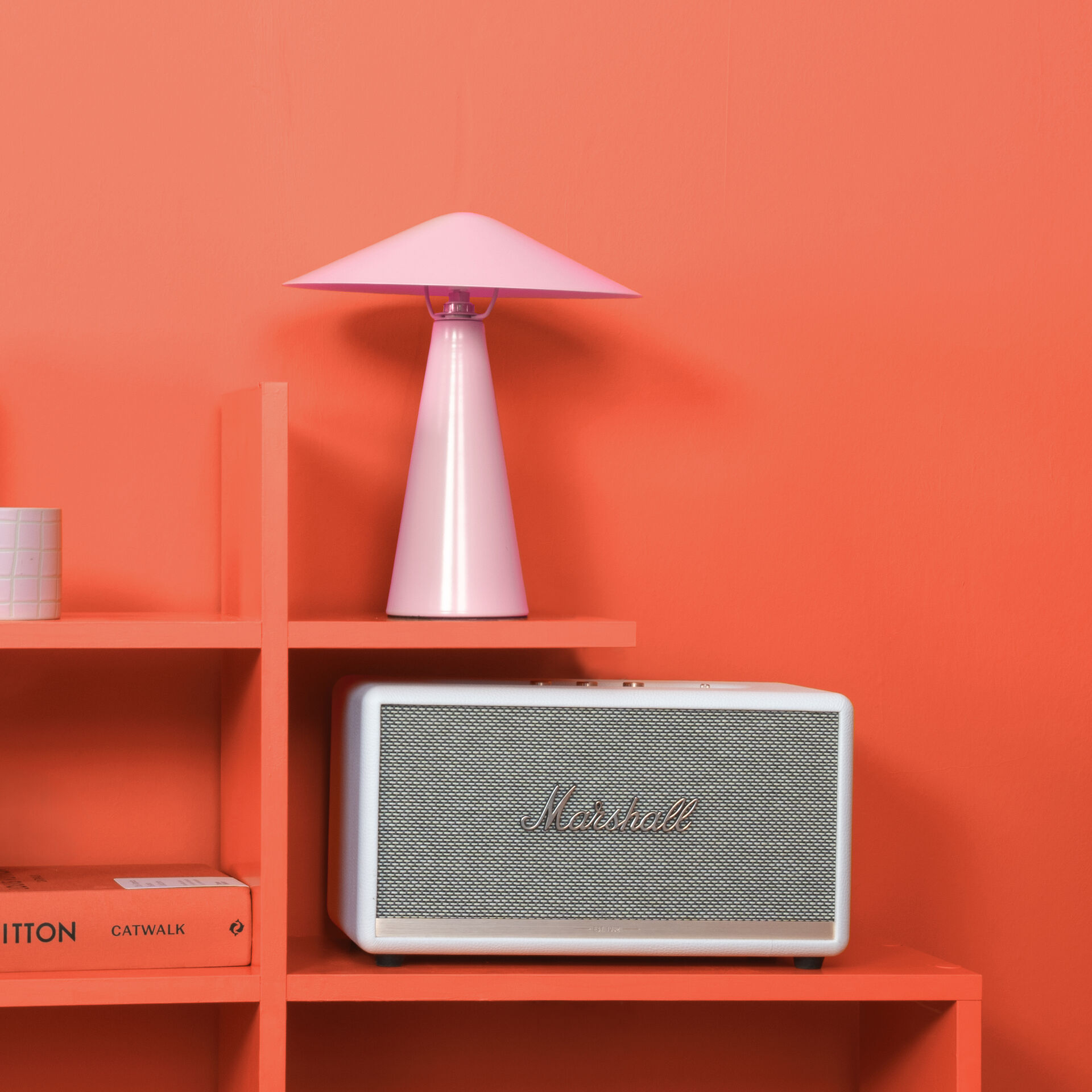
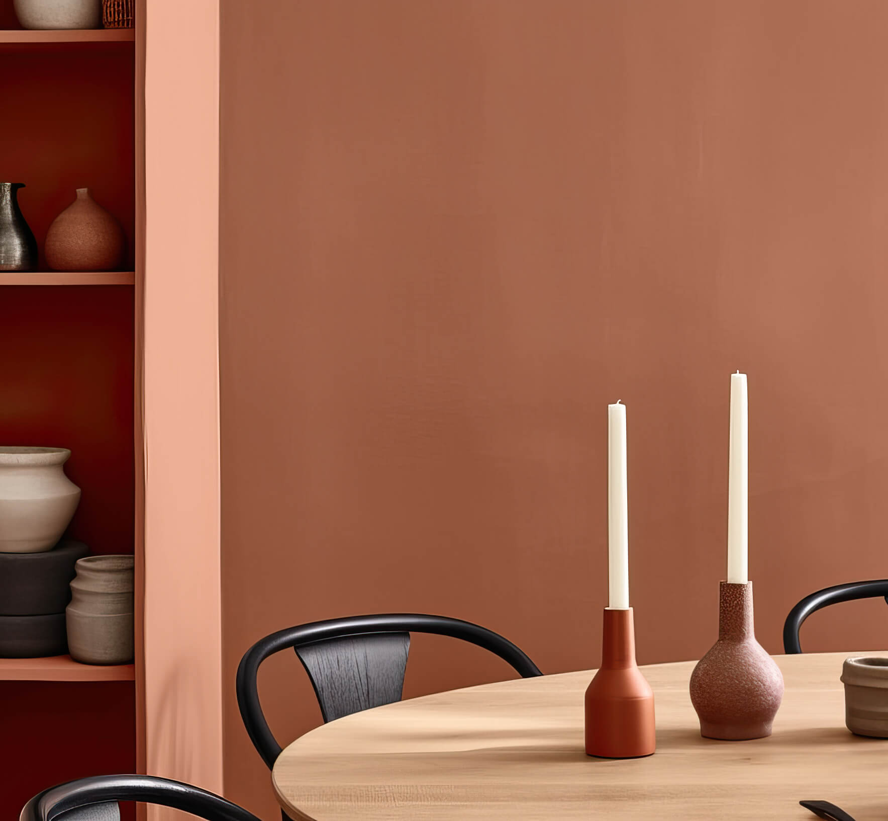
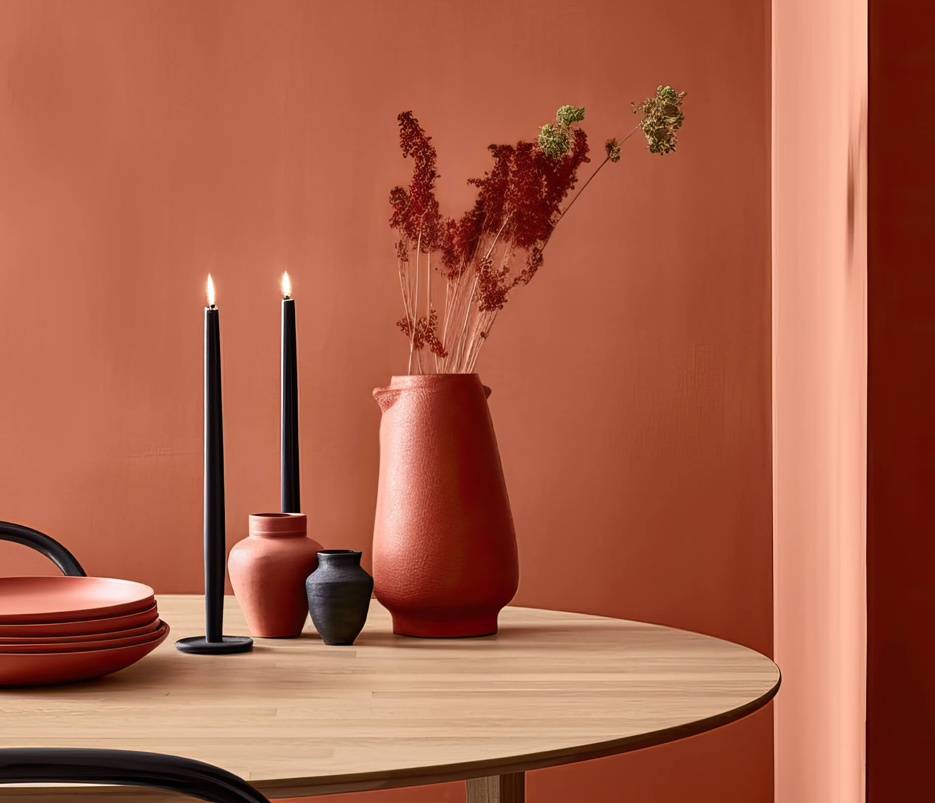
We can also utilise the positive properties of orange in our homes. The summery effect of orange tones can be used to create wonderfully vibrant accents in a room. By using orange as a wall paint, there are numerous ways to fill rooms with energy and joie de vivre. Orange is an ideal colour for dining rooms in particular. It stimulates the appetite and any sociability. This colour enlivens any room, creates an inviting atmosphere and encourages creativity and a zest for life.
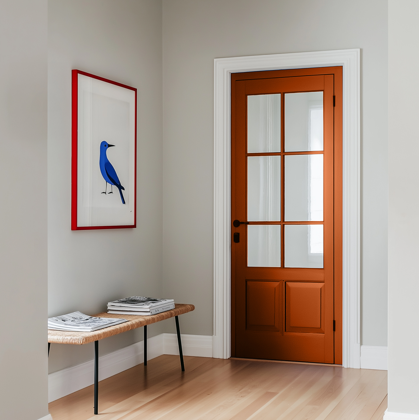
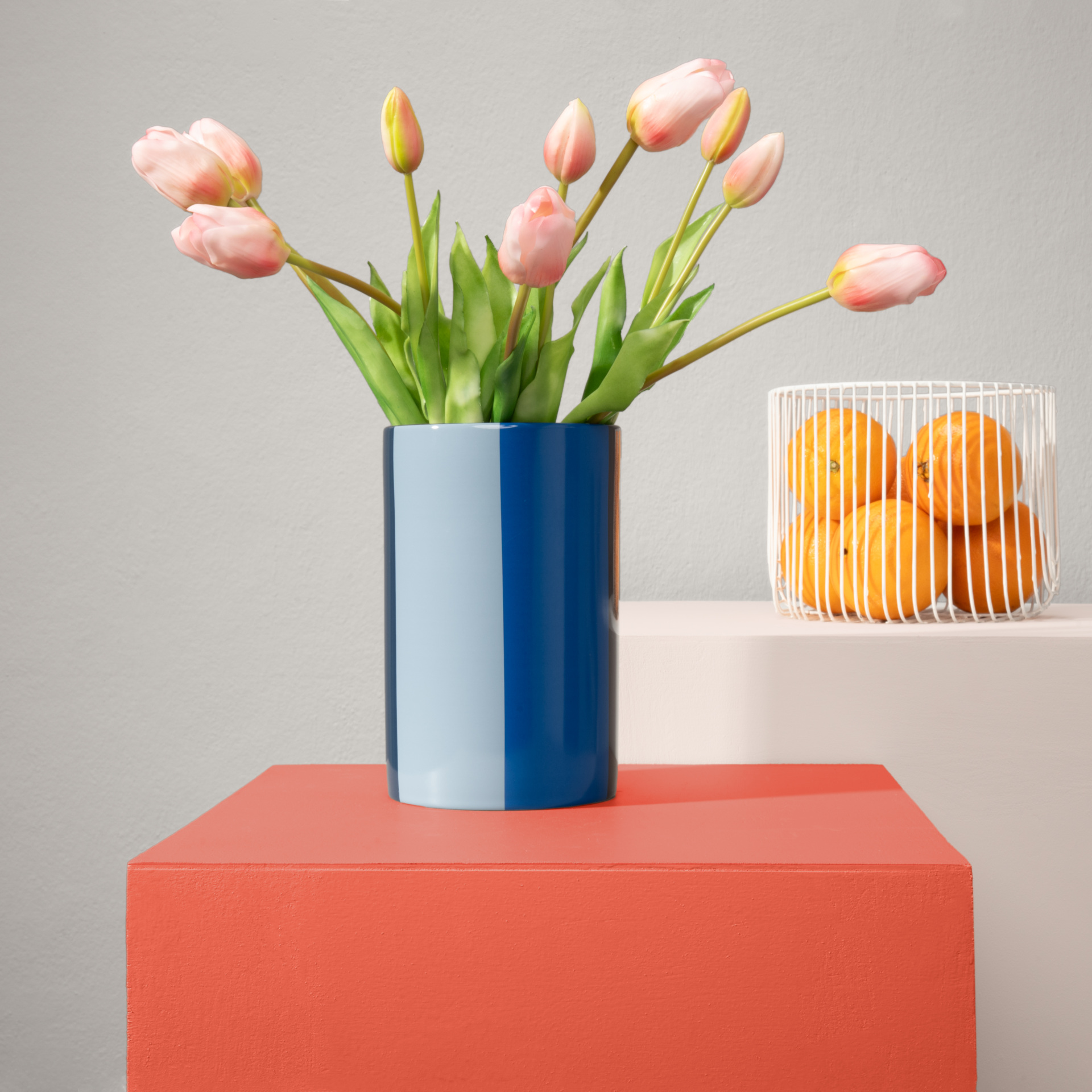
When orange tones are toned down with white, grey or beige, a very harmonious room atmosphere is created. The resulting soft tones convey cosiness and elegance as wall paint. The combination of orange tones with plain colours such as Grey, White with White and Black is particularly effective. All neutral tones make orange really shine. The important thing here is to always find the right balance between the different colour shades.
You should avoid orange here
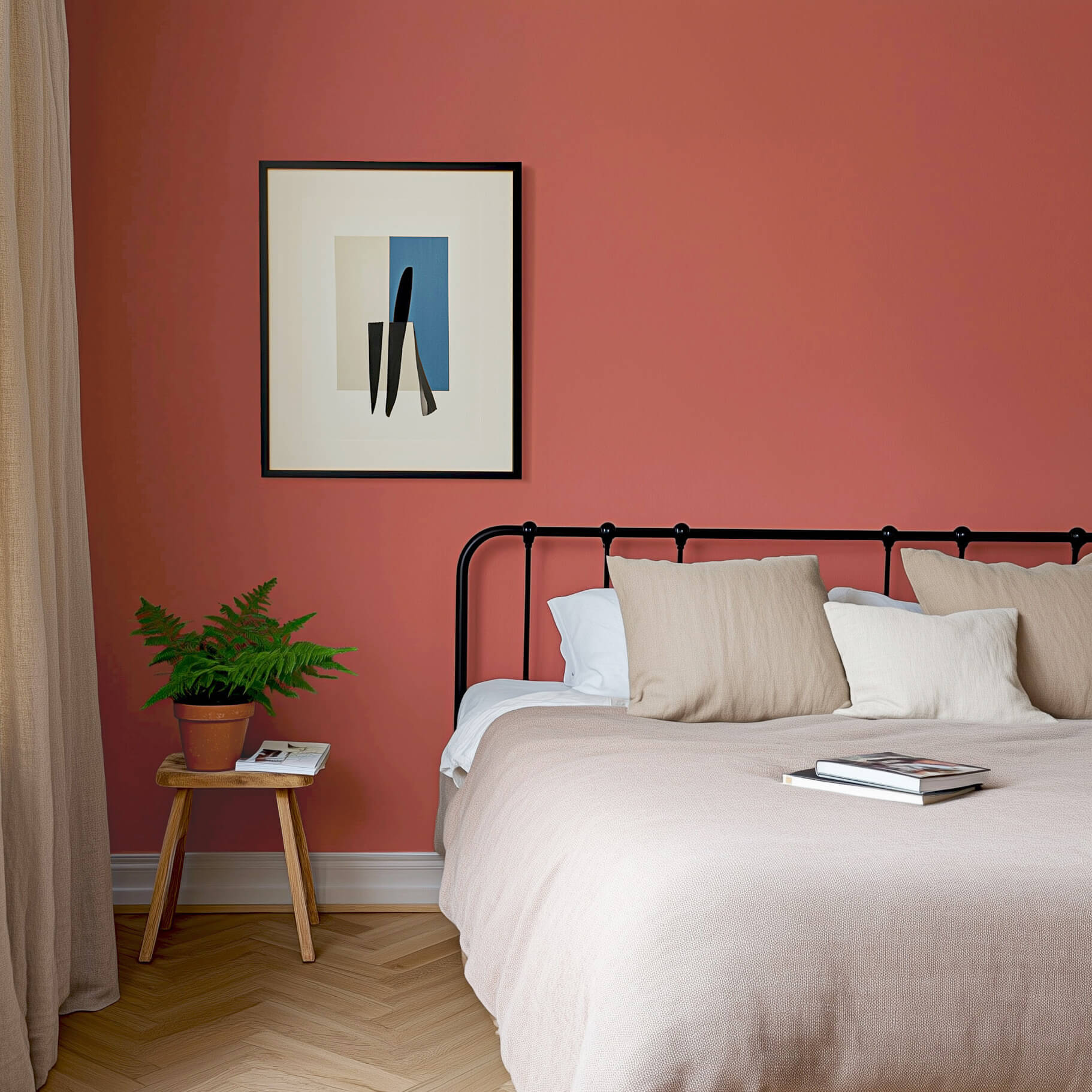
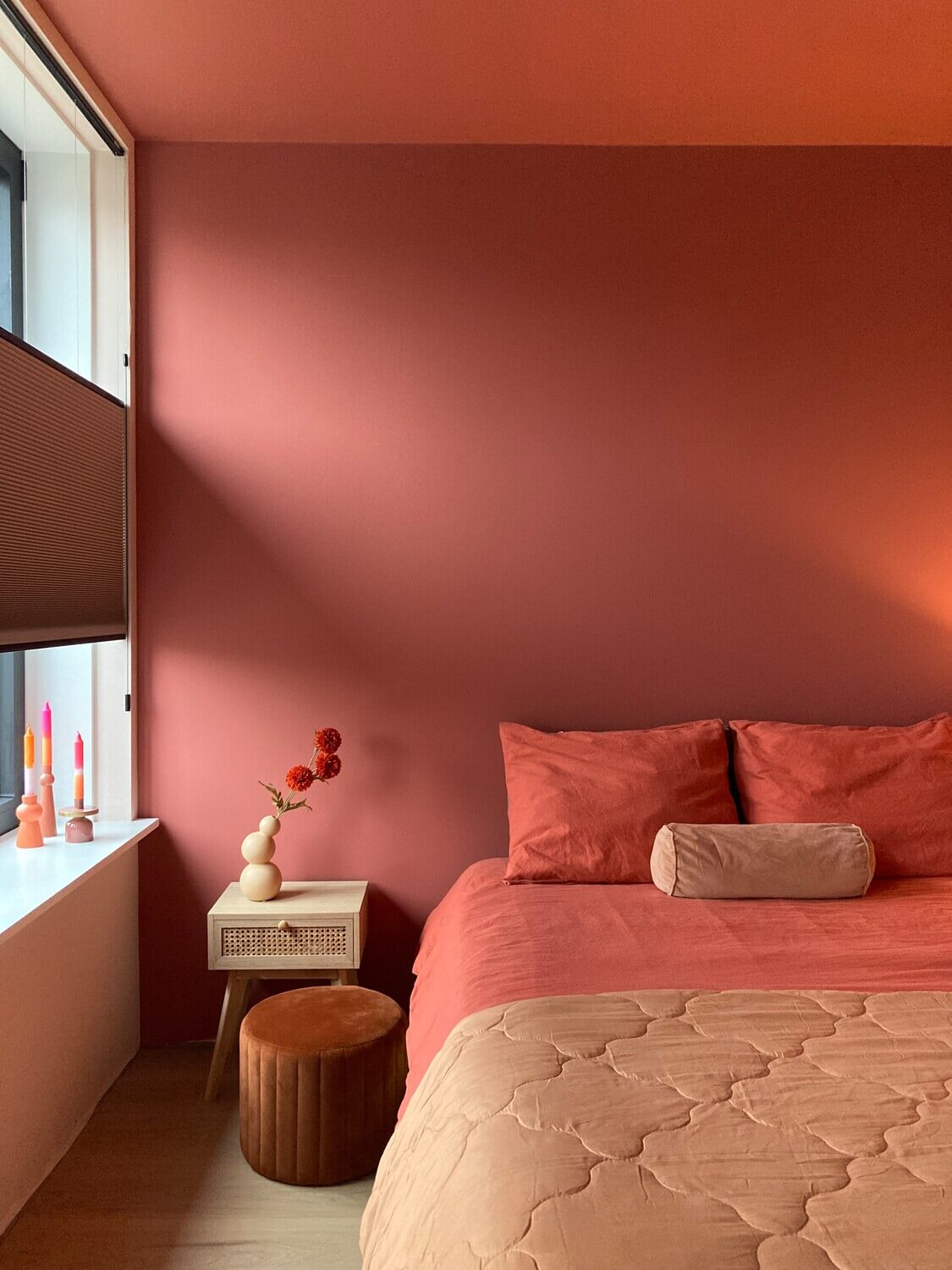
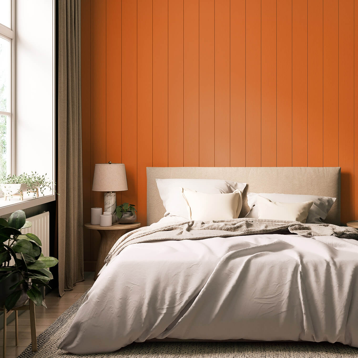
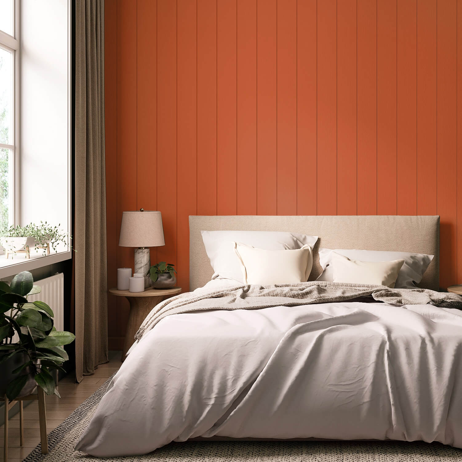
In bedrooms, orange as a wall paint can be too uplifting and stimulating, so that it does not contribute to relaxation and prevents you from finding peace and quiet. Orange should also be avoided in south-facing rooms, as the colour can make southern rooms appear slightly overheated
Alternatives to Colour orange
A beautiful alternative to bright orange is a shade of orange tinted with white or beige.




Orange Variety
Like all colours, orange comes in many different shades and graduations. It starts with an intense orange like the yellow-red of the sun and goes all the way to a gentle apricot, which is perceived more as an atmosphere in a room than as a distinct colour. Dark orange tones, which contain brown pigments alongside red and yellow and sit somewhere between light brown and orange, are gathered under the name Burnt Orange. This variety and vibrancy make orange a perfect colour for your individual home decor!
Nuances of the colour orange
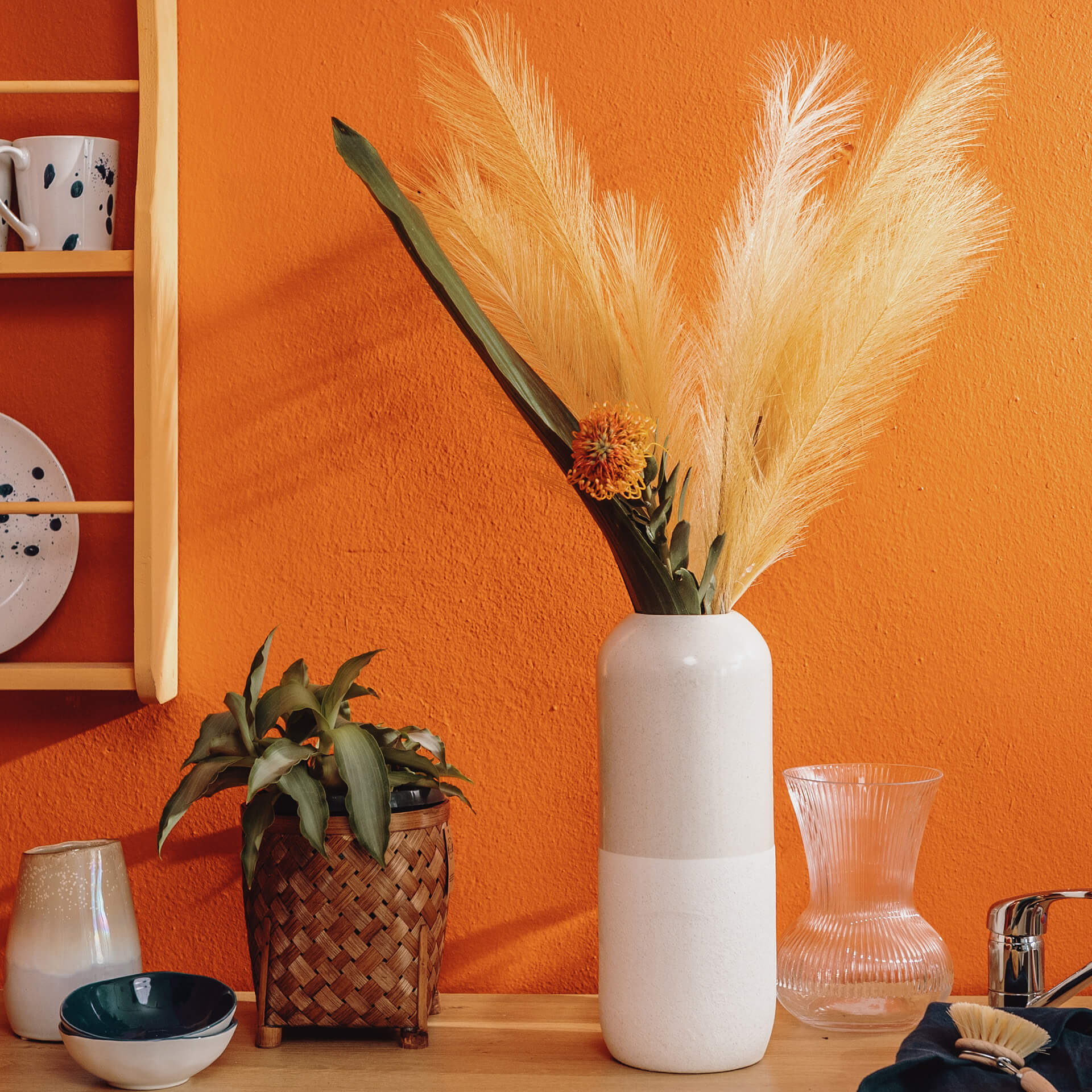
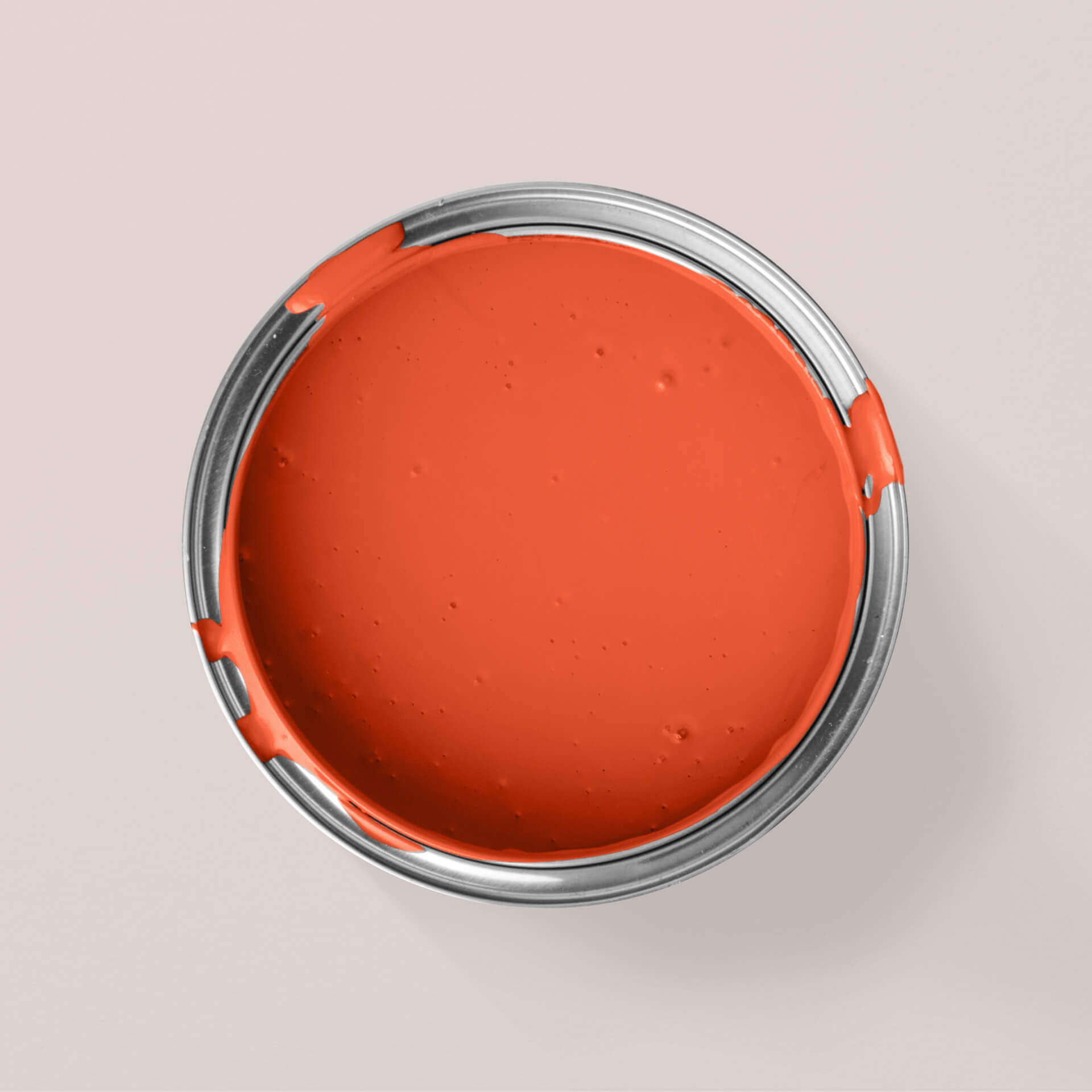
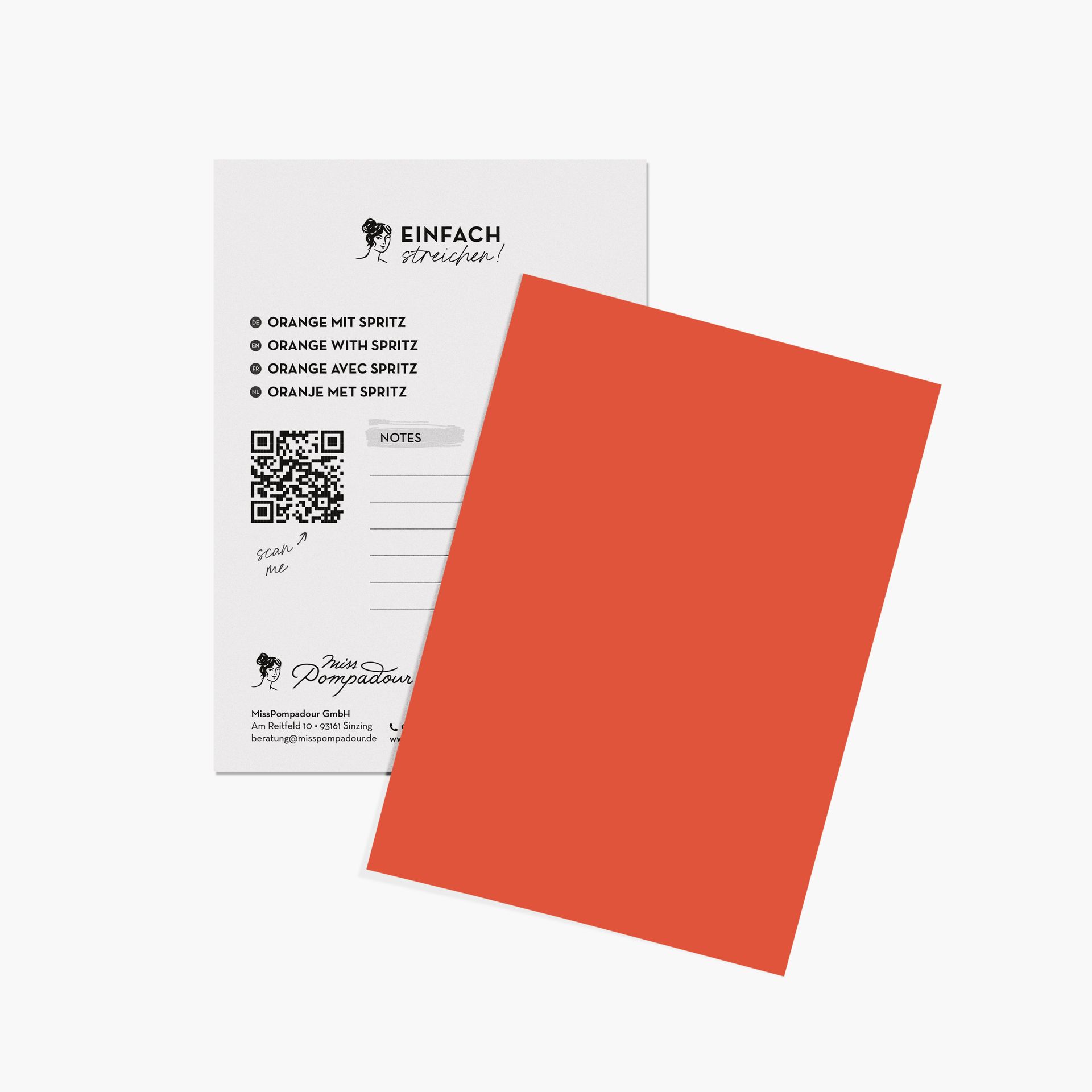
The most intense orange, which we encounter in traffic as a signal and warning colour, can certainly be used as a highlight in interior design. One such luminous shade is Orange with Spritz from our Just Paint collection.
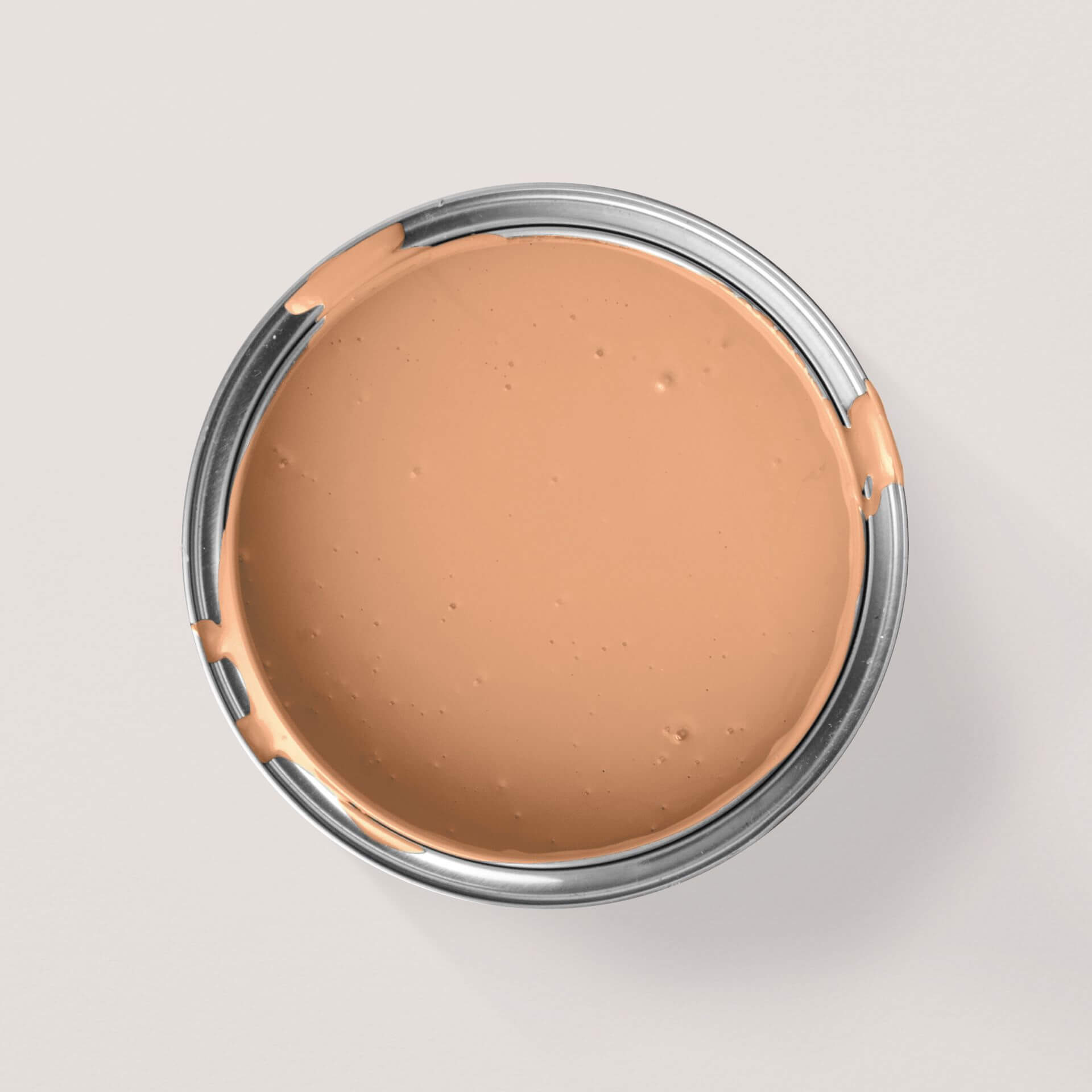
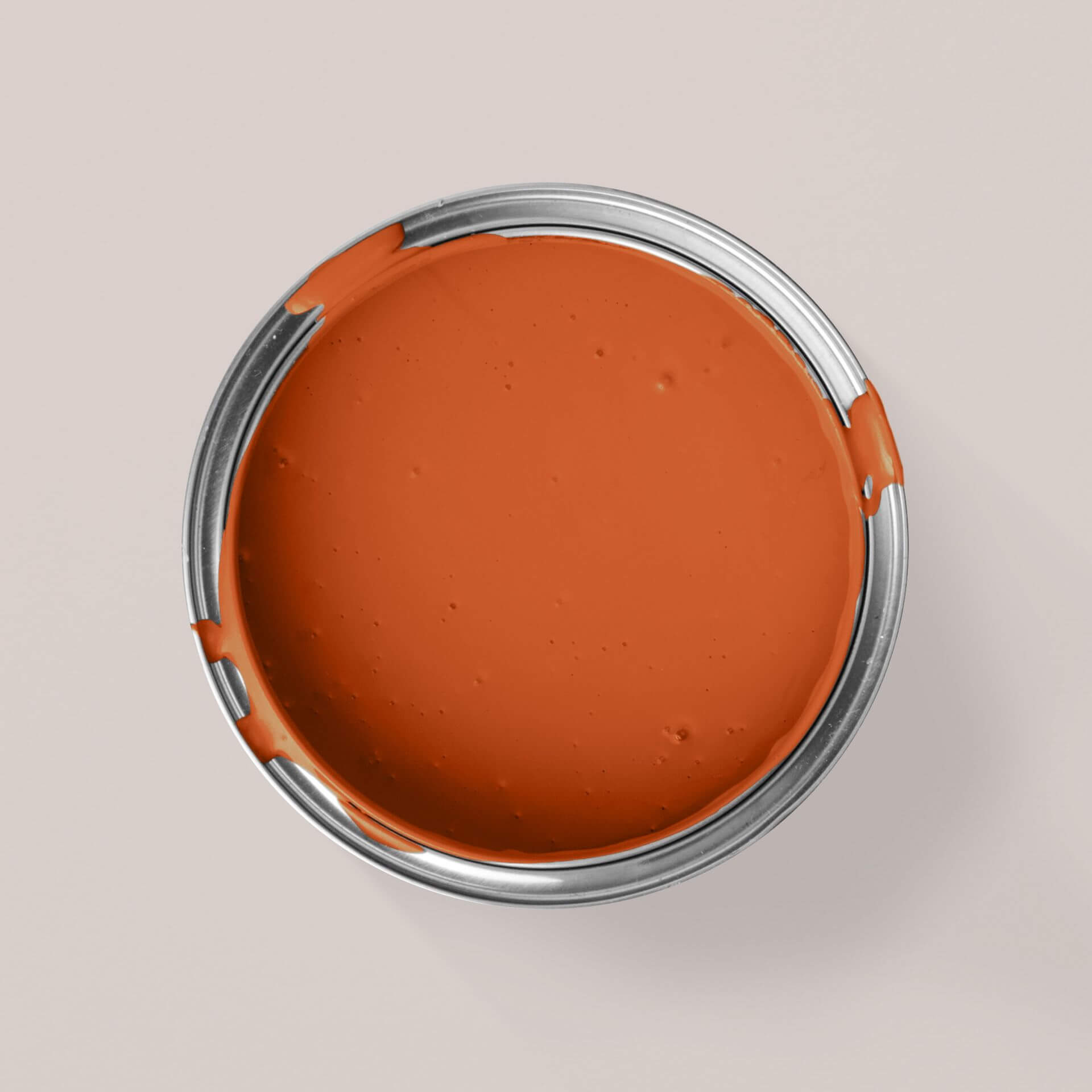
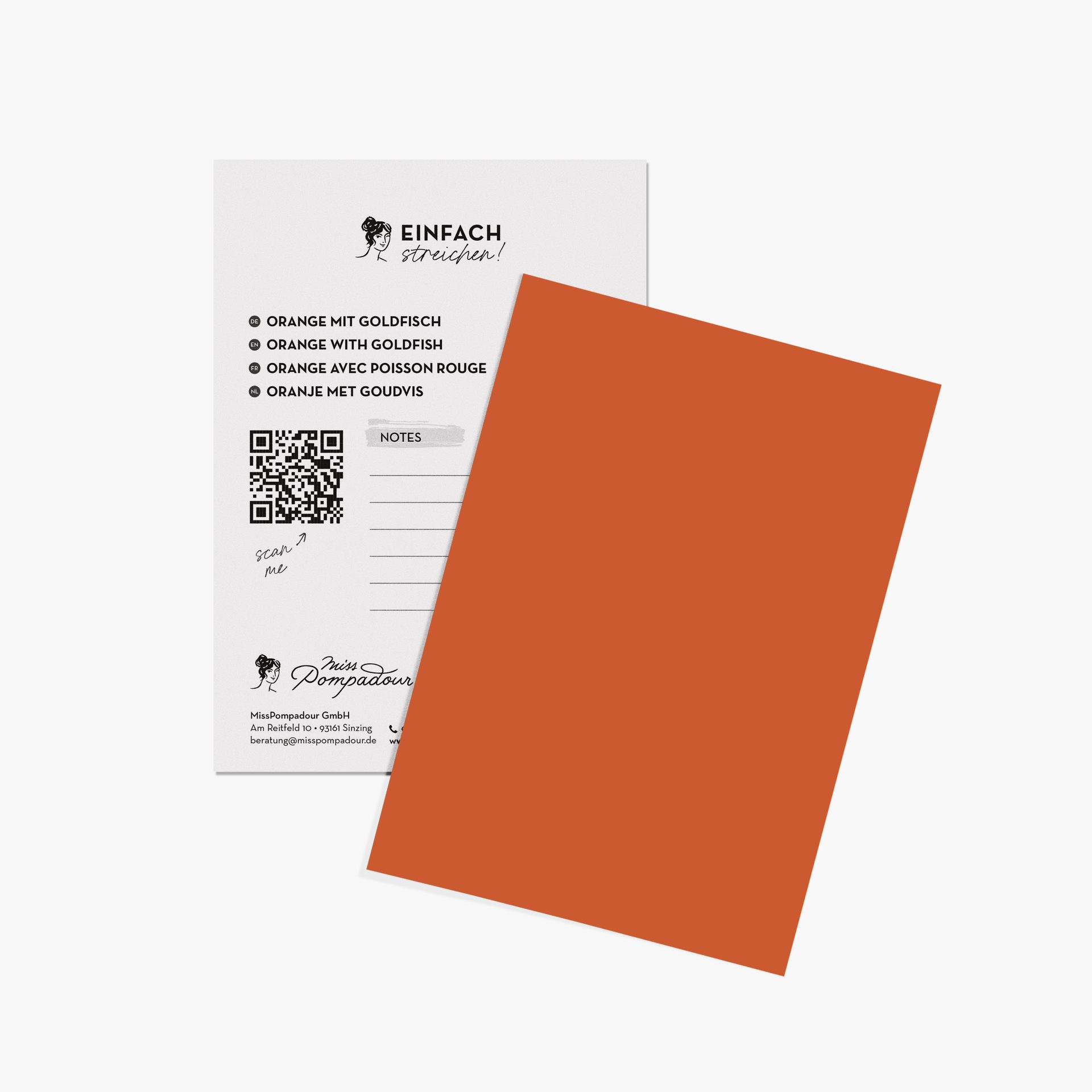
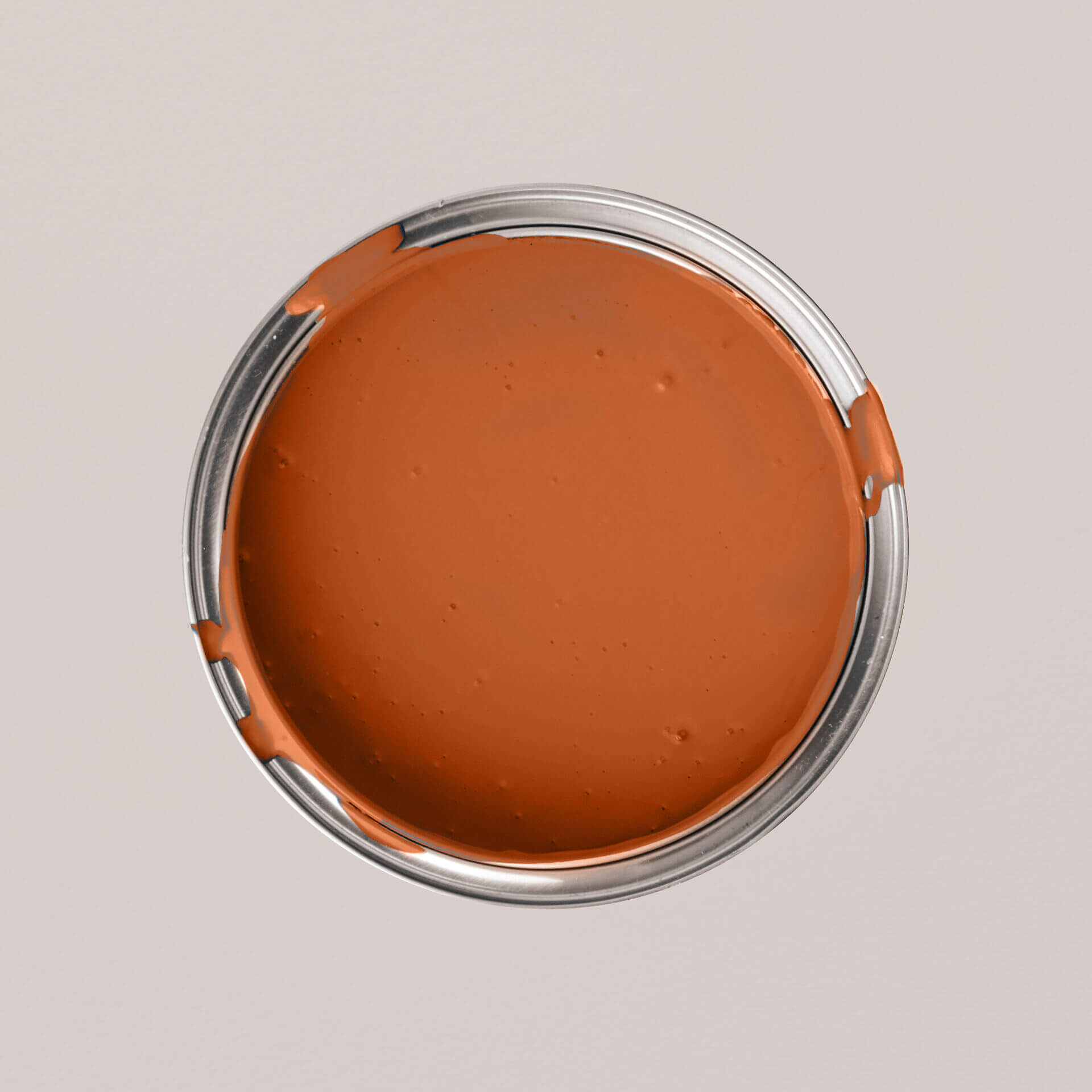
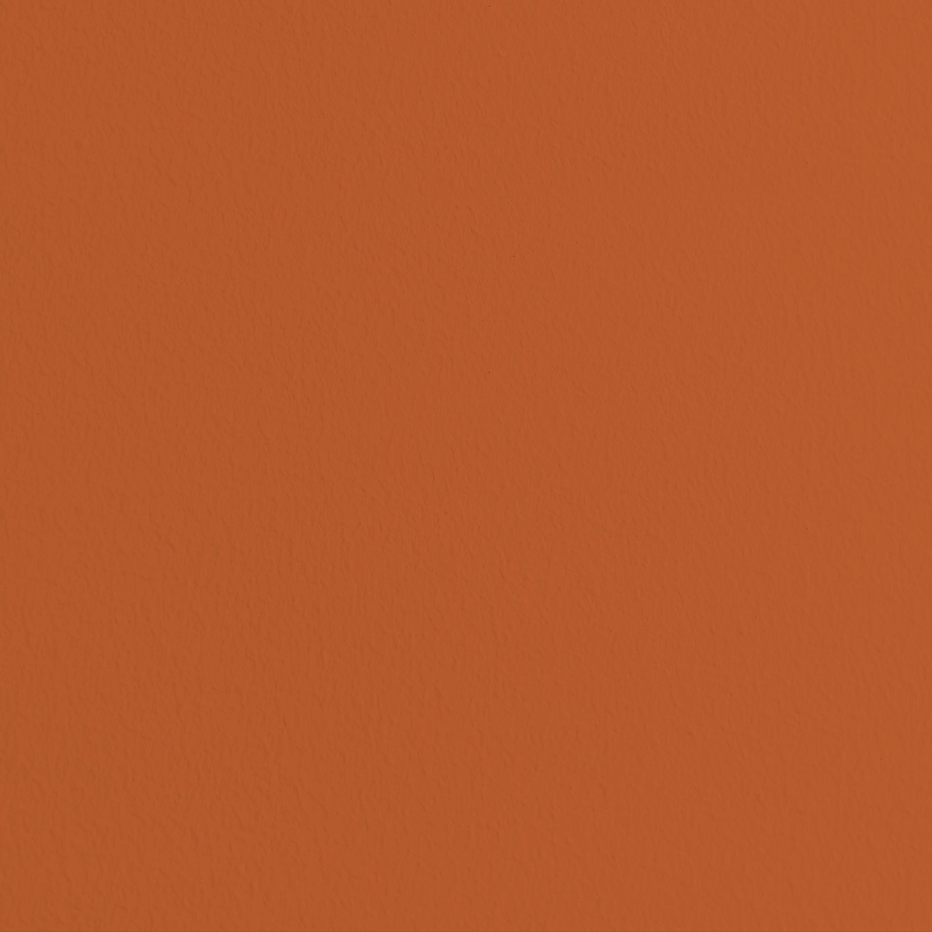
There are also orange tones that remind us of summer and an orange grove. These include Orange with Tangerine and Orange with Goldfish. The warm Orange with Lava and the light Orange with Pumpkin also have this effect.
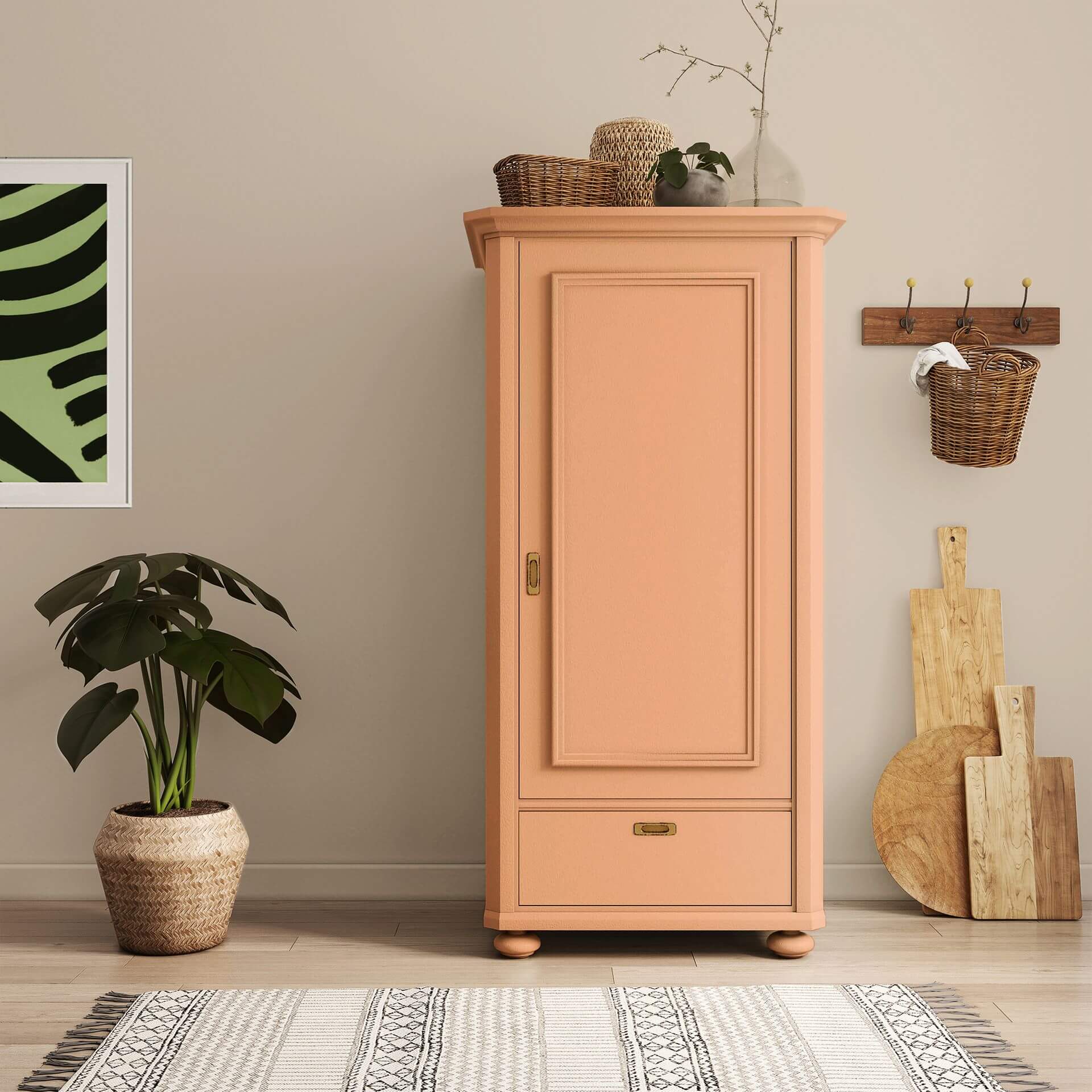
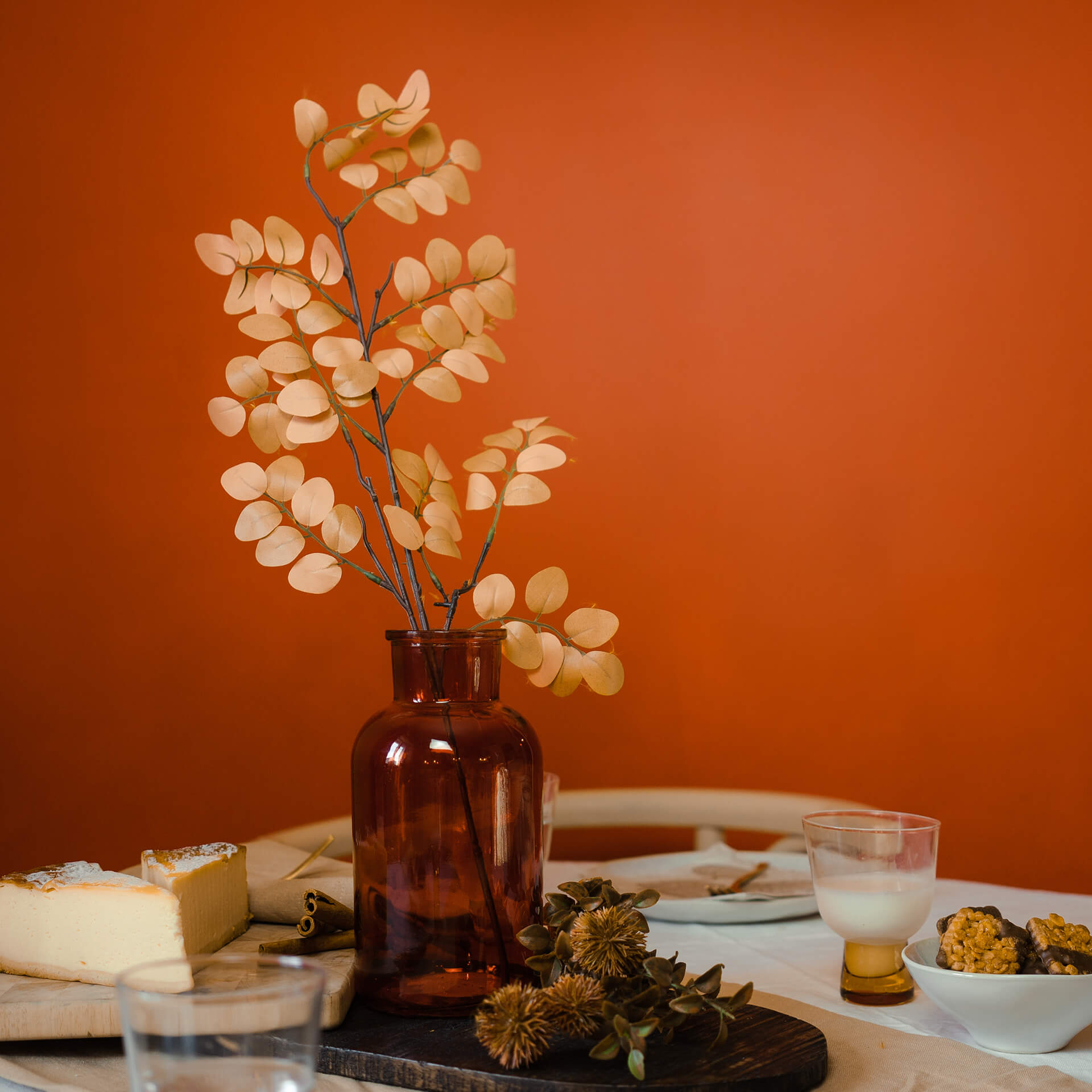
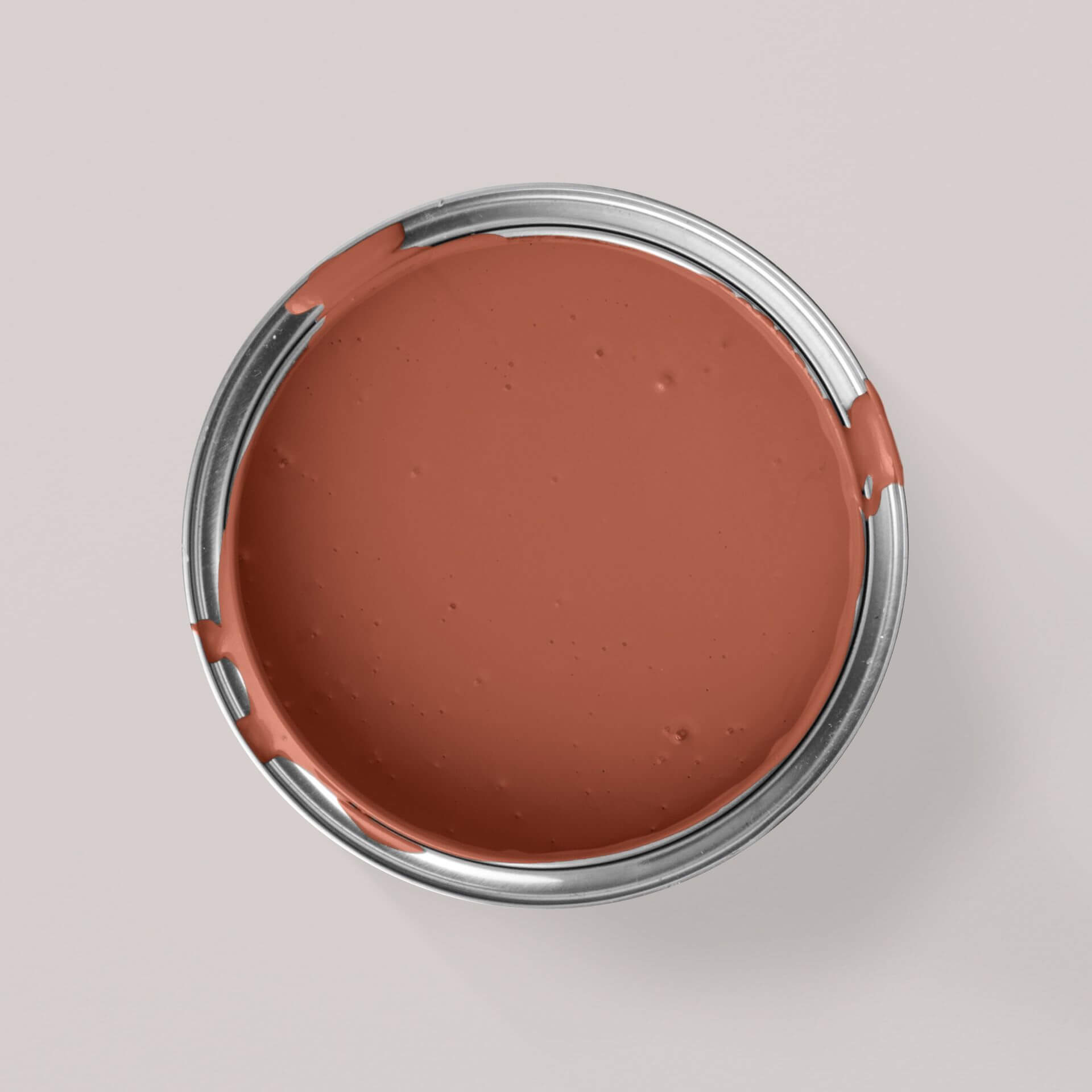
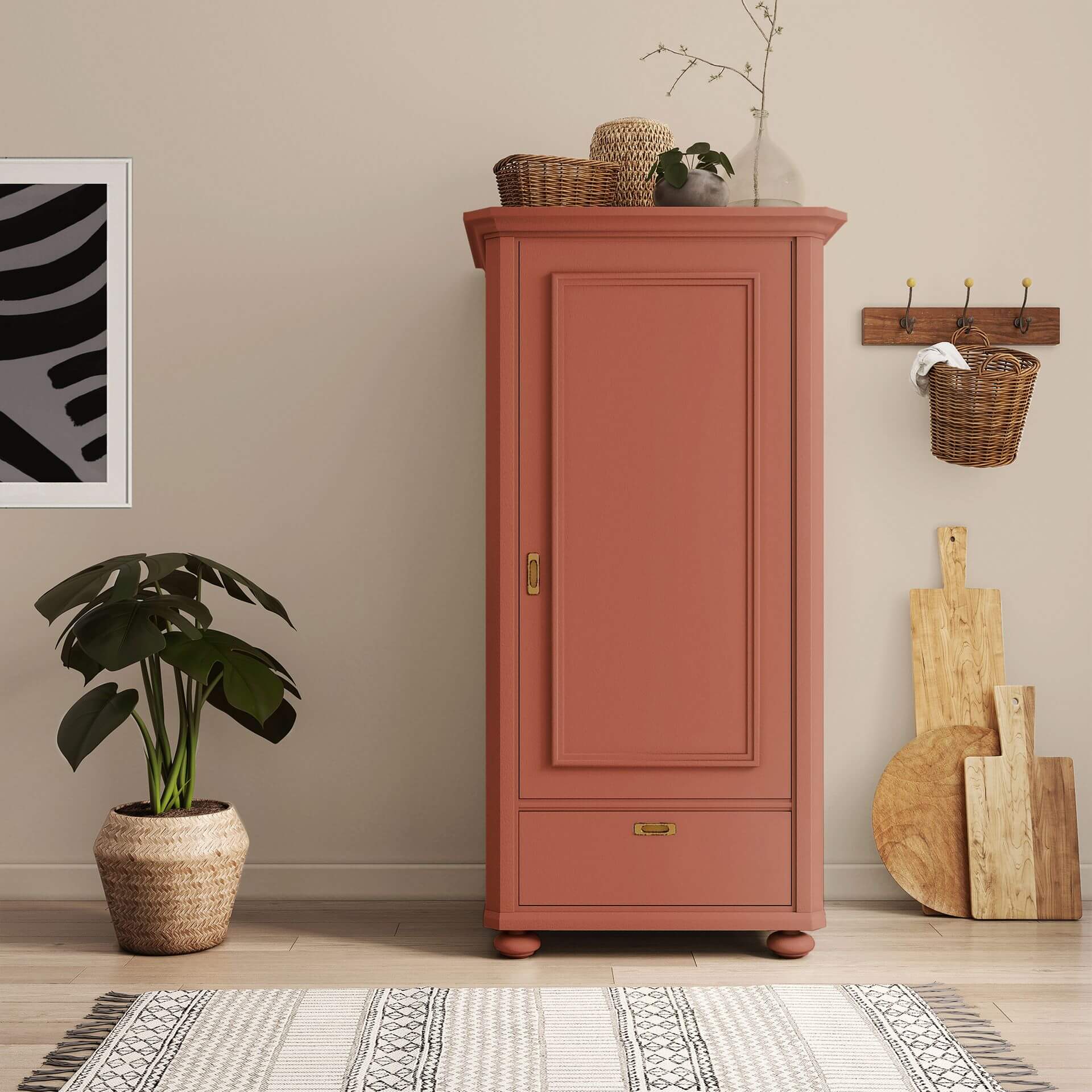
Orange is also represented in the category of warm spice tones. Here, red and brown pigments are mixed into the orange, resulting in particularly warm and pleasant shades. These include Orange with Chestnut. These Burnt Orange tones also include Orange with Chestnut and Orange with Rust, the dark Orange with Copper, and the warm Autumn Red from the CosyColours chalk paints.
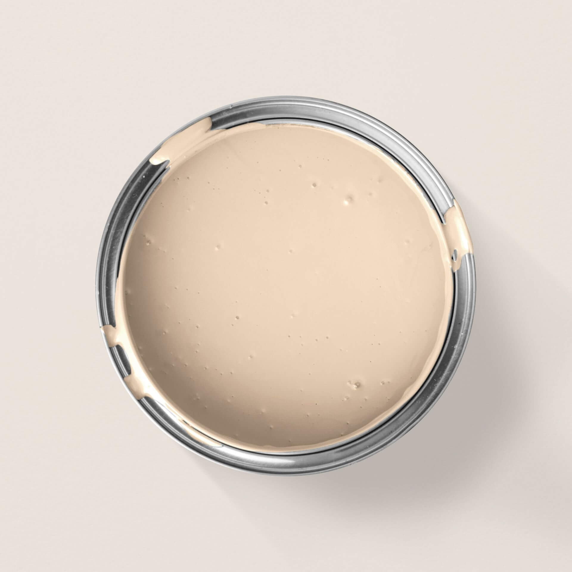
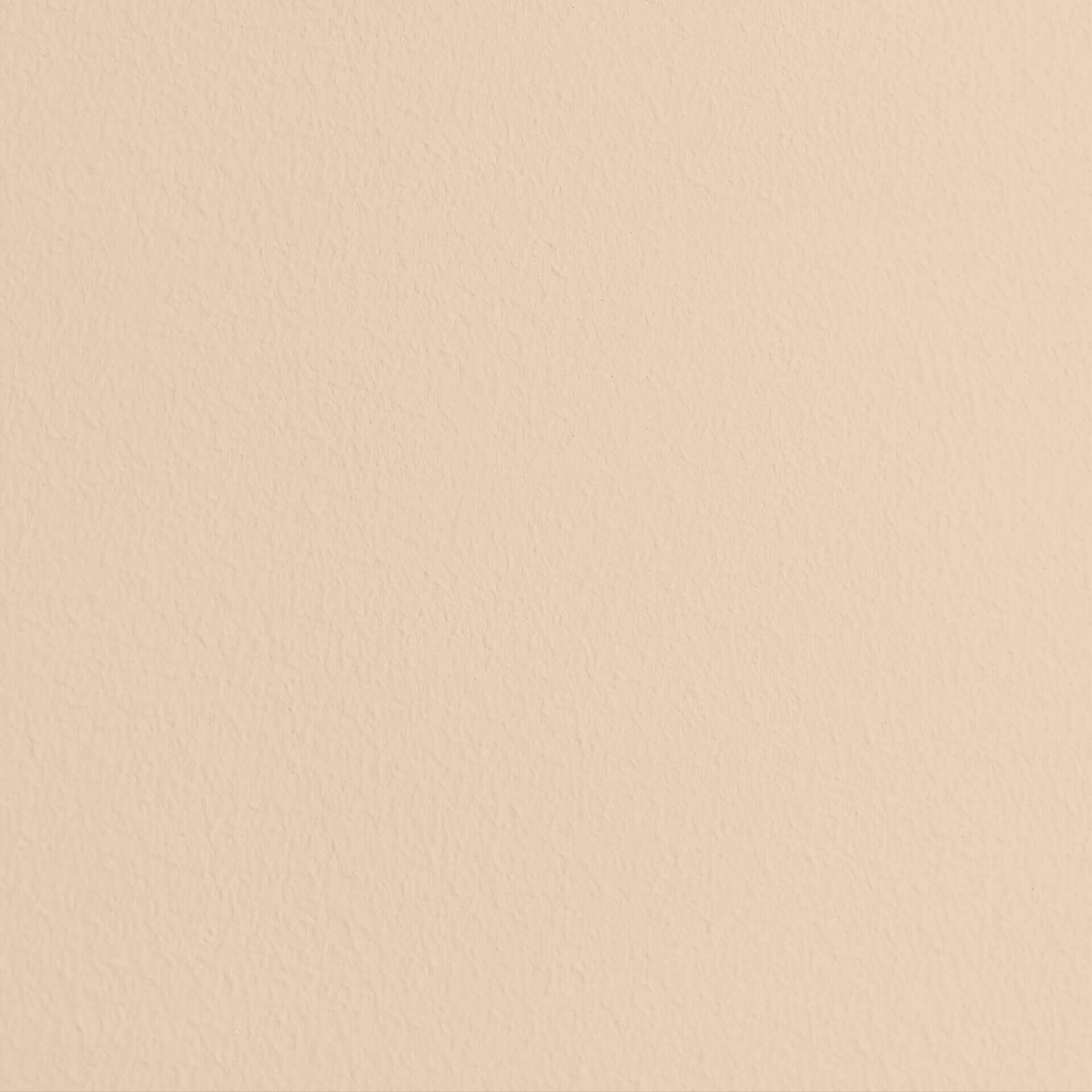
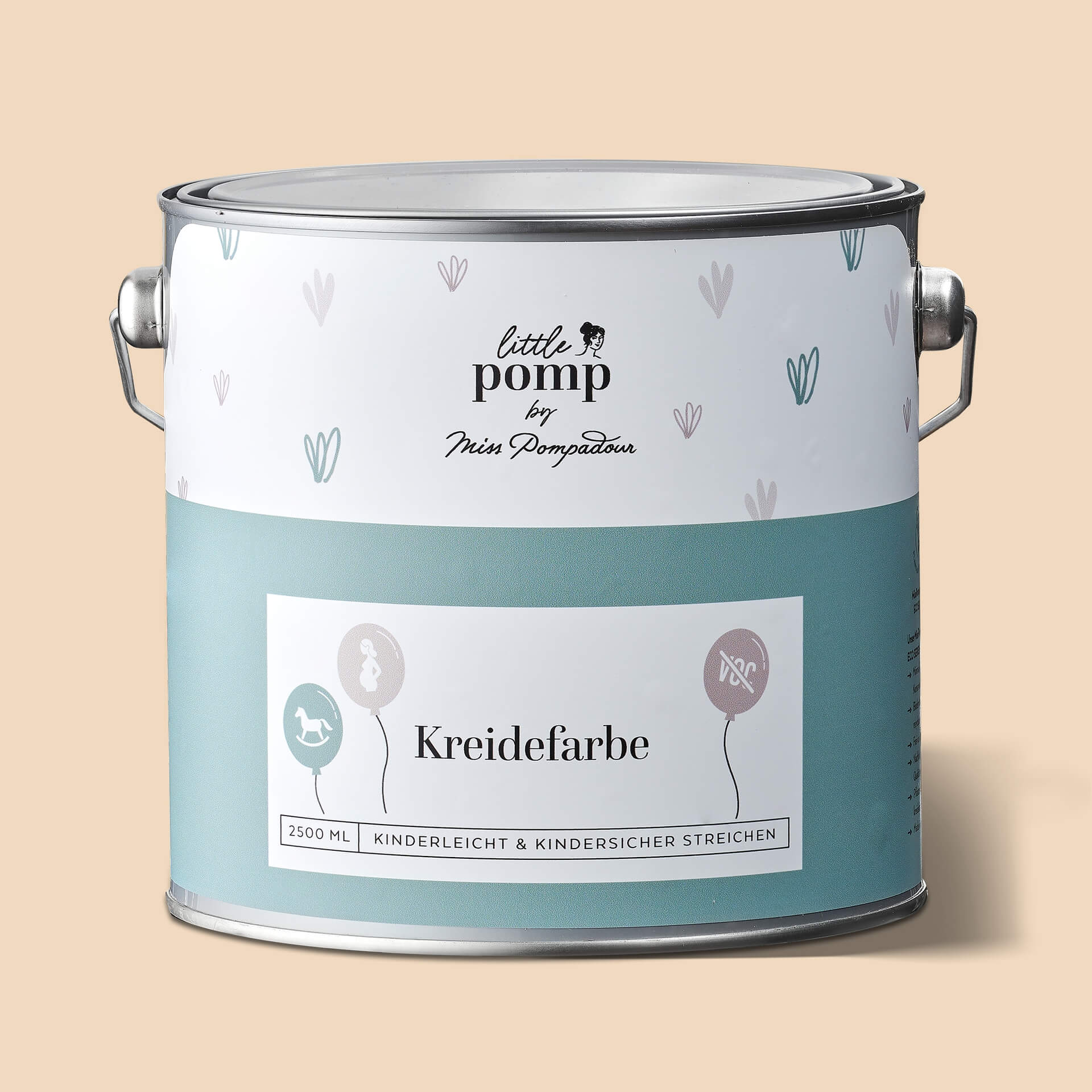
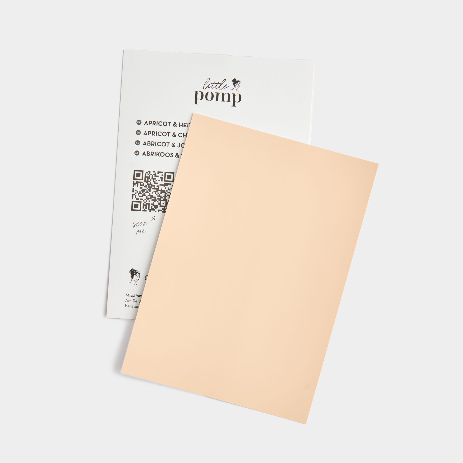
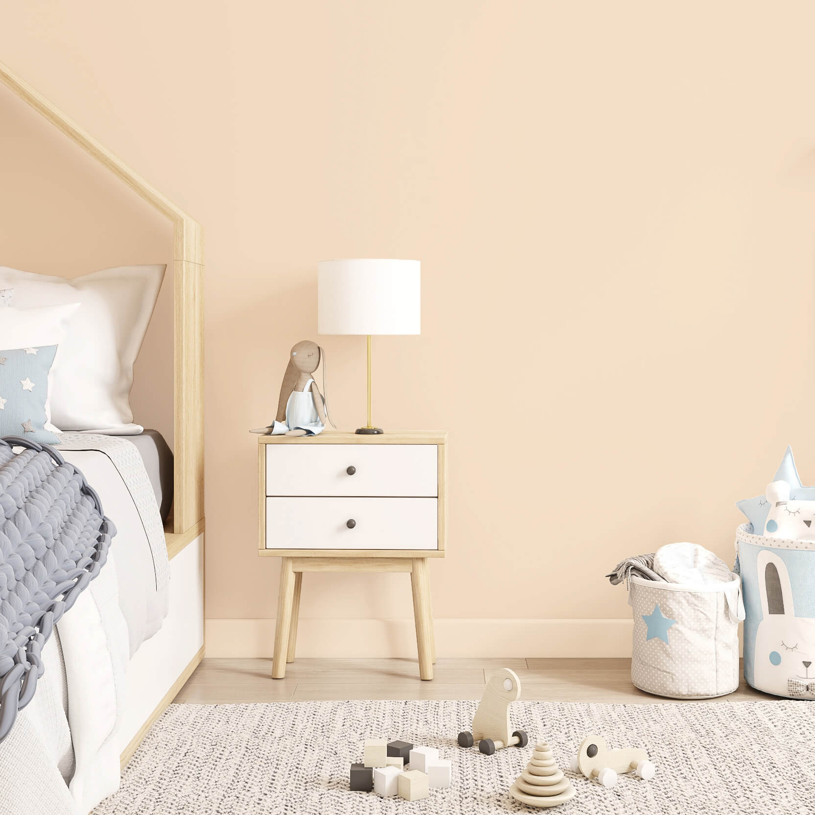
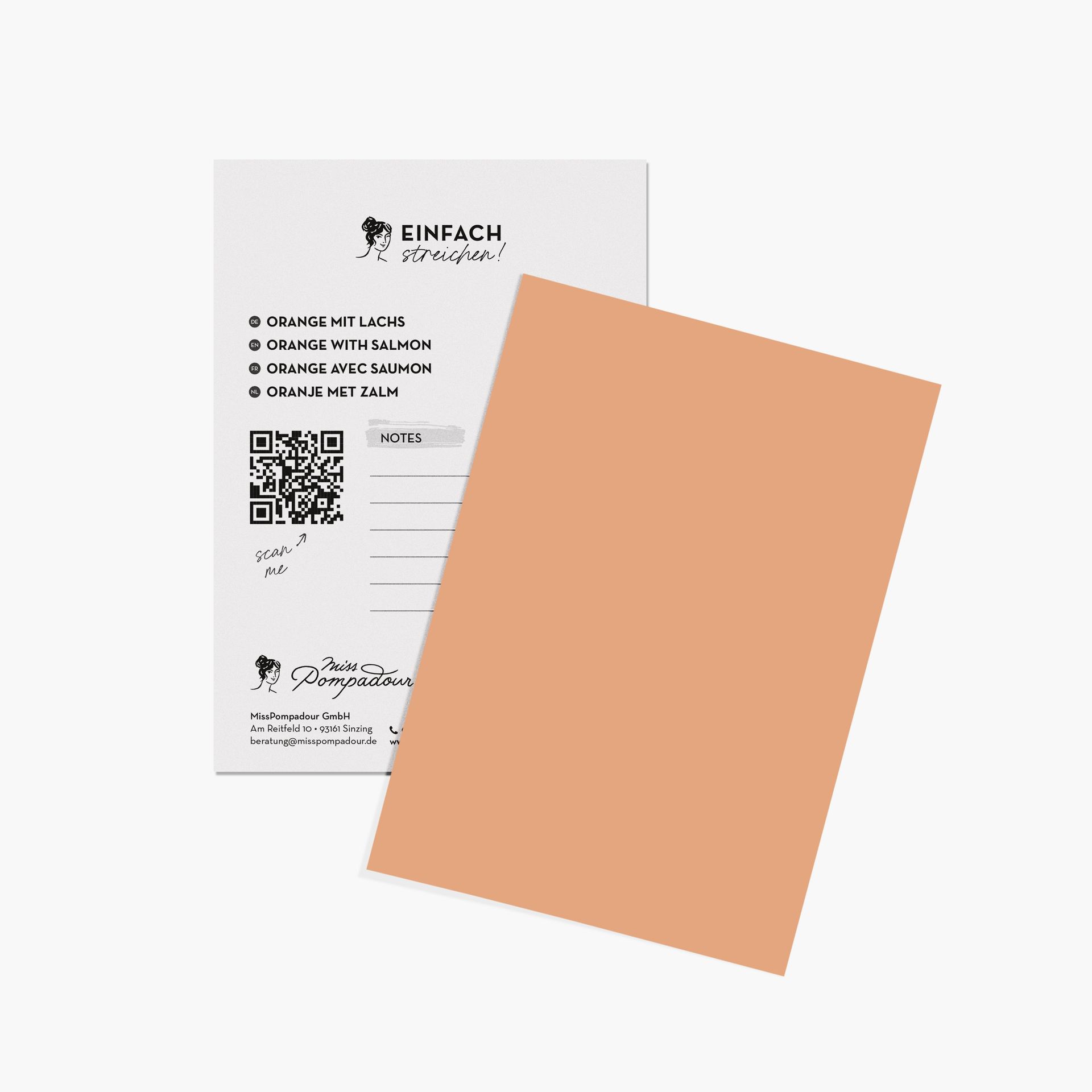
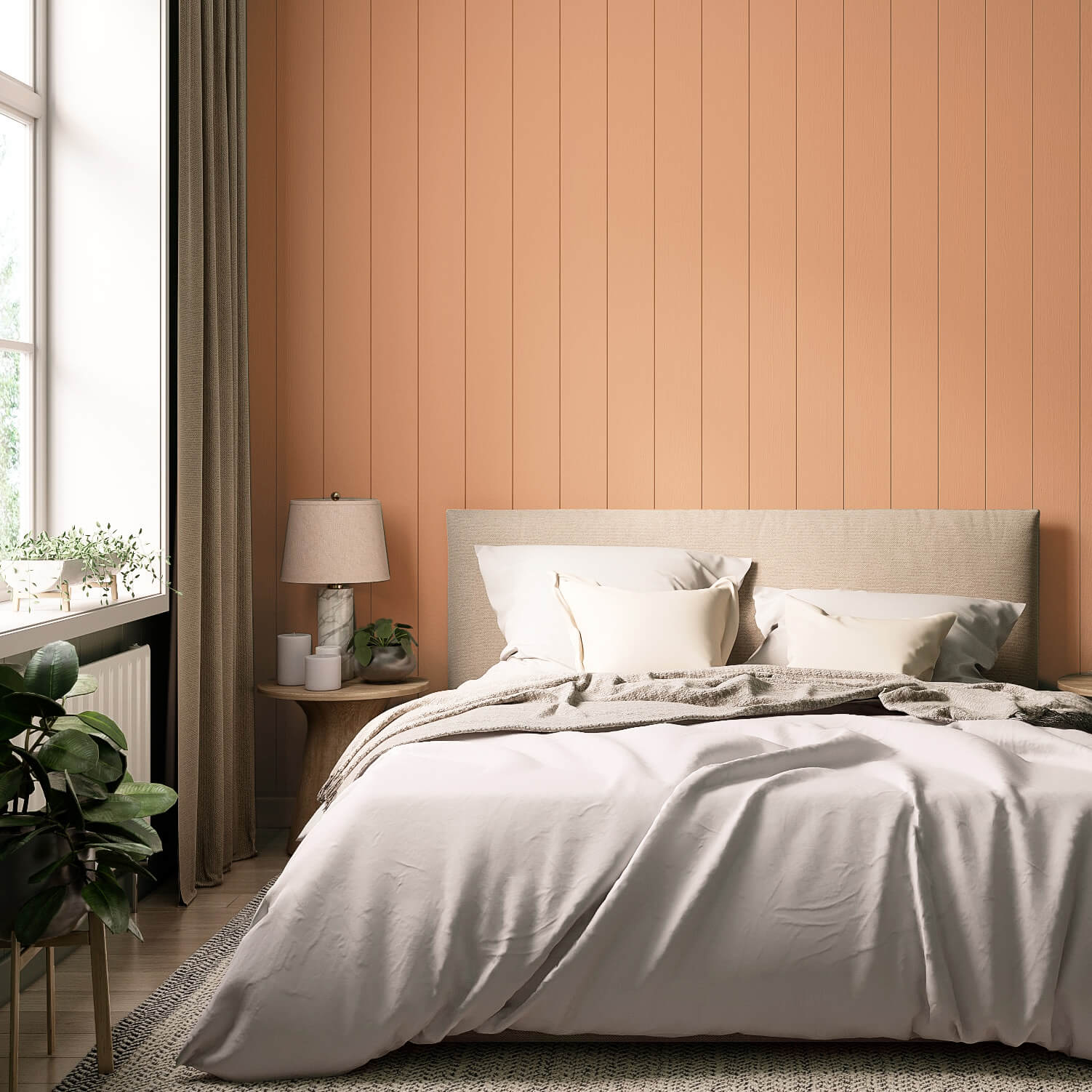
If you find a strong orange too intense for interiors, you can choose orange pastel tones like our Orange with Salmon or, even more subtle, Beige with Peach from the Just Paint collection. Apricot & Heiter from the LittlePomp chalk paints is a beautiful, delicate shade that is particularly suitable for children's rooms.
The effect of the colour orange
When you choose a shade from the orange colour samples, you bring warmth and cheerfulness into your room. Along with that warmth, orange tones create an ambience that spreads optimism and a zest for life. Not least, orange is considered a colour that stands for creativity and enthusiasm.
Orange paint is suitable for many rooms
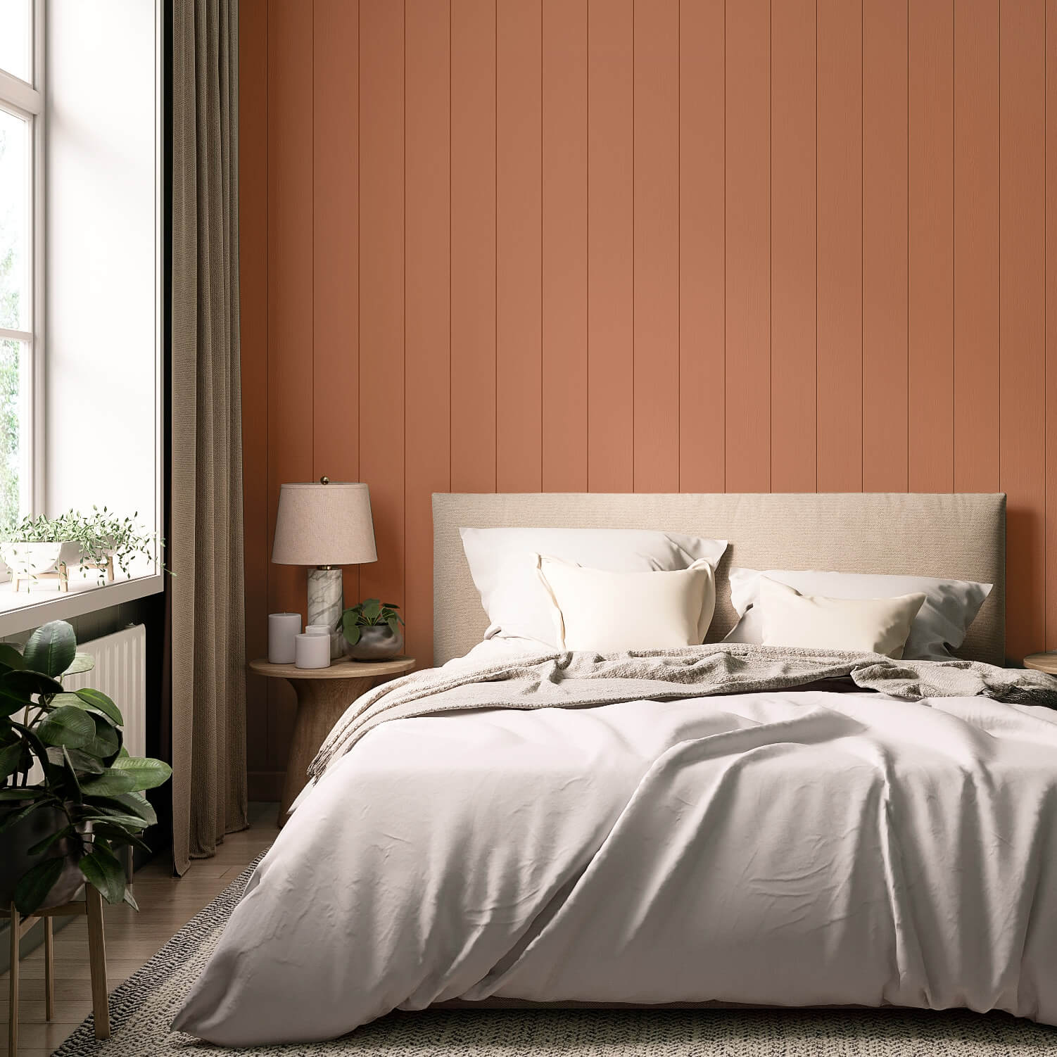
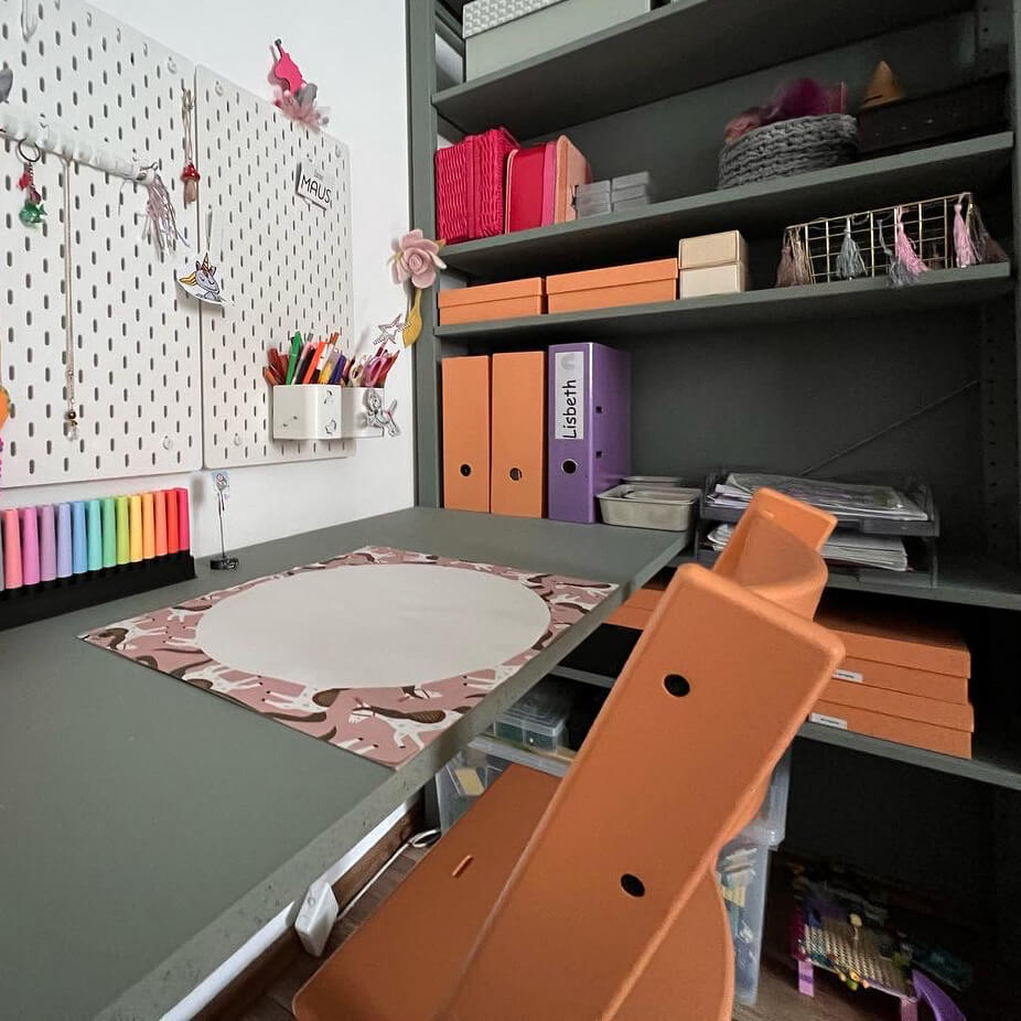
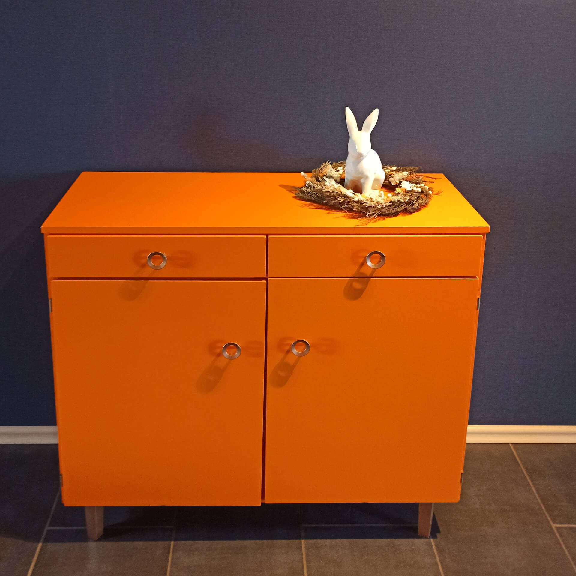
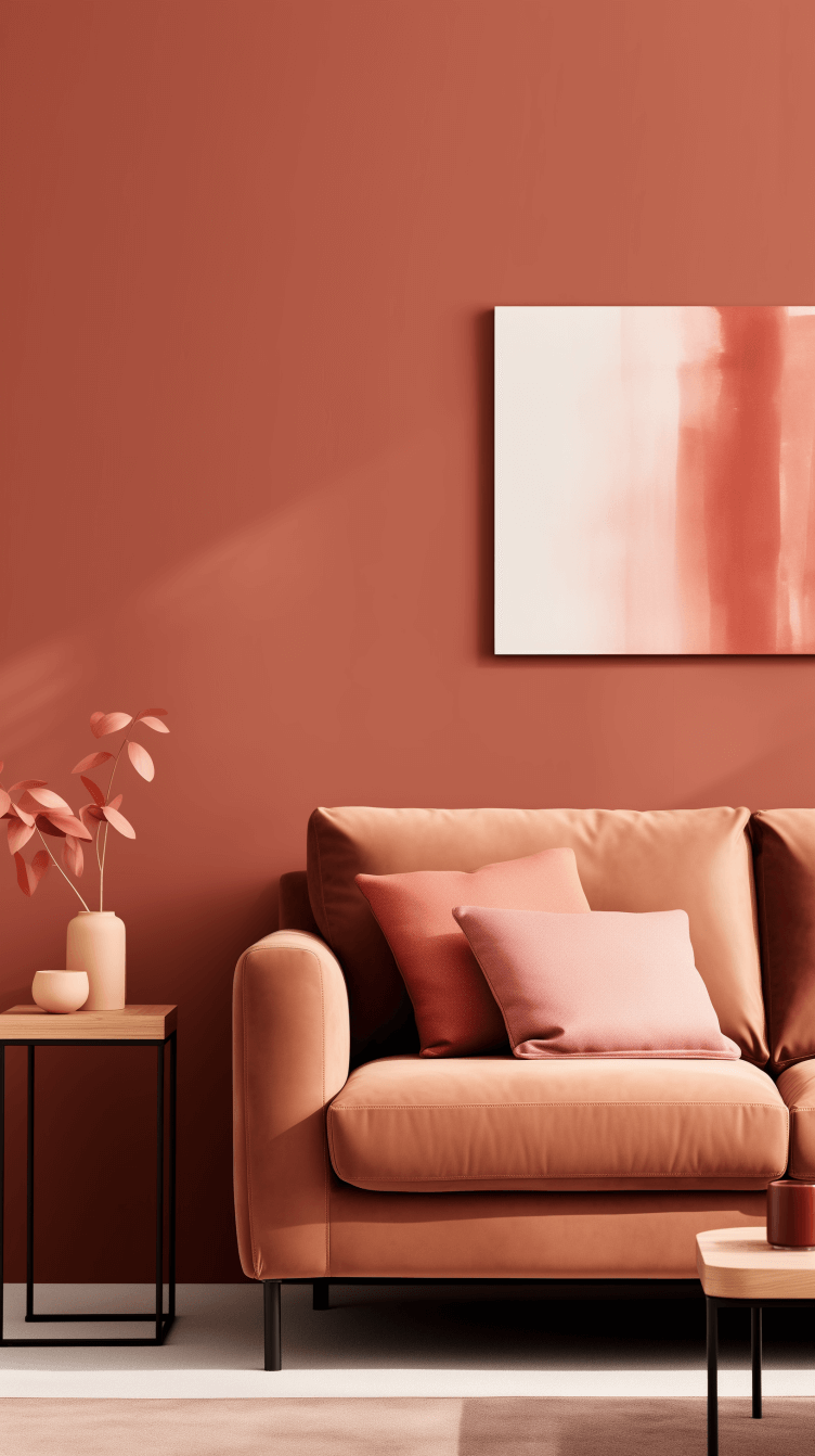
In living areas where you want to have joy, warmth, and energy, accents of orange on walls and furniture are a great way to increase your sense of well-being. In the living room, an orange wall behind a dark brown or blue sofa can be a real highlight. While the colour is also said to have a meditative effect, bright, energy-radiating shades should generally be avoided in the bedroom. If you would like to use orange there, orange tones tinted with brown, such as Orange with Chestnut or Autumn Red, are suitable.
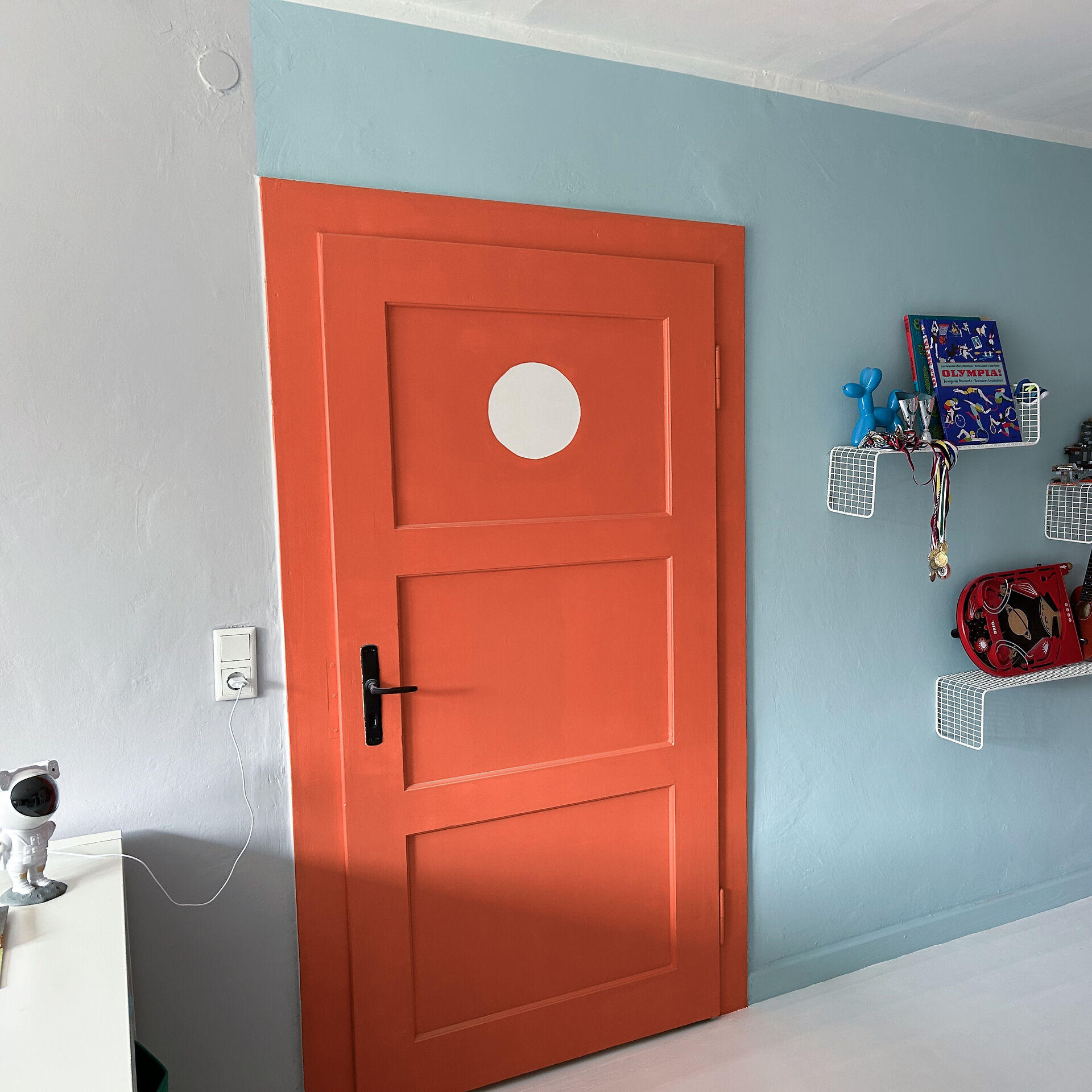
Paint the walls in a child's room in a gentle pastel orange to ensure a creative and stimulating atmosphere. In the nursery, you can use light, reddish orange tones to provide relaxation, as these shades evoke associations of the womb for a baby.
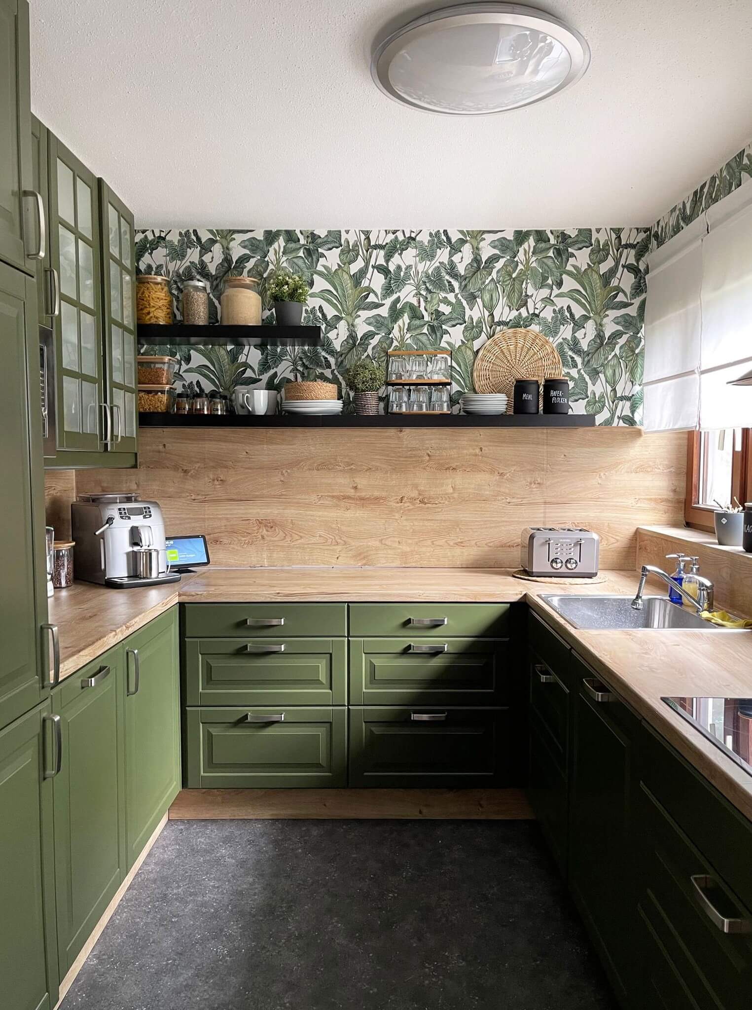
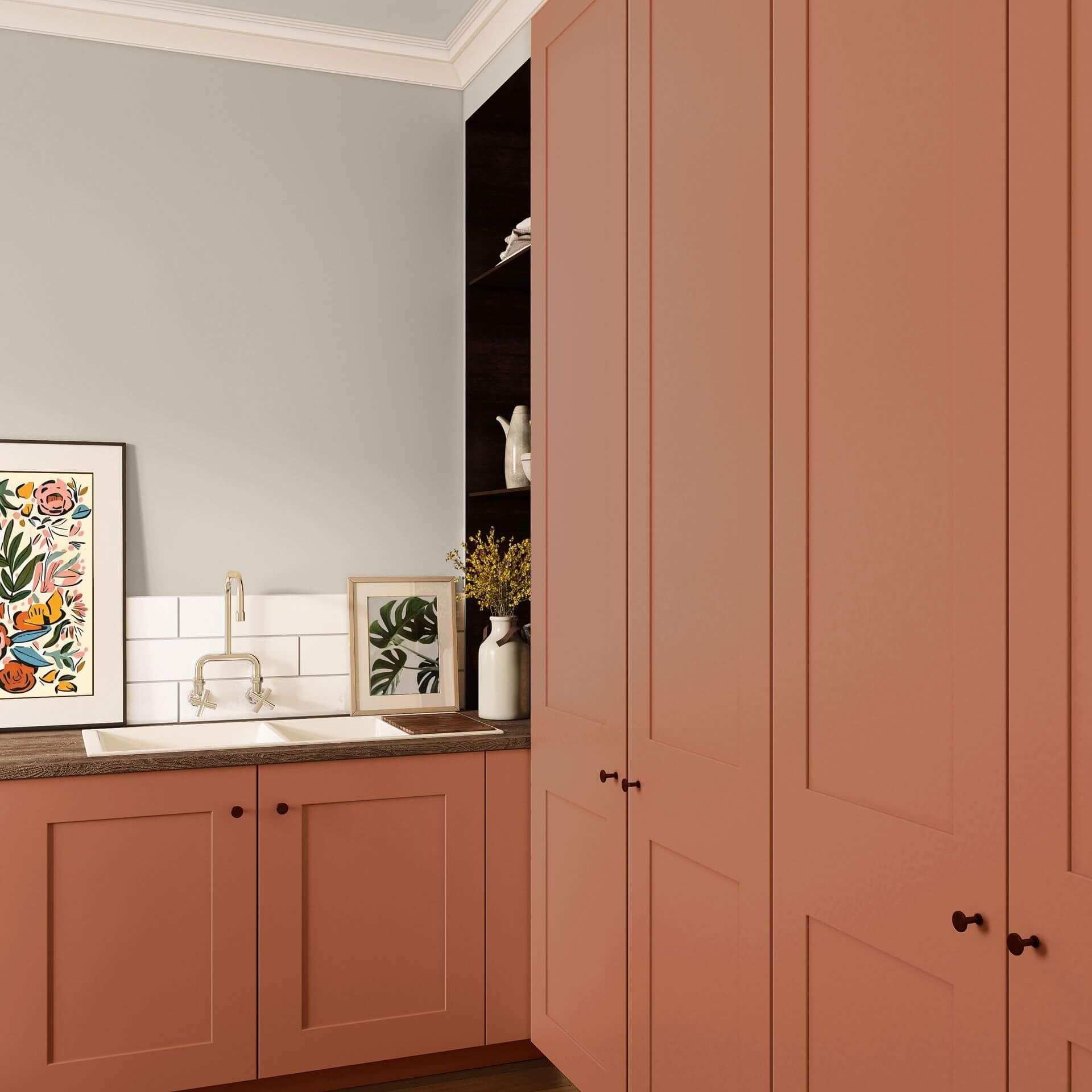
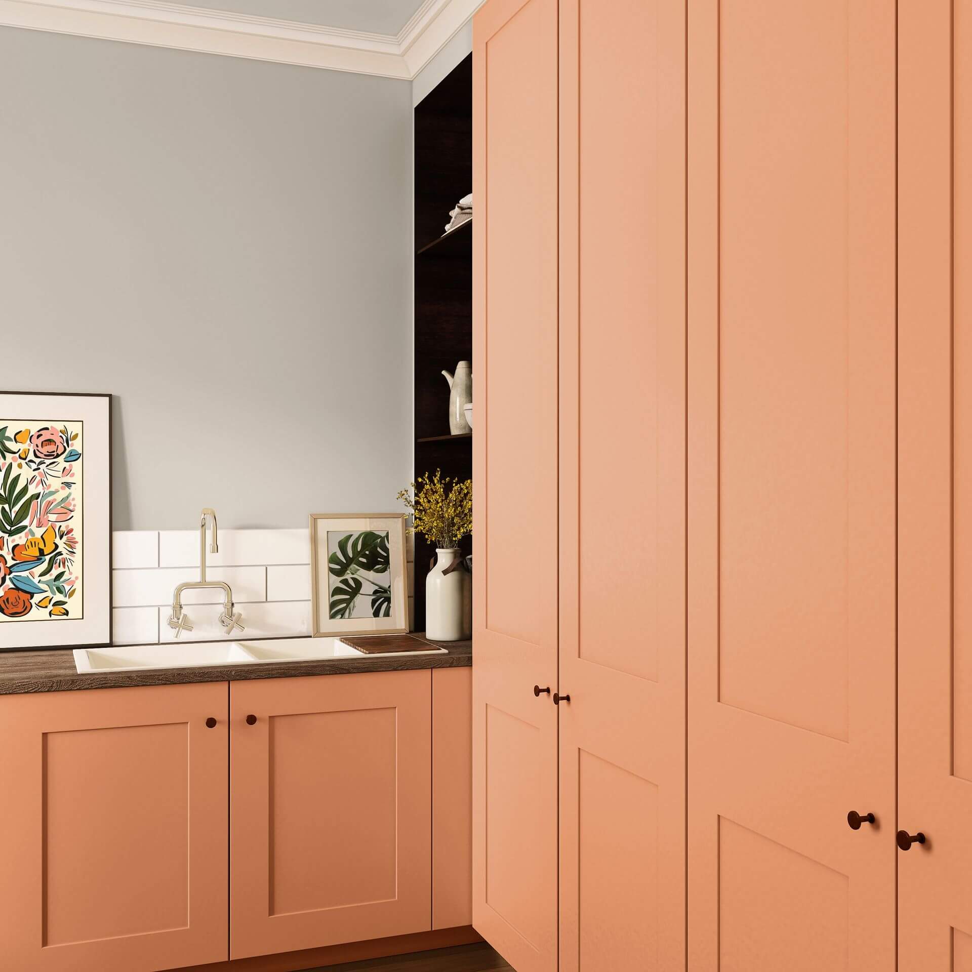
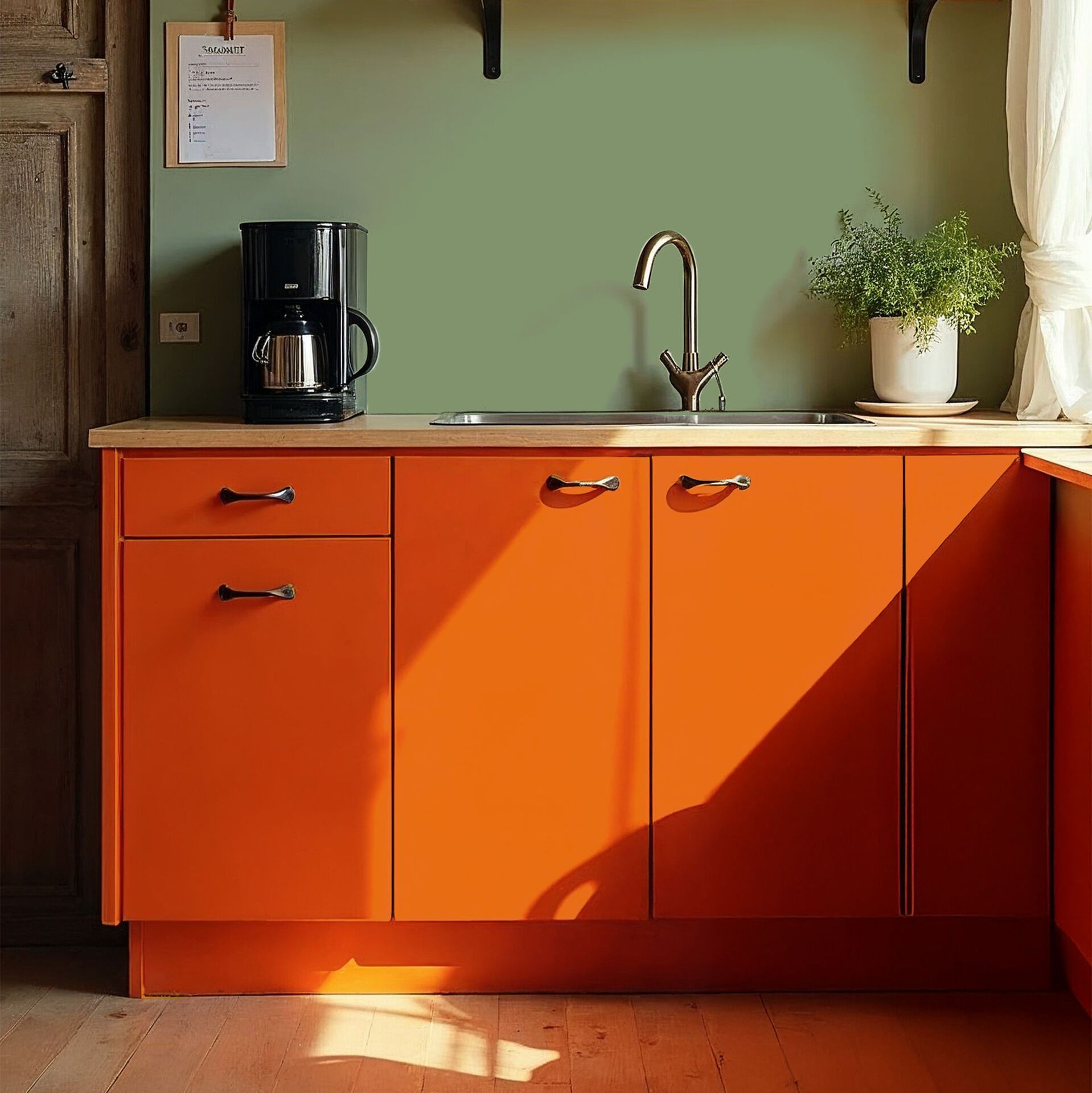
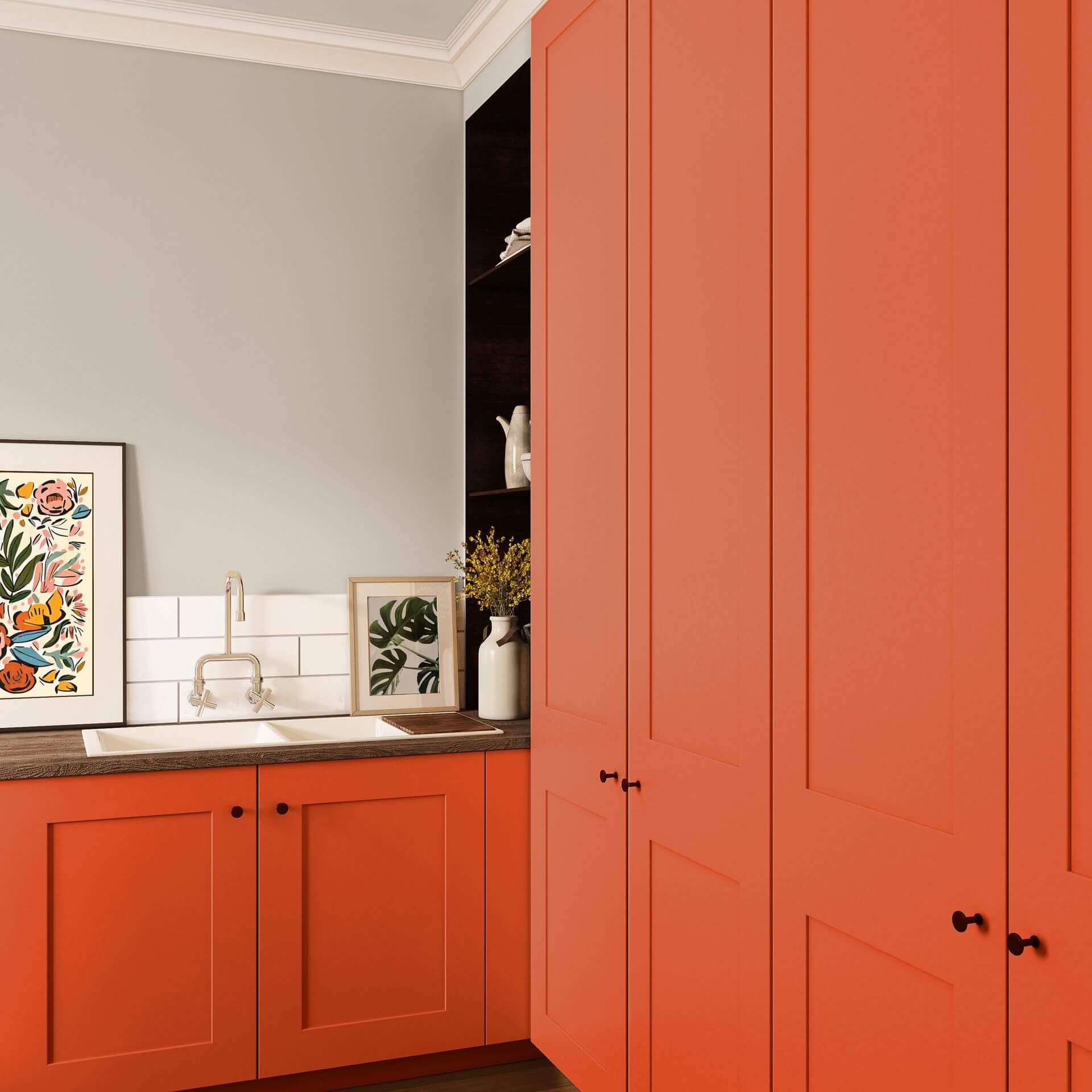
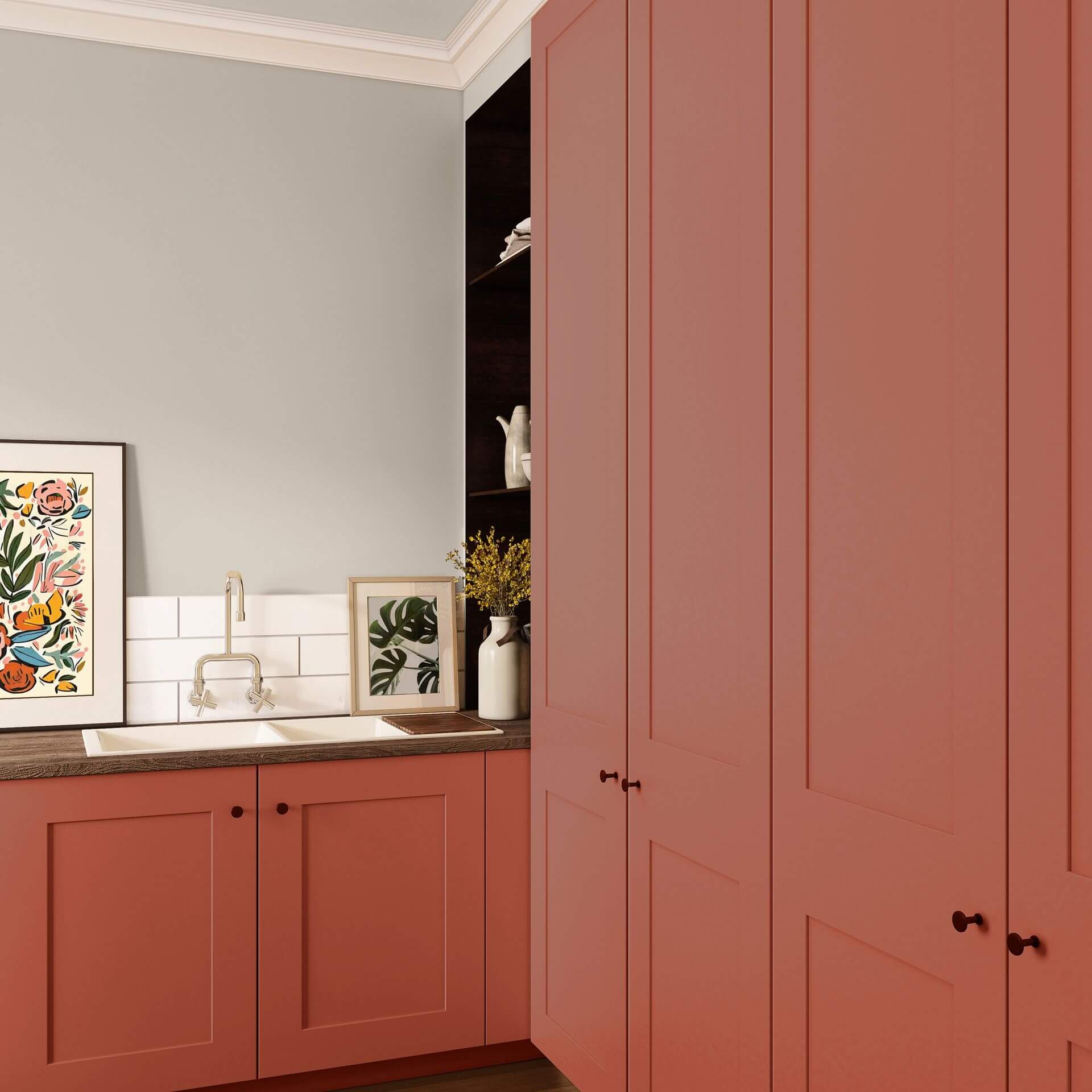
In case you are a fan of the 70s, an orange kitchen is almost a must. With a green tiled splashback or a green wall combined with orange, you can set remarkable accents.
Tips for the trend colour orange
Precisely because orange was a nearly forgotten shade for a long time, the rediscovery of this colour is often a surprise and leads to real "wow" effects. Used skilfully, with the right colours, you have the opportunity to develop your own unique interior design style.
Living styles and trends in orange tones
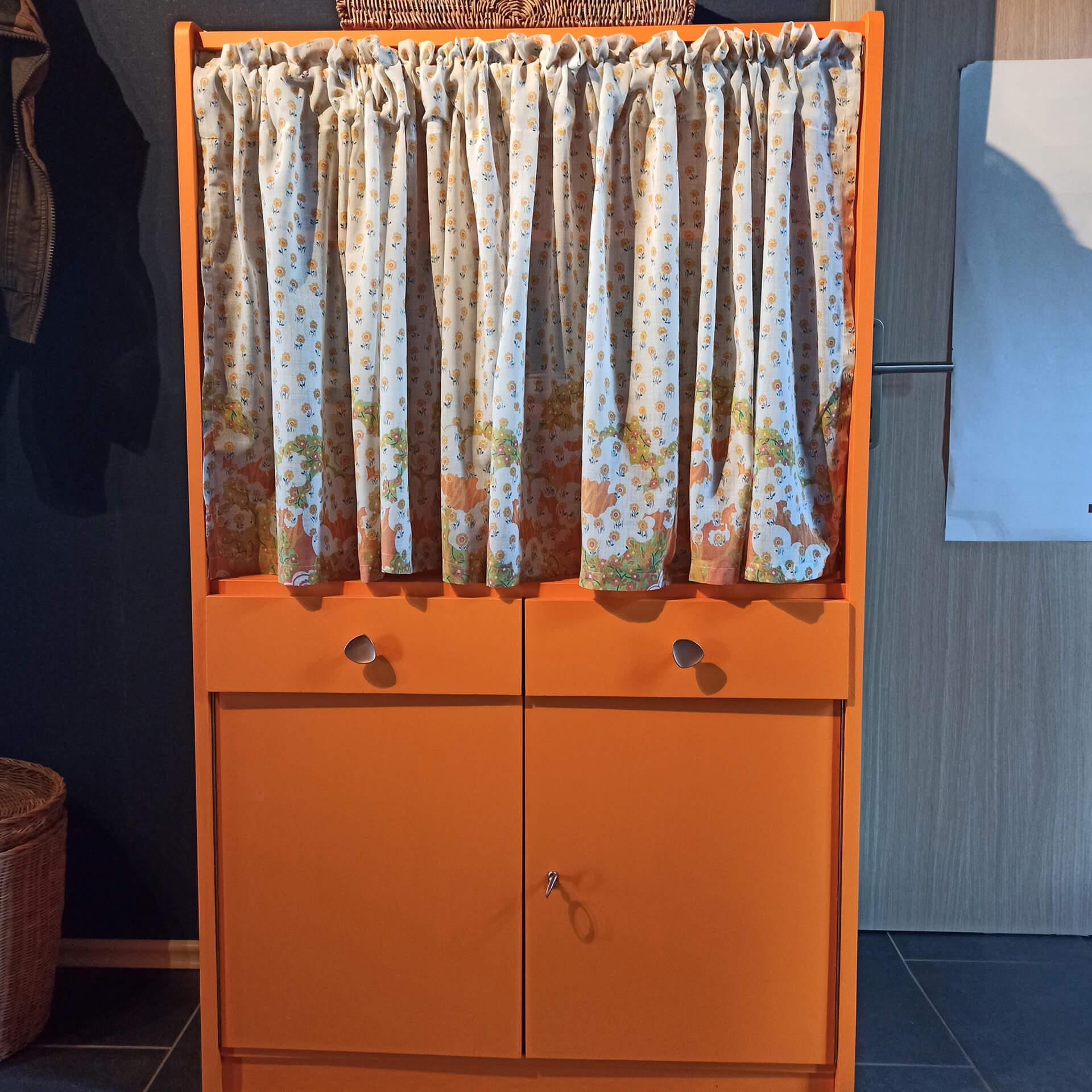
The colour orange is surprisingly versatile: for a Mediterranean style, combine muted orange tones with white and natural shades. For the retro style of the 60s and 70s, orange is almost a classic and, together with yellow and brown tones, brings past times back to life. If your home is more Nordic, use brownish orange for a result in Hygge or Scandi style.
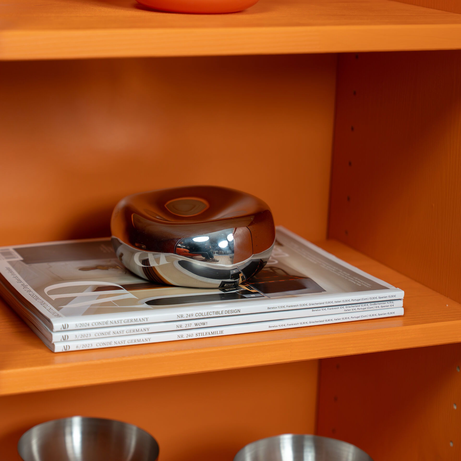
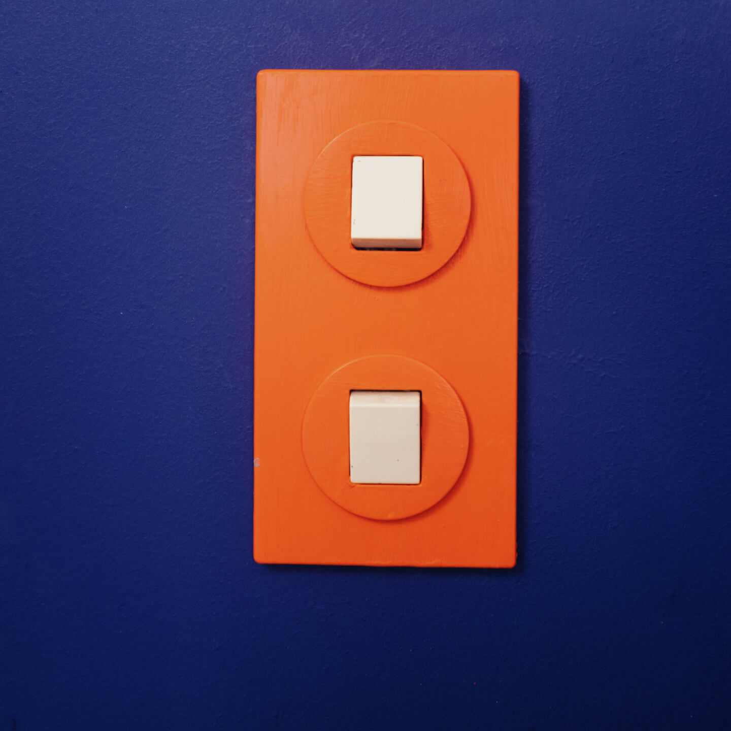
And let's not forget: the colour orange is also excellent for an oriental ambience, especially when combined with deep brown and black tones to create a mysterious atmosphere. In this case, metallic silver tones work well with it. The effect of light orange also fits wonderfully if you like the colour power of Dopamine Decor. The combination of yellow-red with other strong colours like blue or green creates an invigorating, activating effect.
Combining the colour orange skilfully
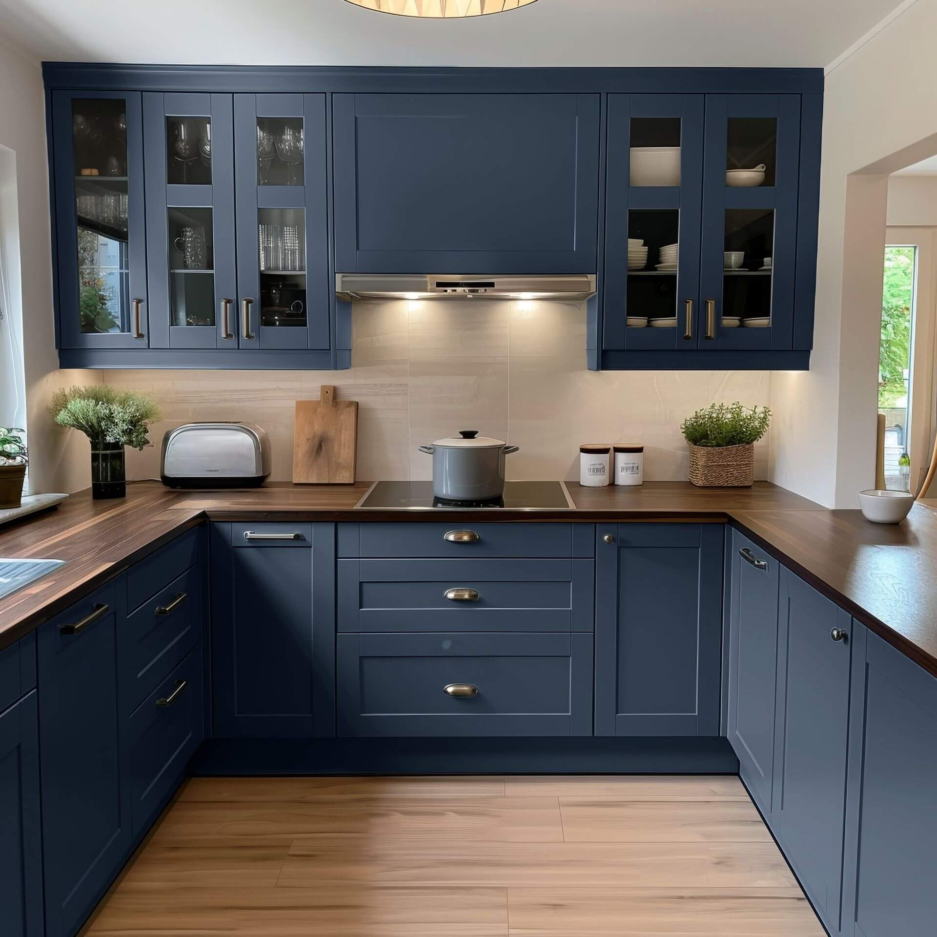
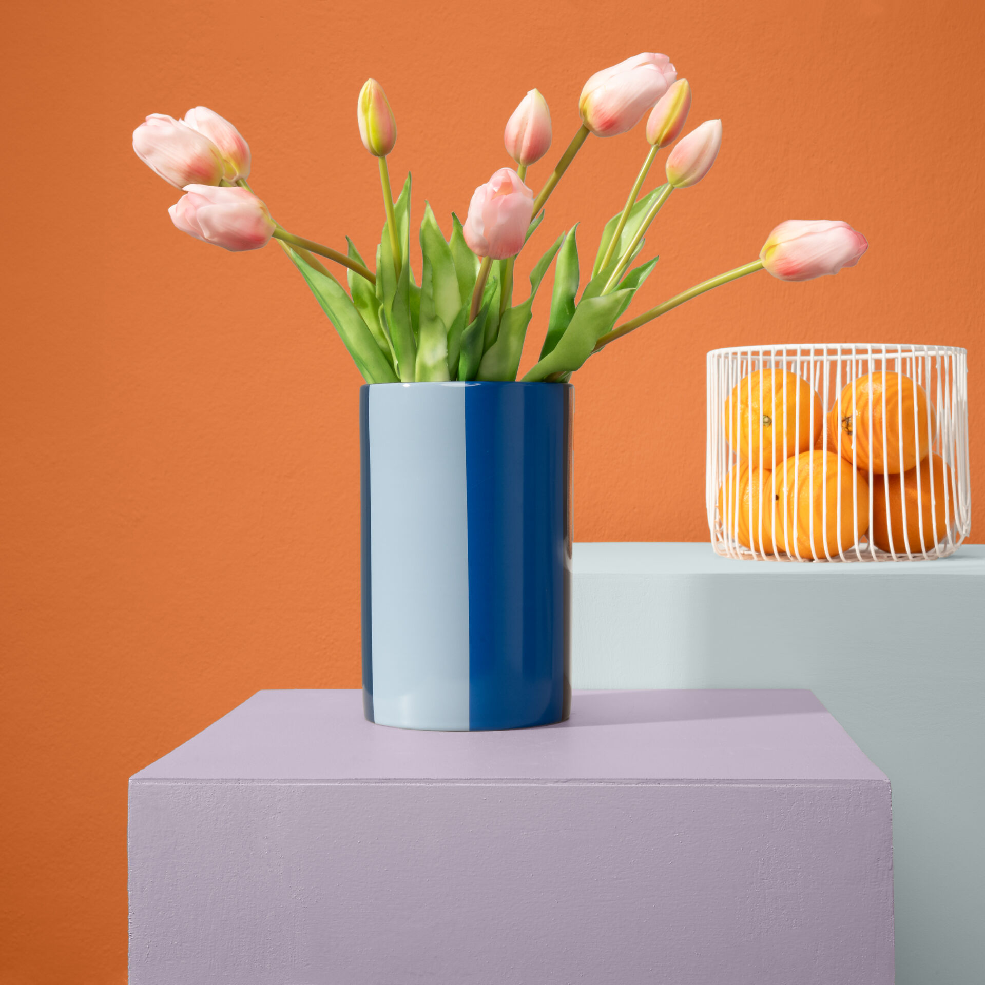
Orange is created from the combination of red, which stands for energy, and yellow, which stands for cheerfulness. That is why the colour orange works wonderfully as a strong contrast to dark, bold shades. Particularly spectacular is the combination with deep midnight blue, such as Blue with Midnight or the rich Stormy Sky Blue. A calm green like Green with Olive can also form a very harmonious connection with a delicate orange like Orange with Salmon.
Of course, all wall paints in brown and earthy tones complement orange in a particularly beautiful way—something people already knew in the 70s. Brown with Black gives a strong orange, such as Orange with Tangerine, a background against which the vibrant colour of the citrus fruit can shine without looking intrusive.
You should not neglect the possibility of combining orange paint with neutral tones like white or grey. A dark grey such as Grey with Black from the Just Paint collection forms an atmospheric combination with a soft orange tone like Orange with Salmon. Warm white, like our White with Melting, goes well with all orange tones. With brownish orange tones such as Orange with Chestnut, it creates a Mediterranean ambience that radiates a zest for life.
Living accessories & co with the colour orange
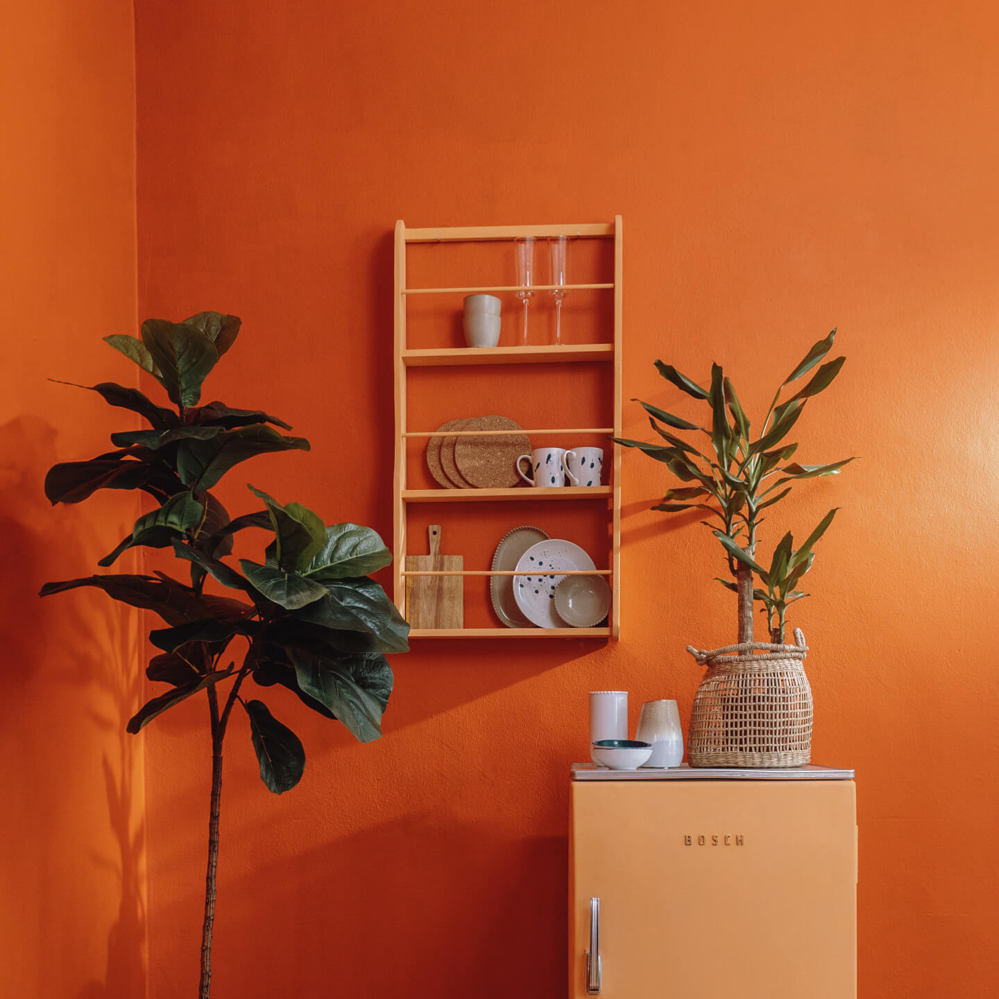
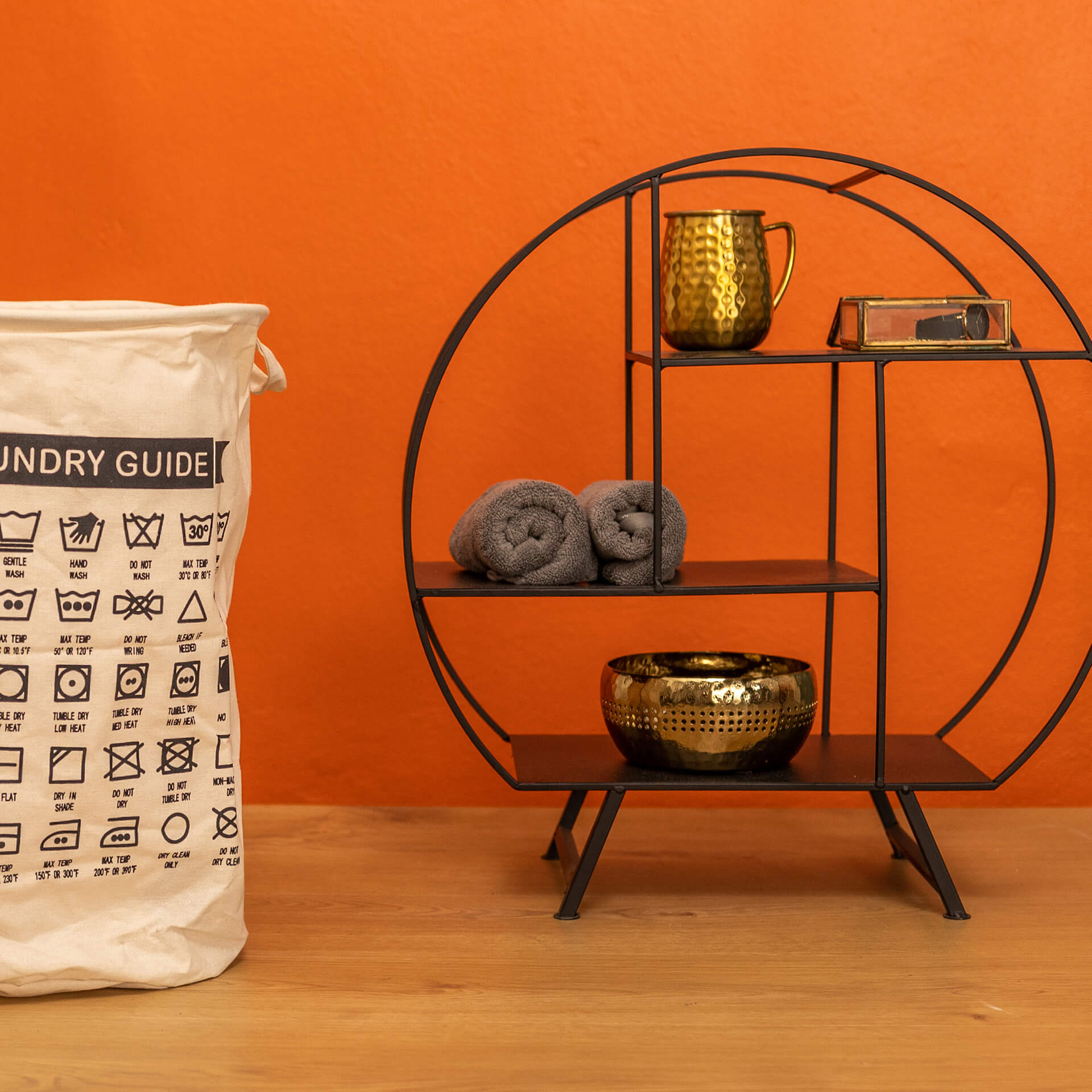
Depending on the style, natural materials like rattan, linen, or cotton go well with orange. Decorative items made of ceramic or with a metallic look can further emphasise the effect. Plants in rich green tones highlight the oriental or Mediterranean orientation of your interior. With this colour, there are no limits to your imagination and creativity.
Especially in a bright living room with many plants, orange tones lift the mood, appear inviting in their most varied nuances, and ensure a good atmosphere with their cosy effect. This makes orange a great colour partner for the Urban Jungle style!
The MissPompadour "Orange" Project Guide
From zesty tangerine to elegant Burnt Orange: Pure zest for life, perfectly executed
In our project guide, we show you how to use the invigorating power of orange to bring warmth and creativity into your home. Whether you want to revive the iconic 70s look in your kitchen or create a cosy oasis of well-being with soft apricot: we have the right inspiration and the right product. Discover the world of orange tones and start your next painting project now!
Wall paint in orange: Energy and warmth for your walls
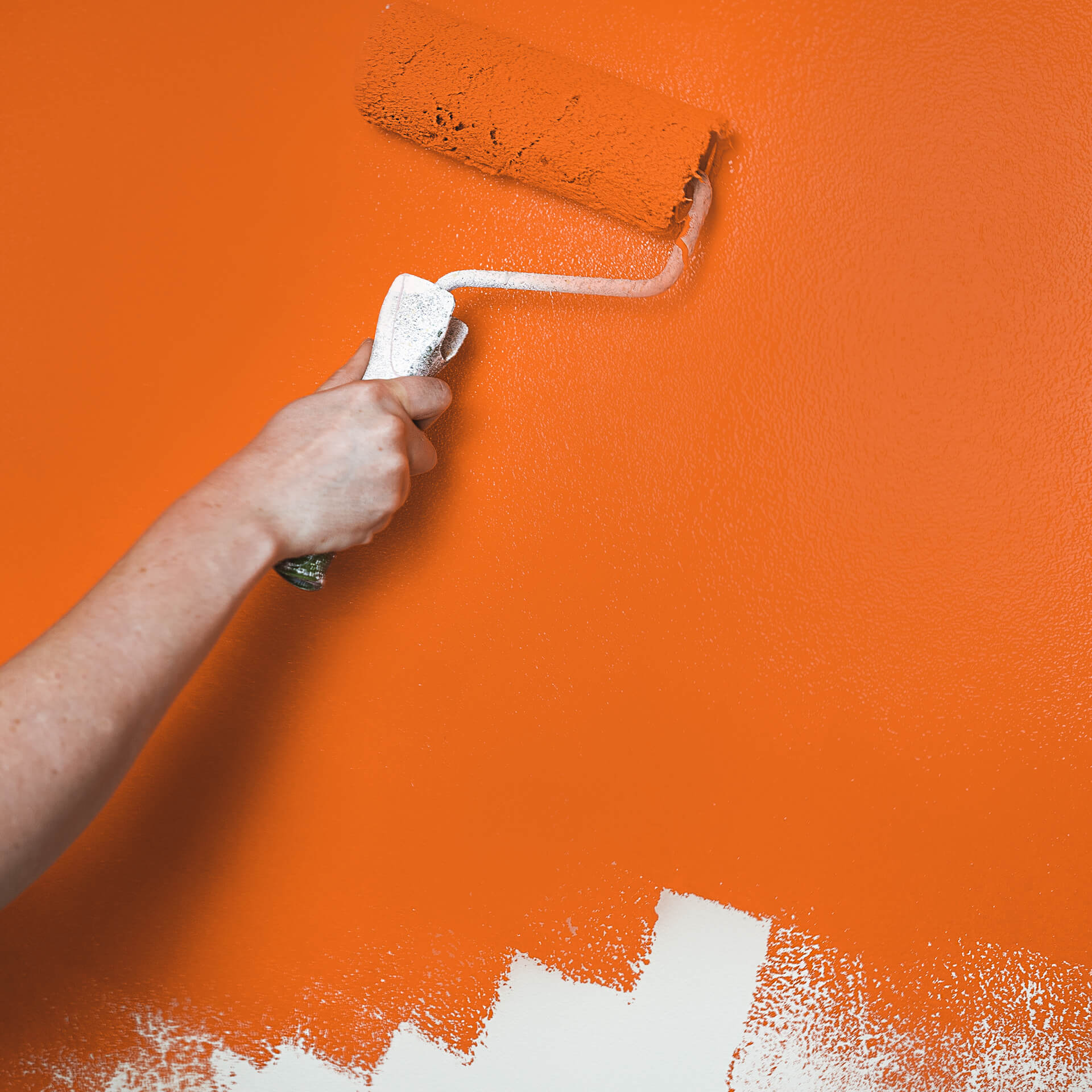
A wall paint in orange radiates pure enthusiasm and makes rooms feel instantly more inviting. While bold shades like Orange with Spritz provide dynamic accents, earthy nuances like Orange with Rust bring a natural calm to your walls. Our matte wall paints adhere excellently to plaster and wallpaper. Thanks to high pigmentation, they offer excellent coverage that casts your walls and ceilings in a warm, positive light.
Tile paint in orange: Retro charm and modern freshness
With tile paint in orange, you make a confident statement in the bathroom or kitchen. Especially for lovers of the 70s style, a bright orange, like our Orange with Pumpkin, on the splashback is an absolute must. You can easily apply our durable tile paints in orange after a thorough cleaning and a base coat of our primer To Bond & Block—you save yourself the tedious task of sanding!
Furniture paint in orange: The ultimate eye-catcher
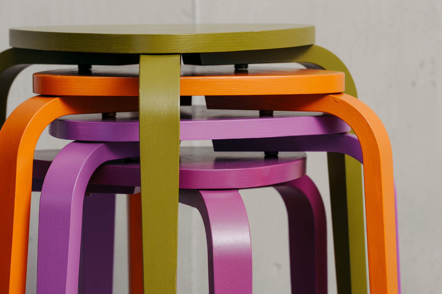
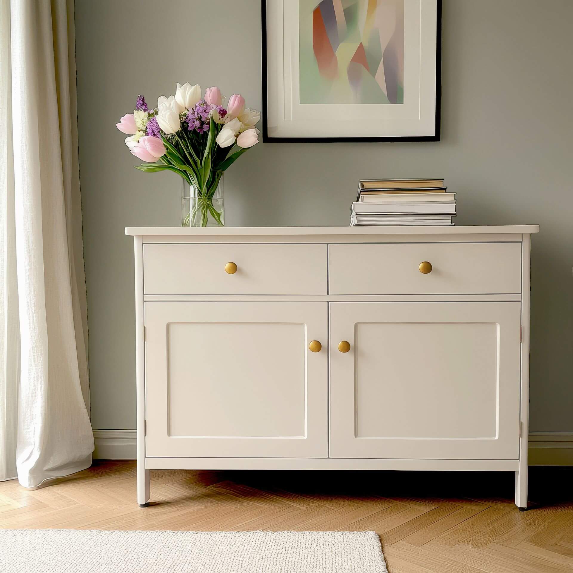
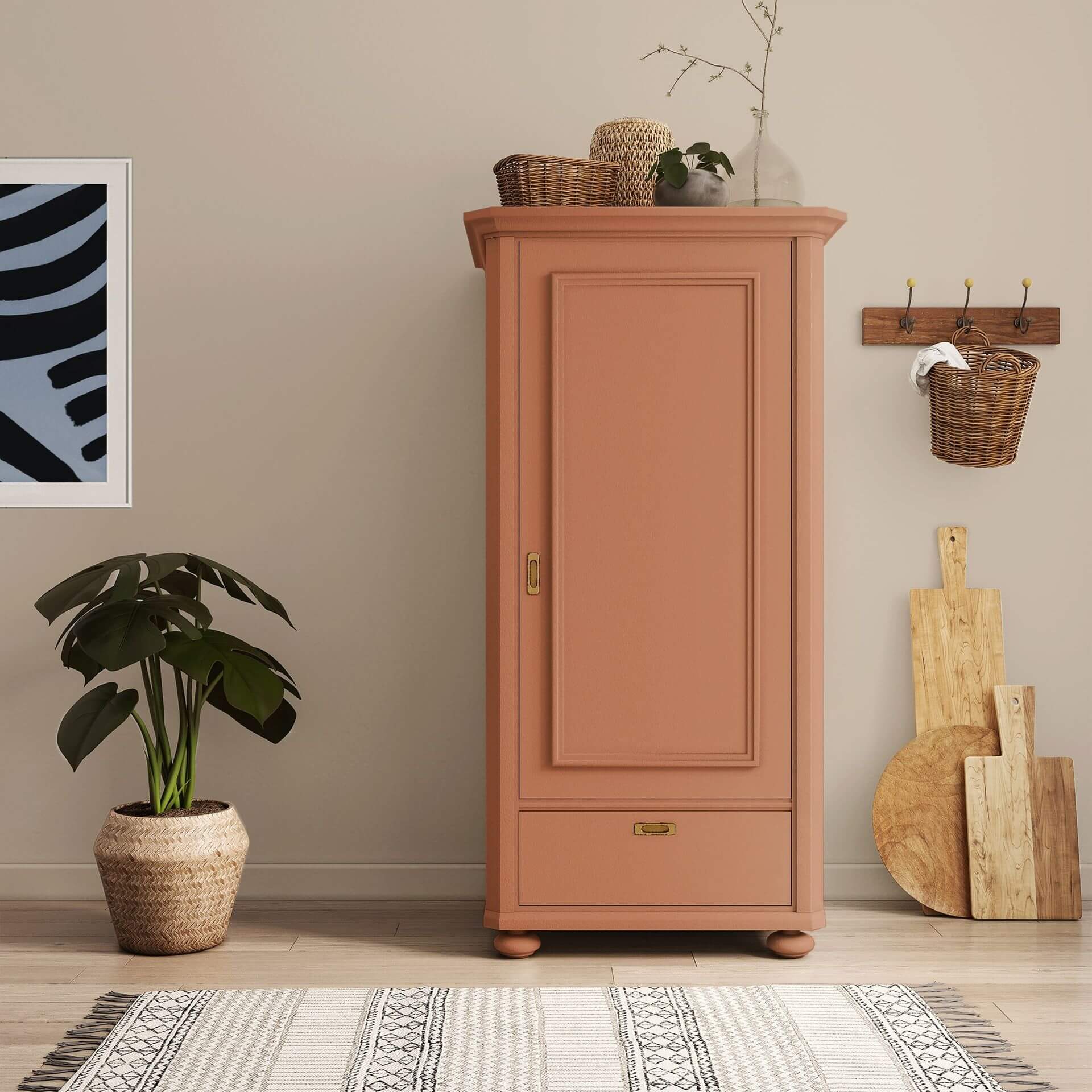
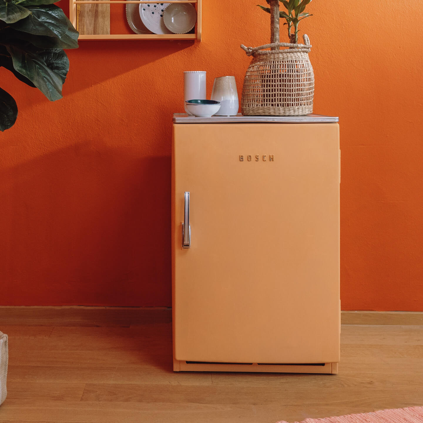
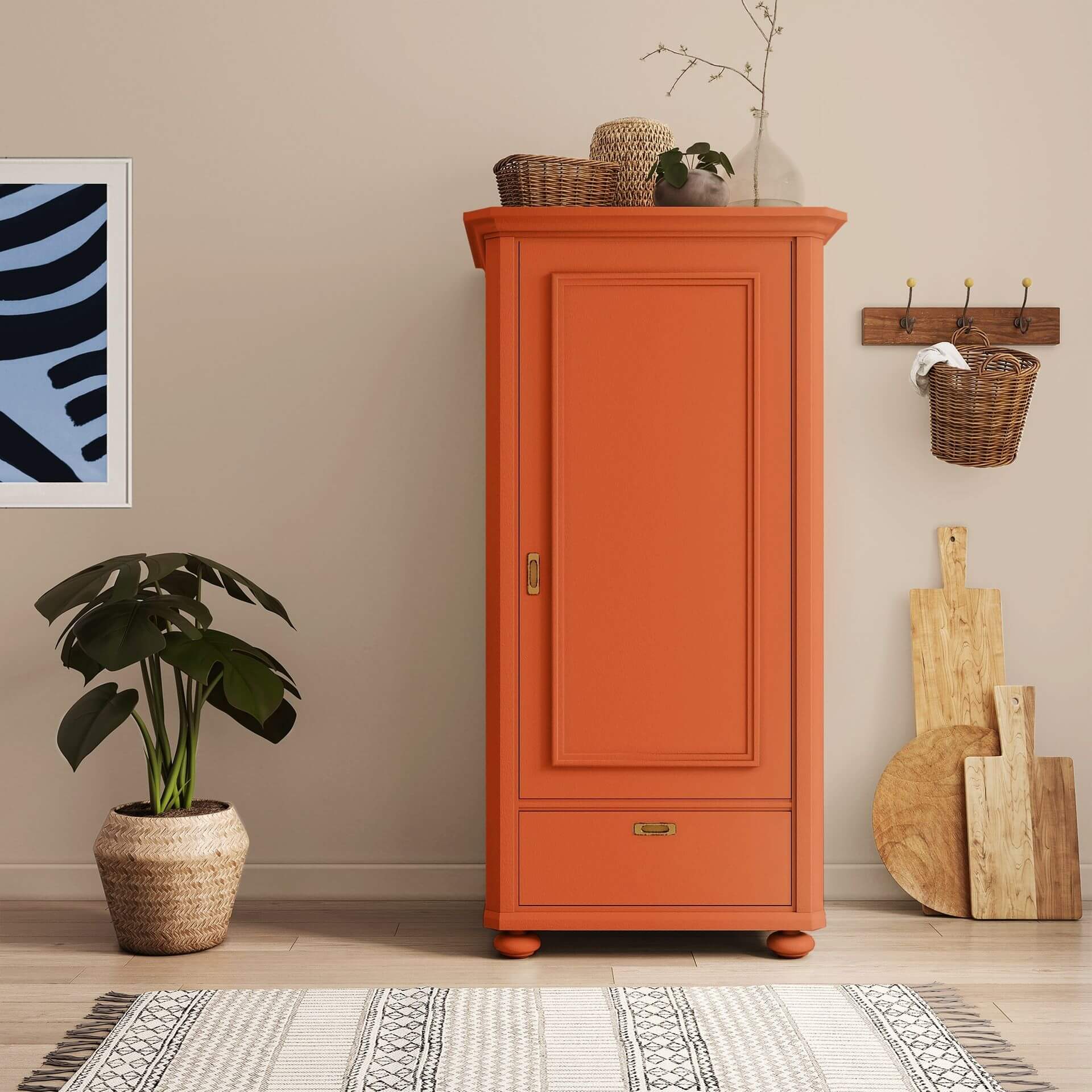
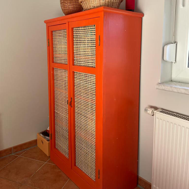
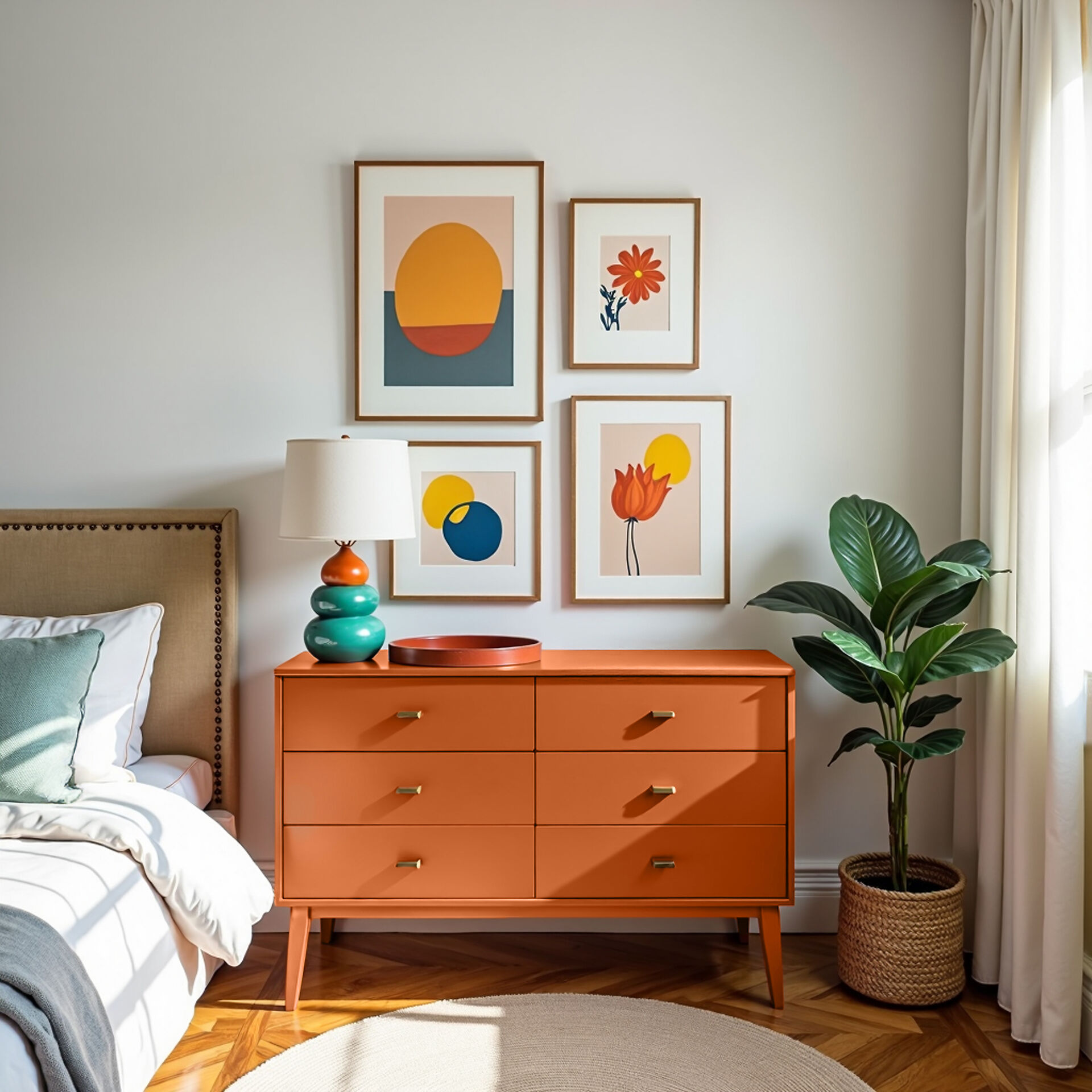
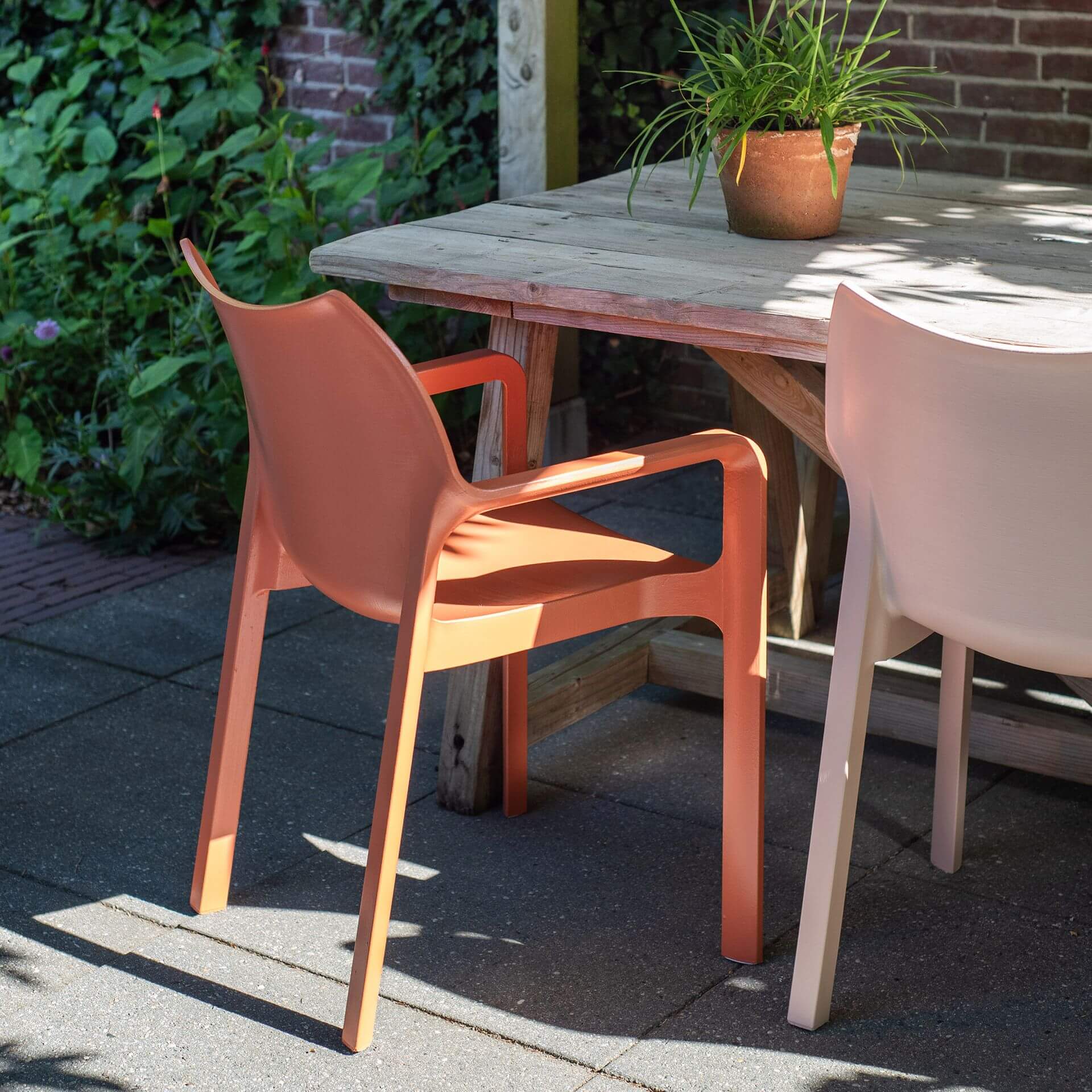
Our furniture paint in orange turns any simple cupboard or table into a real design object. Orange with Tangerine on a standalone piece of furniture immediately creates a good mood and enlivens the entire room. The paints adhere to almost any surface without the need for tiresome sanding. You can also paint IKEA furniture with smooth surfaces or wood that bleeds through—use our primer To Bond & Block as the first step to perfectly prepare your difficult surface.
Wood paint in orange: Expressive design in Dopamine Decor
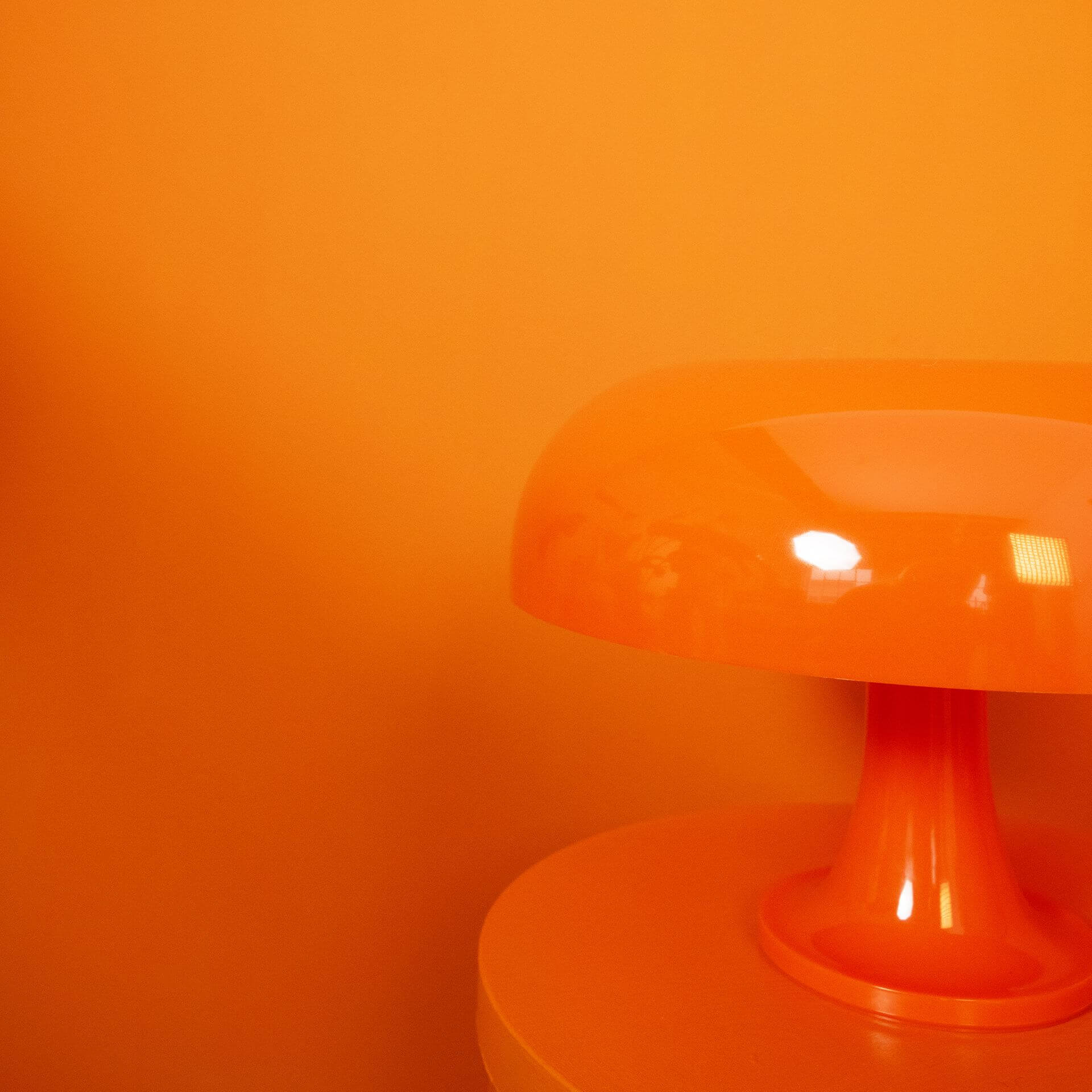
Orange wood paint, like our bright Orange with Lava, is a central element for the trendy Dopamine Decor look. This style focuses on colours that make you happy—and hardly any nuance conveys more zest for life than a bold orange on wooden surfaces. Thanks to fine pigmentation, this luminous shade ensures an incomparably positive radiance in your home.
Chalk paint in orange: Velvety finish for soft accents
For a particularly soft, powdery result, chalk paint in orange is ideal. The velvety texture creates an elegant ambience and is the perfect colour choice for anyone looking for a stimulating yet gentle aesthetic.
Soft pastel tones like Apricot & Heiter from the LittlePomp collection provide instant comfort in children's rooms or sleeping areas.
Buy orange paint in the MissPompadour Online Shop
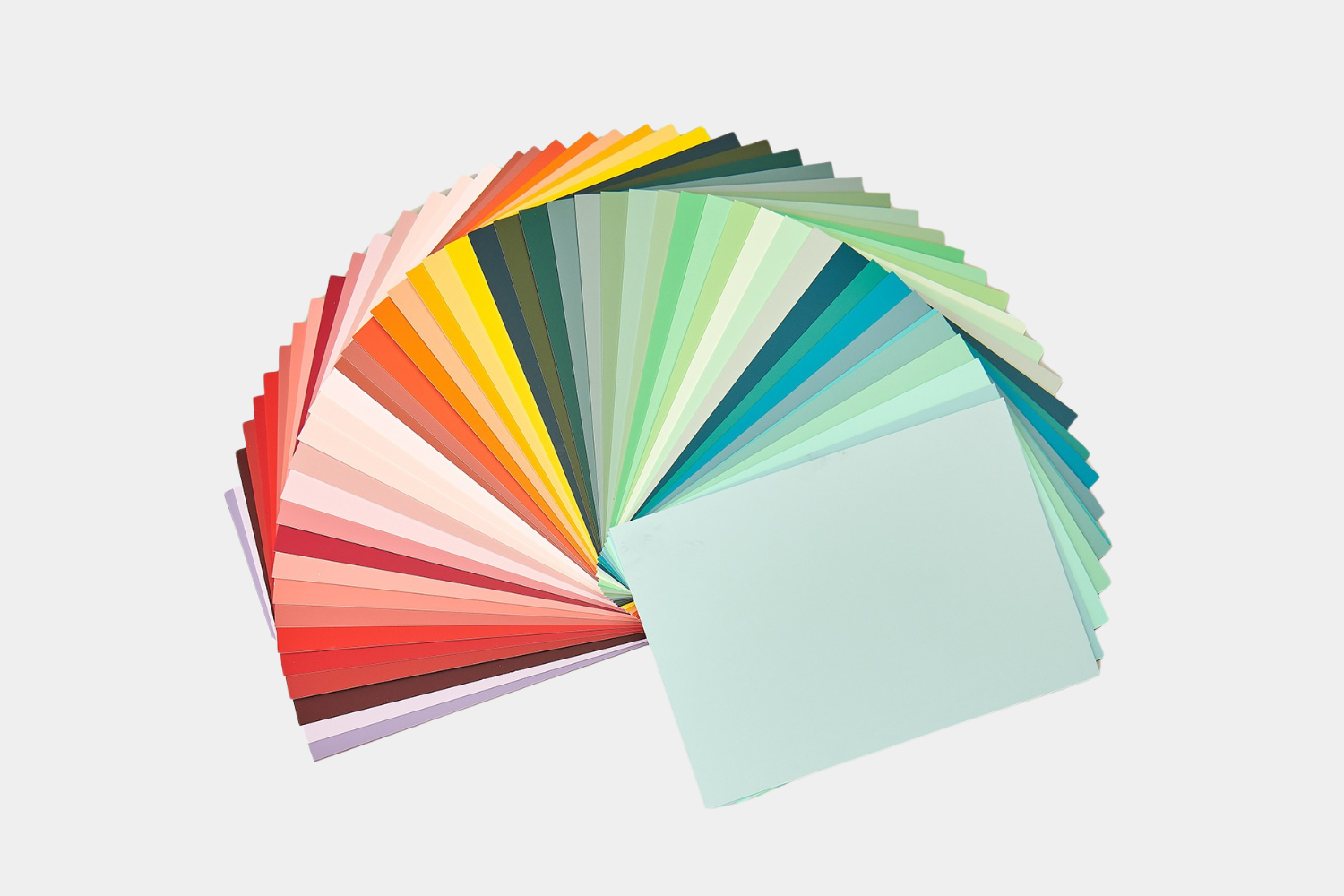
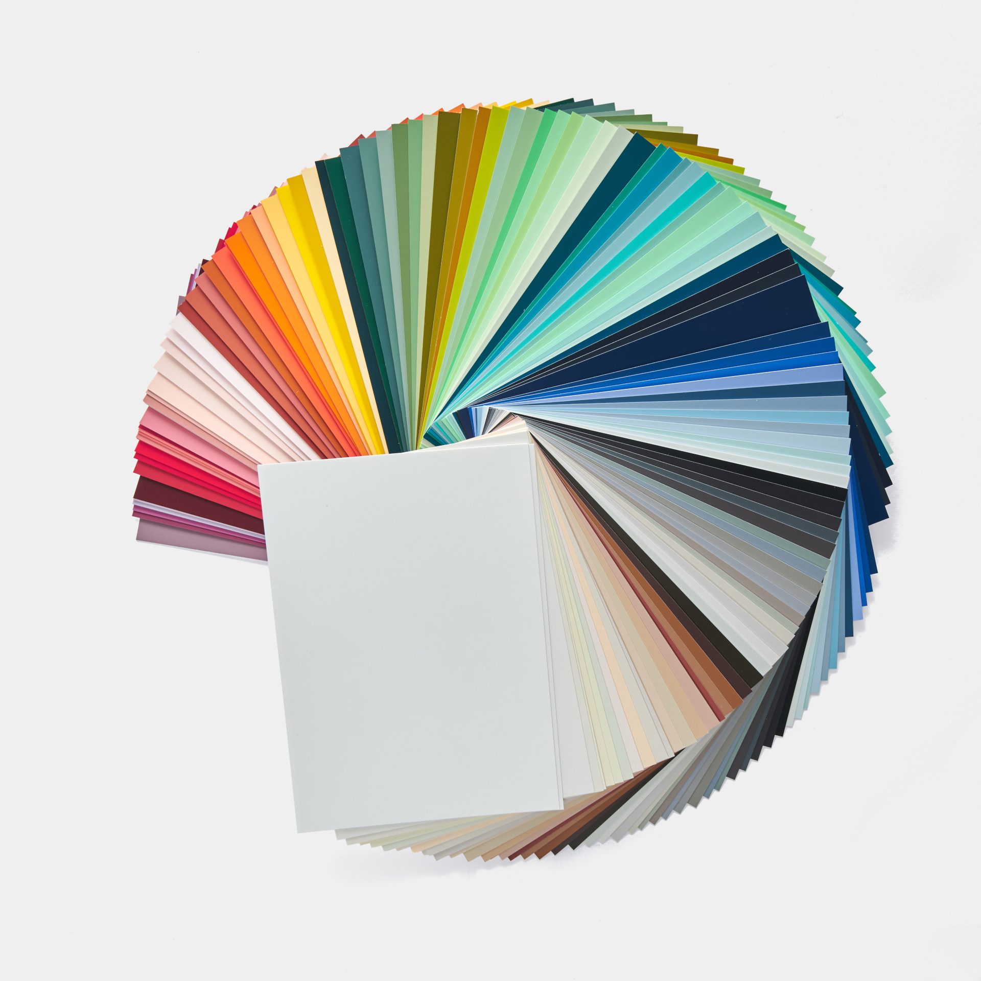
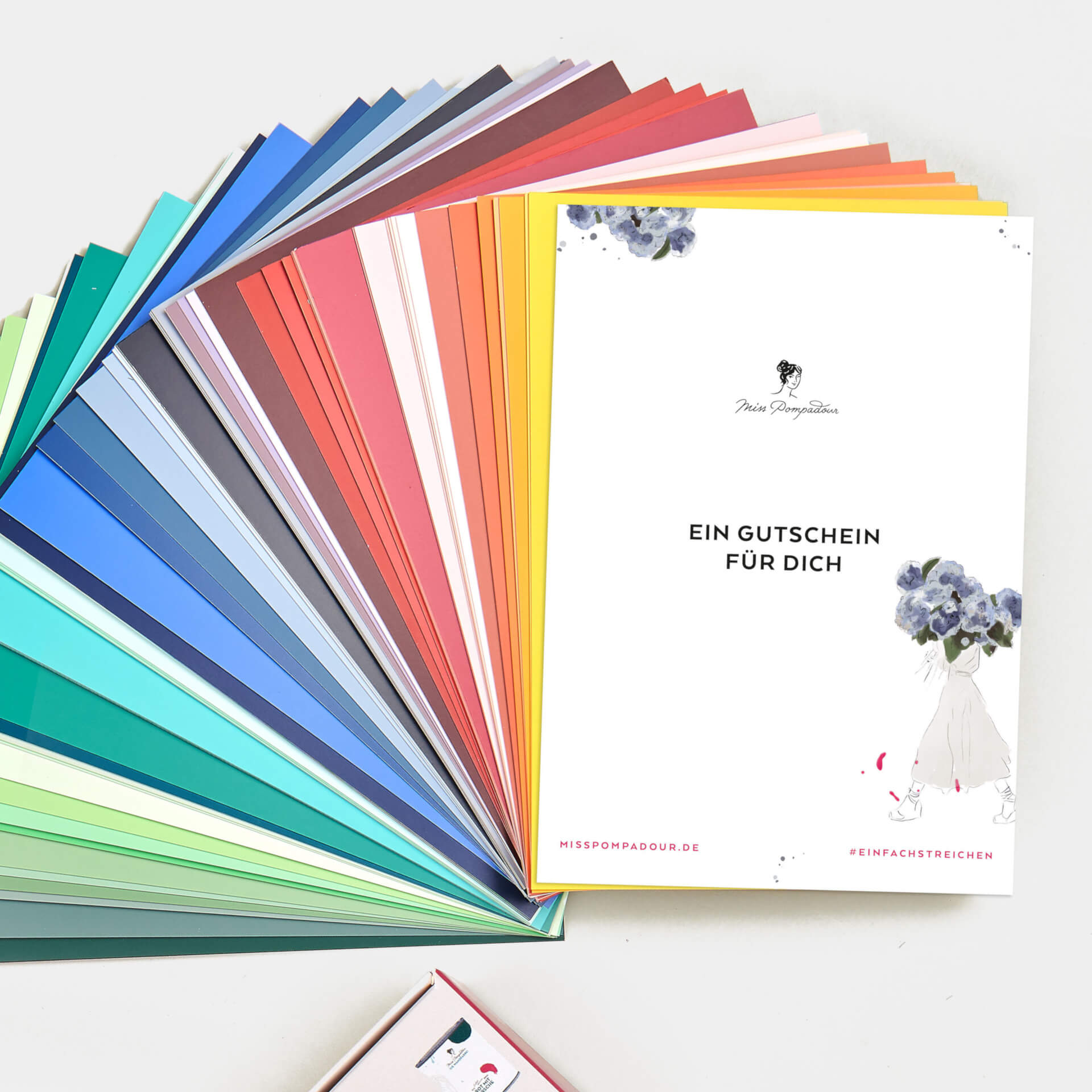
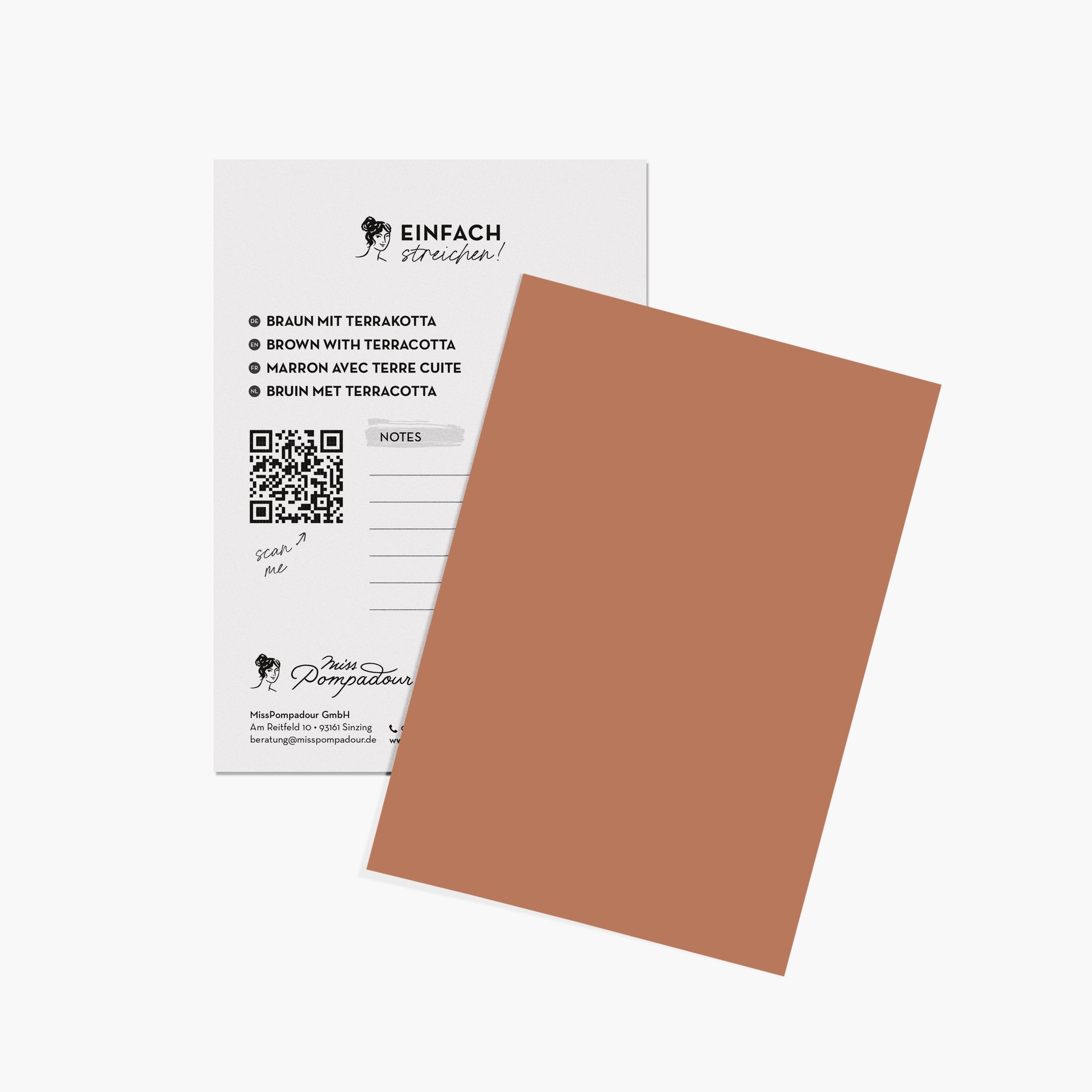
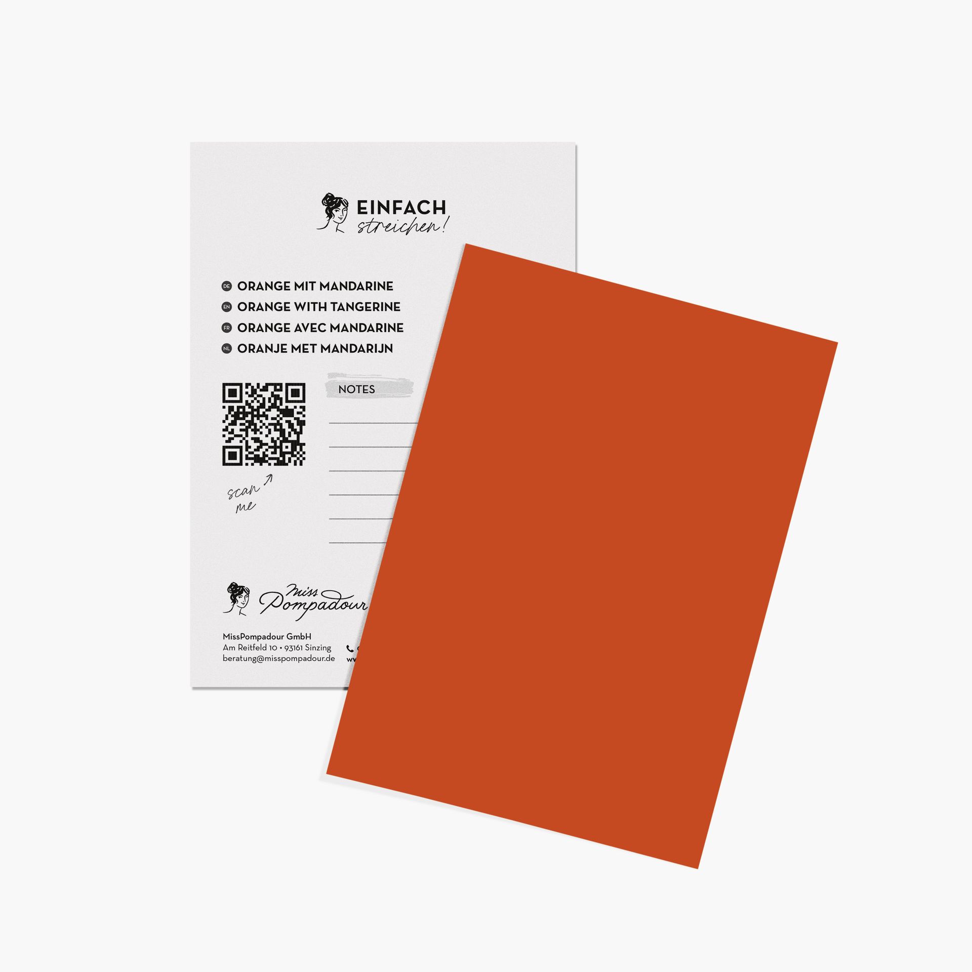
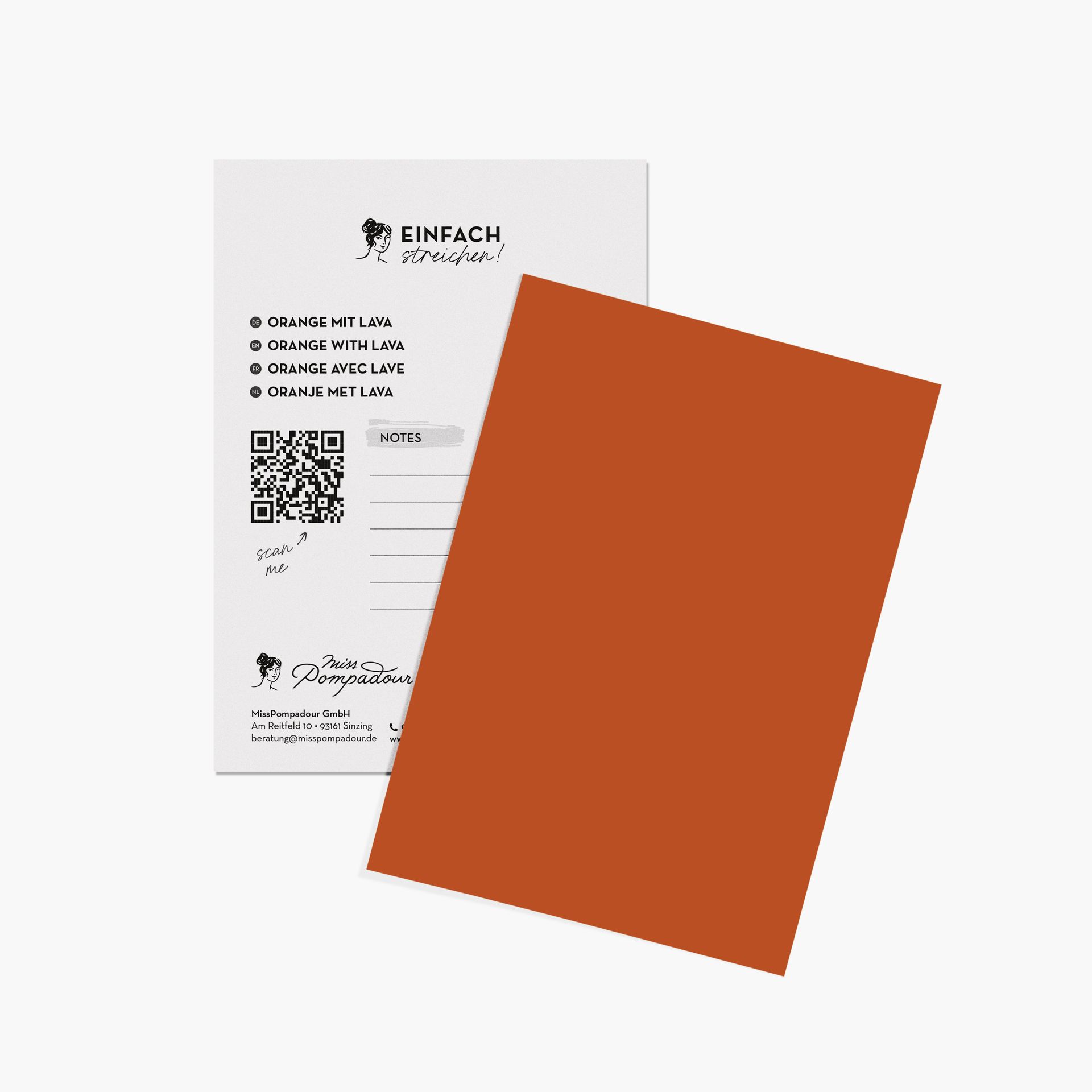
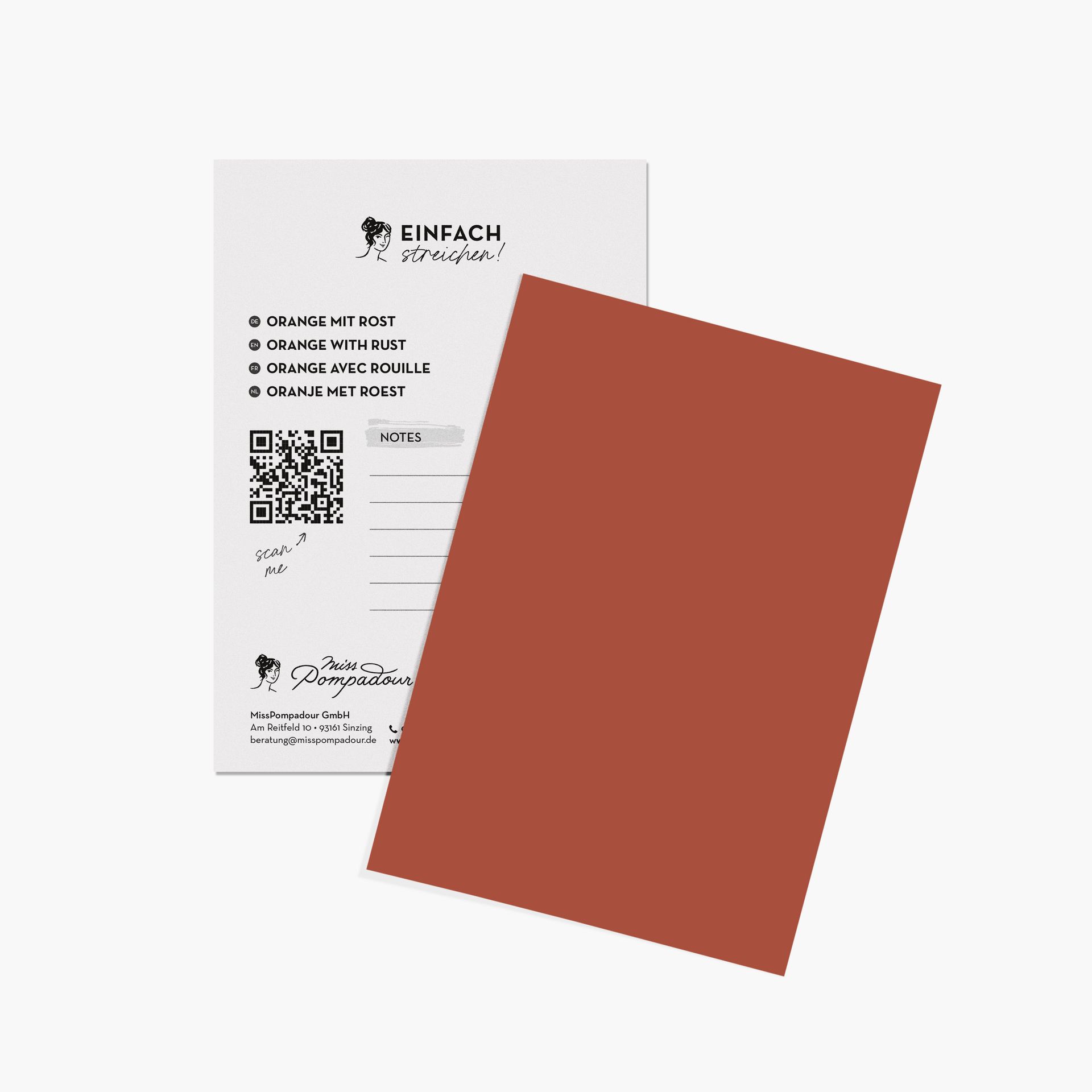
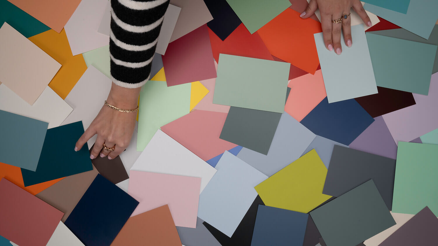
So, go ahead and dare to use the colour orange! If you would like to paint a different great colour later, that is absolutely no problem. You can simply paint over all our wall paints and paints. See for yourself the great coverage that allows you to paint over really any shade. By the way: you can use our colour cards to decide in advance which orange you like best. You can also easily find matching combination colours this way.
We ship within a few days with DHL GoGreen, so that you can get to work on the paints you’ve ordered as quickly as possible. If you have any further questions or need advice for your project, please feel free to contact our expert customer service team.
Which colours harmonise with orange?
The vibrant effect of orange paint looks particularly striking when combined with darker shades like blue, brown, or a modern anthracite. However, soft white tones also work well. For the bold, try pairing orange with a gentle pink – it adds a surprising sense of dynamic energy to the room.
Does orange go well with wood?
Dark shades of orange pair beautifully with light, natural woods. Orange paint that leans towards apricot or coral is also perfectly complemented by dark wood. It’s a wonderful way to showcase vintage furniture in any room and integrate it harmoniously into your home.
How do you combine orange in the living room?
You can either combine orange shades with neutral colours like beige, grey or white tones, or complement the colour with shades of green, ranging from grey-green to olive. The wide selection in our range allows you to perfectly tailor the intensity to your room. For those who love colour, blue or brown are also excellent options to add a little more energy and vibrancy to your decor.
Is orange modern as wall paint?
Inspired by a 70s revival, when orange became a symbol of a new era, progress, and optimism, this vibrant colour is back in style! It has also become an essential part of the popular Dopamine Decor trend. Our customers' many positive reviews show just how much joy a fresh coat of paint can bring to a modern home.
What emotion does orange represent?
The colour orange is associated with life, freshness, and creativity. It radiates a welcoming friendliness and is the most cheerful colour on the colour wheel, simply making painting and living spaces fun.