


wall paints & varnishes in
Purple
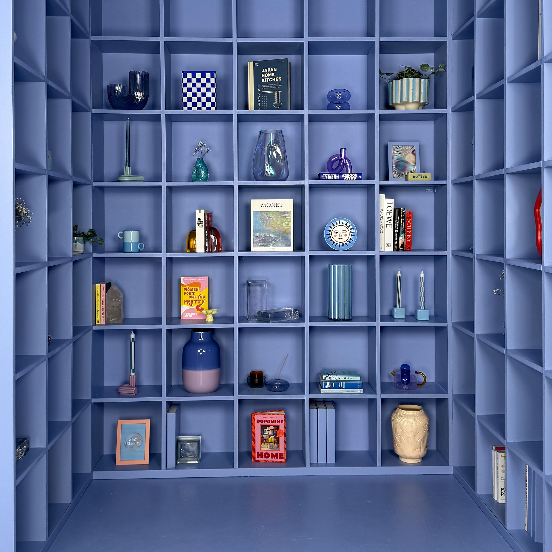
Our colours in purple


Everything for your project in one set


The most important things about the colour purple
Purple and violet are two terms for the same colour. They stand for mixed colours between red and blue. The term violet is derived from the violet (viola). The name purple comes from the French term for lilac (Lilas)
Effect of purple colour
The individual colour shades of violet are often worlds apart: From delicate lilac tones to strong lavender shades. The intense purple tone of magenta also belongs to the violet shades. Its name goes back to the northern Italian city of Magenta. In the Middle Ages, purple was considered the colour of kings. In the Catholic Church, it is still the colour of bishops today, while purple-red is the colour of cardinals.
Purple is considered a very emotional colour. It is the colour of aesthetics, femininity and virtue. In colour psychology, it is associated with wisdom, creativity and inspiration. However, violet also stands for elegance, beauty and open-mindedness. As violet colour shades combine the strong, warm colour red with cool blue, they are also associated with attributes such as maturity, serenity and empathy.
In general, violet colour shades stand for spirituality, magic and art. These colours appeal to all the senses. To this day, their use in fashion is a sign of extravagance and individuality.
Making rooms purple
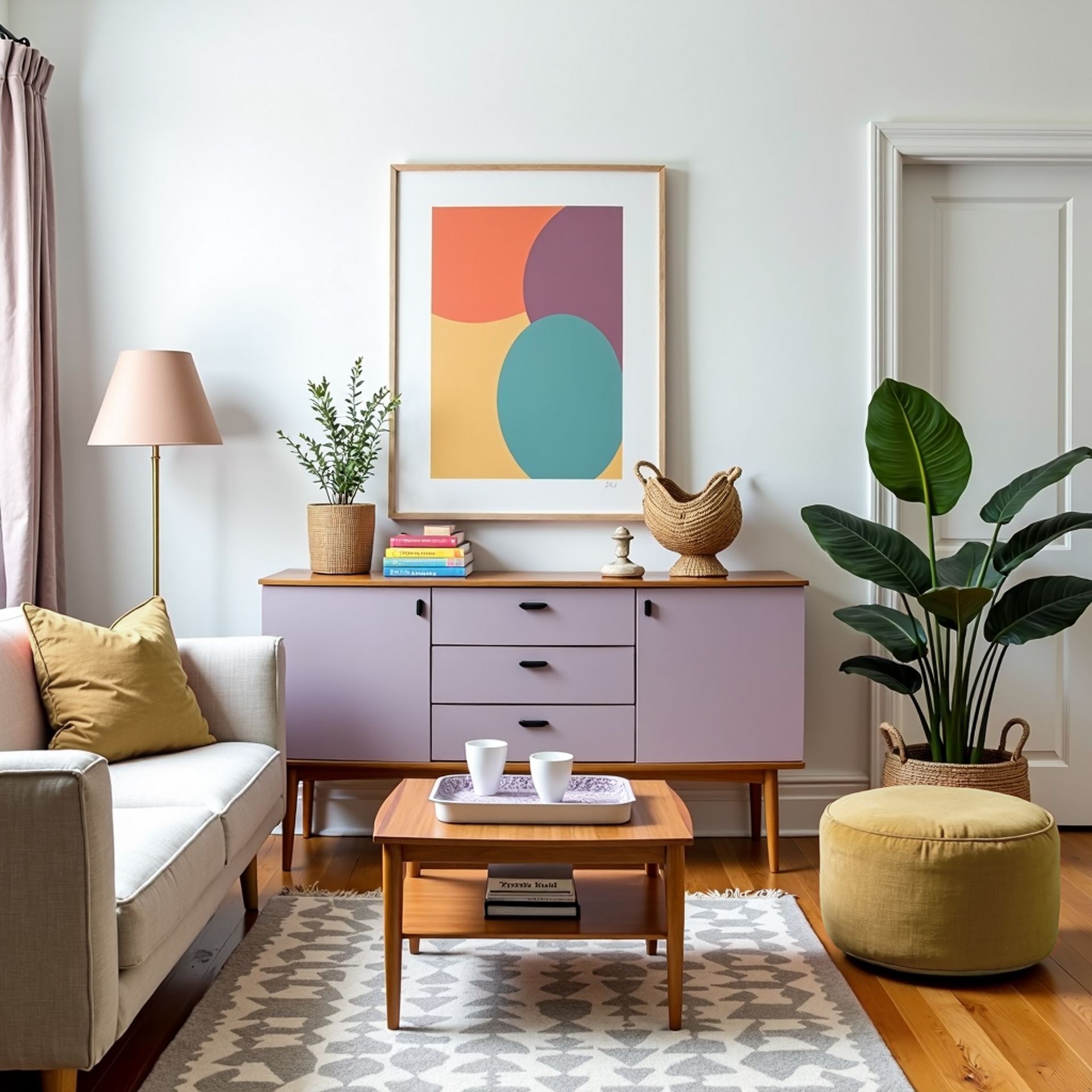
The emotional effect of purple tones is also often utilised in the design of interiors. Purple tones have made a remarkable comeback in the home in recent years. By adding neutral pigments, modern shades of purple tend to appear muted and calm.
As with all colours, the same applies here: It's all about the right mix. If the colour violet contains a lot of white, it appears delicate and subtle. With a strong blue component, violet and purple can have a very powerful effect.
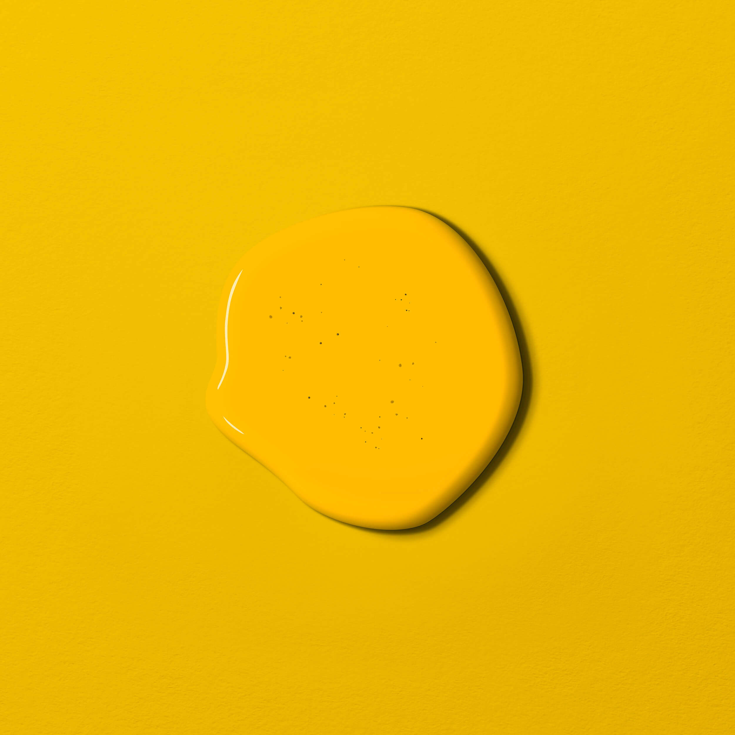
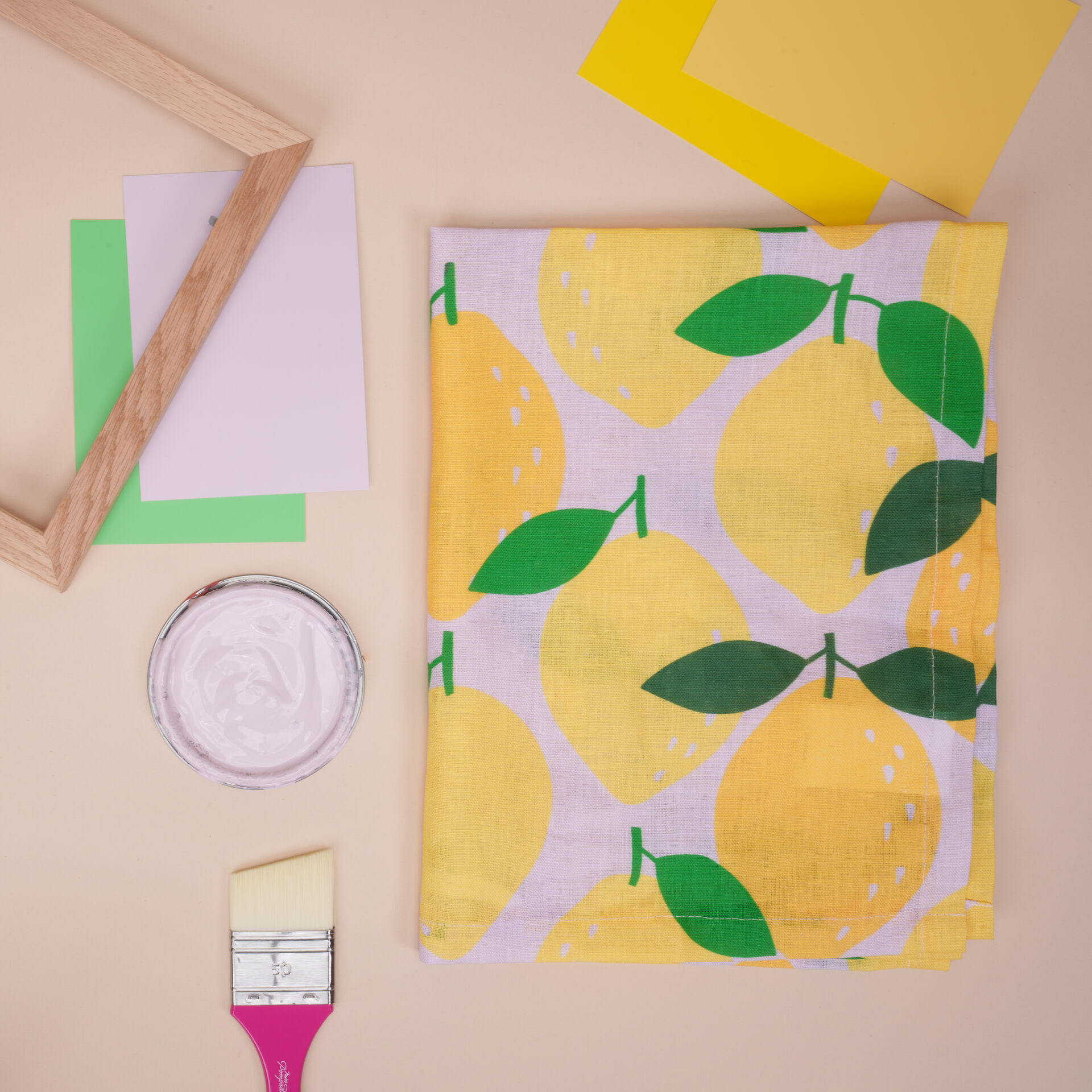
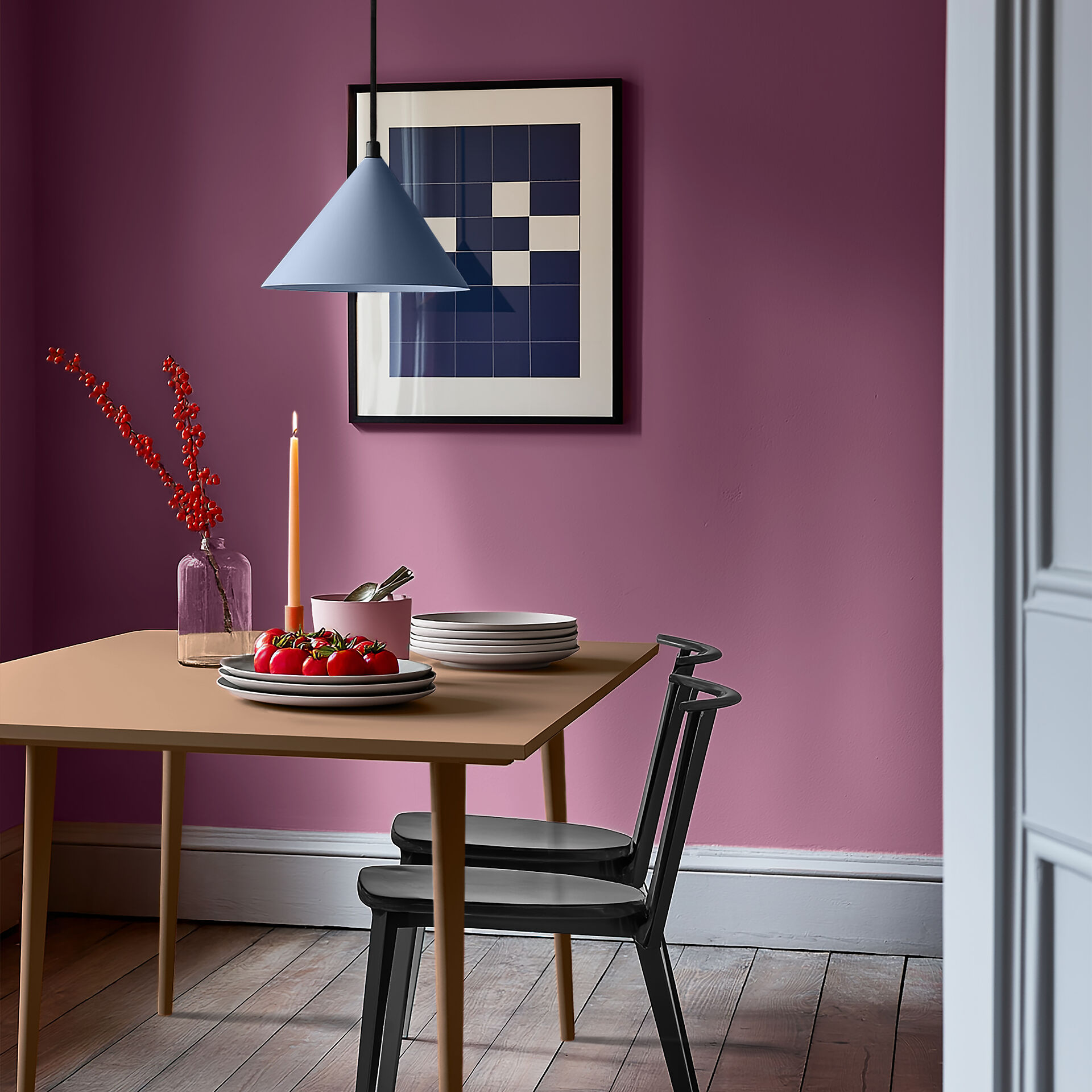
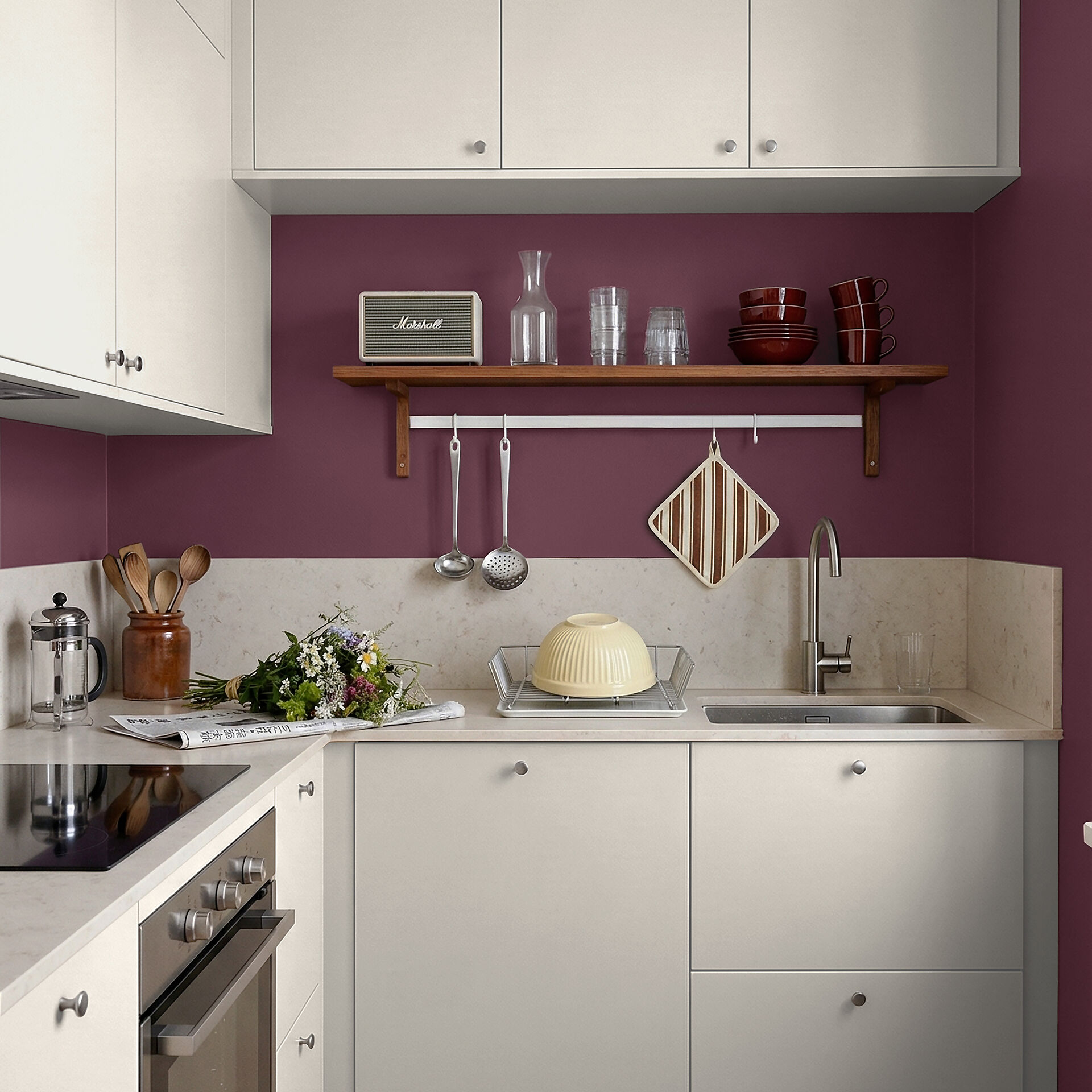
As wall paints, strong purple colour shades should only be used on a single wall in the room and the remaining walls should be designed neutrally with colours from nature, such as grey or beige. However, purple also works well with intense colours, especially with its complementary colour yellow. The strong magenta has green as a complementary colour and can be wonderfully combined with a subtle grey-green.
You should avoid purple here
Purple can have a slightly cool effect and should therefore not be used in rooms that are not well lit
Alternatives to purple colour
In the children's room, a light, warm pink or a fresh shade of blue are a good alternative to light violet. Adults should take a look at grey tones with red colour components. They can make a great alternative to purple.

Purple, violet & lilac: Shades of the colour
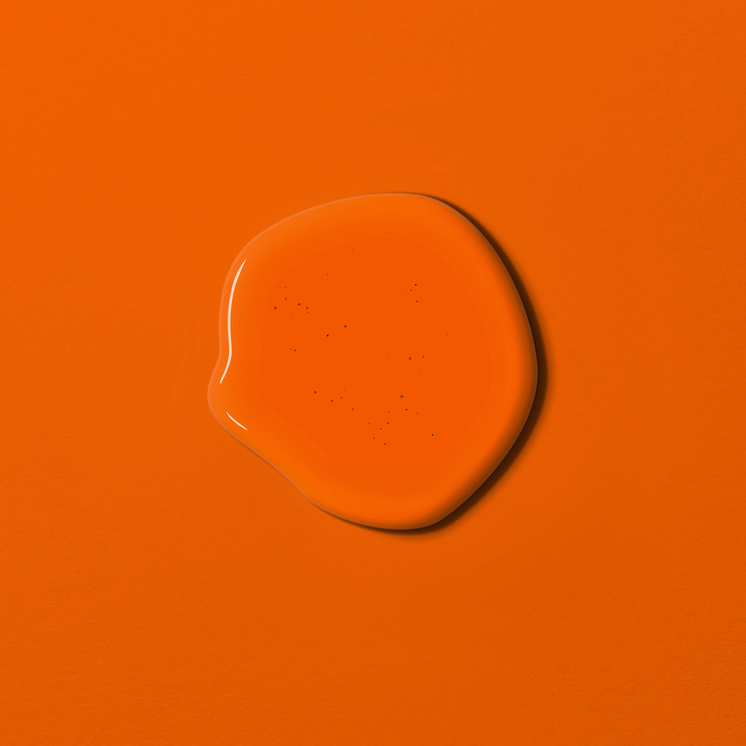
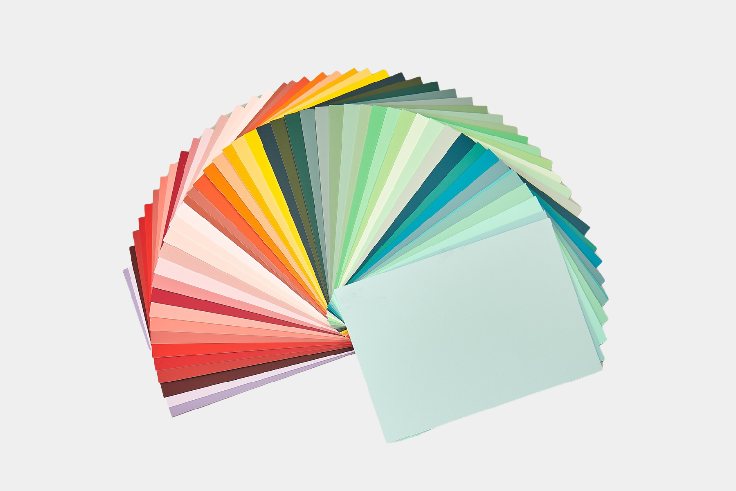
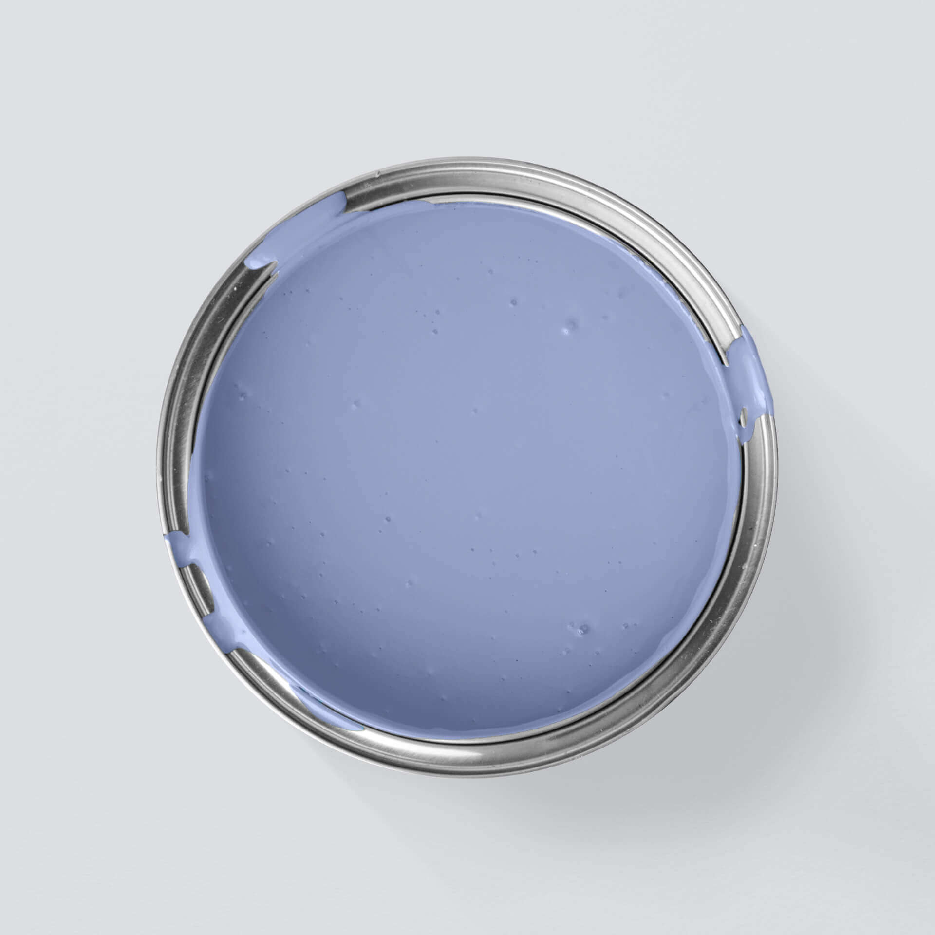
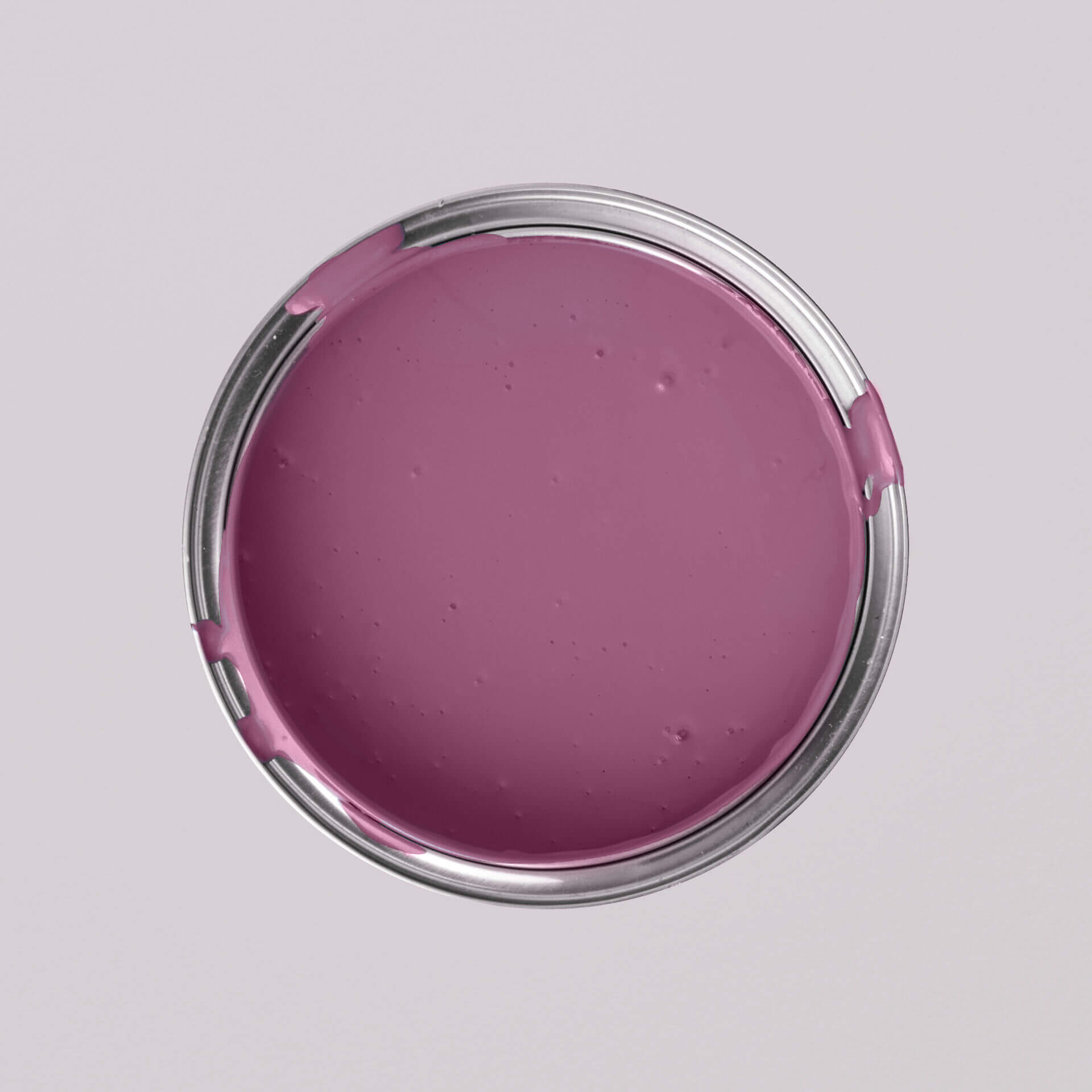
As a secondary colour, purple is mixed from blue and red. Depending on the ratio and how many white or dark pigments are added, purple can create a very different effect.
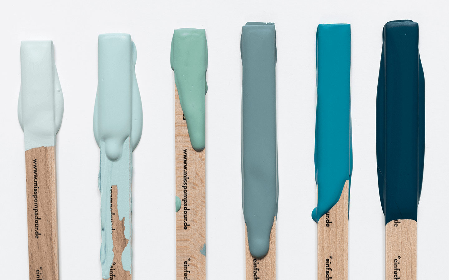
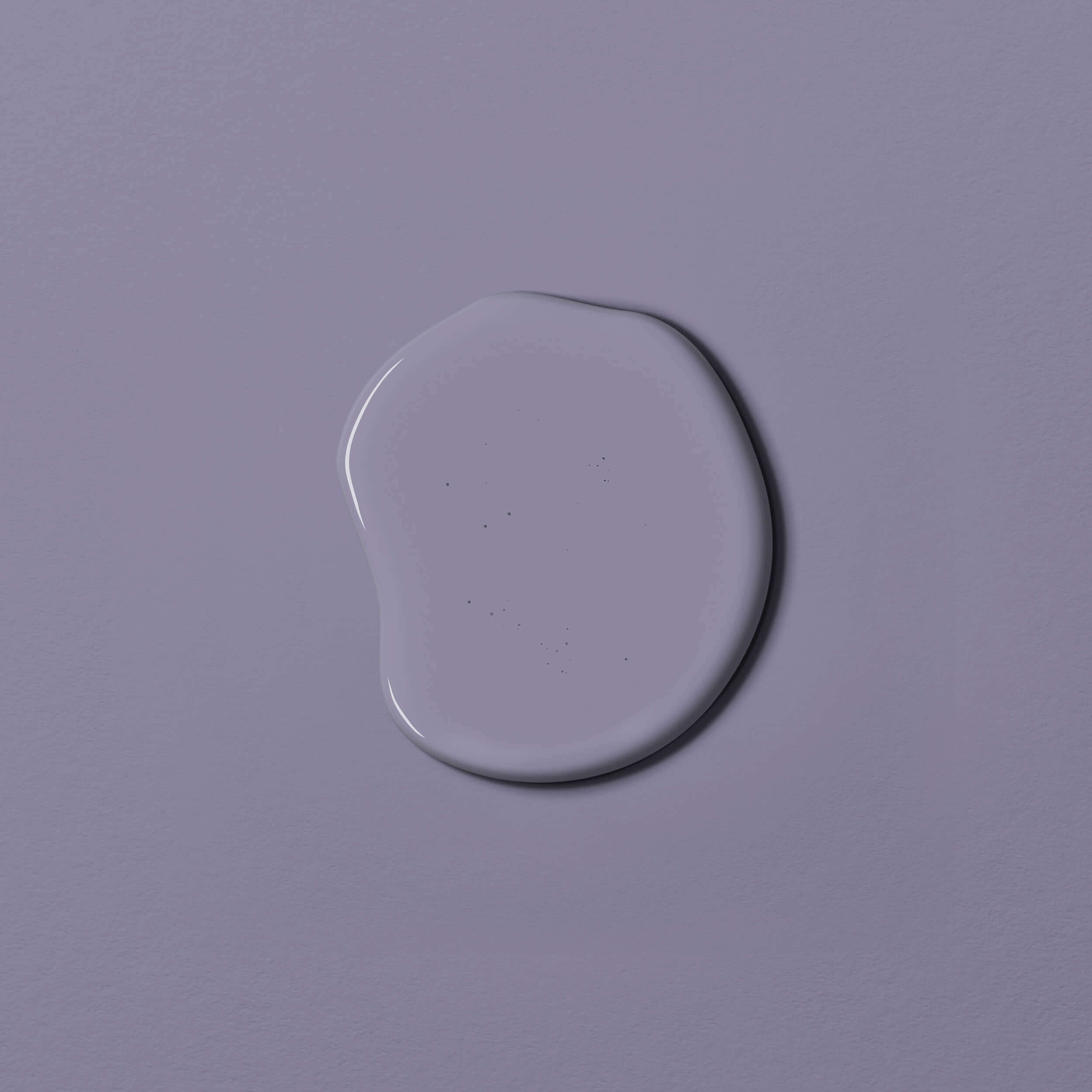
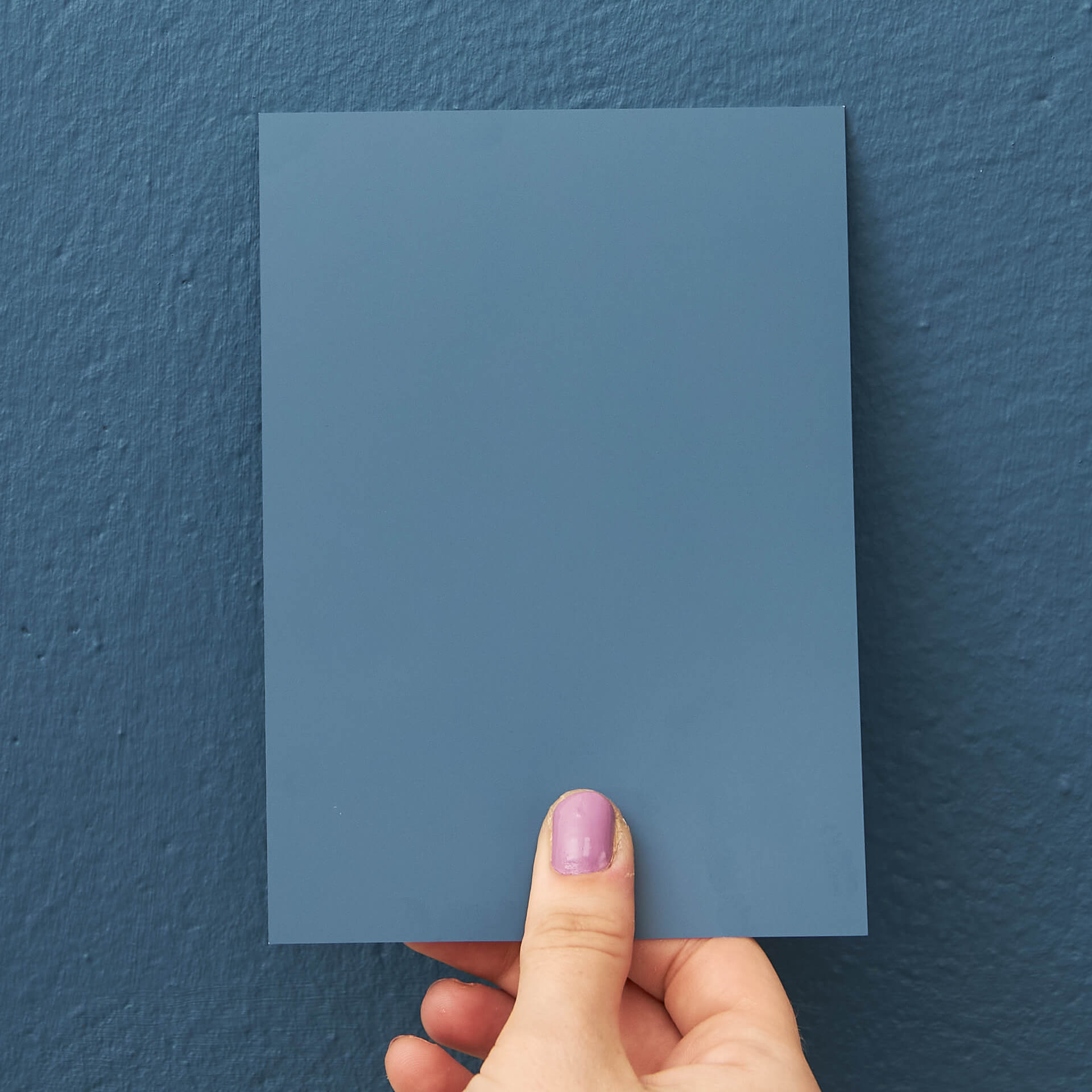
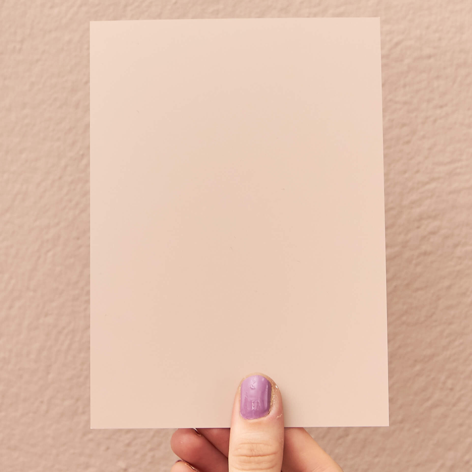
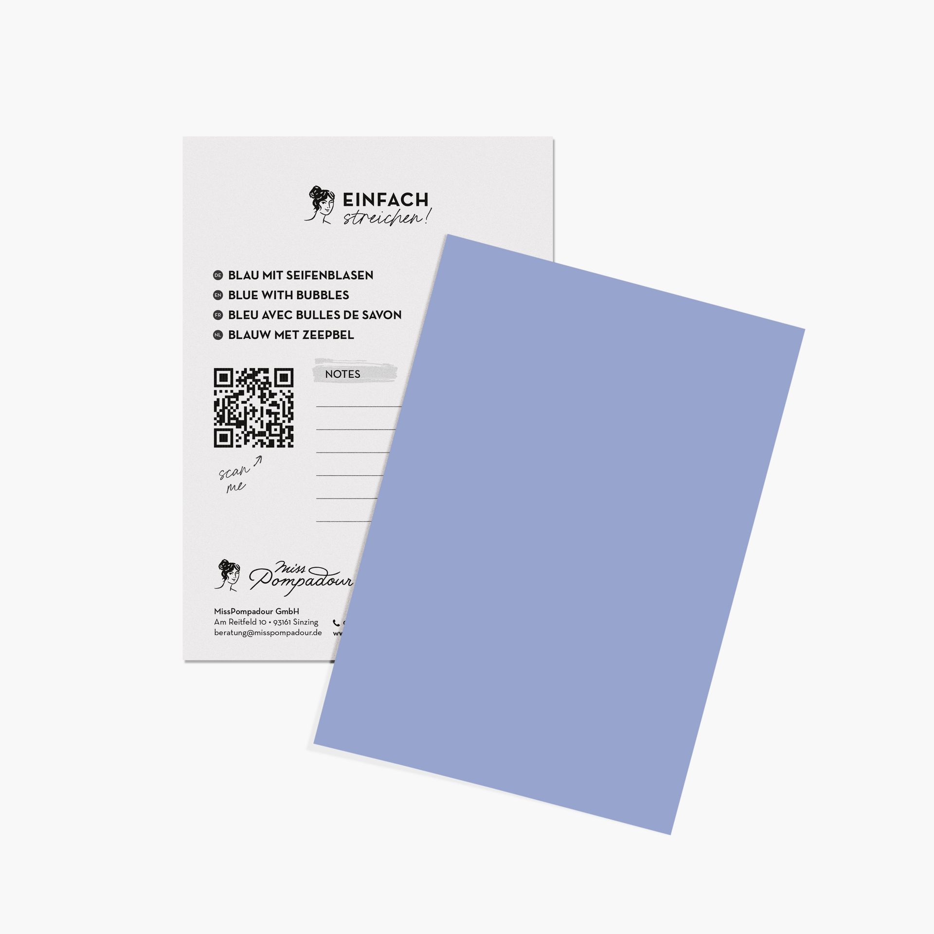
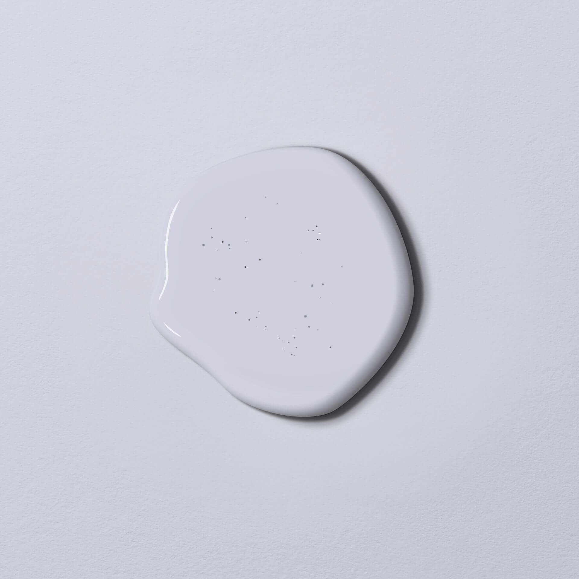
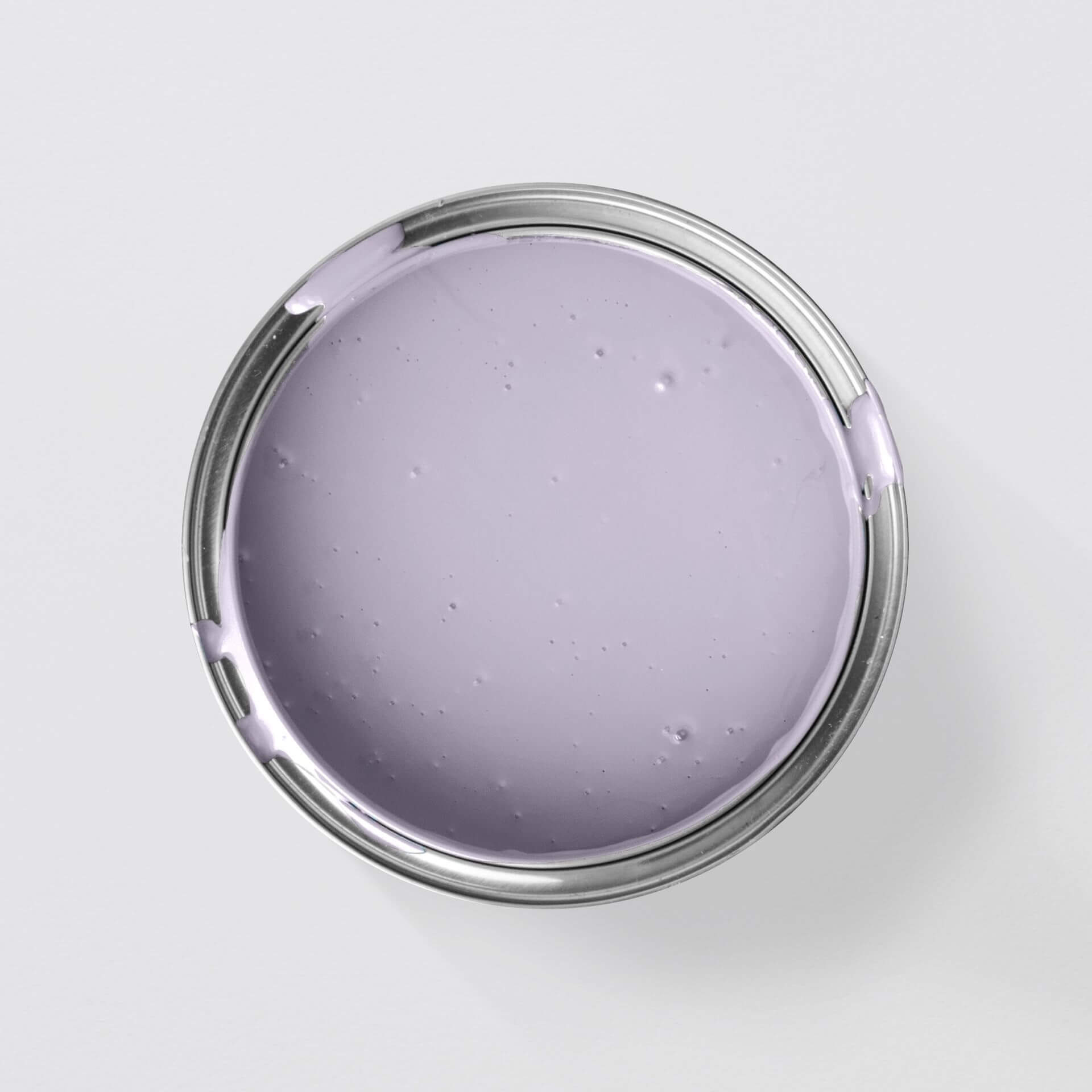
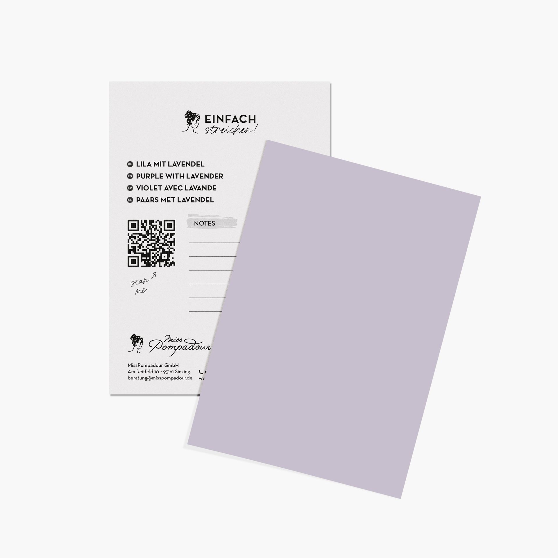
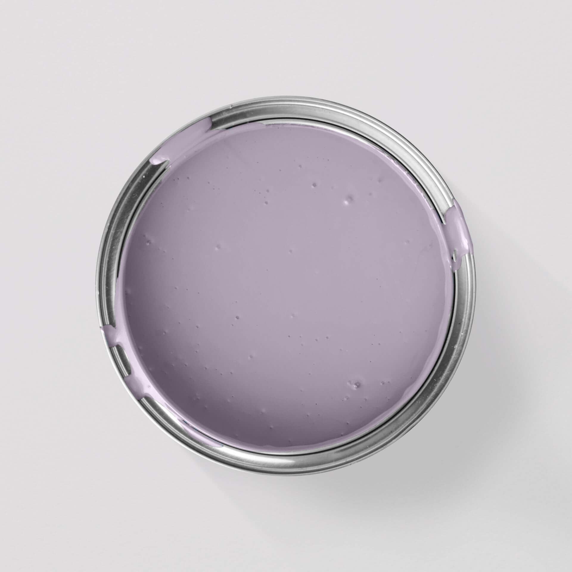
With such a diverse colour, getting an overview of the shades is important. Let’s start with the very light purple tones. By adding white pigments, fine, delicate pastel shades are created — often referred to as lilac — such as our Purple with Lilac or Purple with Lavender. Mauve refers to a violet with blue undertones that is more or less greyish.
An overview of our wall paints in light purple shades:
- Purple with Lavender from the Just Paint collection
- Purple with Lilac from the Just Paint collection
- Purple & Soft from the LittlePomp collection
- Tender Rose from the CosyColours collection
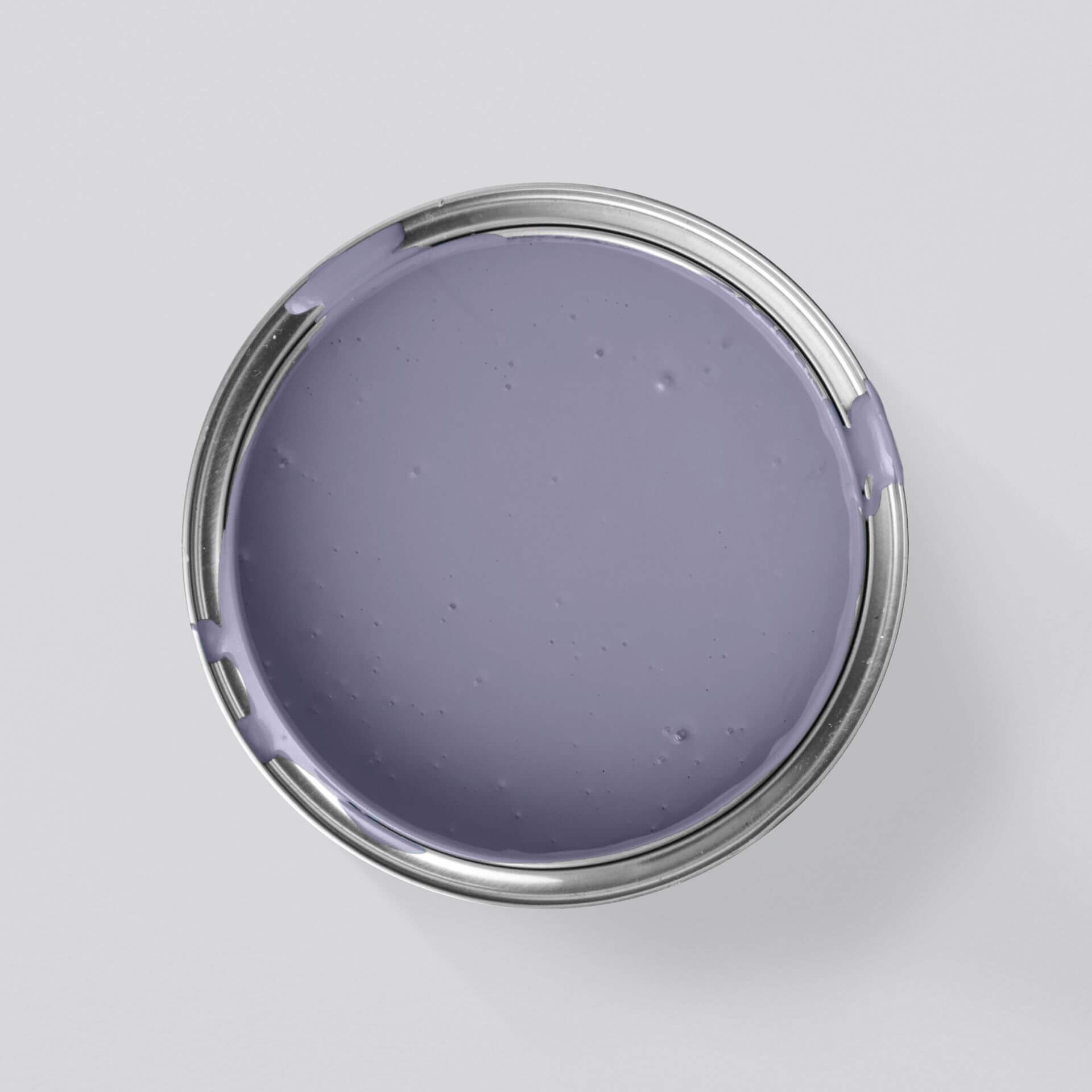
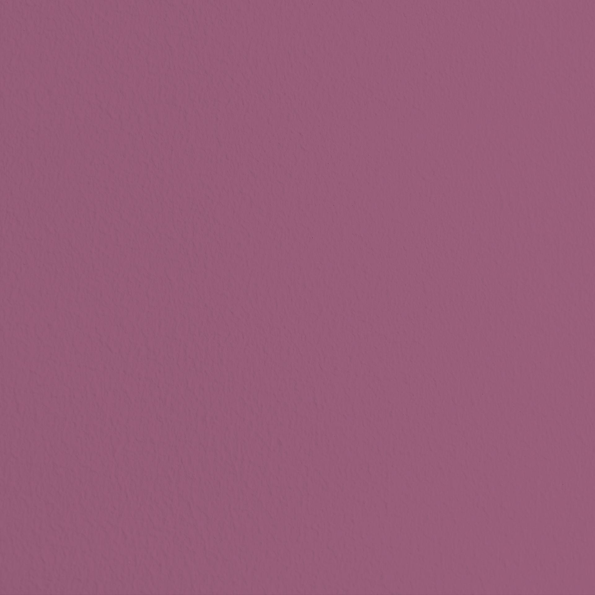
Violet and purple refer to stronger, highly pigmented purple tones. Purple with Provence from our Just Paint collection is a “classic” purple.
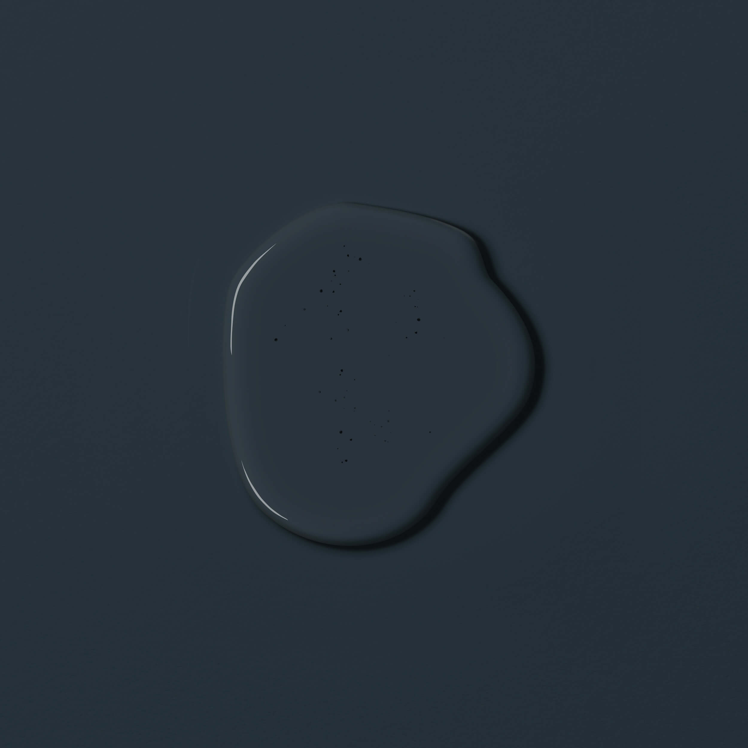
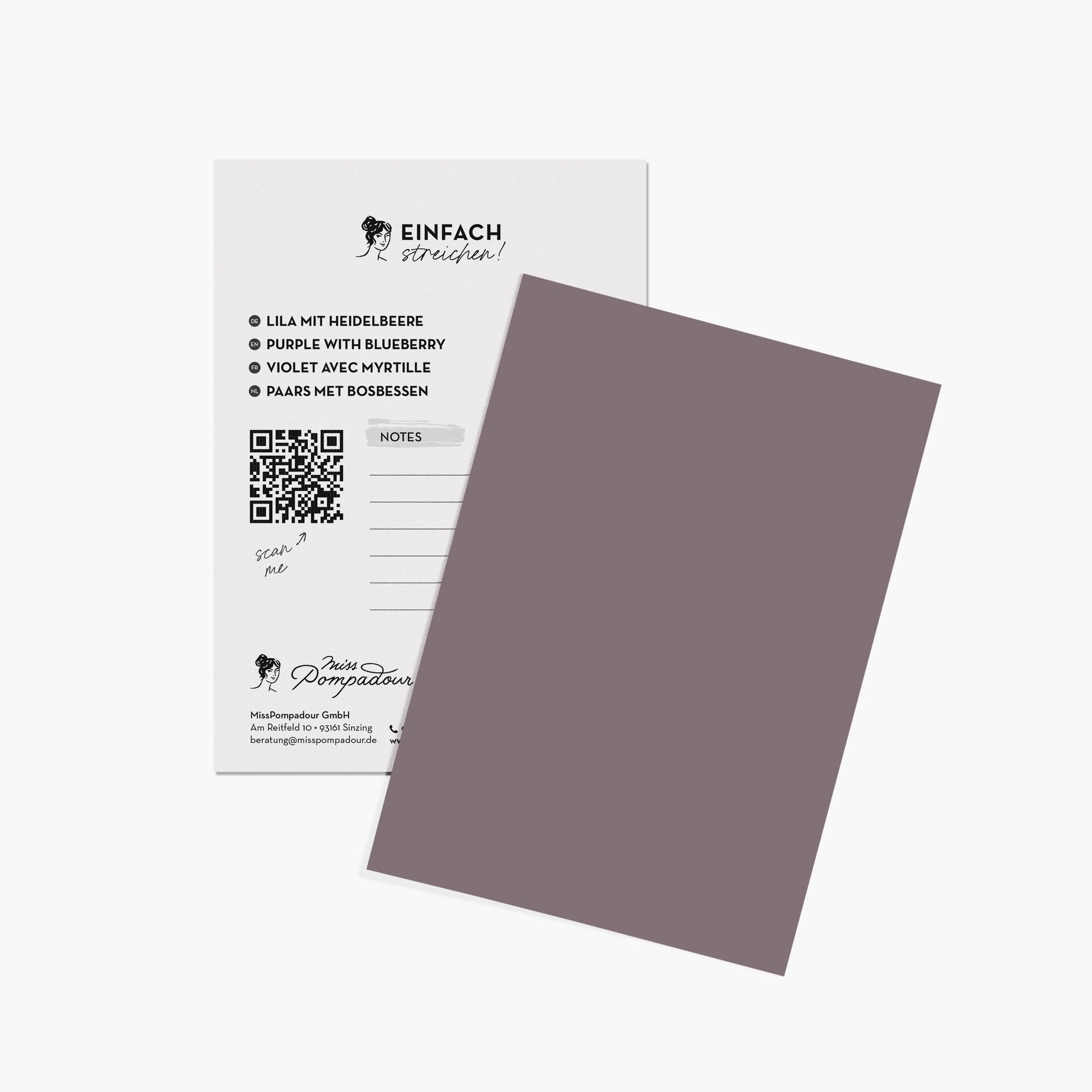
Furthermore, there are of course the brownish-greyish purple tones such as Purple with Blueberry, which appear more subtle and mature.
Examples of our strong purple shades from the Just Paint collection:
- Purple with Provence
- Purple with Blueberry
- Purple with Fig
- Purple with Heather
The colour purple in colour psychology
Purple has appeared in ecclesiastical settings for centuries, where it symbolised humility, spirituality, penance, and mourning. Today, the character of violet tones has evolved into a multifaceted surprise. The colour samples can appear spiritual and reserved, while equally exuding luxury. By uniting red and blue, femininity and masculinity, this colour samples has a meditative and balancing effect on our mood. Therefore, it is recommended for interiors, especially in rooms where you want to gather strength and find rest. Purple is particularly suitable for
- Bedrooms
- Living rooms
- Your favourite retreat, such as a reading, meditation, or yoga room
Lightened to a delicate lilac, this colour creates sweet accents while simultaneously calming the mind, helping you to find your inner balance.
Violet & purple – perfect for many rooms & furniture
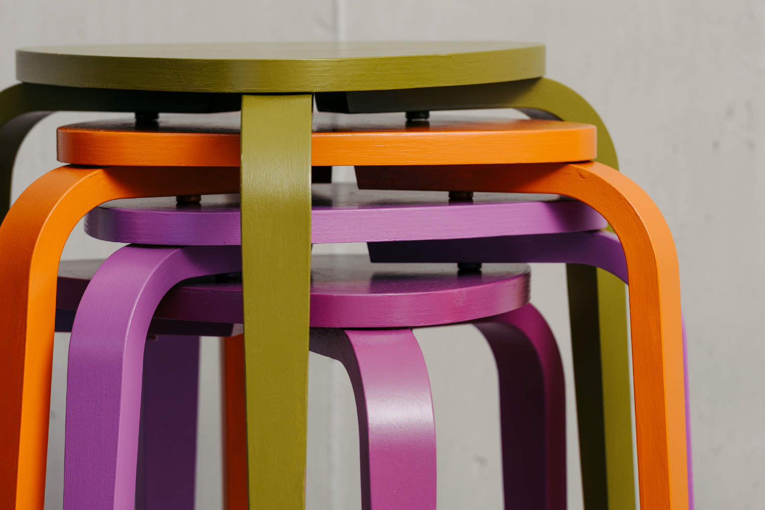
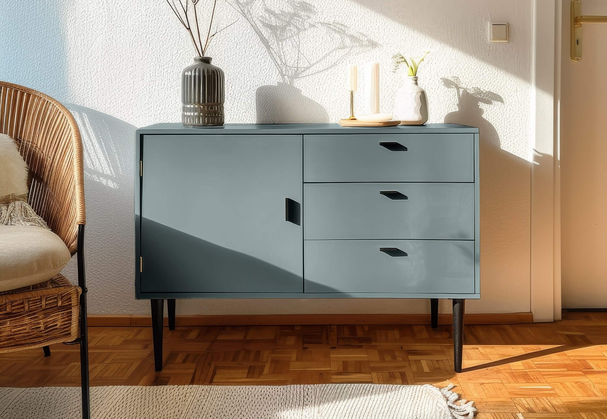
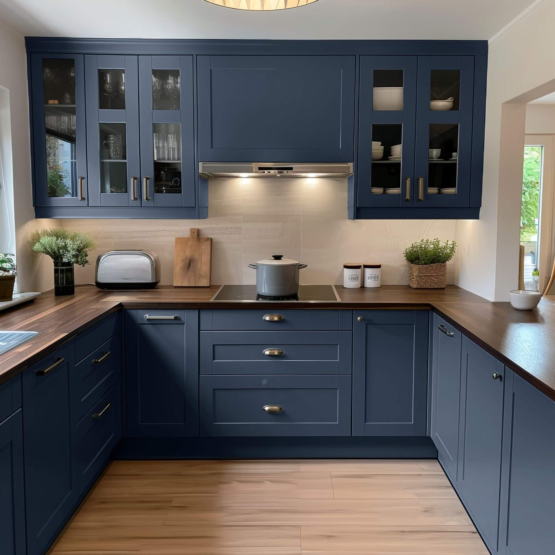
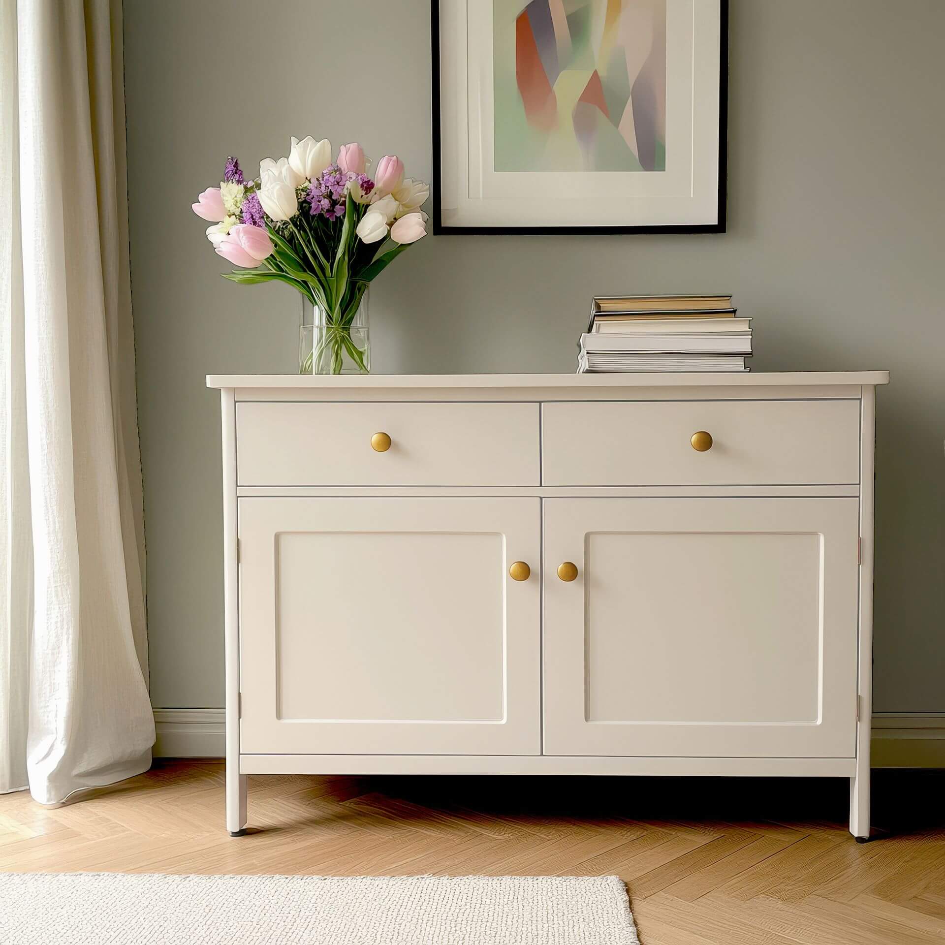
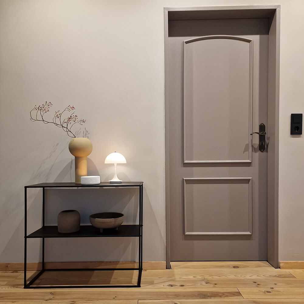
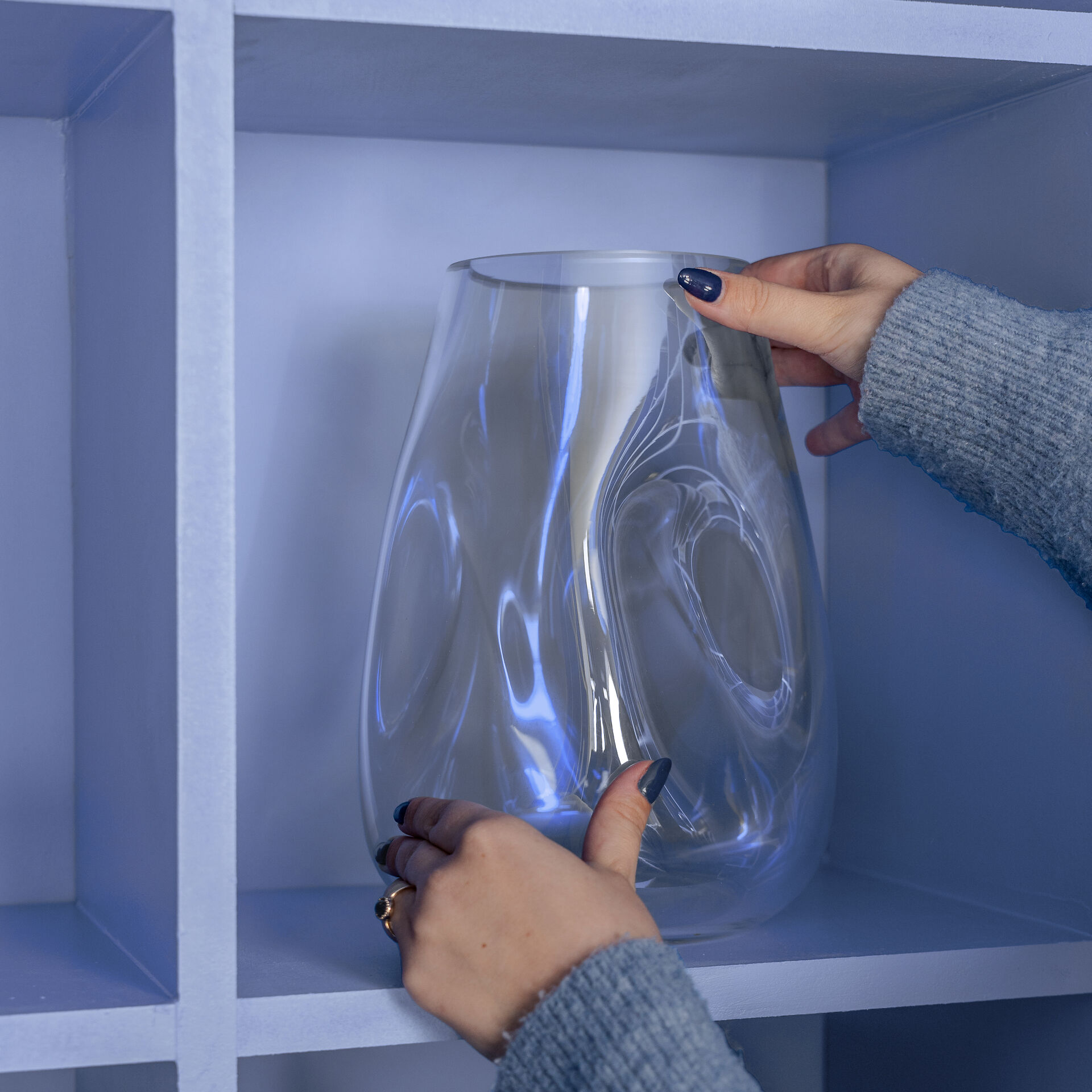
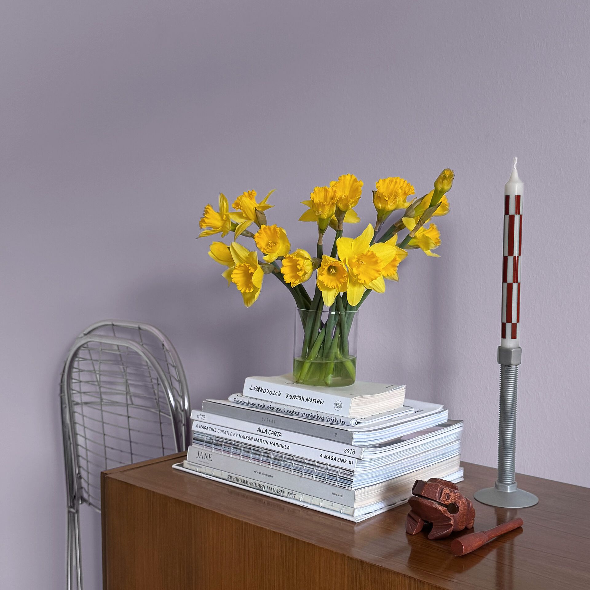
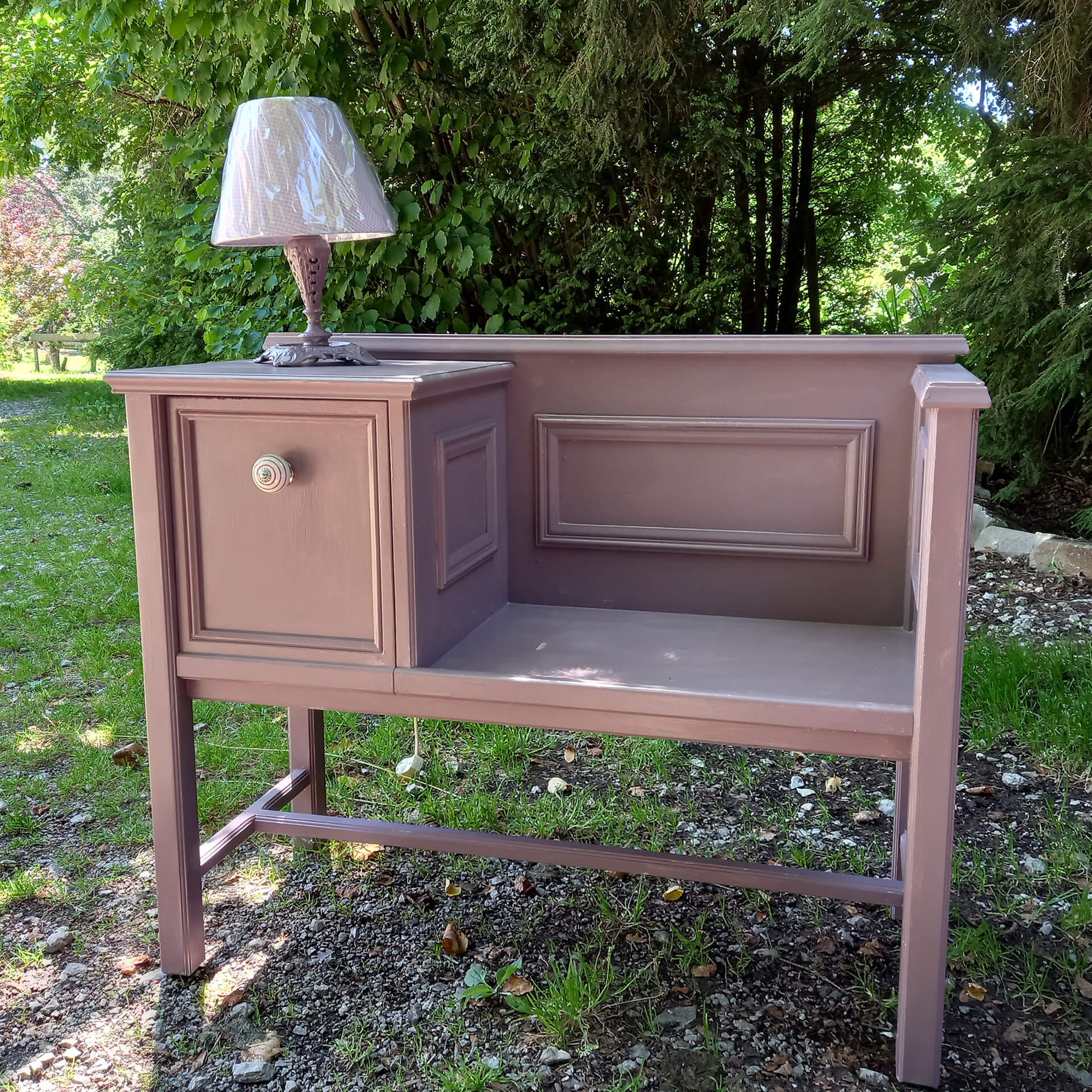
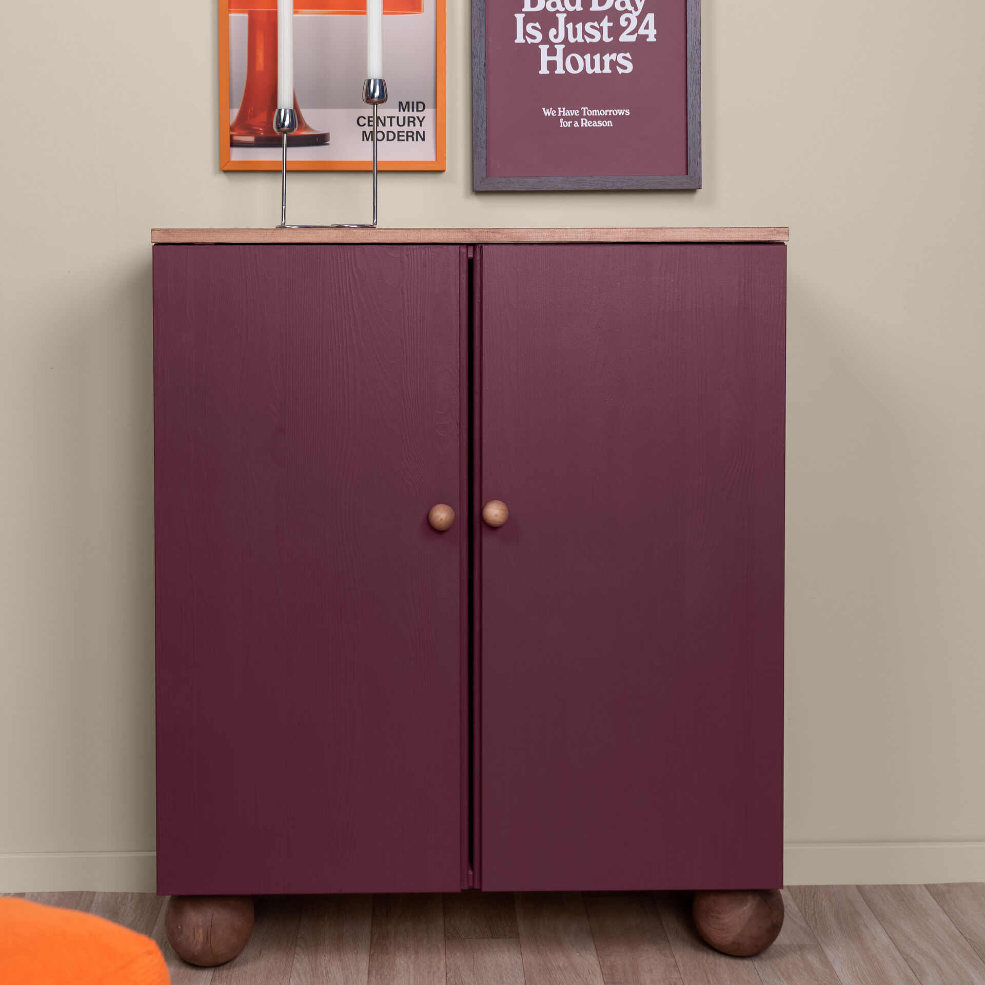
Any room can be individually designed with violet accents. Often, it is enough to embellish a small sideboard in the entrance area with violet paint to create an eye-catcher.
Due to their meditative effect, light purple shades work wonderfully as interior wall paint for yoga rooms and those where you meditate and relax. Purple and violet are also suitable as wall paint for the practices of naturopaths and other health professionals, as they are said to have not only a balancing effect but also a pain-relieving and cleansing one.
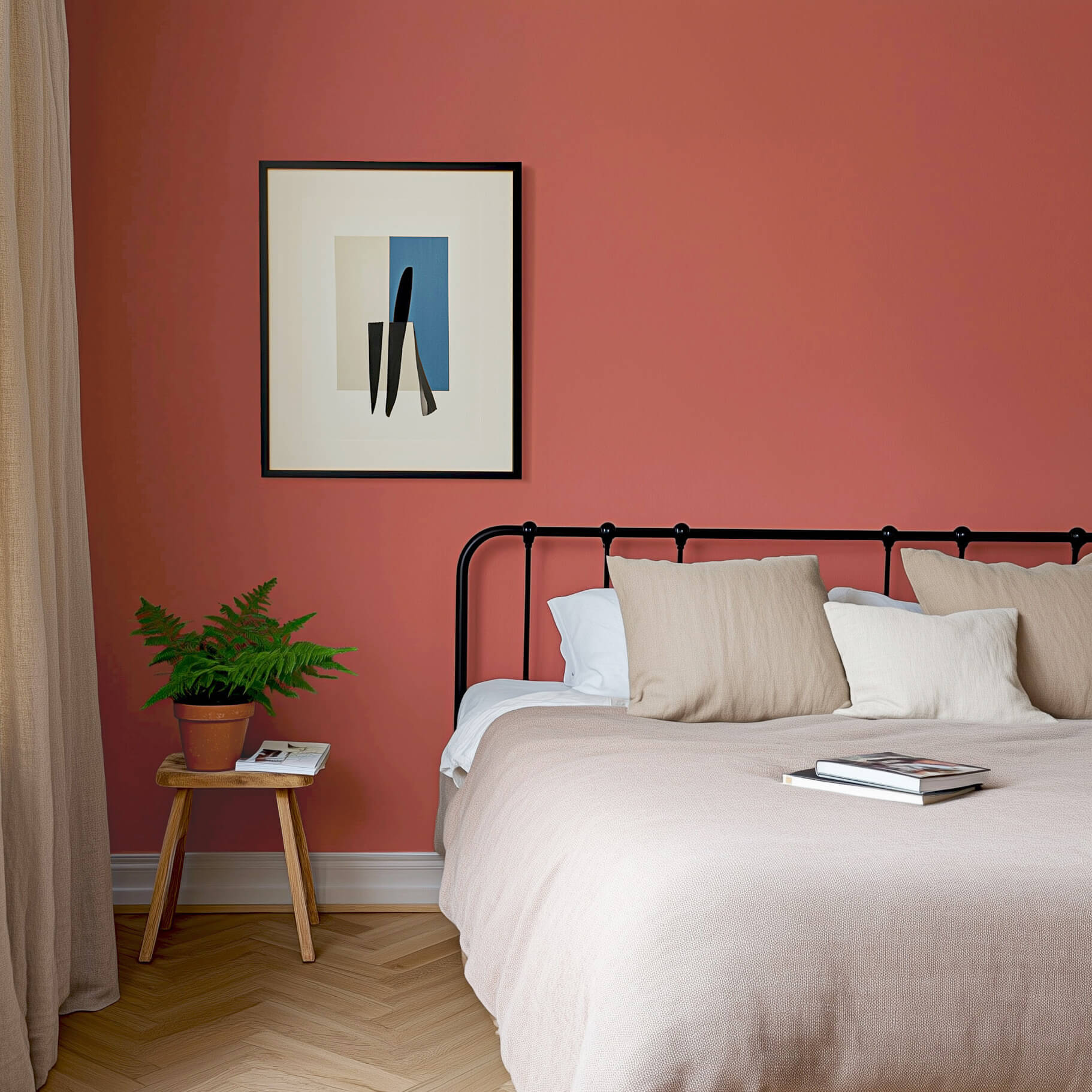
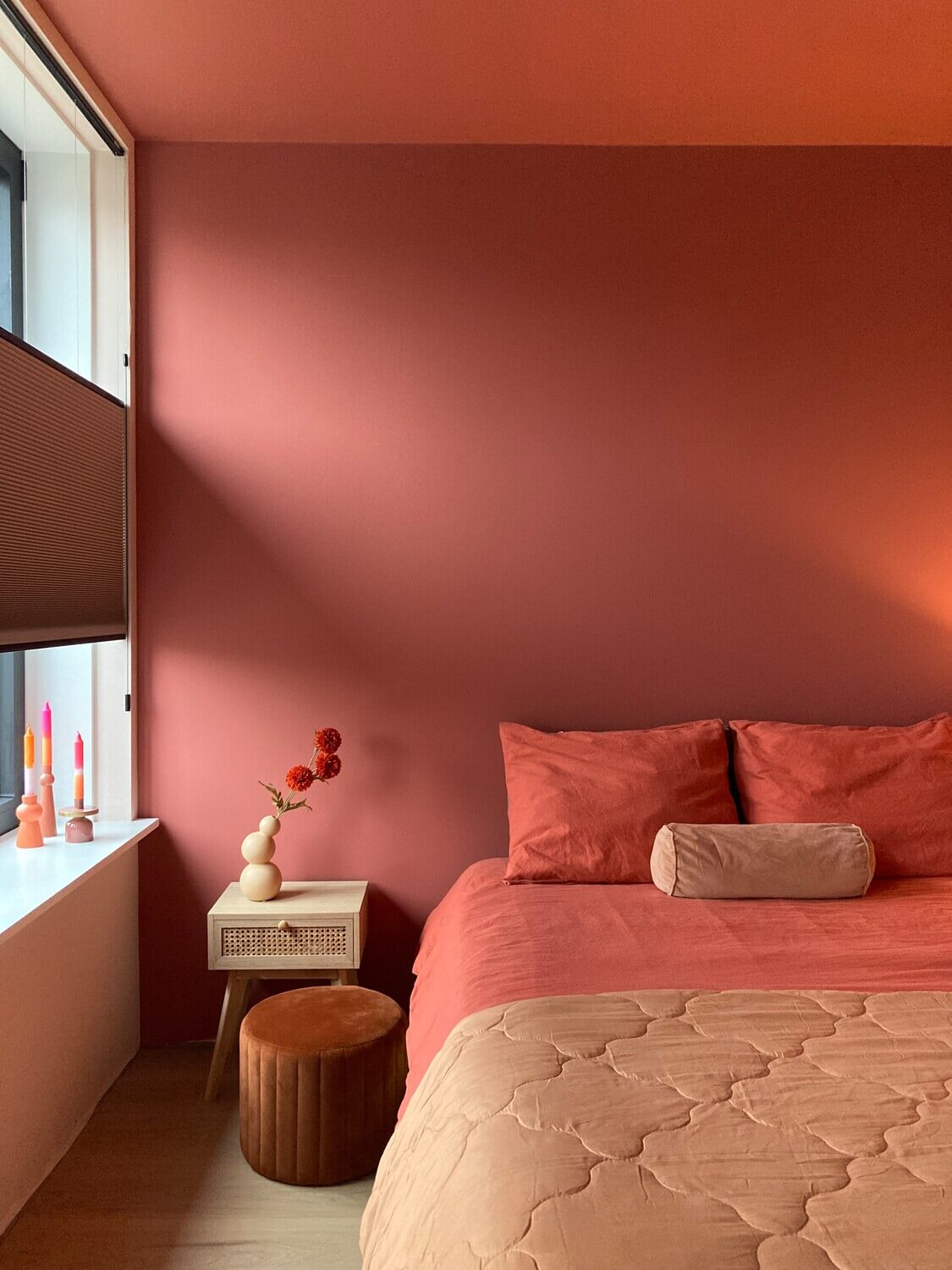
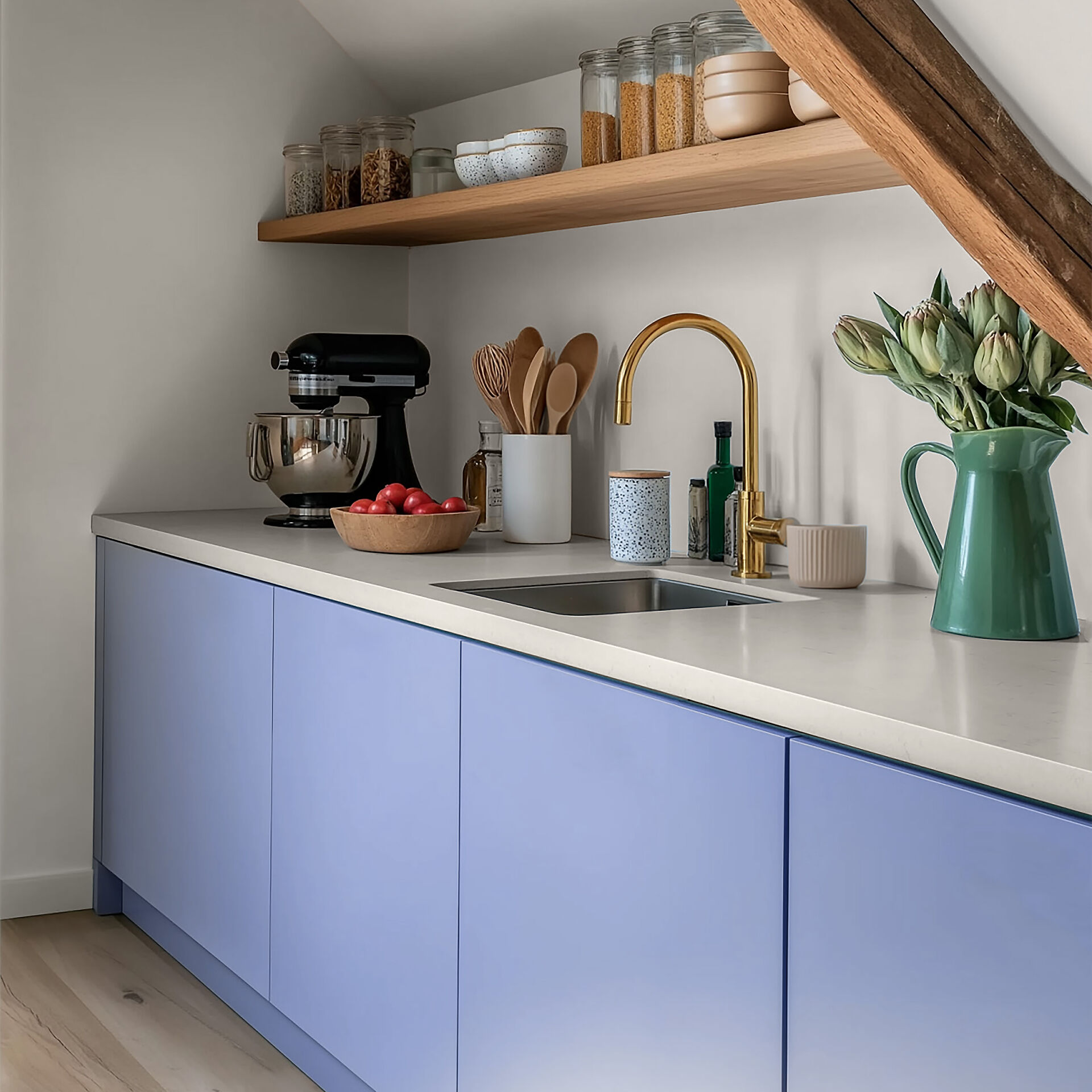
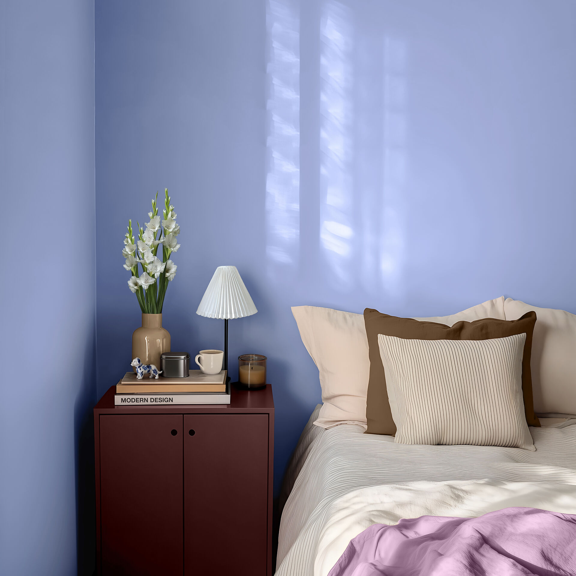
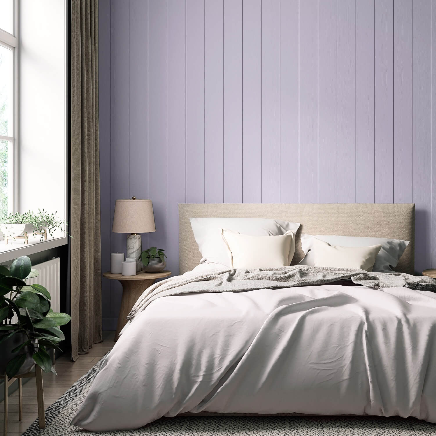
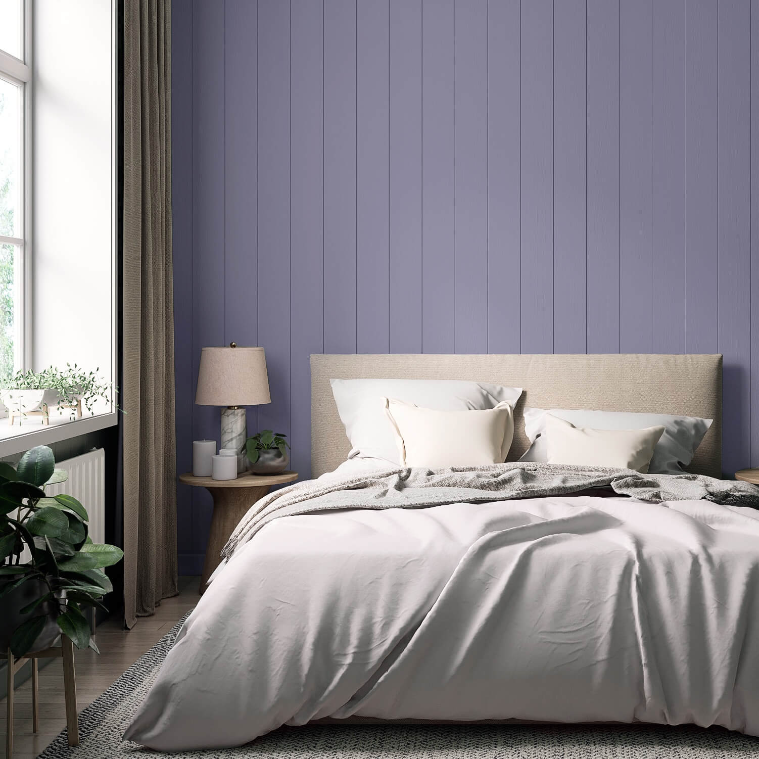
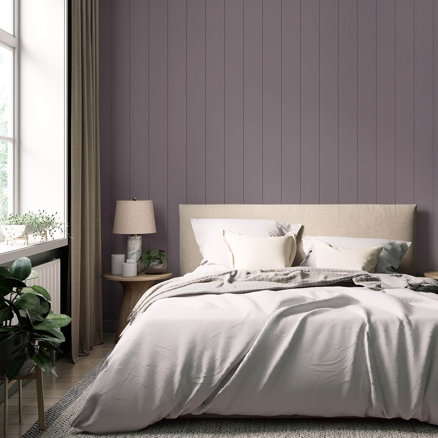
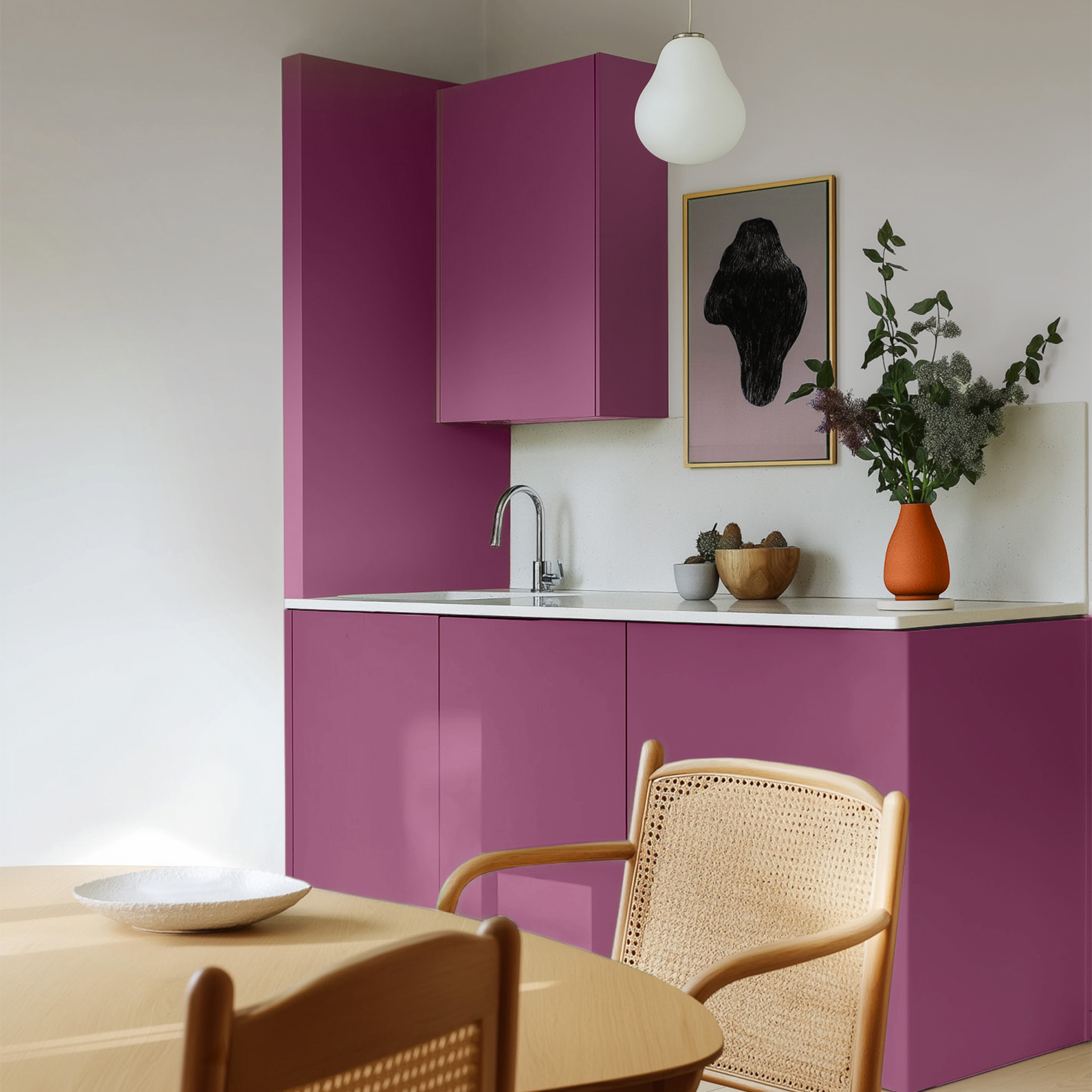
In the bedroom, a purple with blue undertones can promote sleep and relax the mind. Since wall paint in violet tones can sometimes have a very calming effect, we recommend a slightly reddish purple, such as Purple with Heather, for more intimacy. This shade also brings its stimulating aspect into the bedroom.
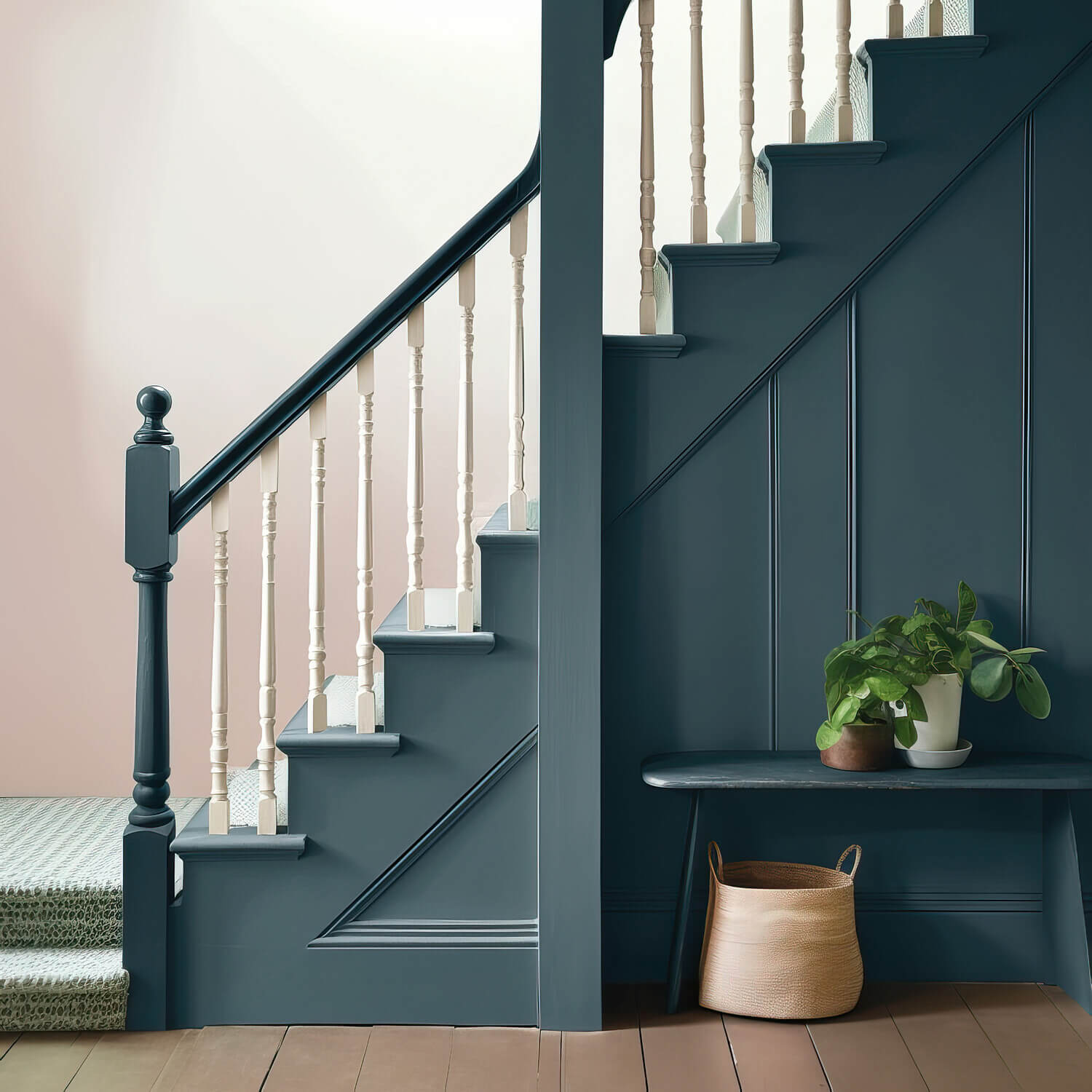
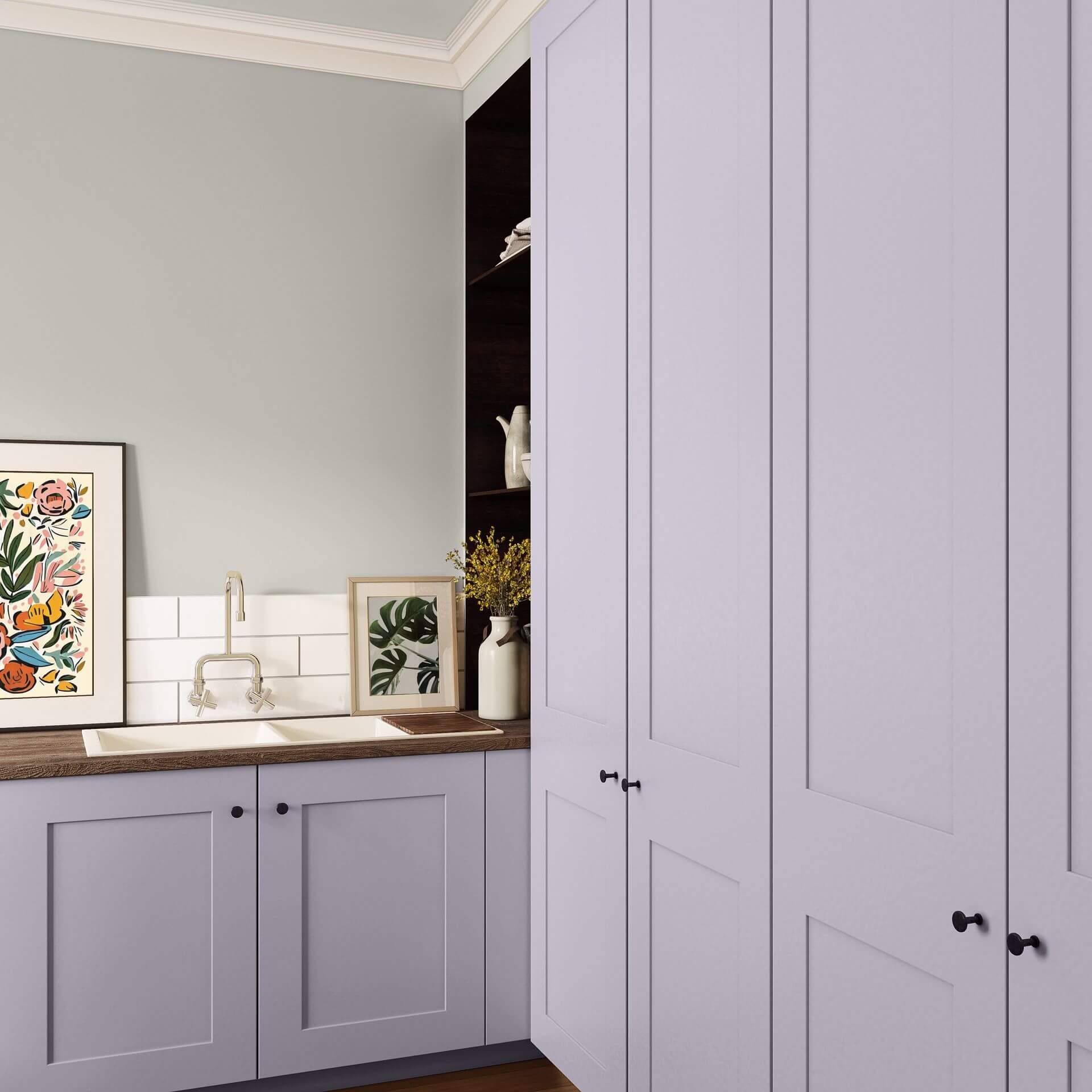
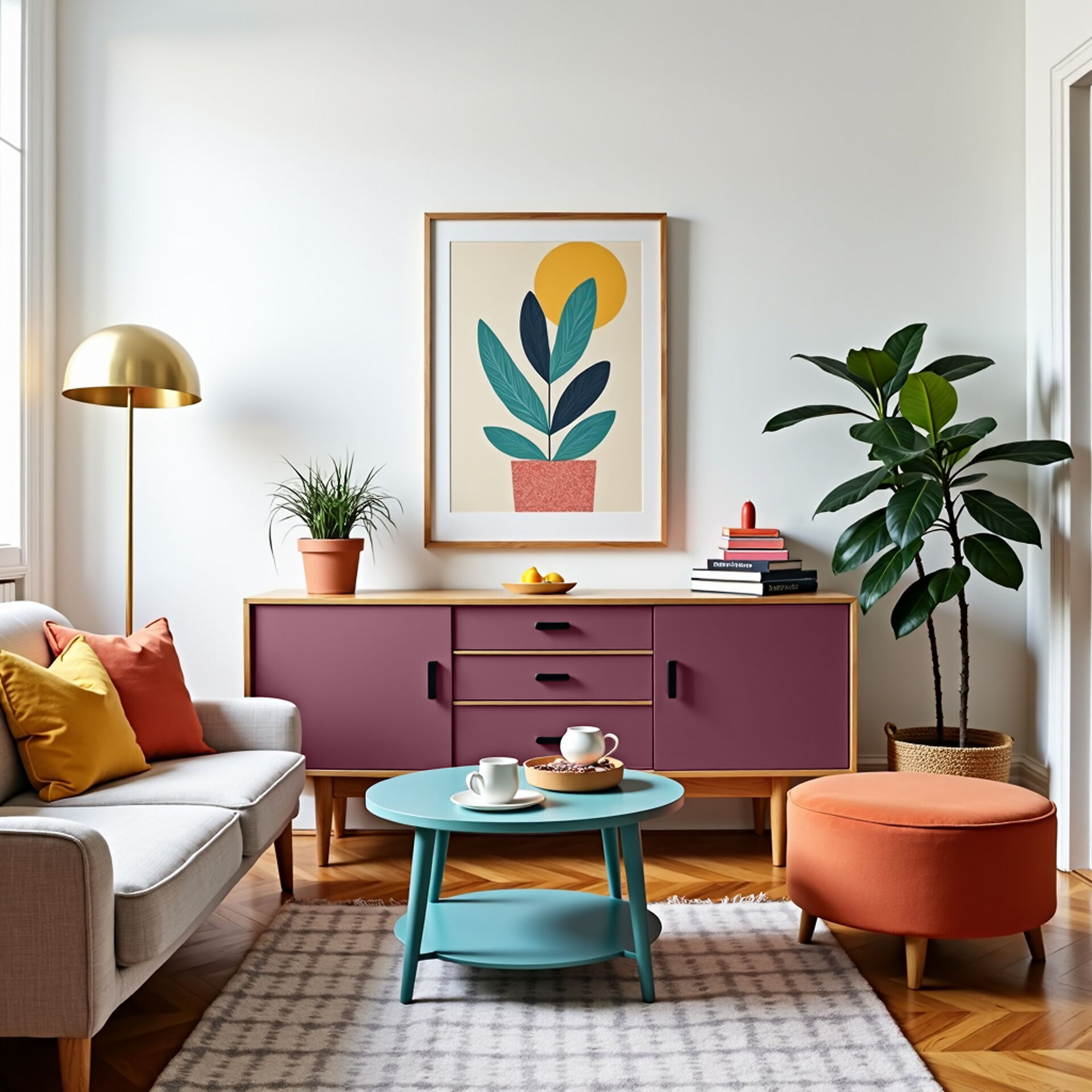
Combined with earth tones and minimal decoration, you can achieve your own distinct, confident look in your living room with a grey-purple wall paint. Alternatively, dark violet wall paint placed behind a sofa in spicy or light natural tones creates an almost mystical effect.
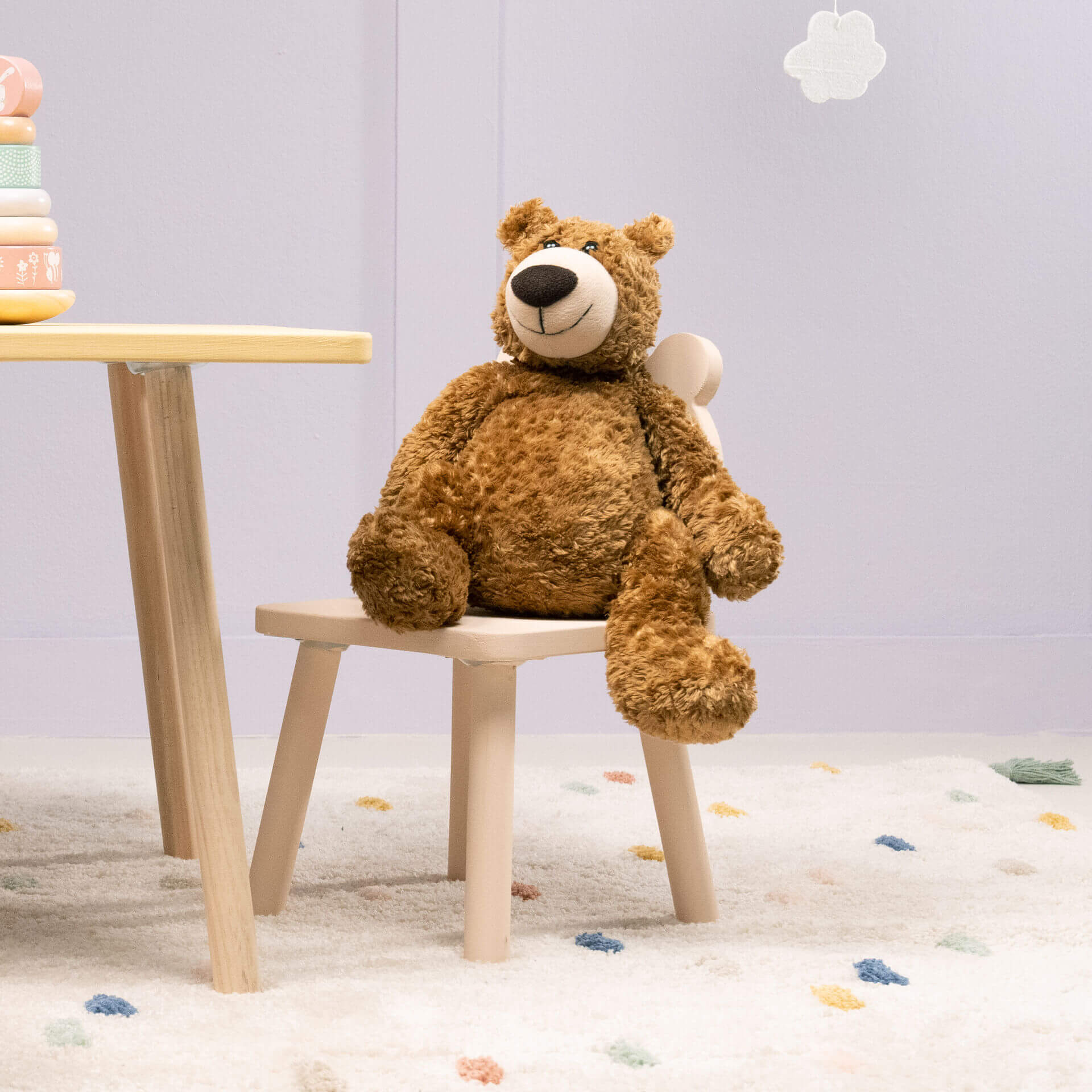
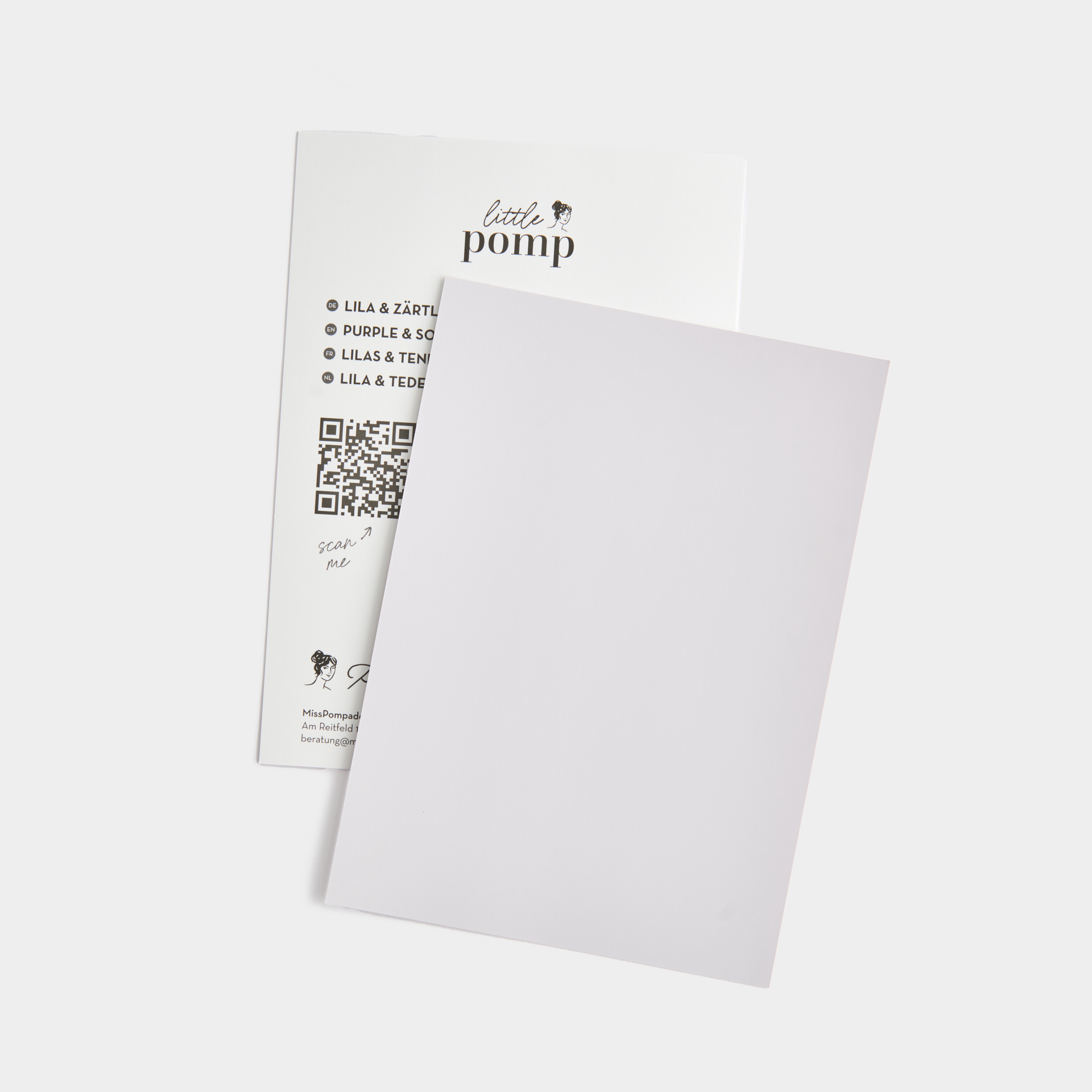
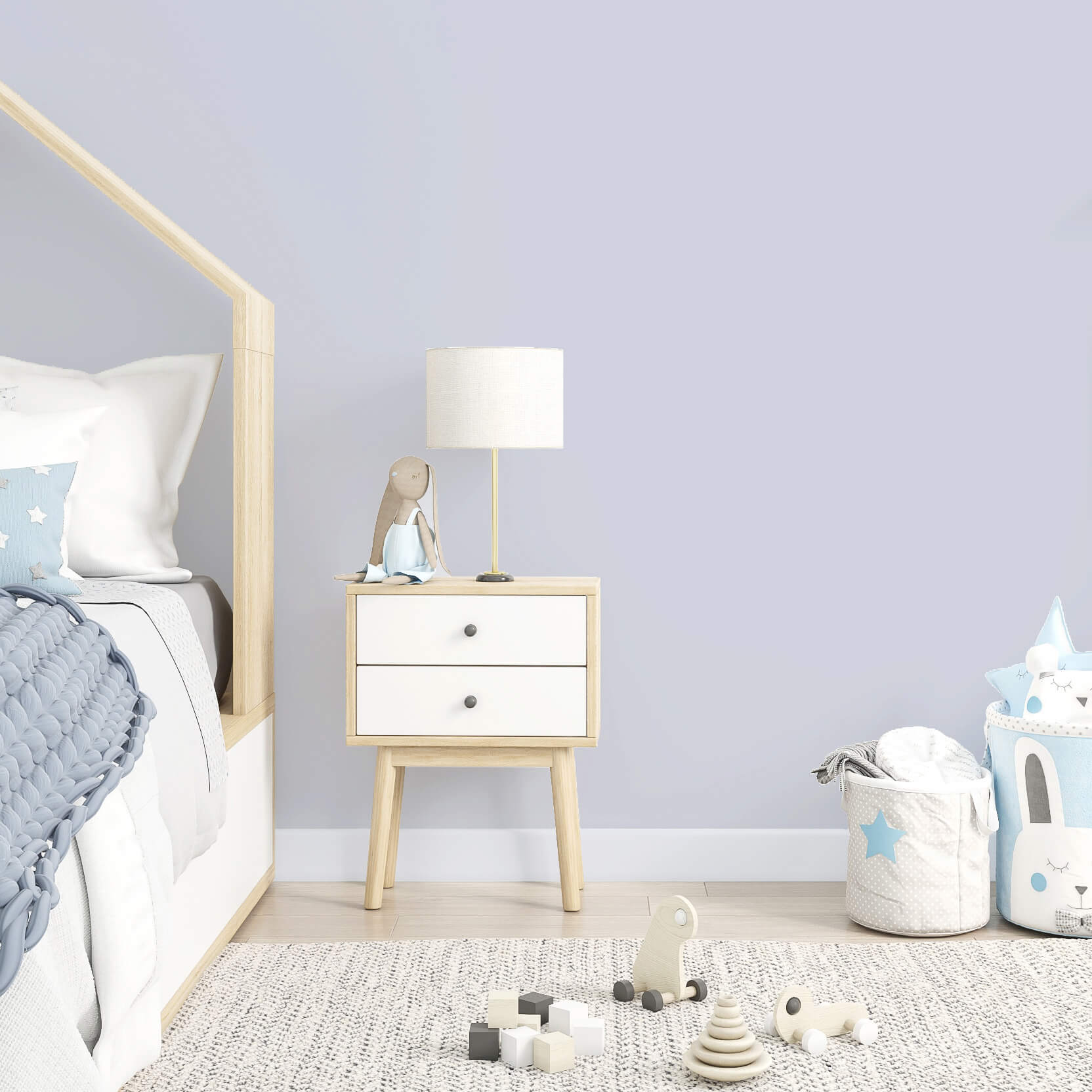
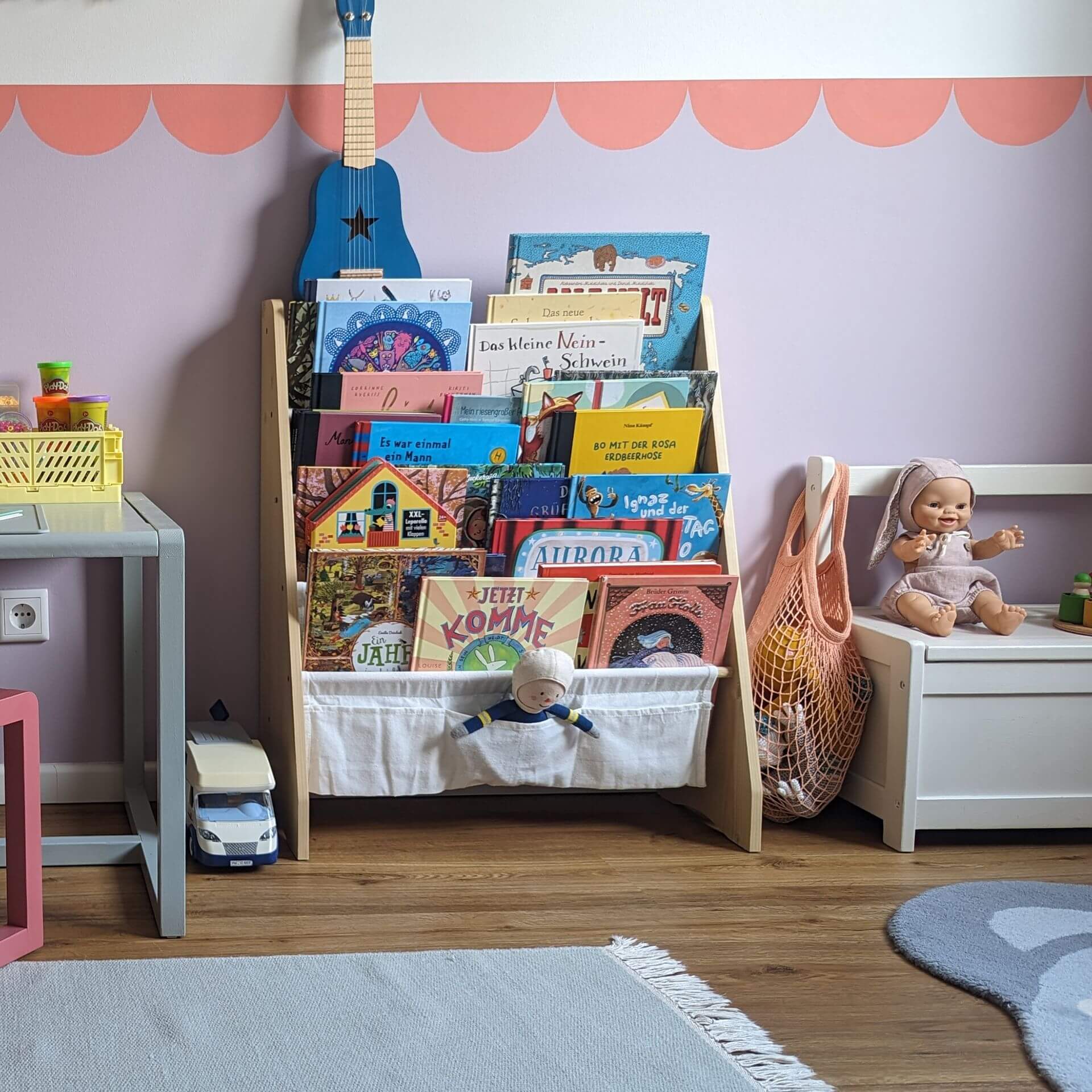
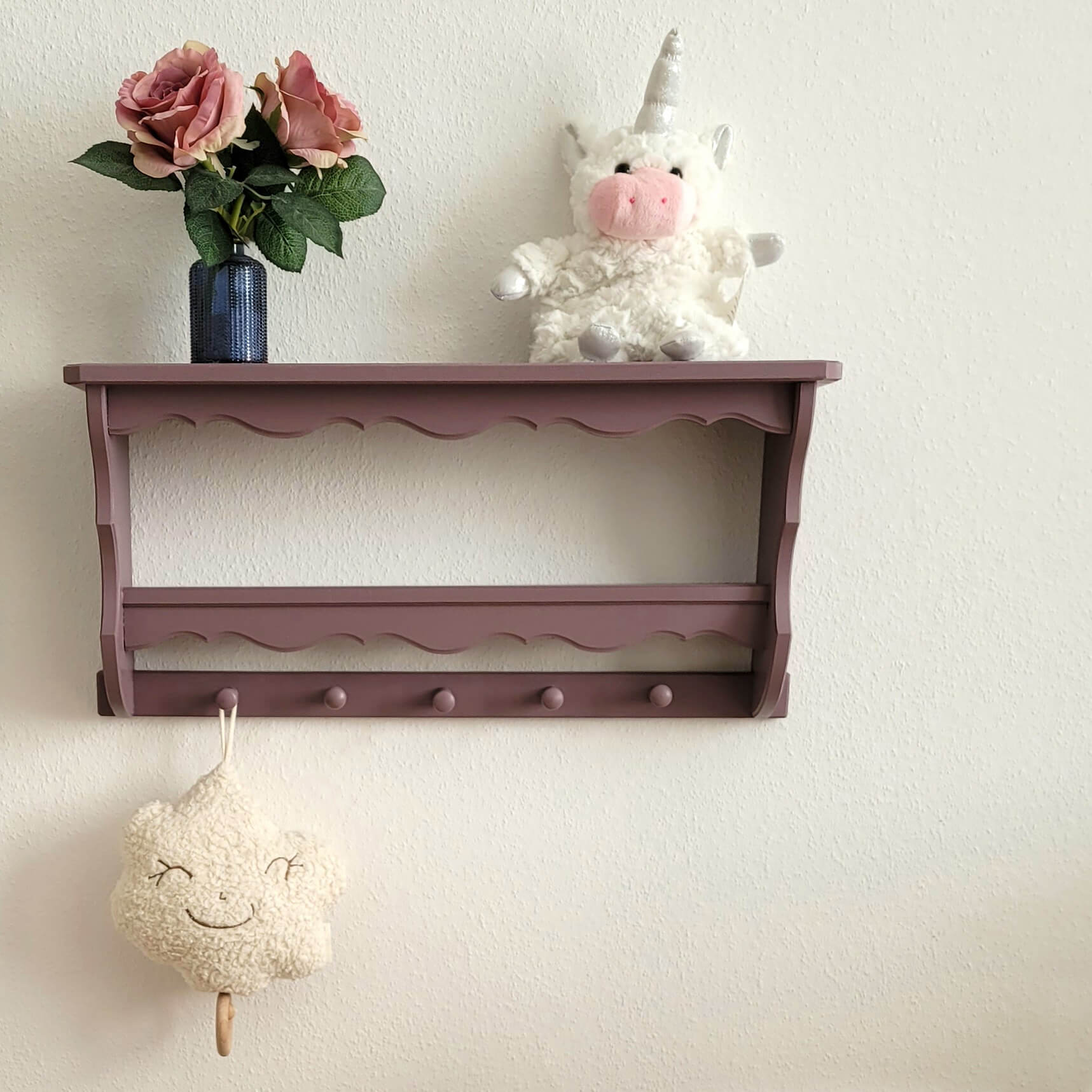
Little princesses often wish for purple as the colour for their nursery. You can easily fulfil this wish with wall paint in lavender or lilac. In the LittlePomp chalk paints collection, you will find Purple & Soft, a great wall paint for the nursery. Like all MissPompadour colours, this shade is of course also available as a lacquer, so you can paint nursery furniture and toys with it. You can also achieve a purple hue with pink-violet wall paint. With these nuances, you create a relaxing and balancing atmosphere in the nursery while simultaneously promoting your children's creativity.
Tips for the trend colour violet
Especially with a colour as versatile as violet, it is fun to try different variations. That is ultimately what makes this shade so special. If you are still looking for design tips, we have put together some more information for you.
Interior styles and trends in purple shades
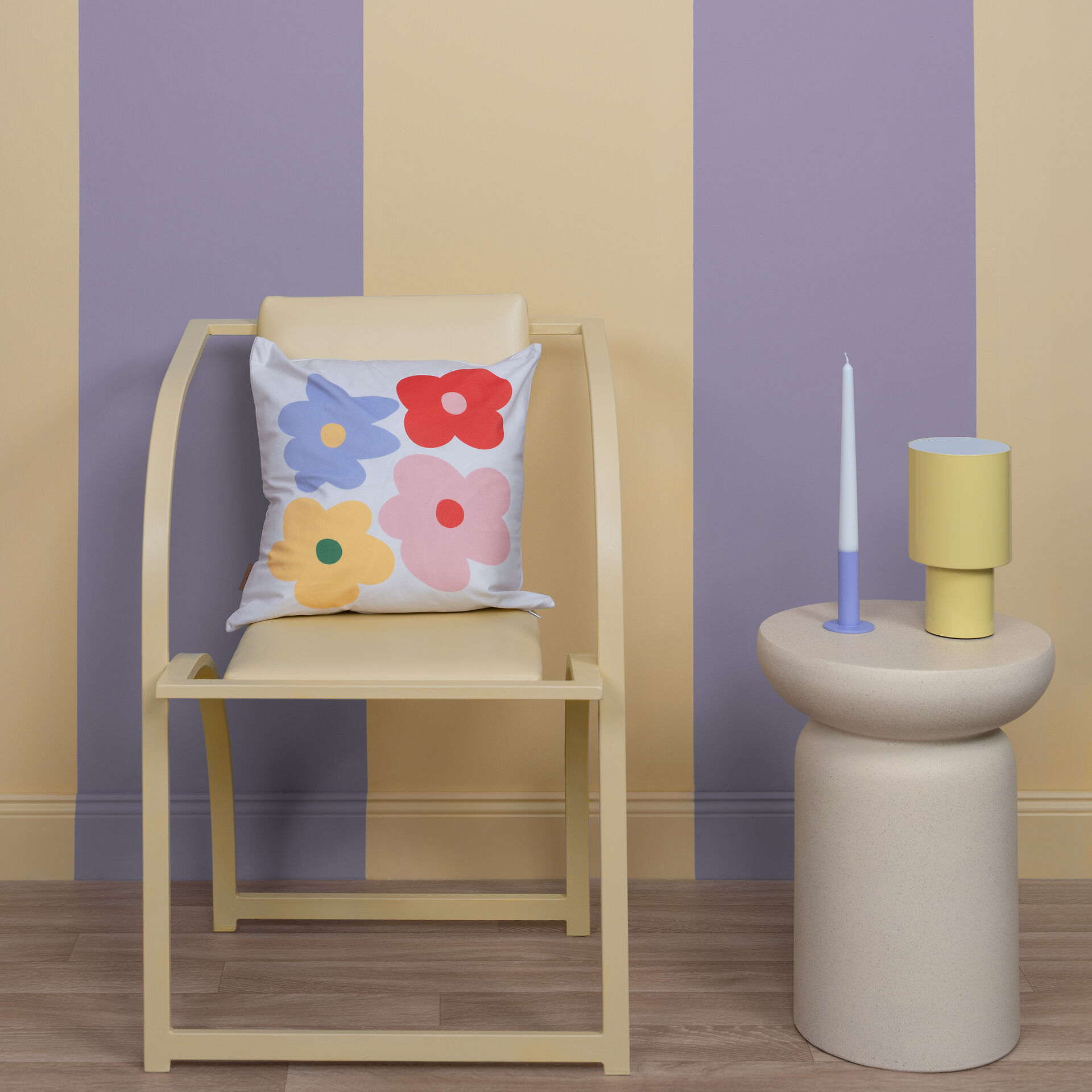
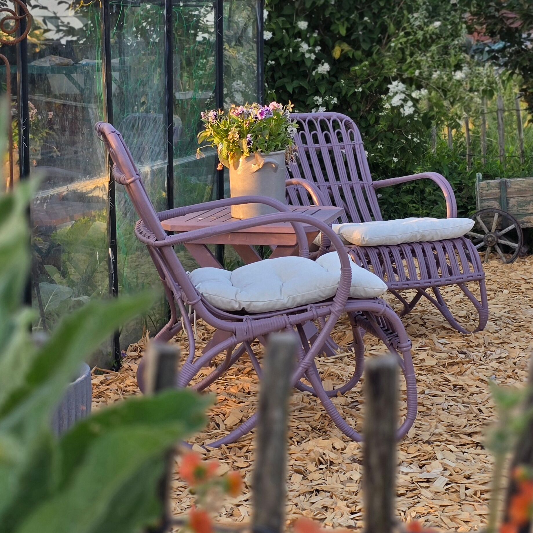
In the Orient, you often find bold, strong colours. If you like the oriental interior style, feel free to choose a strong purple. Combined with gold and orange accents, you can create rooms straight out of 1001 Nights. You can also draw from the full colour samples in the Urban Jungle style. Intensive violet tones like the rich Purple with Provence or the wonderful Purple with Fig fit in perfectly here. The colour purple also goes well with the Boho style, as this style thrives on a mix of woven fabrics, macramé, retro influences, and pattern mixing. Bold colours like Purple with Heather or Purple with Provence match it wonderfully.
The Whimsical style conjures a fairytale atmosphere in your home. Here you can play with strong violet like Purple with Blueberry, gold, and flourishes. If you prefer to decorate romantically in pastel colours, paint a wall in a delicate pastel purple like Tender Rose from CosyColours, as it pairs perfectly with all other pastel colours. This versatile colour also fits an ideal modern style. Design tip: Combine purple and violet with chrome, silver, or glass to create a contemporary interior.
Do you already have a precise idea of how you would like to design your rooms? Then choose your favourite shade in our online shop now and start your painting project!
Combination colours for purple & lilac
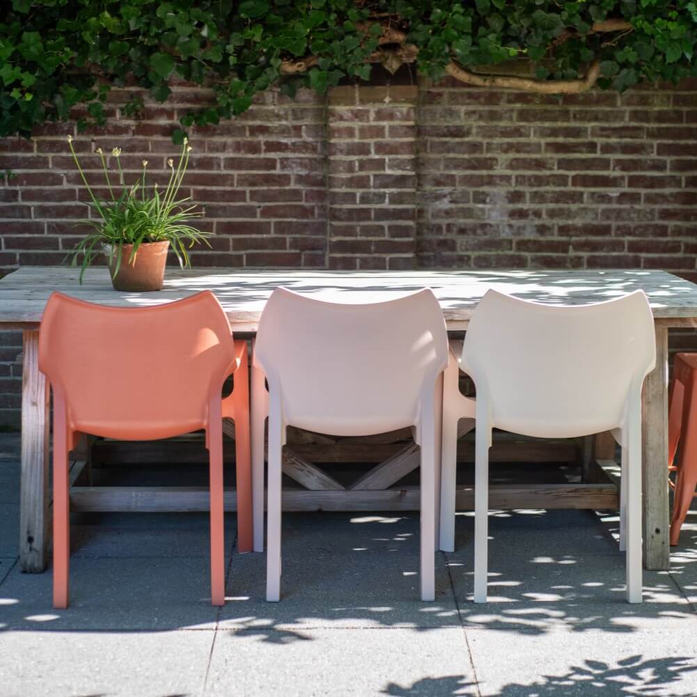
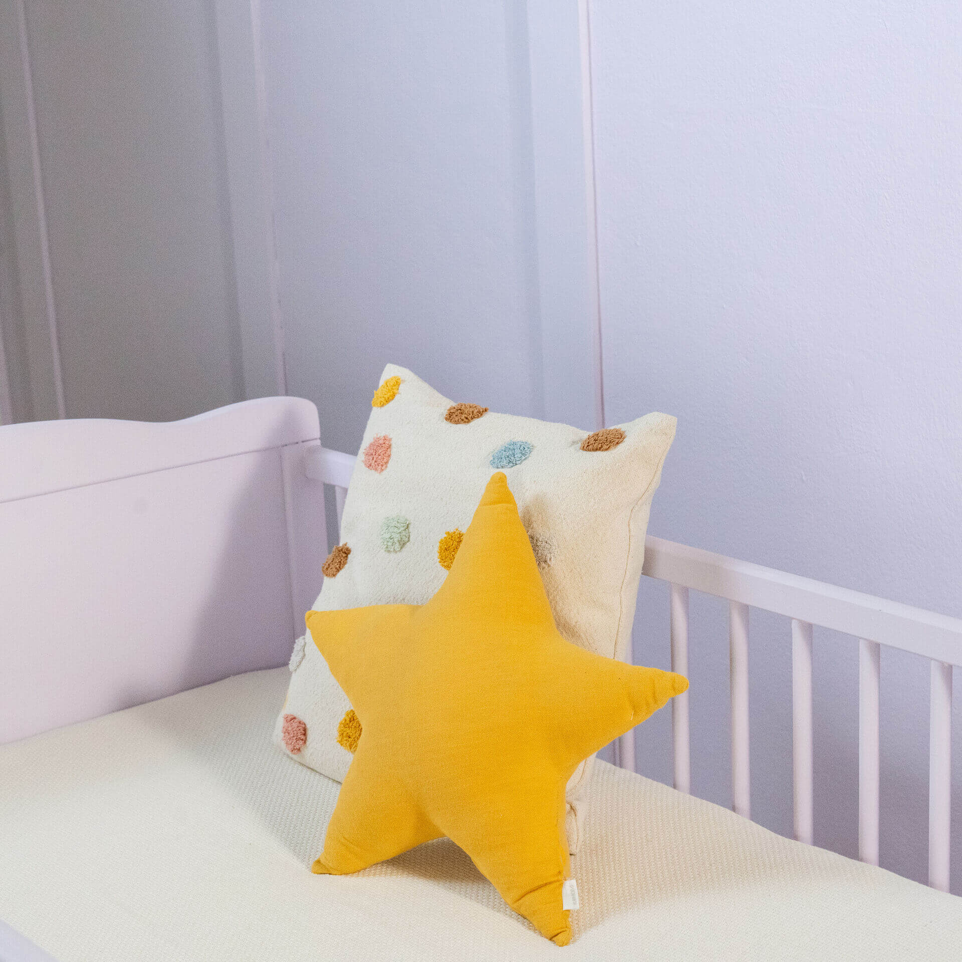
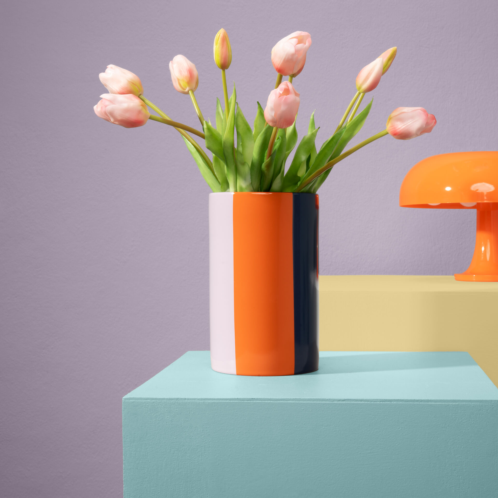
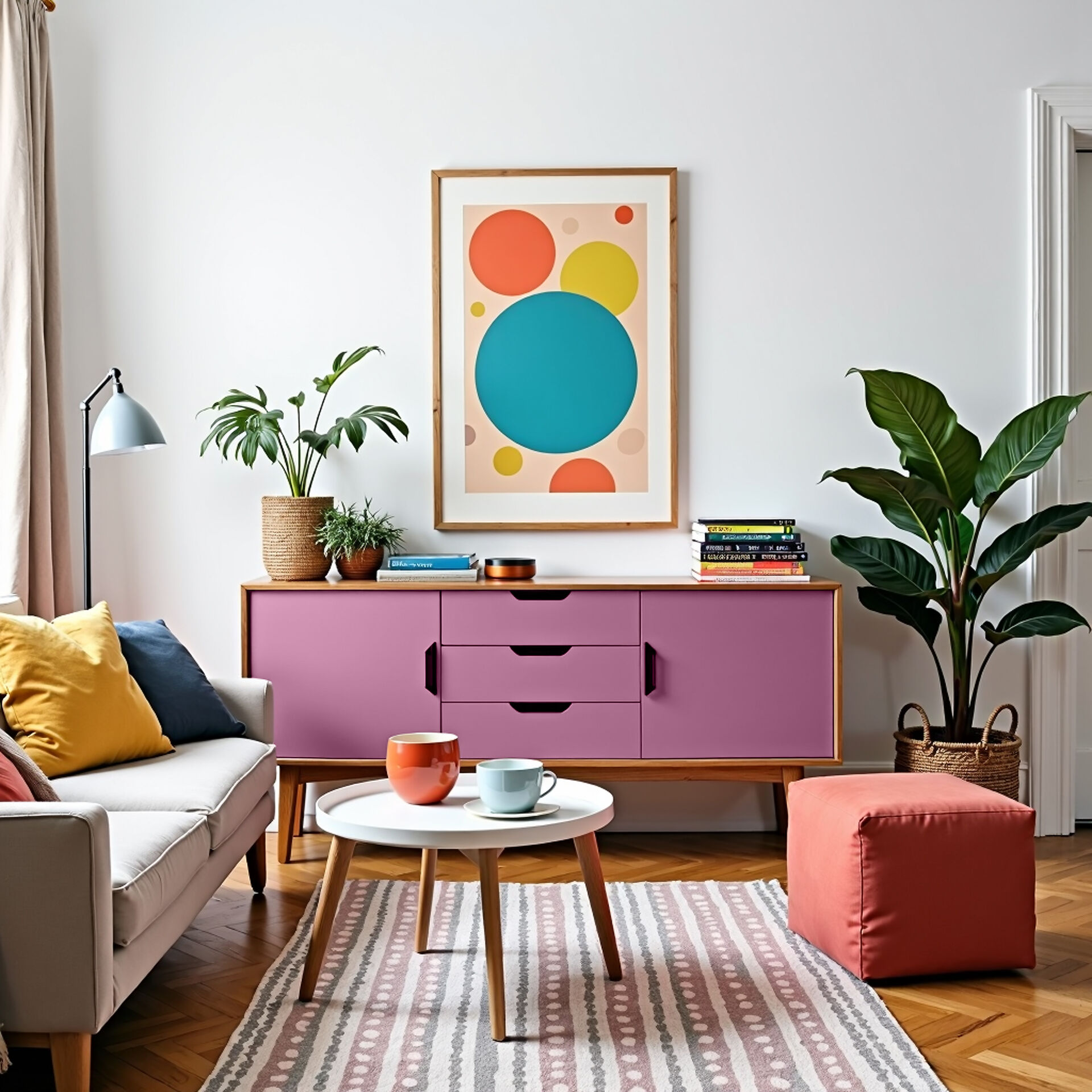
The complementary colour of purple is yellow, and it provides a great contrast to dark purple. But other bold colours also work wonderfully. For a playful look with pastel purple nuances, you can combine other pastel colours like pink, light yellow, or light blue. If you prefer a purist look, combine it with grey.
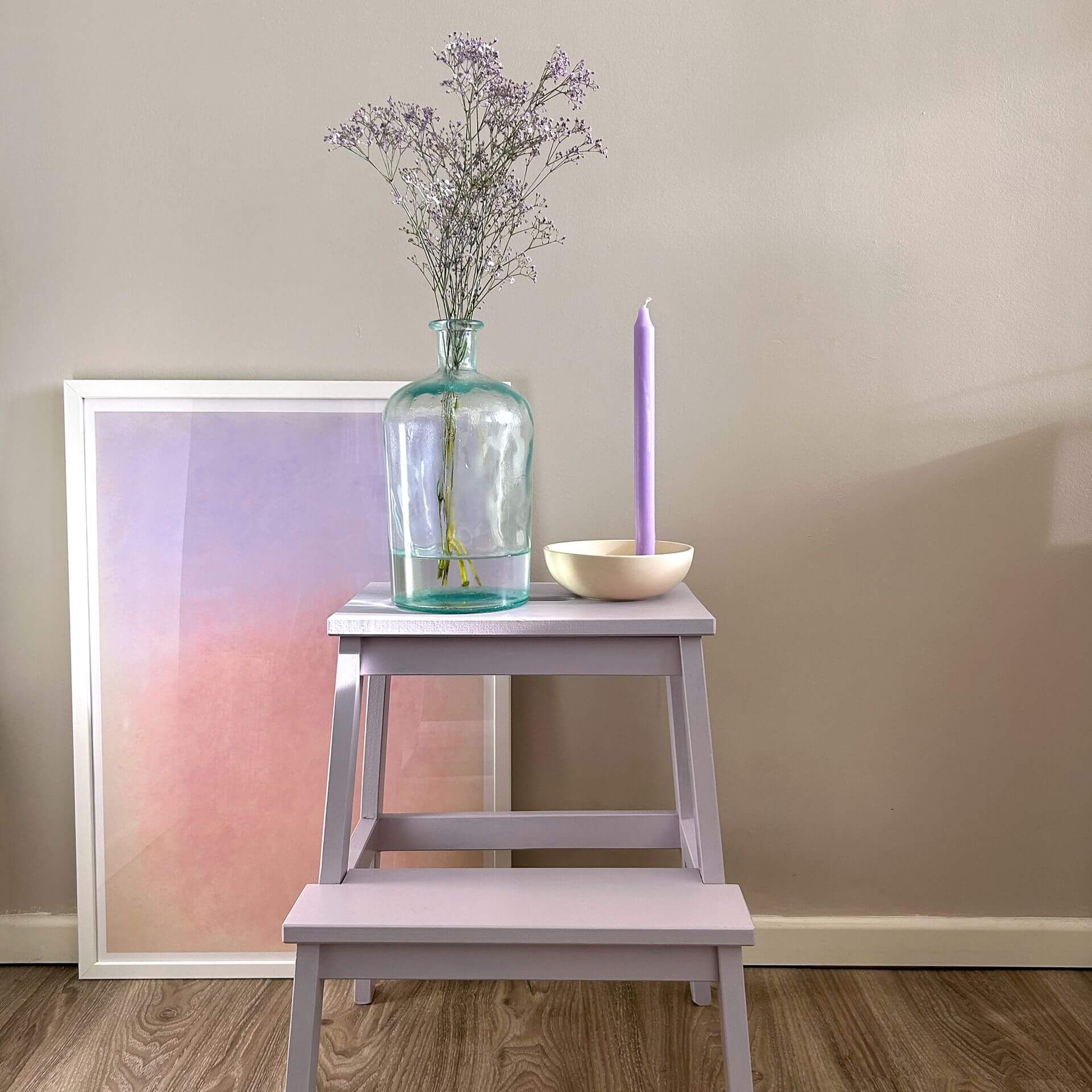
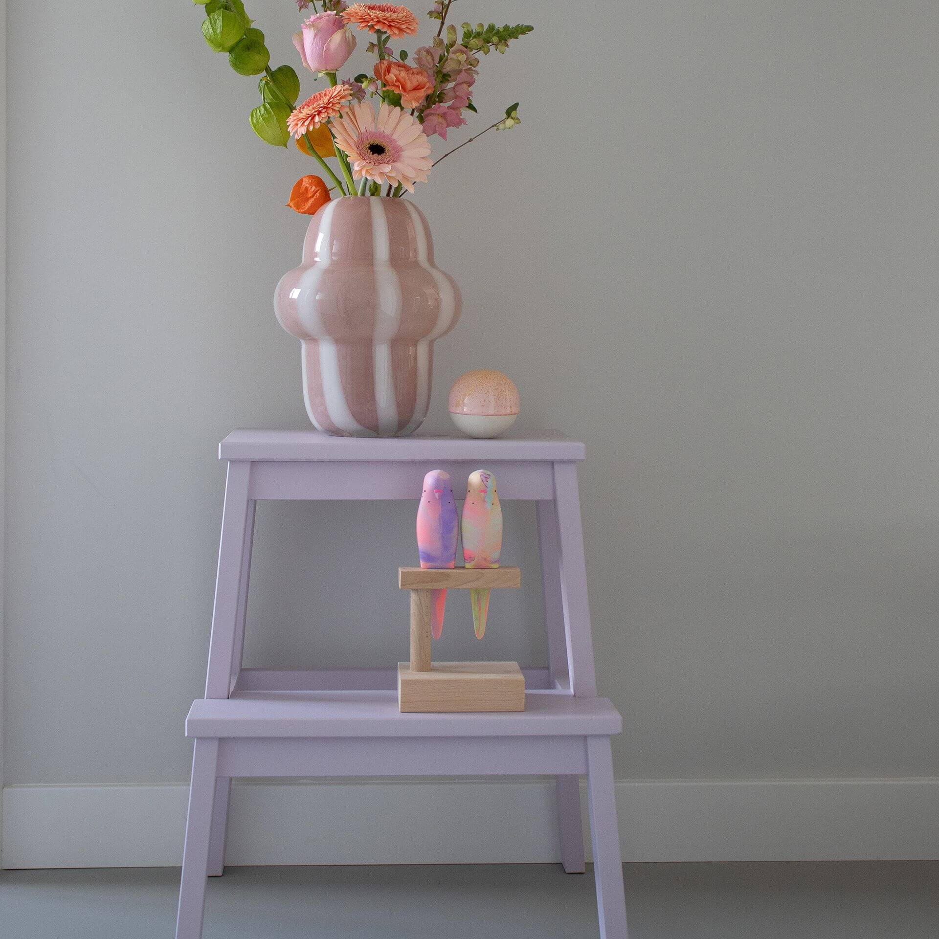
Create a great combination by painting a wall light violet and placing a piece of furniture painted in a lacquer a few shades darker from the same colour family directly in front of it.
Decor ideas for the colour lilac & co.
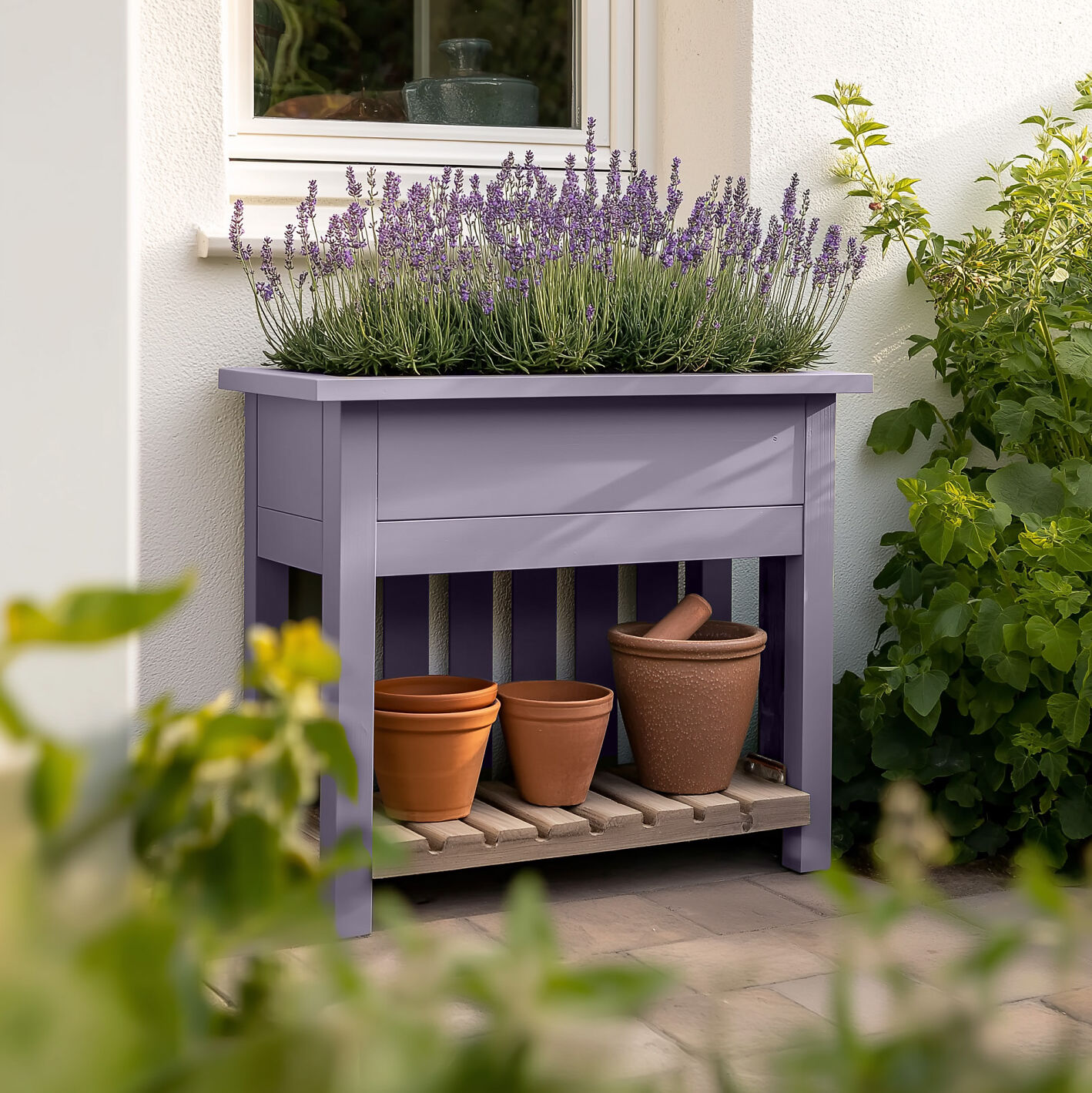
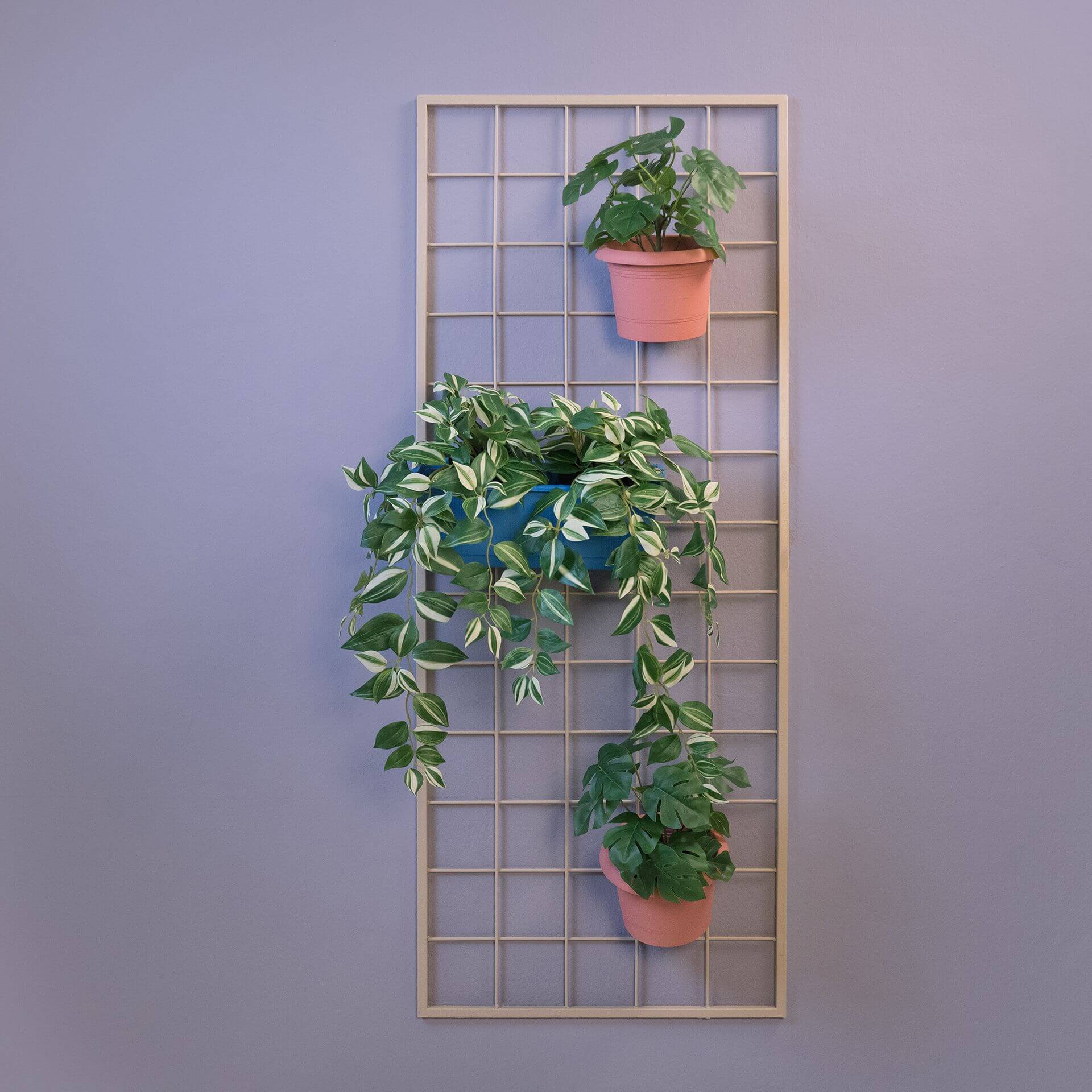
You can combine natural materials and plants with light and pastel violet. Fabrics in natural colours and grey wall paint also go well with it. You can also combine purple and violet nicely with grey wood, white furniture, and colours that tend towards grey – such as Beige with Cashmere.
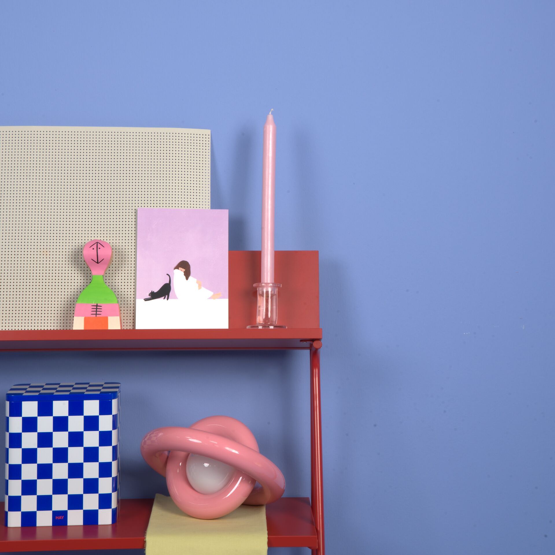
If you have painted with a strong, dark violet, gold and velvety elements fit in wonderfully. Cushions or pictures in orange and yellow also create a great impression. If you like a modern interior style, use black furniture and decorations.
The MissPompadour “Violet” project guide
Your project in violet: From creative energy to gentle relaxation
In our project guide, we show you how to use the transformative power of violet. Whether you want to create a meditative oasis of calm in the bedroom or make a bold statement in the living room: we have the right inspiration and the right product for you. Immerse yourself in the world of lilac, mauve, and purple and start your next painting project!
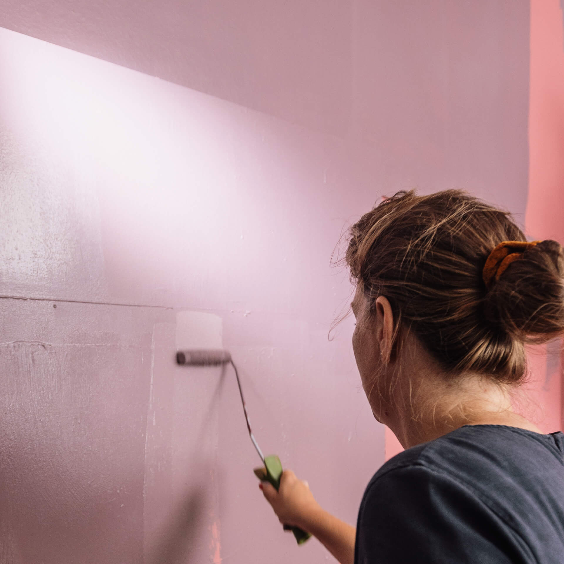
Wall paint violet: Magic for your walls
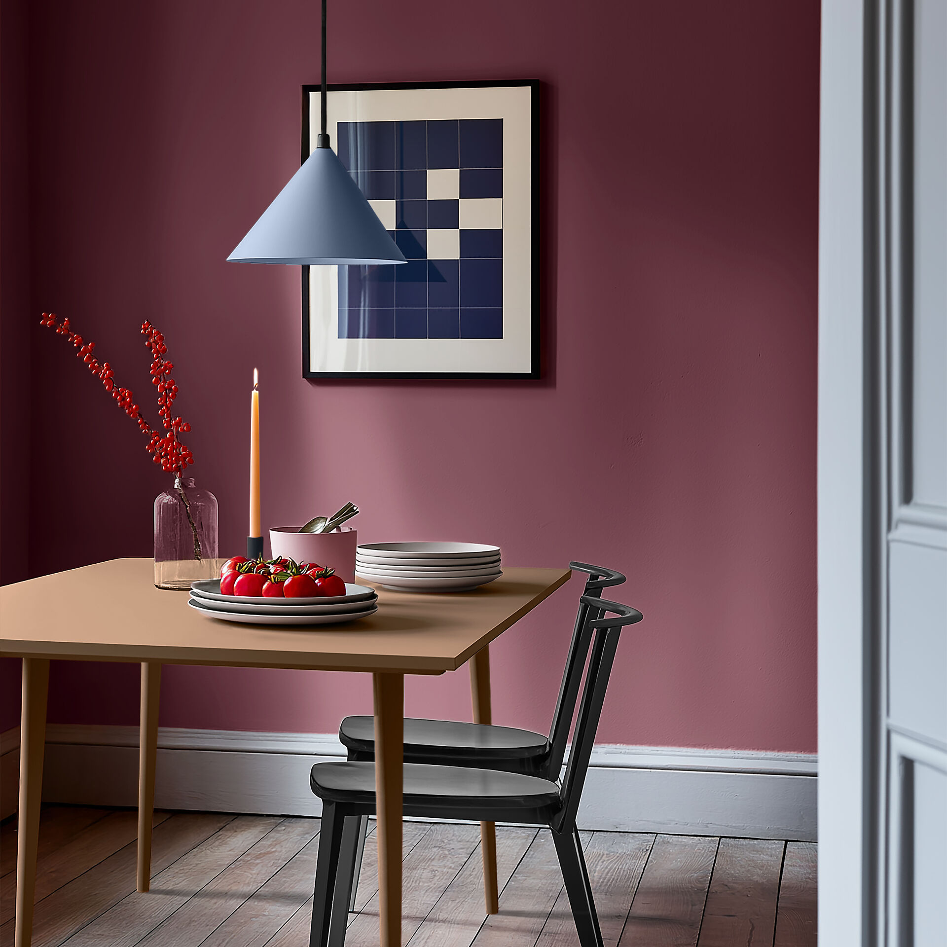
Purple is a powerful colour and its effect is as diverse as its nuances. As a mixture of the two primary colours blue and red, which stand for water and fire, it unites opposites and therefore has a calming and balancing effect in colour theory. Lilac appears feminine, light, and mature. Dark purple, on the other hand, stimulates reflection. Overall, violet promotes creativity and productivity.
Wall paint in violet or delicate lilac changes the atmosphere of your home instantly. While light tones such as Purple with Lavender open up rooms visually and provide brightness, dark nuances like Purple with Blueberry lend your walls a mystical depth. Our matte wall paints adhere perfectly to plaster and wallpaper and offer excellent coverage.
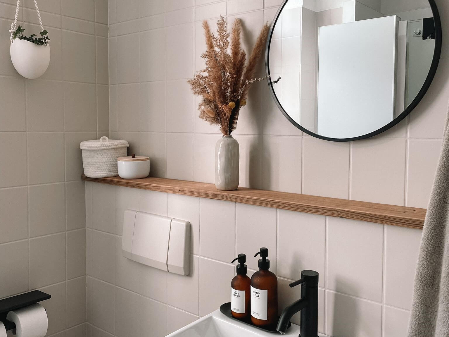
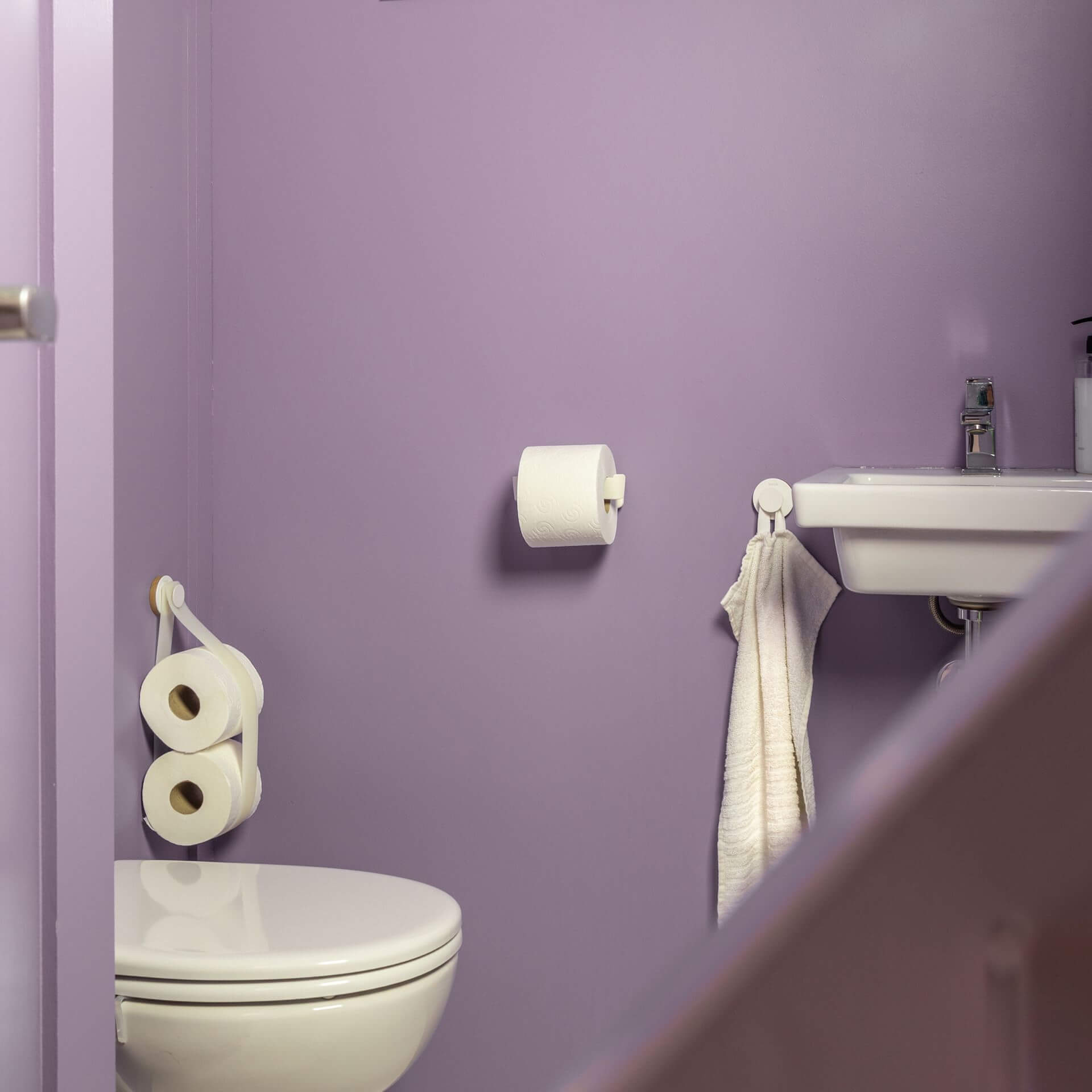
Tile paint violet: Your bathroom as a wellness oasis
With tile paint in violet, you create an unexpected eye-catcher in the bathroom. Especially in combination with silver fittings, a purple with blue undertones looks extremely elegant. You can use our durable tile paints in purple without the hassle of sanding. Clean the tiles thoroughly and apply a coat of our primer To Bond & Block beforehand so that the paint can adhere well to the smooth tiles — after that, you can get started with the paint application.
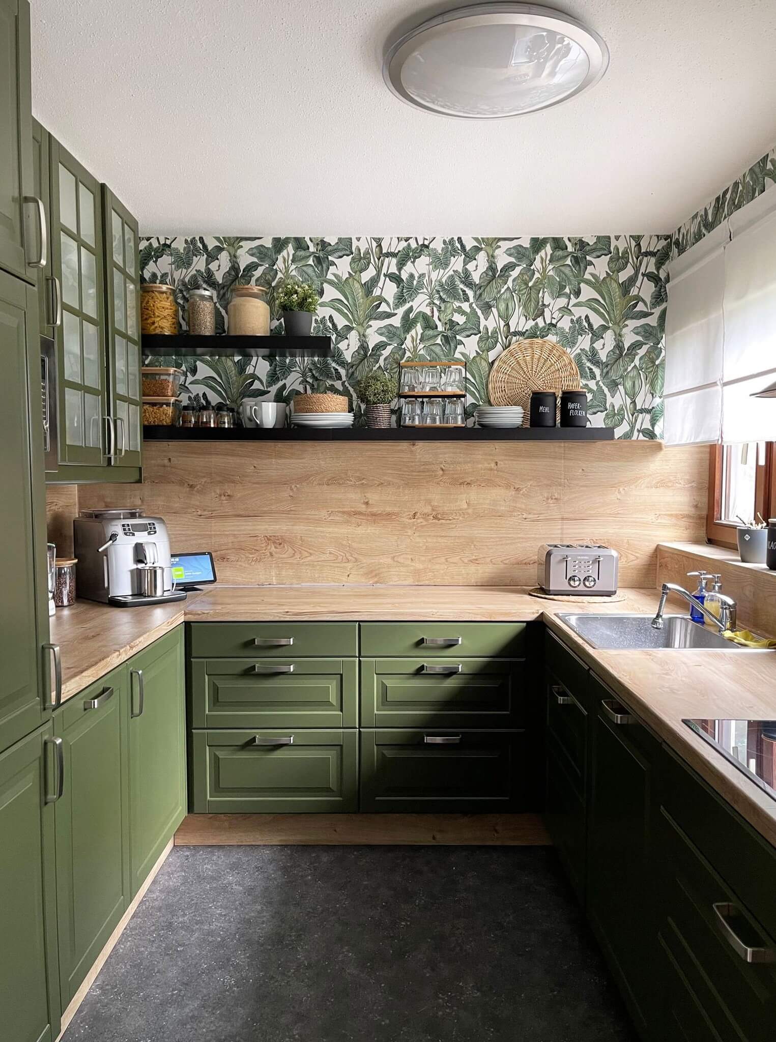
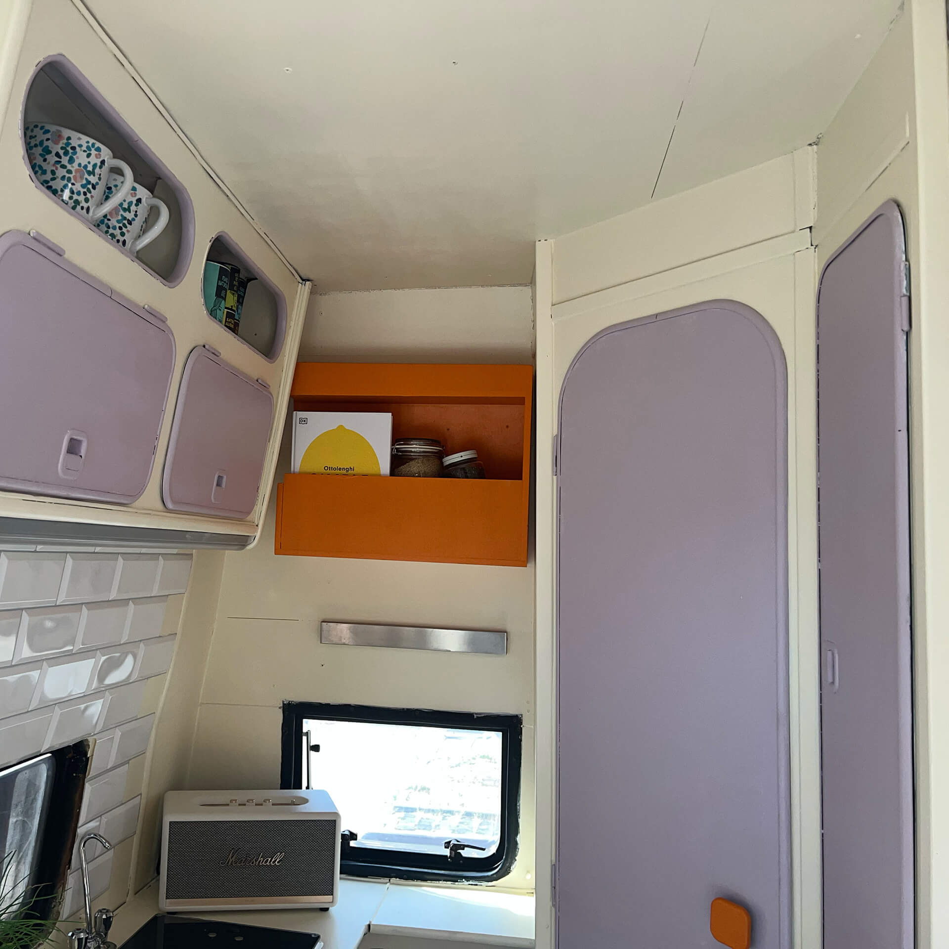
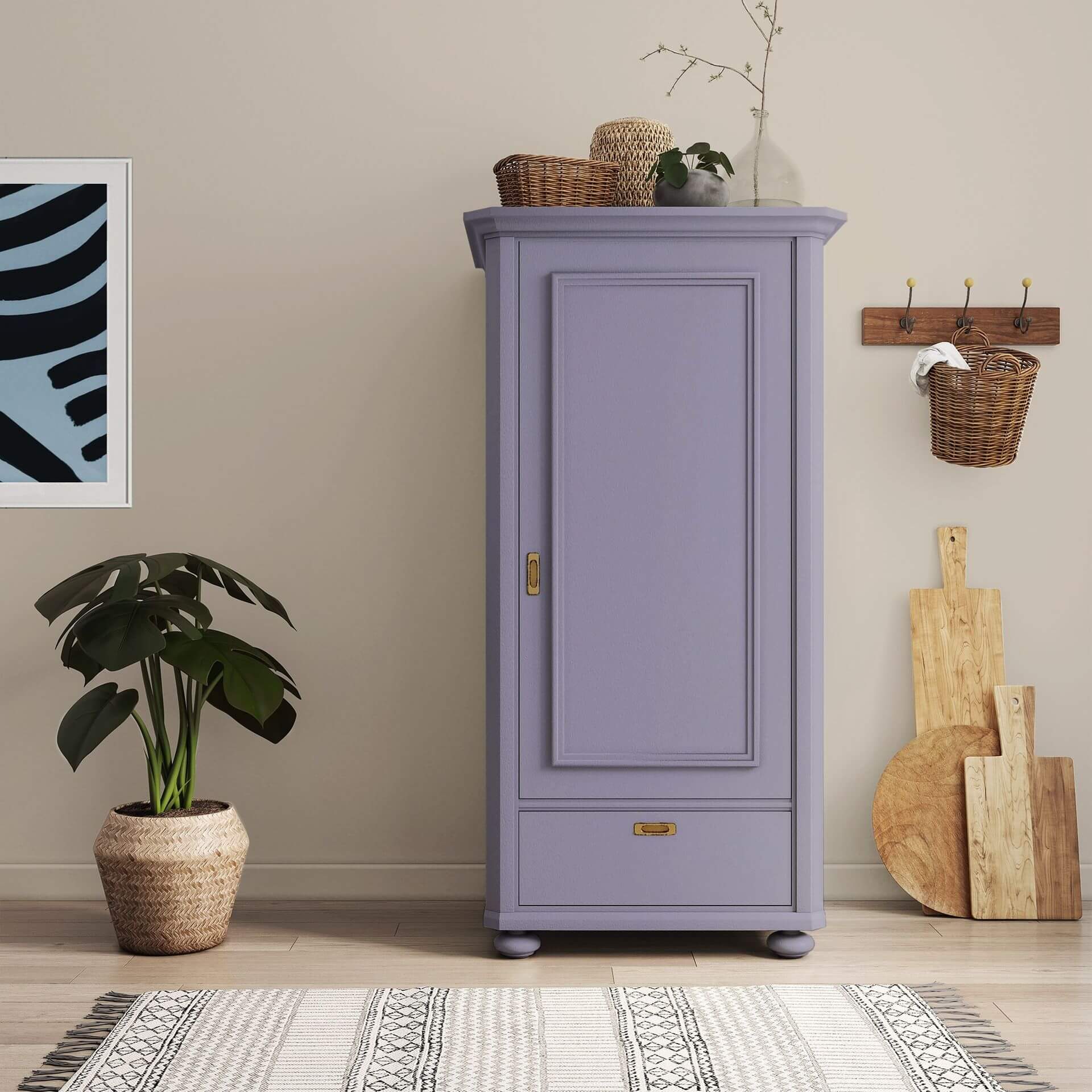
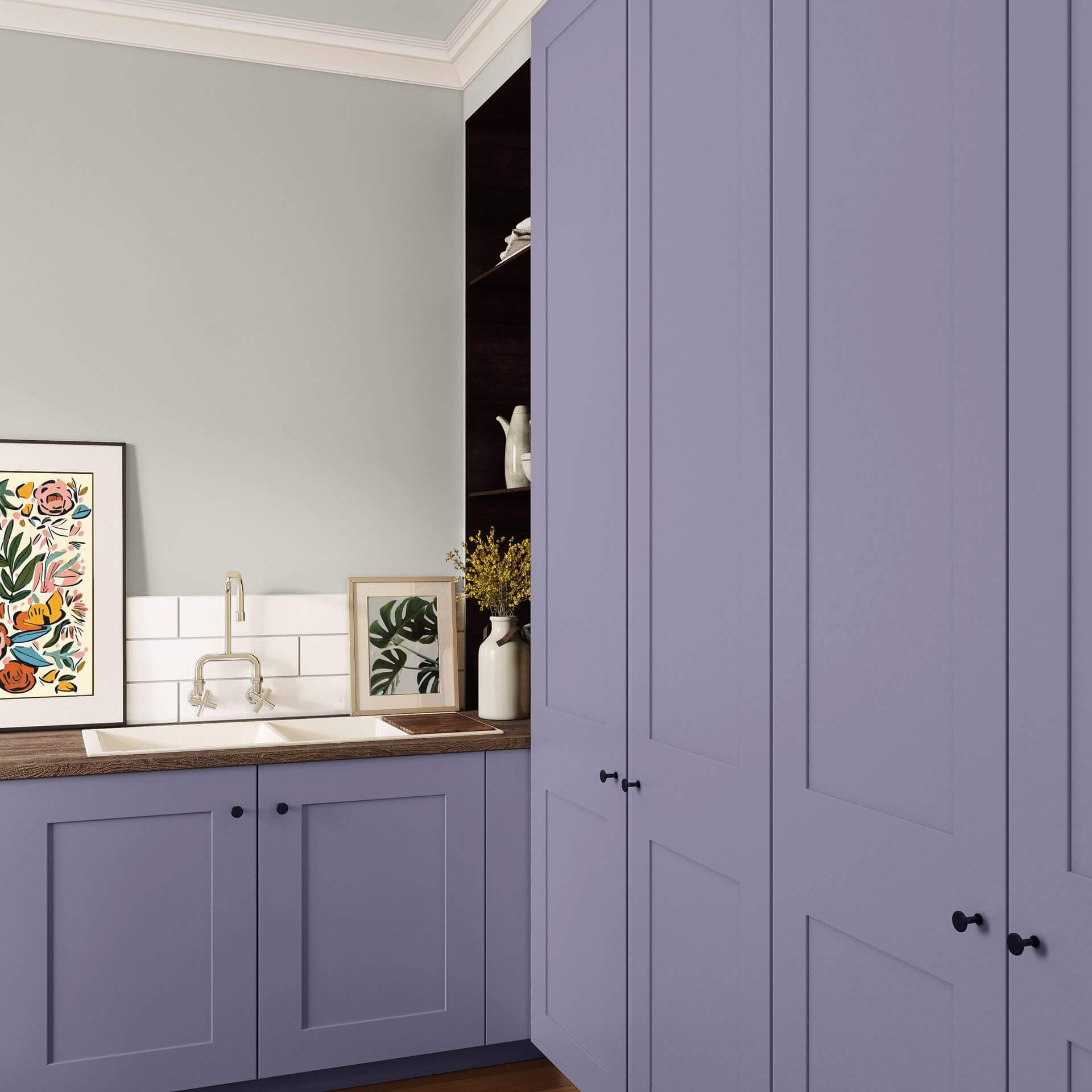
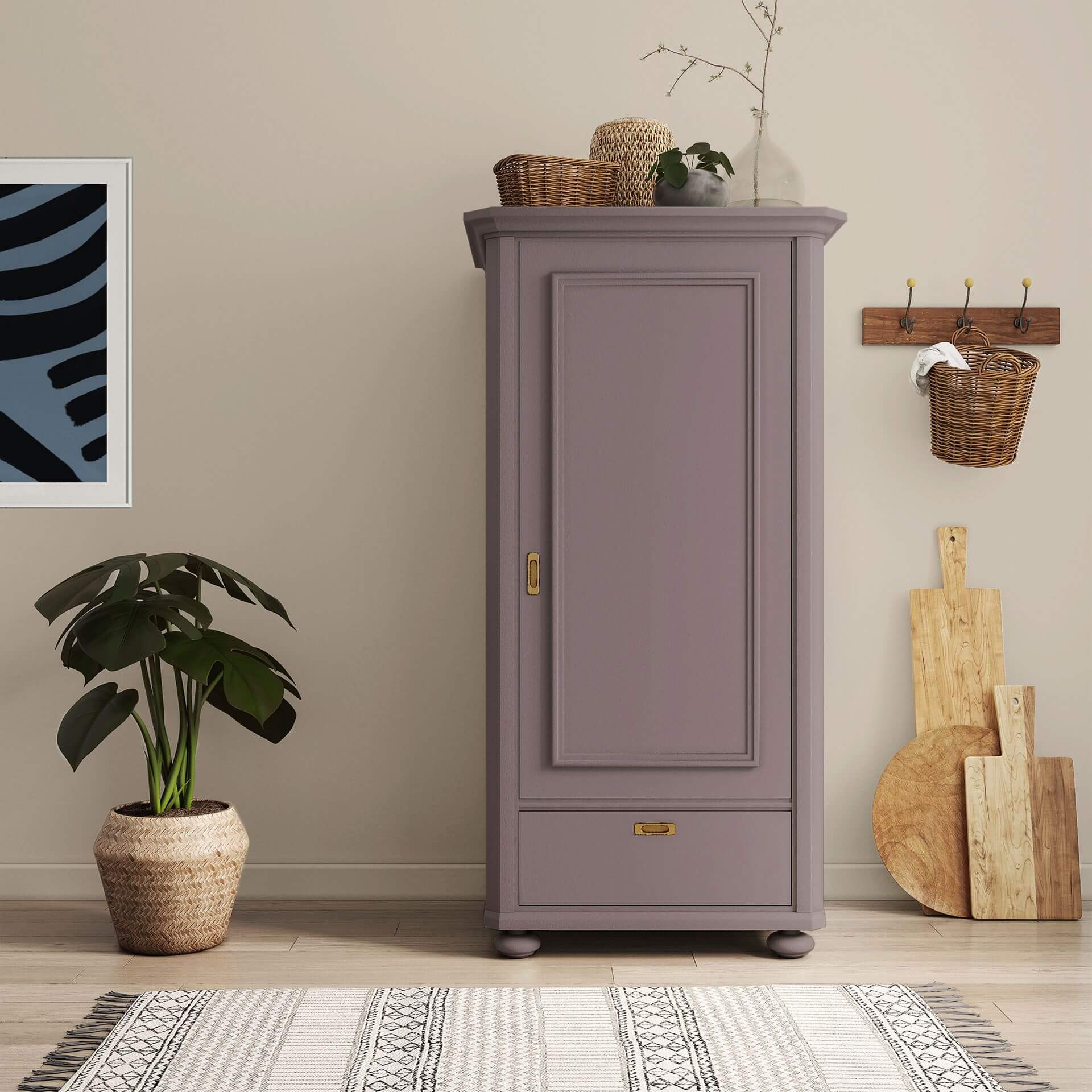
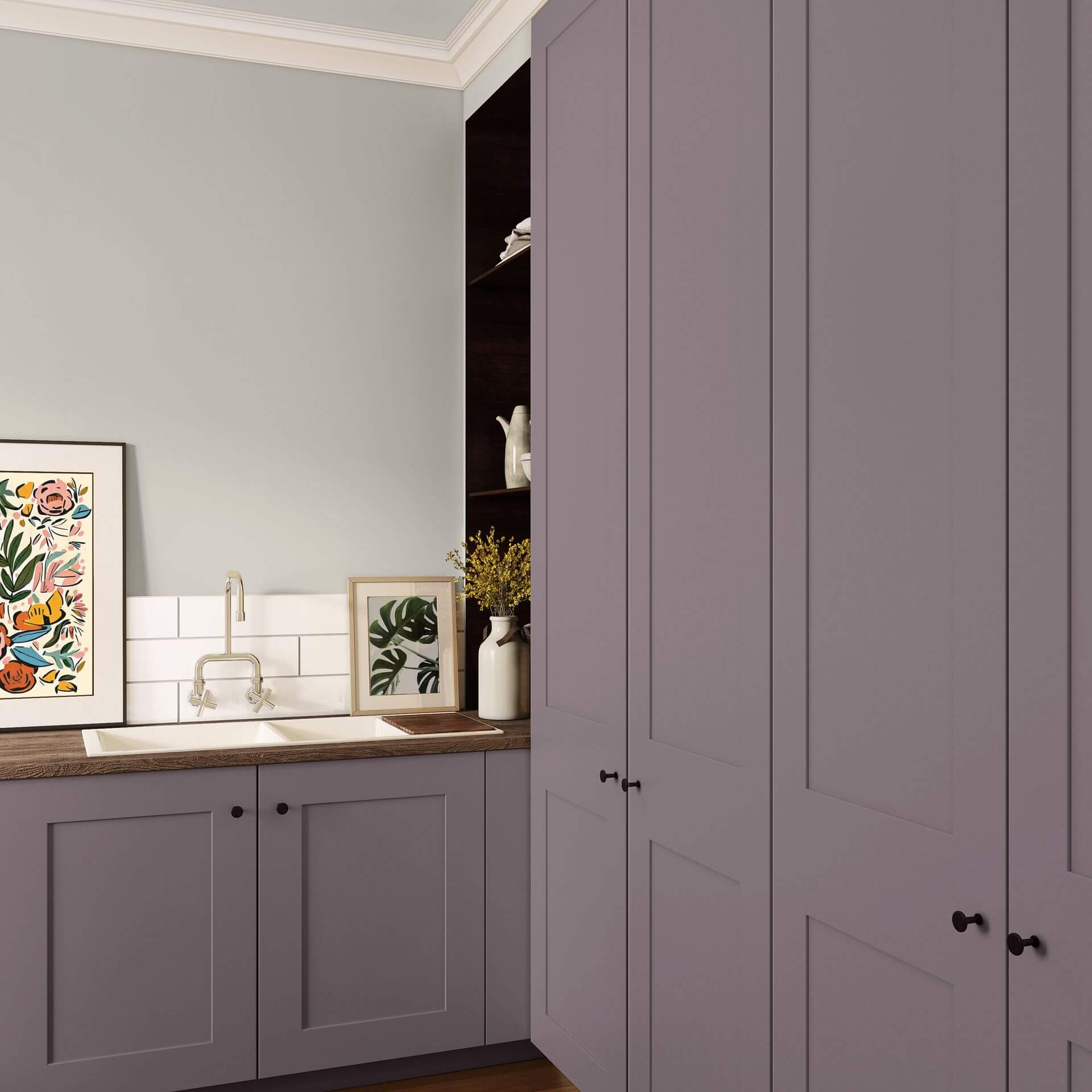
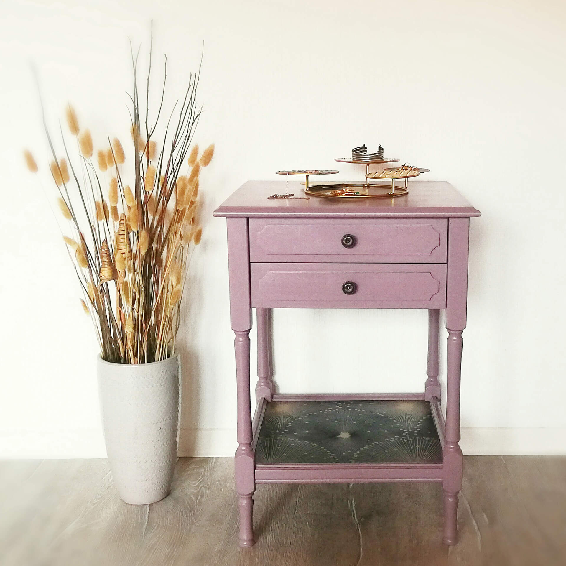
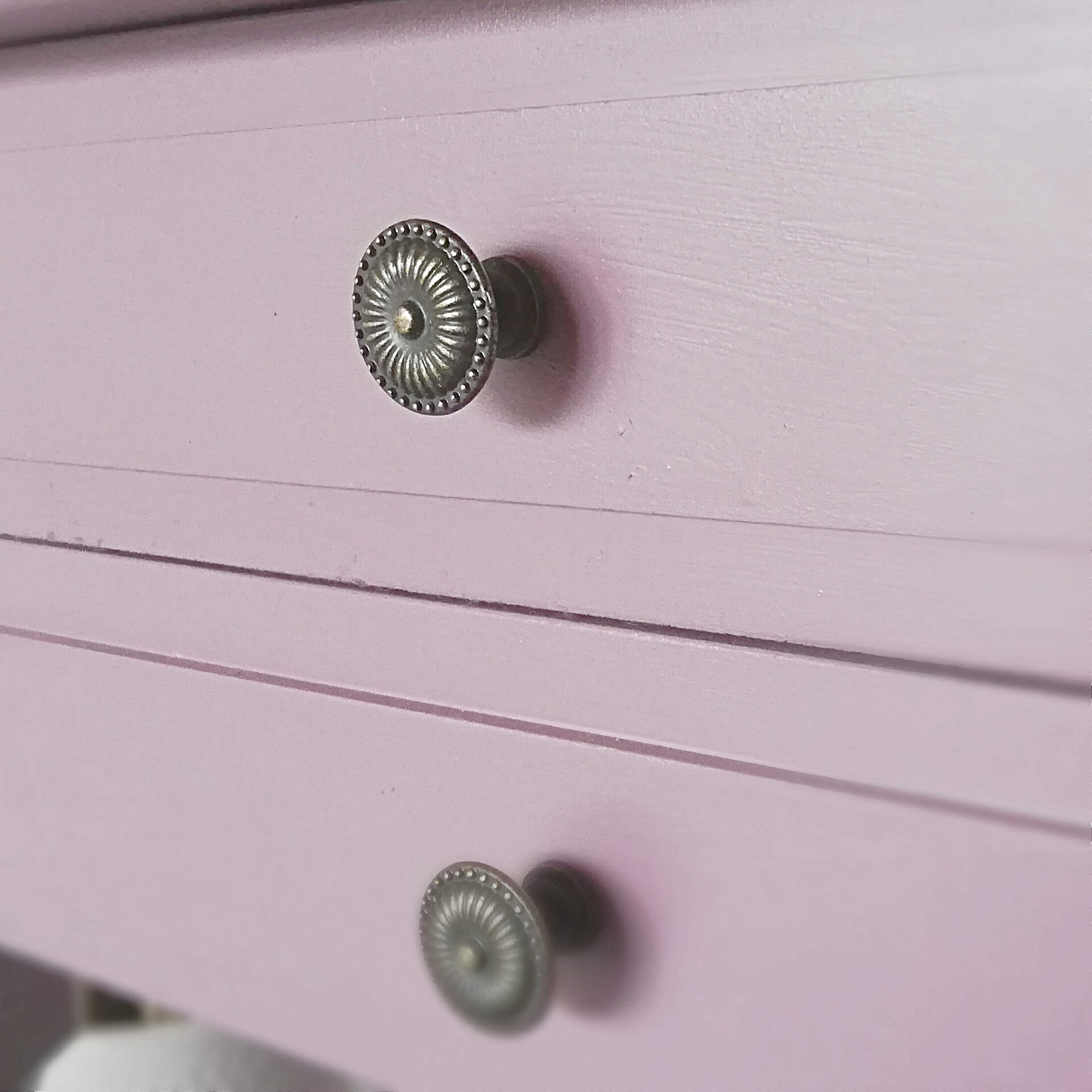
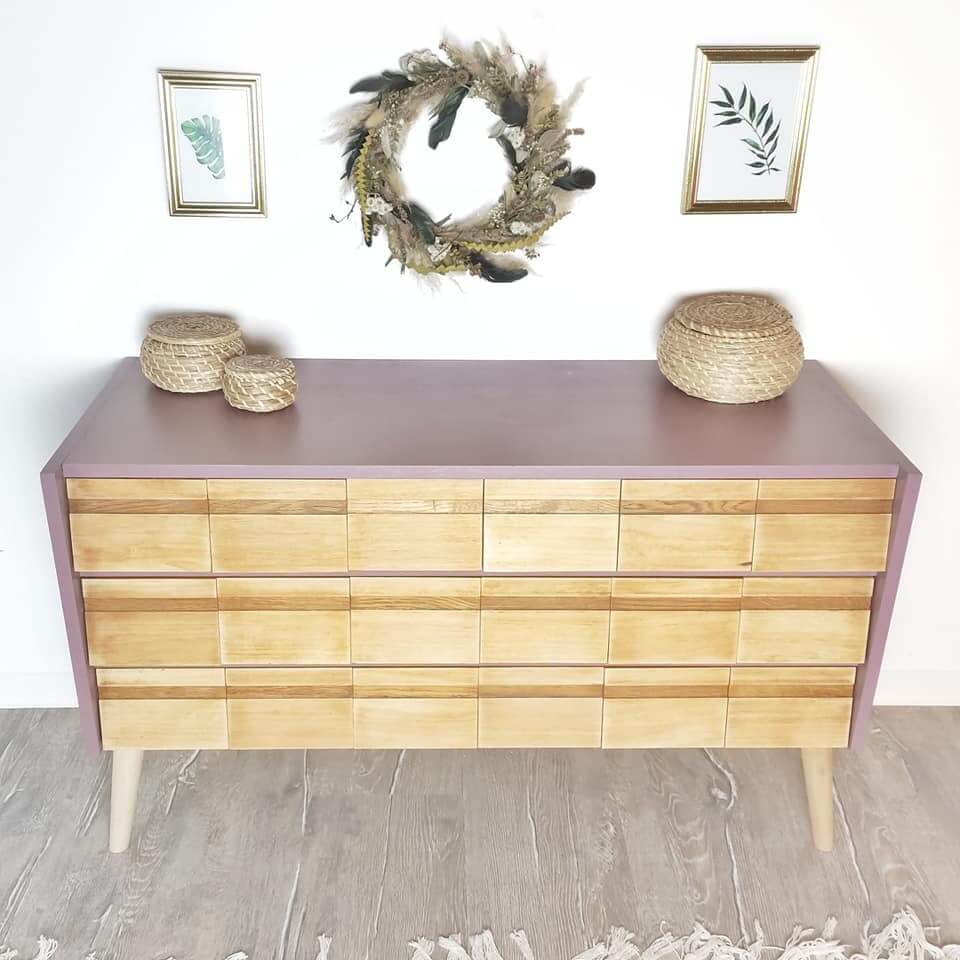
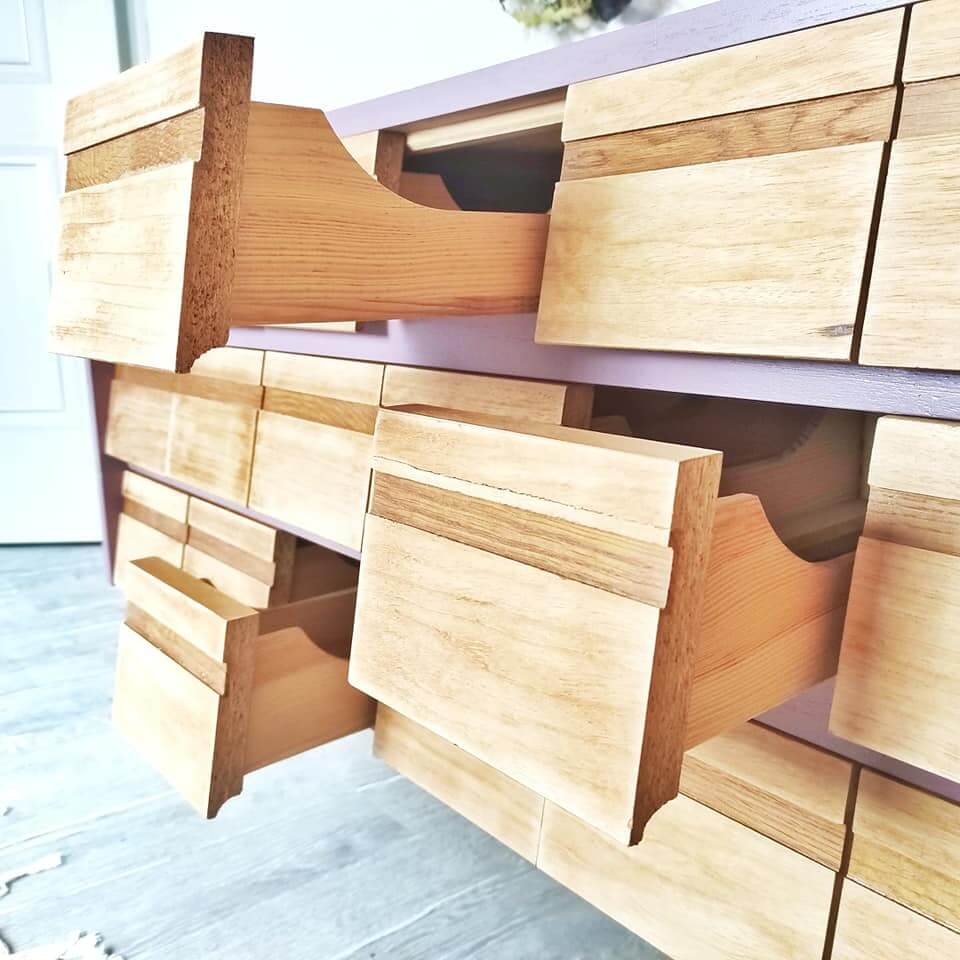
Furniture paint violet: Make statement pieces yourself
Our furniture paint in violet is the secret to furniture with character. Whether it's the changing table in the nursery or an old bureau – you will find your favourite shade among our purple colours! You can also easily paint smooth IKEA furniture or wood that bleeds through after applying a primer like To Bond & Block.
By painting a piece of furniture in purple, you can make it stand out. A delicate violet tone, for example, underlines a romantic interior style particularly well. Furniture paint in purple on a changing table, cot, or chest of drawers also works wonderfully in a nursery or baby's room to conjure up a friendly, quiet atmosphere.
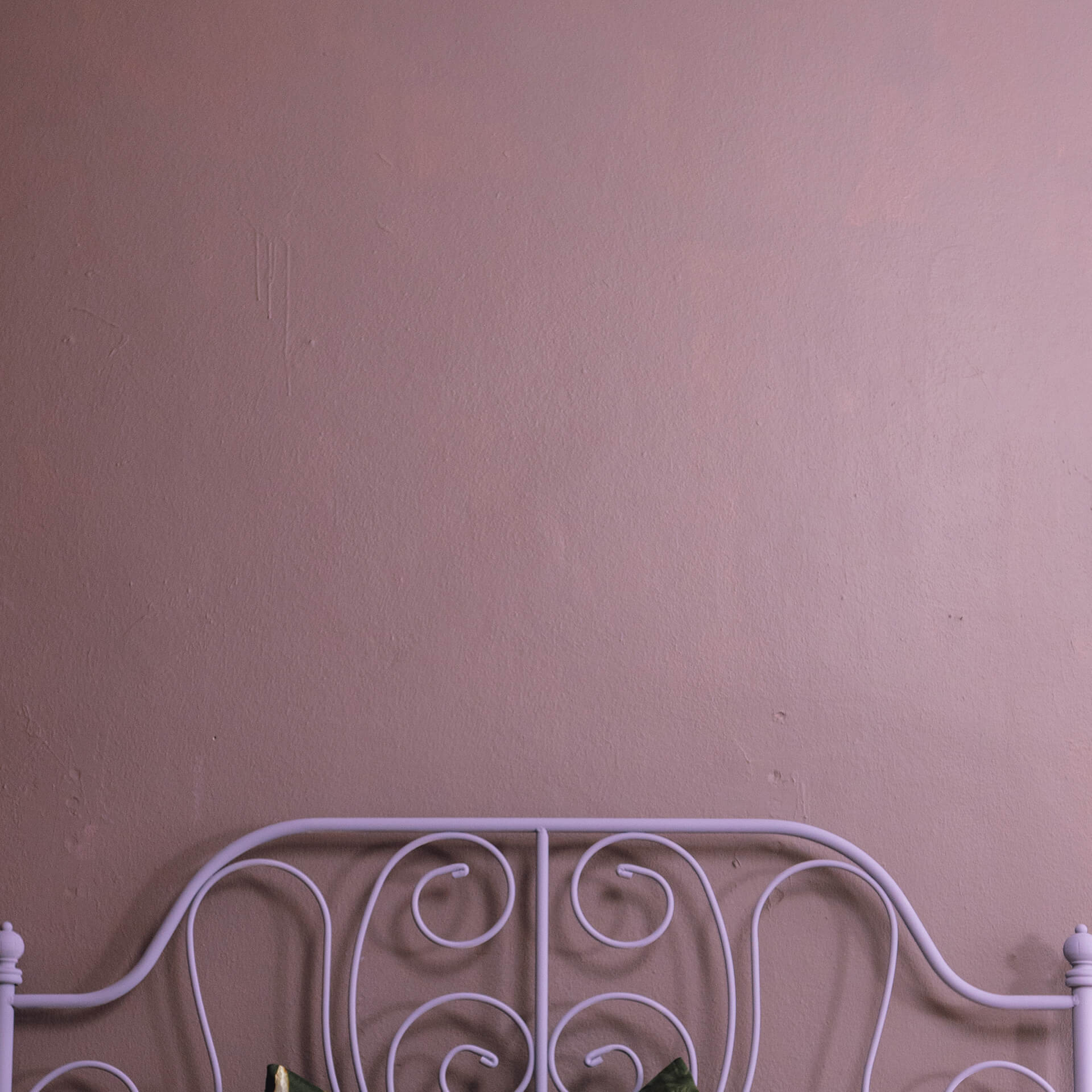
A rich, powerful violet tone on a piece of furniture, on the other hand, can turn a cabinet or side table in your living space into a real focal point. In the bedroom, interesting accents can also be set with purple tones, for example on bedside tables.
Wood paint violet: Modern contrast & Scandi flair
Wood paint in violet gives your interior a dreamy lightness. A light mauve or lilac on wood is the ideal addition to the trendy pastel look, as it sets gentle colour accents without overwhelming the room. In modern, simple black and white interiors, a shelf in dark Purple with Fig can also provide a great contrast.
Chalk paint violet: Velvety feel for creative minds
For an especially soft, powdery finish, chalk paint in violet is ideal. It is the classic choice for Shabby Chic or the playful Boho style. The velvety surface ensures a homely atmosphere and can be combined excellently with other pastel colours from our range.
Order the colour violet online at MissPompadour
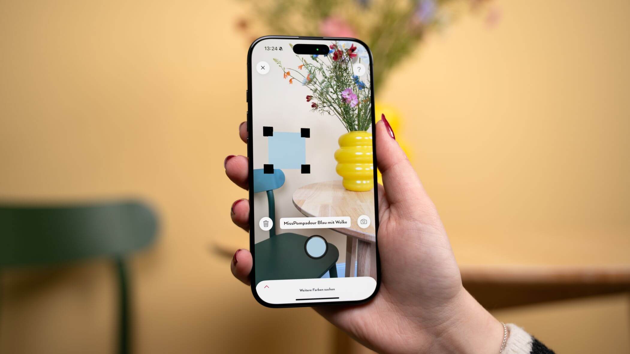
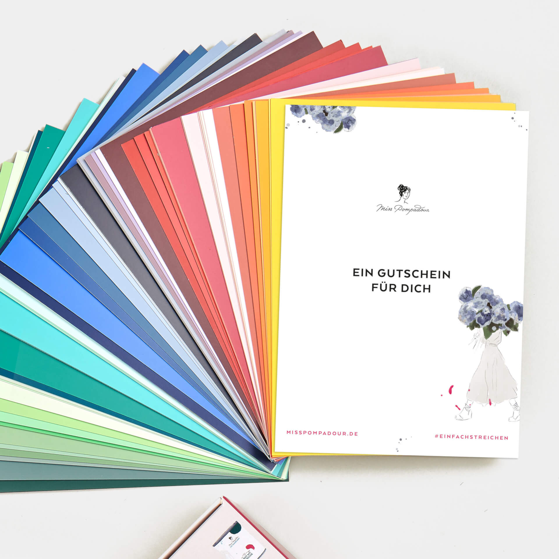
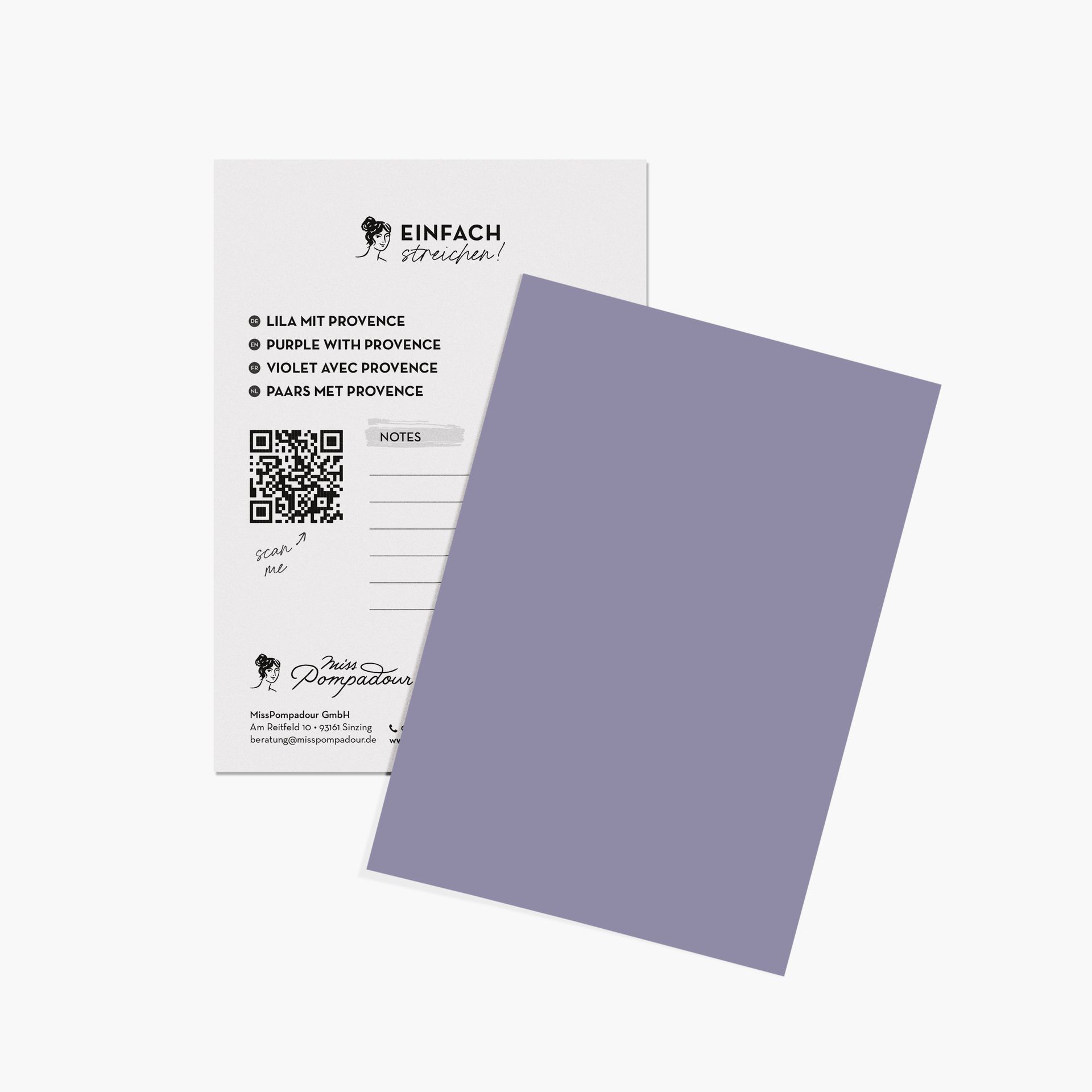
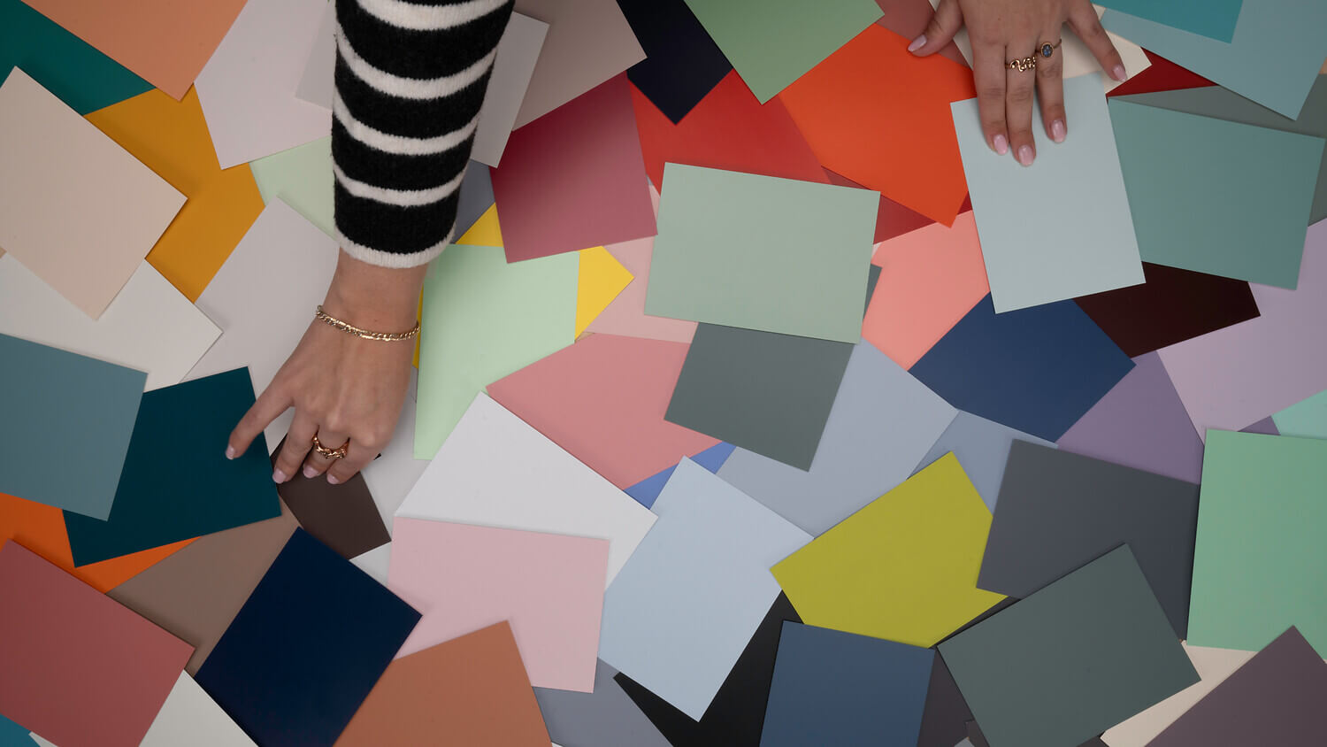
If purple is your favourite colour, just go for it! Hardly any other colour is so versatile. If you would like to see the colours in person first, order our colour cards. Colours on a screen can differ from their actual effect. The colour cards are in postcard format and are individually removable, so you can examine and compare them in any light.
If you are still unsure which shade in which paint quality is right for you, then simply ask for our free colour consultation. We are happy to help!
Does violet go with white?
Yes, combining shades of violet with white creates a pleasant, light-filled atmosphere. The visual contrast between the two colours provides a clean, modern look. Violet creates a particularly sophisticated contrast against brilliant white, which helps to visually open up the room.
Which colours harmonise with lilac?
Complementary colours like yellow tones, but also green tones—especially those with yellow undertones—harmonise perfectly. Interestingly, the German name for this colour is usually derived from the lilac bush, while in French (“violet”), it points more towards the violet flower. Alongside black and anthracite, pink pastel tones and many natural shades from light beige to brown also fit this colour scheme beautifully.
How does lilac work as wall paint?
Light violet has a balancing and calming effect. It is also said to boost creativity. Many people value these unique qualities as a way to give their own personality more space in their living area and to create a meditative atmosphere.
Is lilac modern as a wall paint?
Violet is a colour that showcases your individuality. Its significance as a symbol of luxury and spirituality has long been a staple of design history. Soft lilac is particularly modern for romantic interiors, while purple represents timeless elegance. Shades of lilac offer you endless design possibilities.
What is the origin of this special shade?
The origin of the colour purple is fascinating: in the Middle Ages, the process of obtaining natural purple dyes was so costly that violet was reserved for royalty. The actual invention of the first artificial purple shade, mauveine, did not occur until 1856 in London. Mauveine was the first synthetic dye and revolutionised the production of colours worldwide, meaning that today, everyone can use these magical shades for their home.