


wall paints & varnishes in
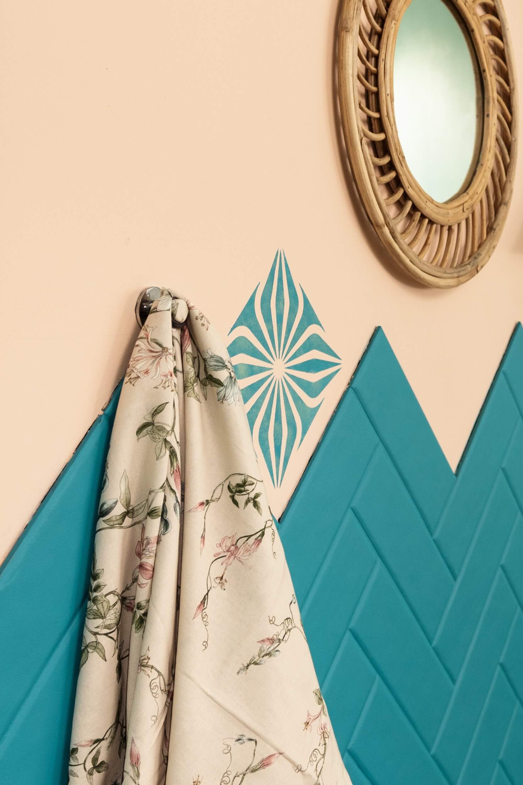
Petrol & turquoise
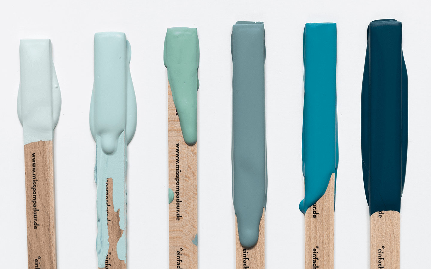
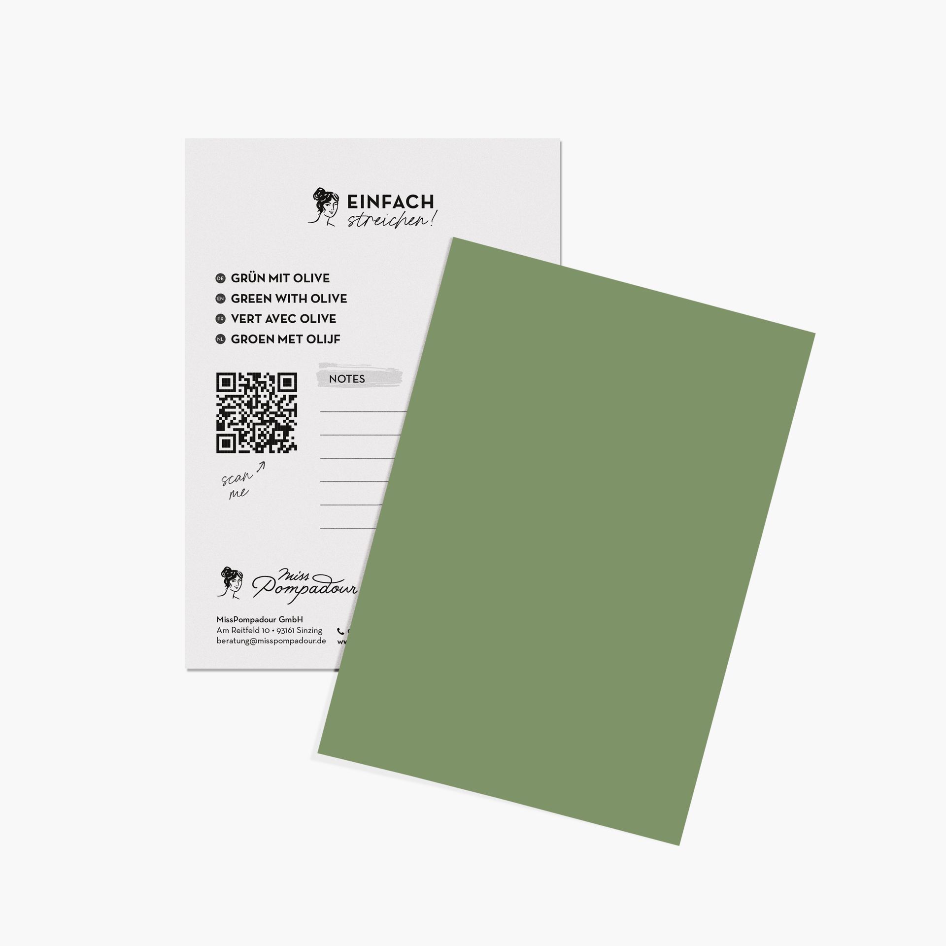
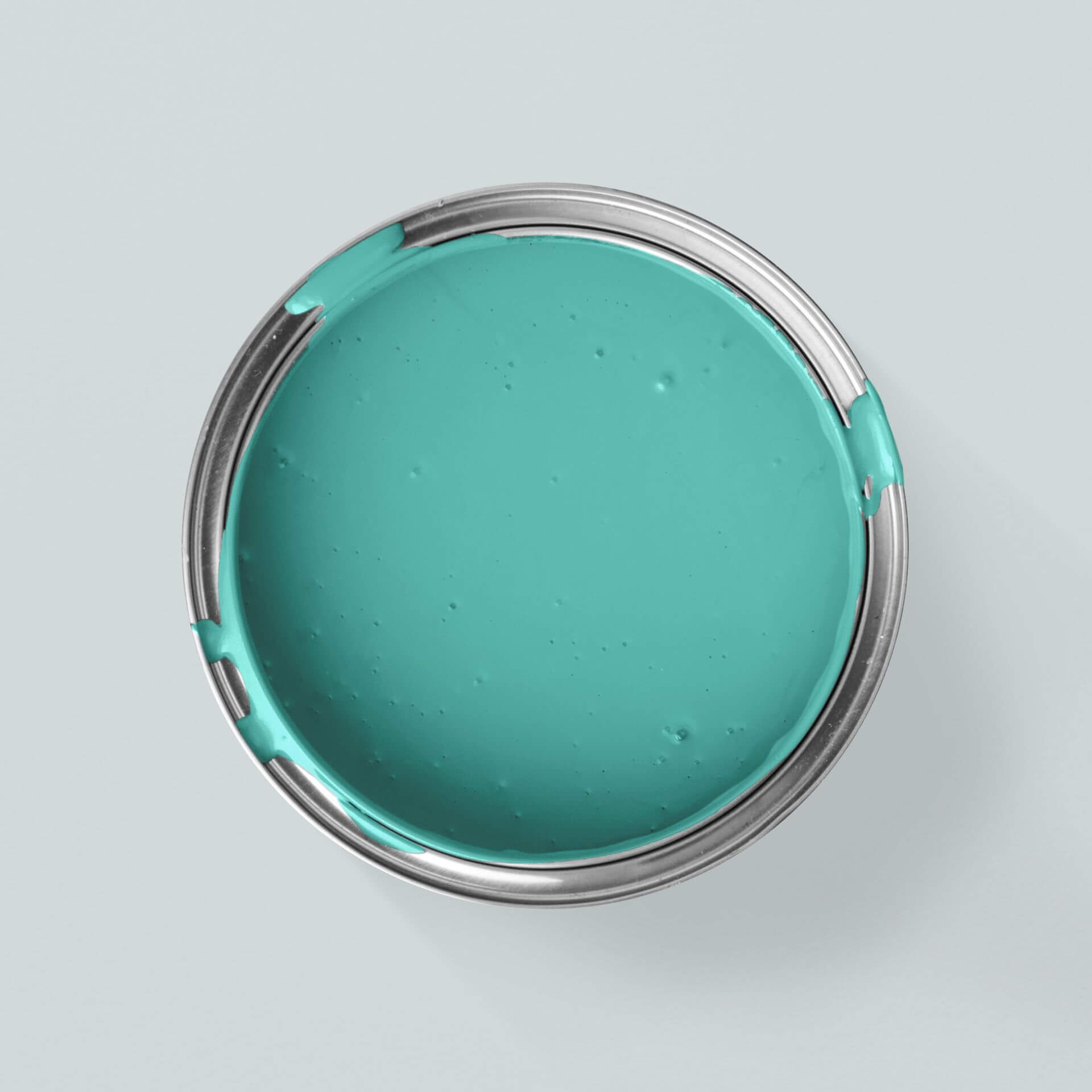
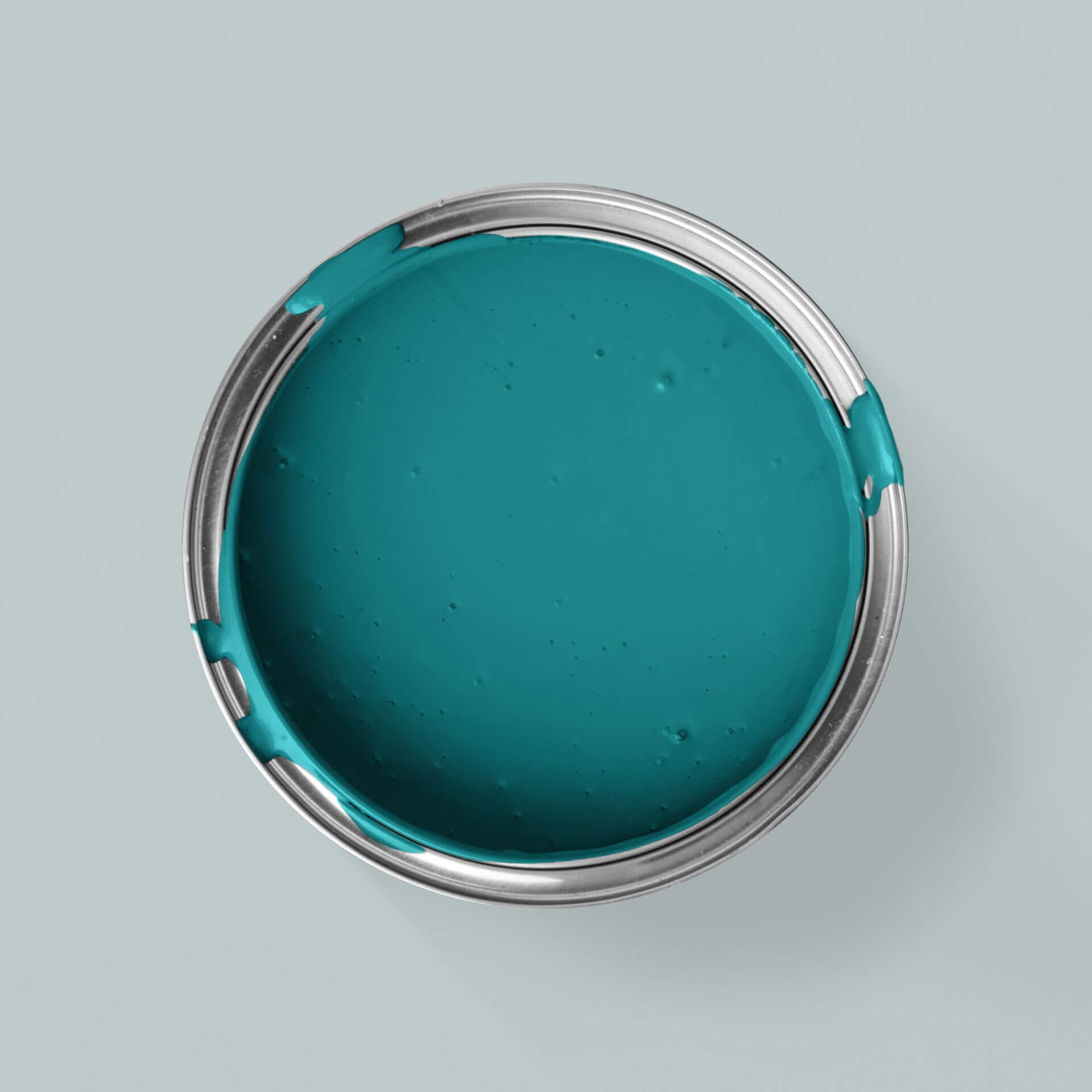
Our colours in petrol & turquoise
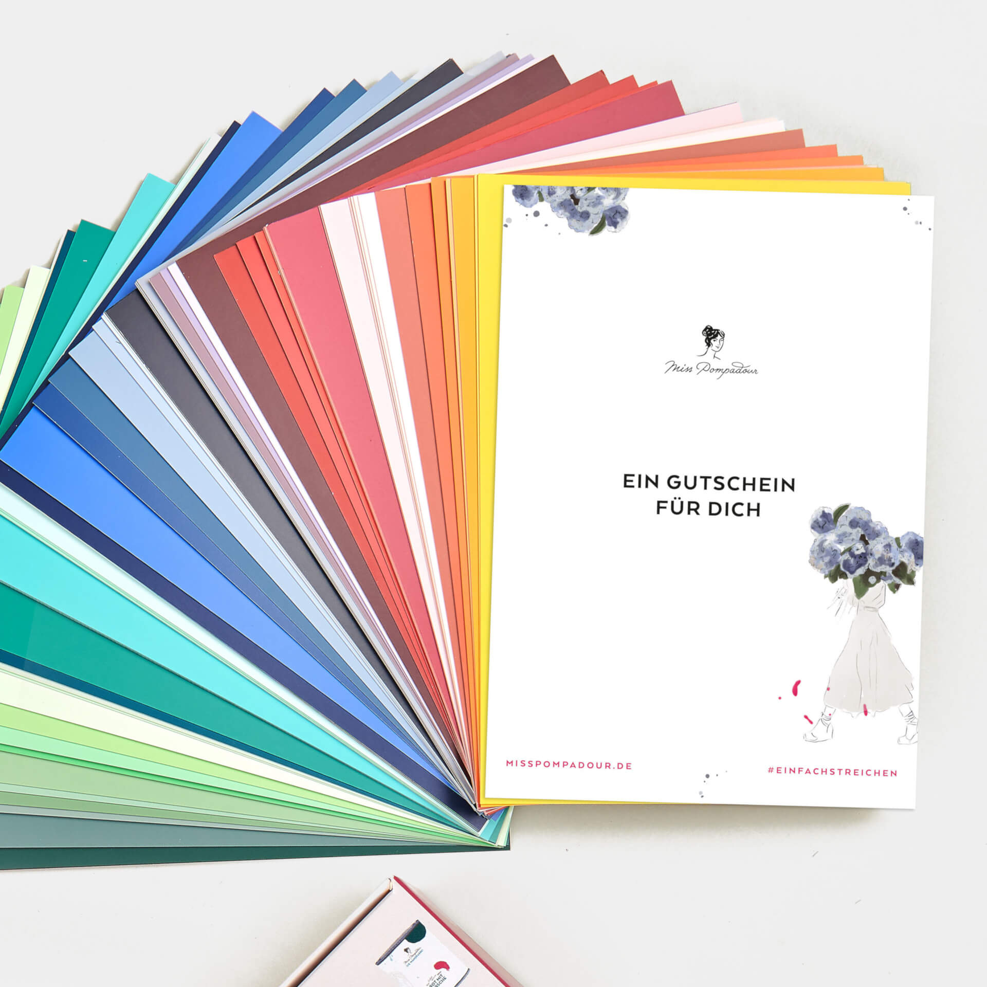
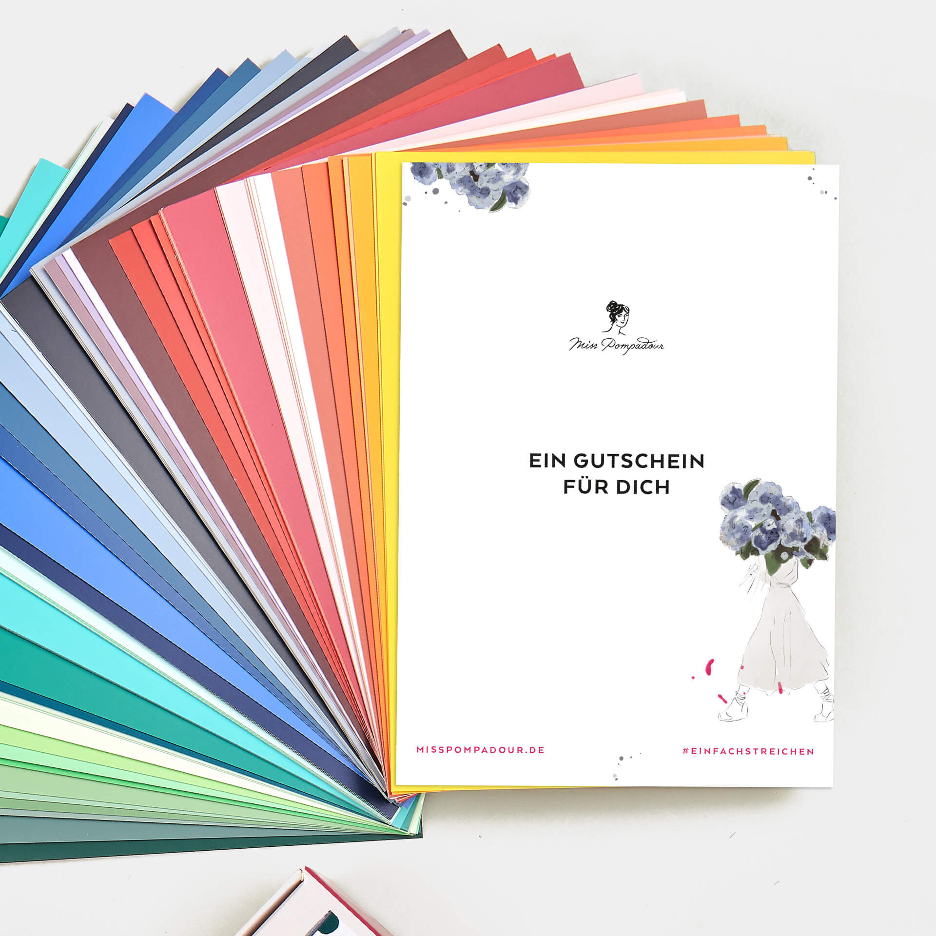


Everything for your project in one set


Our range in petrol & turquoise
The most important facts about the colours petrol & turquoise
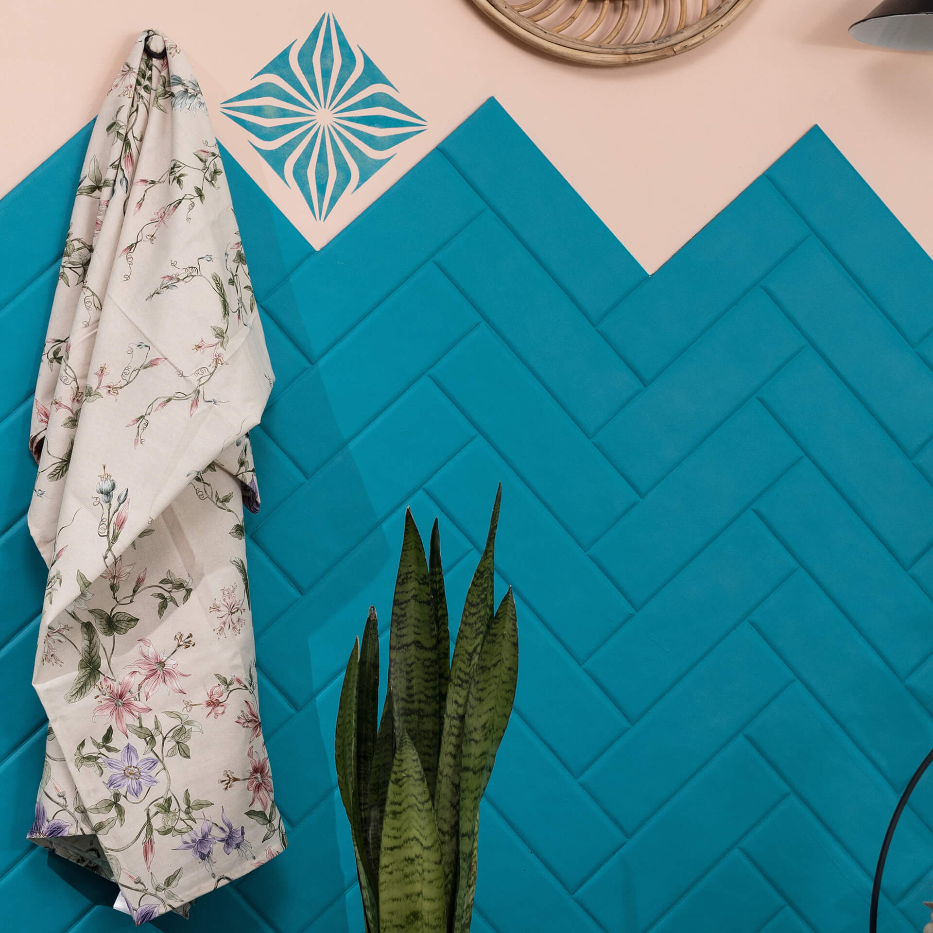
Turquoise and petrol tones are colours that lie between green and blue. Both colours together create a positive balance for the viewer
Effect of colour in petrol & turquoise
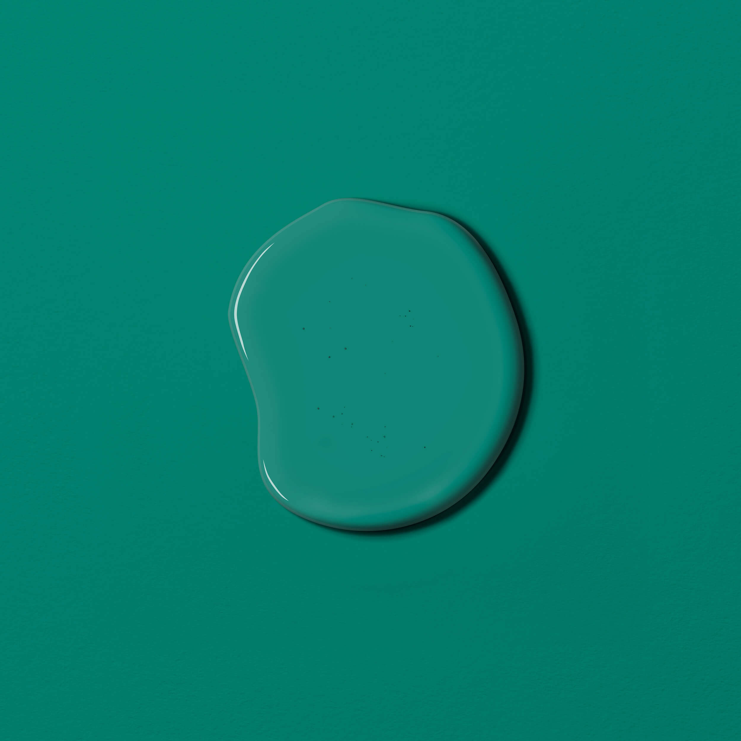
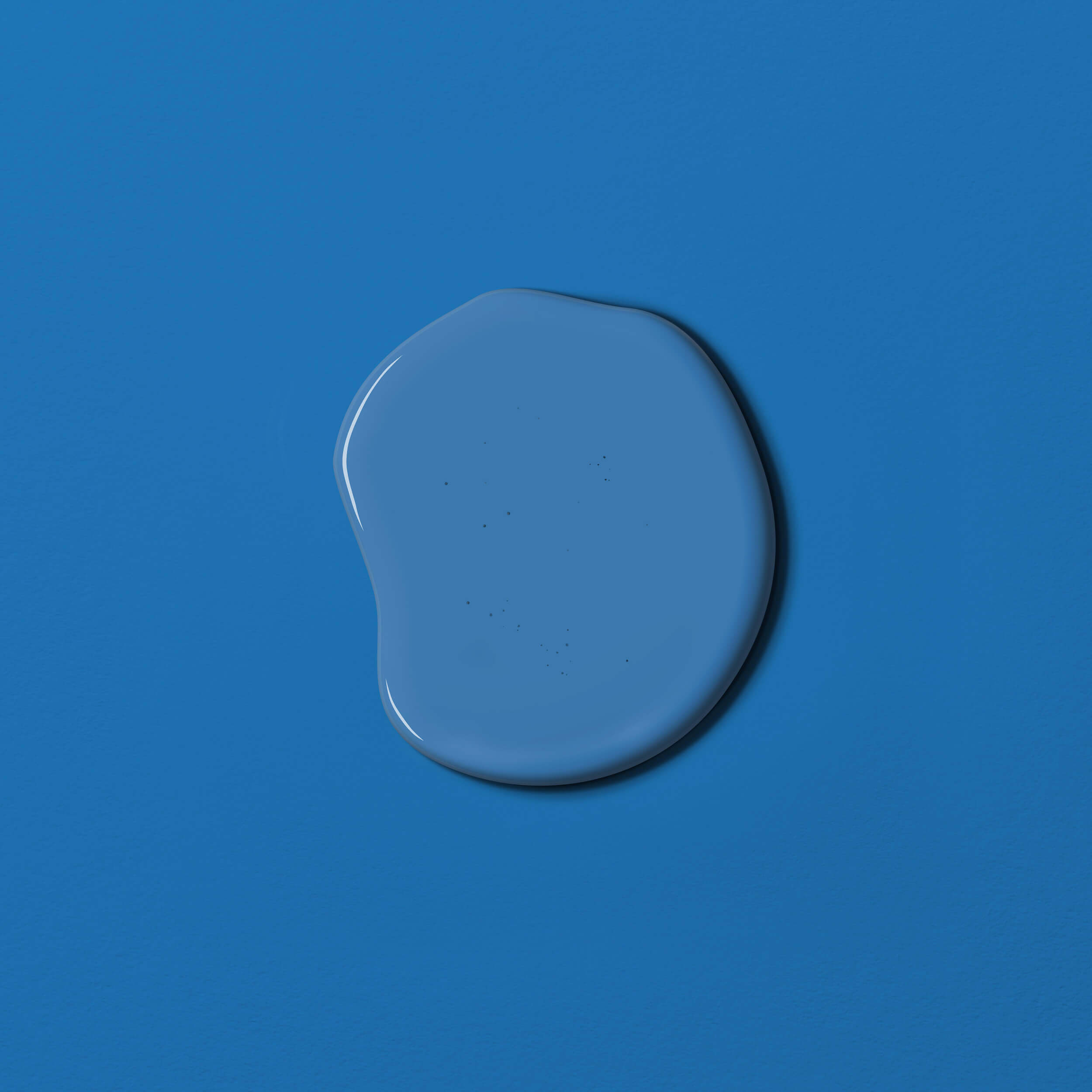
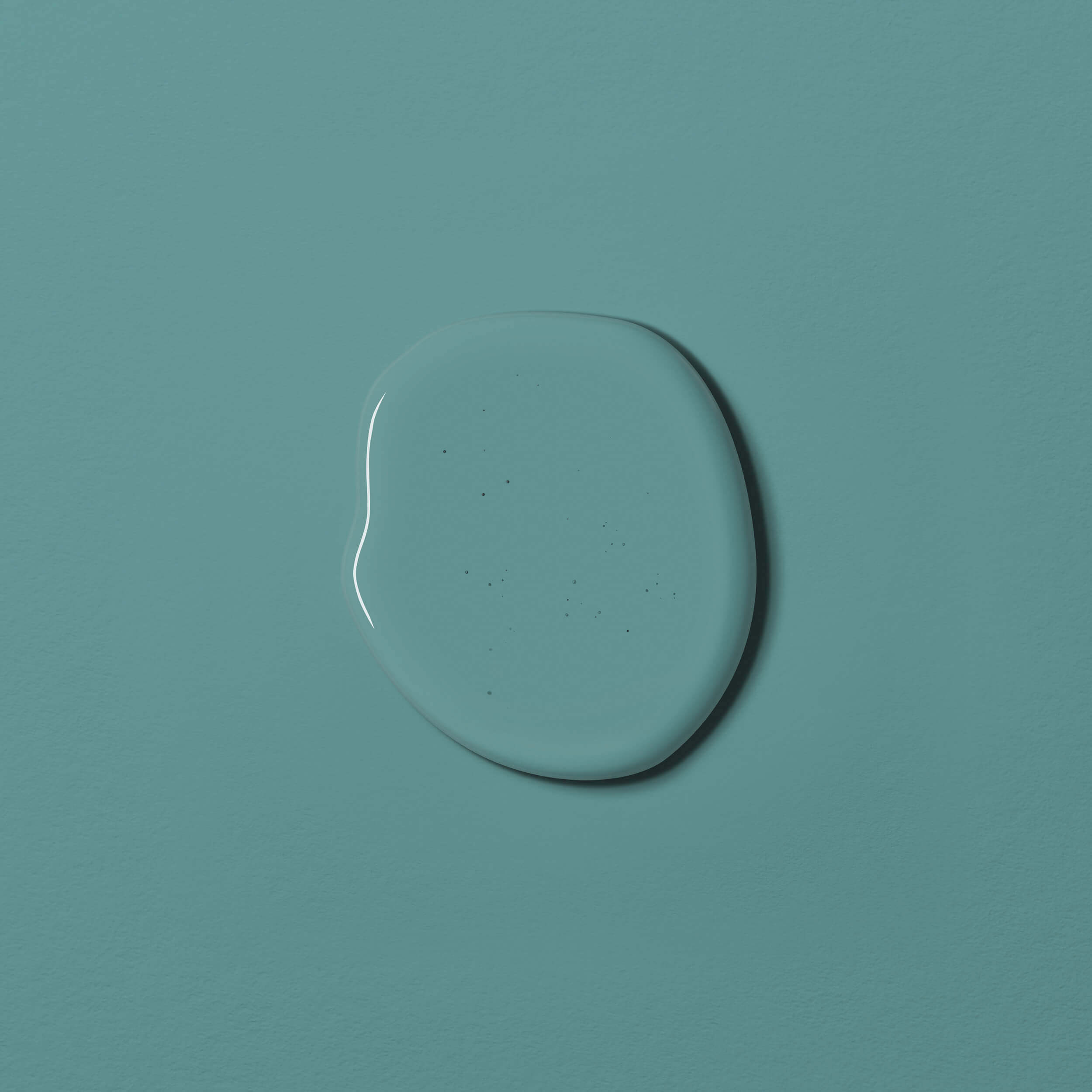
Turquoise colours start with very light aqua tones such as a light aquamarine, reminiscent of a mountain lake. They can also be bright green like the sea green of the South Seas. But rich petrol tones, which impress with their dark, intense colour effect and are reminiscent of a dark sea, also belong to the turquoise shades.
Turquoise is the colour of the communication chakra. It stands for clarity of thought and communication. The colour is said to be able to connect the communication channels between the heart and mind. The colour is associated with clarity and openness and helps to reduce inhibitions and facilitate interpersonal communication.
In colour psychology, turquoise is said to have the ability to dampen emotions and provide emotional balance. Thanks to the balance of green and the energy of yellow, turquoise as a mixture of these two colours radiates calm and serenity. At the same time, it is able to inspire our spirit and reduce stress.
Design rooms with petrol or turquoise
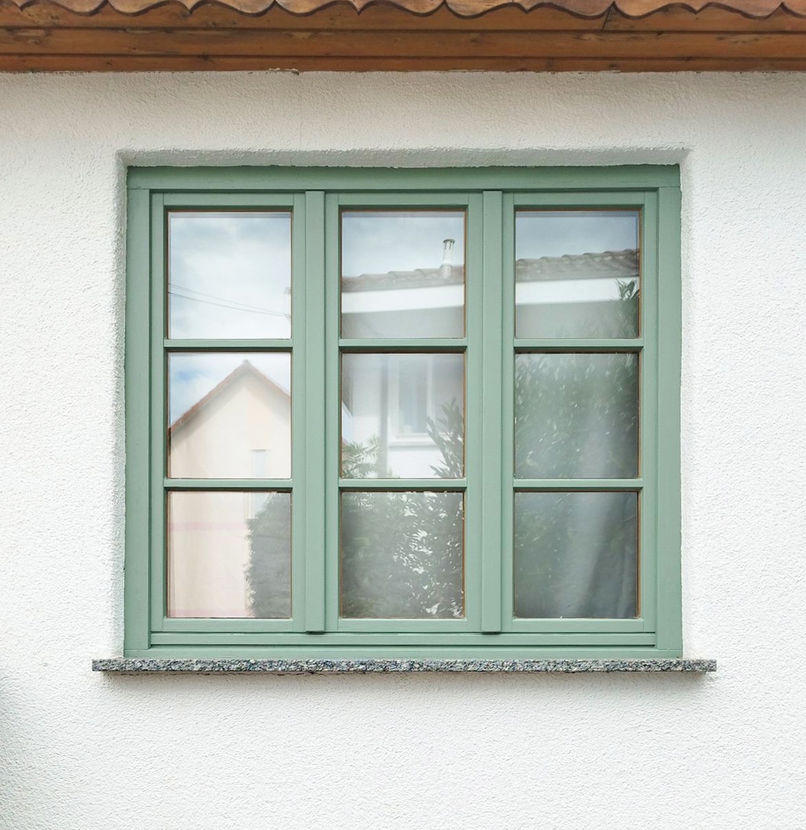
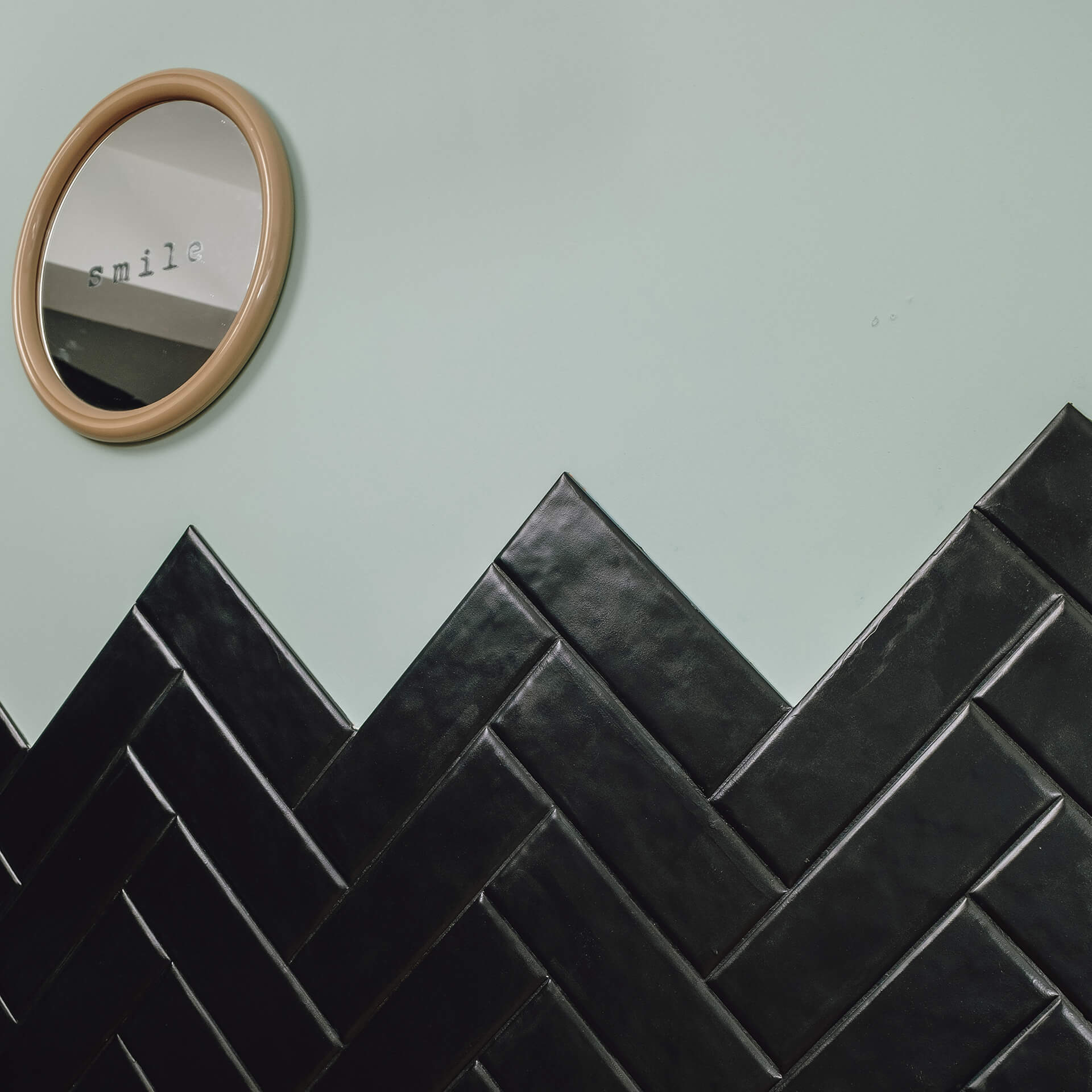
Turquoise tones make rooms appear brighter and more open. They create a relaxing atmosphere and stimulate creativity at the same time. The colour is therefore ideal for workspaces where both concentration and inspiration are important. It can also have a slightly cooling effect, which can be a Roller in hot areas or south-facing rooms.
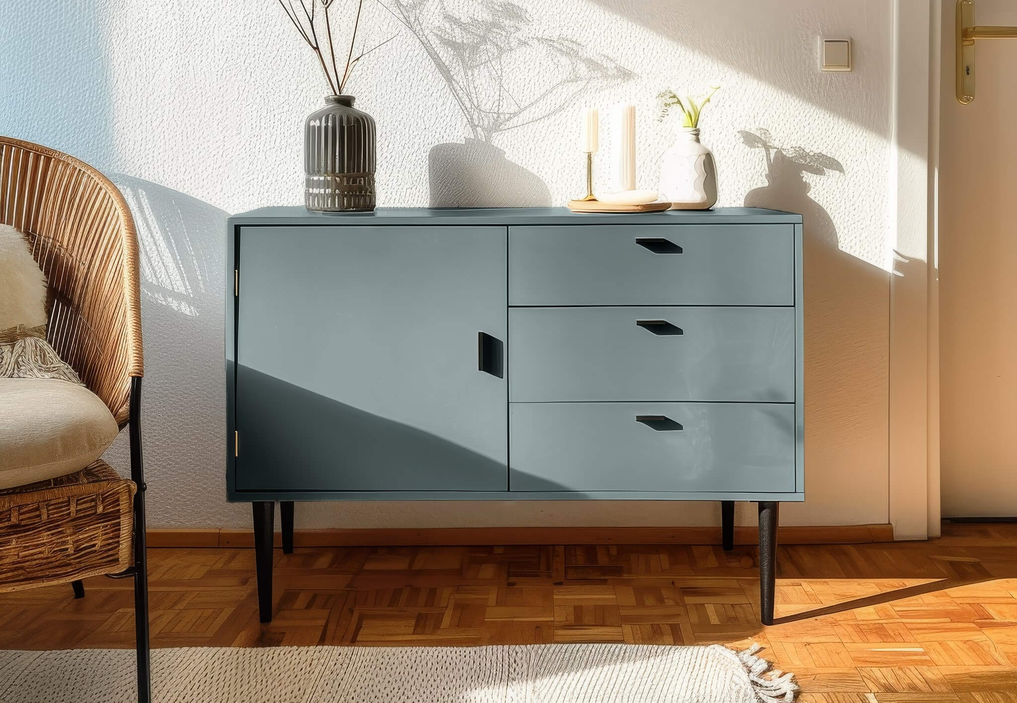
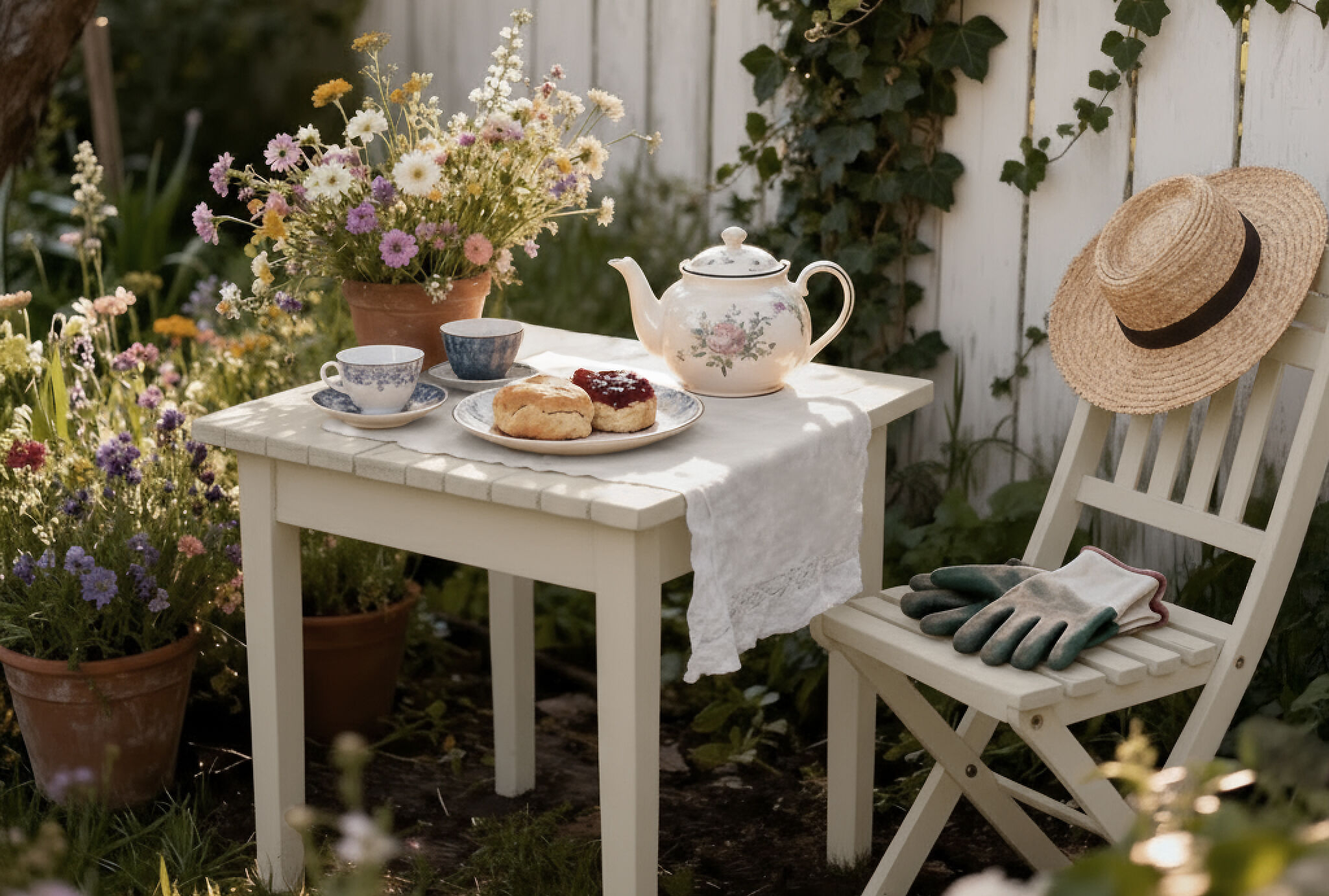
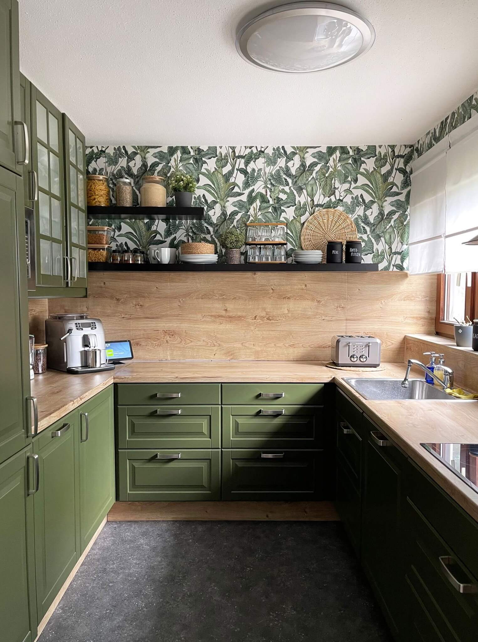
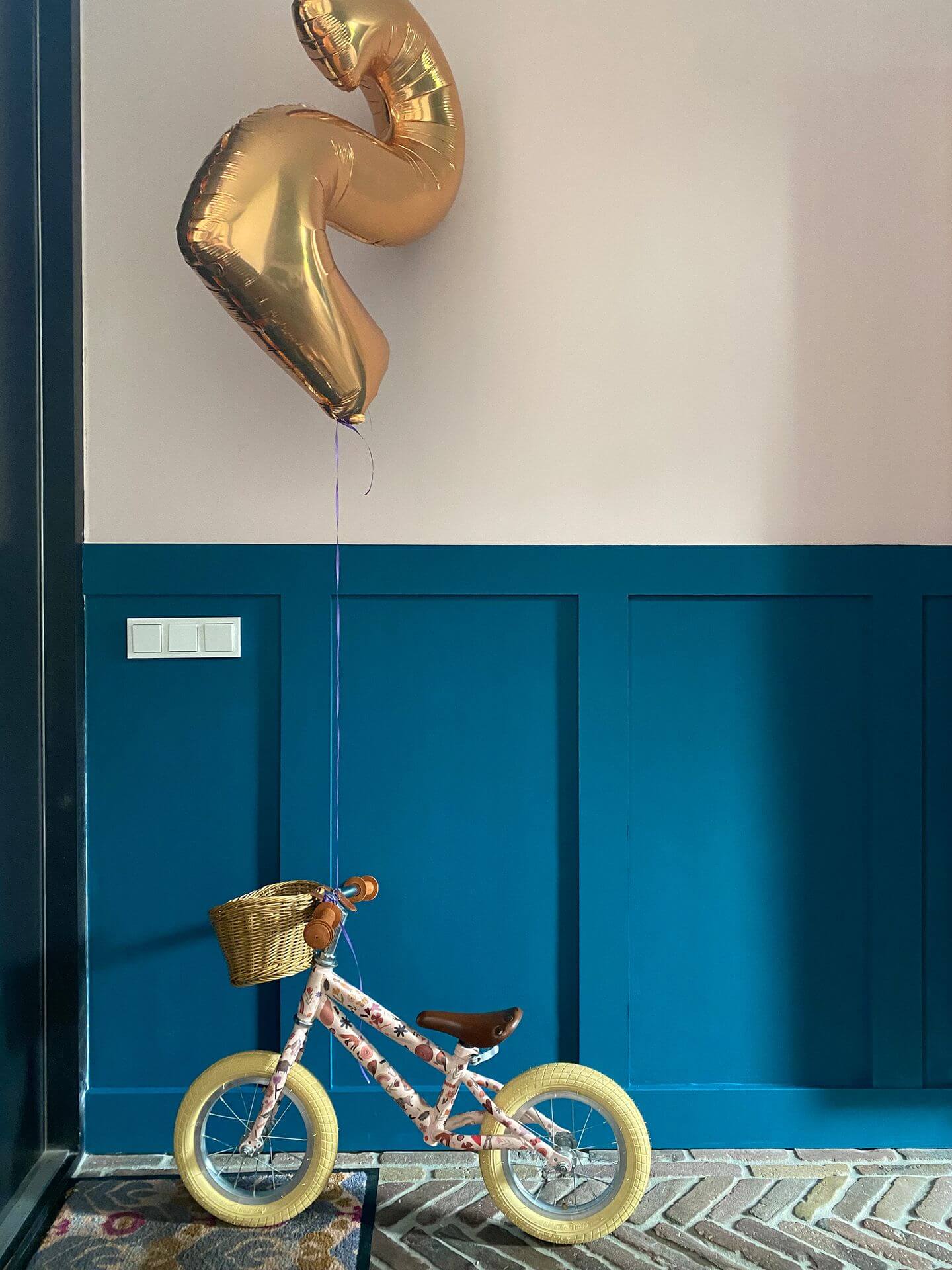
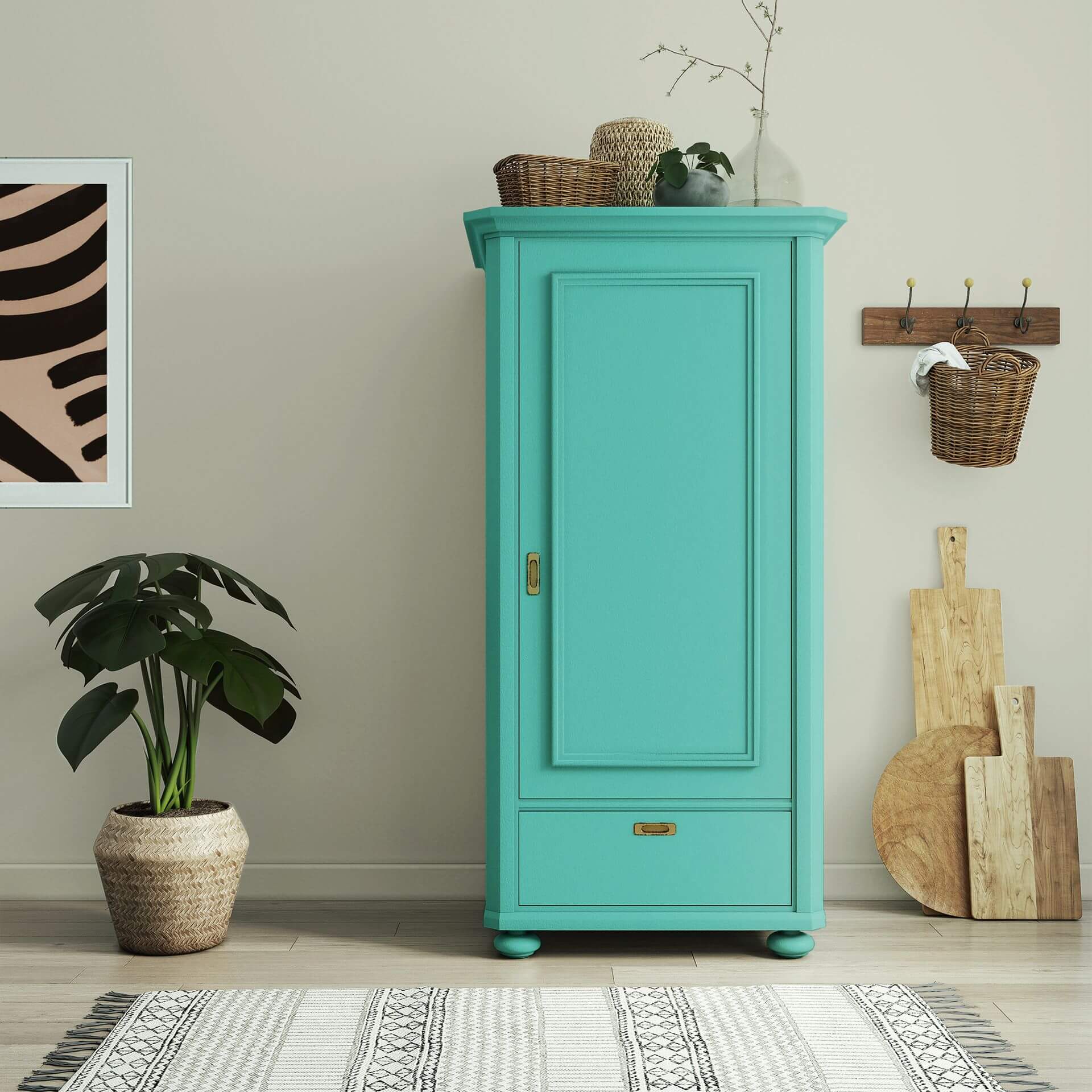
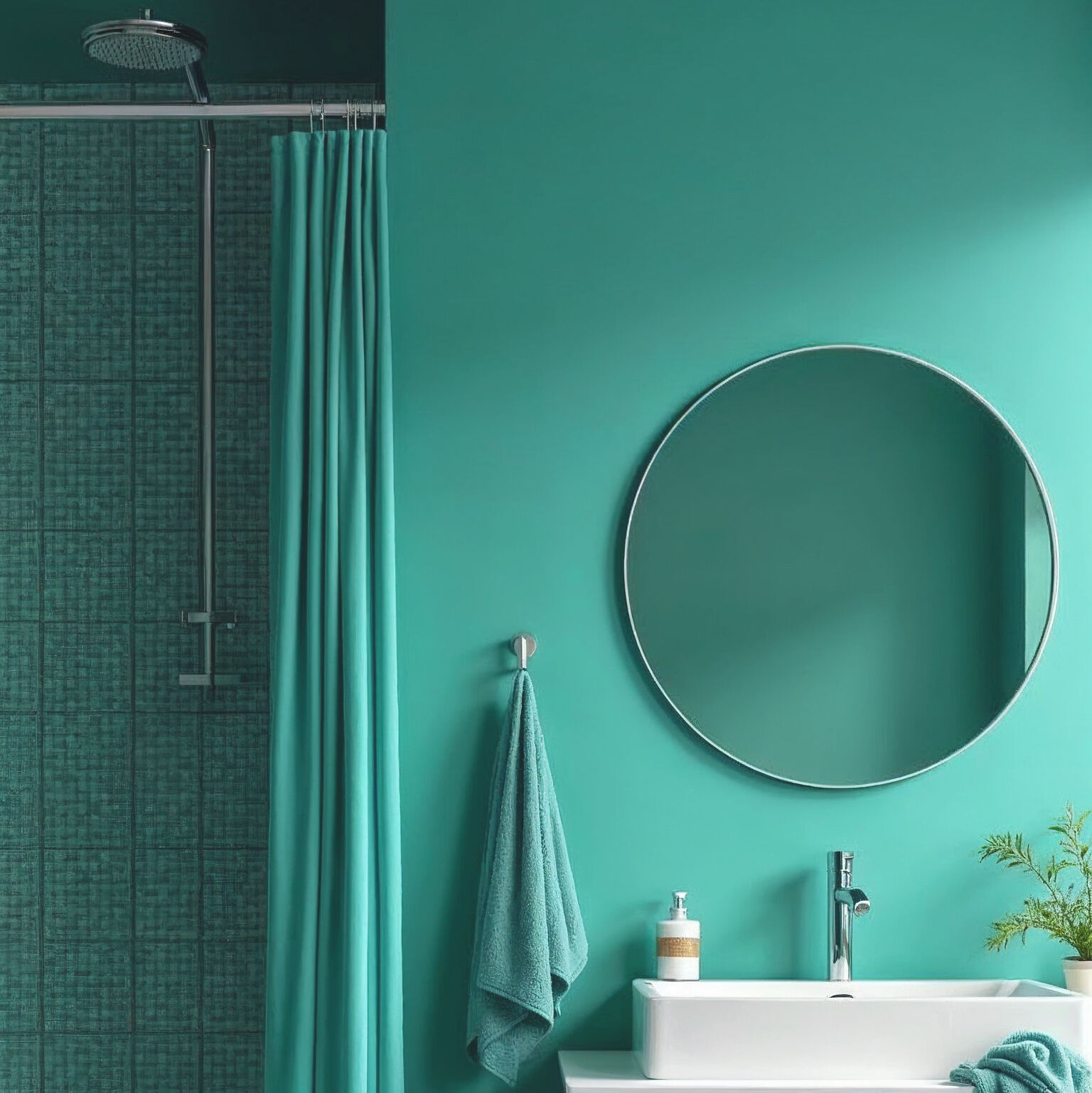
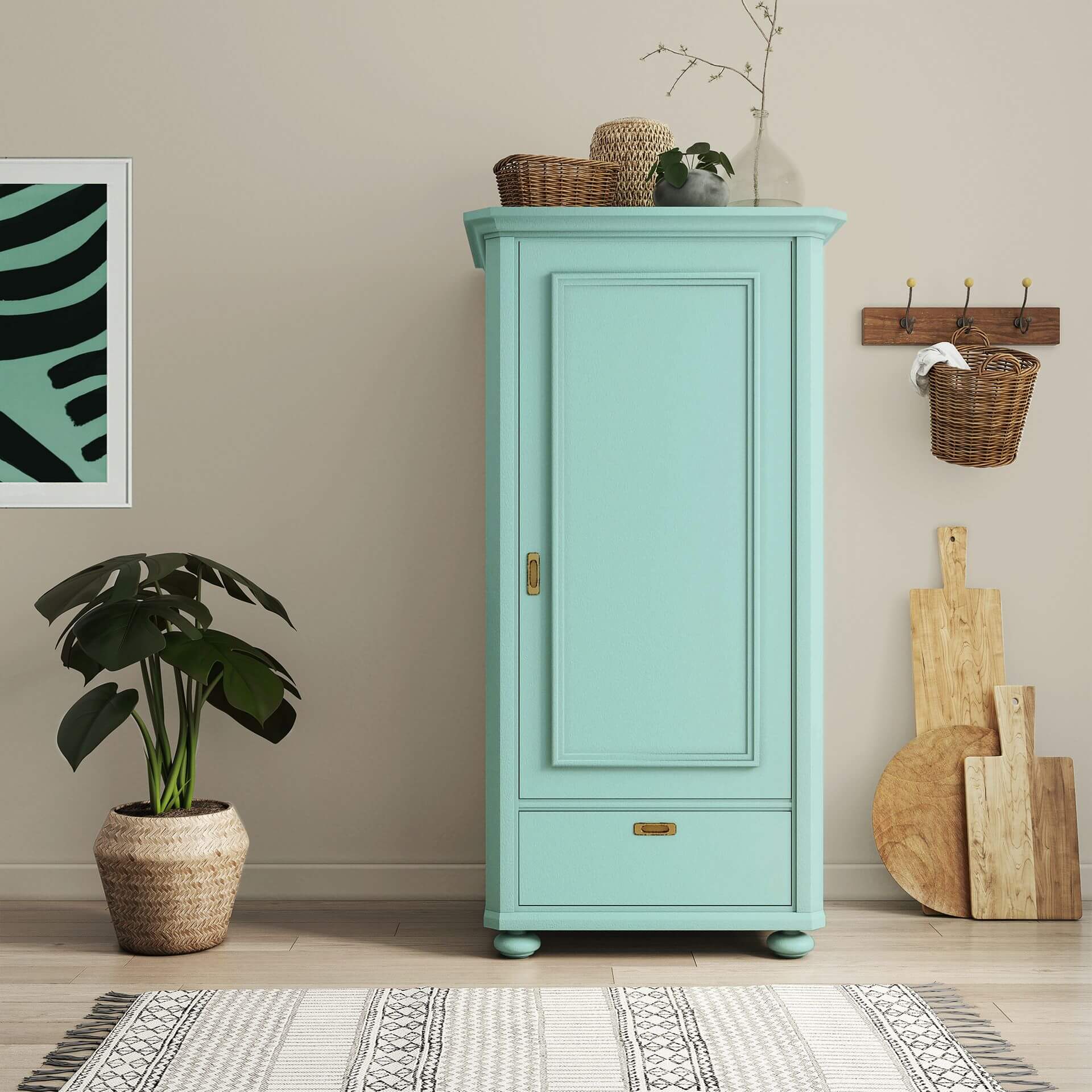
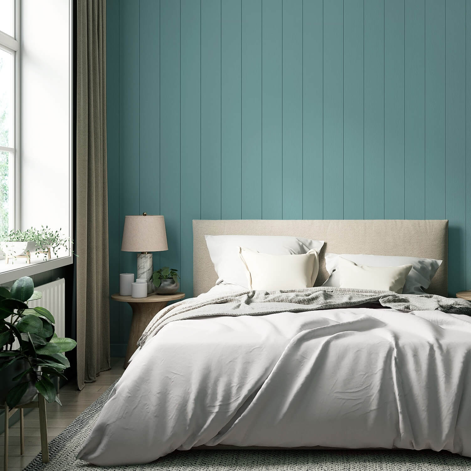
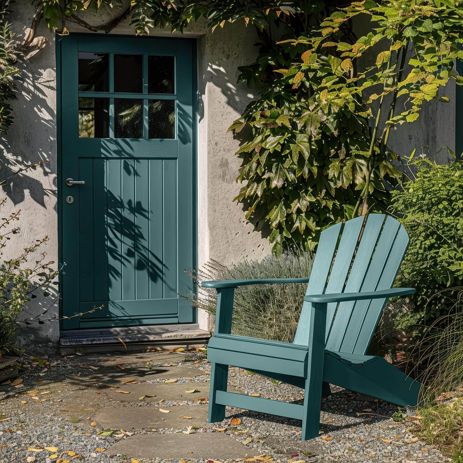
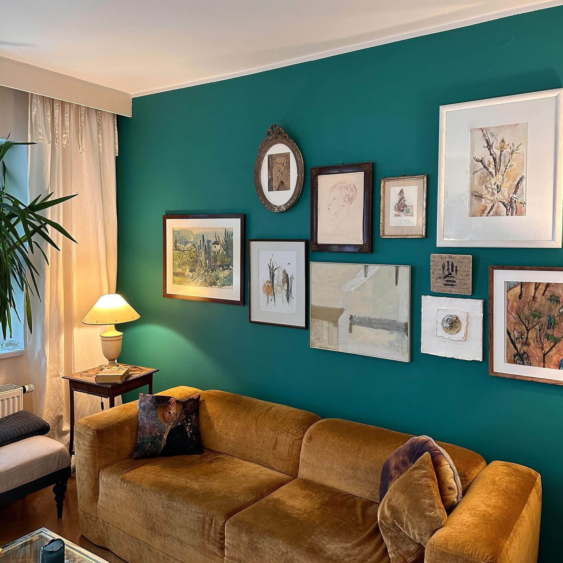
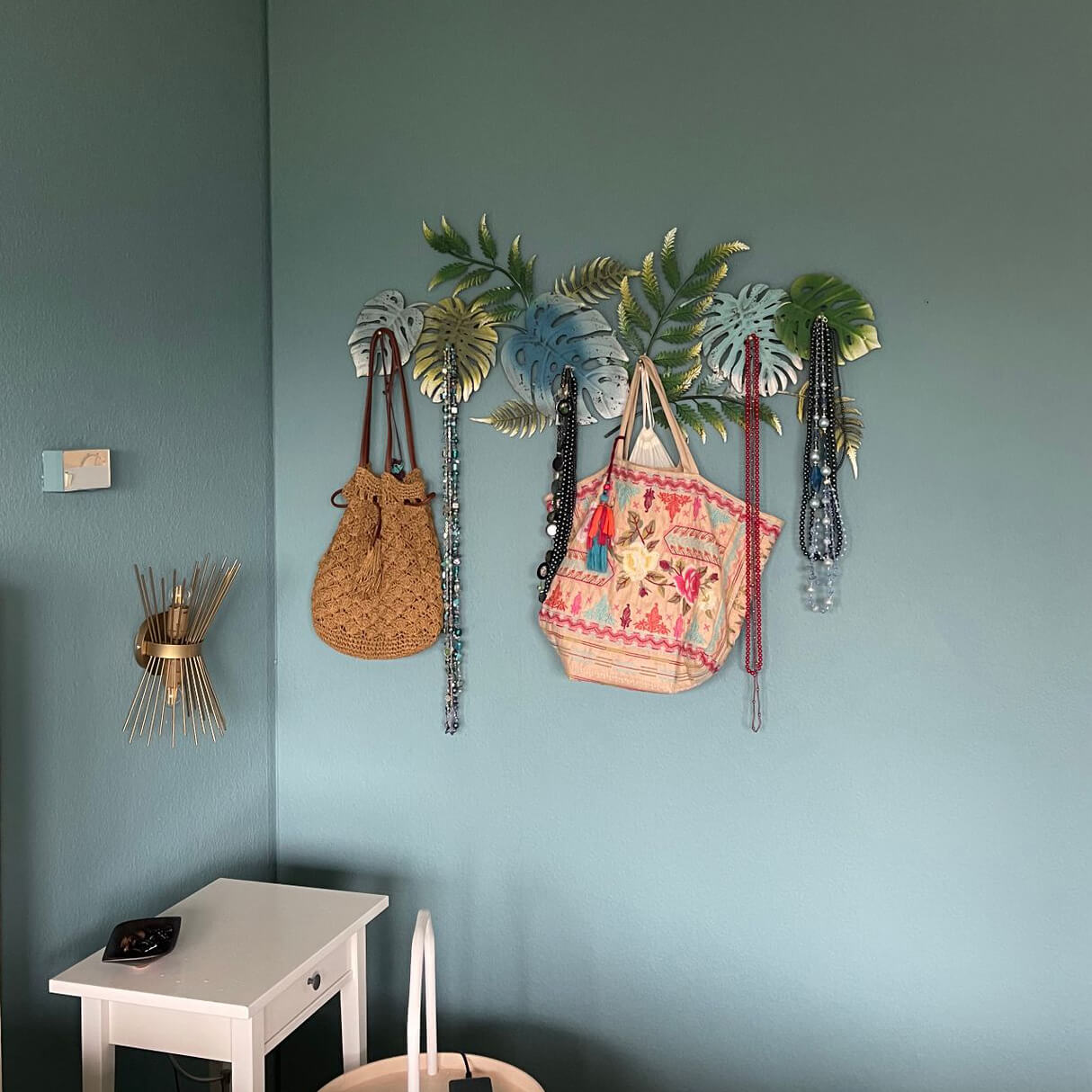
A living room can be stylishly designed with wall paint in turquoise. Here, a single wall painted in a vibrant petrol colour looks very attractive. Works of art from all eras stand out wonderfully against this colour. By combining it with accessories in aquamarine, petrol or other shades of blue-green, you can create an individual living style.
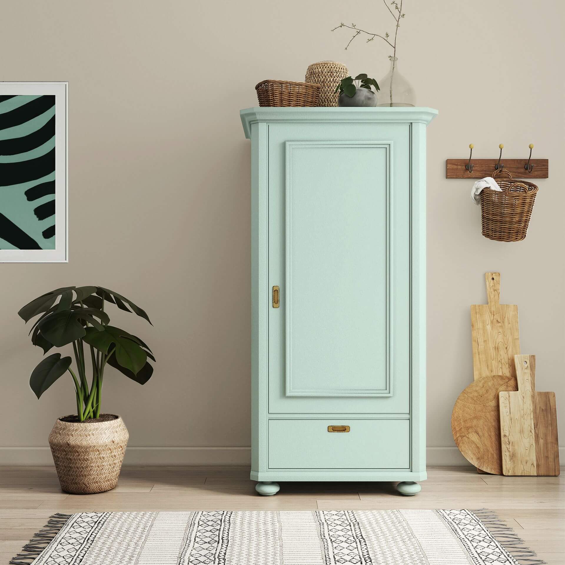
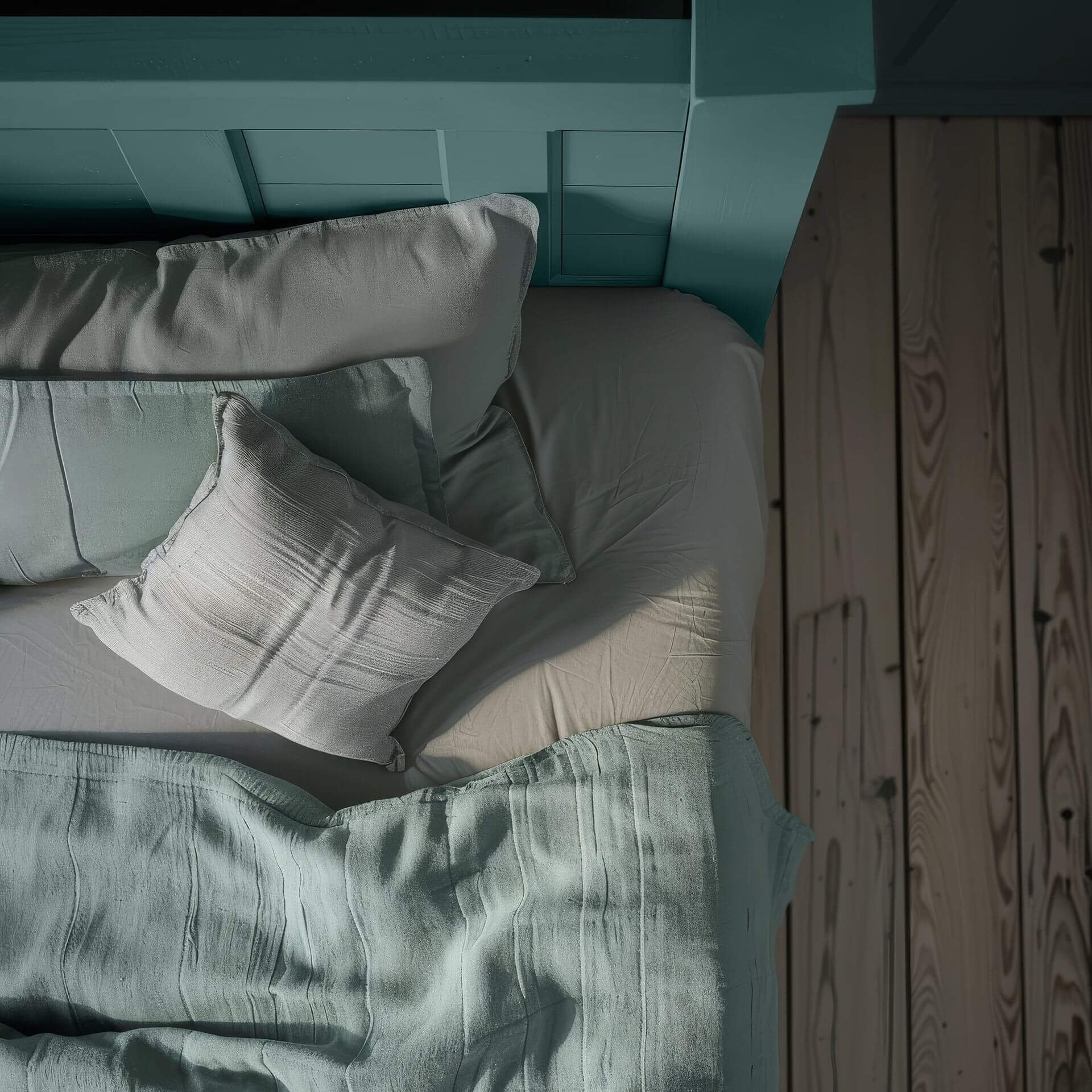
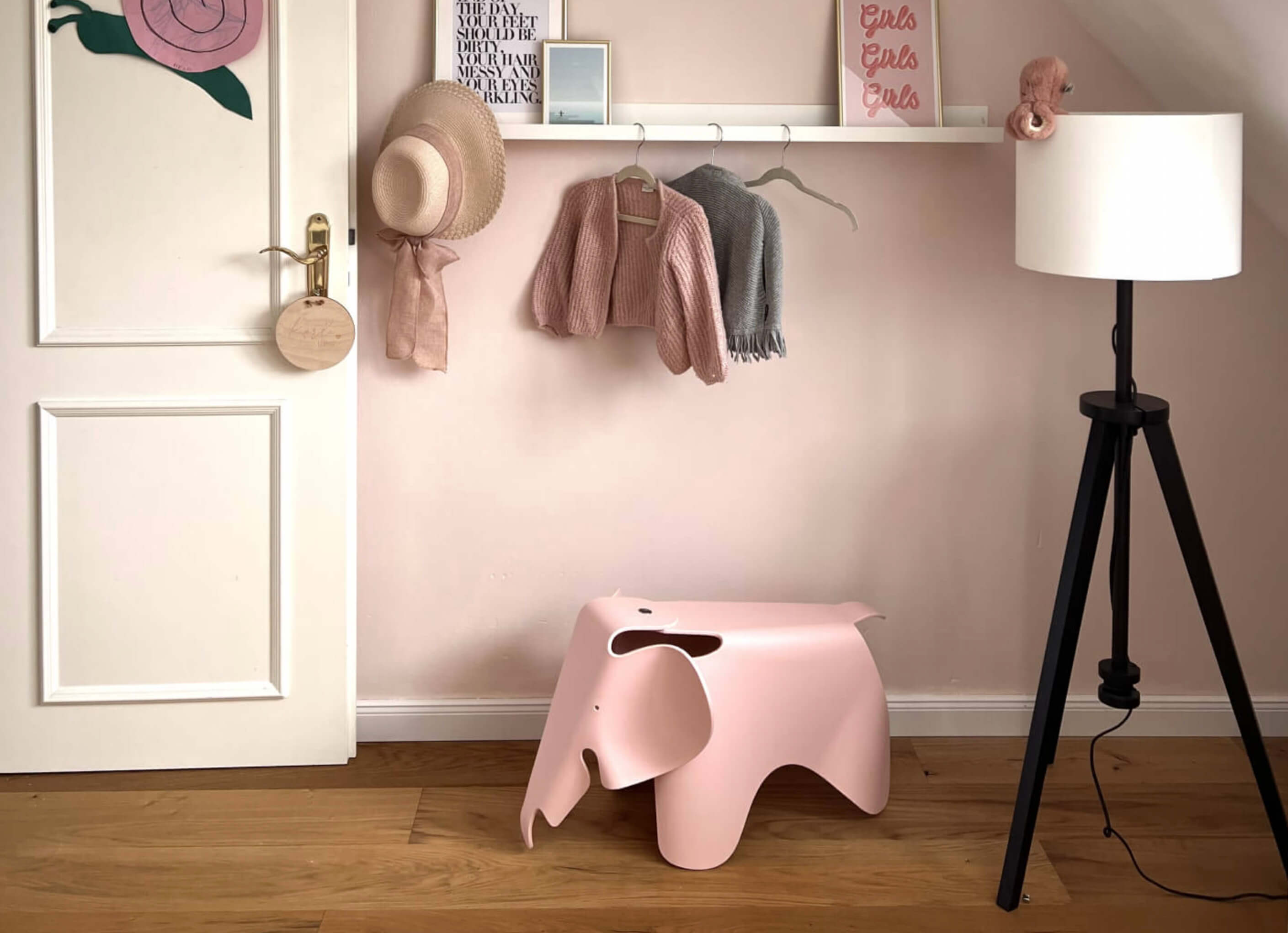
A subtle turquoise colour can also create a calm atmosphere in the children's room. Why not paint furniture such as the cot or a changing table in light turquoise blue? Turquoise is also a colour that eliminates the tiresome decision between pink and sky blue.
You should avoid petrol & turquoise here
Turquoise is not the ideal wall paint in north-facing rooms that are not well lit. It cannot develop its radiance there
Alternatives to Petrol & Turquoise
Delicate green tones without blue components can be a beautiful alternative to blue-green and turquoise. If this colour shade contains yellow components, it can also have a fresh and cheerful effect as a wall paint.

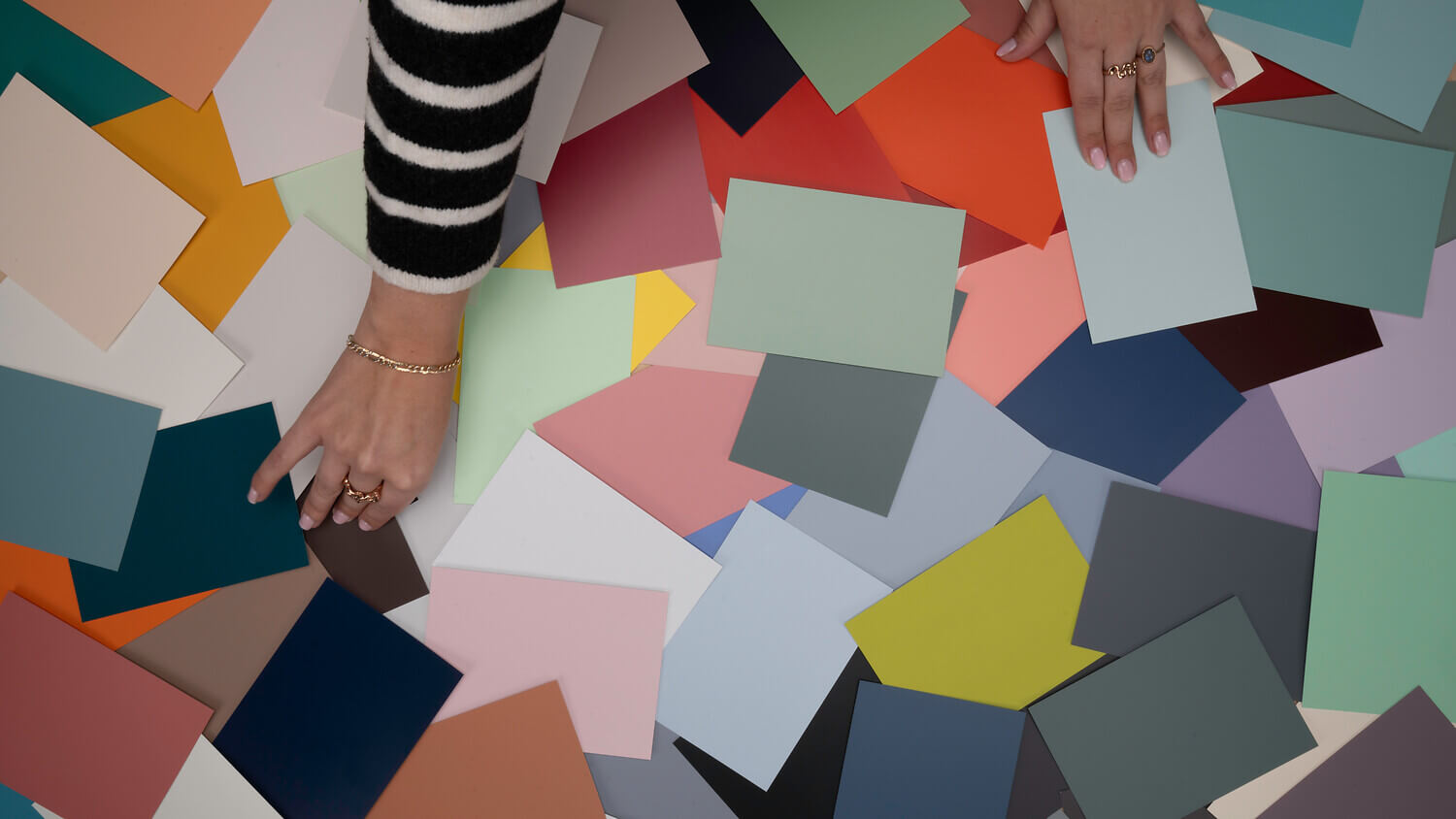
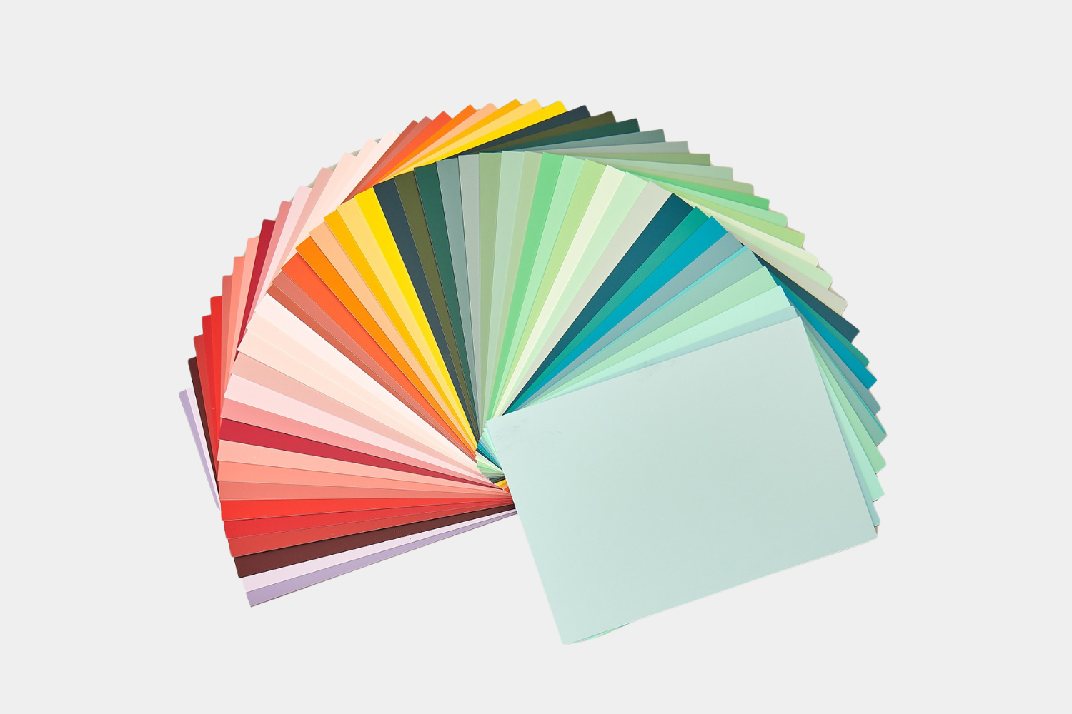
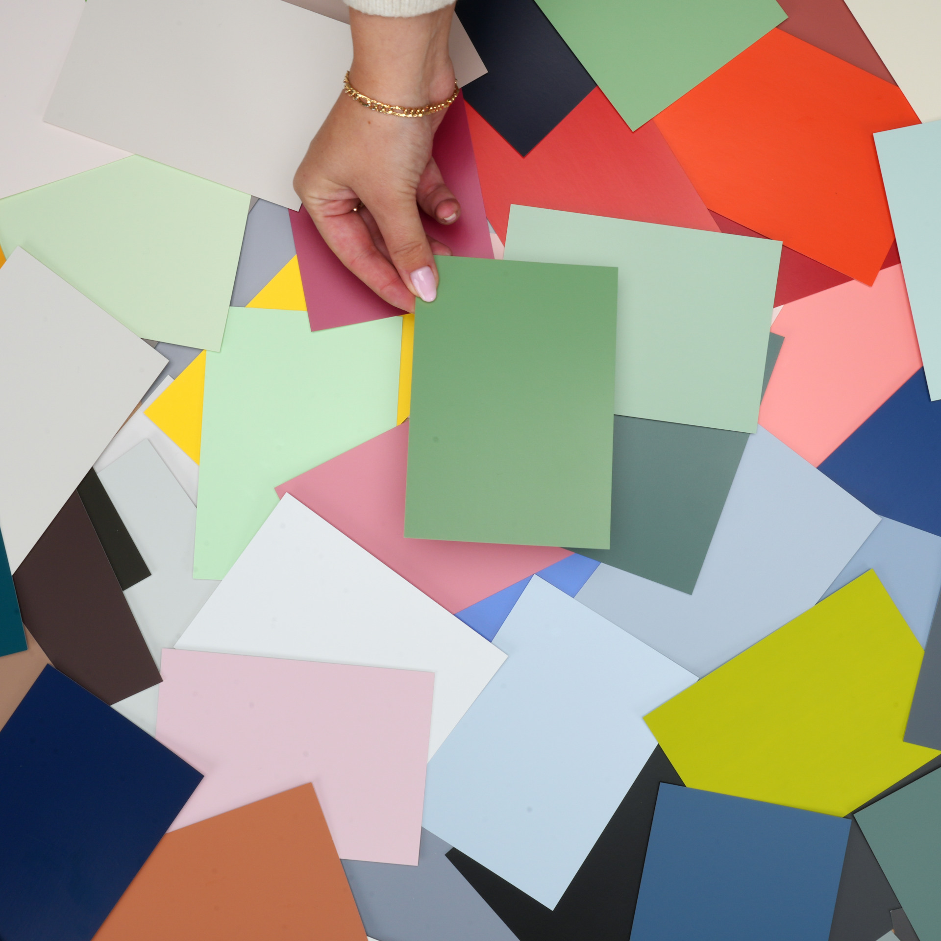
Diverse colour shades in petrol and turquoise
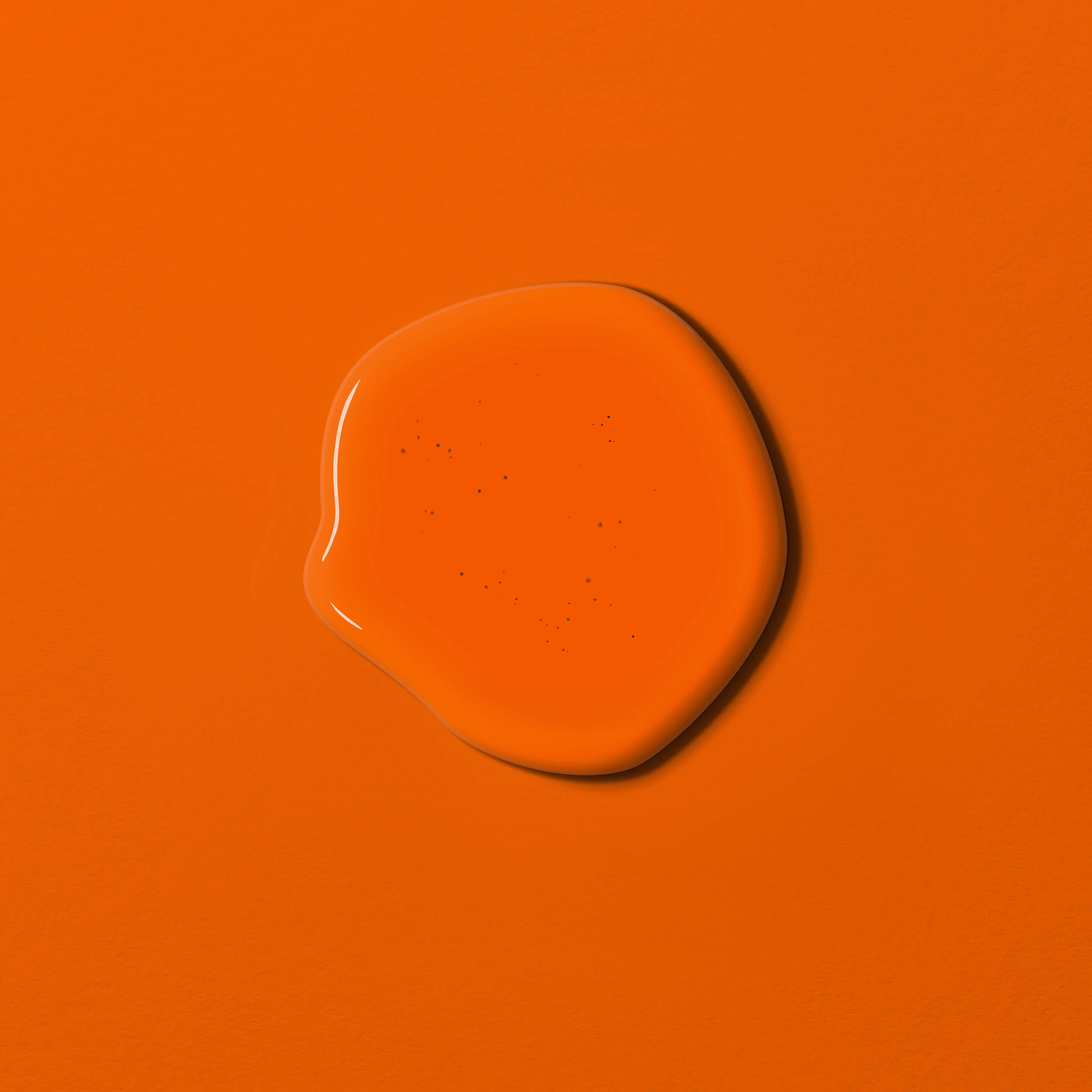
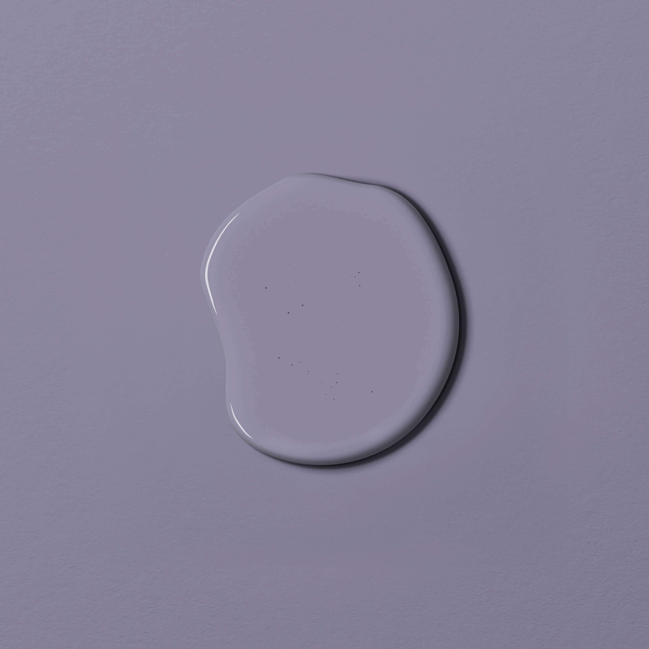
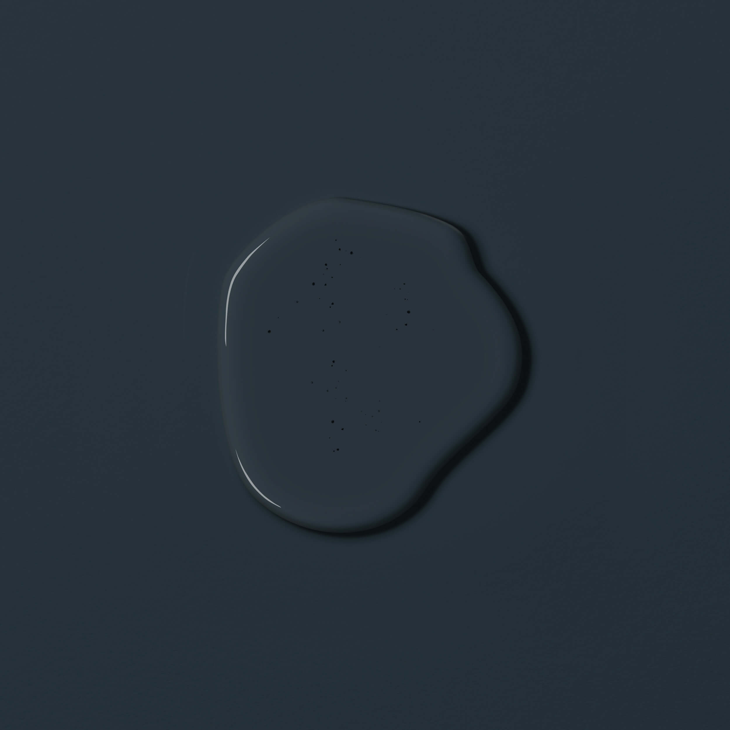
Petrol and turquoise are basically always colour shades in which green and blue are mixed. These colour shades are also known as aqua tones.
The darker colour shades from the aqua tones tend to be referred to as petrol. Another name for this colour family is blue-green or sea green. Petrol comes in many shades. The effect of this colour varies depending on whether the blue or green component predominates. The colour intensity also varies, so you can cover all areas with petrol paint, from pastel shades to a strong accent colour.
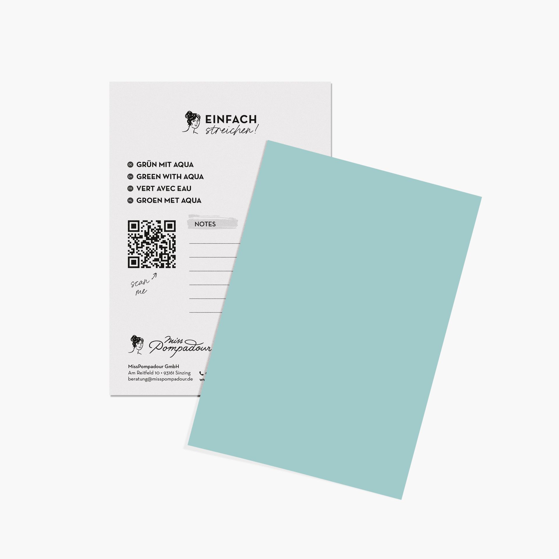
Turquoise is the name given to the lighter nuances of aqua tones. They often contain more green and yellow pigments. Examples from the MissPompadour range include Green with Aqua and Green with Turquoise.
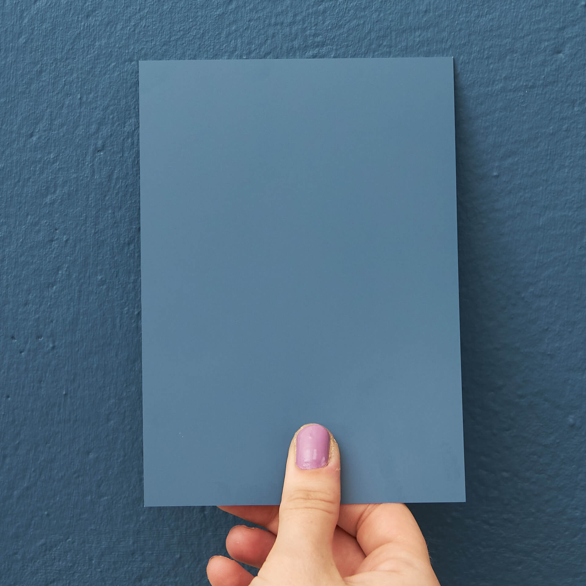
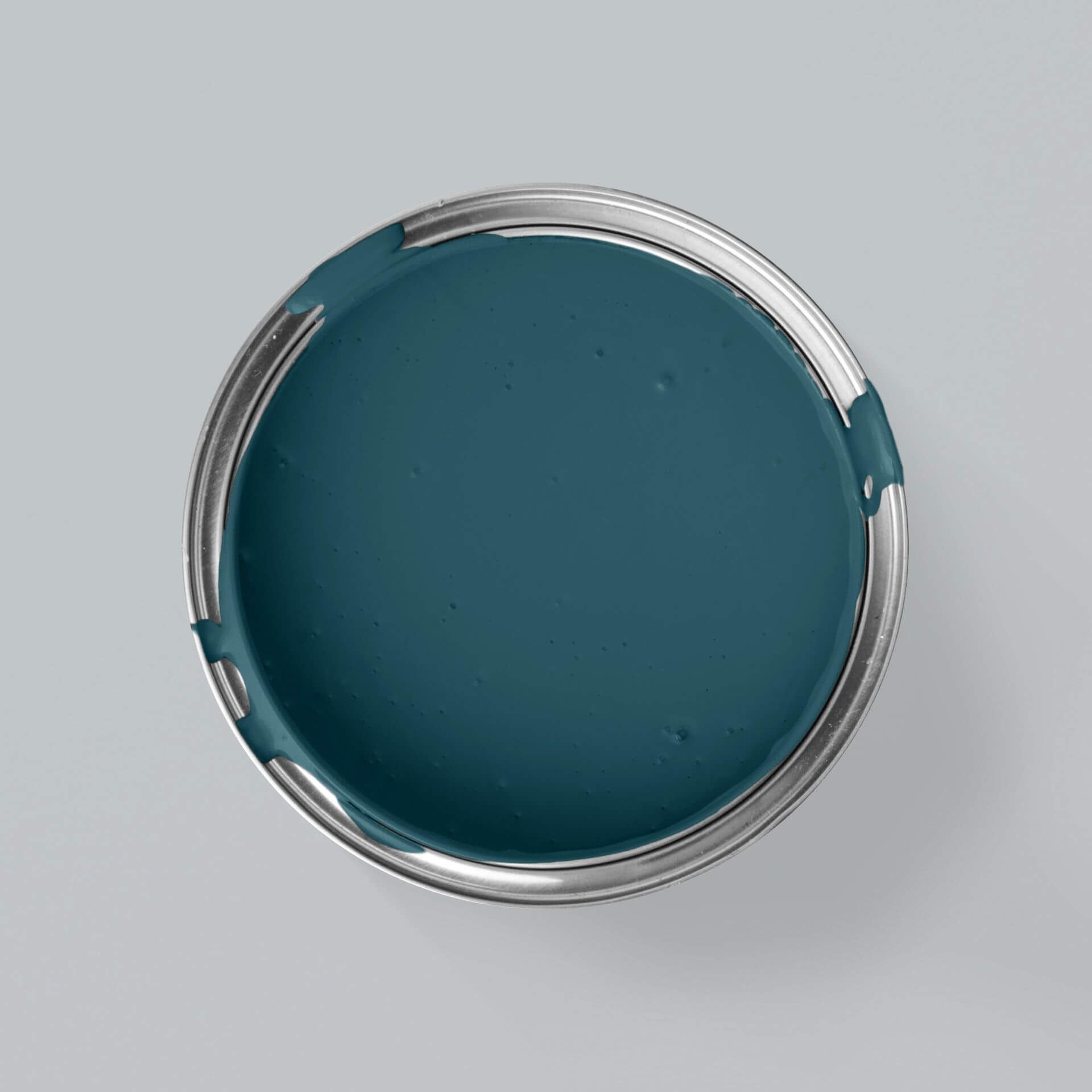
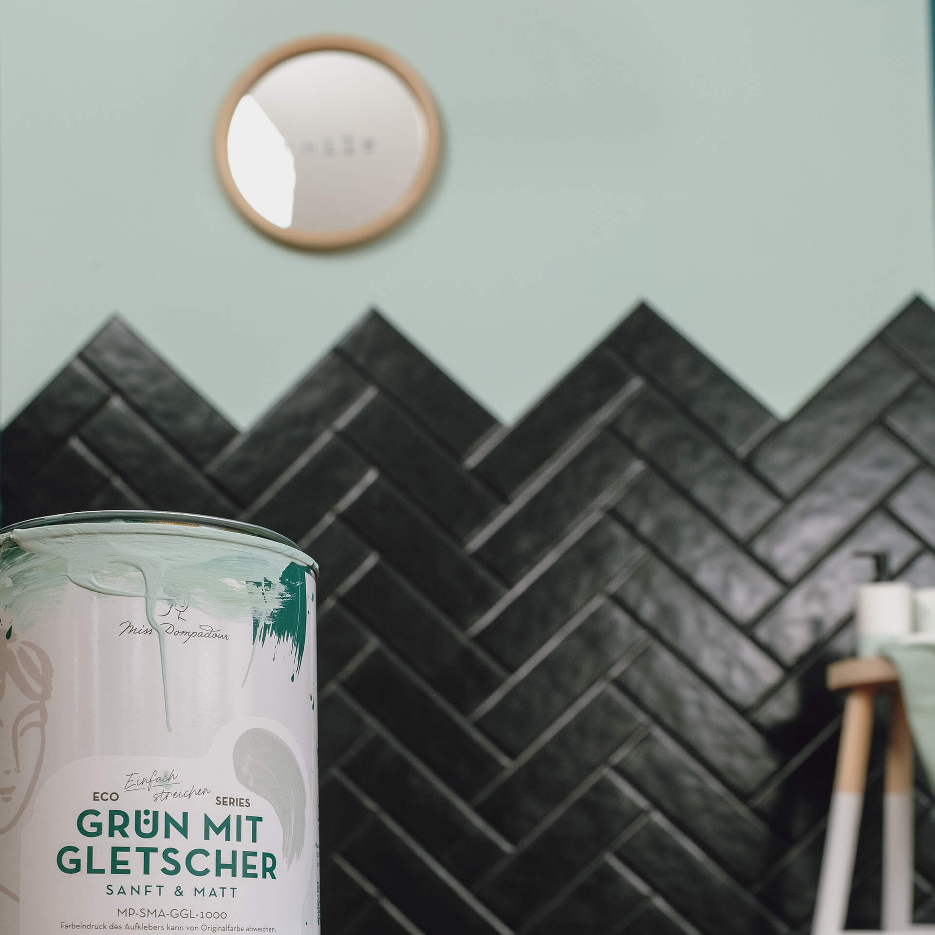
In some petrol tones, the blue component predominates so that you perceive the effect more as a greenish blue. These colour shades include Dark Blue with Green from our Just paint Collection. If the proportion of green pigments predominates, the result is a deep, dark water tone such as Green with Teal
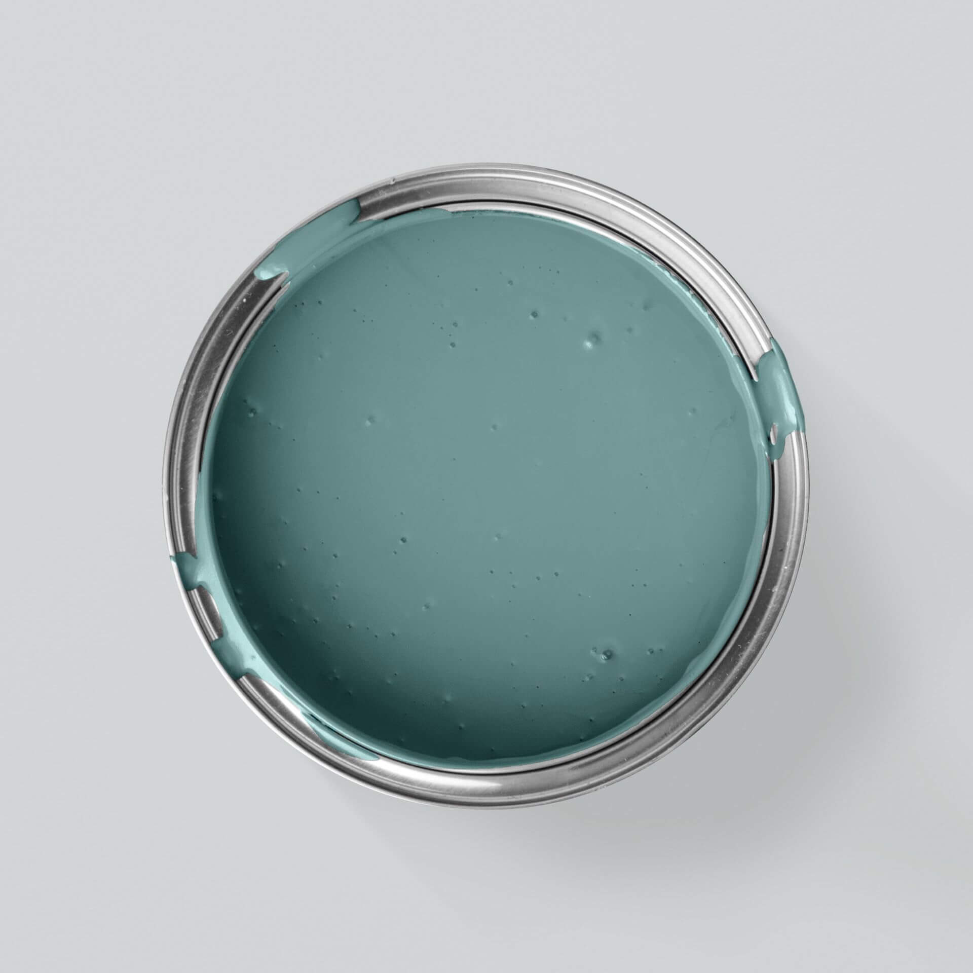
Green with Ocean, for example, is tinted with grey and therefore not quite as strong. The luminous Green with Emerald is intense and at the same time lighter in colour.
Effect of petrol and turquoise
If you decide to buy petrol as a wall paint, you can use it to create great accents. Above all, this colour shade radiates a strong sense of calm and has a relaxing effect on the viewer. Petrol is extremely elegant and profound. The effect varies depending on which component predominates.
Petrol blue wall paint encourages reflection and promotes concentration. With petrol green wall paints, you can give any room an elegant atmosphere. In addition, greenish petrol tones in particular radiate a feeling of safety and security.
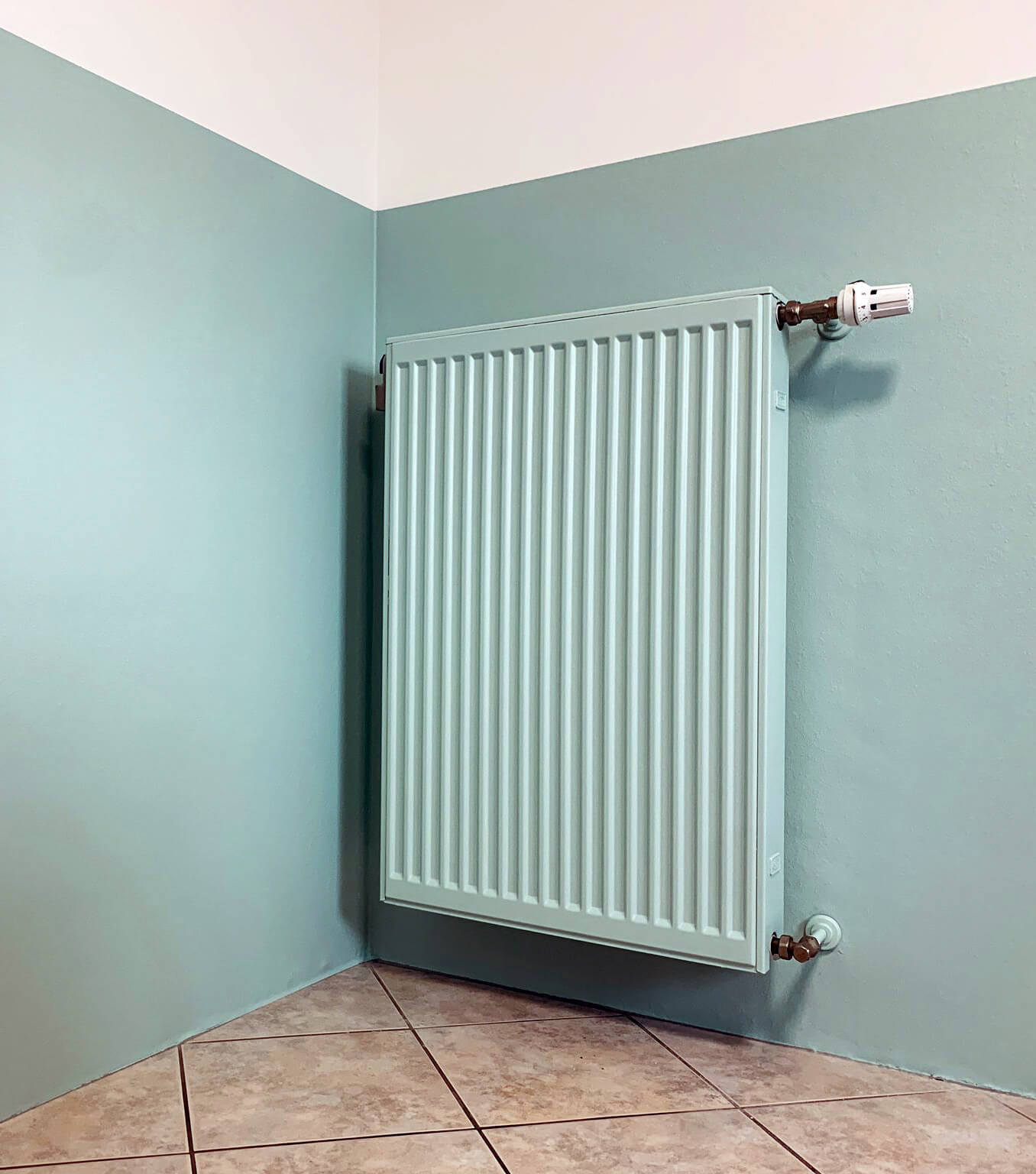
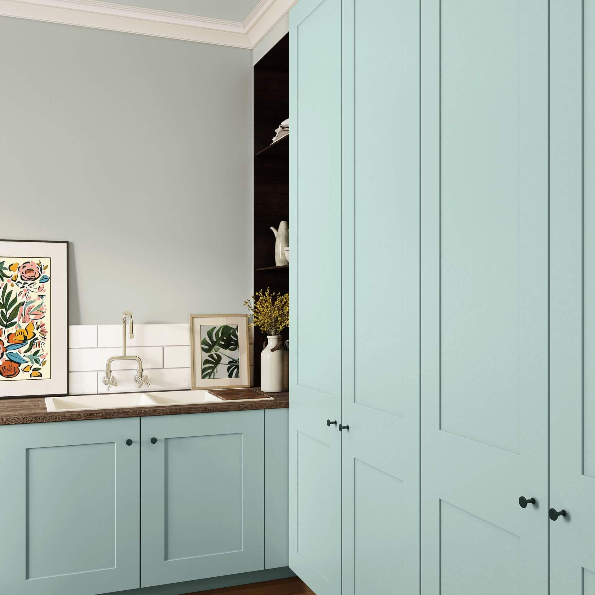
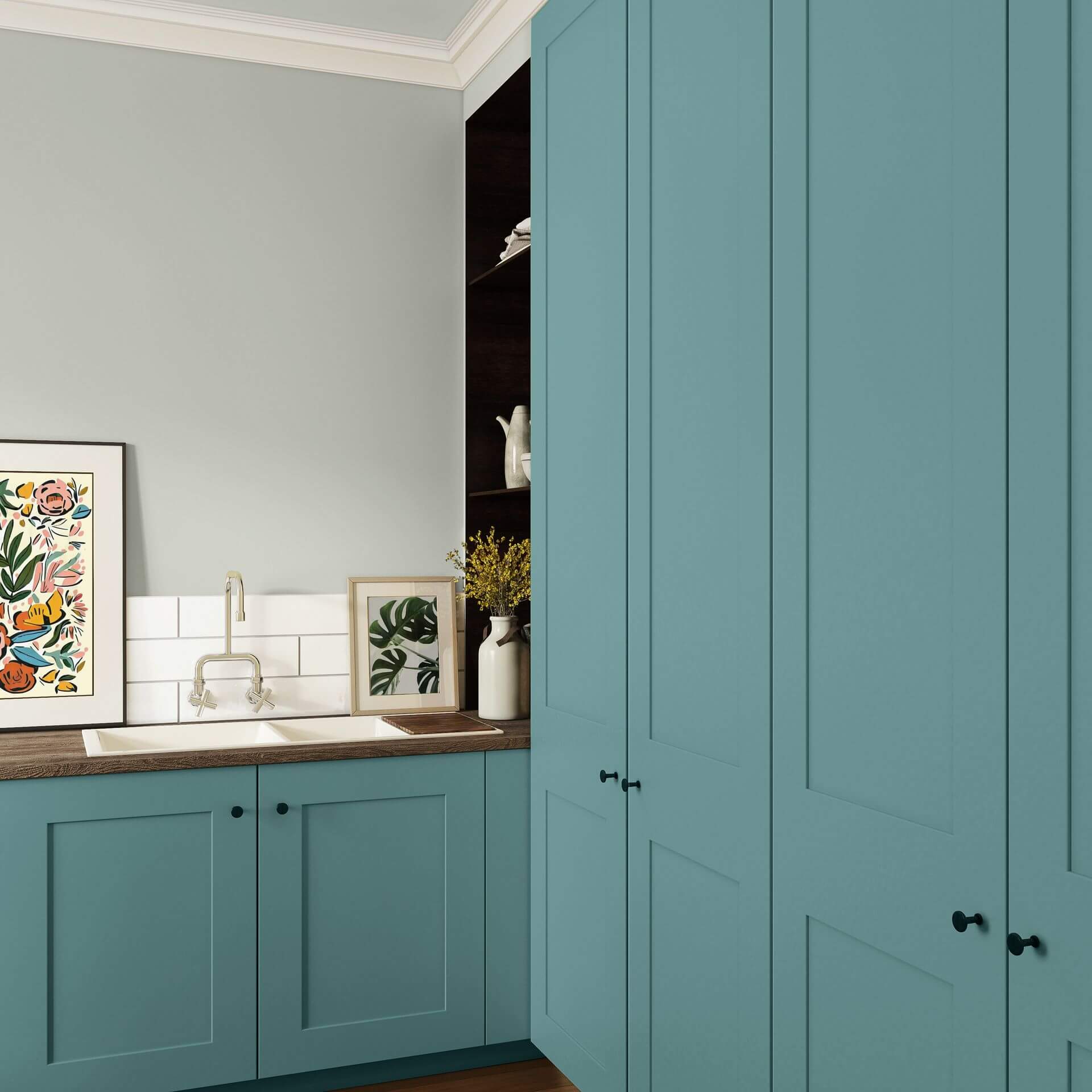
Turquoise walls seem rather cool at first. However, they are revitalising and refreshing. Turquoise promotes emotional balance. Decide between different types of turquoise in the colour scheme: if the green component predominates, your wall paint will appear mint turquoise - as with Green with Emerald. There are turquoise shades such as Green with Lagoon, where the blue component dominates, creating a maritime effect. If you don't want it quite so colourful, opt for a turquoise-grey wall paint such as Green with Ocean. In your bathroom, a light turquoise wall paint is clarifying and fresh. Dark turquoise wall paints create a cosy atmosphere and turquoise green wall paints emphasise the natural and informal effect of this beautiful colour shade. As you can see, there are no limits to your ideas with turquoise.
Petrol & turquoise colour for many rooms
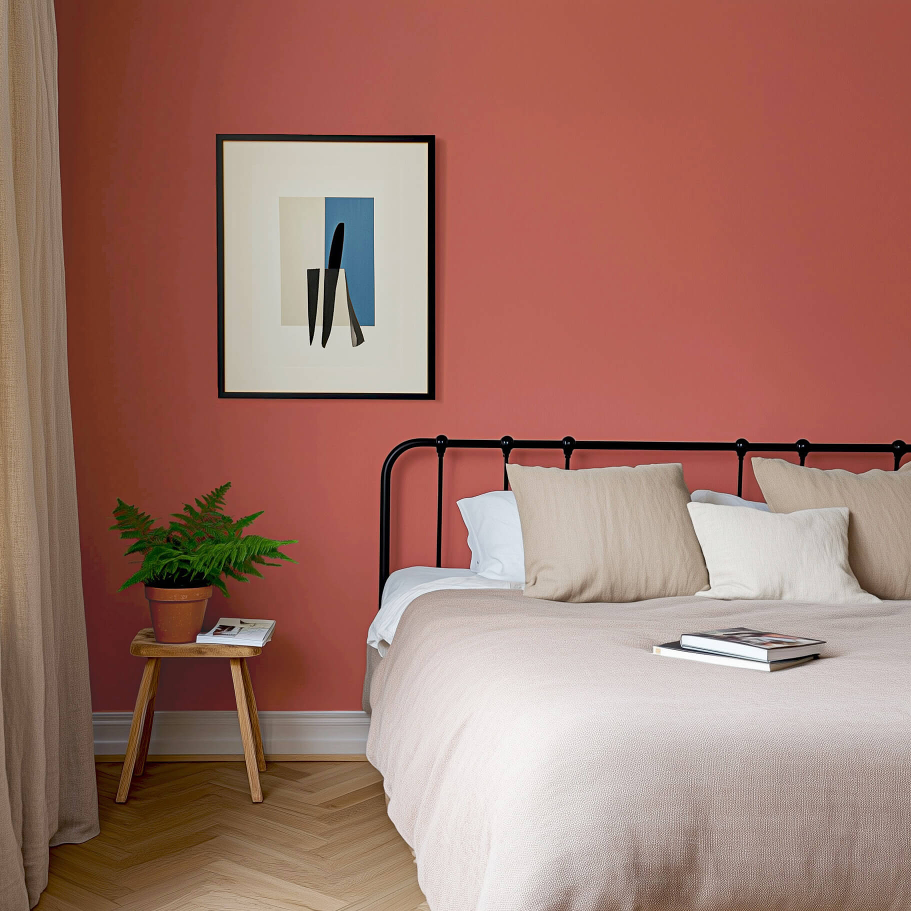
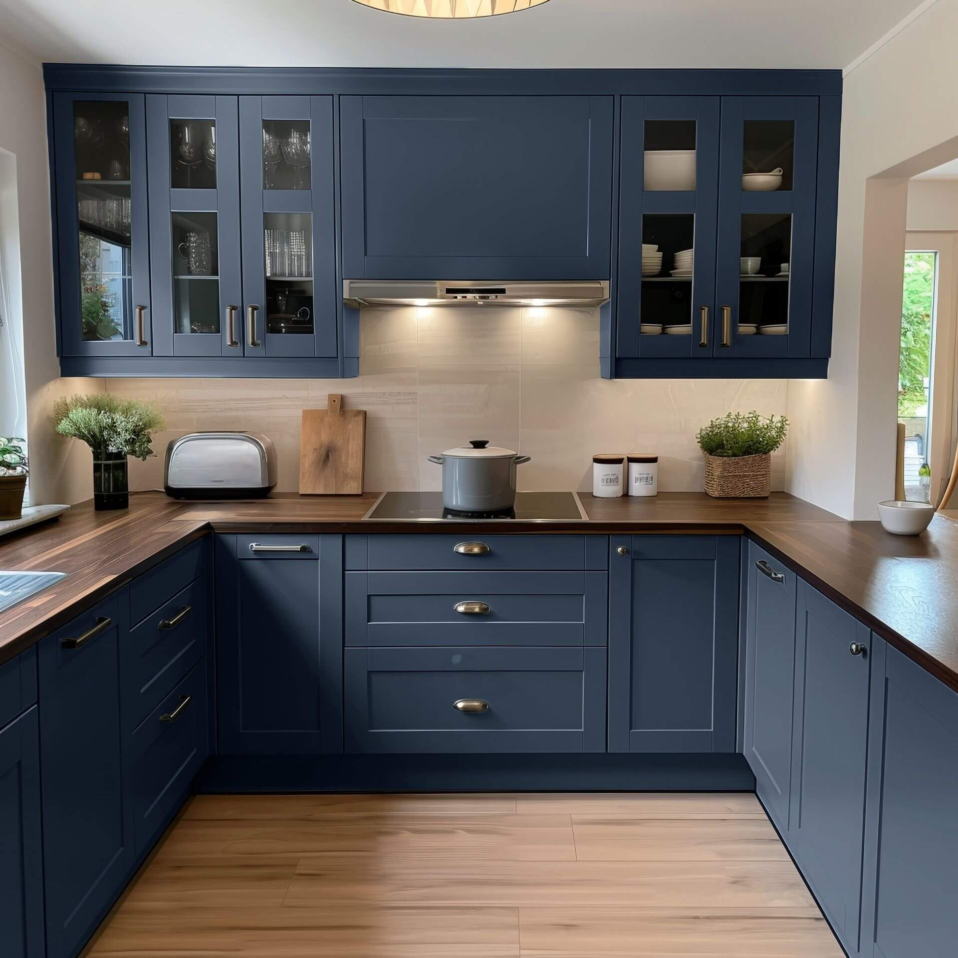
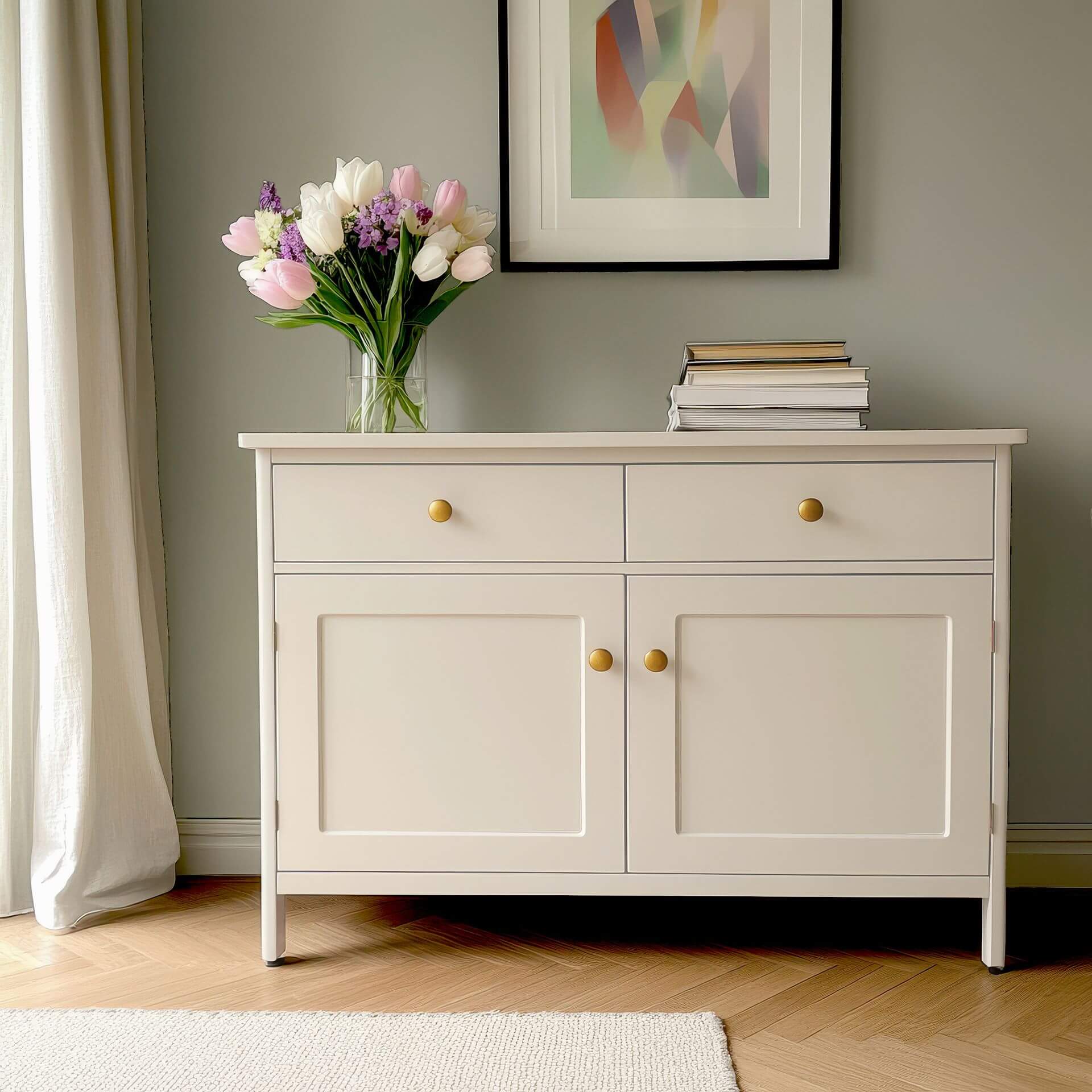
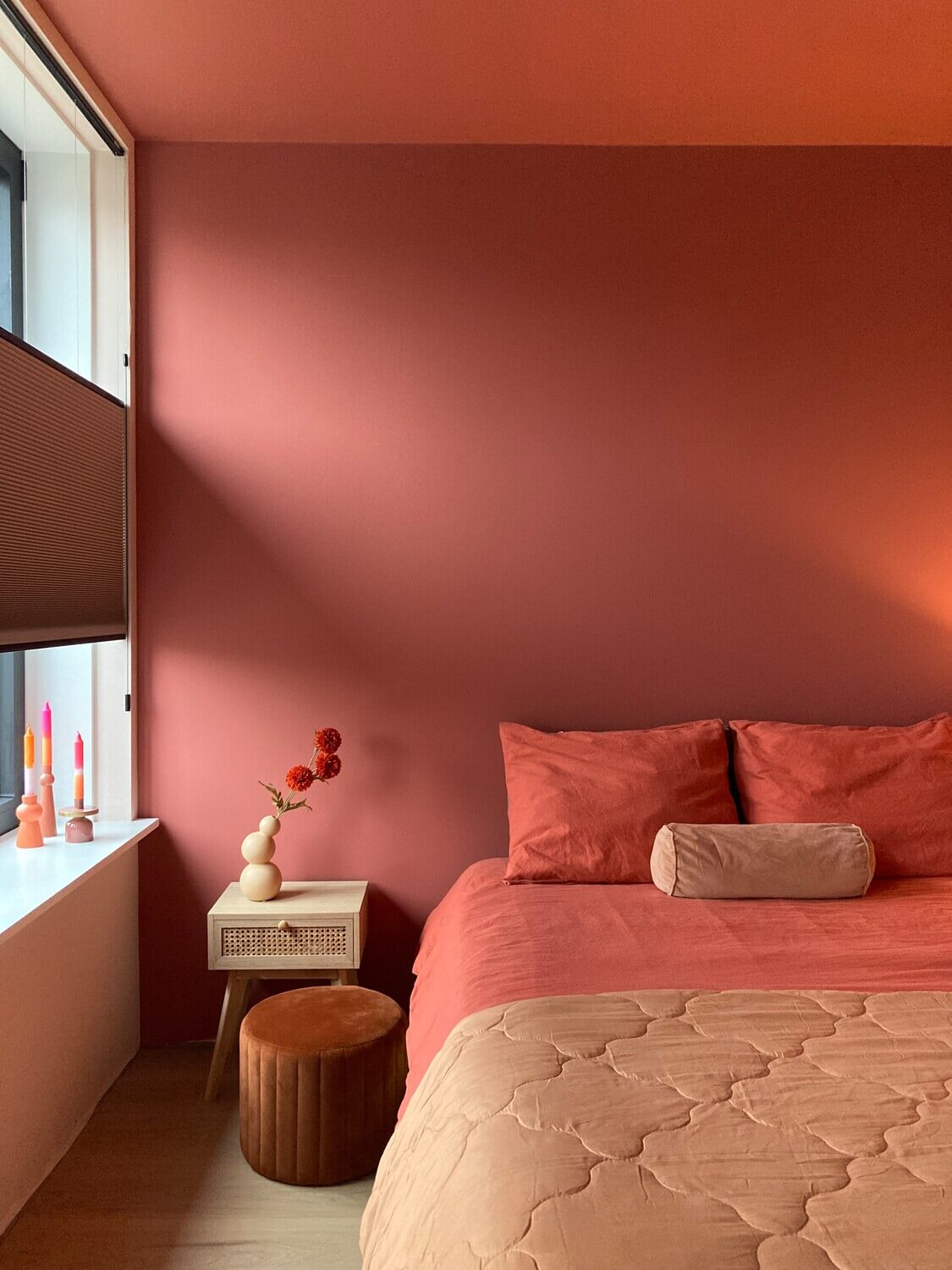
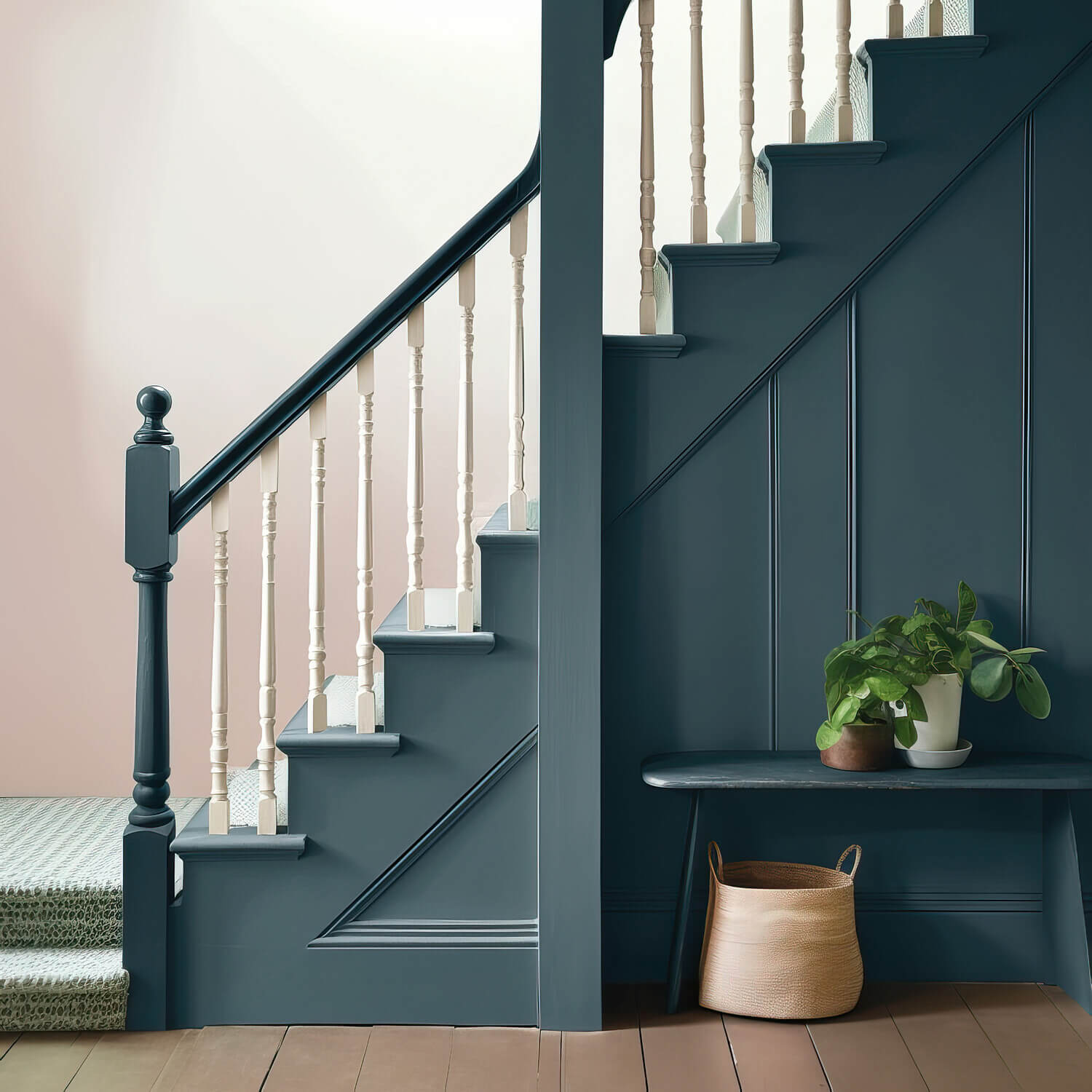
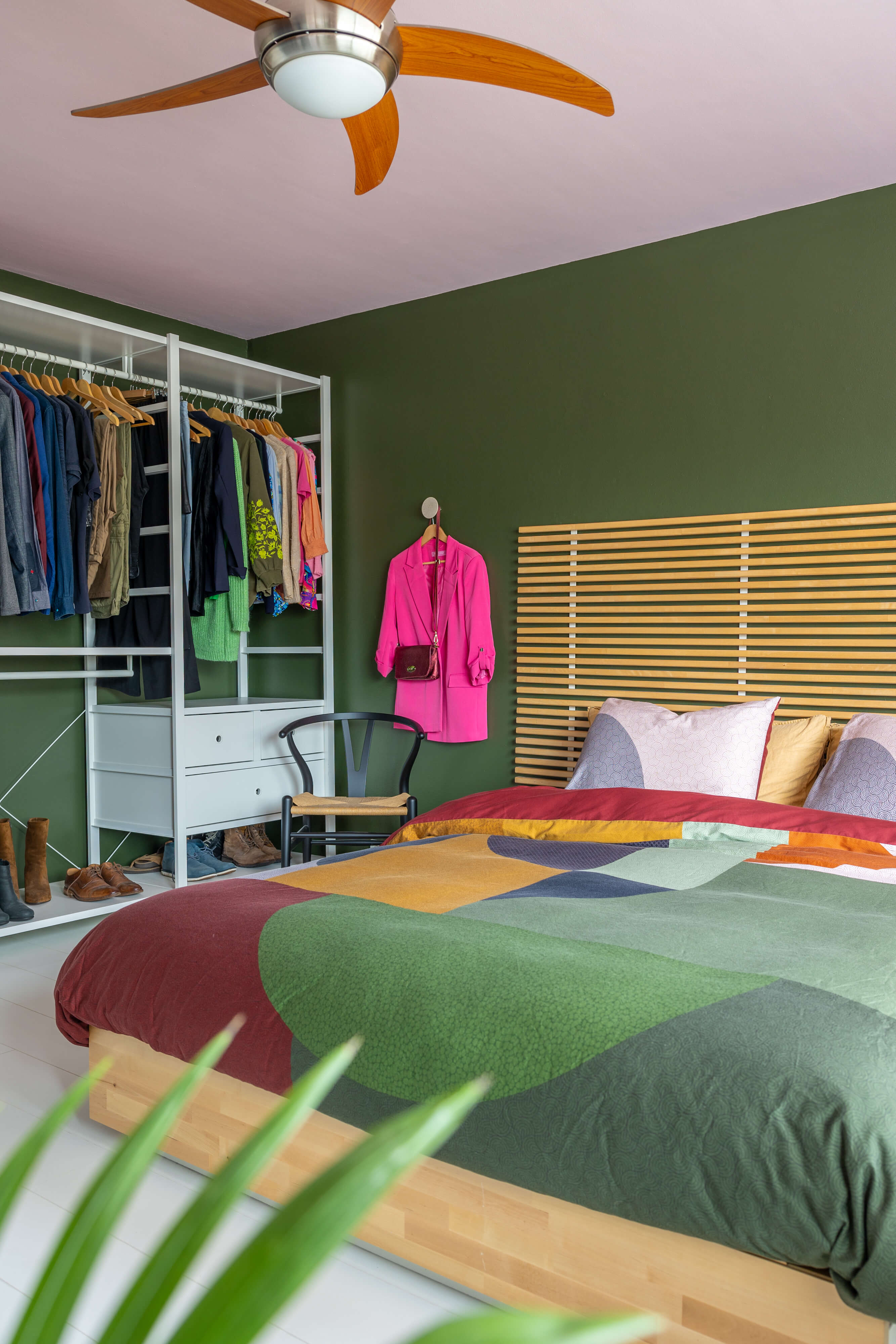
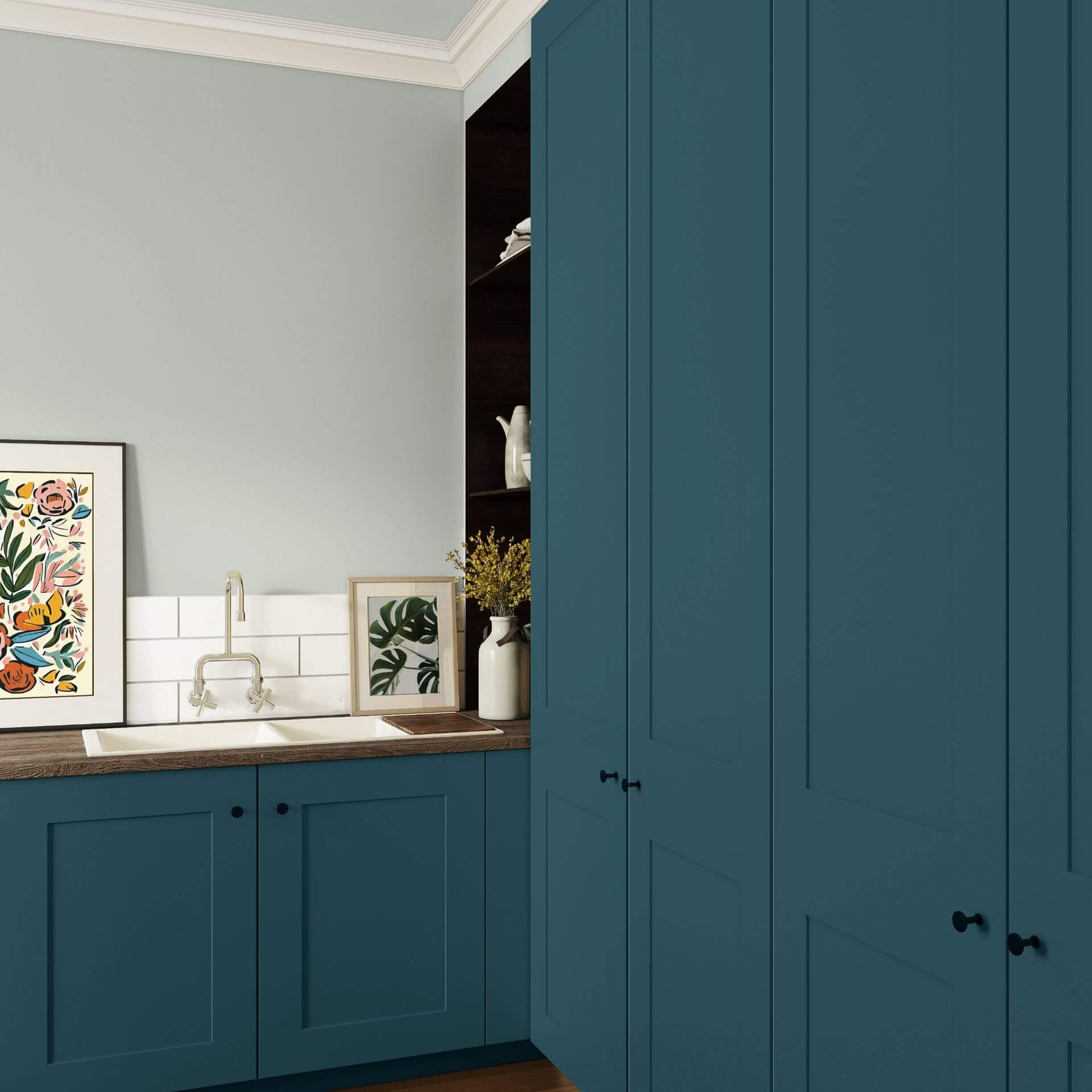
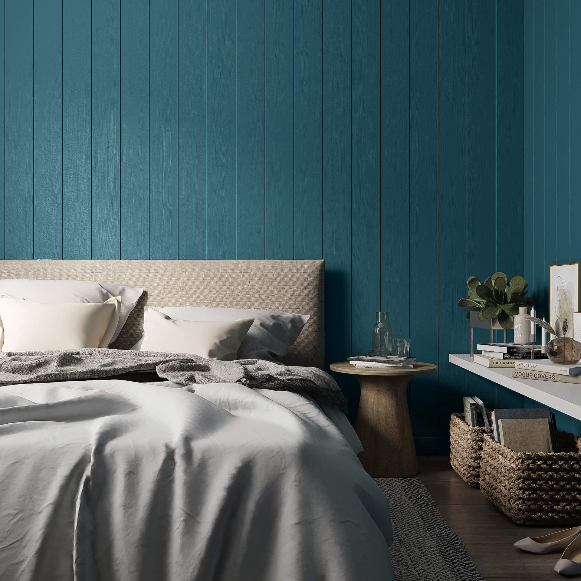
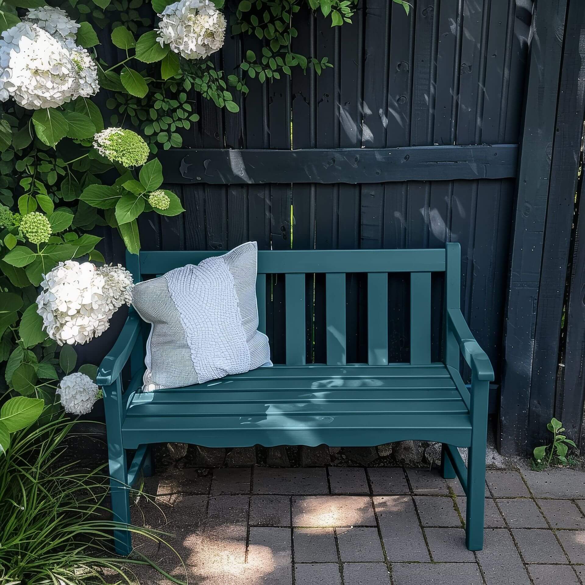
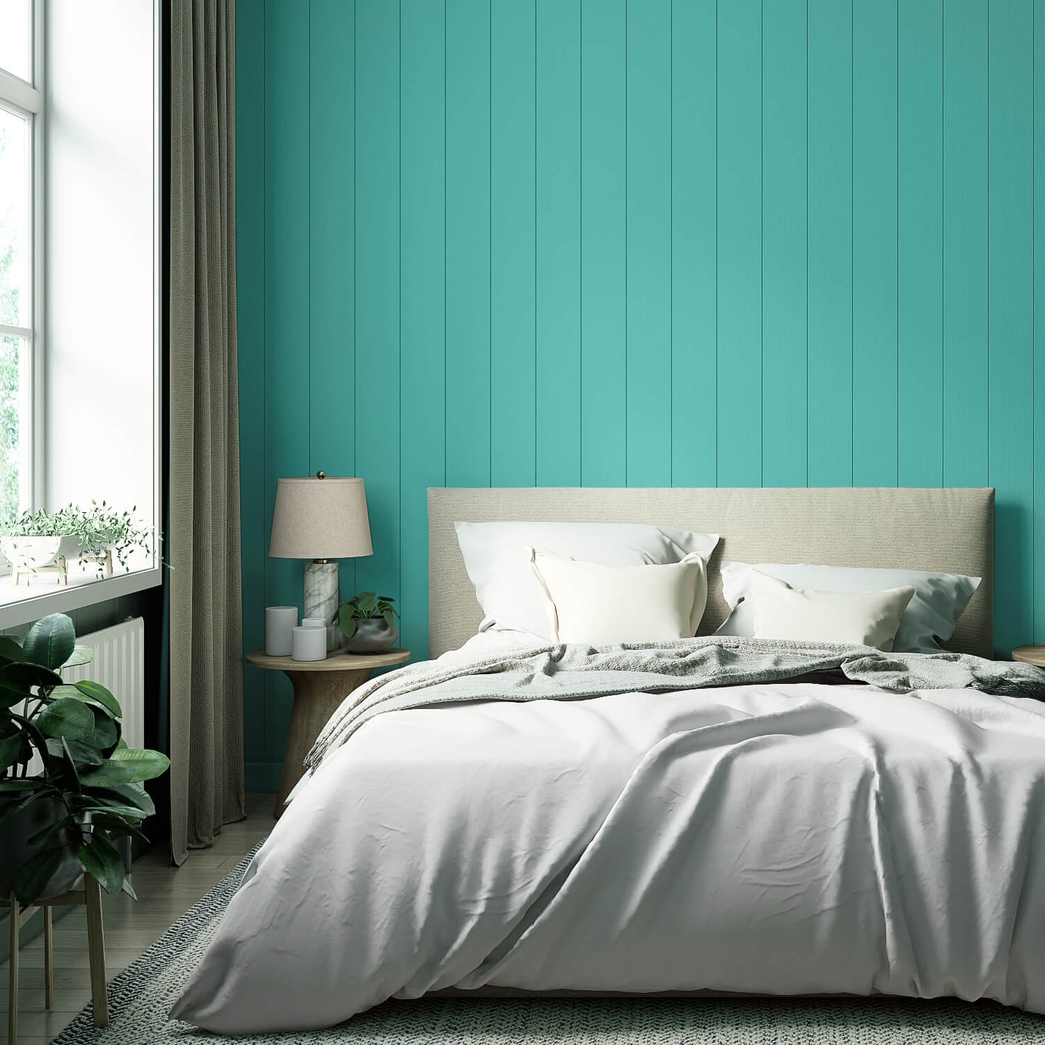
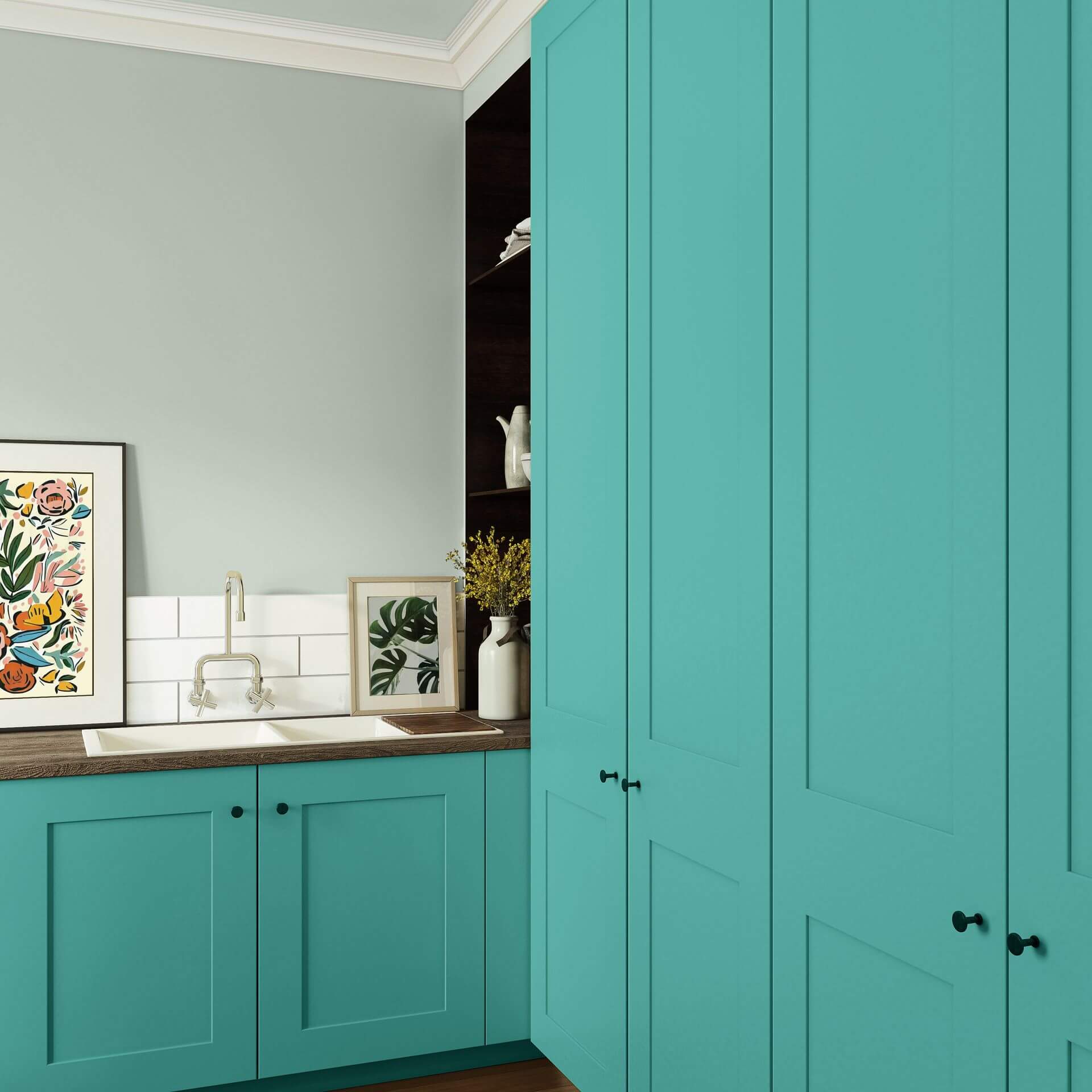
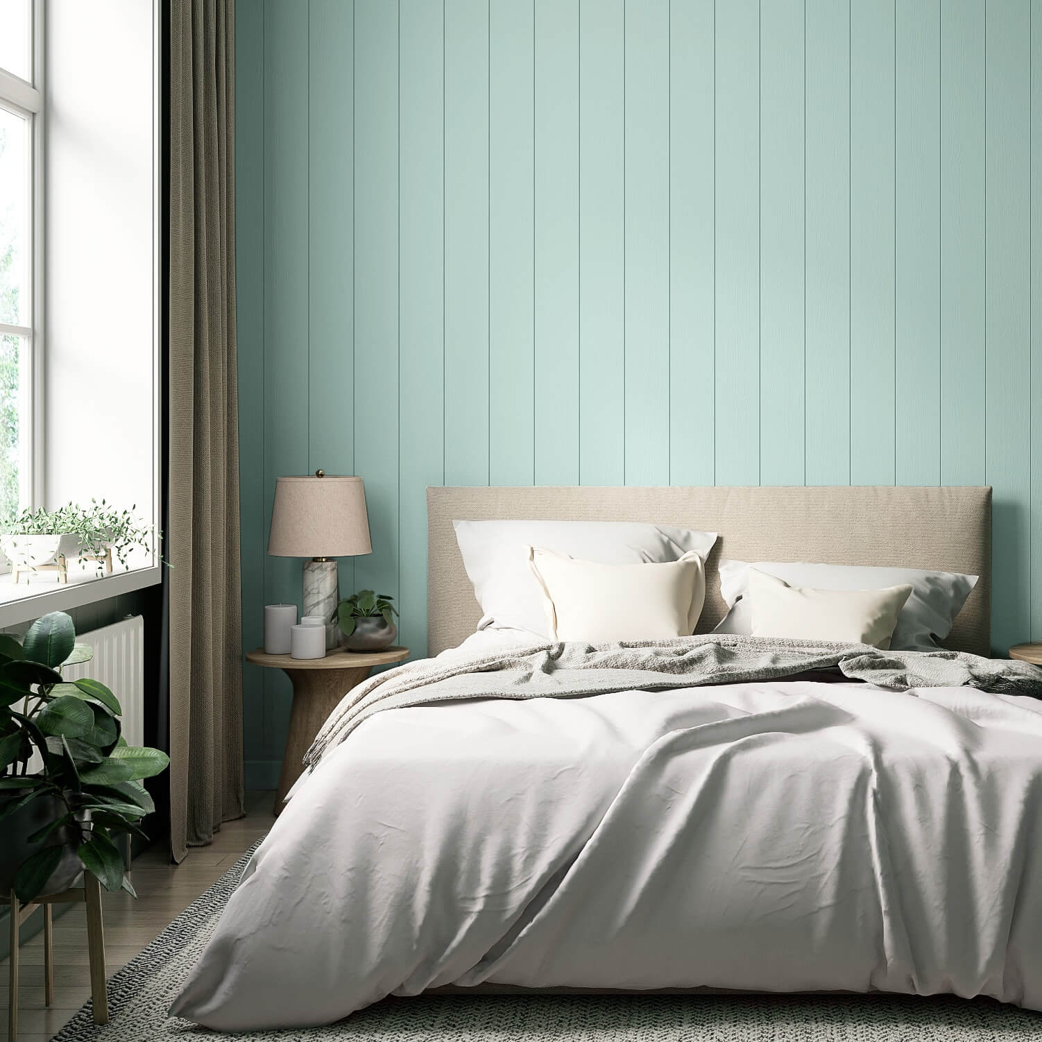
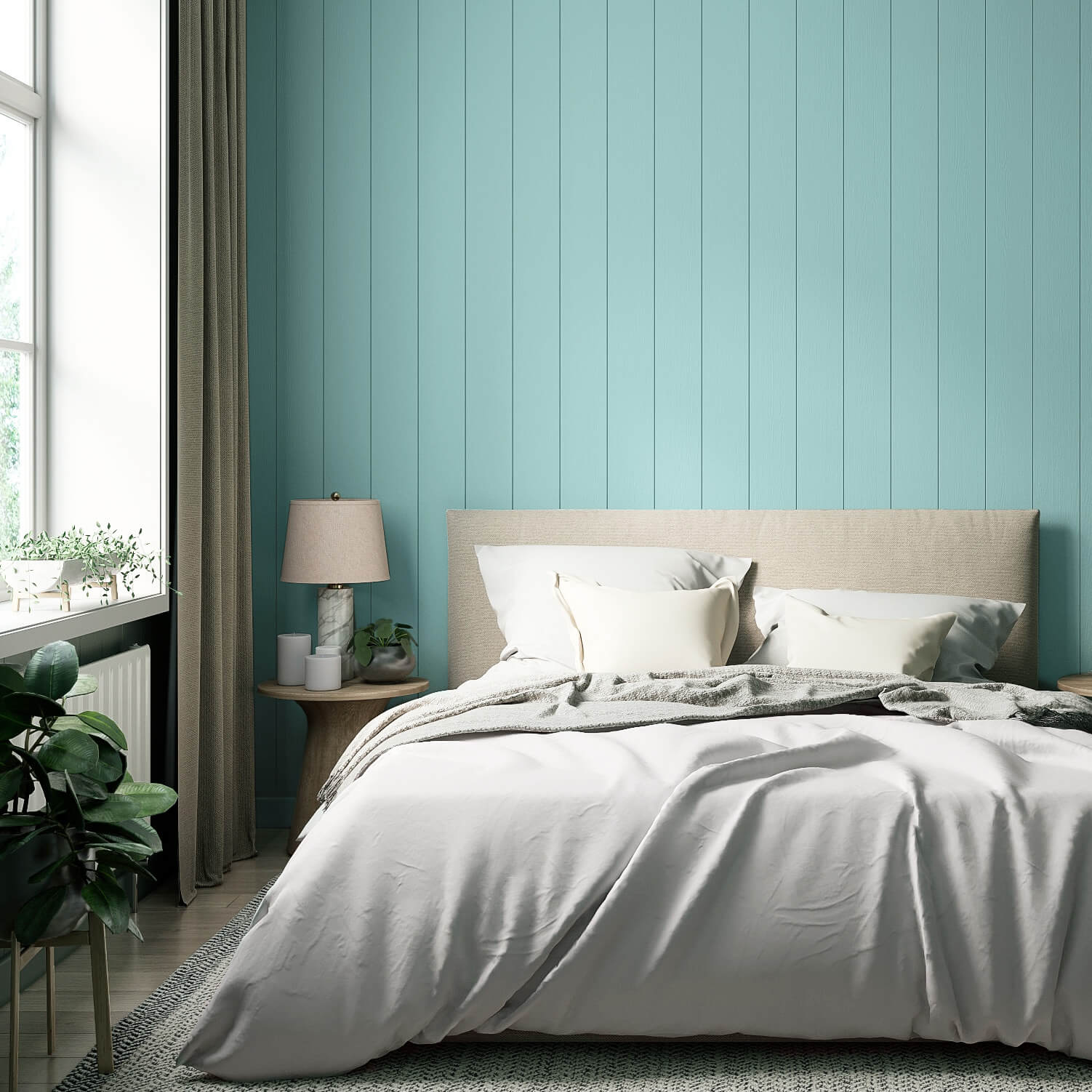
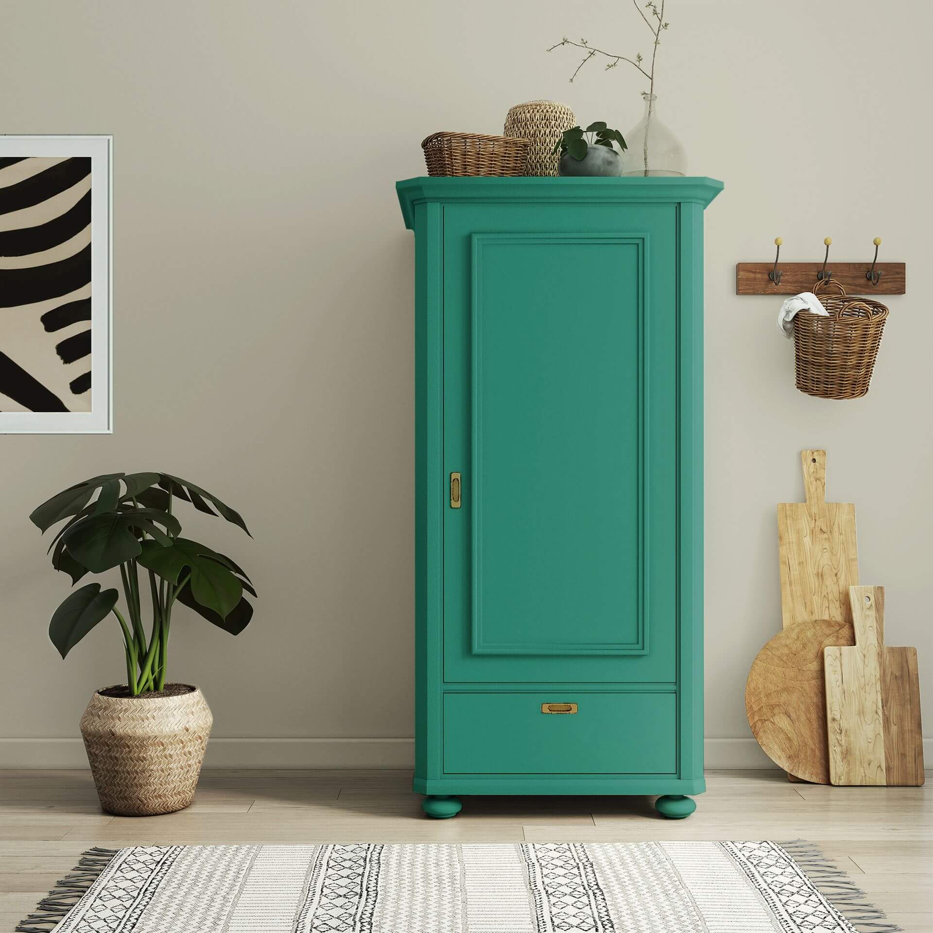
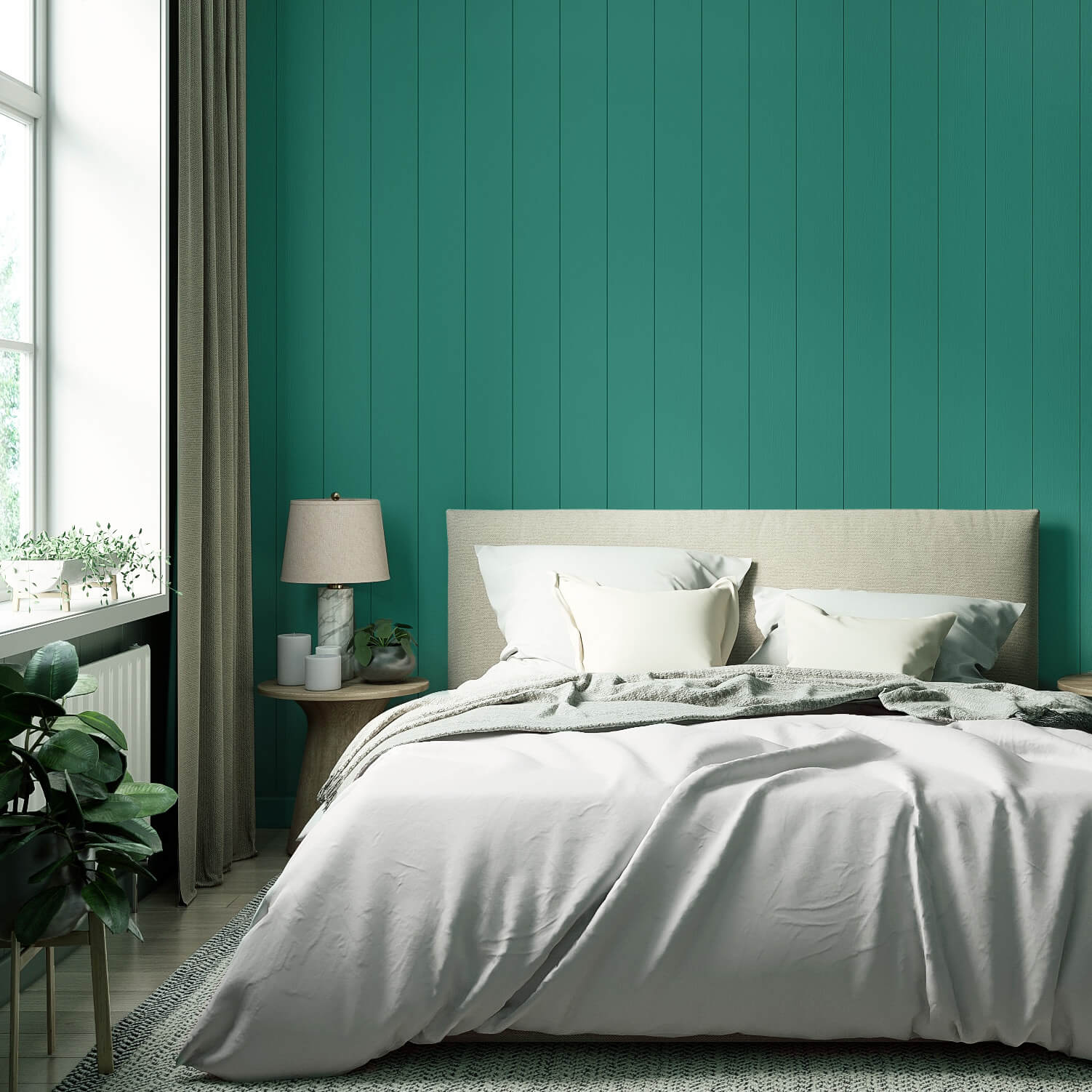
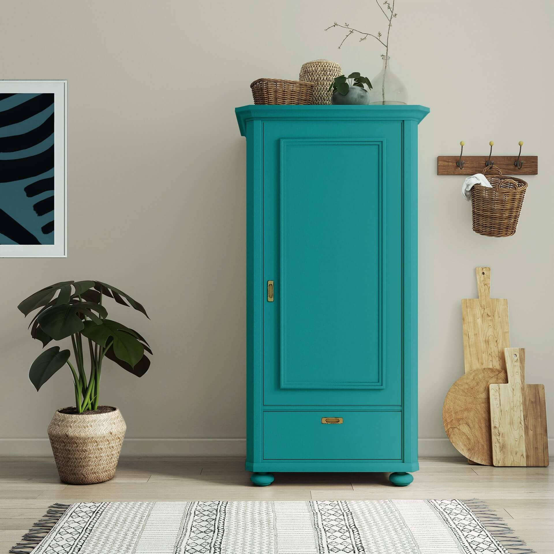
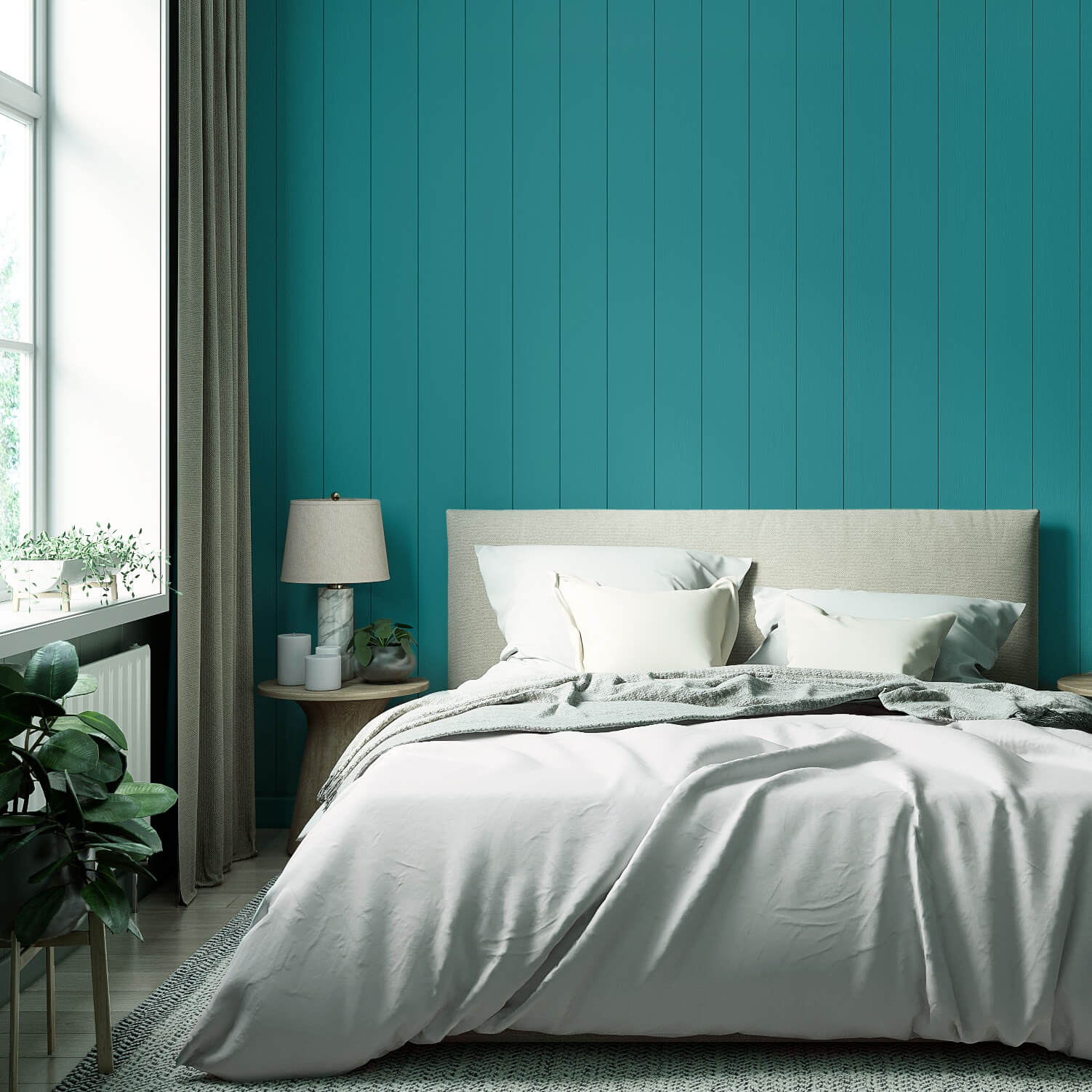
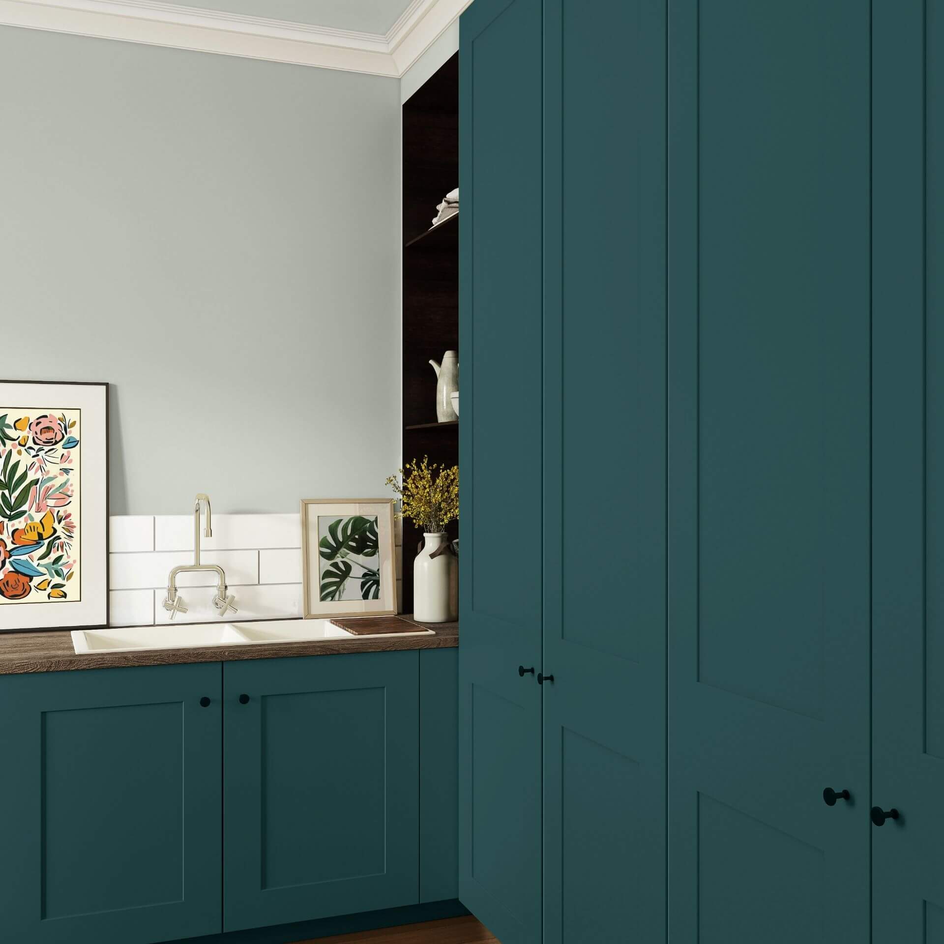
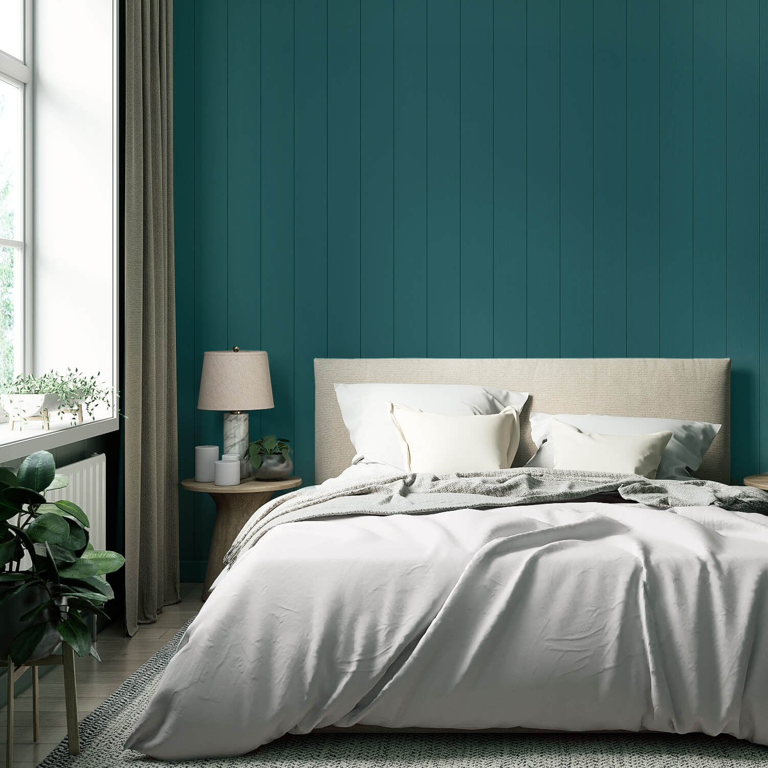
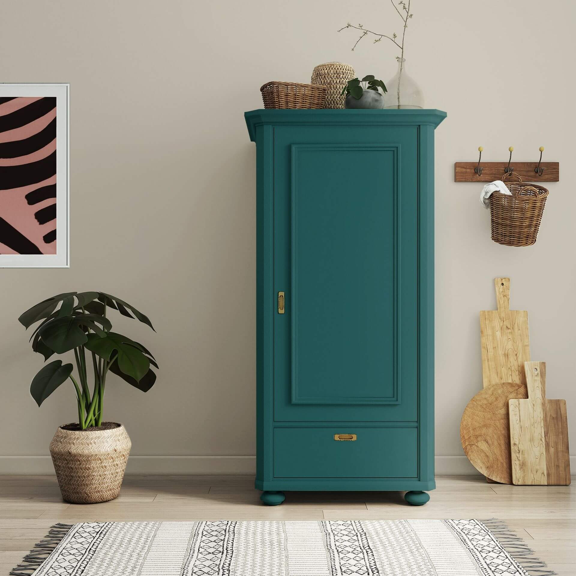
In the bedroom, petrol radiates cosiness and elegance as a dark contrast, for example on just one wall or as a painted wardrobe. In combination with warm white or light wall paints in grey, you can create a very special atmosphere.
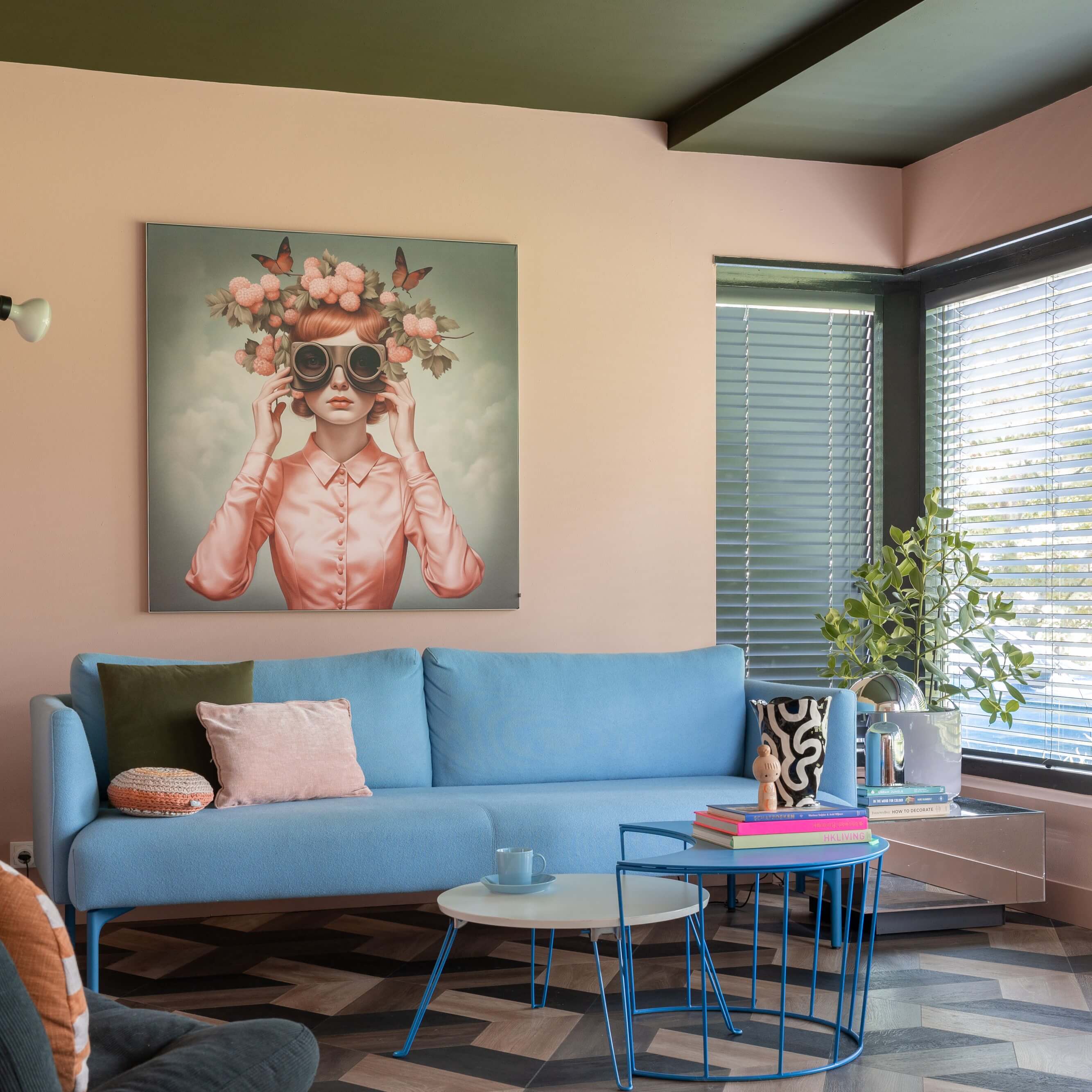
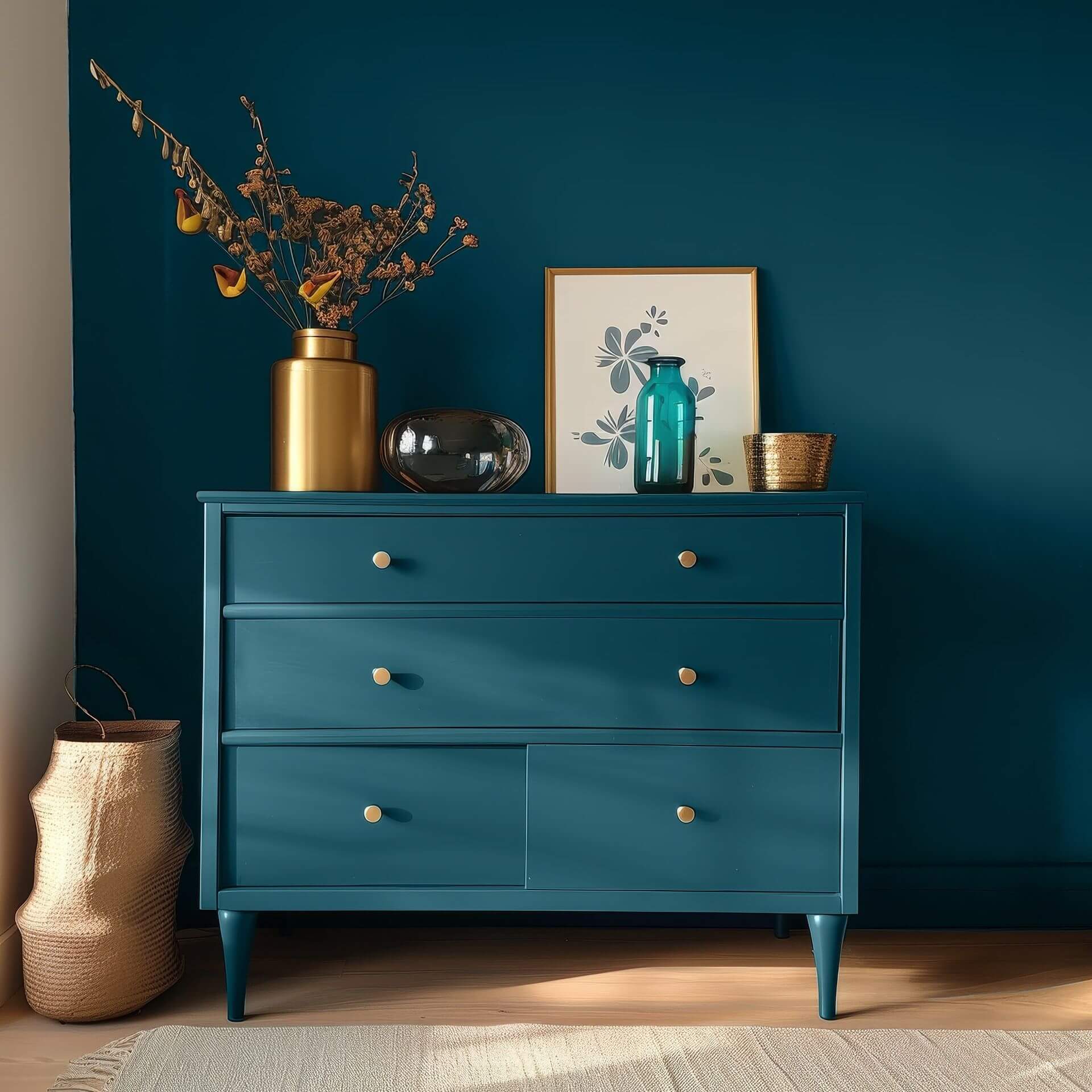
Petrol also comes into its own in the living roomas a deep colour shade. Combined with furniture in light natural wood colours, you can create a cosy atmosphere with petrol. Accessories in gold or copper underline the elegant effect of this colour. Strong colours such as red or orange shine all the more against the background of this neutral colour, while soft pastel shades form a gentle contrast to the intense petrol.
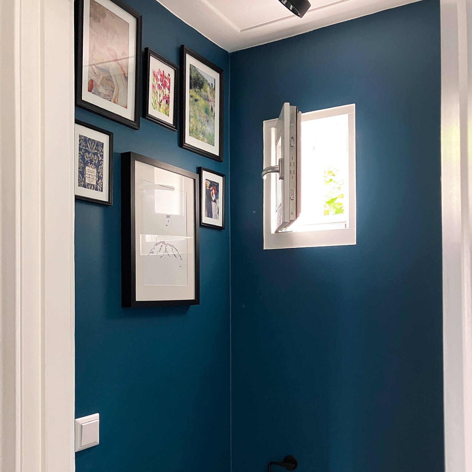
Petrol-coloured walls also form a perfect backdrop for art of all kinds. From modern and abstract to classic works in gold frames, a dark petrol colour is fantastic for showing off pictures.
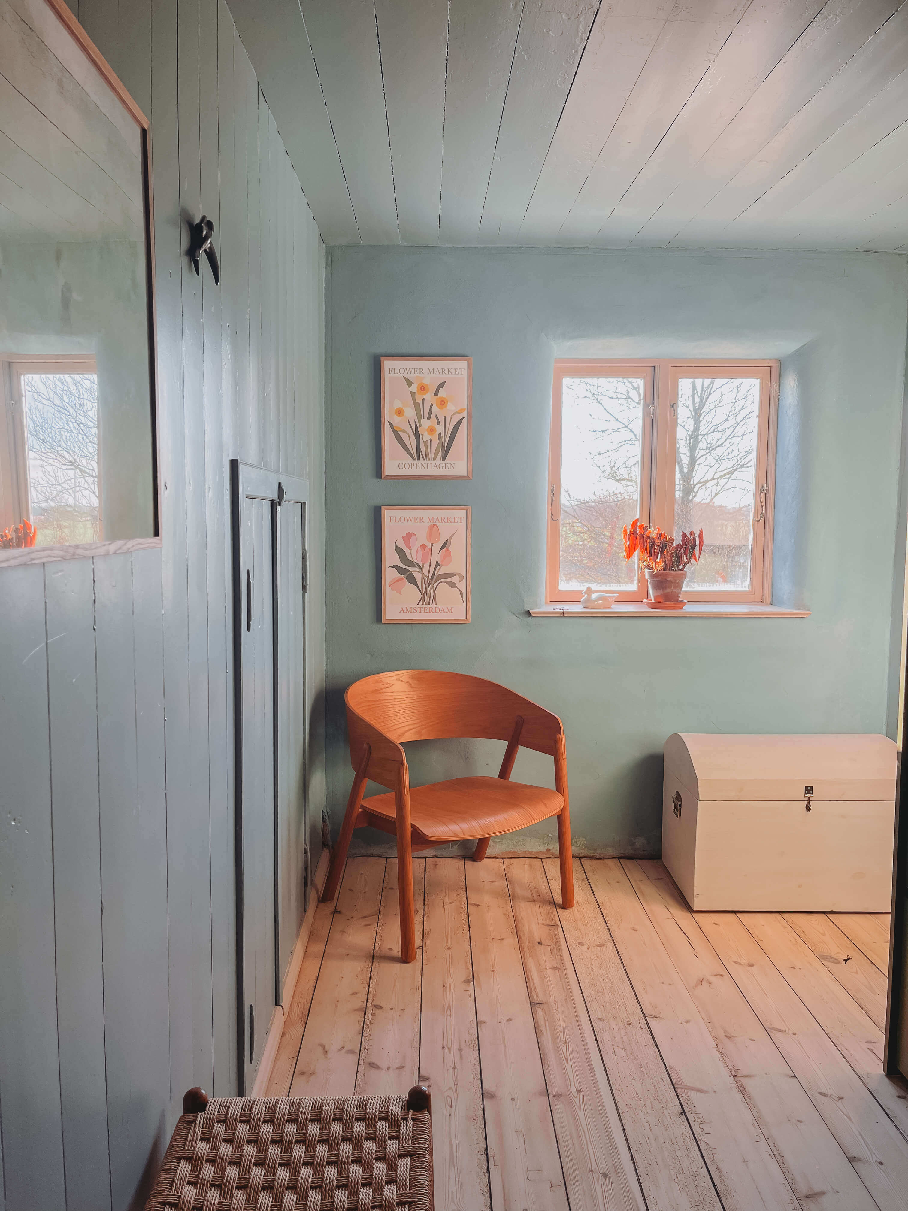
Light turquoise tones tend to be used in children's rooms. They provide balance and calm. Furniture in turquoise has both an invigorating effect for playing and a balancing effect for relaxing in the evening.
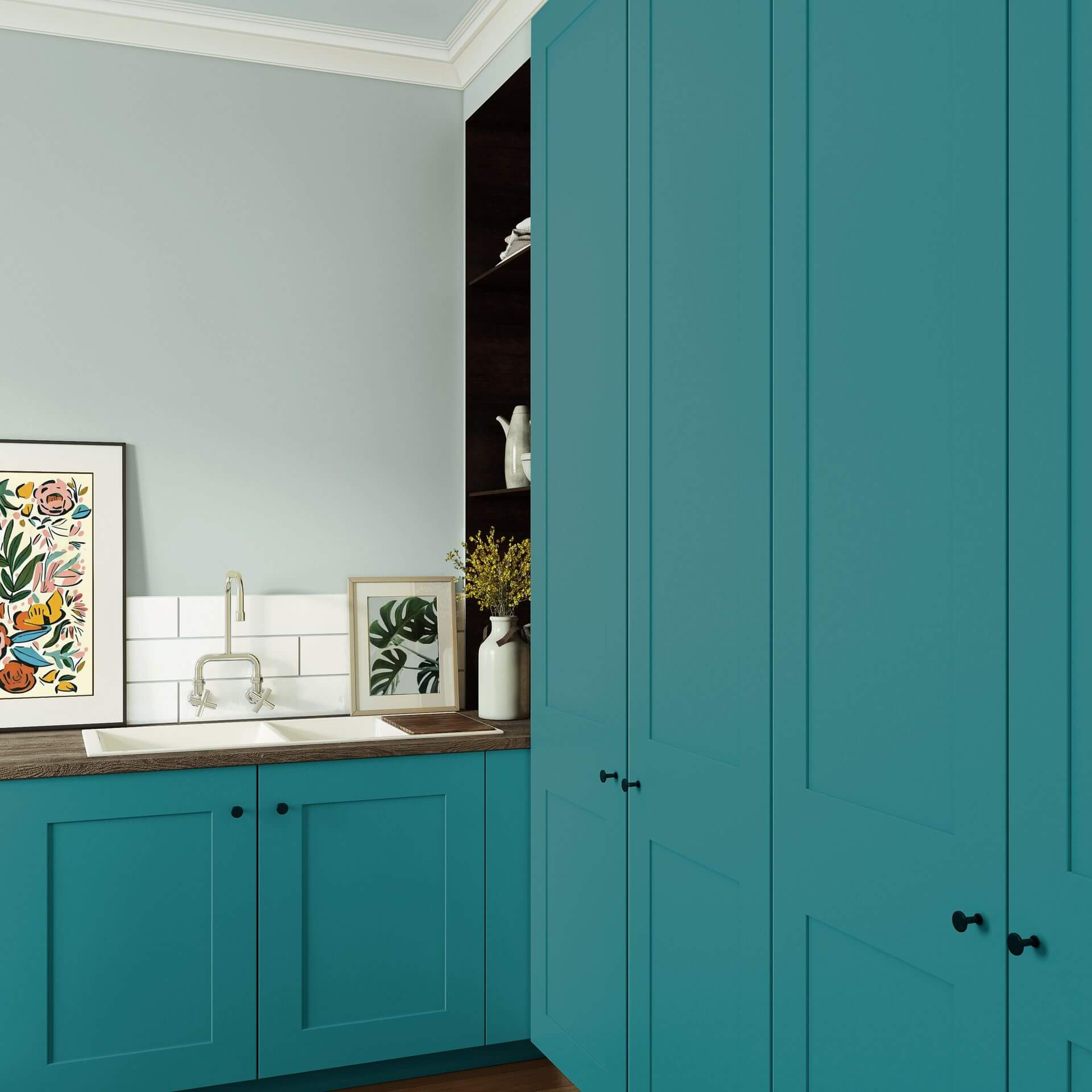
Used in the office or home office, the factual and clarifying effect of the turquoise colour shade comes to the fore. In workspaces, a bright, fresh turquoise colour can be combined with clear white to create a focused atmosphere that is particularly conducive to work.
Tips for the elegant trend colour petrol
As an interesting alternative to pure blue or green, you can create a wow effect in your interior with petrol.
Living styles and trends in petrol colours
Thanks to their wide range, petrol and turquoise cannot be assigned to just one interior design style. Both colours are also core elements of an oriental style. Combined with sandy beige and warm natural woods, you are sure to create a successful interior. Turquoise is also fresh in a Mediterranean living style and brings vibrancy to an interior design style that is otherwise characterised by warm natural tones. In combination with oak and warm white tones, you'll feel like you've been transported to the coast of Greece.
Petrol tones go just as well in a classic ambience with antiques or in a modern interior with clear shapes. Anyone who appreciates natural furnishings will find what they are looking for in petrol tones, as will someone who wants to display their art collection on the walls.
Harmonious combinations with the colours petrol and turquoise
Due to its adaptability, the colour petrol can be combined with many colour shades. Colour in dark petrol can be combined with all cool, light tones if it is used as an accent colour. Blue with Snow and White with Linden Green from the Just paint Collection, for example, go wonderfully with all petrol tones.
As an aqua tone, petrol forms an almost magical combination with all other aqua tones. You can achieve an exciting effect by combining it with colours such as Green with Aqua, Green with Turquoise or Green with South Sea. These colour shades really shine against a petrol-coloured background.
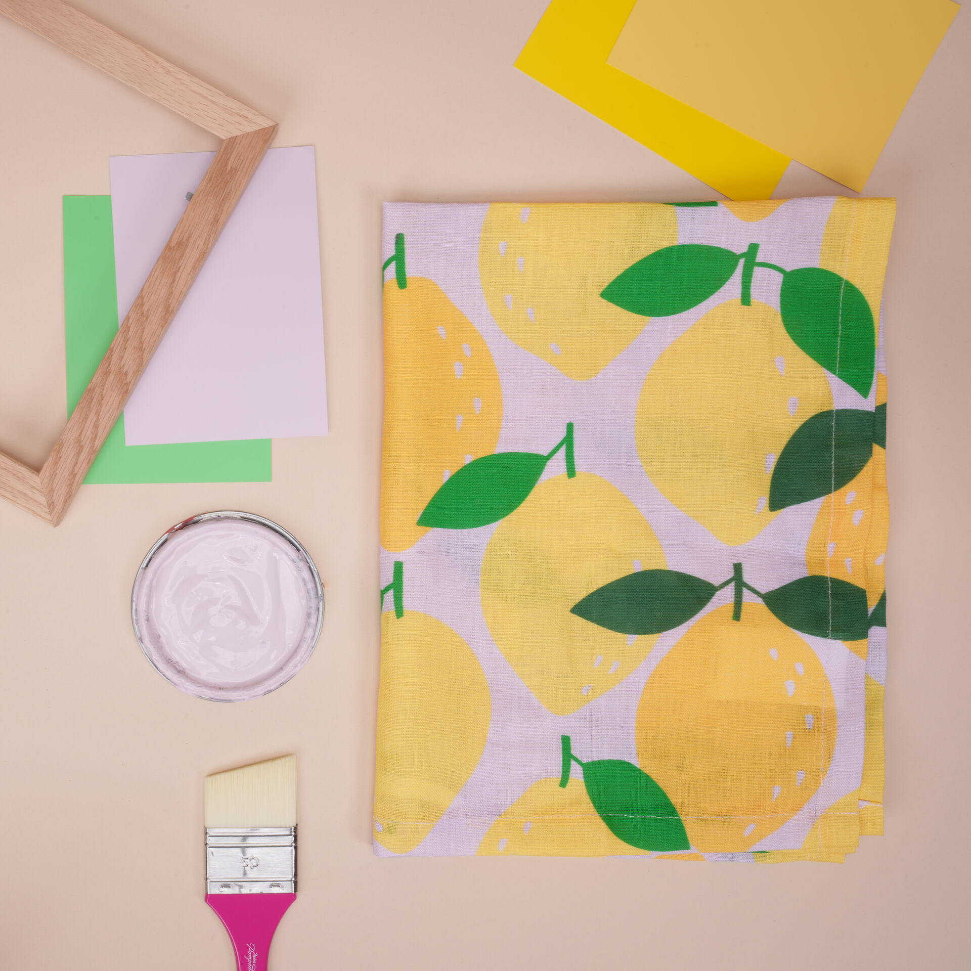
Petrol also works perfectly with pastel shades. Combine it with colour shades such as Purple with Lavender or our delicate Yellow with Sun. Perhaps you could paint an accent piece of furniture in Rose with Cherry Blossom on the outside and a petrol shade on the inside?
If you have decided on turquoise tones, you can combine all earth tones such as Brown with Choc wonderfully. Light grey and beige tones also go very well. If you like bright colours, you can present your favourite strong accent colour fantastically against a muted petrol background: What do you think of the warm Yellow with Saffron, Pink with Peony or Red with Cherry?
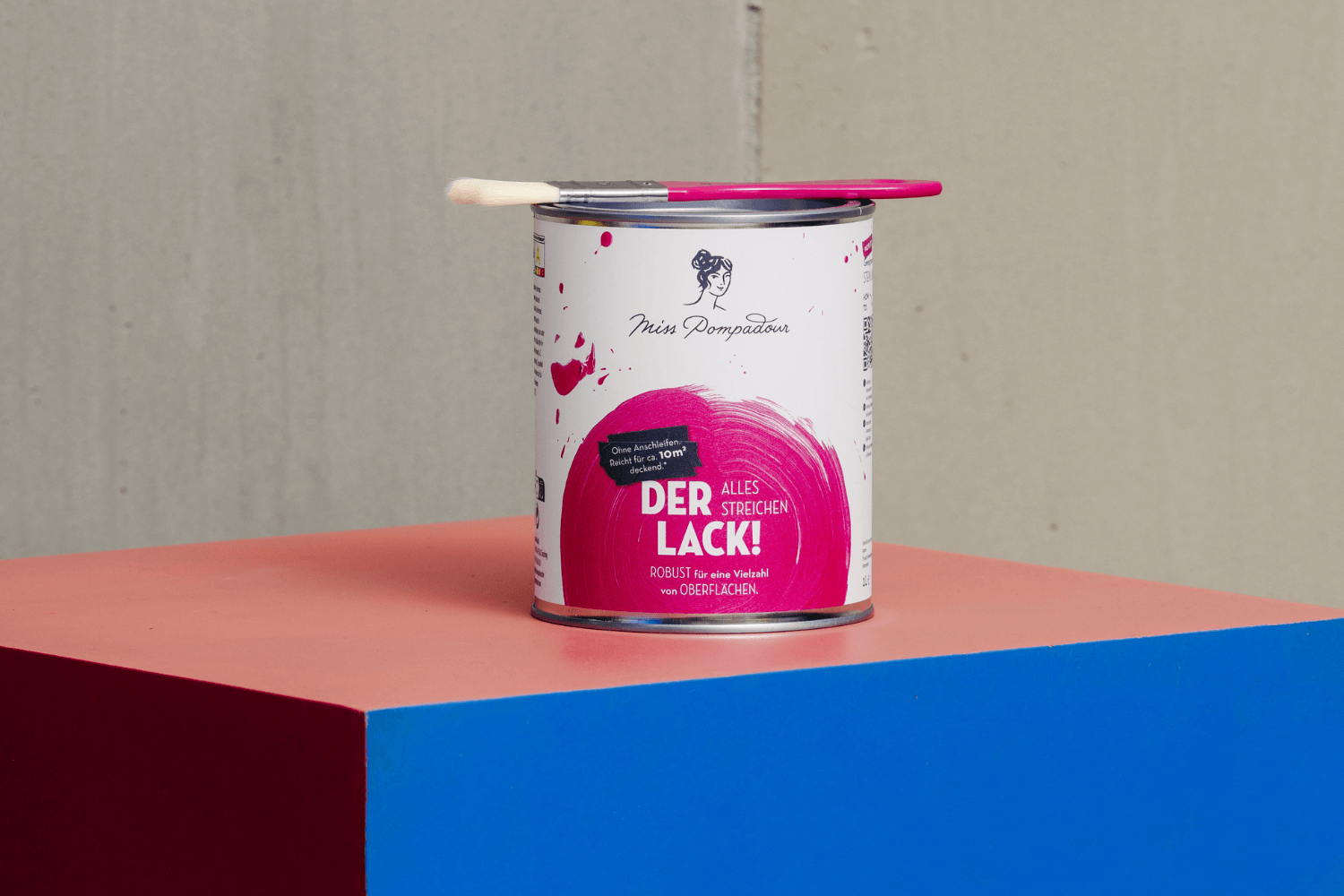
Which colours can I order from MissPompadour?
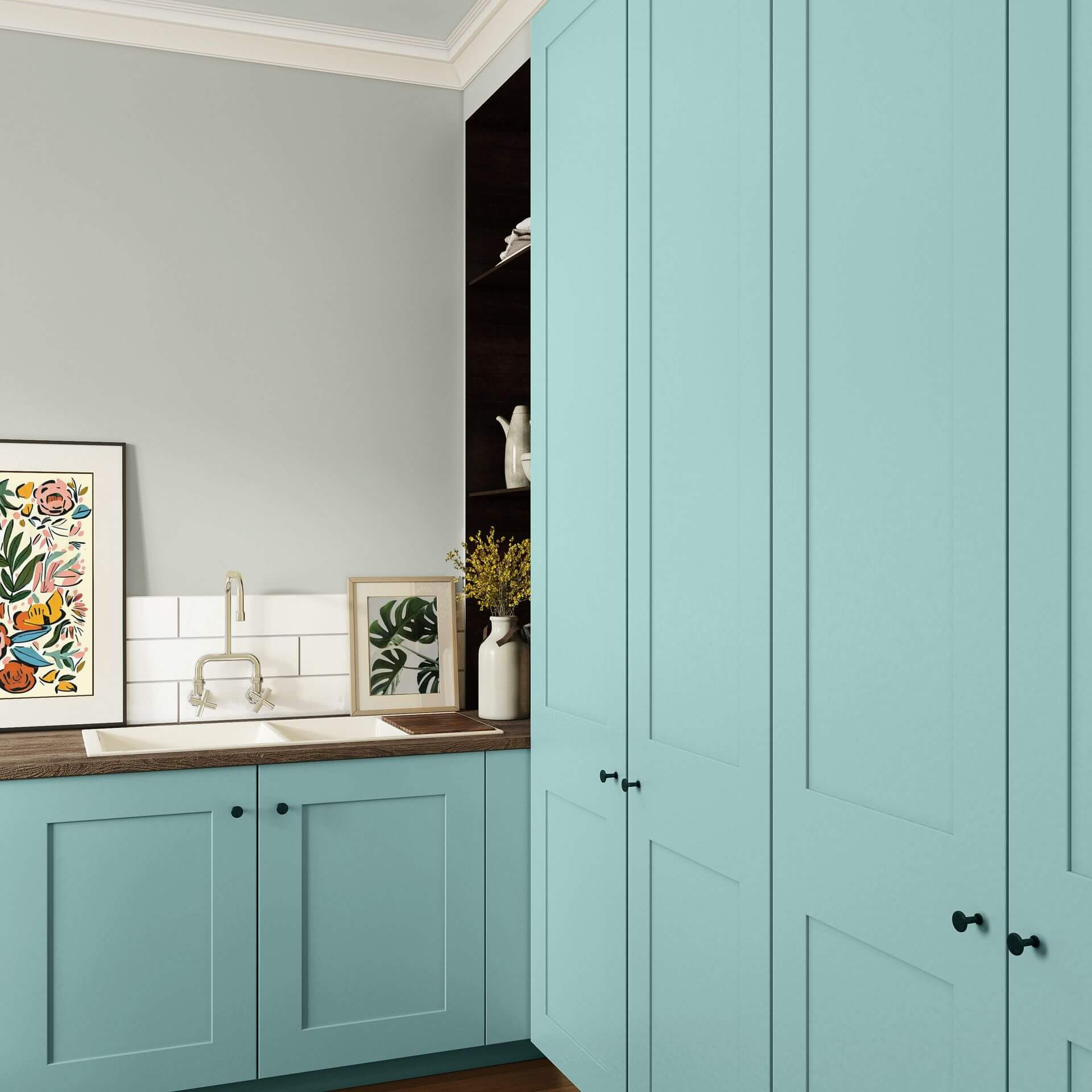
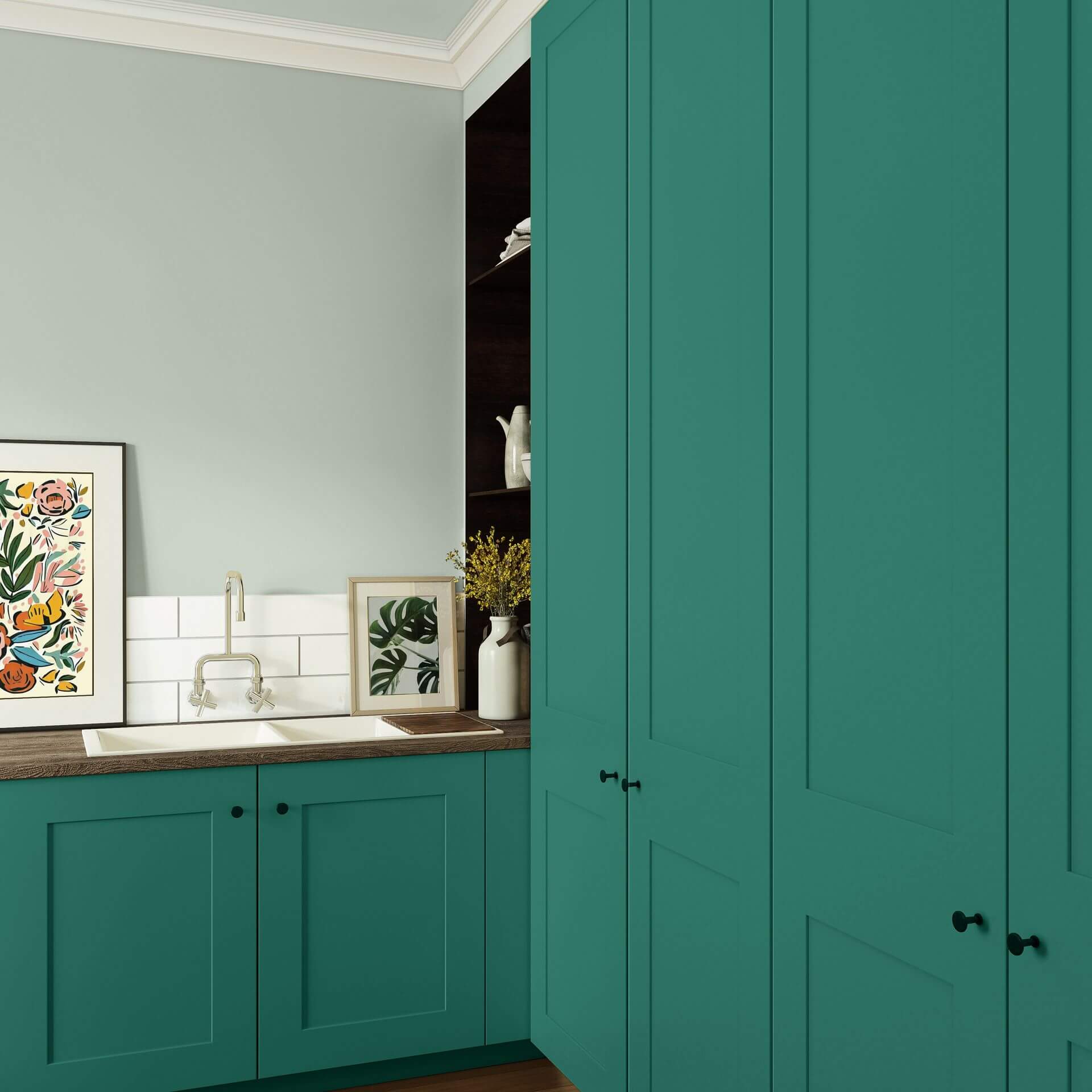
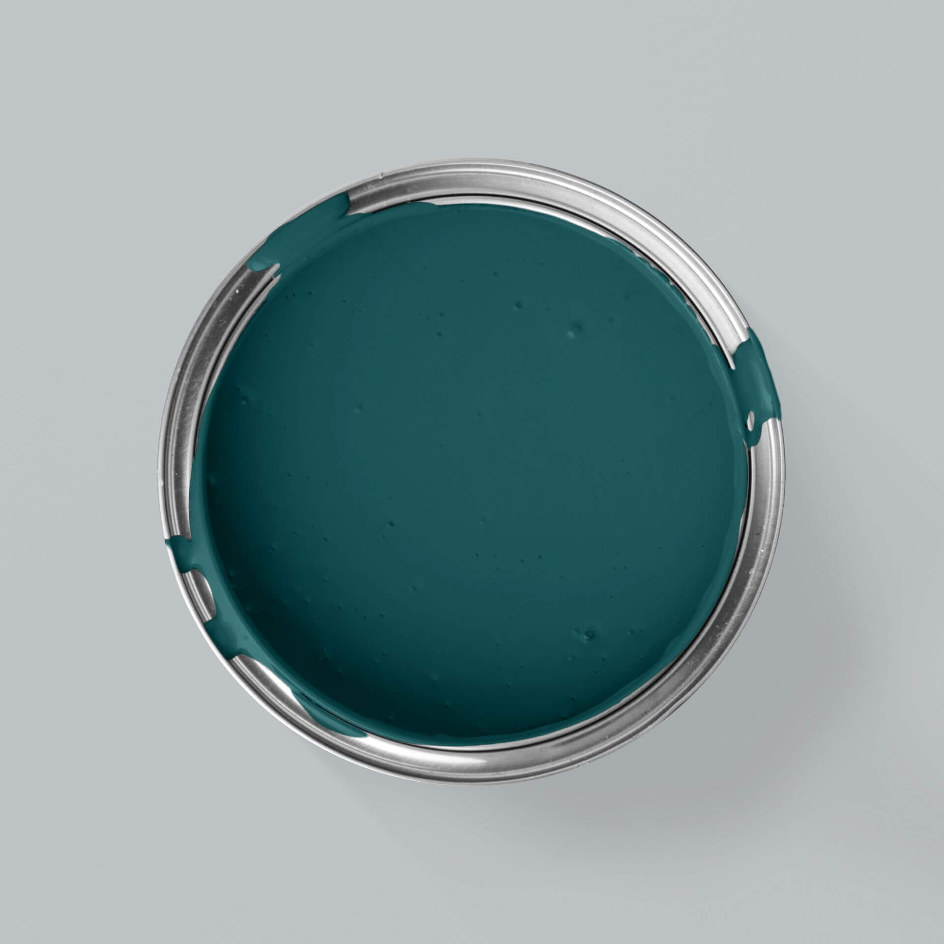
At MissPompadour Paint, the colours petrol and turquoise are available in different qualities so that you can paint these great colour shades on all surfaces. Simply embellish walls, tiles, floors, furniture and decorative items with colour.
Wall paints in petrol and turquoise
Depending on what requirements your wall needs to fulfil, you can choose between
- the extra-matt wall paint The Valuable Wall Paint from the Just paint Collection by MissPompadour
- and the extremely robust, washable and abrasion-resistant Just paint wall paint The Functional Wall Paint
- the chalky matt wall paint from the LittlePomp Chalk Collection
- the velvety matt wall paint from our CosyColours chalk paints.
Varnishes in petrol and turquoise
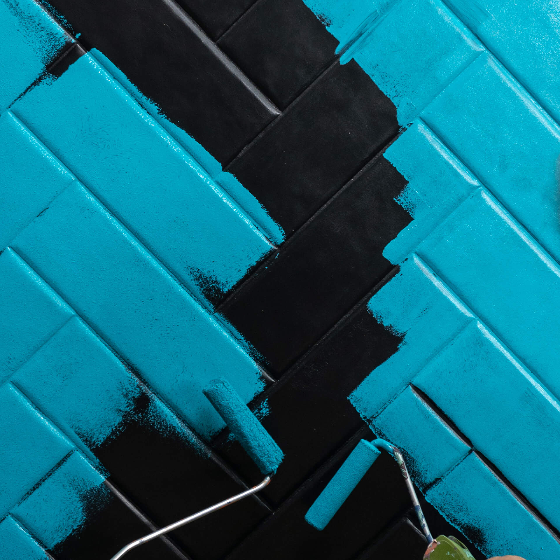
Not only walls can be designed in the colour petrol. We also offer all petrol and turquoise shades as paint and varnishes, so you can design your furniture, tiles, stairs and even metal in the same colour.
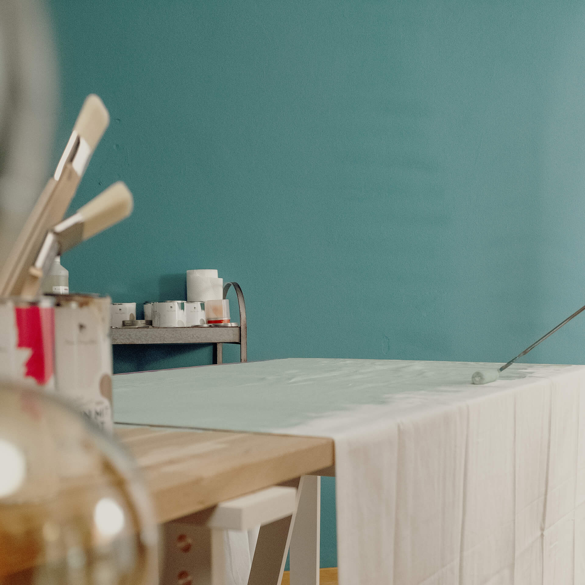
You can choose between different collections for petrol tones and varnishes in turquoise. For example, there is the robust Easy Eggshell! which creates a very smooth and easy-care surface. It is very suitable for almost all surfaces, both inside and out, and conjures up a soft silky matt lustre. Use this varnish to refinish kitchen furniture and doors! It is also the perfect varnish quality if you want to redesign your garden furniture.
The CosyColours chalk varnishes and LittlePomp chalk varnishes are particularly suitable for a powdery matt finish in the living area.
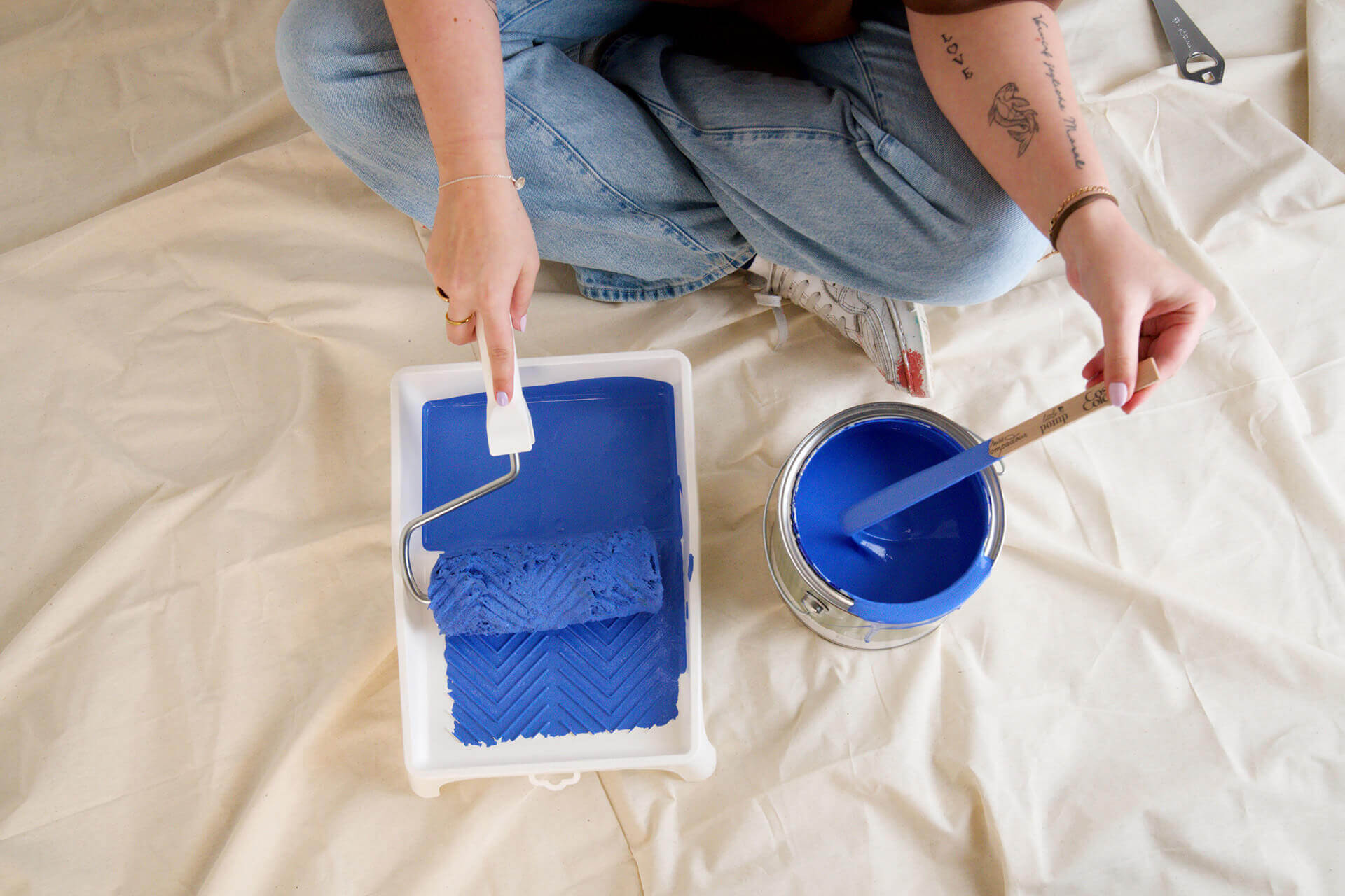
Order petrol and turquoise paint online at MissPompadour Paint
At MissPompadour, we attach great importance to sustainability. That's why we pack your order in the most resource-friendly way possible. We do without plastic and use paper instead.
We shred old cardboard boxes as filling material and our adhesive tape is also plastic-free. DHL GoGreen will then deliver your order climate-neutrally within a few days.
Once you have found your favourite shade among the petrol shades, your parcel can be delivered to you with the smallest possiblecarbon footprint. Need help with so much choice? Then contact our free customer advice centre right away!
Is turquoise a warm colour?
As there are warm and cool versions of both blue and green, there is no general answer to this question. Depending on which colour components predominate in petrol, its character tends to be cool or warm. However, turquoise tones usually have a fresh effect
Are the colours petrol and turquoise still modern?
Petrol and turquoise are real colour classics and therefore always modern. Depending on the colour context in which petrol is used, it appears calm, serious, elegant or even businesslike. Turquoise, on the other hand, as a lighter shade, has a rather airy, cool and refreshing effect
What can I combine petrol and turquoise with?
As petrol is an elegant colour shade, it looks particularly classy with accessories in metallic tones. Above all, the combination of gold and blue-green is a great eye-catcher in any room, especially in the living room. Fine materials such as leather or velvet also go wonderfully with this colour. If you use turquoise in combination with pastel shades, natural materials such as linen, silk and natural wood are a nice addition. If petrol is used in the office, you can complement it with clear materials such as white furniture, chrome elements and plants in light green to emphasise the clarifying and functional effect of the colour
Is petrol blue or green?
Both! :) Petrol is a dark colour shade in blue-green. The mixture can lean towards both the green and the blue colour spectrum. However, blue and green can also form the petrol shade in equal parts
What is the difference between turquoise and petrol?
Turquoise is the name given to the lighter mixtures of green and blue. Often grey, yellow or other pigments are also added. Petrol is darker
Is petrol a warm or cold colour?
Petrol is also a very versatile colour. The more petrol tends towards green, the warmer its colour effect. The radiance of petrol can best be described as intense and deep.
What goes with the colour petrol?
Many fresh colour shades from the yellow and red colour spectrum go well with dark petrol, as do pastel shades. Petrol harmonises particularly well with gold. And, of course, many shades of white go well. Petrol can also be combined wonderfully with other lighter aqua tones
What goes with turquoise?
Turquoise goes particularly well with many shades of brown, from light sand to dark chocolate brown. Orange accents also go well and bring out the best in turquoise tones