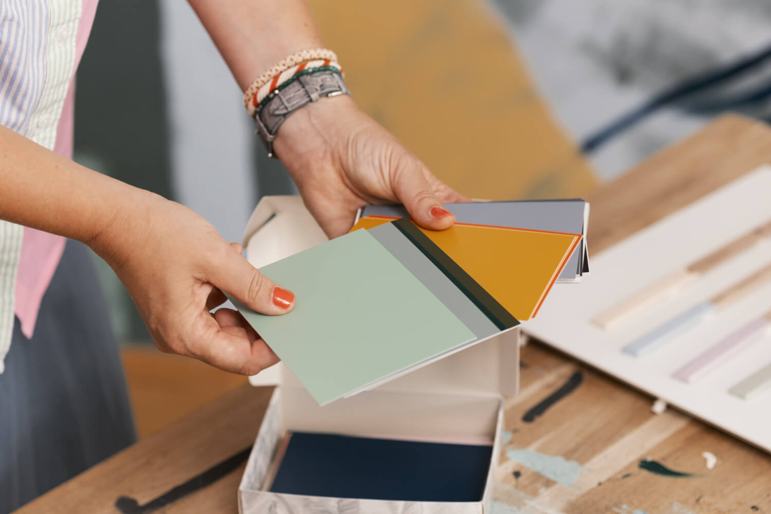
MissPompadour colour cards - Simply paint collection
The MissPompadour colour cards differ in many ways from the colour cards in our other collections. First of all, we have found a printer who is able to spray colour onto the cards in such a way that the respective colour shade appears absolutely true to the original on the colour card. The producer of our colour cards does nothing else but print colour cards in excellent colour reproduction quality. So you can be sure that MissPompadour colour cards will perfectly reproduce every single colour shade.
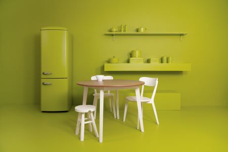
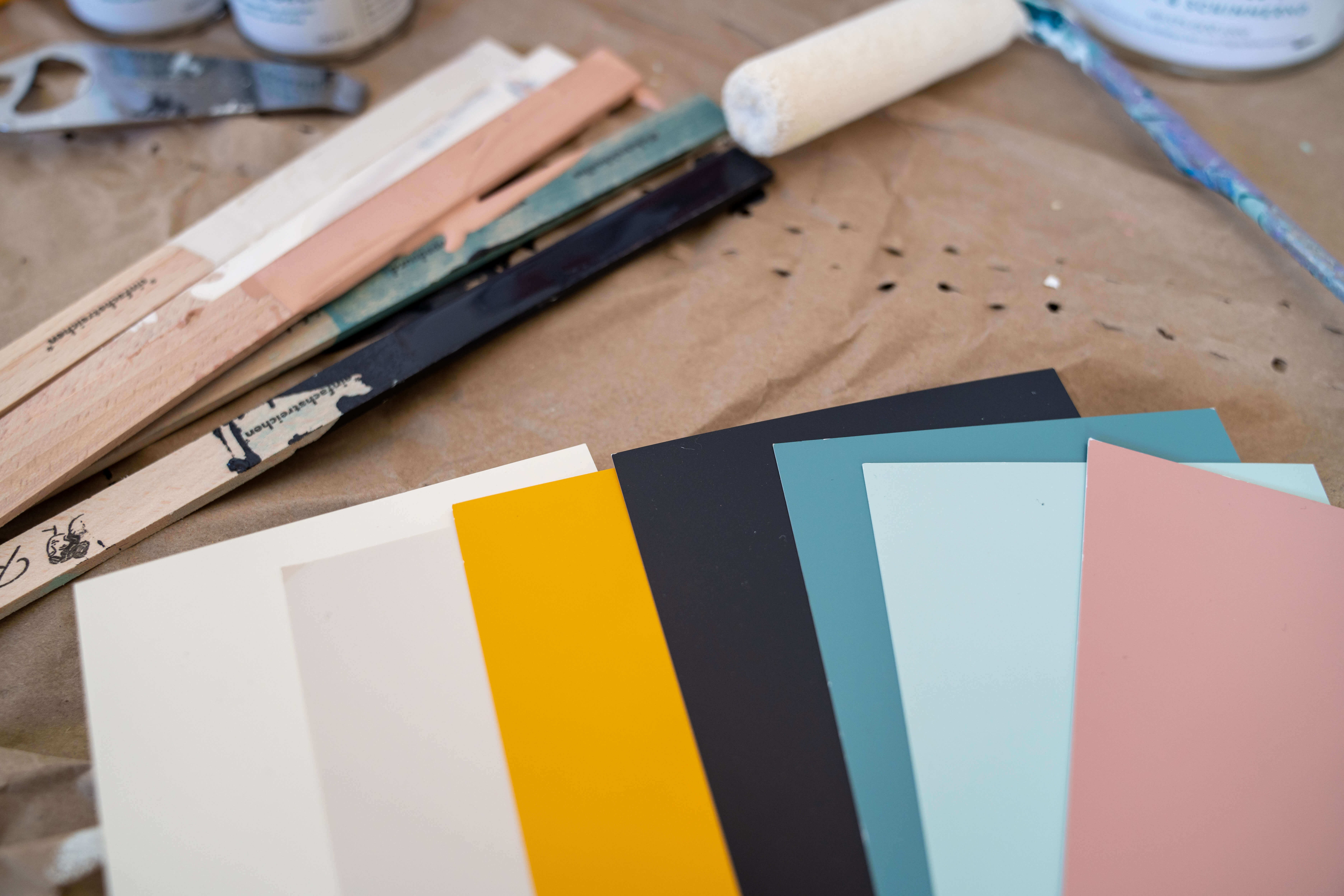
The great advantage of this process is that we can offer the colour samples in a large size. This gives you the opportunity to judge the colour shades really accurately. With normal colour cards, only a small strip can be coloured. This has the disadvantage that the colour shades always appear a little darker than they do on the large surface. The new MissPompadour colour cards have the proud format DIN A6. And that means postcard size. They are sprayed with colour all around the edges. This allows you to seamlessly apply the cards to other colour shades on walls and textiles.
The MissPompadour colour cards in their packaging
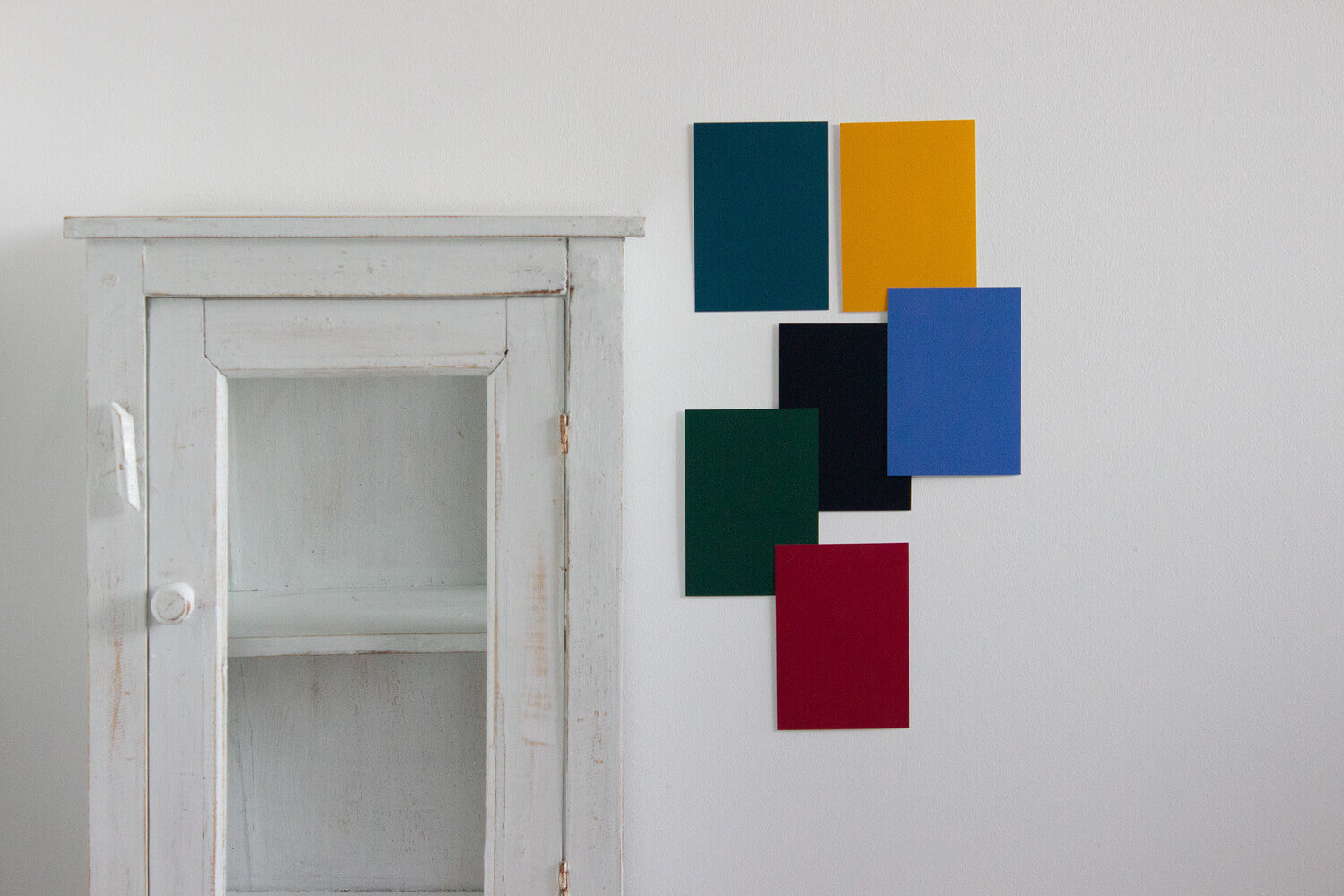
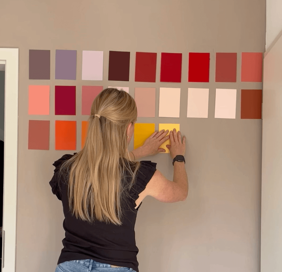
Another new feature: the MissPompadour colour cards set comes to you in a pretty box. You can take the cards out of the box individually. This gives you the opportunity to place different colour shades next to each other and compare them exactly. Just pin two colour cards on the wall to get an impression of their effect in any light. It is also easy to have a colour card with you when you want to choose curtains or furniture.
The informative MissPompadour colour cards
On the large colour cards in postcard format you can not only see and judge the colour wonderfully. On the back of each colour card you will also find a detailed description of the individual colour shades. Sometimes you get a different approach to a colour shade when you read about its composition. For example, it is often not immediately obvious that grey shades contain traces of green or red pigments. It doesn't matter if you like the colour. But it is important if you want to combine one colour with another. This is because the eye unconsciously makes a connection between the pigment contents of the individual colours. For example, if you use a grey with very little blue pigment, you should combine it with a white with a my blue pigment. This creates a harmonious overall impression. In addition, each colour card has a QR code on the back that takes you straight to the colour page. There you can immediately see in which qualities and container sizes your selected colour shade is offered.