


Wall Paints & Varnishes in Purple & Violet
Make a statement with this unique colours. Purple and violet combine beautifully and are always eye-catching. Choose your favourite and see how you can transform your home with our wall paints, chalk paints and varnishes in purple.


What shades of purple are there?
As a secondary colour, purple is mixed from blue and red. Depending on which proportion predominates and how many white or dark pigments are added, purple can create a very different effect
What shades are there?
Especially with such a diverse colour, it is important to get an overview of the shades.
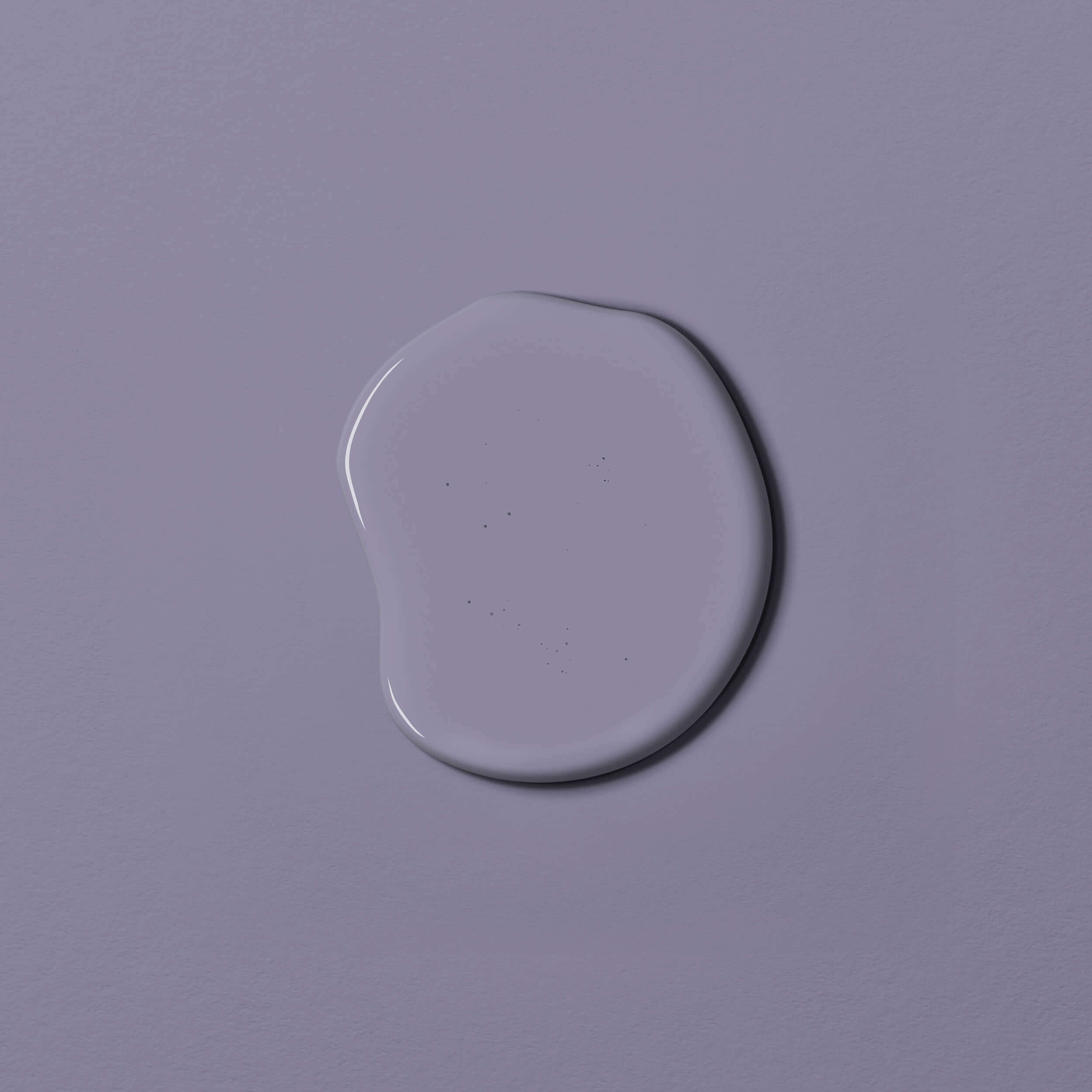
Let's start with the very light shades of purple. Adding white pigments creates fine, delicate pastel shades, often referred to as lilac, such as MissPompadour Purple with Lavender. Mauve is a bluish, more or less greyish violet.
Let's start with the very light shades of purple. Adding white pigments creates fine, delicate pastel shades, often referred to as lilac, such as MissPompadour Purple with Lavender. Mauve is a bluish, more or less greyish violet.
An overview of our wall paints in light purple shades:
- MissPompadour Purple with LavenderLittlePomp
- Purple & SoftCosyColours
- Tender Rose
Violet and purple are stronger shades of purple that are highly pigmented. MissPompadour Purple with Provence is a "classic" purple.
There are also, of course, the brownish-greyish purple shades such as Purple with Blueberry, which are more subtle and more awakening.
Examples of our colours in strong shades of purple
- MissPompadour Purple with Provence
- MissPompadour Purple with Blueberry
Whether you are looking for a light or strong purple for your interiors, you are sure to find it here!
Effect of purple and lilac as wall paint
Purple is a strong colour and its colour effect is as varied as its nuances.
As a mixture of the two primary colours blue and red, which stand for water and fire, it combines opposites and thus has a calming and balancing effect. Lilac has a feminine, light and awakening effect. Dark purple, on the other hand, encourages reflection. Overall, purple promotes creativity and creative energy.
As a mixture of the two primary colours blue and red, which stand for water and fire, it combines opposites and thus has a calming and balancing effect. Lilac has a feminine, light and awakening effect. Dark purple, on the other hand, encourages reflection. Overall, purple promotes creativity and creative energy.
How does purple affect the mind?
Purple originally appeared in the ecclesiastical context, where it symbolised priestly dignity and modesty. Today, purple tones have evolved into a multifaceted surprise. The colour scheme has a spiritual, restrained and equally unusual effect. By combining red and blue, feminine and masculine, fire and water, this colour scheme has a meditative and balancing effect on our minds. It is therefore particularly suitable for indoor spaces where you want to draw strength and calm. Purple is particularly suitable for
- Bedrooms
- Living rooms
- your favourite retreat such as a reading, meditation or yoga room
Lightened up to a light lilac, it provides lovely accents and calms the mind at the same time, helping you to find your inner centre.
Which rooms is violet suitable for?
Due to its meditative effect, light shades of purple are a wonderful interior wall colour for yoga rooms and rooms where people meditate and relax. Purple and violet are also suitable wall paints for the practice rooms of alternative practitioners and other healing professions. This is because they are said to have not only a balancing but also a pain-relieving and cleansing effect.
In the bedroom, a bluish purple colour can promote sleep and relax the mind. As a wall paint in violet tones can have a very calming effect, we recommend a slightly reddish purple for more togetherness. This way, the colour shade also brings its stimulating aspect into the bedroom
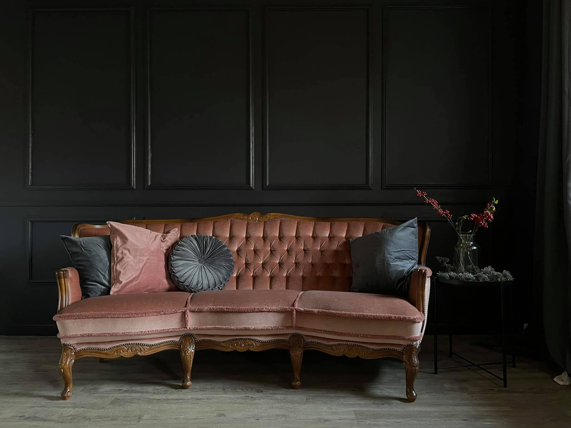
Combined with earth tones and minimalist decorations, a wall paint in grey-grey purple will give your living room its very own self-confident look. However, wall paint in dark purple, applied behind a sofa in spice or light natural tones, also creates an almost mystical effect
Little princesses often want purple as a colour for their nursery. You can fulfil this wish with wall paint in lavender or lilac. You can also achieve a purple colour shade with wall paint in pink violet. At the same time, these shades create a relaxing and balancing atmosphere. Creativity is also encouraged.
Tips for the trend colour violet
With the versatile wall paint colour purple, it can be fun to try out different variations. After all, that's what makes this colour shade so special. If you're still looking for design tips, we've put together some more information for you
Living styles and trends in shades of purple
Strong colours are often found in the Orient. If you like the oriental style of living, you can go for a strong purple colour. In combination with golden and orange accents, it creates rooms like something out of 1001 nights.
The colour purple also works well in the boho style. This style is characterised by a mixture of woven fabrics, macramé, retro influences and a mix of patterns. Bold colours go wonderfully with it.
The colour purple also works well in the boho style. This style is characterised by a mixture of woven fabrics, macramé, retro influences and a mix of patterns. Bold colours go wonderfully with it.
The whimsical style conjures up a fairytale atmosphere in your home. Here you can play with bold purple, gold and flourishes.
If you like romantic pastel shades, paint a wall in soft pastel purple, as you can combine it perfectly with all other pastel colours.
But this versatile colour shade is also ideal for a modern style .
Design tip: combine purple and violet with chrome, silver or glass to create a contemporary interior.
Do you already have a clear idea of how you want to design your rooms? Then choose your favourite purple colour shade in our online shop now and start your painting project!
Which colour goes with a purple wall?
The complementary colour of purple is yellow and provides a great contrast to dark purple. But other strong colours also go well with purple. You can combine pastel shades of purple with other pastel colours such as pink, light yellow or light blue for a playful look. If you prefer a purer look, combine it with grey.
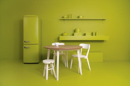
Colour recipes that use purple together with shades of green create a calm and interesting effect. Deep purple combined with a light, fresh green creates an eye-catching effect.
If you paint an accent wall in a really dark purple, wall paints in beige tones on adjacent surfaces really bringit out.
Colour recipes that use purple together with shades of green create a calm and interesting effect. Deep purple combined with a light, fresh green creates an eye-catching effect.
If you paint an accent wall in a really dark purple, wall paints in beige tones on adjacent surfaces really bringit out.
What can I combine purple with?
You can combine natural materials and plants with light and pastel purple. Fabrics in natural colours and grey wall paintalso go well with it. Purple and violet also go well with grey wood, white furniture and colours that tend towards grey - such as beige with cashmere.
If you have painted a strong, dark violet, golden and velvety elements go wonderfully with it. Cushions or pictures in orange and yellow also make a great impression. If you want to create a modern style, use black furniture and decorations, as they also go perfectly with purple. They also support each other's colour effect.
If you have painted a strong, dark violet, golden and velvety elements go wonderfully with it. Cushions or pictures in orange and yellow also make a great impression. If you want to create a modern style, use black furniture and decorations, as they also go perfectly with purple. They also support each other's colour effect.
What colours can I order from MissPompadour Paint?
Whether walls, furniture, floors, tiles... you can find all shades of purple in the right colour quality and in different containers! The basic price per litre varies depending on the paint tin
wall paints in purple
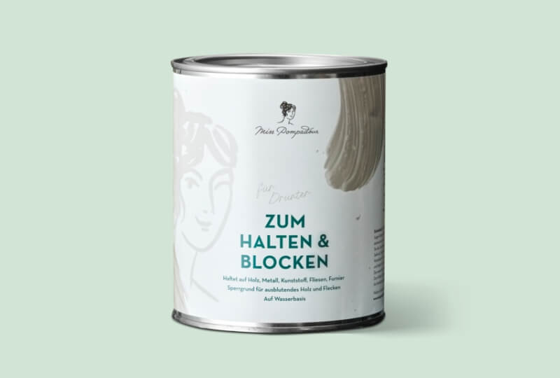
If you want to paint your walls purple, you can use our sustainable wall paint The Valuable Wall Paint, for example. It has a sophisticated matt finish, is odourless, low in solvents and does not splatter. And with incredible opacity, as it is characterised by opacity class 1. If you need an emulsion paint that is scrub-resistant and robust, reach for MissPompadour The Functional Wall Paint. You canalso choose fromthe rich chalk paints in our LittlePomp chalk collection .All our interior colours can be painted in any room without hesitation.
varnishes in purple
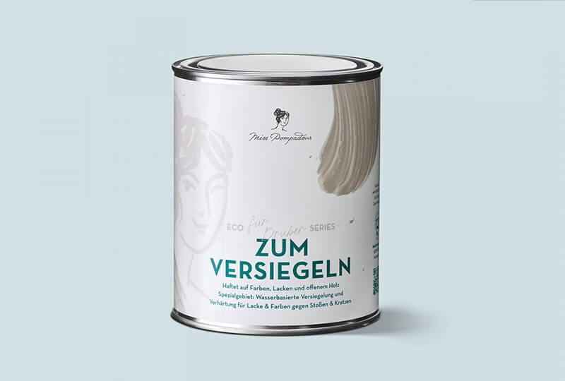
To paint your furniture, kitchen, tiles or floors, we have theright choice of purple varnish foryou with our varnish qualities. There's hardly anything you can't paint with it because our varnishes are suitable for a wide variety of surfaces. You can also find articles on various painting projects with tips and lots of useful application informationin our guide.
From matt to glossy: our different qualities
Which varnish quality is right for your project depends on the stress on the surface and your individual taste. If you are painting a heavily used surface such as a kitchen or floor, you should opt for the semi-gloss varnishes. These are particularly robust and impact-resistant. You canchoose from the MissPompadour Eggshell Varnish varnishes.
If you prefer a really matt finish, choose from the matt varnishes MissPompadour Matt Varnish, LittlePomp chalk varnish and CosyColours. You can seal these with wood wax and give them a personalised look.
Order wall and chalk paint in purple online from MissPompadour
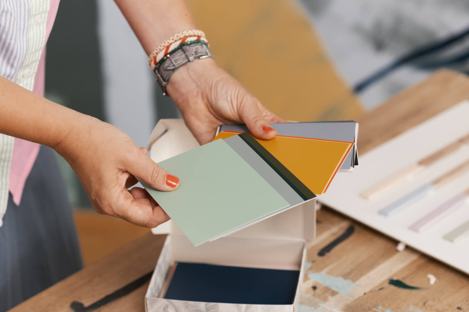
Dare to try purple! Hardly any other wall paint can be used in so many different ways. If you want to see the colours in real life first, our colour cards are a good idea. This is because the colours may differ from their actual effect on screen.
Don't shy away from this small first order, because you can place it with a clear conscience. We don't just send small parcels, but also large ones, without exception, plastic-free and with DHL Go-Green. No matter how many litres you order from us, our packaging is made from recyclable and often directly recycled paper.
Do you already know our Facebook group? Around 85, 000 members are now exchanging ideas there. You can use the group search to get more impressions of how the colour purple can be used. If you're still unsure about which shade and colour quality is right for you, just ask our free colour consultancy. We'll be happy to help you!